
The DiviFlash Advanced Tabs module lets you create vertical or horizontal tabs and place any type of content inside each tab.
Let’s see the settings in brief and how to make better use of it —
Content Tab
This tab contains the essential settings that control the content of the Advanced Tabs module.
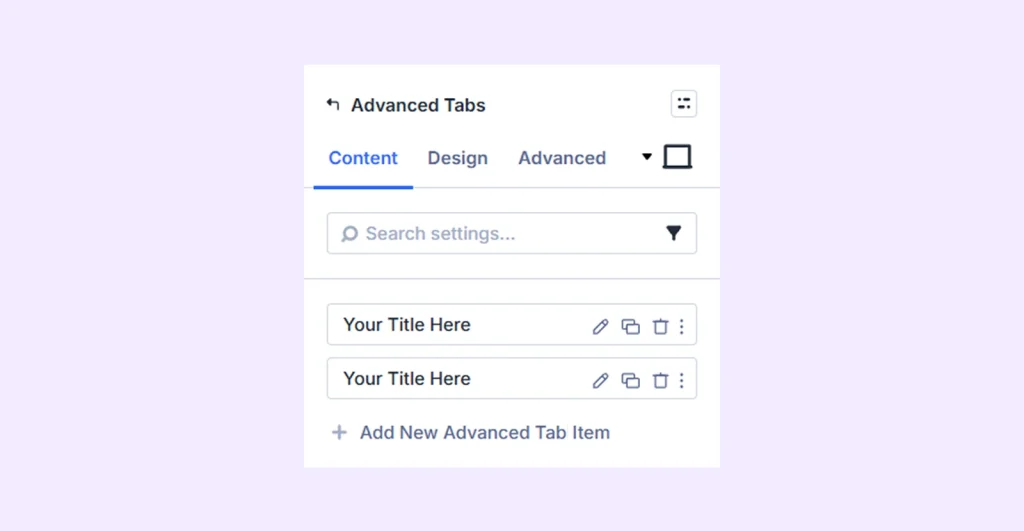
Adding & Editing Tab Items
When you first insert the module, a few pre-built tab items appear. You can edit these directly or click Add New Advanced Tab Item to create a new one. Both options share the same settings and to learn more about them, click here.
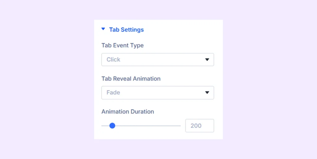
Tab Settings
- Tab Event Type: Choose the action to open a tab (click/on hover).
- Tab Reveal Animation: Set a tab reveal animation from 8 different options.
- Animation Duration: Set the length of the tab reveal animation.
Nav Container Background: Add a background color, gradient, or an image to the navigation container.
Content Container Background: Add a background color, gradient, or an image to the content container.
Background: Add a background color, gradient, image, video, pattern, or mask to the module.
Element Label: Rename the module to organize it more easily in the Divi Builder. (Only you can see this label.)
Design Tab
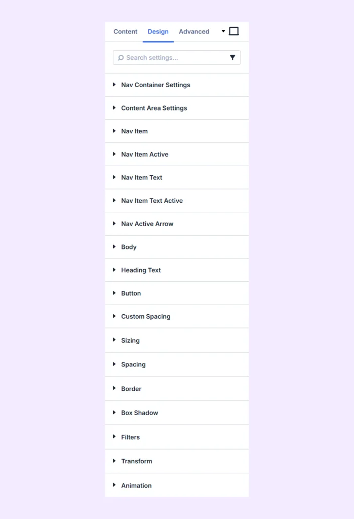
This tab allows you to customize the visual appearance of the Advanced Tabs module.
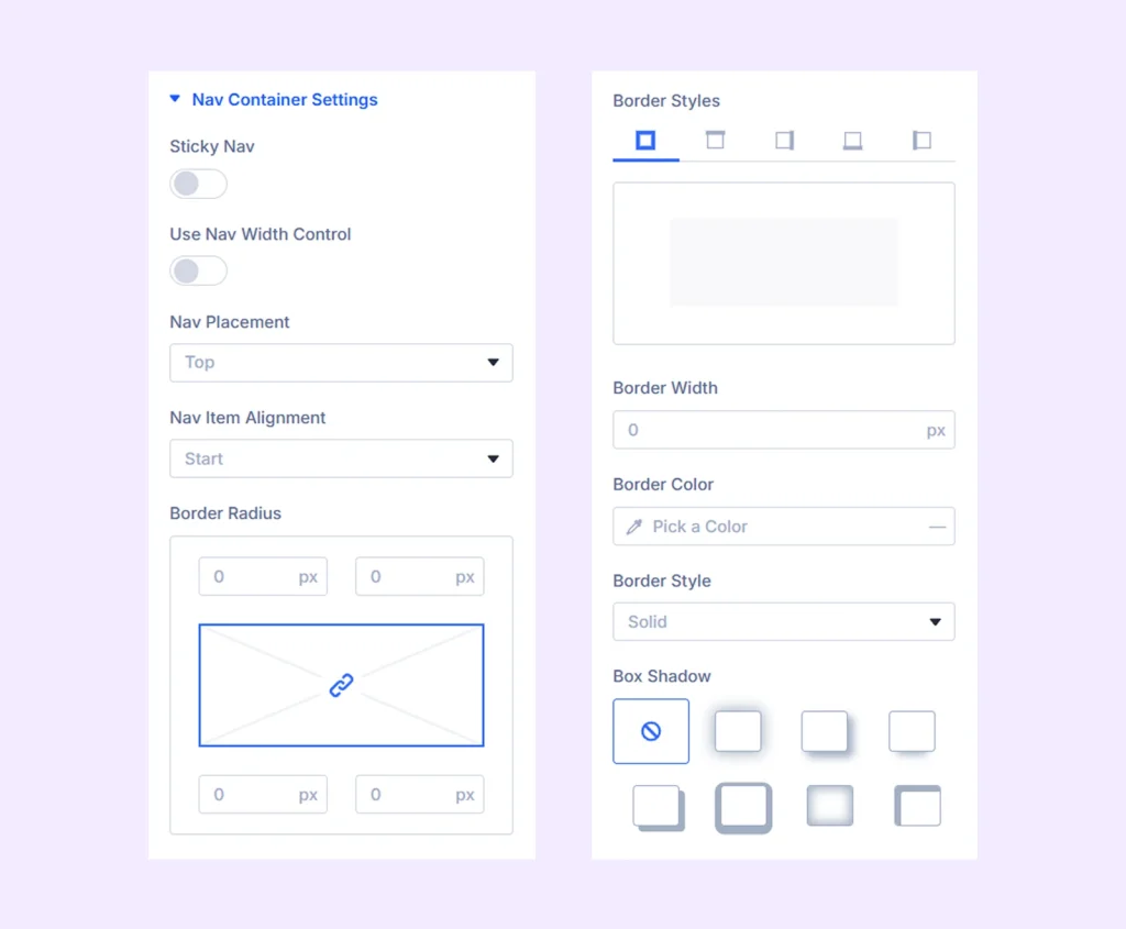
Nav Container Settings
- Sticky Nav: Enable to make the tabs sticky while scrolling.
- Turn Off Sticky On: Turn off sticky mode for mobile and tablet if required.
- Sticky Top Offset: Set the point where the tab will stick from top.
- Use Nav Width Control: Turn on and set the width and height of the navbar.
- Nav Item Min Width: Set a minimum width for the nav items.
- Nav Item Max Width: Set a maximum width for the nav items.
- Nav Item Height: Adjust the height of the nav items.
- Nav Placement: Set the placement to the top, bottom, left or right and alignment of navigation items.
- Nav Container Width: Adjust the width of the nav container. Only available if you choose “Left” or “Right” as “Nav Placement.”
- Nav Item Alignment: Choose how the navigation items are aligned within the container.
The rest of the options are for styling the border of the navigation container.
Content Area Settings
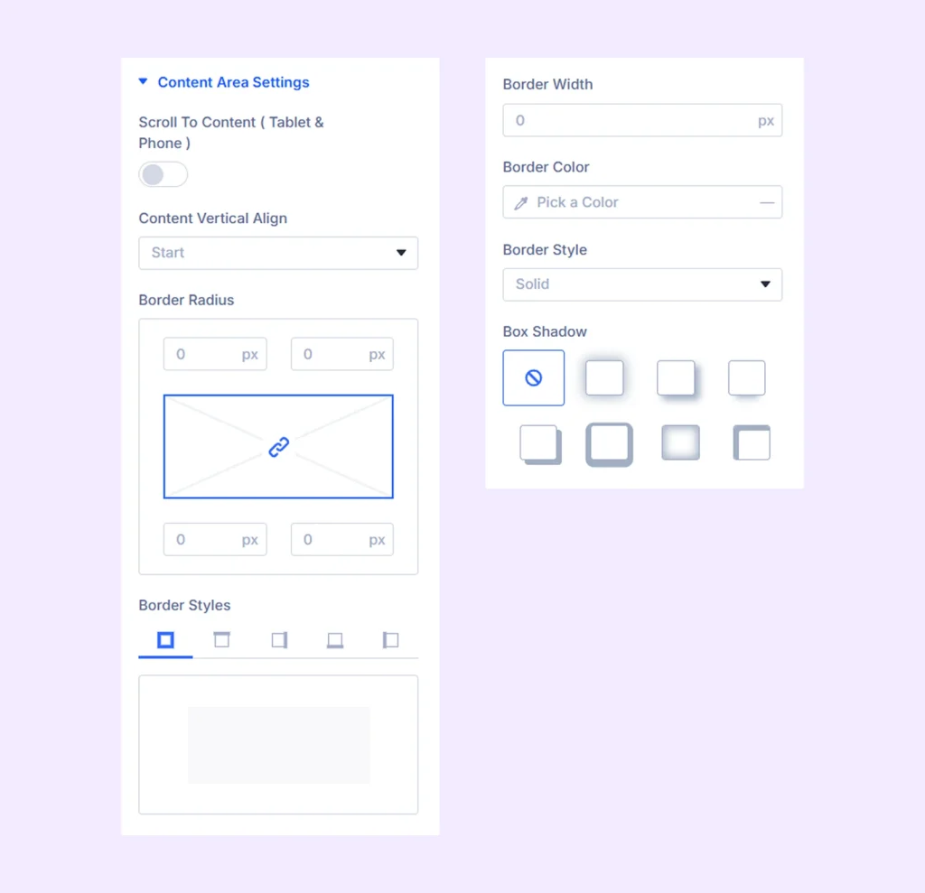
- Scroll To Content (Table & Phone): Enable this to automatically scroll to the main content on smaller devices.
- Content Vertical Align: Change the vertical alignment of the content in 4 different positions.
The rest of the options are for styling the border of the content area.
Nav Item: Set background color, gradient, or image size to the navigation items. Also, change the nav icons’ color, size, placement, borders, etc.
Nav Item Active: Set background color, gradient, or image to the active navigation item. Also, change the active nav icon’s color, size, placement, borders, etc.
Nav Item Text: Find a wide range of customization options for the typography of the nav items’ titles and descriptions.
Nav Item Text Active: Find a wide range of customization options for the typography of the active nav item’s title and description.
Nav Active Arrow
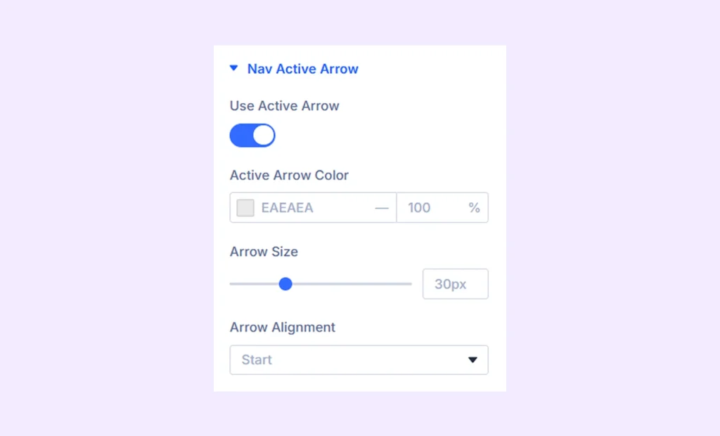
- Use Active Arrow: Toggle on to add an arrow to the active nav item and reveal other customization options.
- Active Arrow Color: Change the color of the active arrow.
- Arrow Size: Adjust the size of the arrow.
- Arrow Alignment: Change the placement of the arrow in 3 different positions.
Body: Typography, color, and placement options for different types of body text such as links, ordered and unordered lists, and blockquotes.
Heading Text: Typography, color, and placement options for different types of heading texts from h1 to h6.
Button
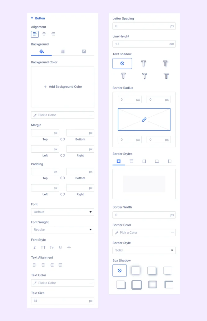
- Alignment: Set the alignment of the nav item buttons.
- Background: Add a background color, gradient, or image to the button.
- Button Margin: Add custom margins to the buttons’ containers.
- Button Padding: Add custom paddings to the buttons’ containers.
In addition to these, there are options to customize the typography, color, and borders of the buttons.
Custom Spacing: Add custom margins and paddings to all the wrappers and every item of content and navigation.
Sizing: Adjust the width, height, and alignment of the module.
Spacing: Adjust the margins and padding of the module container.
Border: Customize the border using radius, style, width, and color settings.
Box Shadow: Add shadow effects to the module container.
Filters: Apply color filter effects to the module.
Transform: Adjust the scale, position, rotation, and size of the module.
Animation: Add reveal animation effects and control the animation style, delay, duration, and more.
Advanced Tab
This tab provides additional settings for advanced users who want greater control over the module with custom code, conditions, and more.
Advanced Tab Item Settings
From here, you can add content and style each tab item separately. Any changes you make here will only apply to that tab and will override the general settings of the main Advanced Tabs module.
Content Tab
Content: Input the title, description, and body text of the tab item. You can also choose to display a library item instead of content.
Nav Icon Settings: Choose to use an icon or an image in the tab item. When an icon is chosen, you can also pick the color and the size of the icon.
Image: Upload an image to display as content in the tab item. You can also input the alt text and change the placement for different devices.
Navigation Settings
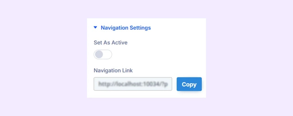
- Set as Active: Toggle this option on to set this nav item as active by default.
- Navigation Link: Use this link to land on the page with this navigation item opened by default. Simply click to copy the link.
Button: Add a button to the tab item.
Text Area Background: Add a background color, gradient, or an image to the text area.
Background: Add a background color, gradient, image, video, etc. to the tab item.
Element Label: Change the tab item name or label.
Design Tab
Use this tab to style the tab item’s text, image, heading, button, and other visual elements.
Advanced Tab
Use this tab for custom code, advanced logic, and additional configuration options.
Need Help?
If you have any questions or need assistance, contact our support team: [email protected]