
DiviFlash Animated Heading module lets you create eye-catching animated headings.
Let’s see the settings in brief and how to make better use of it —
Content Tab
This tab contains the settings to add the heading text and configure animation effects.
Content
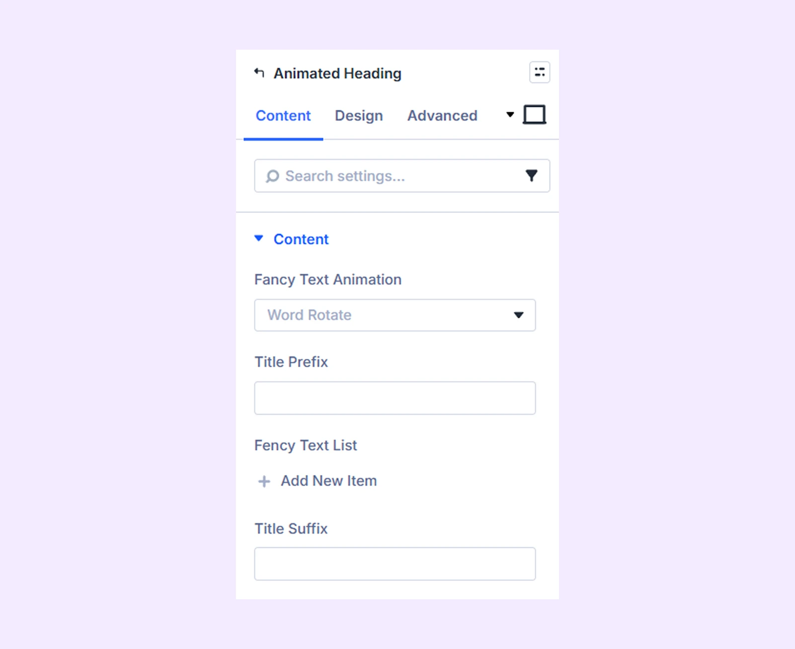
- Fancy Text Animation: Choose from 8 different animation style presets.
- Title Prefix: Add text that appears before the animated heading.
- Fancy Text List: Add the text you want to animate. You can add multiple animated texts using the “Add New Item” option.
- Title Suffix: Add text that appears after the animated heading.
Settings
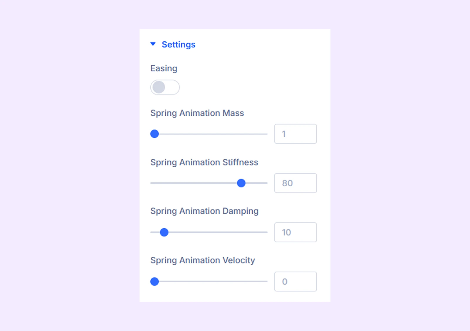
- Easing: Enable this option to apply easing effects to the animation.
- Animation Duration: Adjust how long the animation lasts.
- Animation Delay: Set the delay between each animation.
- Easing: Choose how the animation accelerates and slows down from a variety of easing options.
Note: If Easing is enabled, the spring animation settings will not be available.
- Spring Animation Mass: Adjust the speed and bounciness of your animation.
- Spring Animation Stiffness: Adjust the rigidity of your animation.
- Spring Animation Damping: Adjust how quickly the animation comes to a rest.
- Spring Animation Velocity: Adjust the initial speed of the bounciness of the animation.
Prefix, Fancy-text, Suffix Background: Add a background color, gradient, or an image to the prefix, fancy, and suffix text.
Link: Use this default Divi setting to add a link to the entire module.
Background: Add a background color, gradient, image, video, pattern, or mask to the module.
Element Label: Rename the module to organize it more easily in the Divi Builder. (Only you can see this label.)
Design Tab
Customize the appearance of the Animated Heading module with settings for prefix, fancy text, and others.
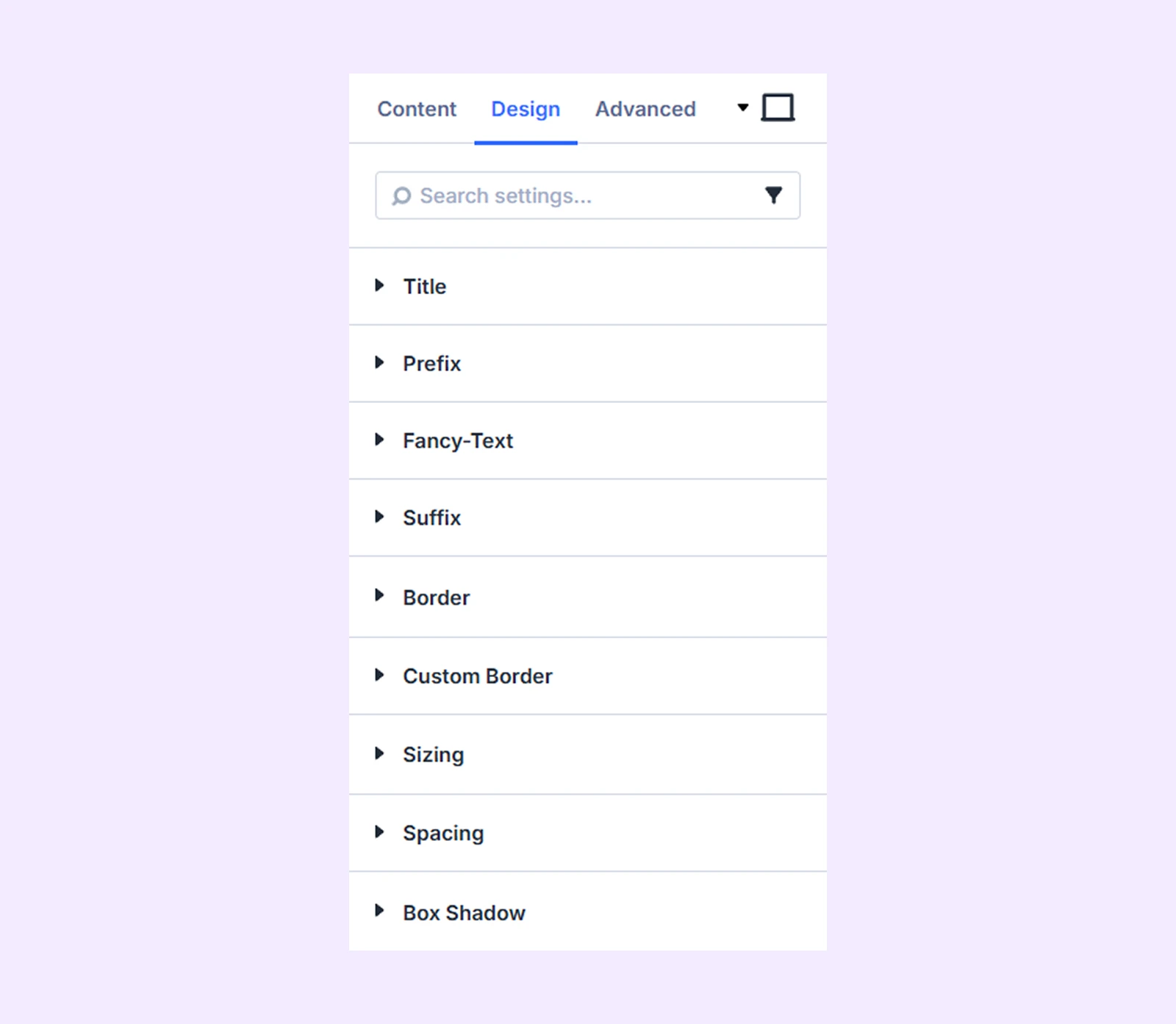
Title: Typography options for the heading.
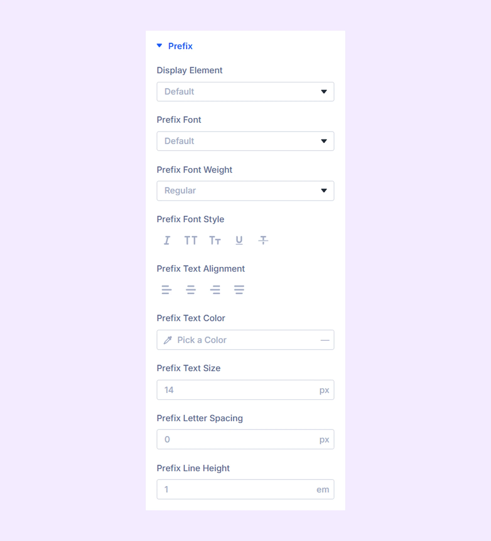
Prefix
- Display Element: Choose how the prefix text is displayed. You can select Default, Inline, or Block.
- Max Width: Set the maximum width of the prefix container. (Available when “Block” is selected.)
- Alignment: Adjust the horizontal alignment of the prefix container. (Available when “Block” is selected.)
The rest of the options are for the typography of the prefix text.
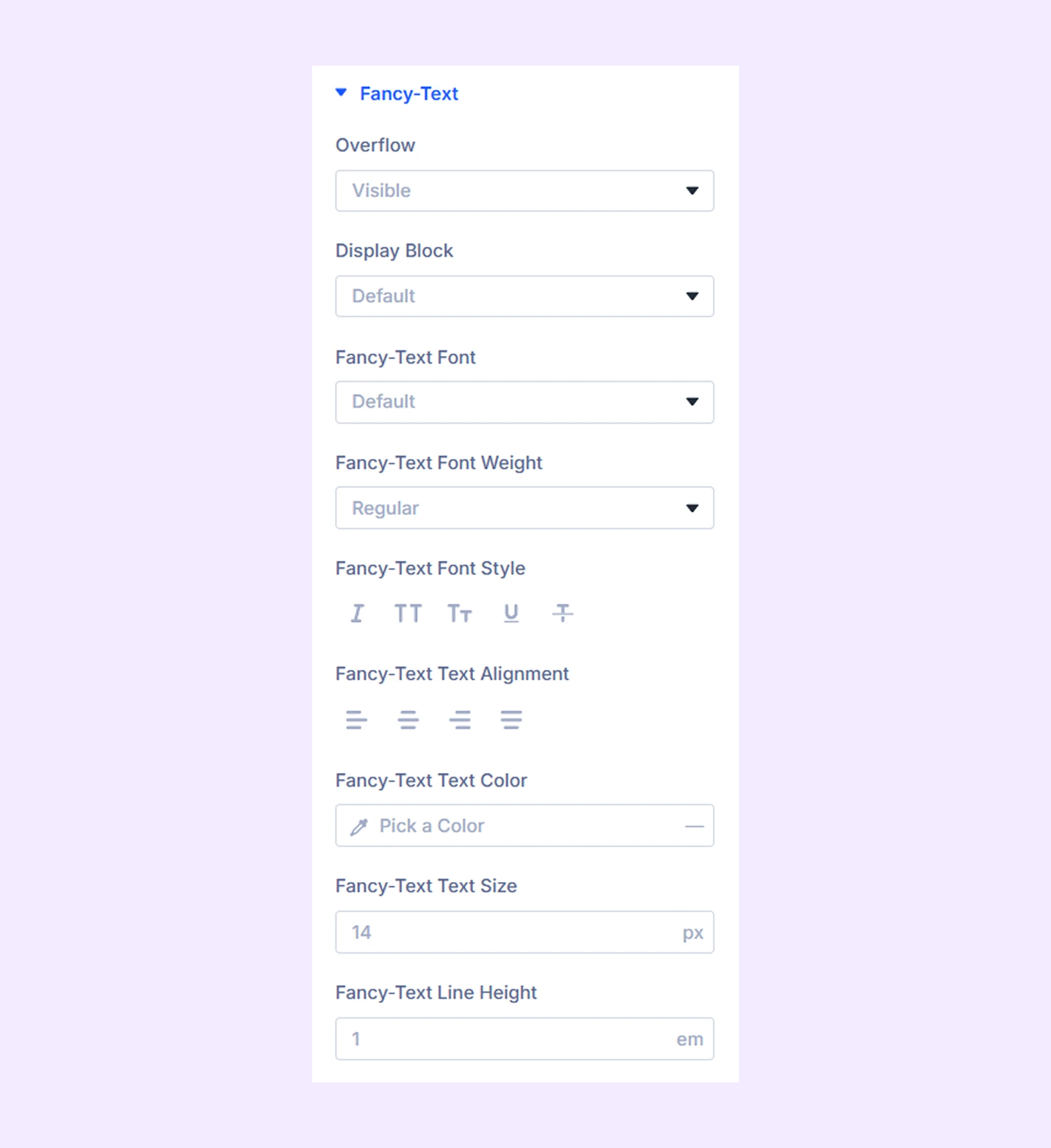
Fancy-text
- Overflow: Choose whether to hide or show the animation when it exceeds its container. And the rest of the options are the same as the “Prefix.”
Suffix: The rest of the options are the same as the “Prefix.”
Border: Border options for the heading container.
Custom Border: Separate border options for the prefix, fancy, and suffix text.
Sizing: Adjust the width, height, and alignment of the module.
Spacing: Adjust the margins and padding of the module container.
Box Shadow: Add shadow effects to the module container.
Advanced Tab
This tab provides additional settings for advanced users who want greater control over the module with custom code, conditions, and more.
Need Help?
If you have any questions or need assistance, contact our support team: [email protected]