Logo Carousel
The Logo Carousel module is a versatile tool designed to showcase a collection of logos or brand identities in a visually appealing carousel format.
Let’s see the settings in brief and how to make better use of it —
Content Tab
The Content Tab contains the essential settings for adding and configuring logos in the carousel.
Add New Item
Click the + Add New Item button to add a new logo slider to the carousel. This opens the Logo Carousel Item Settings, where you can upload logos and customize individual settings. To learn more about adding content to logo sliders, click here.
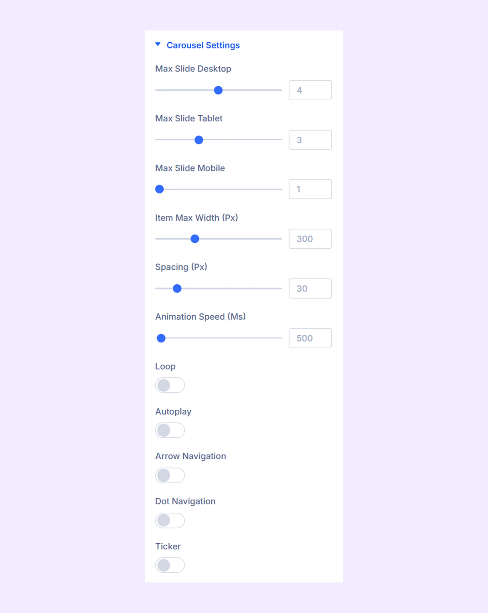
Carousel Settings
- Max Slide Desktop: Choose the number of logos you want to display on desktop devices.
- Max Slide Tablet: Choose the number of logos you want to display on tablets.
- Max Slide Mobile: Choose the number of logos you want to display on mobile devices.
- Item Max Width (Px): Set a maximum width limit for the logo carousel’s container.
- Spacing (Px): Adjust the space between the carousel items.
- Animation Speed: Define the slide speed for the logo carousel items.
- Loop: Enable this option to add a loop effect to the logo carousel.
- Autoplay: Enable this option to have the logos rotate automatically.
- Autoplay Duration (Px): Define how long the autoplay will pause before moving on to the next logo.
- Pause on Hover: When enabled, the auto-playing logos will pause when hovered. Only available when autoplay is enabled.
- Arrow Navigation: Turn on to enable arrows to navigate the logos.
- Dot Navigation: Turn on to enable dots to navigate the logos.
- Ticker: Enable to have the logos continuously slide without ever pausing.
- Ticker Pause On Hover: When enabled, the logos will pause when hovered. Only available when the ticker is enabled.
- Animation Speed: Adjust the ticker animation speed. Only available when the ticker is enabled.
Note: When “Ticker” is enabled, all the other effects (Loop, Autoplay) and navigation options (Arrow, Dot) will be disabled.
Link: Use this default Divi setting to add a link to the entire module.
Background: Add a background color, gradient, image, video, pattern, or mask to the module.
Element Label: Rename the module to organize it more easily in the Divi Builder. (Only you can see this label.)
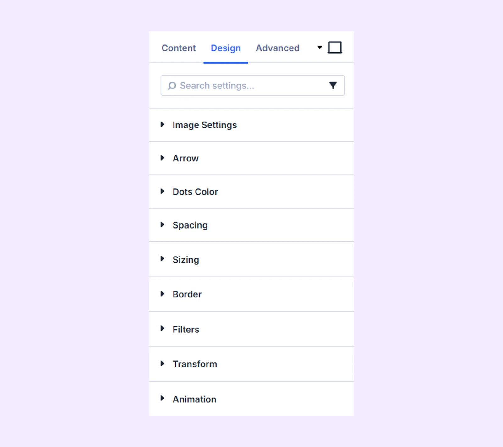
Design Tab
Customize the appearance of the Logo Carousel module with advanced design settings.
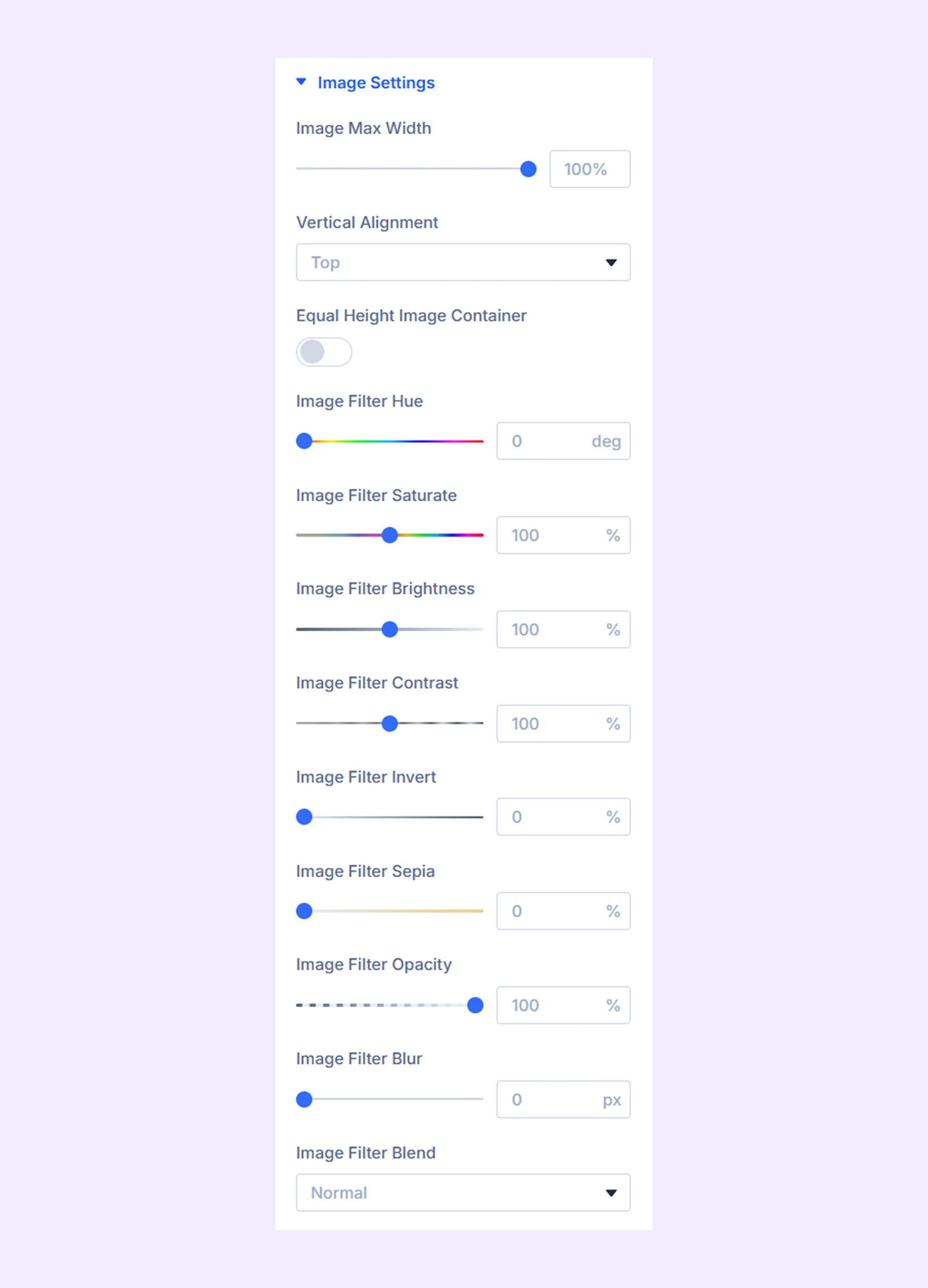
Image Settings
- Image Max Width: Set a maximum width limit for the logos in the carousel.
- Vertical Alignment: Change the vertical position of the logos respective to the logo carousel’s container.
- Equal Height Image Container: Turn on to make all the logo containers the same height.
The next option is to add different color filters to the logos in the carousel.
Arrow: Customize arrow icon color, background, spacing, and positioning. (Available when Arrow Navigation is enabled)
Dots Color: Change dot color and active dot color. (Available when Dot Navigation is enabled)
Sizing: Adjust the width, height, and alignment of the module.
Spacing: Adjust the margins and padding of the module container.
Border: Customize the border using radius, style, width, and color settings.
Filters: Apply color filter effects to the module.
Transform: Adjust the scale, position, rotation, and size of the module.
Animation: Add reveal animation effects and control the animation style, delay, duration, and more.
Advanced Tab
This tab provides additional settings for advanced users who want greater control over the module with custom code, conditions, and more.
Logo Carousel Item Settings
Each logo acts as a child item of the module. Settings applied here will override the main module settings.
Content Tab
Image: Add the logo and its alt text.
Link: Comes by default with Divi. No real use case.
Background: Add a background color, gradient, image, and more to the logo.
Admin Label: Change the logo slider name or label if required which will only be visible to you.
Design Tab
Use this tab to style individual logos. The options are similar to those in the main module settings.
Advanced Tab
Add custom CSS, visibility rules, or conditions for individual logo items.
Need Help?
If you have any questions or need assistance, contact our support team: [email protected]