
The DiviFlash Marquee Text module allows you to add scrolling text to your Divi website.
Let’s see the settings in brief and how to make better use of it —
Content Tab
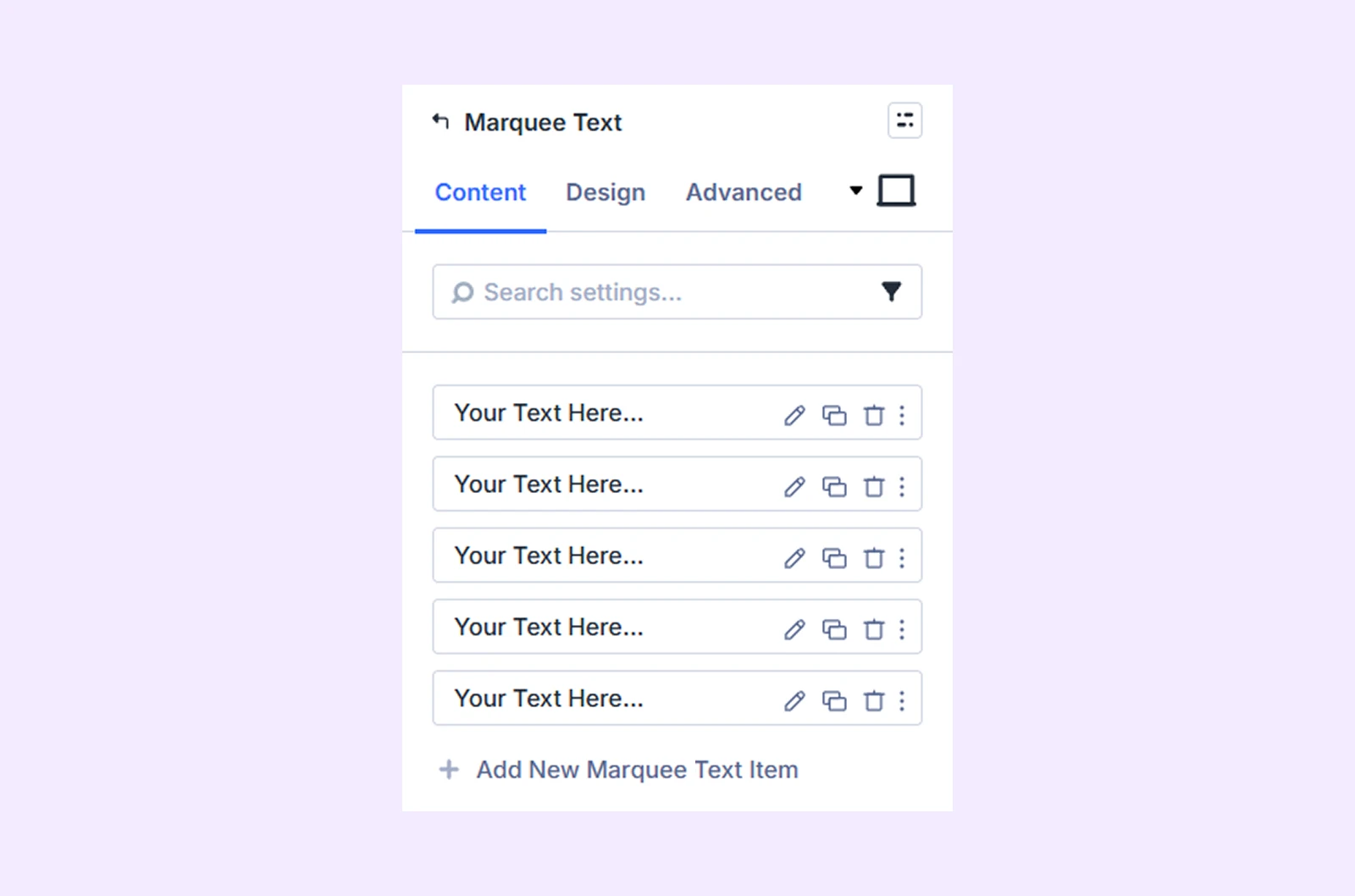
This tab contains the essential settings to add and configure marquee text items.
Add New Item
Click the + Add New Item button to create a new marquee text item. This opens the Marquee Text Item Settings, where you can add content and style each item individually. By default, the module provides 5 marquee text items. To learn more about how to customize marquee text items, click here.
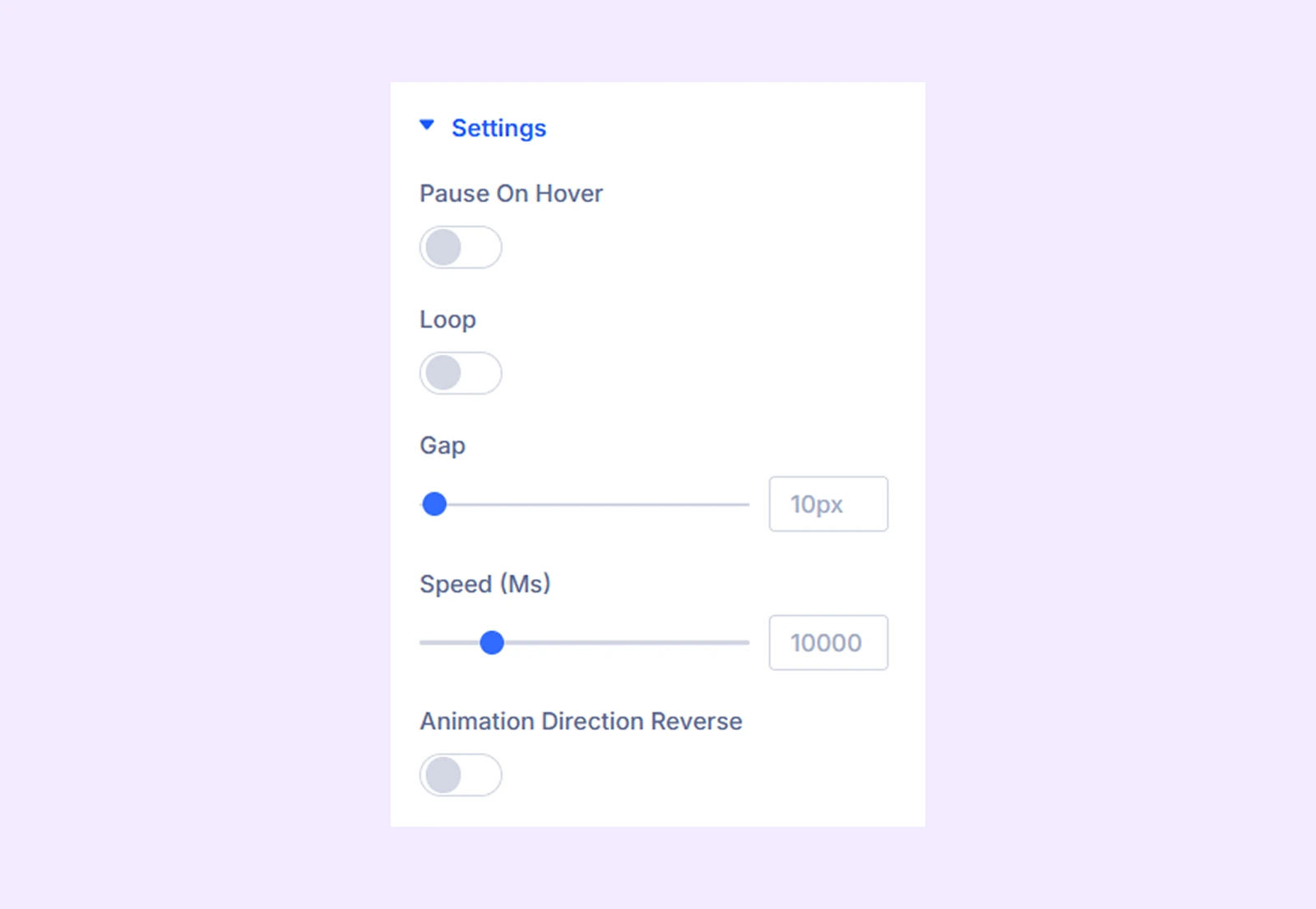
Settings
- Pause on Hover: Enable this option to have the marquee text pause when hovered.
- Loop: Apply a loop effect to the marquee text.
- Gap: Adjust the gap between the marquee text items.
- Speed: Adjust the speed of the marquee text animation.
- Animation Direction Reverse: Enable this option to make the marquee text go from left to right.
Link: Use this default Divi setting to add a link to the entire module.
Background: Add a background color, gradient, image, video, pattern, or mask to the module.
Element Label: Rename the module to organize it more easily in the Divi Builder. (Only you can see this label.)
Design Tab
This tab controls the visual appearance of the marquee text module.
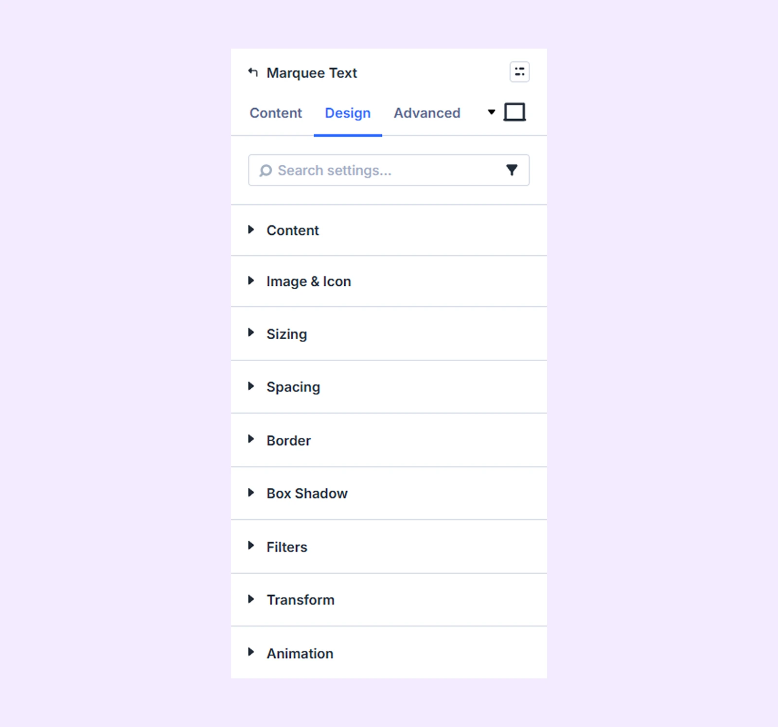
Content: Background, spacing, and typography options for the marquee text content.
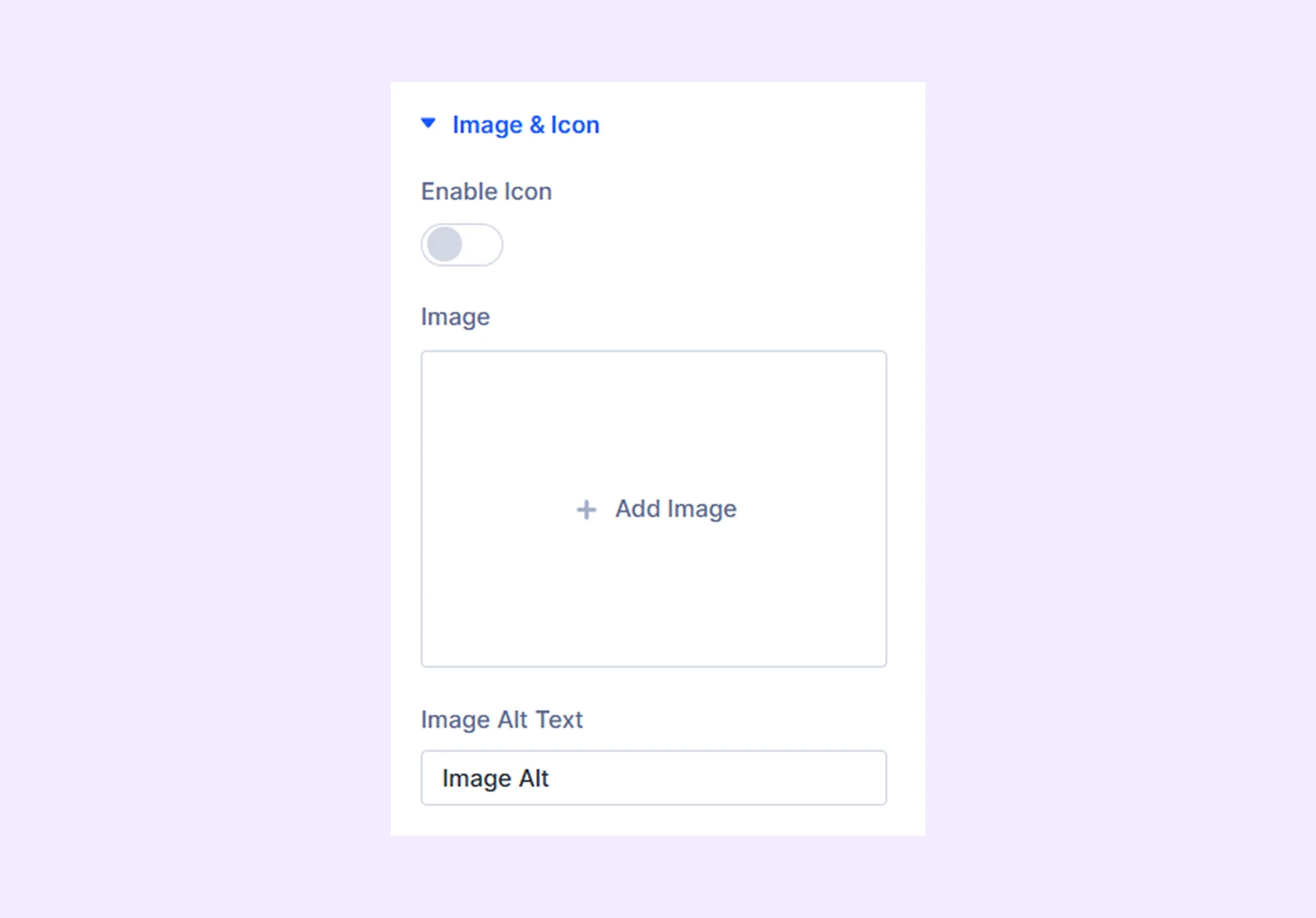
Image & Icon: Color, size, spacing, and border options for the marquee text images and icons.
Sizing: Adjust the width, height, and alignment of the module.
Spacing: Add custom margin and padding to the module’s container.
Border: Customize the border style, width, and color. And style each border separately or apply the same style to all sides.
Box Shadow: Add shadow effects to the module.
Filters: Apply color filters to enhance the appearance.
Transform: Scale, rotate, move, or skew the module.
Animation: Add reveal animation effects and control the animation style, delay, duration, and more.
Advanced Tab
This tab provides additional settings for advanced users who want greater control over the module with custom code, conditions, and more.
Marquee Text Item Settings
Each marquee text item acts as a child of the main module. You can customize each item individually, and these settings will override the parent module settings.
Content Tab
Content: Enter the text and select an H-tag for the marquee text item.
Image & Icon: Add an image or icon to accompany the text.
Link: Add a URL to make this specific marquee text item clickable.
Background: Apply a background color, gradient, or image specifically for this item.
Element Label: Rename the item for easier identification in the builder (visible only to you).
Design Tab
Content
- Background: Add a plain color, gradient, or image as the item background.
- Enable Clip: Apply a clip effect to the text.
- Enable Background Clip: Apply a background clip effect.
- Fill Color: Set the fill color for the clip effect.
- Stroke Color: Set the stroke color for the clip.
- Stroke Width: Adjust stroke thickness.
Other options include spacing, typography, and borders for the marquee text content.
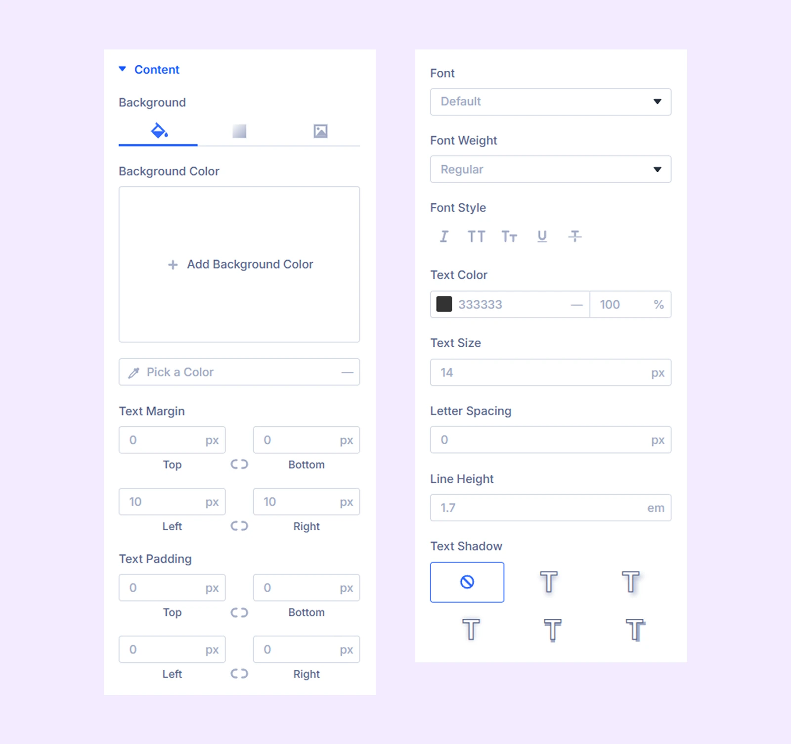
Image & Icon
After Text: Enable this option to place the image or the icon before or after the marquee text.
Additional options control color, size, spacing, borders, and background for images and icons.
Spacing: Add custom margins and padding to the item container.
Border: Style individual or all borders of the item container.
Box Shadow: Apply shadow effects to the item.
Filters: Add color filter effects specifically for this item.
Transform: Adjust scale, rotation, and position of the marquee text item.
Advanced Tab
Provides advanced settings specific to the marquee text item.
Need Help?
If you have any questions or need assistance, contact our support team: [email protected]