DiviFlash Scroll Image module lets you display images that scroll automatically based on user interaction or configured animation settings.
Activation Required: This module is disabled by default. To use it, you need to enable it manually. Refer to our guide for step-by-step instructions.
Let’s see the settings in brief and how to make better use of it —
Content Tab
This tab contains the main settings for configuring the image, scrolling behavior, and more.
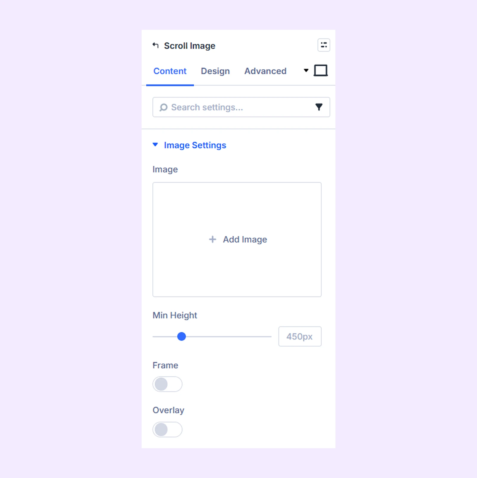
Image Settings
- Image: Upload the image that will display in the module.
- Min height: Set the minimum height for the image container.
- Frame: Enable this option to add a frame around the image.
- Frame Type: Choose the style of frame applied to the image.
- Overlay: Enable this option to add a gradient overlay on top of the image.
- Overlay Primary Color: Choose the starting color of the gradient overlay.
- Overlay Secondary Color: Choose the ending color of the gradient overlay.
- Overlay Gradient Direction: Select the direction of the overlay gradient.
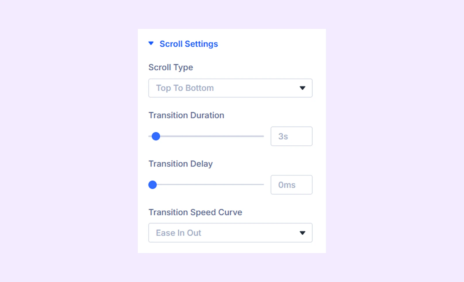
Scroll Settings
- Scroll Type: Choose the direction of the scrolling animation.
- Transition Duration: Set the total duration of the scrolling animation.
- Transition Delay: Set a delay before the scrolling animation begins.
- Transition Speed Curve: Choose how the scrolling animation progresses over time.
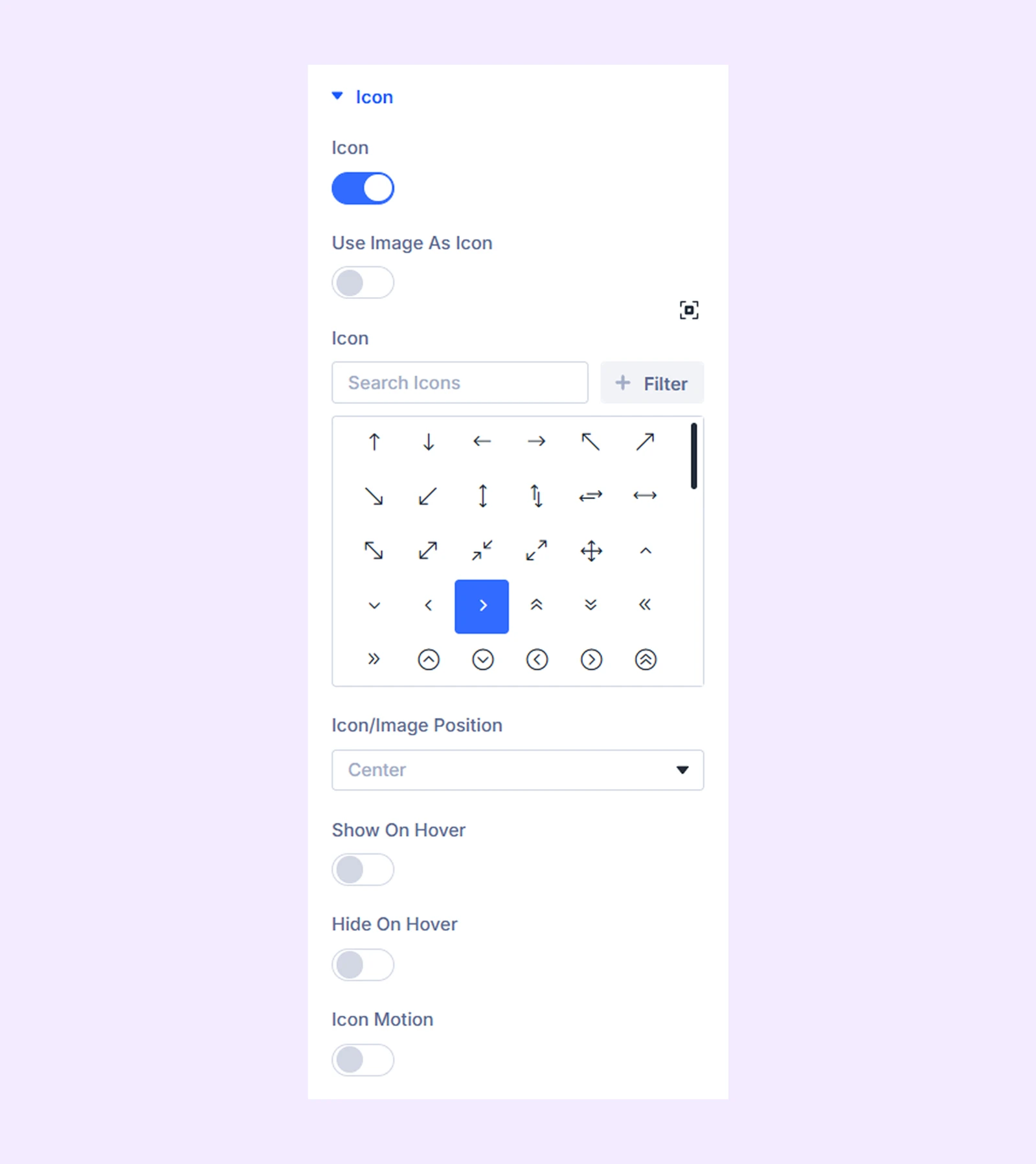
Icon
- Icon: Enable this option to use an icon over the image.
- Use Image as Icon: Enable this option to use an image as an icon.
- Image As Icon: Upload an image that will be used as the icon.
- Image Alt Text: Add alternative text for the image icon.
- Icon/Image Position: Choose the position of the icon or image over the scrolling image.
- Show on Hover: Toggle on to only display the icon/image on hover.
- Hide on Hover: Toggle on to hide the icon/image on hover. (You won’t see this when “Show on Hover” is enabled.)
- Icon Motion: Enable this option to make the icon move with the scrolling animation.
Caption: Display a caption for the scrolling image.
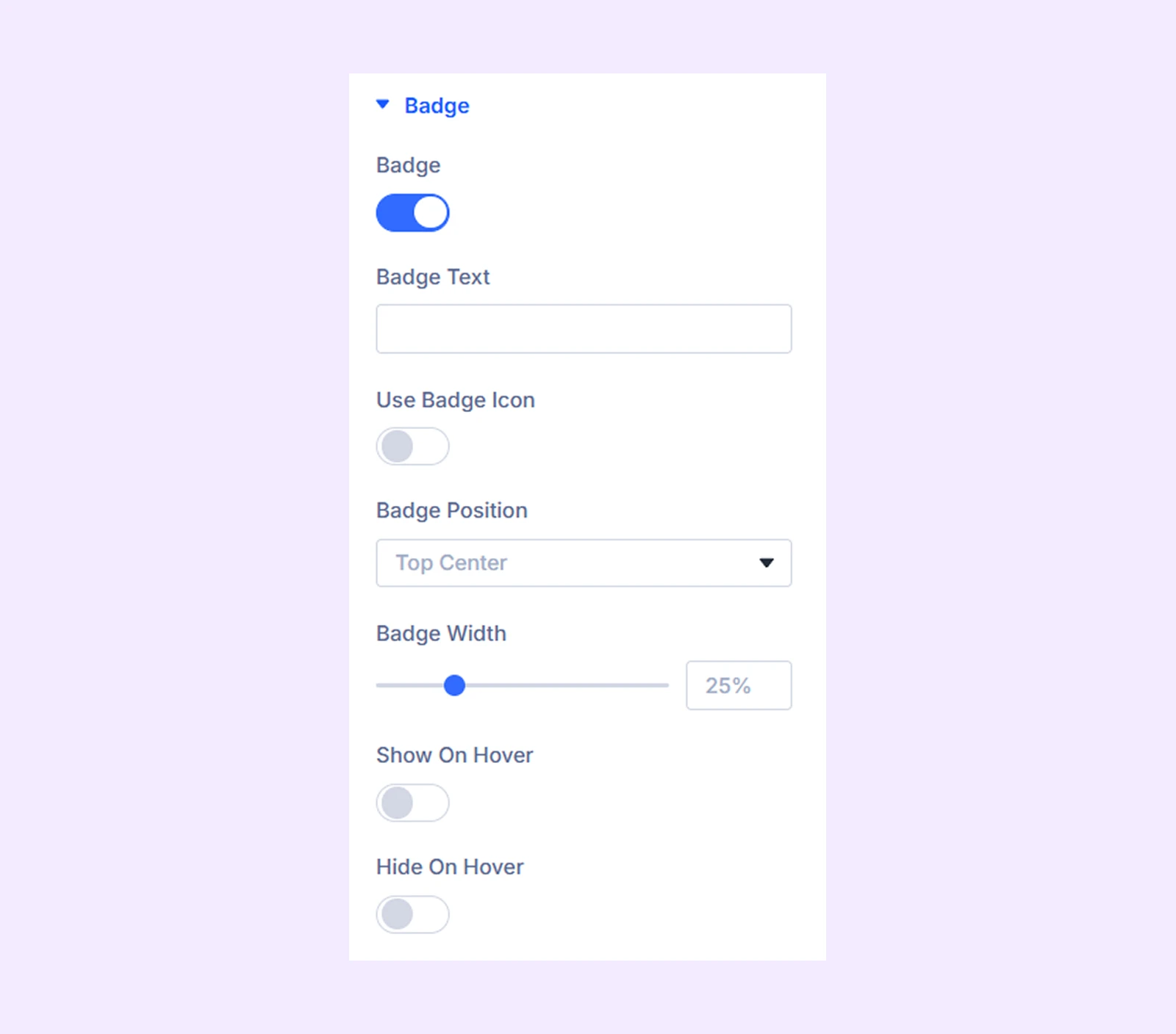
Badge
- Badge: Toggle on to display a badge over the scrolling image.
- Badge Text: Enter the text you want to display inside the badge.
- Use Badge Icon: Enable this option to display an icon inside the badge.
- Budget Icon: Choose an icon for the badge.
- Icon Placement: Choose if you want to place the icon on the left or right side of the badge text.
- Badge Position: Choose the position of the badge over the image.
- Badge Width: Adjust the width of the badge.
- Show on Hover: Enable this option to display the badge only on hover.
- Hide on Hover: Enable this option to hide the badge on hover.
Lightbox & Link
- Use Lightbox: Enable this option to open the image in a lightbox.
- Use Different Lightbox Image: Enable this option to display a different image inside the lightbox.
- Custom Link: Add a custom link to the image.
Element Label: Rename the module to organize it more easily in the Divi Builder. (Only you can see this label.)
Design Tab
Use this tab to customize the visual appearance of the Scroll Image module.
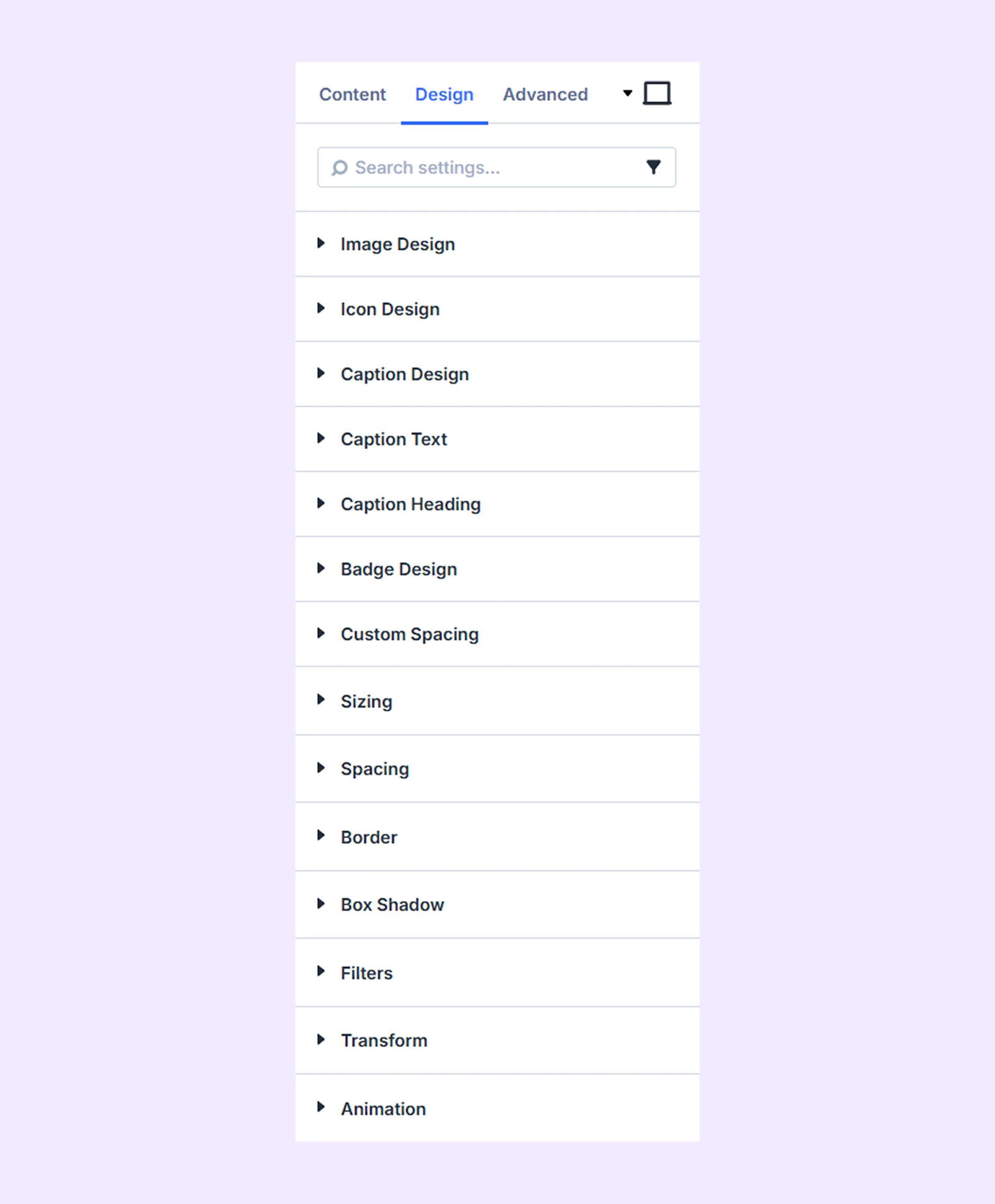
Image Design: Border customization options for the image.
Icon Design: Color, size, and border options for the icon.
Caption Design: Background and border options for the caption.
Caption Text: Typography options for the caption.
Caption Heading: Typography options for the caption heading.
Badge Design: Color, size, and typography options for the badge.
Custom Spacing: Add custom margins and paddings to each component of the module.
Sizing: Adjust the width, height, and alignment of the module.
Spacing: Adjust the margins and padding of the module container.
Border: Customize the border using radius, style, width, and color settings.
Box Shadow: Add shadow effects to the module container.
Filters: Apply color filter effects to the module.
Transform: Adjust the scale, position, rotation, and size of the module.
Animation: Add reveal animation effects and control the animation style, delay, duration, and more.
Advanced Tab
This tab provides additional settings for advanced users who want greater control over the module with custom code, conditions, and more.
Need Help?
If you have any questions or need assistance, contact our support team: [email protected]