DiviFlash Text Highlighter module allows you to highlight important text using creative shapes, animations, and styling options.
Activation Required: This module is disabled by default. To use it, you need to enable it manually. Refer to our guide for step-by-step instructions.
Let’s see the settings in brief and how to make better use of it —
Content Tab
This tab contains the settings to add the text content, configure the highlighter effects, etc.
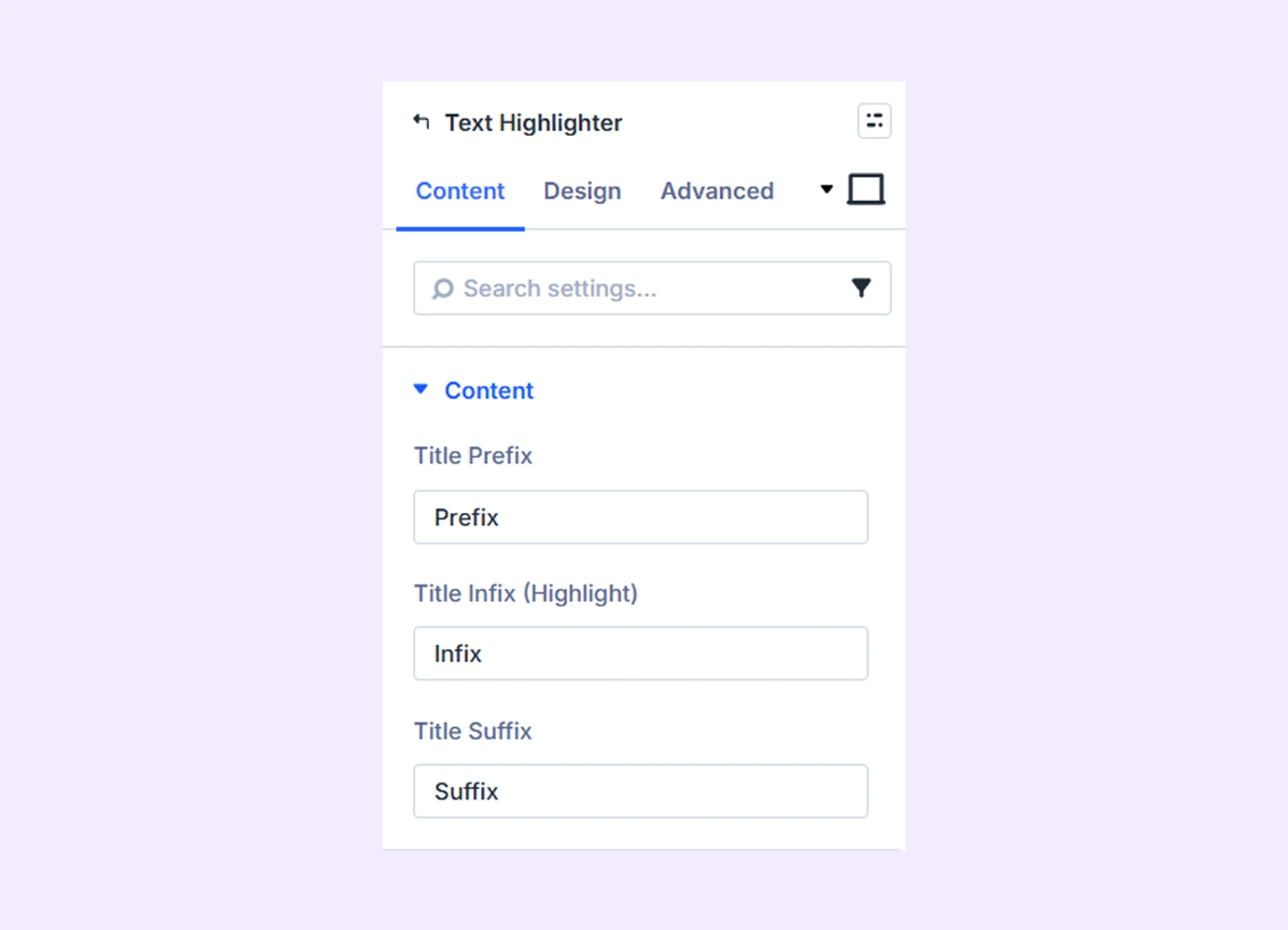
Content
- Title Prefix: Add the text that appears before the highlighted part of the title.
- Title Infix (Highlight): Add the main text you want to highlight.
- Title Suffix: Add the text that appears after the highlighted part of the title.
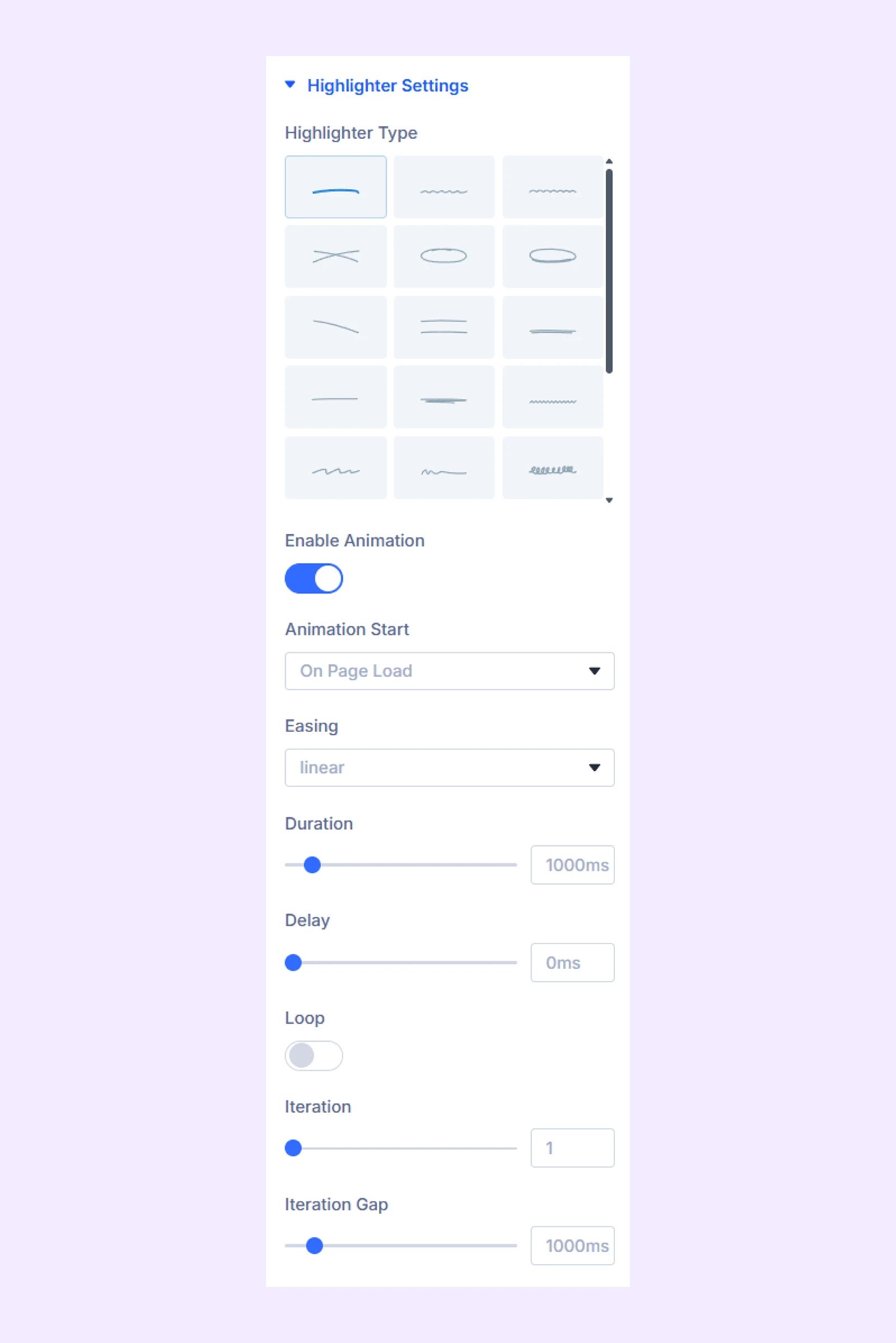
Highlighter Settings
- Highlighter Type: Choose from 23 different highlighter shapes.
- Enable Animation: Enable animation for the highlighter.
- Animation Start: Choose when the animation begins (on page load or when the element enters the viewport).
- Easing: Set the speed at which the highlighter animation begins and ends.
- Duration: Set how long the animation takes to complete.
- Delay: Define the delay before the animation starts.
- Loop: Enable continuous animation.
- Iteration: Set how many times the animation should repeat. (Only available when Loop is disabled.)
- Iteration Gap: Adjust the time gap between animation iterations.
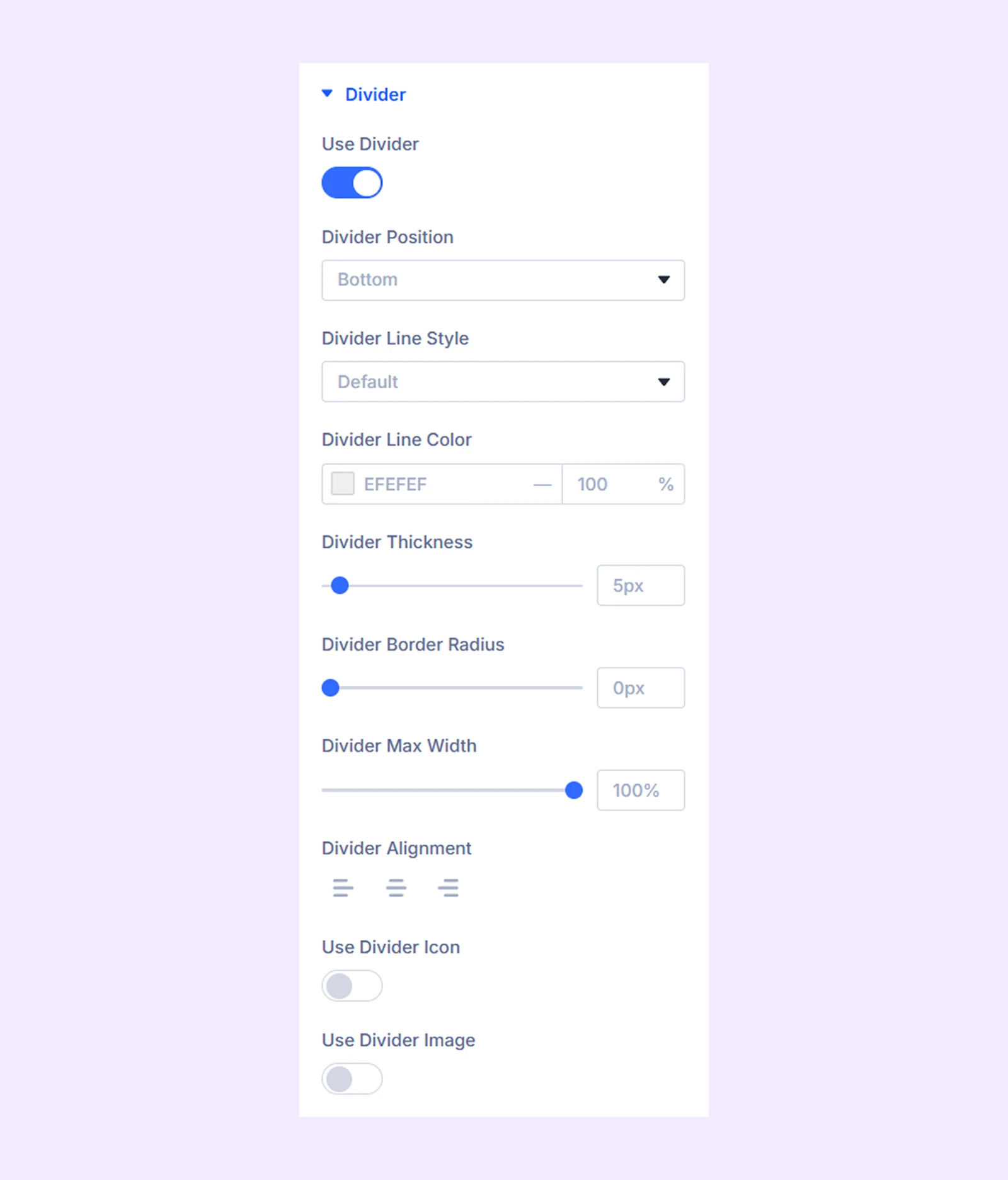
Divider
Use this section to add and customize a divider around the highlighted text.
- Use Divider: Enable this option to display a divider.
- Divider Position: Choose whether the divider appears above or below the text.
- Divider Line Style: Select one of the available divider styles.
- Divider Line Color: Choose the color of the divider line.
- Divider Thickness: Adjust the thickness of the divider.
- Divider Border Radius: Control the corner roundness of the divider.
- Divider Max Width: Adjust the maximum width of the divider.
- Divider Alignment: Set the horizontal alignment of the divider.
- Use Divider Icon: Enable this option to display an icon within the divider.
- Icon: Select an icon from the available options.
- Divider Icon Alignment: Adjust the position of the icon.
- Divider Icon Color: Choose the icon color.
- Divider Icon Background Color: Set the background color of the icon.
- Icon Circle: Enable this option to make the icon background circular.
- Divider Icon Size: Adjust the size of the icon.
- Divider Image: Enable this option to display an image instead of an icon. (Available when “Use Divider Icon” is disabled.)
- Image Alt Text: Add alternative text for the image.
- Divider Image Max Width: Set the maximum width of the image.
- Divider Image Alignment: Adjust the position of the image within the divider.
- Divider Image Background Color: Set the background color of the image.
- Image Circle: Enable this option to make the image background circular.
Design Tab
This tab contains settings to customize the visual appearance of the text, highlighter, borders, and other elements.
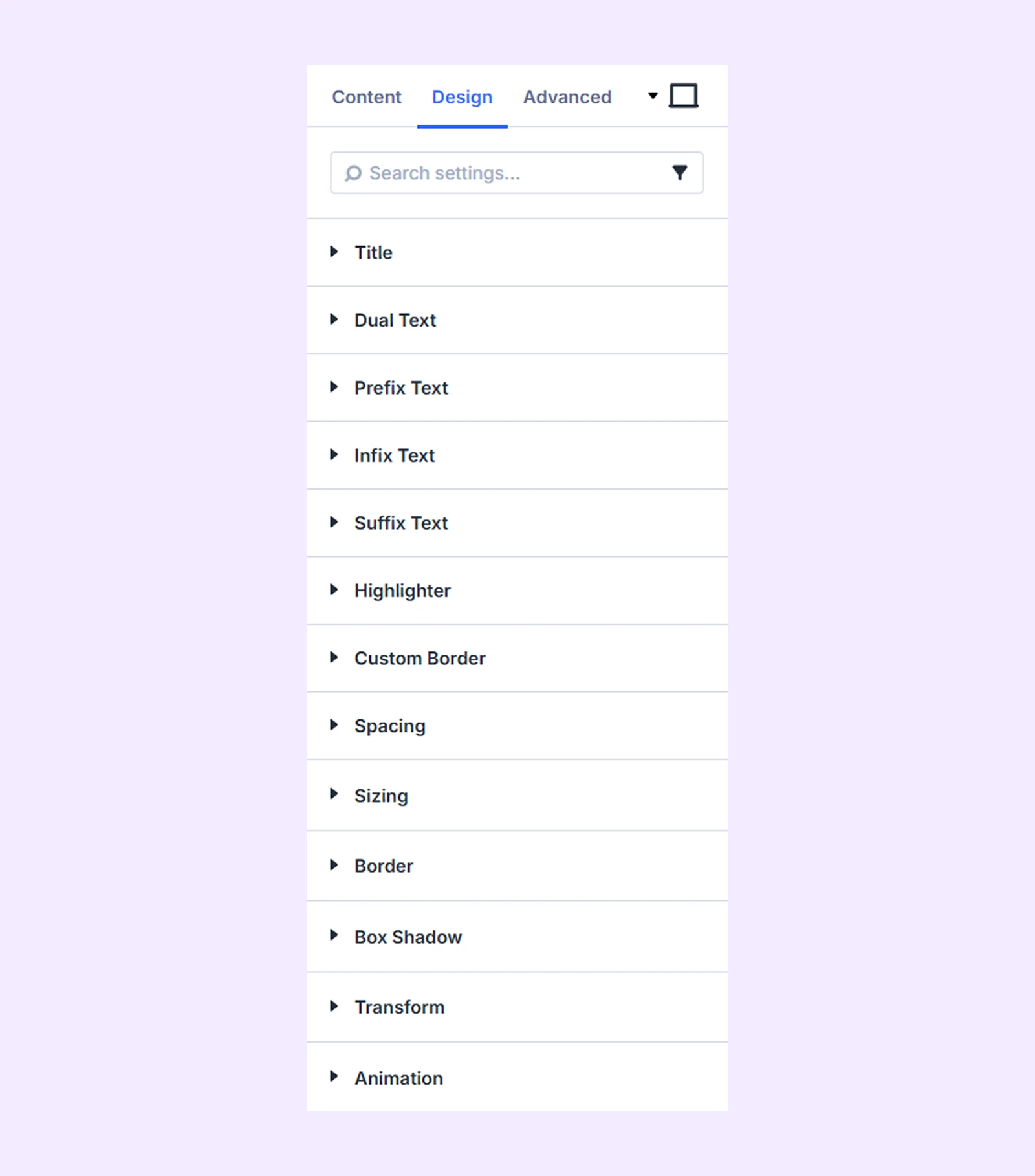
Title: Customize the typography of the entire title.
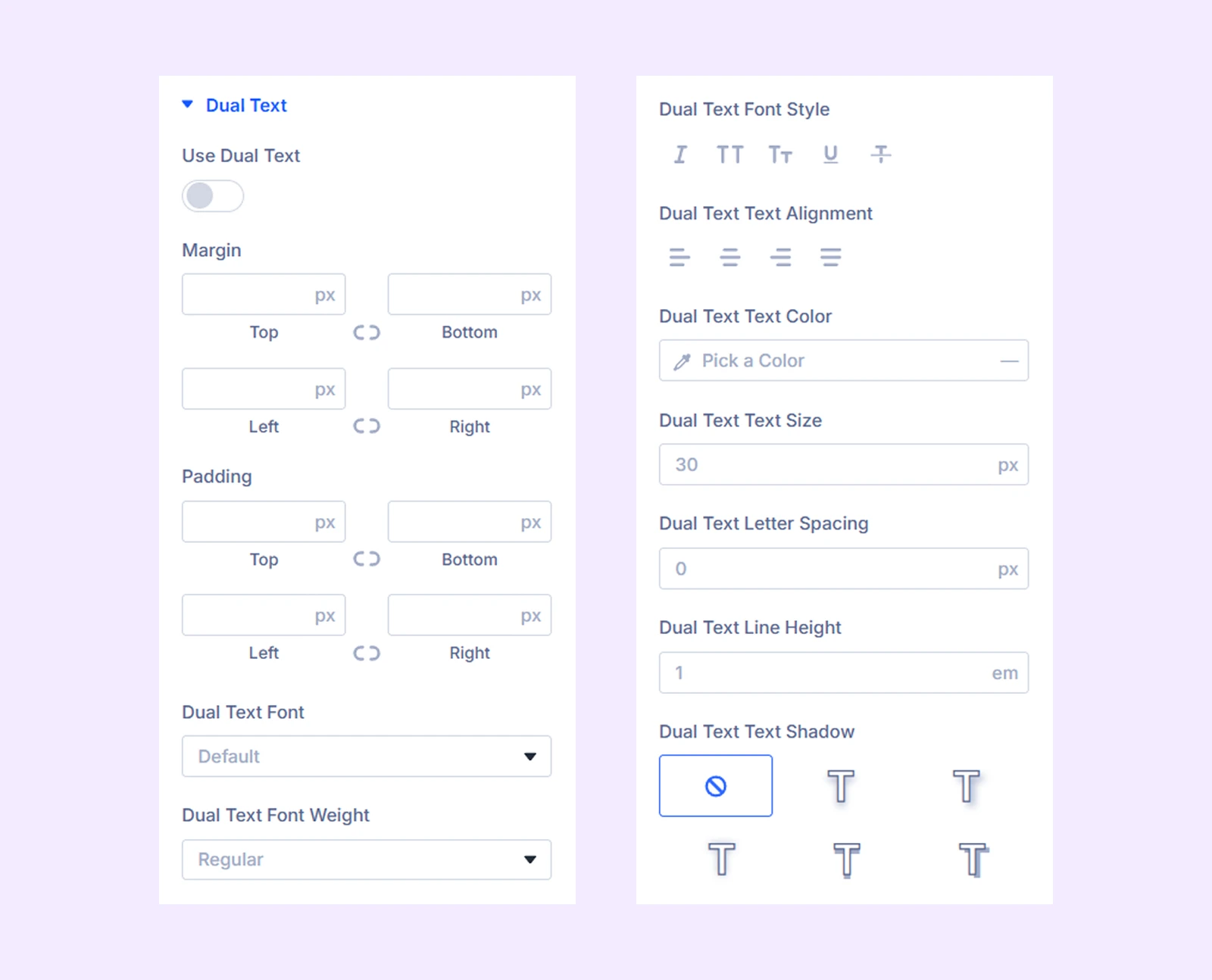
Dual Text:
- Use Dual Text: Enable a dual text effect for the title.
- Custom Text: Enable this option to add alternate text for the dual text effect.
- Custom Text Input: Enter the alternate text that will appear as part of the dual text effect.
Additional spacing and typography settings are available to customize the appearance of the dual text.
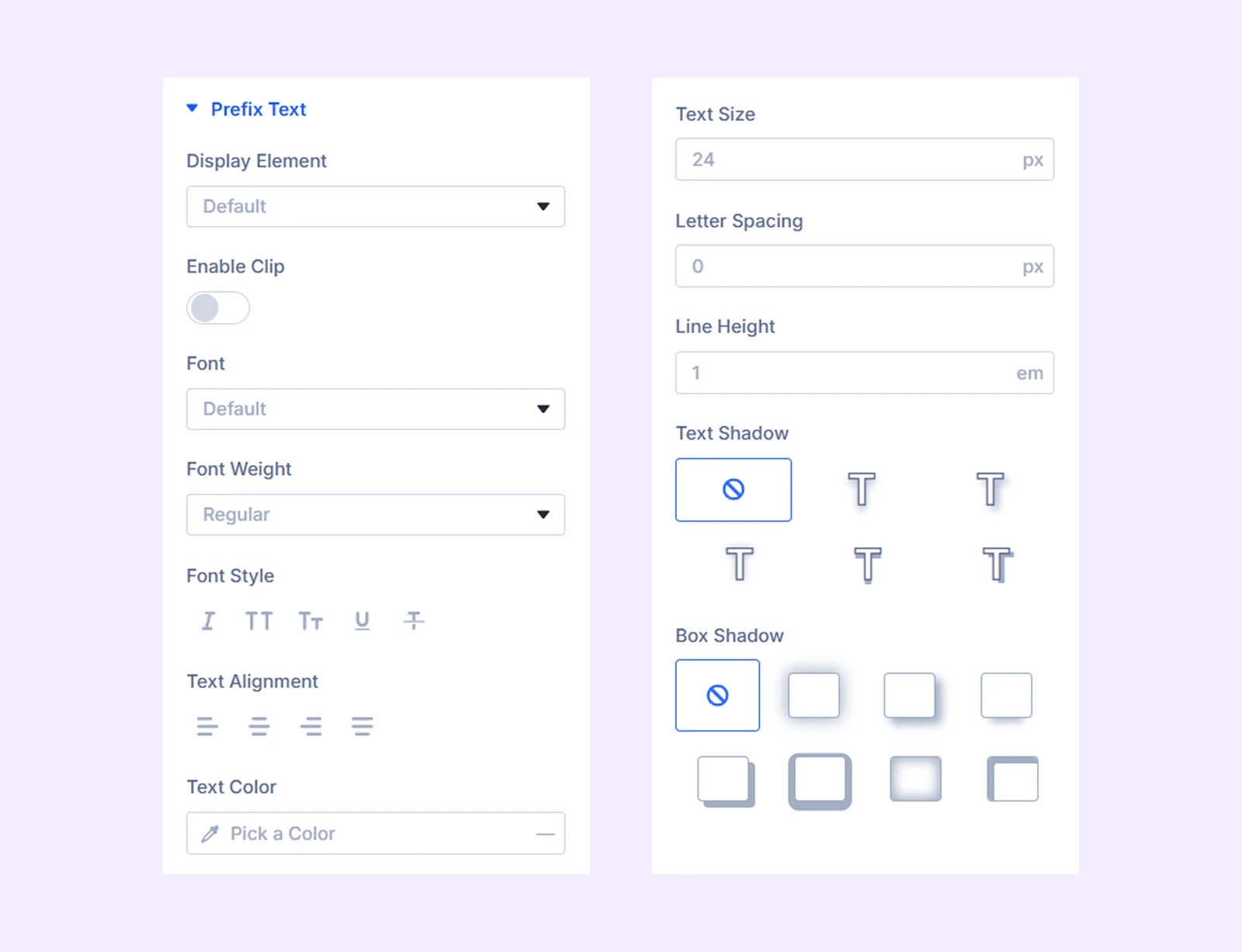
Prefix Text
- Display Property: Choose how the prefix text is displayed relative to the other title elements. You have three options:
- Default: Display the text as is.
- Inline: Display item on the same line.
- Block: Show the item on separate lines
- Enable Clip: Toggle on to apply a clip effect to the prefix text.
- Enable Background Clip: Toggle on to apply clip effect to the prefix text’s background.
- Fill Color: Set the fill color for the clip effect.
- Stroke Color: Set the stroke color for the clip effect.
- Stroke Width: Adjust the width of the stroke.
Additional typography settings are available for the prefix text.
Infix Text: Contains the same settings as “Prefix Text” but for Infix text.
Suffix Text: Contains the same settings as “Prefix Text” but for Suffix text.
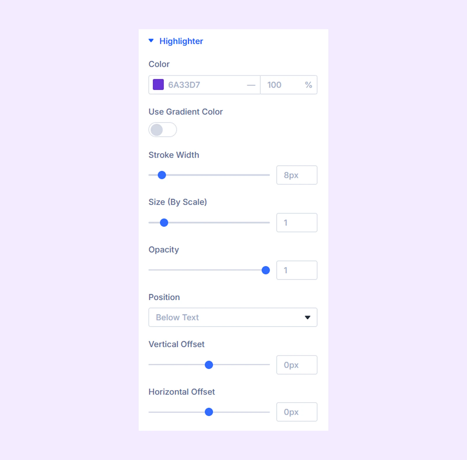
Highlighter
- Color: Select the color you like for the highlighter.
- Use Gradient Color: Turn this option on to use gradient as the highlighter’s color.
- Start Color: Select the starting color of the gradient.
- End Color: Select the ending color of the gradient.
- Gradient Type: Choose the gradient style, from linear or radial.
- Gradient Direction: Set the direction in which the gradient flows.
- Start Position: Adjust the position where the gradient begins.
- End Position: Adjust the position where the gradient ends.
- Stroke Width: Choose the width of the highlighter.
- Size (By Scale): Increase or decrease the scale of the highlighter.
- Opacity: Adjust how transparent you want the highlighter to be.
- Position: Choose if you want to place the highlighter below or above the text.
- Vertical Offset: Change the position of the highlighter along the Y-axis.
- Horizontal Offset: Change the position of the highlighter along the X-axis.
Custom Border: Customize borders for the prefix, infix, and suffix individually.
Sizing:Adjust the width, height, and alignment of the module.
Spacing: Adjust the margins and padding of the module container.
Border: Border options for the heading container.
Box Shadow: Add shadow effects to the module container.
Transform: Adjust the scale, position, rotation, and size of the module.
Animation: Add reveal animation effects and control the animation style, delay, duration, and more.
Advanced Tab
This tab provides additional settings for advanced users who want greater control over the module with custom code, conditions, and more.
Need Help?
If you have any questions or need assistance, contact our support team: [email protected]