

Let’s be honest, building complex layouts in Divi4 was frustrating. You had to stack rows inside rows, fight with column spacing, or add custom CSS to align a few modules perfectly.
That ends with Divi 5 CSS Grid, the new era of a smarter layout system. That gives you complete freedom over how your content looks and behaves.
With this modern grid system, you can design two-dimensional layouts directly inside the Visual Builder without any code, no hacks, and no guesswork.
In this guide, we’ll break down what Divi 5 CSS Grid is, how it works, and how you can use it to create stunning, flexible, and responsive designs effortlessly. By the end, you’ll see why CSS Grid isn’t just a new feature; it’s the future of layout design you have always wanted.
What is Divi 5 CSS Grid?
CSS Grid is a modern layout system of Divi 5, designed to help you create advanced, two-dimensional layouts to design any full-page layout with row and column control.
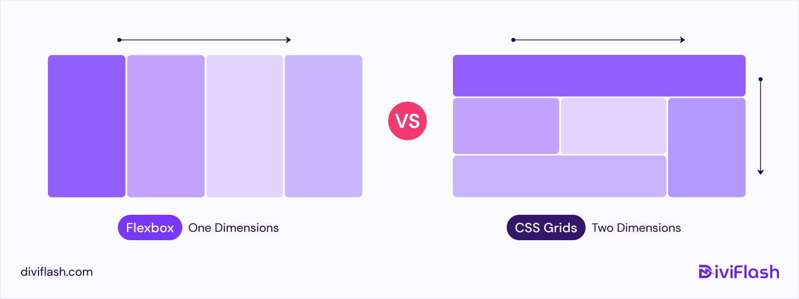
While Flexbox in Divi 5 focuses on arranging items in a single direction (either rows or columns), CSS Grid lets you work with both rows and columns at the same time.
That gives you greater control over how your page elements align and respond across different screen sizes.
With CSS Grid, you can:
- Create full-page layouts with precise row and column control.
- Adjust gaps, spacing, and alignment visually without writing CSS.
- Create layouts that are fully responsive for every device.
In Divi 4, achieving this kind of structure often required creating multiple nested rows or adding custom CSS. But with Divi 5 CSS Grid, all that complexity is gone. You can now build structured, responsive layouts directly inside the Divi visual builder.
Comparison Between the CSS Grid and Flexbox
Understanding the difference between Flexbox and CSS Grid would give you a clear idea of the Divi 5 layout system, if you aren’t familiar with them before.
| Feature | CSS Grid (Grid Layout Module) | Flexbox (Flexible Box Layout) |
| Primary Dimension | Two-dimensional: works with both rows and columns simultaneously. | One-dimensional: works in either a row or a column at a time. |
Core Purpose | Structuring entire page layouts or complex sections, like multi-column grids, galleries, or blog feeds. | Aligning and spacing items or modules within a single row or column. |
| Alignment Control | Aligns items precisely in both axes (horizontal and vertical). | Aligns items easily along one axis (horizontal or vertical). |
| Responsiveness | Let’s you define how many columns or rows appear at each screen size. | Automatically wraps or stacks items when space runs out. |
Layout Example | Displaying 4 team members in a grid on desktop, reflowing to 2 per row on tablet, and 1 on mobile. | Showing 4 team members in a row on desktop, stacking into 1 per row on tablet and mobile. |
| Best Use Case | Full sections, blog grids, galleries, and product layouts. | Headers, menus, buttons, and small module groups. |
How CSS Grid in Divi 5 Works
The best way to understand how Divi 5 CSS Grid works is to imagine your page as a flexible structure made of rows and columns, just like this example below.
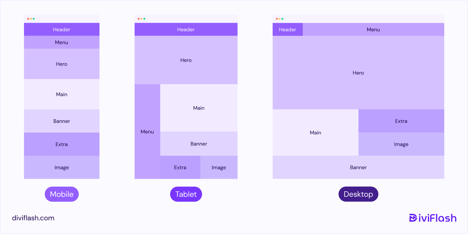
In this layout, each colored block (like Header, Menu, Hero, Main, Banner, Extra, and Image) represents a Grid Item, and the entire layout acts as a Grid Container.
With CSS Grid, Divi 5 gives you the power to decide how these elements are positioned across different screen sizes within the Divi visual builder.
The Key Features and Use Cases of Divi 5 Grid Layout
Understanding the key features of Divi 5 CSS Grid will help you use its full potential. Let’s walk through the features Divi 5 has introduced to the CSS Grid Layout System. At the same time, we will describe how these features work for your better understanding of the topic.
A. CSS Grid Layout Structure
There are three main components of the CSS Grid system in Divi 5, including:
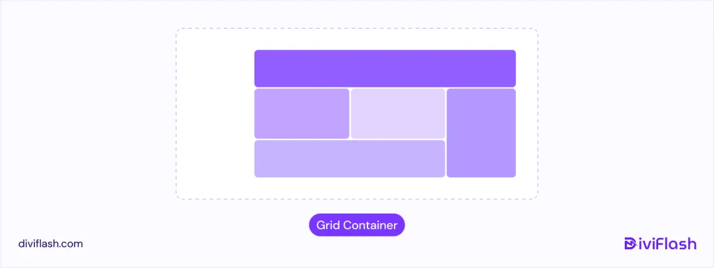
1. Grid Container:
Think of the Grid Container as the main box that holds your entire layout, like the frame of a puzzle where each piece fits perfectly.
When building a page in Divi 5, you have to create a container first by clicking the “+ icon” and deciding how many grid items you want in the container. Inside it, you can add modules (like text, images, or buttons) that automatically snap into place as Grid Items.
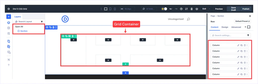
If you take a look at the Divi Builder, the highlighted section or rows you are editing, or where you see “Columns” listed on the right sidebar, is your Grid Container.
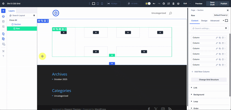
Once you choose a grid structure, you always have the option to switch between multiple Grid presets, such as Multi Row, Masonry, or Sidebar Layout, based on your preference.
Grid Container is where your design begins, where you define its structure, and Divi automatically organizes everything inside it.
2. Grid Items:
Grid items are the modules you add inside the container, such as text, images, buttons, blurb, or any other Divi module. Each one sits in its own cell inside the grid, and Divi automatically arranges them based on your chosen structure.
If you look at the example in the Divi Builder, each numbered section (Divi 5, button, or Icon) is a separate Grid Item. These items snap neatly into place within the grid, just like puzzle pieces fitting perfectly inside a frame. You can also move, resize, or style them however you like.
Grid Items are the content blocks that bring your layout to life. And with Divi 5, you can control their position, size, and appearance visually, all inside the Builder.
3. Customizable Properties
Divi 5 makes working with CSS Grid incredibly easy with its visual editing experience. Everything is customizable right inside the Divi visual builder.
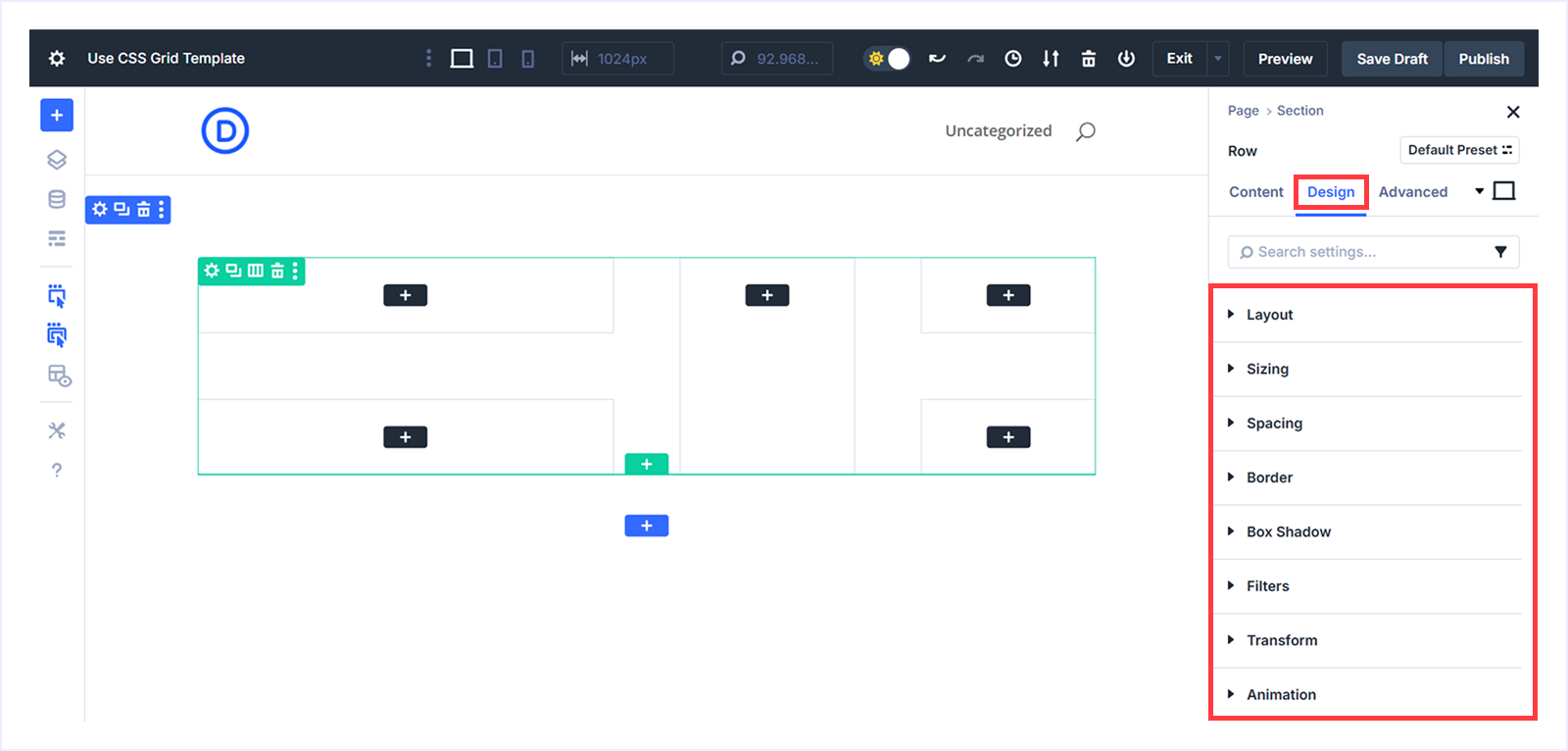
In the Design Tab, you will find options like Layout, Sizing, Spacing, Border, Box Shadow, Filters, Transform, and Animation to customize how your CSS Grid looks.
Here is a quick overview of what each does:
- Layout: Switch between Grid, Flex, or Block layouts. Set the number of rows and columns, adjust width and height, control alignment, and define grid direction, density, or offset rules for unique layouts.
- Sizing: Control how much space each item takes by adjusting width, height, max width, or minimum height. This ensures consistency and balance across all screen sizes.
- Spacing: Fine-tune the margin and padding around items to manage the space between modules. Adjust each side individually for clean, well-structured layouts.
- Border: Set and style borders by customizing the border radius, width, colour, and style to create clean separations or subtle highlights.
- Box Shadow: Create a visual depth using the shadow effects. Choose from presets or customize it using the horizontal/vertical position, blur strength, shadow colour, and position.
- Filters: Apply visual effects like hue, brightness, contrast, invert, or blur to enhance modules directly without external image editing.
- Transform: Use scale, translate, rotate, or skew to reshape or move grid items. Perfect for adding layered, dynamic, or 3D-style effects visually inside the builder.
- Animation: Bring layouts to life with smooth motion effects such as fade, slide, bounce, zoom, or flip to make elements appear naturally on load or scroll.
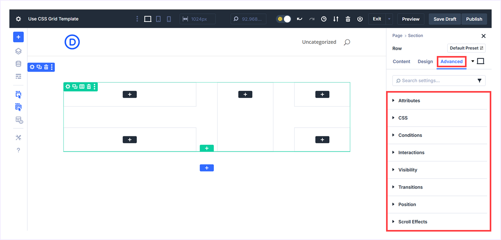
For users who want to go beyond that and get deeper control of customization, the Advanced tab next to the design offers the options. This section lets you combine Divi’s visual flexibility with custom logic, CSS, and interactions all inside the Divi page builder.
Here is a quick overview of what each does:
- Attributes: Add custom data or tags of sections, rows, or modules for integrations or advanced customization.
- CSS: Write your own CSS to style specific parts of your Grid layout.
- Conditions: Set rules to show/hide elements based on factors like post type, user login status, browser, or operating system.
- Interactions: Add interactive triggers such as click, load, mouse enter/exit, or viewport enter/exit to make layouts more dynamic.
- Visibility: Choose which devices (desktop, tablet, or phone) will display an element and control overflow for better responsiveness.
- Transitions: Adjust animation speed, delay, and easing to create a smooth transition between states.
- Position: Move elements exactly where you want them using positioning, vertical or horizontal offset, and z-index.
These controls give you complete design flexibility inside Divi 5’s Visual Builder, helping you craft professional, responsive, and visually appealing layouts with ease.
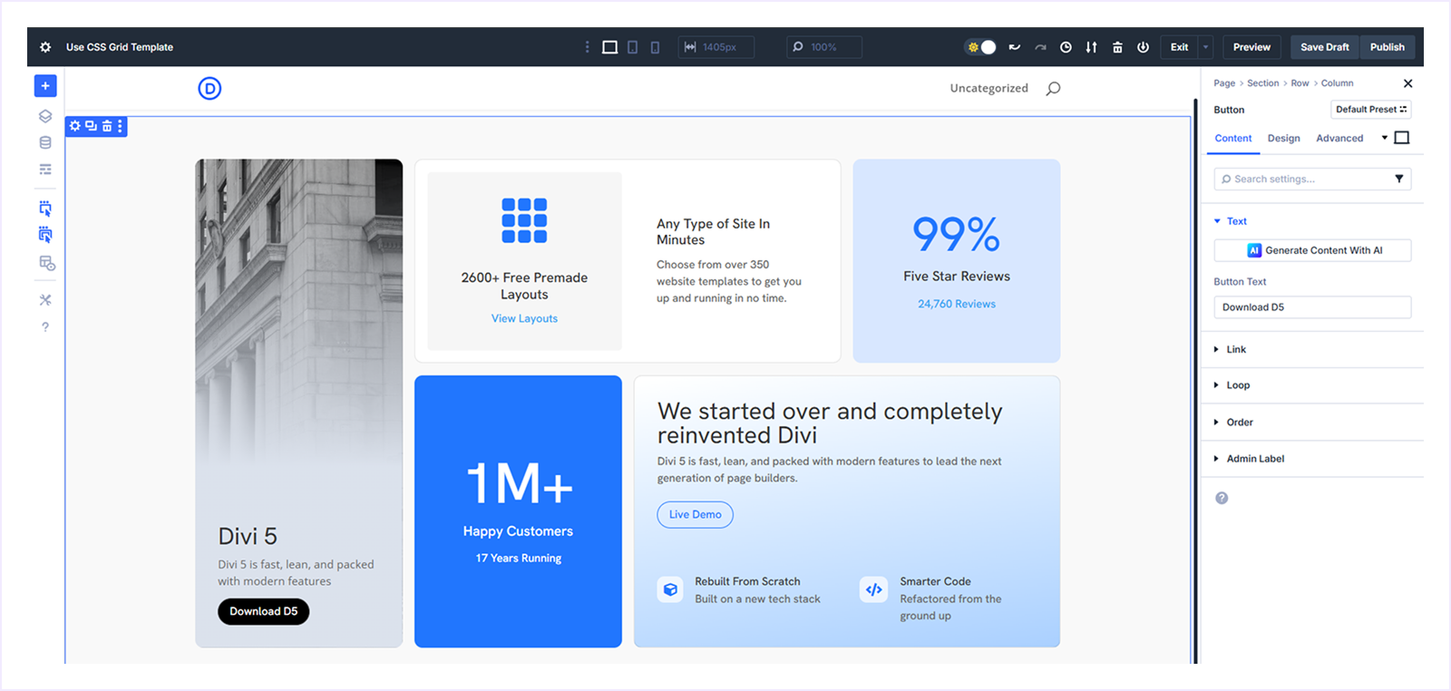
B. Ready to Use Grid Templates
Divi 5 offers a collection of 8 FREE pre-designed CSS Grid Layouts. These templates make it effortless to design a professional and responsive layout without starting from scratch. You can get them by simply joining the Divi Newsletter.
Follow these simple steps to download and use any Grid templates:
Step 1: Download The Templates:
- Visit this page and find the newsletter section.
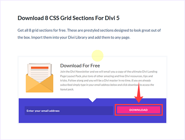
- Enter your email address and click Download.
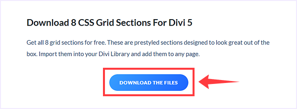
- Once done, click the Download The File button to start downloading.
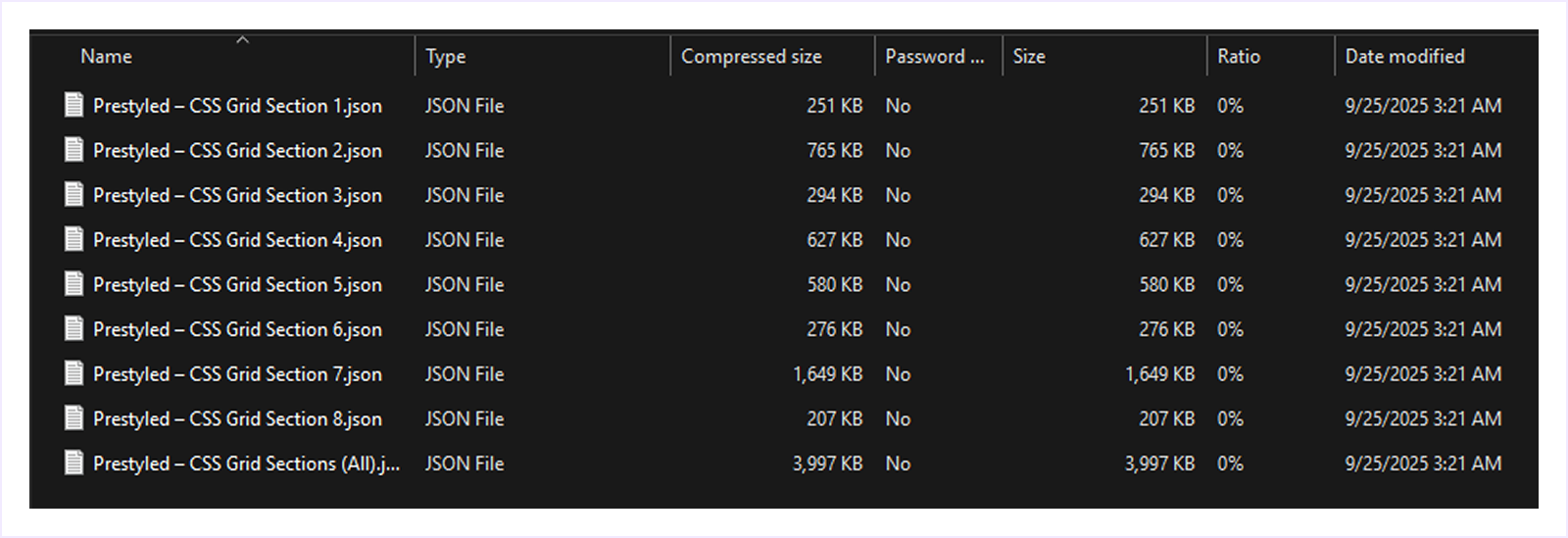
- A Zip file will be downloaded, extract it to find the JSON files of layouts to use later.
Note: You can import these files one by one to your Divi Library. Or, you can import all together by importing the last file named “Presetyled – CSS Grid Section (All). json”.
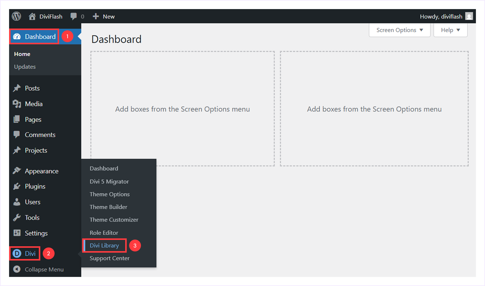
Step 2: Import templates into the Divi Library:
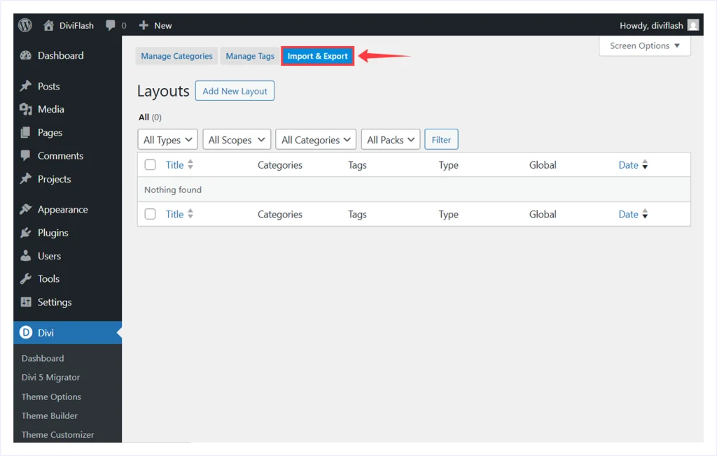
- Go to your WordPress Dashboard → Divi → Divi Library.
- Select the Import & Export tab.
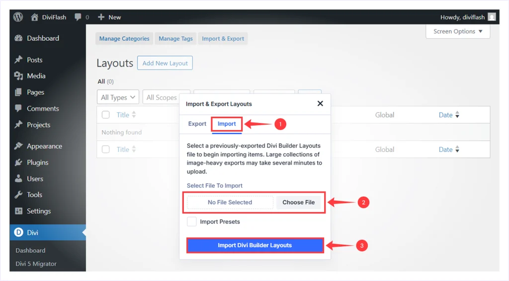
- Select Import and choose the JSON file from your computer, and click “Import Divi Builder Layouts”.
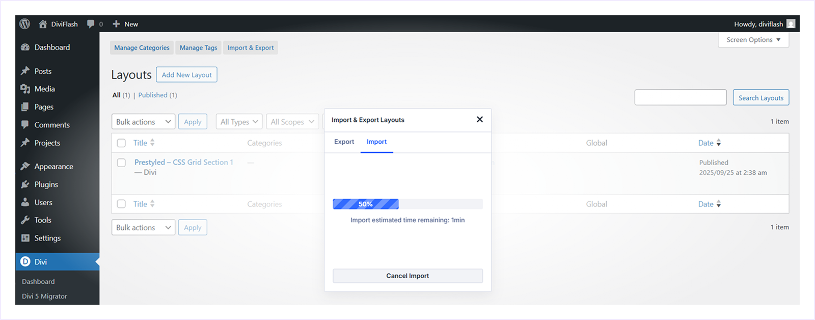
- Wait a few seconds for the layouts to appear in your library.
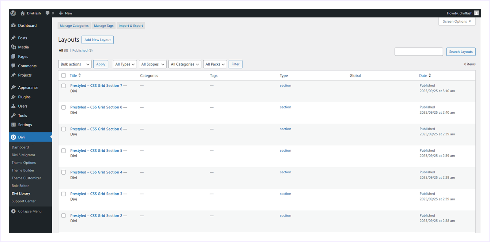
- Once imported, all these 8 CSS Grid layouts will be available in your Divi Library for quick access.
Step-3: Use a Grid Section on A Page:
- Open any page in the Divi Visual Builder.
- Click the “+ icon” to add a new section.
- Select the “Add from library” tab.
- Choose any layout you want to use.
- Click “Use this section” to use this layout.
That’s it! You can now customize the imported CSS Grid section directly inside the visual builder.
FAQs about Divi 5 CSS Grid Layout System
Can I use CSS and Flexbox together in Divi 5?
Yes. Divi 5 lets you switch between Grid, Flex, and Block. You can also mix them on the same page by using different layouts in different sections or rows on the same page.
Are the prebuilt CSS Grid templates free?
Yes, all 8 prebuilt CSS Grid templates are completely free. You need to join the Divi Newsletter with an email address to get access to the download link.
Can I customize a Grid template after importing it?
Absolutely, every Grid template you import is fully editable inside the Visual Builder. You can edit the content, change the style, and even do advanced customization based on your needs.
Do I need to use CSS to use the CSS Grid system?
Not at all, Divi 5’s CSS Grid system is completely customizable inside the Divi visual builder. You can design everything with the easy-to-use interface of the Divi page builder, featuring simple sliders and drag-and-drop controls.
Does CSS Grid affect page speed or performance?
In most cases, CSS Grid helps to get a better page speed and performance by reducing the extra wrappers and custom CSS, which leads to a cleaner markup. But the overall performance still depends on the images you use, scripts, and hosting.
Which is better, Flex or Grid?
Both Flex and Grid are better depending on where you use them. Use flex for one-directional layouts like a navigation menu. Use Grid for two-direction layouts like galleries, blog grids, and multi-row sections.
Can I convert my old Flexbox layout to CSS Grid?
Yes, but there is no one-click convert solution. The Flexbox and CSS Grid layouts are both compatible with Divi 5. Once you have created a flexbox layout, you have the option to convert it to a CSS Grid layout from the design tab.
To do this: open the flexbox layout container you created → go to the design tab → select Layout → and choose the layout style from Flex to Grid. And that’s how you can convert your Flex layout into Grid and do any customization as well.
What if I don’t use CSS Grid and stick with Flexbox?
That’s fine for many layouts. Flexbox still works well for simple rows, menus, and small groups of modules. Use Grid when you need more control across rows and columns and want to create a complex layout.
Does CSS Grid work with all Divi modules?
Yes, any module you place inside a Grid Container becomes a Grid Item. You can position, span, and style it with the Grid controls.
Final Thoughts
Introducing the CSS Grid Layout system in Divi 5 was a major step forward for Divi in the web design ecosystem. It gives you complete control over your page structure, all inside the Divi Visual Builder.
No matter if you are a beginner building your first responsive layout or an advanced user using the Grid layout system for a long time, Divi 5’s CSS Grid makes it faster, smarter, and easier to create any pixel-perfect design.
With tools like pre-built templates, customizable design control, and advanced settings, Divi 5 combines the power and simplicity in a way no previous version does.
It’s the future of the layout design system you always wanted. And thanks to Divi for taking the visionary step to make the web design faster than ever.


0 Comments