

To create a bar chart in Divi, you will need the DiviFlash Bar Chart module, since Divi does not include a built-in option. Its default Bar Counters module only supports single-line horizontal bars.
With DiviFlash, you can create vertical, horizontal, and stacked bar charts. You can also enter data manually or import it from external sources and customize datasets, axes, tooltips, and animations.
In this guide, we will show you how to create bar chart in Divi step by step by using the plugin.
Let’s get started.
Our Created Bar Chart
We will recreate the following bar chart to demonstrate the complete process.
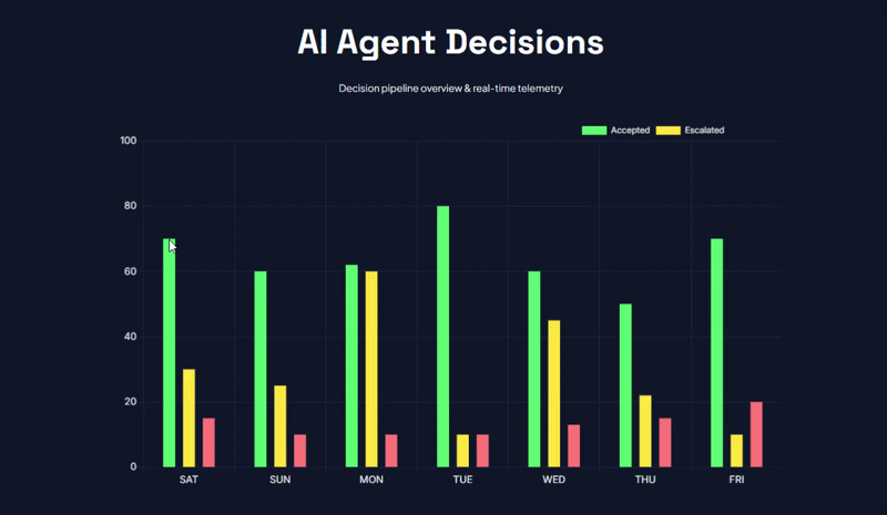
Note: We will only cover the Bar chart creation process. You can download the complete design for free from DiviFlash’s Bar Chart demo page.
Required Setup
Before starting, make sure you have:
- Latest version of Divi (Divi 5) is installed and activated.
- Latest version of DiviFlash (5.2.0) is installed and activated.
Step 1: Add the DiviFlash Bar Chart Module
Open the page where you want to display the chart and enable the Visual Builder. Then, follow these steps:
- Add a Section, Row, and Column
- Click the + icon
- Search for Bar Chart
- Insert the module
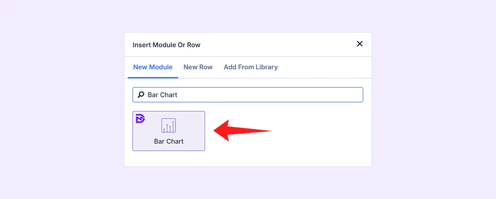
Note: If you can’t find the module, go to WordPress dashboard > DiviFlash > Modules and enable the Bar Chart.
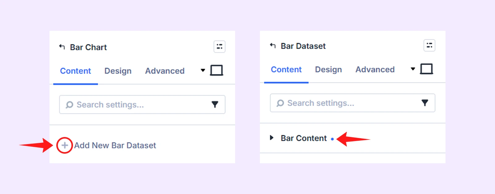
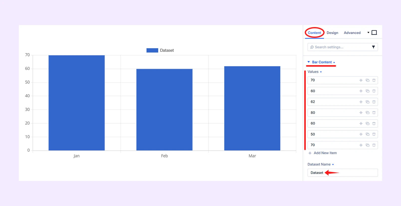
Step 2: Add the Bar Chart Datasets
After inserting the module, you will see two default dataset, delete them as we will show how to create one one from scratch. Here is what to do:
- Click on “Add New Dataset” and click on “Bar Chart”
- Delete all the default values and click on “Add New Item”
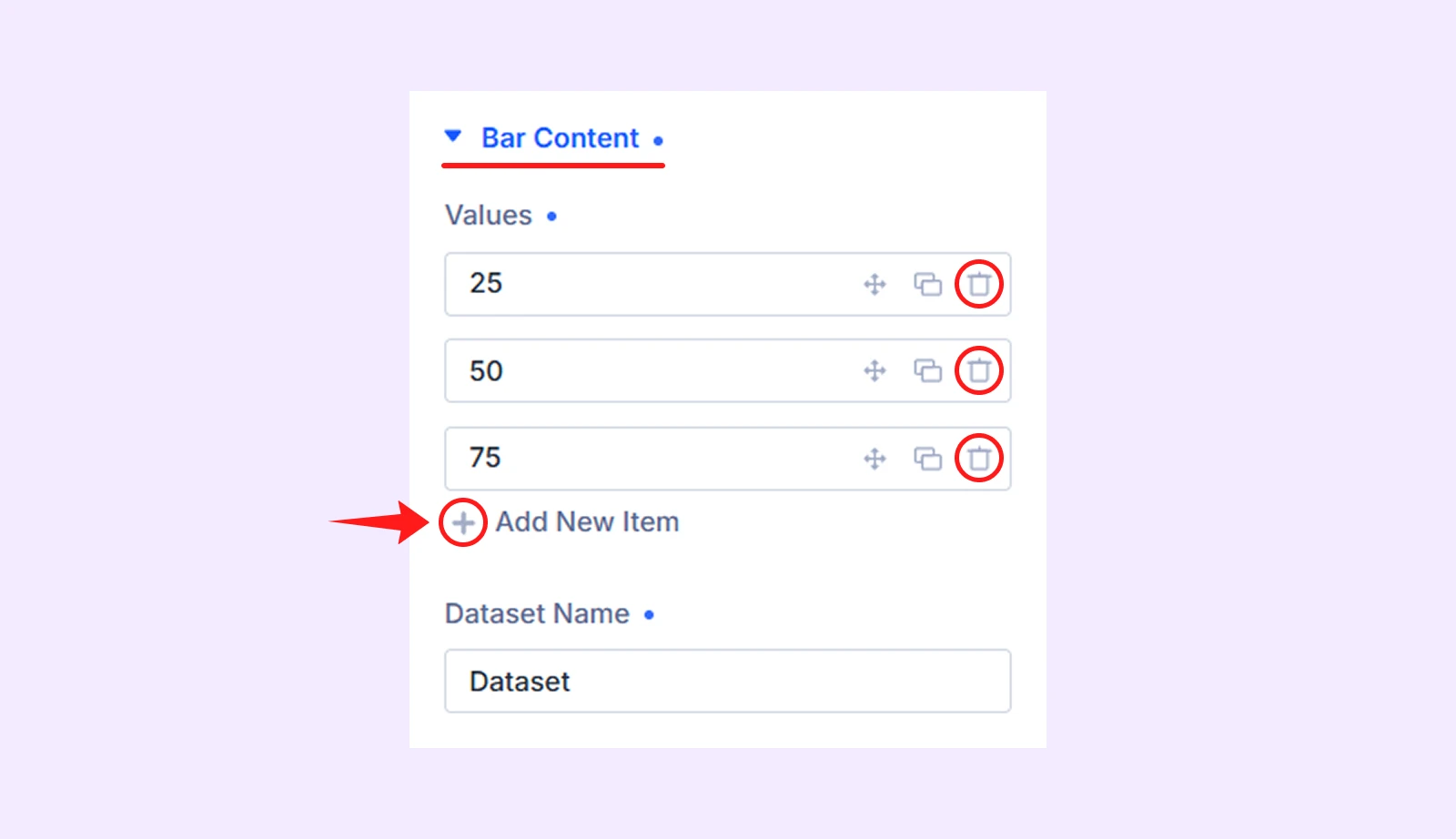
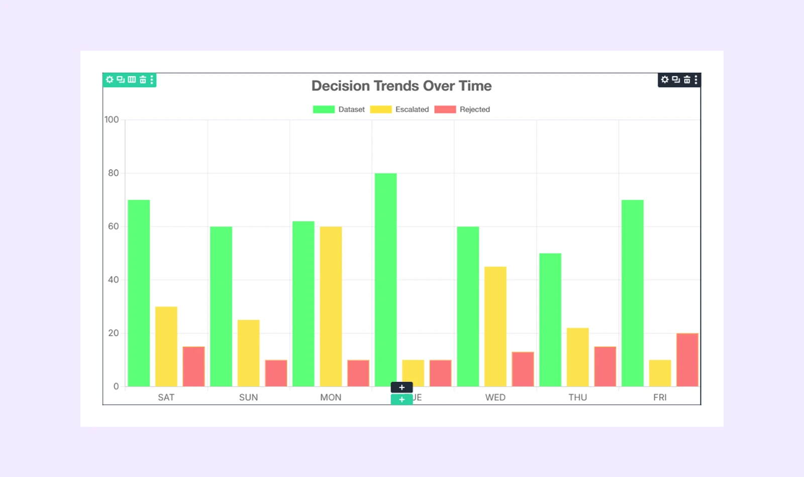
- Then add 7 new items with these values: 70, 60, 62, 80, 60, 50, and 70
- In the “Dataset Name,” set the name to Accepted.
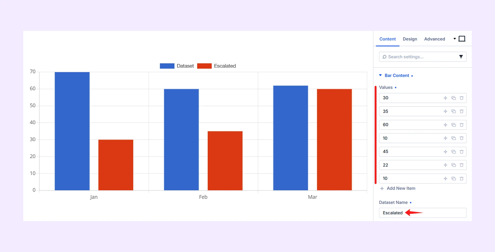
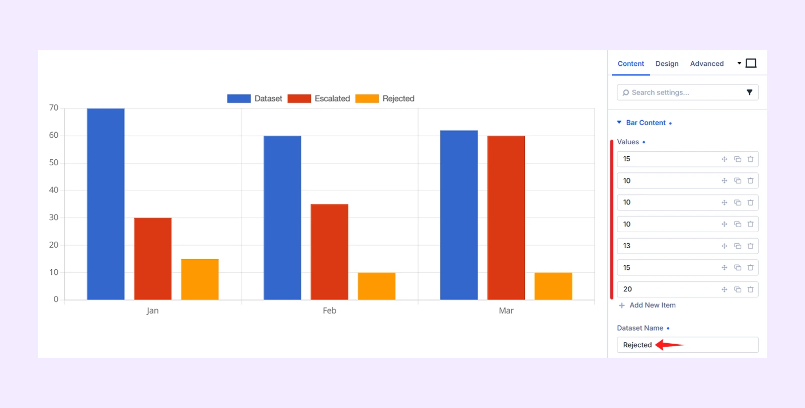
By following the same steps, add two more bar dataset and here is what info to add for each:
- Second Dataset: Values (30, 25, 60, 10, 45, 22, 10) and Dataset Name (Escalated)
- Third Dataset: Values (15, 10, 10, 10, 13, 15, 20) and Dataset Name (Rejected)
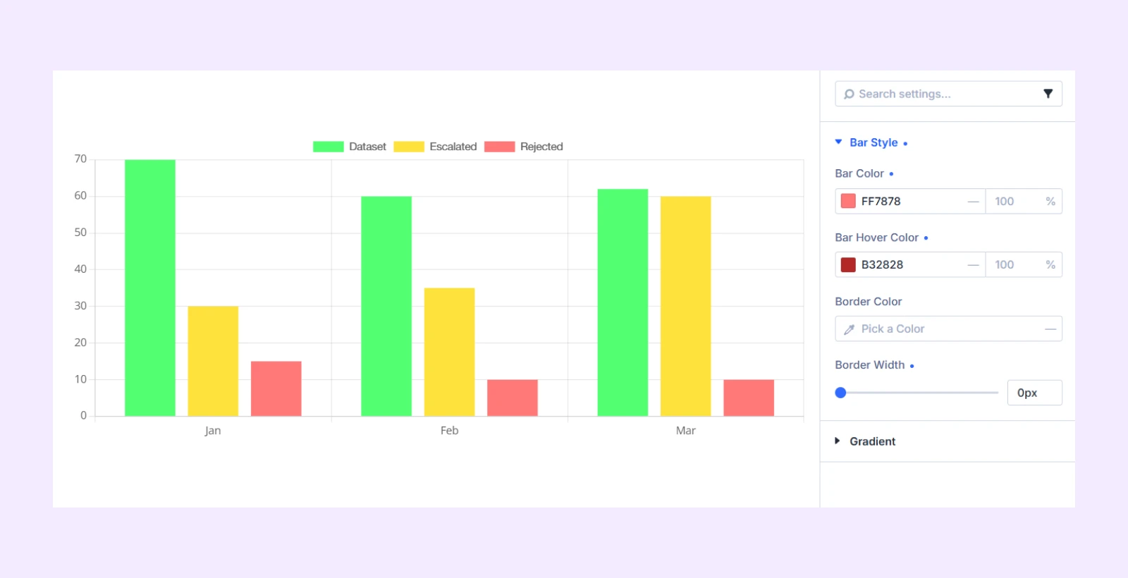
Step 3: Customize Each Bar Chart Dataset
You have to individually style each dataset. To do that, click on the pencil icon beside a dataset, then go to Design tab > Bar Style and then perform these:
- First (Accepted) Dataset: Bar Color (51ff71), Bar Hover Color (33c24d), Border Width (0px)
- Second (Escalated) Dataset: Bar Color (ffe23d), Bar Hover Color (ae9b30), Border Width (0px)
- Third (Rejected) Dataset: Bar Color (ff7878), Bar Hover Color (b32828), Border Width (0px)
Here is how the chart looks like after adding the colors:
Step 4: Configure the Bar Chart Display
Once the datasets are ready, configure the chart labels, title, and axis range. Here is how to do it:
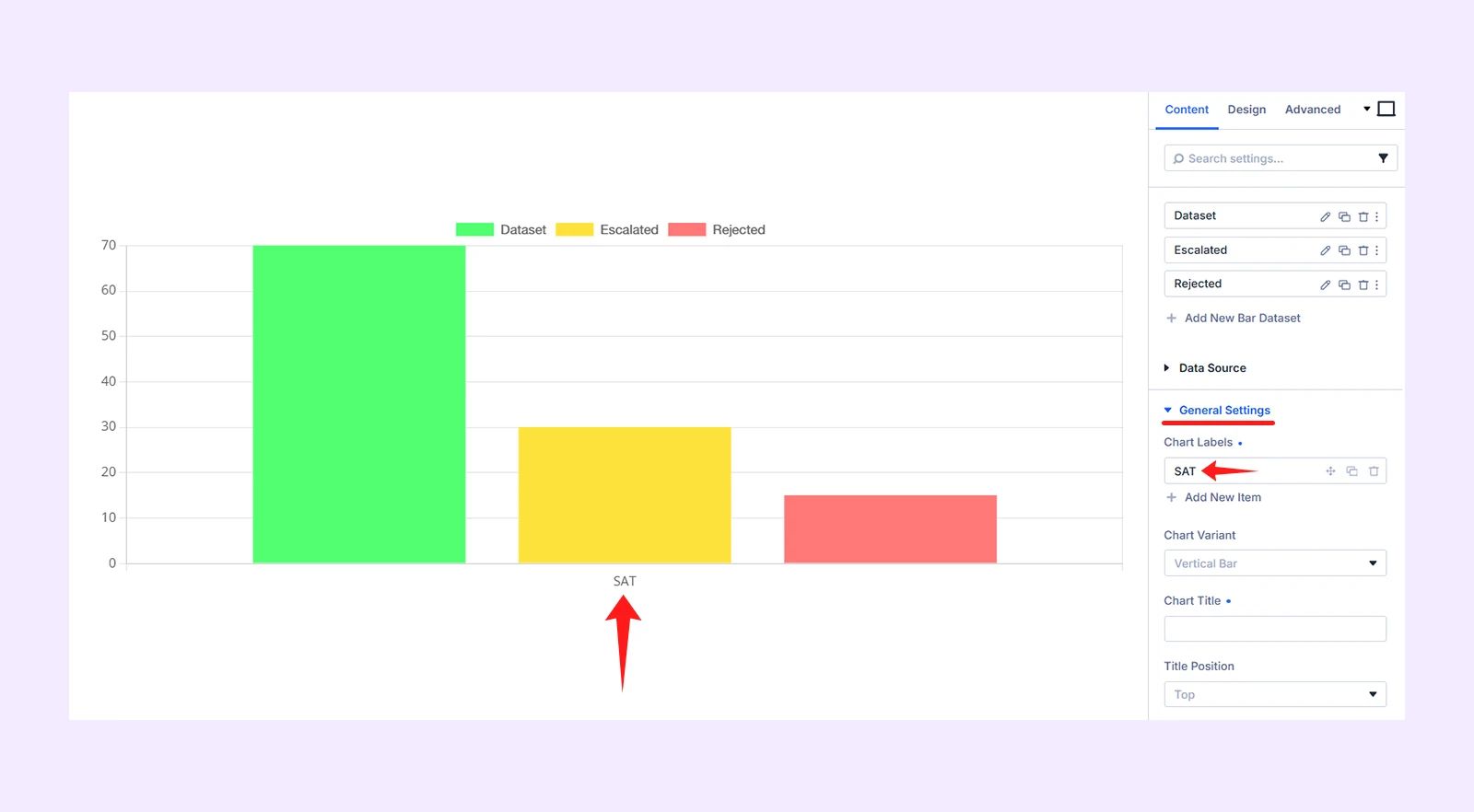
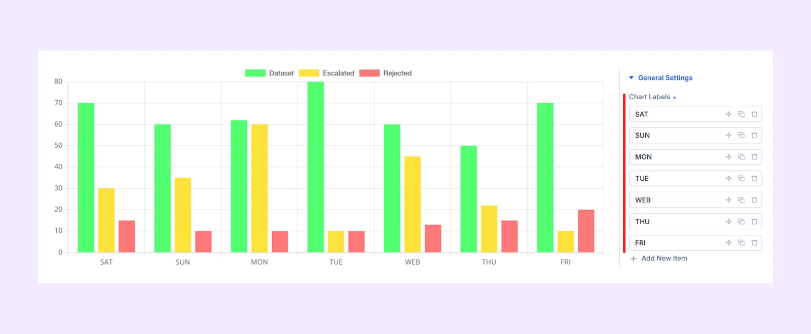
4.1: Add the Chart Labels
- Click on General Settings in the Content tab and delete all the default items
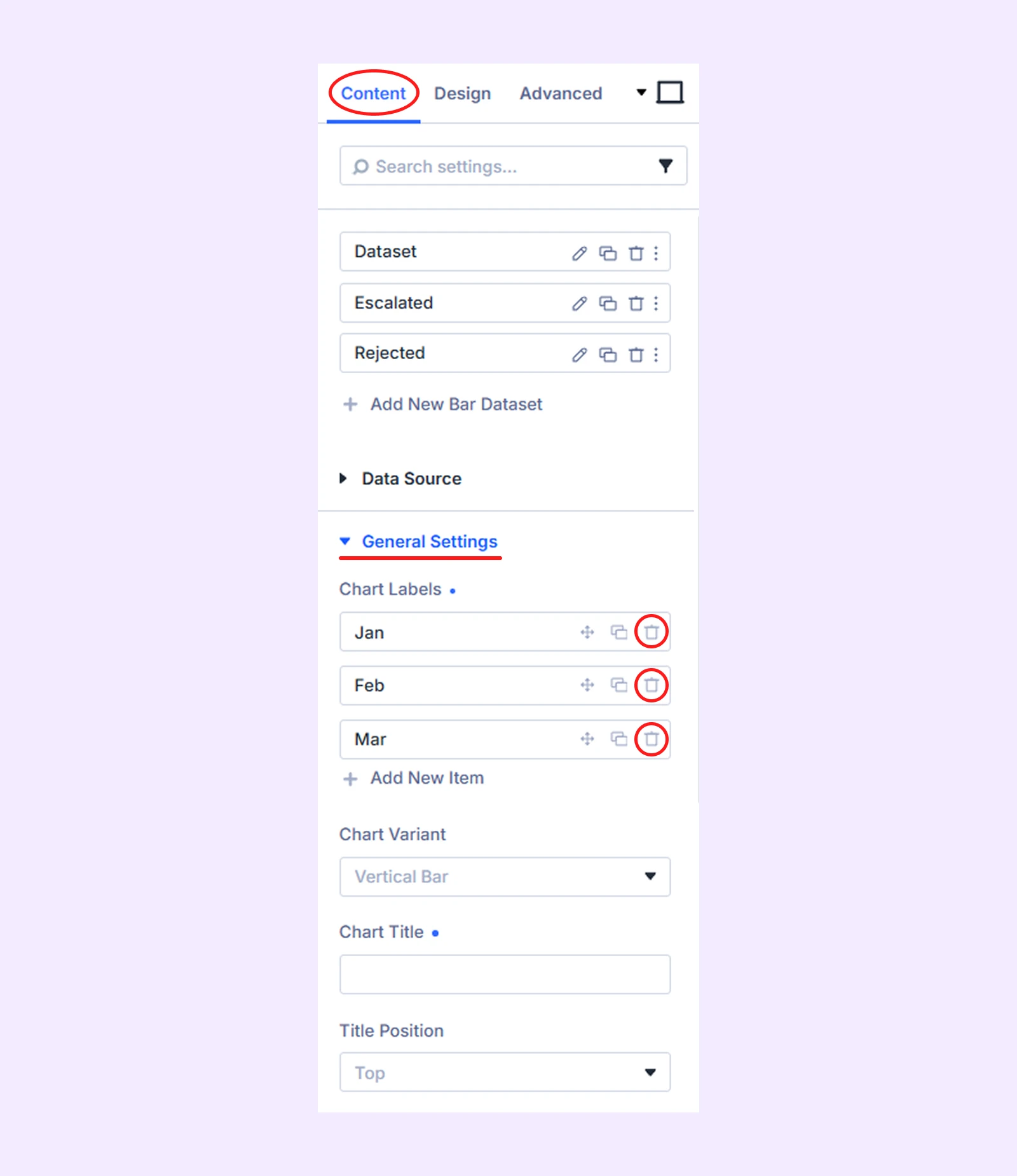
- Then click on “Add New Item” and set the name to SAT
- Add 6 more items with names like: SUN, ,PM, TUE, WED, THU, and FRI
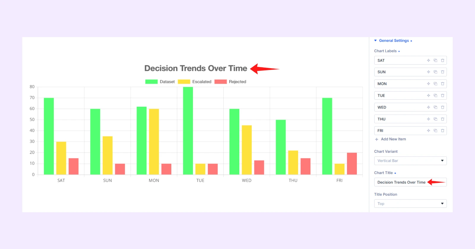
- Click on “Chart Title” and write “Decision Trends Over Time”
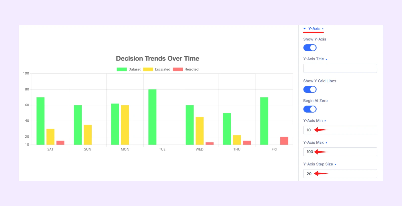
4.2: Configure the Y-Axis Range
Open the Y-Axis settings and use the following values:
- Y-Axis Min: 0
- Y-Axis Max: 100
- Y-Axis Step Size: 20
Step 5: Style the Bar Chart
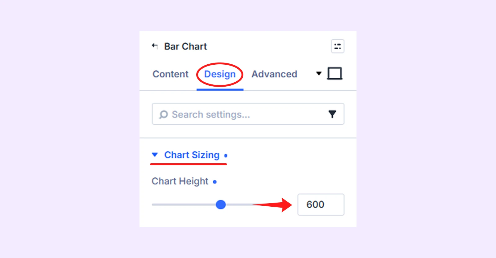
Go to the module’s Design tab to adjust its size, spacing, grid lines, typography, and animation.
5.1: Adjust the Chart Height
Open Chart Sizing and set:
- Chart Height: 600
5.2: Adjust the Bar Width and Spacing
Open Bar Appearance and set:
- Category Width (%): 100%
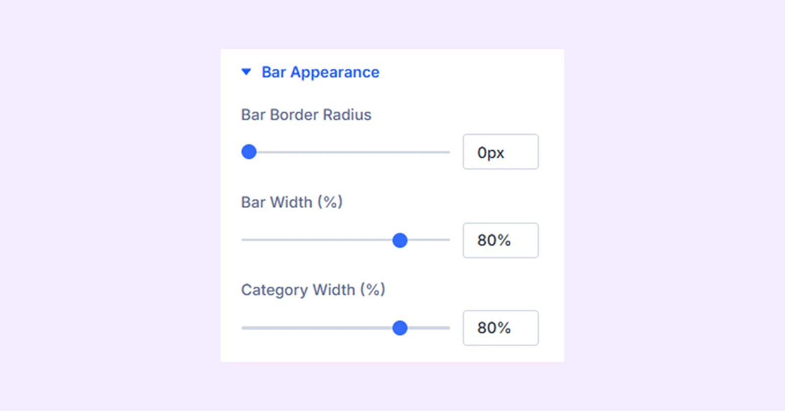
This controls the amount of space used by each group of bars.
5.3: Customize the Grid Lines
Open Grid Lines and set:
- Grid Color: 1e3058
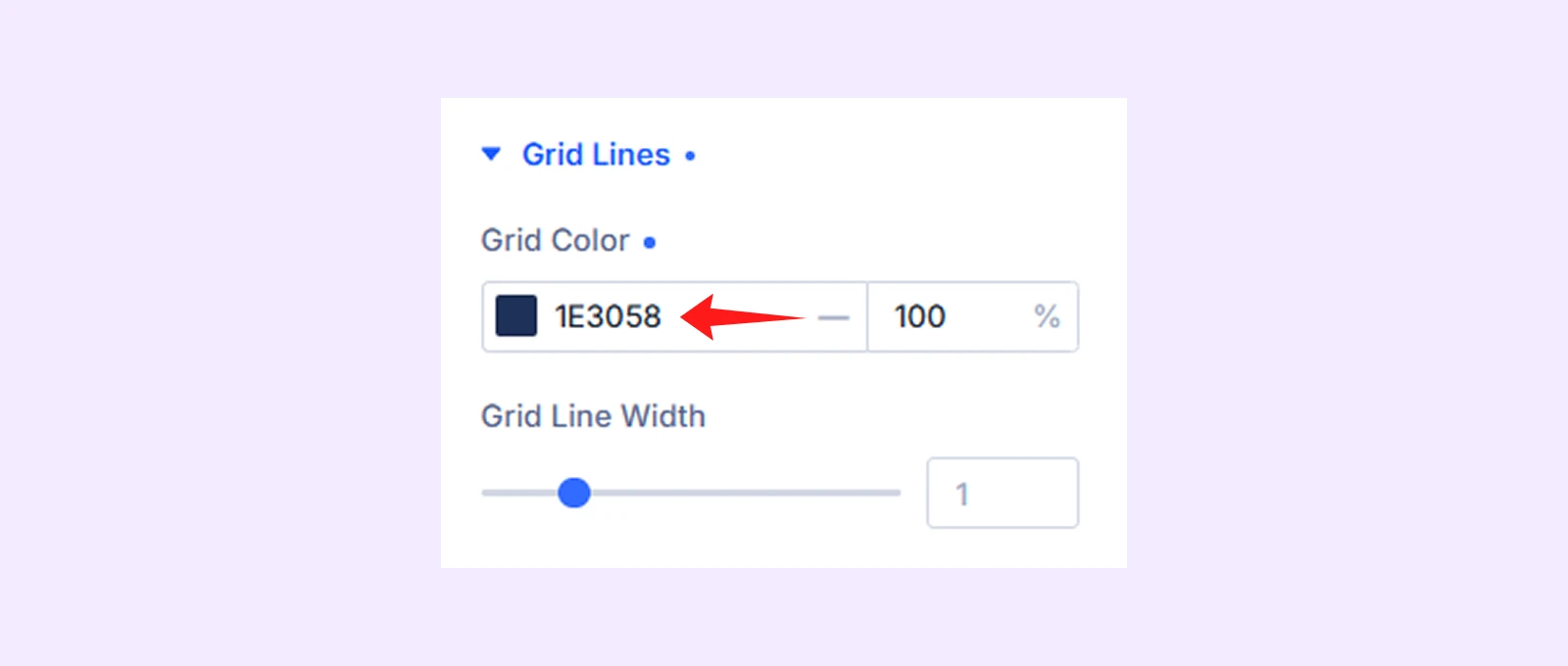
Note: Always choose grid line color that remains visible against the chart background without distracting from the data.
5.4: Style the Chart Typography
Open Typography and apply the following settings.
- Title: Title Font (Space Grotesk), Title Font Weight (Medium), Title Text Size (26)
- Legend: Legend Font (Inter)
- Axis Tricks: Axis Tricks Font (Inter), Axis Tricks Text Color (e6e6ef), Axis Tricks Text Size (16)
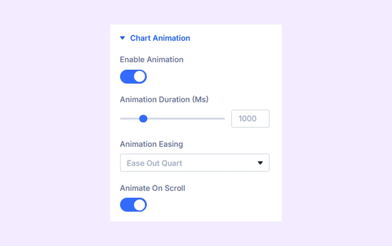
5.5: Add Chart Animation
Open Chart Animation and configure:
- Enable Animation: Toggle on
- Animation Easing: Ease Out Quad
- Animate On Scroll: Toggle On
Step 6: Save and Publish the Bar Chart
Review your chart settings one last time, then click Update to save the changes and exit the Visual Builder.
Here is the final output:
Note: The final chart size and spacing may vary depending on the row layout, column width, and module settings used on your page.
Final Thoughts
Now you know how to create a bar chart in Divi using DiviFlash’s Bar Chart module. We used DiviFlash because Divi’s default Bar Counters module is limited to creating simple, single-line horizontal bars.
With DiviFlash, you can build vertical, horizontal, and stacked bar charts, use manual or external data sources, and customize everything from datasets and axes to tooltips, legends, and animations.
The plugin also includes dedicated modules for creating line charts and pie charts in Divi. So, instead of relying on multiple tools, a single plugin can handle most of your chart-building needs.


0 Comments