

You have to use DiviFlash’s Pie Chart module as Divi does not include a built-in option for that. With this, you can display data as either a pie or doughnut chart.
You can customize individual slices, labels, legends, tooltips, and other chart elements. The module also supports manual data entry and external sources such as Google Sheets, CSV, and JSON.
In this guide, we will show you how to create a pie chart in Divi in a simple step-by-step way.
Let’s get started.
Our Created Pie Chart
To show you the creation process of the Pie Chart in Divi, we will create the following design.
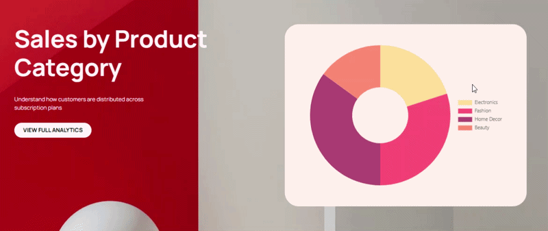
Note: We will only cover the pie chart creation setup. You can download the complete design for free from DiviFlash’s Pie Chart demo page.
Required Setup
Before starting, make sure the following are ready:
- Latest version of Divi (Divi 5) is installed and activated.
- Latest version of DiviFlash (5.2.0) is installed and activated.
Once these are ready, let’s start building.
Step 1: Add Pie Chart Module
Open the page where you want to display the pie chart and click Enable Visual Builder. After that:
- Add a Section, Row, and Column
- Click the + icon
- Search for Pie Chart
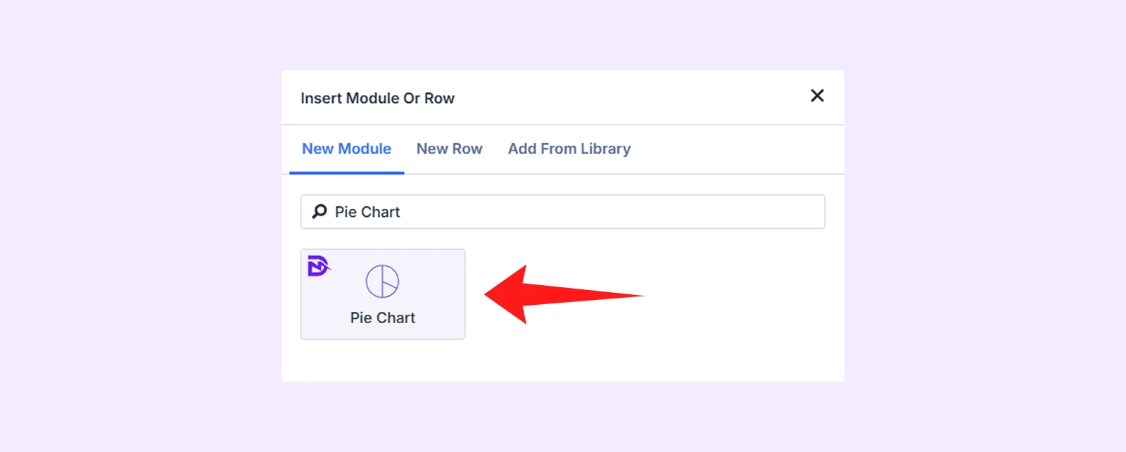
- Insert the module
Note: If you cannot find the module, go to WordPress Dashboard > DiviFlash > Modules and toggle on Pie Chart.
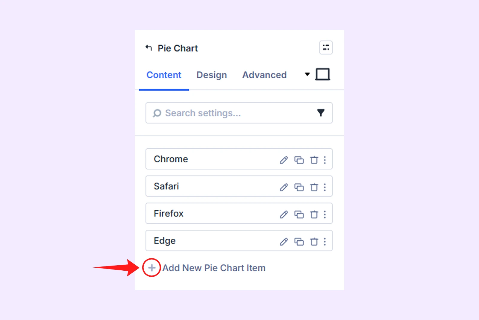
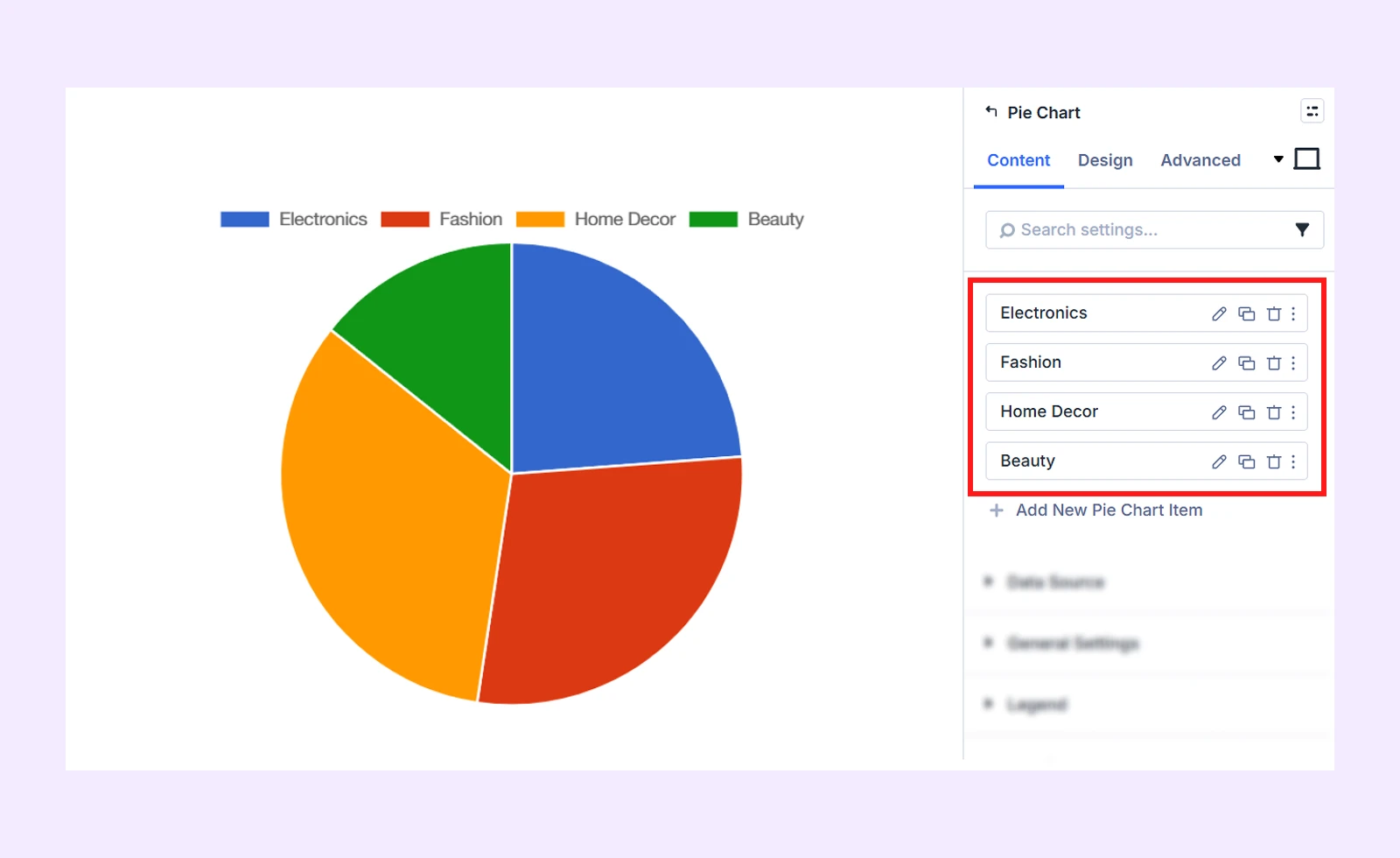
Step 2: Add Pie Chart Item
After inserting the module, you will see 4 default pie chart items. You can either keep them or delete. We will remove the existing items and start fresh.
Here is how you can also do it:
- Click on “Add New Pie Chart Item”
- Then update the Slice Label (Electronics) and enter the Value (20).
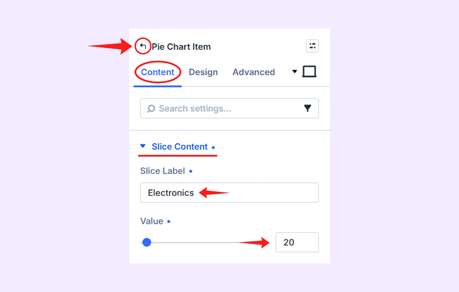
- Next, click the “Back to parent” icon in the module settings.
- After that, again click “Add New Pie Chart Item” again to add more slices with the following data:
- Slice Label (Fashion) and Value (30)
- Slice Label (Home Decor) and Value (35)
- Slice Label (Beauty) and Value (15)
Step 3: Customize Each Chart Design
Now, open each Pie Chart Item and assign a distinct color to its slice so the categories are easy to identify.
Here is how to do it for each 4 slices.
3.1: Customize the First Slice
- Click on “pencil icon” of the first pie chart item
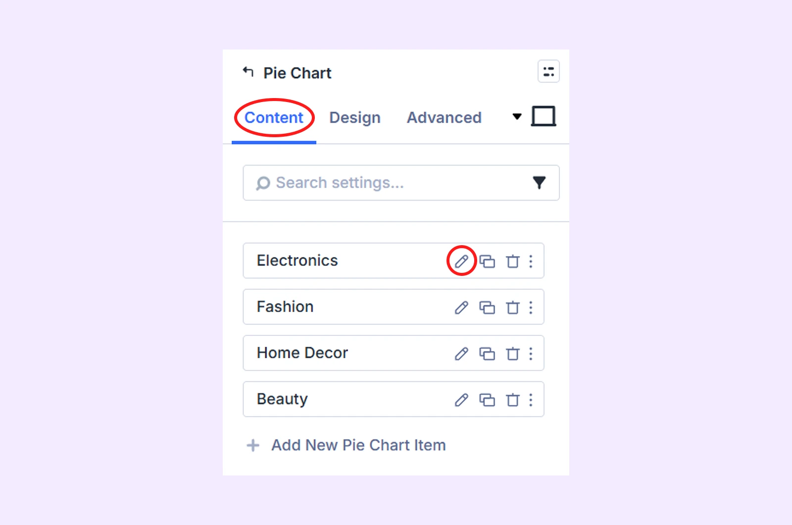
- Then navigate to the Design tab > Slice Style and make these changes:
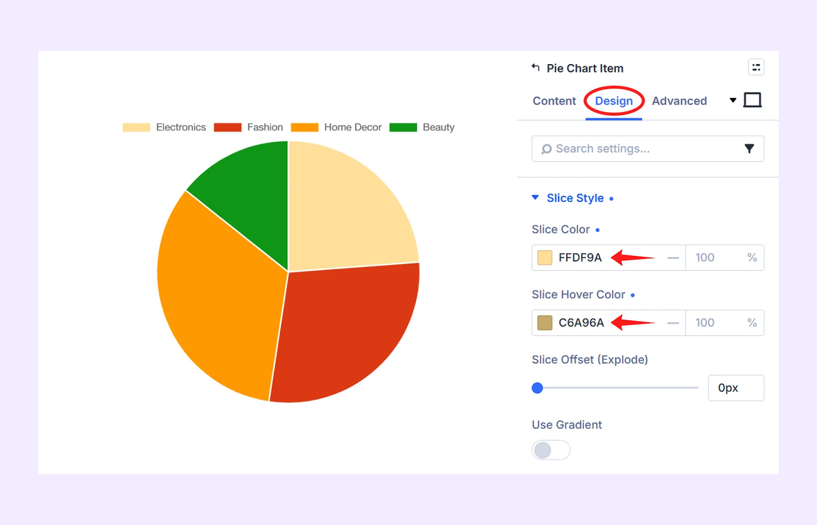
- Slice Color: ffdf9a
- Slice Hover Color: c6a96a
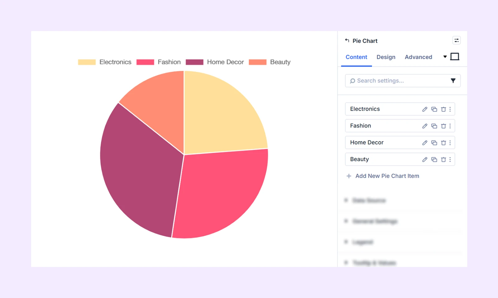
3.2: Customize Other Slice Items
Now click on other remaining slice items and then add the following color to each:
- Second Slice Item: Slice Color (ff5277) and Slice Hover Color (bd425d)
- Third Slice Item: Slice Color (b24775) and Slice Hover Color (853558)
- Forth Slice Item: Slice Color (ff8d73) and Slice Hover Color (ba6957)
Here is how it looks like so far:
Step 4: Configure Data Chart Related Settings
Once you are done customizing the individual items, it’s time to configure the overall settings that control how the chart presents your data.
Here is how to do it:
4.1: Select Data Source
In the module’s parent setting’s Content tab, click on “Data Source” and then make the following changes:
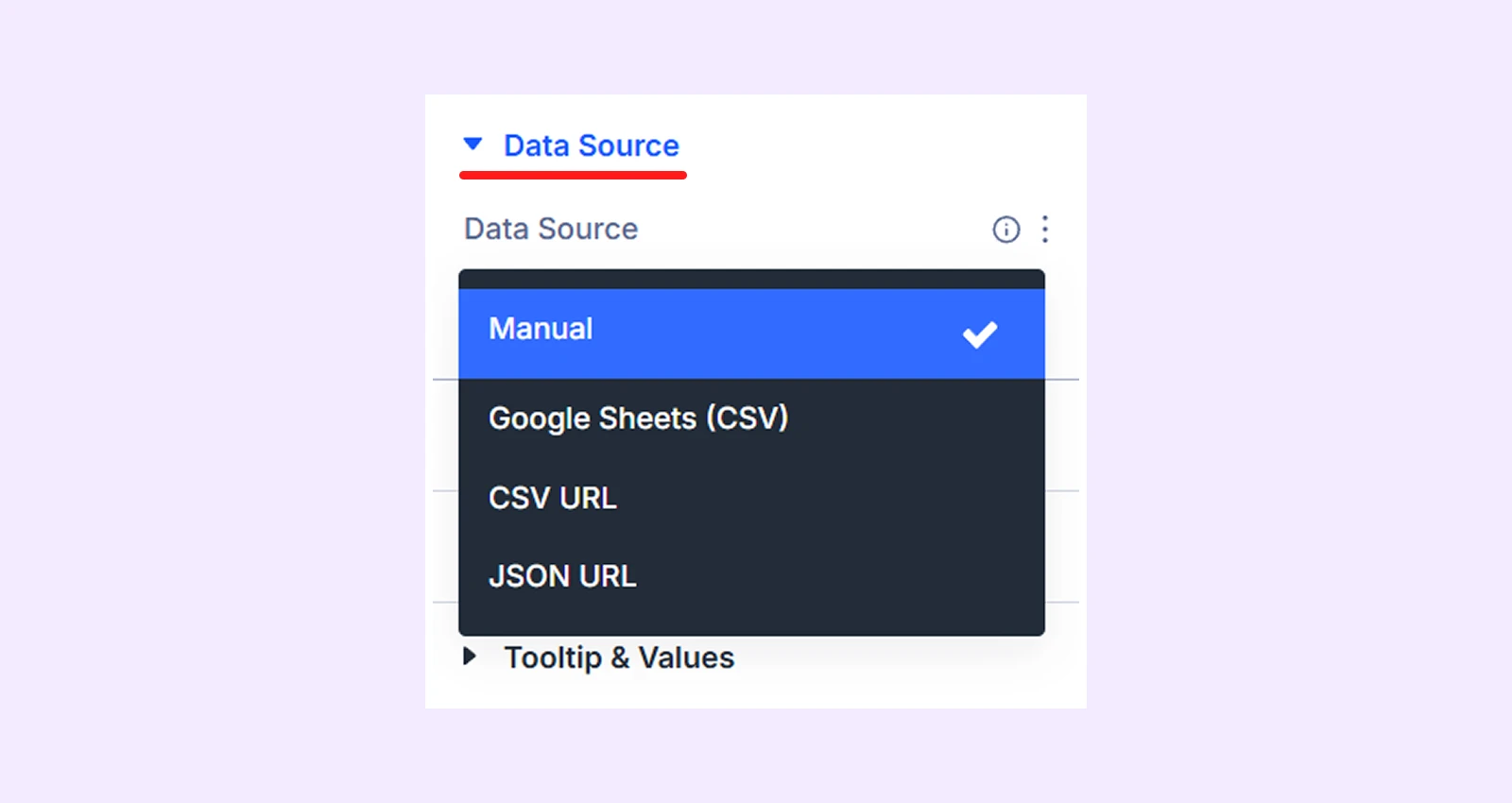
- Click on the Data Source dropdown box and select “Manual”. (it’s also a default setting.)
Note: The pie chart module also lets you source data from Google Sheet (CSV), CSV URL and JSON URL.
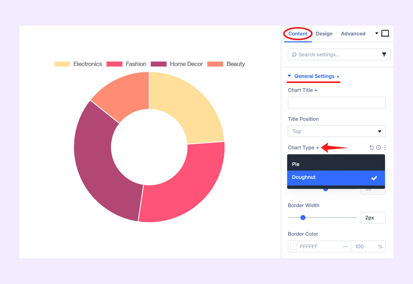
4.2: Select Chart Type
In the Content tab, click on “General Settings” and then make the following changes:
- Chart Type: Choose Doughnut
4.3: Add Legend
Click on “Legend” in the Content tab and make these changes:
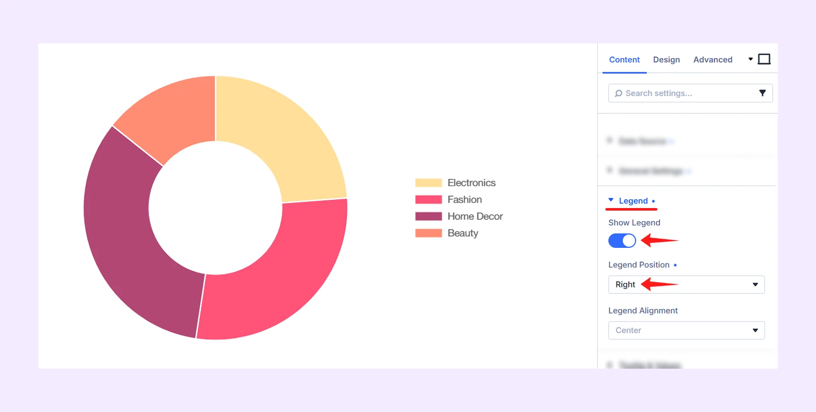
- Show Legend: Enable it
- Legend Position: Right
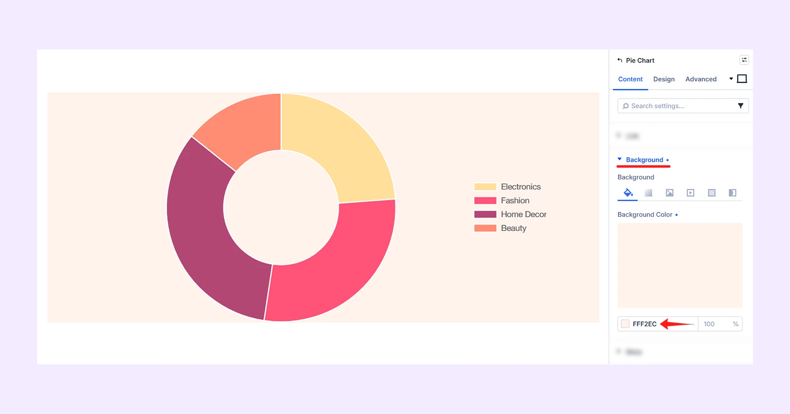
4.4: Add Background Color
Our demo design has a background color that you can also add. To do that, click on “Background” and add this color: fff2ec
Step 5: Customize the Appearance of the Module
Now, refine the module’s overall appearance, navigate to the Design tab. Then make these changes:
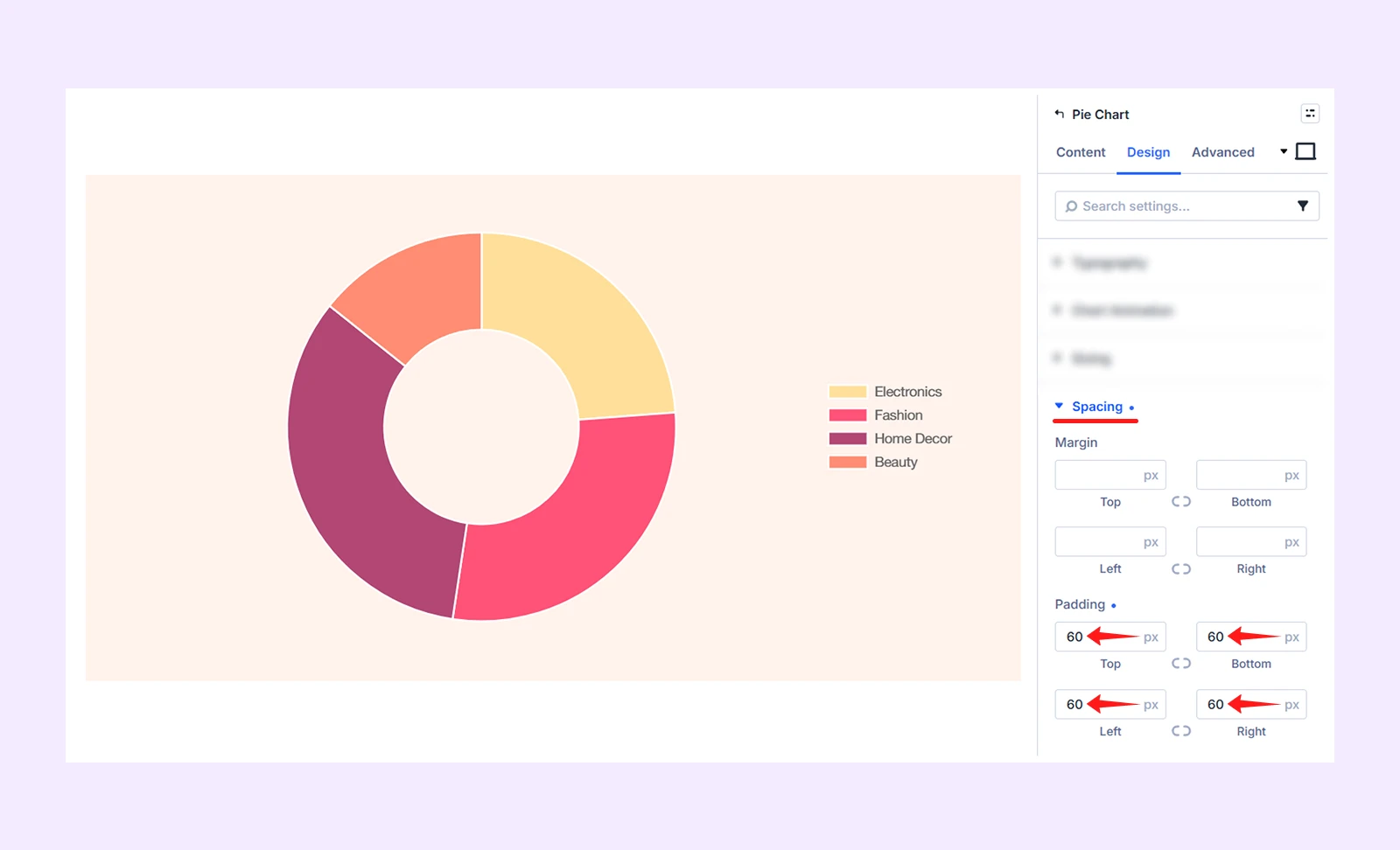
5.1: Add Spacing
In the Design tab, click on “Spacing” to add Padding to top, bottom, left and right (60px)
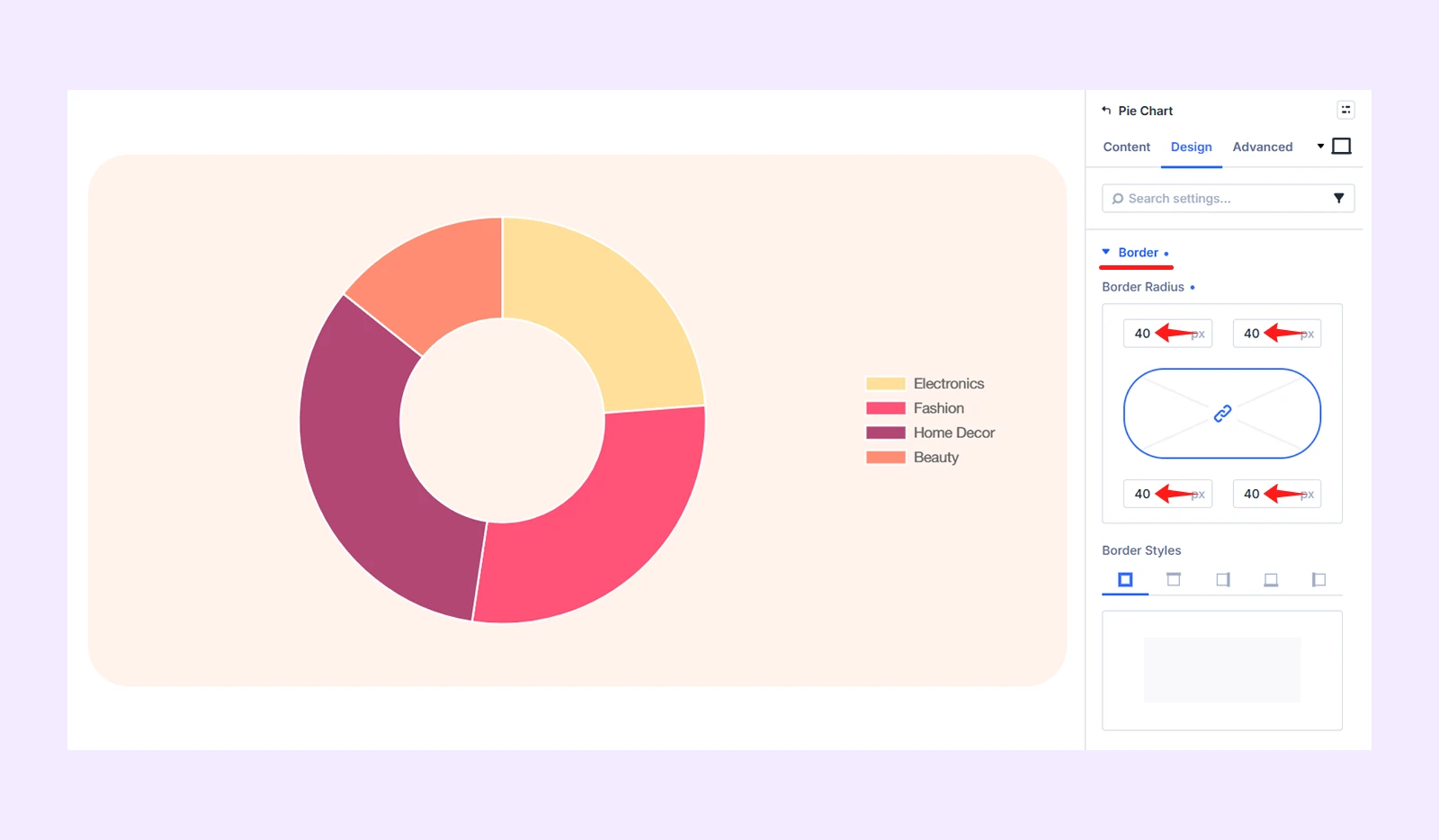
5.2: Add Border
Click on “Border” in the Design tab and add Border Radius 40px to all the corners.
Step 6: Save and Publish
Once you are satisfied with the chart’s data, colors, and overall design, save your changes and exit the Visual Builder. Then, publish or update the page to make the pie chart live.
Here is the final output:
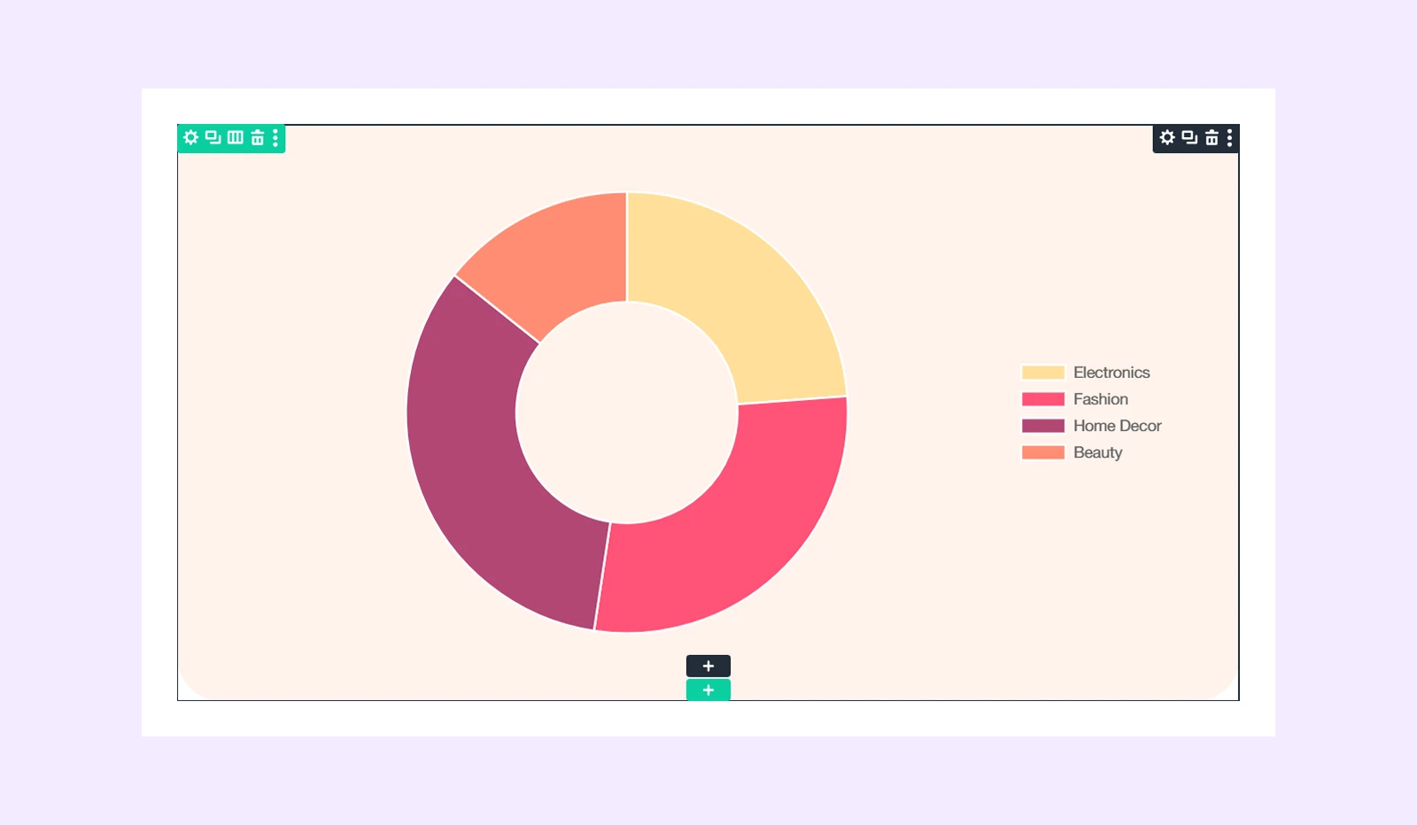
Note: The final output may look slightly different from our demo depending on the row and column structure you select.
Final Thoughts
Now you know how to create a pie chart in Divi in six easy-to-follow steps. Since Divi does not include a built-in chart module, DiviFlash provides a simple way to create both pie and doughnut charts.
DiviFlash also includes dedicated modules for other chart creation needs. You can create a line chart in Divi to show trends over time or create a bar chart in Divi to compare values across different categories.
In total, DiviFlash has 70+ modules to help you build more functional and visually engaging Divi websites without relying on multiple plugins.


0 Comments