


A table shows data in rows and columns, while a chart uses visuals like bars or lines to show data. Both are used to present data, but each serves a different purpose.
Tables are best for showing exact values, while charts are better for highlighting trends, or patterns. Charts make information easier to understand quickly in presentations or reports.
Both have many other differences, such as how they handle data, present information, create visual impact and more.
In this table vs chart comparison guide, we will explore their key differences and help you choose the right one.
Let’s get started.
Table vs Chart: Quick Comparison
| Aspect | Table | Chart |
| Main purpose | Show exact data | Show visual patterns and insights |
| Data format | Rows, columns, and cells | Bars, lines, slices, or points |
| Best for | Lookup, reference, and detailed comparison | Trends, patterns, and quick comparisons |
| Reading speed | Requires more careful reading | Communicates the main point quickly |
| Data volume | Can display large datasets | Works best with selected or summarized data |
| Space efficiency | Can get dense with large datasets | More space-efficient for showing trends |
| Common interaction | Search, sort, filter, and pagination | Hover, tooltip, zoom, and animation |
| Audience | Analysts, detail-oriented readers | General audiences, presentations |
| Example Use Case | Pricing, specifications, schedules, directories | Sales trends, growth, market share, performance |
What Is a Table?

A table is a way to organize information using rows and columns. In the table, where a row and column meet, they create a cell, which is where your content is displayed. Each cell can contain text, images, numbers, links, or other types of data.
While creating a table, you can create as many rows and columns as required to organize your content. And to make the table more visually appealing and easier to read, you can customize its grid lines, background colors, borders, and spacing.
In short, a table makes complex information easier to organize. However, if you are creating a really big table, it can be overwhelming to read and understand. And in such cases, you can use features like filtering, sorting, or pagination.
Some of the common examples of tables types are:
- Data Tables
- Comparison Tables
- Pricing Tables
- Product Tables
- Schedule Tables
- Pros and Cons Tables
Pros of Tables
- Display exact values clearly
- Support detailed comparisons
- Handle both text and numerical data
- Work well with search, sorting, and filtering
Cons of Tables
- Large tables may feel overwhelming
- Wide tables can be difficult to view on mobile
- Less engaging for general audiences
Note: If you are using WordPress, you can explore the best WordPress Table plugin blog to find the best one.
What Is a Chart?
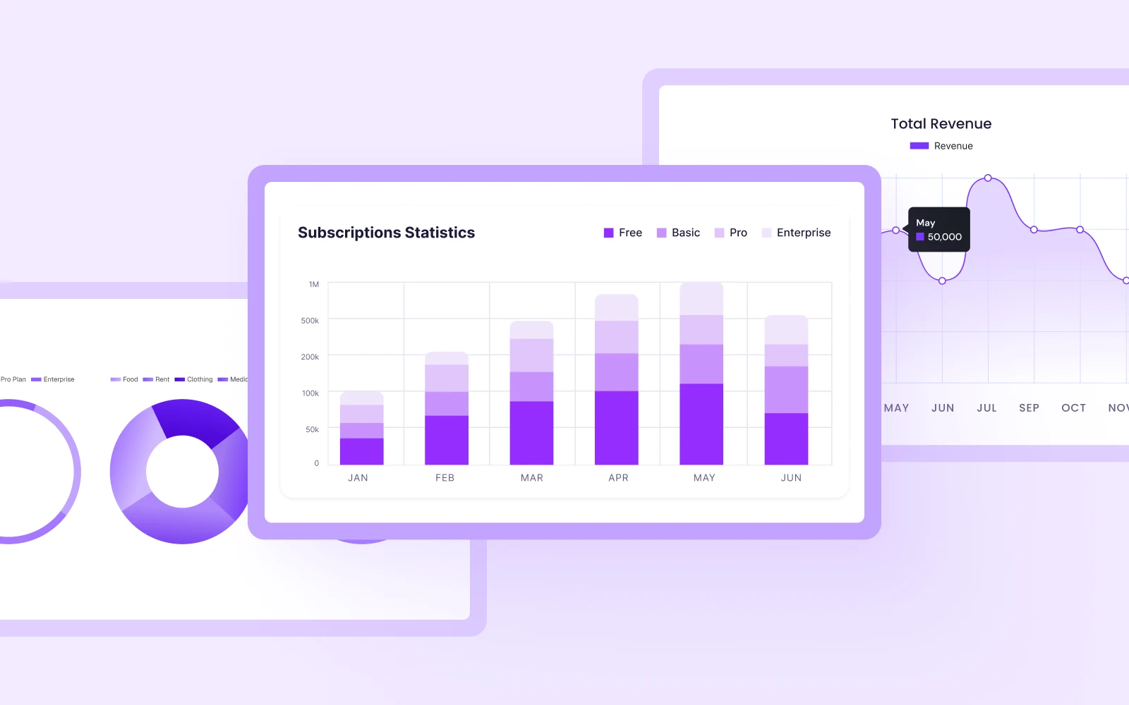
A chart gives you a simple way to show data using visuals like bars, lines, dots, slices, or shapes. These elements represent numerical values and make the data easier to understand.
Moreover, they help you quickly see trends, patterns, and unusual values that may be hard to notice in a table of numbers. That’s because, in a chart, you can display data with different colors, sizes, and shapes.
You can even add labels, legends, hover effects, and tooltips to make the data easier to read and explore. All of these together make charts an easy way to understand data quickly and see the main story behind it.
Some of the common examples of chart types are:
- Line Charts
- Bar Charts
- Doughnut Charts
- Pie Charts
Note: If you are using Divi, you can explore our guides on creating line, bar, and pie charts in Divi.
Pros of Charts
- Reveals trends and patterns instantly
- Make comparisons easier to understand
- Summarize large datasets visually
- Create a more engaging presentation
Cons of Charts
- May not show exact values clearly
- Not ideal for detailed, granular comparisons
Chart vs Table: Detailed Comparison
Now that you know everything about both table and chart in detail, now let’s compare both of them with their key aspects:
Purpose and Goal: What Each One Is Designed to Do?
A table is used to show data exactly as it is. It puts information in rows and columns so every value is clear and precise. And tables work best when you need to:
- Find a specific value
- Check or compare exact numbers
- Look at many data points in detail
- Keep records for later checking or calculations
A chart can turn numbers into a visual form. Instead of showing every value, it helps you see the main idea behind the data, like growth, comparison, or change.
Charts are useful when you need to:
- Compare groups easily
- Show parts of a whole
- See trends quickly
- Show changes over time
In short, a table shows exact data in detail, while a chart shows the main idea and patterns in a simple visual way.
Supported Data Types: What Type of Data Each One Can Handle?
Tables can hold many types of information in one place. That means you can mix different formats in rows and columns, such as:
- Text
- Numbers
- Dates
- Images
- Icons
- Links
- Buttons
Because of this flexibility, tables are great for things like product comparisons, pricing plans, or detailed specifications.
Charts primarily represent numerical or categorical data. They work best with:
- Numbers (counts, amounts, values)
- Percentages (parts of a whole)
- Changes over time (trends)
- Categories with values (comparisons)
Charts do not display things like images, buttons, or long text. They focus only on data that can be measured and compared.
Reading Speed: How Fast You Can Read the Information
Tables are best when you already know what you are searching for. You can quickly scan rows and columns to find a specific value without reading everything.
Charts are best when you want to understand the overall story quickly. Your eyes can instantly notice shapes, trends, and sizes.
In short, tables help you find exact details quickly, while charts help you understand overall patterns and trends at a glance.
Data Volume: How Much Data Each One Can Hold
Tables can easily handle growing data because you can keep adding rows and columns without changing the structure. You can also use tools like sorting, filtering, search, and pagination to manage large datasets.
Charts are designed to show data in a simple visual form. They work best when the data is limited or grouped. If there are too many values, the chart becomes hard to read.
So, tables are better for high-volume data, while charts are better for showing summarized data.
Comparison Capability: How Well Each One Supports Comparisons
Tables are great when you need to compare several details side by side. Each row and column can hold different types of information, so nothing is lost.
For example, you can compare:
- Price
- Ratings
- Features
- Warranty
- Availability
Because of this level of flexibility, tables are useful for product comparison, service or vendor comparison and more.
Charts are best when you compare one or a few numerical values across different categories. They make it easy to quickly see which is higher or lower.
For example:
- Revenue by region
- Rankings of values
- Sales by product
However, charts cannot easily show detailed text or mixed information like features or descriptions.
In short, tables compare everything about items, while charts compare one or a few numbers across items.
Visual Impact: Which One Has More Visual Appeal?
Tables focus on clear structure and accuracy rather than visual style. They are easy to read and organize. Tables usually:
- Look similar no matter what data they contain
- Focus on organization instead of visual design
- Feel neutral and straightforward
- Work best for reference and detailed reading
Charts use visual elements like shapes, colors, and sizes to show crucial information. They make key insights easier to notice at a glance.
However, visual impact should not replace clarity. A chart should only be used when its visual form makes the data easier to understand.
Interaction: How Users Interact With Each
Tables include tools that help users quickly find specific information and manage large amounts of data. And some of the common table interactions include:
- Search
- Sort
- Fitler
- Pagination and more
Charts include interactive features that help users understand the meaning behind the data. Here are some of the chart interactions:
- Hover (tooltips)
- Click legends
- Zoom
- Highlight and more.
Limitations: Where Each One Falls Short?
Tables are great for showing exact data, but they can become difficult to read when there is too much information.
Some common limitations are:
- Large tables can feel overwhelming
- Long lists of numbers can be boring to read
- Tables do not automatically show trends or patterns
- It is easy to read the wrong row or column by mistake
Charts make patterns easy to see, but finding precise values can sometimes be difficult. Some common limitations are:
- Exact values may be hard to read
- Small differences can be difficult to notice
- Poor design choices can make data misleading
- Too much data can make charts crowded and confusing
Table vs Chart: When Should You Use Each One?
Now you know the differences between tables and charts. Both help present data, but they are useful in different situations.
Here is a simple way to decide:
- Choose a table when you need to show exact information and let readers look up specific details.
- Choose a chart when you want readers to quickly understand trends, comparisons, or patterns.
You can also use both together. In many cases, such as reports, dashboards, or presentations, using both gives the best results. This will help readers understand the main points at a glance while still giving them access to exact details when needed.


0 Comments