

Have you ever filled out a form that felt effortless, where every step flowed naturally? That is the real impact of good web form design.
Research shows that only 66% of users who start a form actually complete it, while nearly 36% of marketers never run user tests on their forms, leading to lost leads and lower conversion rates.
A well-designed website form reduces friction and guides users toward action. From sign-ups and quote requests to bookings and purchases, many key interactions begin with a form.
In this article, we explore the best web form examples that show how clarity, usability, and visual balance create forms users enjoy filling out and are more likely to complete.
What is a Form in a Website?
A website form is an online interface that allows users to enter and submit information on a website. Businesses use web forms to collect data such as contact details, feedback, survey responses, booking requests, registrations, or purchase information.
A typical web form includes input fields, labels, buttons, and validation messages that guide users through the process.
When designed properly, a form simplifies data entry, improves the user experience, and helps users complete the form quickly while allowing websites to capture accurate information efficiently.
Types of Website Forms
Website forms come in different types based on their purpose, use case, and placement on a site. Each form type serves a specific role and helps users complete a particular action. Here are the most common types of website forms you will see on modern websites:
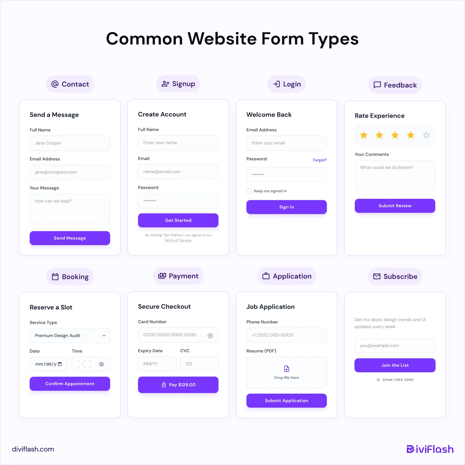
- Contact Forms: Used on Contact Us pages to let users send messages, inquiries, or support requests.
- Signup / Registration Forms: Allow users to create an account, sign up for a service, or start a free trial.
- Login / Authentication Forms: Let returning users access their accounts using email and password.
- Feedback & Survey Forms: Help businesses collect opinions, reviews, and survey responses from users.
- Booking & Reservation Forms: Used for scheduling appointments, event registration, or service bookings.
- Payment & Checkout Forms: Enable users to place orders and complete purchases securely.
- Application Forms: Used for job applications, memberships, or program registrations.
- Lead Generation / Subscribe Forms: Capture email addresses for newsletters, updates, or marketing campaigns.
Key Elements of a website form
A website form is made up of several elements that work together to guide users from start to submission. Not every form needs all of these elements, but using the right combination helps simplify the process and improve the overall user experience.
Here are the most common elements found in a well-designed website form:
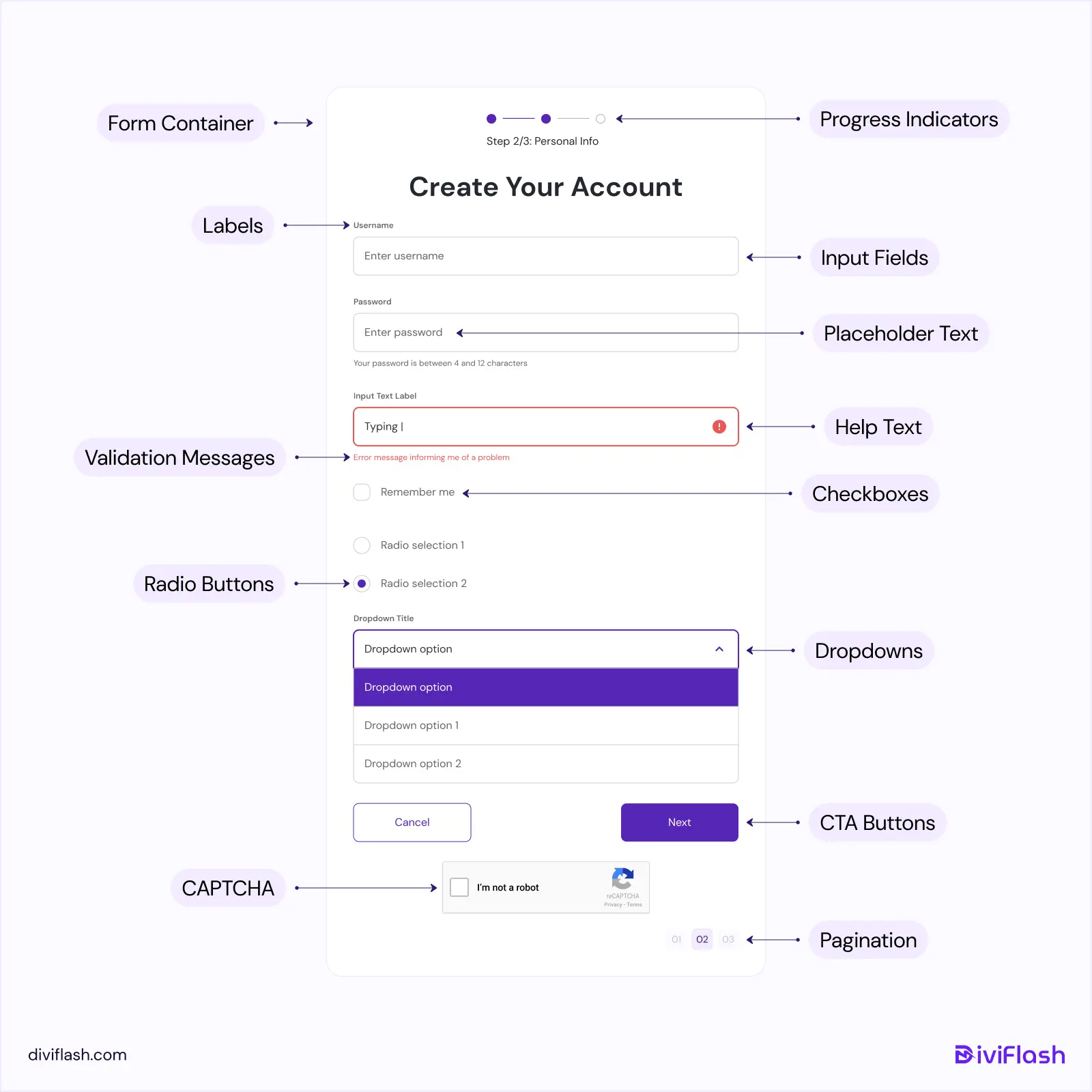
- Form Container: The main wrapper that holds and structures all form elements.
- Input Fields: Fields where users enter text, choose options, upload files, or provide other information.
- Labels: Clear descriptions that explain what information is required in each form field.
- Placeholder Text: Short hints or examples inside input fields that guide users on what to enter.
- Validation Messages: Real-time alerts that help users correct errors while filling out the form.
- CTA Buttons: Action buttons such as Submit, Send, or Sign Up that allow users to submit the form.
- Progress Indicators: Visual cues that show how much of a multi-step form is completed and what remains.
- Help Text: Optional hints or notes that clarify the requirements for specific fields.
- Dropdowns, Checkboxes, and Radio Buttons: Selection elements that let users choose one or multiple options easily.
- Pagination: Navigation controls used in multi-step forms to move between sections.
- CAPTCHA: A verification element that helps protect forms from spam and automated submissions.
When these elements are used thoughtfully, they make forms easier to understand, reduce friction, and help users complete the form with confidence.
10 Best Website Form Design Examples
We have curated some of the best web form examples from real websites to inspire your next form design. Each example shows a different approach, from contact and signup forms to booking and multi-step forms, helping you create website forms that are easy to understand and complete.
1. Duolingo (Onboarding Form)

Duolingo turns its onboarding form into a friendly, game-like experience. Guided by its mascot “Duo”, users answer one question at a time using clear visuals, large buttons, and a visible progress bar.
This step-by-step approach feels fun and conversational, helping users stay engaged and complete the form without feeling overwhelmed.
2. USADEFEND (Booking Form)
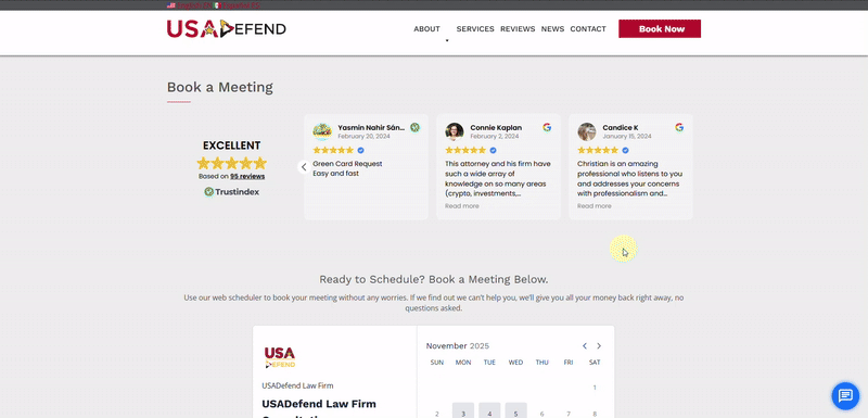
USADefend’s booking form makes scheduling simple and transparent. Users can select a date and time from a built-in calendar, review session details, and enter information using clear, structured form fields.
Pricing, timezone, and payment details are displayed on a single screen, helping users understand the cost and complete the booking with confidence before checkout.
3. Figma (Contact Sales Form)
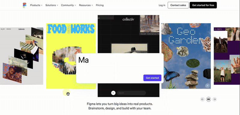
Figma’s contact sales form uses a clean, minimal layout focused on clarity and ease of use. It opens in a centered modal, allowing users to stay on the same page while entering key details such as company information, inquiry type, and message.
Clear spacing, simple form fields, and required-field prompts keep the form distraction-free and easy to complete.
4. Mailchimp (Account Setup Form)
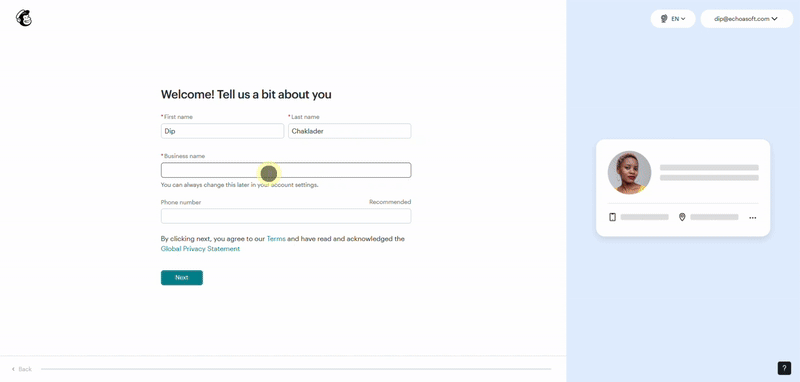
Mailchimp’s account setup form guides users through simple, step-by-step questions about their business and marketing goals. Each screen is clean and well-spaced, with visual previews that help users understand their choices.
This guided flow feels personal and interactive, making the setup process easy to follow and complete.
5. Primal Pet Food (Signup / Subscribe Form)
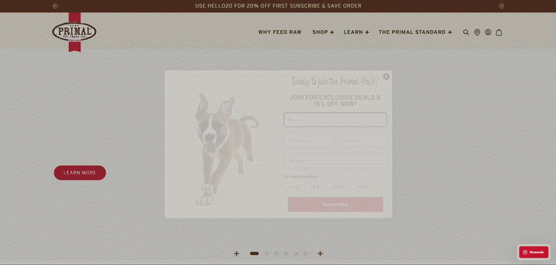
Primal Pet Foods uses an engaging popup signup form with playful pet visuals that quickly grab attention. The form is short and friendly, asking only for essential details such as email, name, and pet type, while offering a clear incentive.
A warm color palette, cheerful imagery, and a simple layout make the form feel approachable and encourage users to sign up without hesitation.
6. MaeveChocolate (Contact Form)
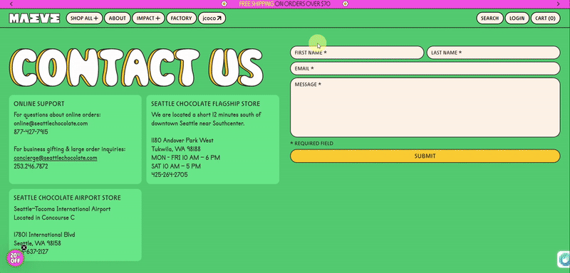
Maeve Chocolate’s contact form features a playful, colorful design that reflects the brand’s fun personality. A bold “Contact Us” heading, rounded form fields, and a bright background create a welcoming first impression.
The form stays simple with only name, email, and message fields, making it quick and easy for visitors to reach out.
7. Grammarly (Contact Form)
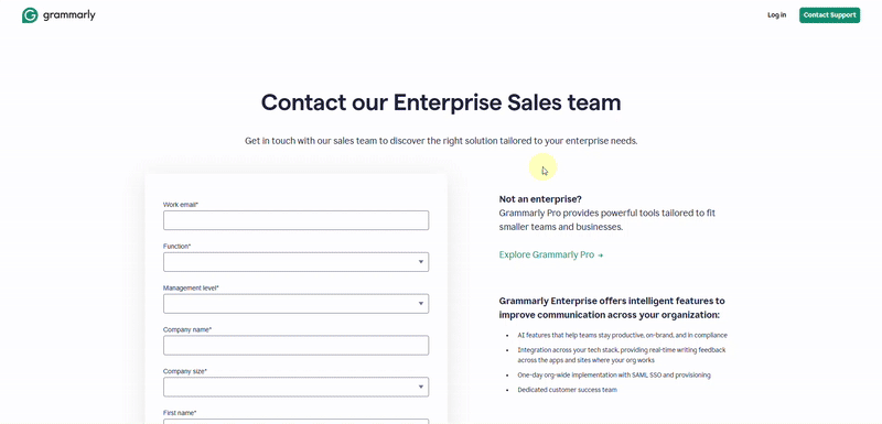
Grammarly’s contact form is clean, structured, and designed for clarity. It separates inquiries into Sales, Support, and Press, helping users quickly choose the right channel.
Simple form fields, clear spacing, and short helper text keep the experience professional and easy to complete.
8. Demostack (Lead Generation Form)
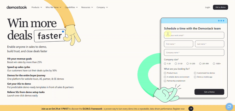
Demostack keeps its demo request form short and focused to capture leads efficiently. It asks only for essential details such as email, company name, and demo type.
A clean layout, clear form labels, and a strong call-to-action make the form quick to fill out and effective at capturing qualified leads.
9. Slack (Support Form)
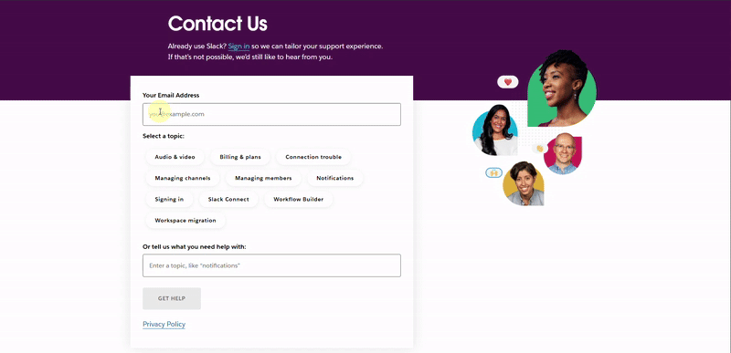
Slack’s support form is designed with ease and clarity in mind. Users can quickly select a help topic or describe their issue using a clean and focused layout.
The form also suggests related questions and articles based on the topic selection in real time, helping users find instant solutions before submitting.
This smart, conversational flow reduces friction and improves the overall support experience.
10. Zendesk (Job Application Form)
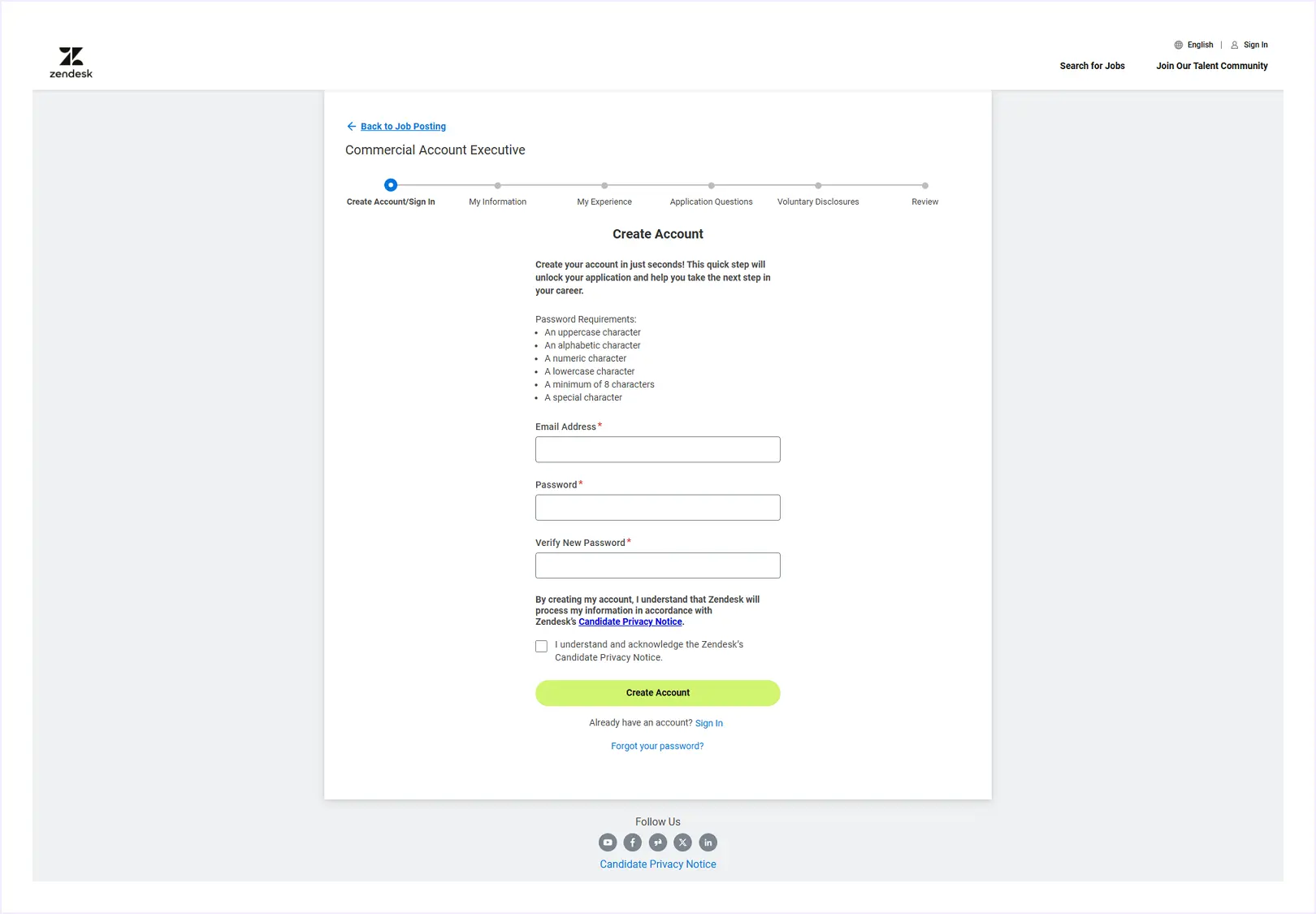
Zendesk’s job application form uses a clear multi-step layout to guide applicants through each stage of the process. It starts with account creation and moves through sections such as personal information, work experience, and disclosures.
A progress indicator at the top shows how far users have gone, helping reduce form fatigue. The minimal design and structured layout keep the experience professional, clear, and easy to complete.
Website Form Design Best Practices
Good form design helps users understand and complete forms quickly. Here are the best practices you can follow when designing your form:
- Keep forms short and focused: Ask only for essential information. Fewer fields usually lead to higher completion rates.
- Use a single-column layout: One-column forms are easier to scan and faster to complete than multi-column layouts.
- Start with easy fields: Place simple questions first and leave sensitive or complex fields for later.
- Group related fields: Organize fields logically so users understand what information belongs together.
- Use clear and descriptive labels: Make it obvious what users should enter in each field. Avoid vague or technical language.
- Group related fields logically: Organize form fields into clear sections so users can scan and understand the form quickly.
- Use clear labels: Clearly explain what each field is for. Avoid vague or technical wording.
- Prefer radio buttons over dropdowns: Radio buttons are quicker to use and easier to understand.
- Reduce typing when possible: Use autofill, saved data, or suggestions to help users fill out forms faster.
- Provide real-time feedback: Show helpful validation messages as users fill out the form, not after submission.
- Guide users in long forms: Use multi-step forms and progress indicators to reduce form fatigue.
- Design for mobile users: Make sure fields and buttons are easy to tap and read on small screens.
- Use clear CTA buttons: Replace generic labels like Submit with action-based text such as Sign Up or Get Started.
- Avoid distractions: Remove unnecessary links or visuals that pull attention away from the form.
- Build trust: Explain why you ask for certain information and reassure users about privacy when needed.
- Test and improve regularly: Review form performance and make small improvements based on user behavior.
Best Website Form Design Templates from DiviFlash Form Styler
Website forms can be created in many ways, depending on how a site is built. However, WordPress remains the most popular platform, powering over 43% of all websites.
WordPress offers a wide range of form builder plugins such as Gravity Forms, Contact Form 7, Ninja Forms, Fluent Forms, BookingPress, and WPForms.
If you are exploring options, our guide on the best WordPress form plugins can help you choose the right tool based on your needs.
These plugins make it easy to create functional and professional website forms using ready-made templates, saving both time and effort. When combined with the Divi theme and the DiviFlash plugin, you can take your form design even further.
DiviFlash includes powerful Form Styler modules that let you visually customize forms built with popular plugins like WPForms, Contact Form 7, and Gravity Forms directly inside the Divi Builder. You can style layouts, colors, spacing, and buttons without writing code.
Here are some of the best website form templates styled with DiviFlash Form Styler to inspire your next project.
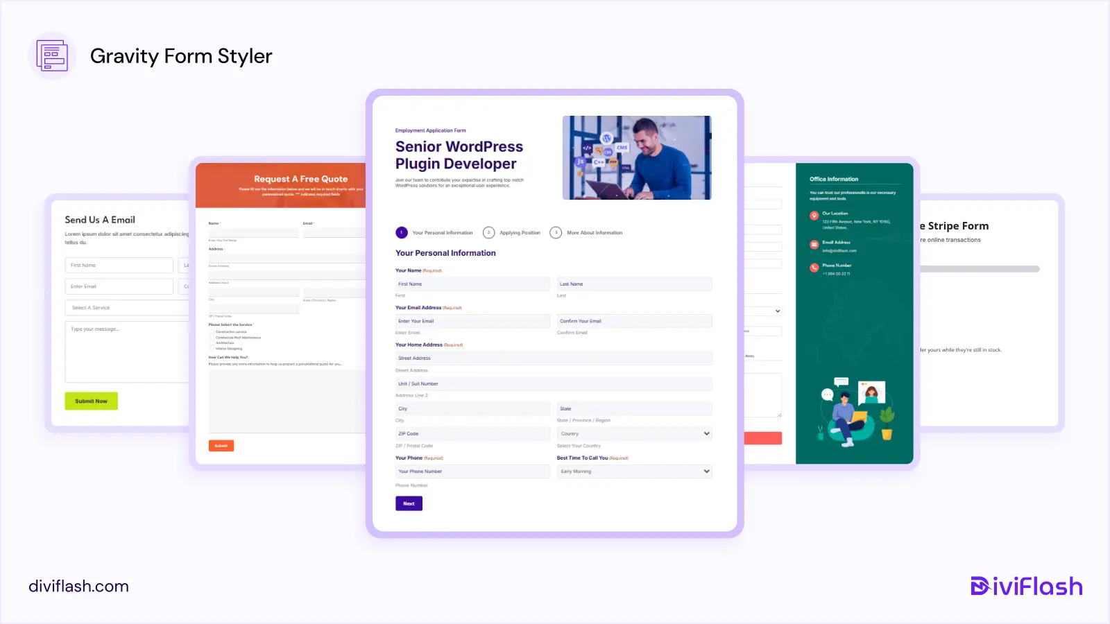
Best Form Design Templates Using DiviFlash Gravity Forms Styler
These templates show how you can turn default Gravity Forms into clean, modern website forms using DiviFlash. If you want a step-by-step walkthrough, you can also follow our detailed guide on how to style Gravity Forms in Divi.
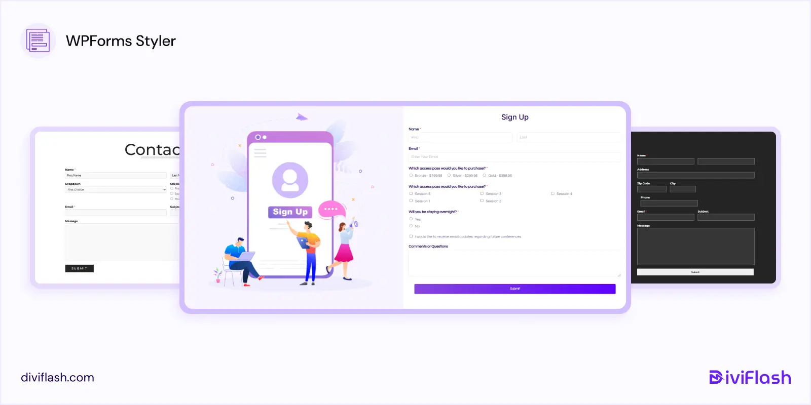
Best Form Design Templates Using DiviFlash WPForms Styler
DiviFlash WPForms Styler templates help you design user-friendly contact forms, signup forms, and lead generation forms without custom CSS. For a complete setup guide, check out our tutorial on how to style WPForms in Divi.
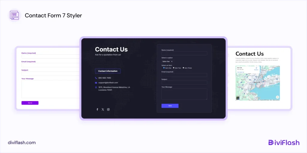
Best Form Design Templates Using DiviFlash Contact Form 7 Styler
These templates demonstrate how Contact Form 7 forms can be styled to look polished and professional inside Divi. If you want to learn the full styling process, see our guide on how to style Contact Form 7 in Divi.
FAQ
Is Google Form considered a web form?
Yes. Google Forms is a type of web form used to collect data online. It supports common form elements such as input fields, multiple-choice questions, dropdowns, and file uploads, just like other online forms.
How many fields should a form have?
Most studies suggest that fewer fields lead to better conversion rates. According to HubSpot, the average web form contains around five form fields. As a general rule, keep your form as short as possible. Using 3 to 7 fields helps reduce friction and increases the chance that users will complete the form. Only ask for information that is truly necessary.
What makes a web form user-friendly?
A user-friendly web form is simple, clear, and easy to understand. It works well on mobile devices, uses clear labels, and provides helpful validation messages when errors occur. A clean layout and logical flow help guide users and make the form easier to complete without confusion.
Should I use single-step or multi-step forms?
Single-step forms work well for simple tasks like newsletter signups or contact requests. Multi-step forms are better for longer forms such as applications, bookings, signups, and onboarding forms. Breaking a long form into steps makes it feel easier to complete and reduces form fatigue.
Conclusion:
A web form works best when users find it easy and comfortable to fill out. No matter how polished the design looks or how many features it includes, a form will not perform well if users feel confused or frustrated while using it.
In this guide, we explored some of the best website form examples and templates to show how thoughtful form design can improve usability and completion rates. These examples highlight how clarity, simplicity, and user-focused design help forms look good and work effectively.
If you found this article helpful, feel free to share it with others who are designing their next website form. And if you think we missed something, let us know. We always appreciate feedback.


0 Comments