

One-page websites are the epitome of modern web design. Their simplicity and efficiency make them ideal for businesses looking to make a strong first impression.
If you combine WordPress’s flexibility with Divi’s design prowess, you can create stunning one-page websites that not only look impressive but also deliver results.
This guide will walk you through the process of how to create a one page website with Divi step-by-step, from selecting the perfect domain to fine-tuning your website’s design.
Stay with us!
First, let’s look at what we’re building. Its a free layout by DiviFlash which you can get from their official website.  |
Step 1: Select the Domain and Hosting Provider
The first step in building a one page website with Divi is to select a domain name and a hosting provider.
The domain name is the web address visitors will use to find your site. Choose a domain name that’s easy to remember and reflects your site’s purpose. You can include relevant keywords in your domain for better SEO and relevancy. Finally, check its availability using a domain registrar like GoDaddy or Namecheap.
Next, select a hosting provider that meets your needs. Look for features like one-click WordPress installation and SSL certificates. You can check our best Divi hosting guide where we compared top providers like Cloudways, Flywheel, and Hostinger to find the best fit for your budget and site requirements.
Step 2: Install WordPress
Once we are done with the domain and hosting, it’s time to install WordPress. Most hosting providers offer a one-click installer for WordPress. This simplifies the process significantly. You just have to,
- Log in to your hosting control panel.
- Look for an option like “Install WordPress”, “WordPress Installer”, or something similar.
- Click “Install” and follow the on-screen instructions to complete the installation.
You can also follow the official documentation by WordPress for the manual installation guide.
Step 3: Configure WordPress Settings
After installing WordPress, configuring its settings is an essential step to ensure your website runs smoothly and is optimized for your needs. To access and configure these settings,
- Log in to your WordPress dashboard
- Navigate to Settings
- Make your changes to specific settings, and save.
Here’s a breakdown of the key settings to configure in WordPress:
General Settings
- Site Title: Enter your website’s name; it will show in browser tabs and search results.
- Tagline: Add a short description or slogan for your site.
- WordPress Address (URL): This is your website’s main address.
- Site Address (URL): This is usually the same as the WordPress address, but can be different for multisite installations.
- Administration Email Address: This is the admin email address for notifications.
- Membership: Choose whether new users can register.
- New User Default Role: Define the default user role for new registrations.
- Site Language: Choose the default language for your website.
- Time Zone: Set your website’s time zone.
- Date Format: Select the preferred date format.
- Time Format: Select the preferred time format.
- Week Starts On: Select the starting day of the week for the calendar.
Writing Settings
- Default Post Category: Select the default category for new posts.
- Default Post Format: Choose the default post format, such as standard, gallery, or video.
- Post via Email: Set up email posting to publish content remotely.
- Update Services: Add ping services to notify others when you publish new content.
Reading Settings
- Front Page Displays: Select if your homepage shows the latest posts or a static page.
- Blog Pages Show at Most: Set how many posts to display on blog pages.
- Syndication Feeds: Configure RSS feed settings for user subscriptions.
- For Each Post in a Feed: Choose to display full text or a summary in RSS feeds.
- Search Engine Visibility: Decide if search engines can index your site.
Discussion Settings
- Default Post Settings: Set default preferences for comments and trackbacks to control user interactions with your content.
- Other Comment Settings: Manage comment moderation and notifications to handle user engagement.
- Email Me Whenever: Configure email notifications for comments and replies.
- Before a Comment Appears: Decide if comments need manual approval before being published to prevent spam.
- Comment Moderation: Set rules for automatically holding comments for review based on factors like links or specific words.
- Disallowed Comment Keys: Add words, phrases, or URLs that trigger automatic comment moderation or spam marking.
- Avatars: Choose to display user avatars with comments and set a default avatar for users.
Media Settings
- Image Sizes: Set default image sizes by Adjusting dimensions for thumbnails, medium, and large images for better display across your site.
- Uploading Files: Set up how uploaded files are organized for efficient media management.
Note: WordPress doesn’t support SVG natively. Check this to learn how to upload SVG in WordPress.
Permalinks
- Common Settings: Choose a permalink structure for your posts and pages.
- Optional: Create a custom permalink structure.
Privacy Settings
- Privacy Policy Page: Create a new Privacy Policy page or choose the page with your site’s privacy policy to ensure data protection compliance.
Step 4: Install Divi Theme
It’s time to install and set up Divi. Divi is a premium WordPress theme that you must purchase from the official website of Elegant Themes. Once you have it, follow the instructions below to install Divi and authenticate your membership.
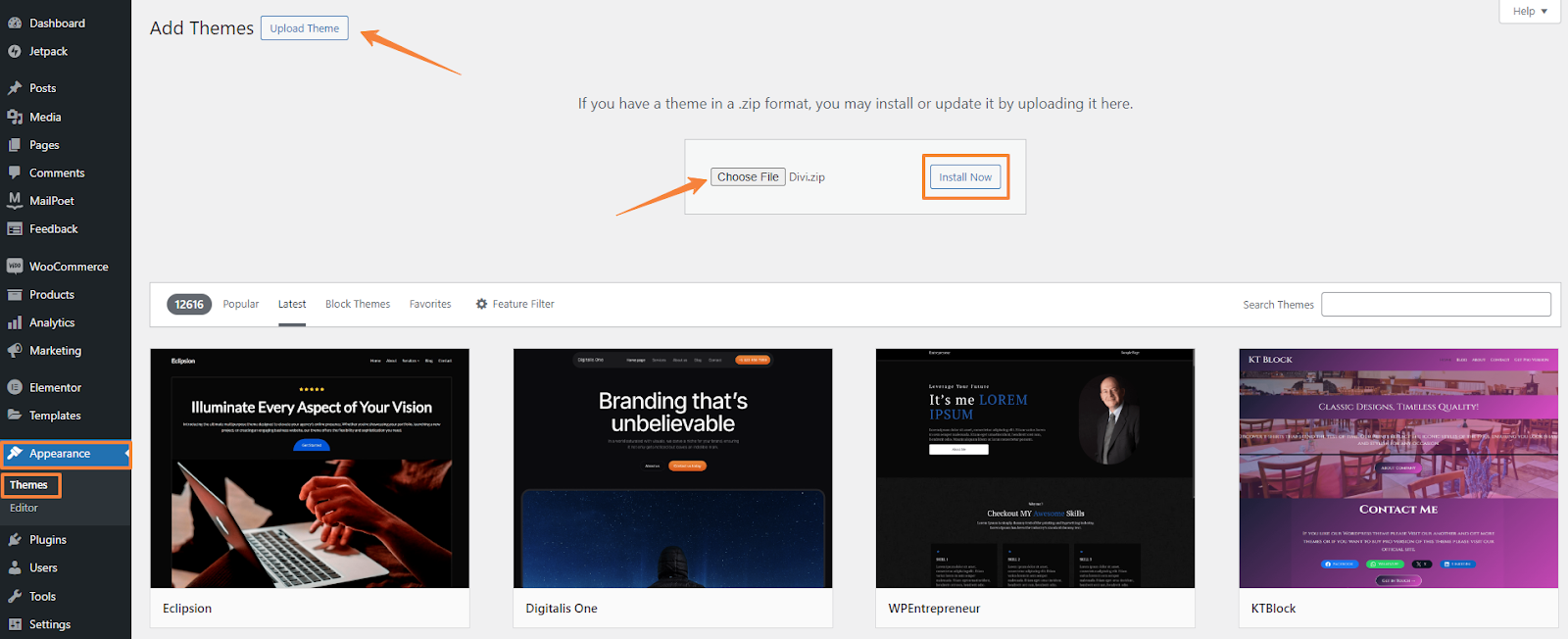
- From the WordPress Dashboard, navigate to Appearance > Themes.
- Click “Add New” and choose “Upload Theme.”
- Click the choose file and select the Divi Theme ZIP file.
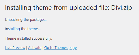
- Once the file is uploaded, click “Install Now.”
- After successful installation, click the “Activate” button to activate the theme.
Authenticating Your Membership with Divi API Key
Divi API key ensures you can update the Divi theme and plugins, access Divi layouts, and receive the latest features and bug fixes from Elegant Themes.
To get the API key,
- Log in to your Elegant Themes “Members Area” on elegantthemes.com using your username and password.
- Navigate to Account > Your API Key. (Here, you can add or deactivate API Keys.)
- Copy the API Key displayed on the page.

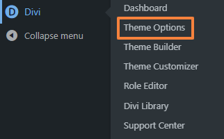
Now you need to pasting this key into your Theme or Plugin options page,
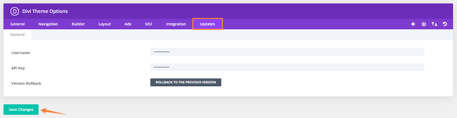
- From your WordPress dashboard navigate to Divi > Theme Options > Updates.
- Paste your Elegant Themes username in the “Username” field.
- Paste your copied API key in the “API Key” field
- Click the “Save Changes” button.
Now you can update your theme or plugin from WordPress Dashboard > Updates.
Step 5: Divi Theme Configuration & Customization
With Divi installed, you will need to work with two main areas.
- Divi Theme Options
- Divi Theme Customizer
Divi Theme Options Configuration
The Divi Theme Options allow you to add a logo, set global colors, configure site navigation, and manage SEO and performance with 8 different settings. Additionally, you can enable the Divi Builder on custom post types and add scripts for extra functionality.
Here’s an overview of Divi Theme Options,
- General: This tab includes settings for your logo, color palette, social media links, sidebar layout, Google fonts, and performance optimizations.
- Navigation: The navigation tab lets you manage dropdown menus, homepage links, and top-tier menu options across three subcategories.
- Builder: Configure settings related to the Divi Builder, including post-type integration and advanced options.
- Layout: Adjust layout settings for your pages, including sidebar options and default page layouts.
- Ads: Set up ad placements and configurations if you plan to monetize your site.
- SEO: Adjust settings for page SEO, including homepage, single page, and index page.
- Integration: Add custom code snippets for third-party services, such as Google Analytics.
- Updates: Enter your Elegant Themes username and API key to enable updates and support access.
For our example, we will make sure of three things here.
- First, go to General > General > Logo option and upload a site logo by clicking on the upload option.
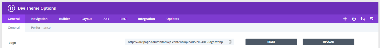
- Next, scroll down a bit and enable the Back To Top Button option.

Theme Customizer Options
The Divi Theme Customizer lets you adjust global fonts, site width, titles, and colors for headers, footers, and buttons, and configure mobile styles. Simply navigate to Divi > Theme Customizer to configure these settings. In our case, we will keep it unchanged.
Let’s discuss some key customization areas,
- General Settings: The general setting lets you adjust site-wide settings, such as body text styles, header text styles, and logo sizes.
- Header and Navigation: Here you can customize the appearance and behavior of your site’s header and navigation menus.
- Typography: Set global font styles for headings, body text, and links to ensure consistency across your site.
- Colors: Manage your color palette, including primary and secondary colors, to align with your branding.
- Buttons: Customize the appearance of buttons, including size, color, and hover effects.
Step 6: Build the Basic Structure
So far we are done with all the setup. Now we will map the website’s flow.
6.1 Create a New Page
Let’s start with the page creation.
- In the WordPress dashboard, navigate to the Pages > Add New Page.
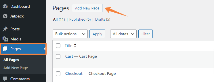
- Give your page a name and click on “Publish”.
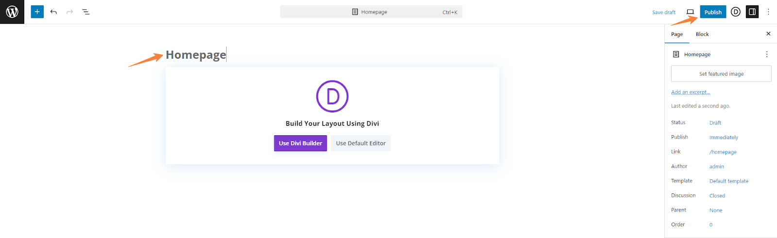
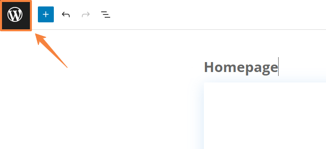
- This sets up the website’s foundation, which we will customize and style later. Now, click the WordPress icon in the top left to return to the dashboard.
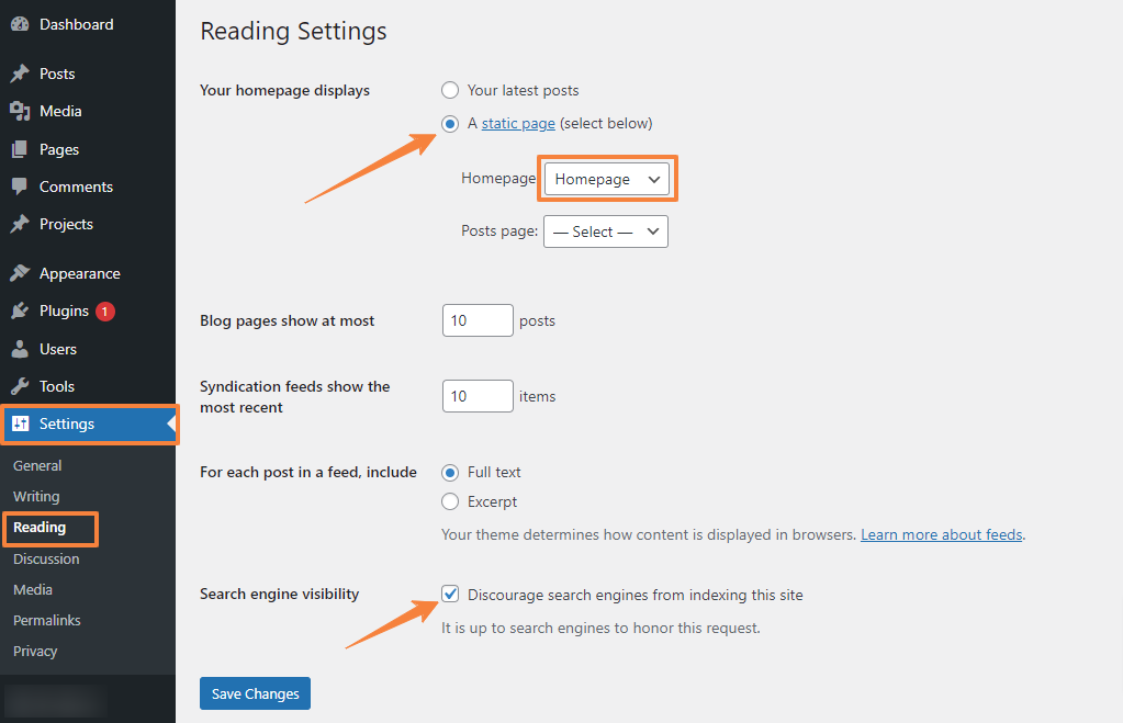
6.2 Setting the Home Page
To set up the Divi homepage,
- Navigate to Settings > Reading
- Select the static page option since we are going to have a static homepage, and choose the Homepage.
- Check the box to hide the site from search engines while it’s in development.
- Finally, click “Save Changes”
Step 7: Design the Single Page Website With Divi Builder
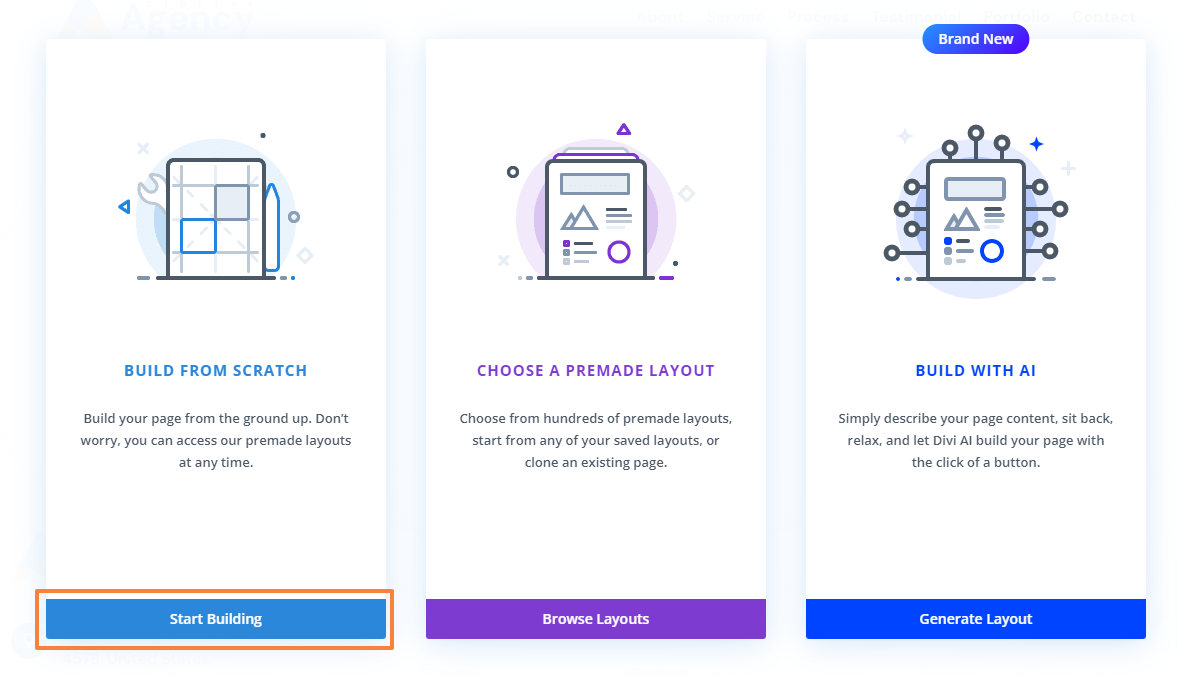
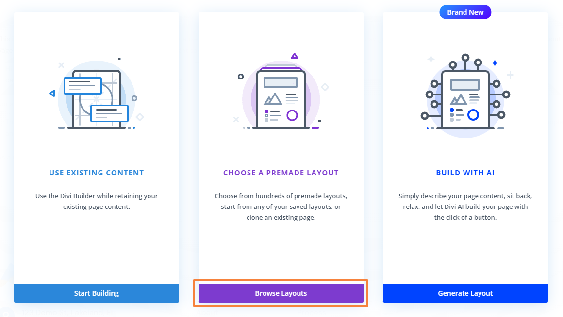
Now we will focus on the real work. There are three main ways to build a website with Divi:
- Create a page from scratch.
- Use a premade Divi layout.
- Build with AI
In this guide, we’ll cover all three options so you can choose the best way to create pages. First, let’s show you how to make a single page website with Divi from scratch. We will design an Agency site with seven sections including a header and footer.
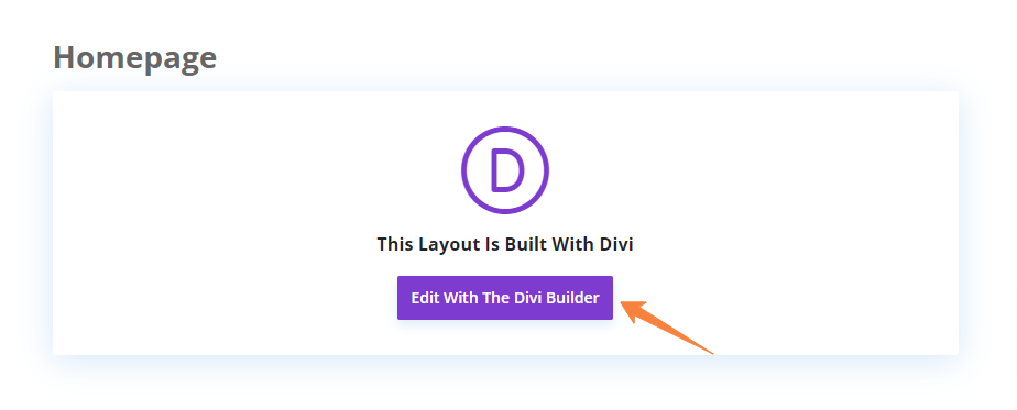
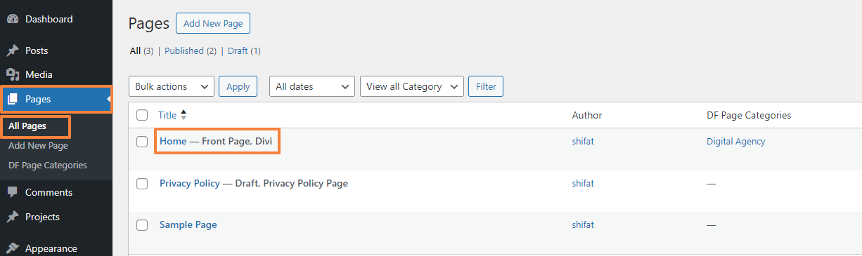
We have already created our Homepage in the previous section. Now, let’s edit it with Divi to initiate the building process.
- From your WordPress dashboard navigate to Pages > All Pages > Homepage.
- Click on “Edit with The Divi Builder” to open up the Divi Builder.
- From the three options choose “Build From Scratch”
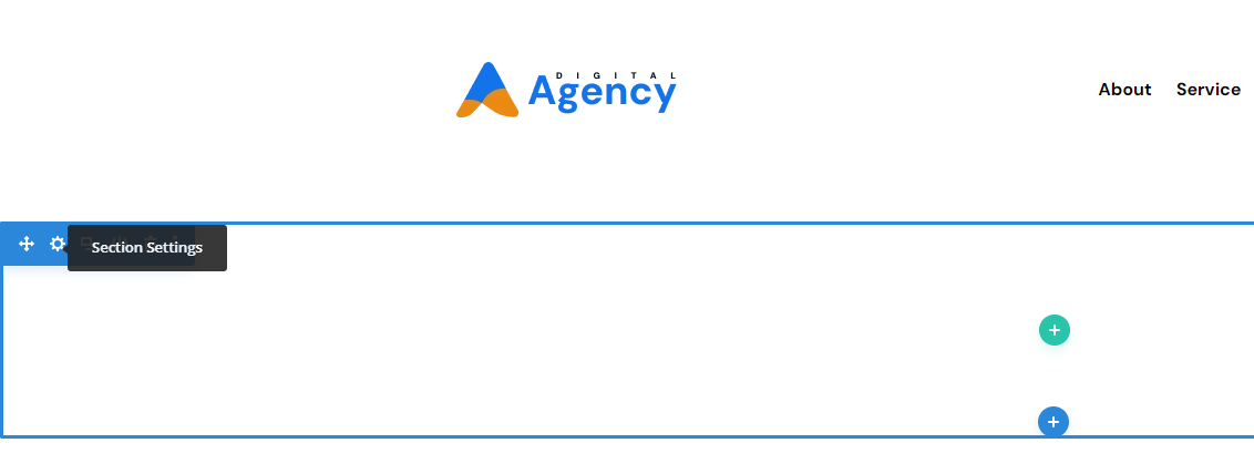
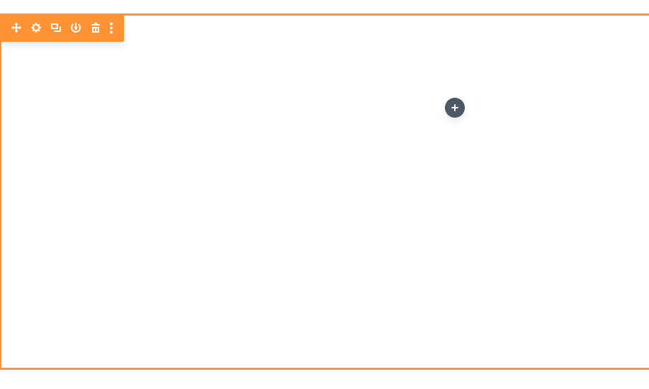
- You will have a blank page to start building your page from scratch. Initially it will look like this,

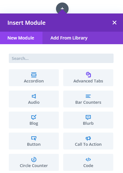
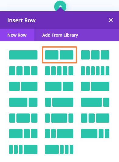
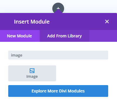
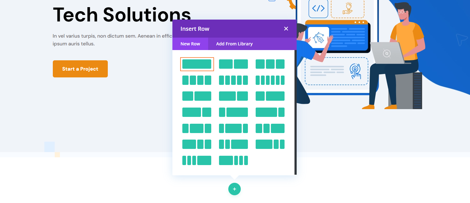
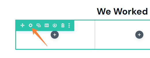
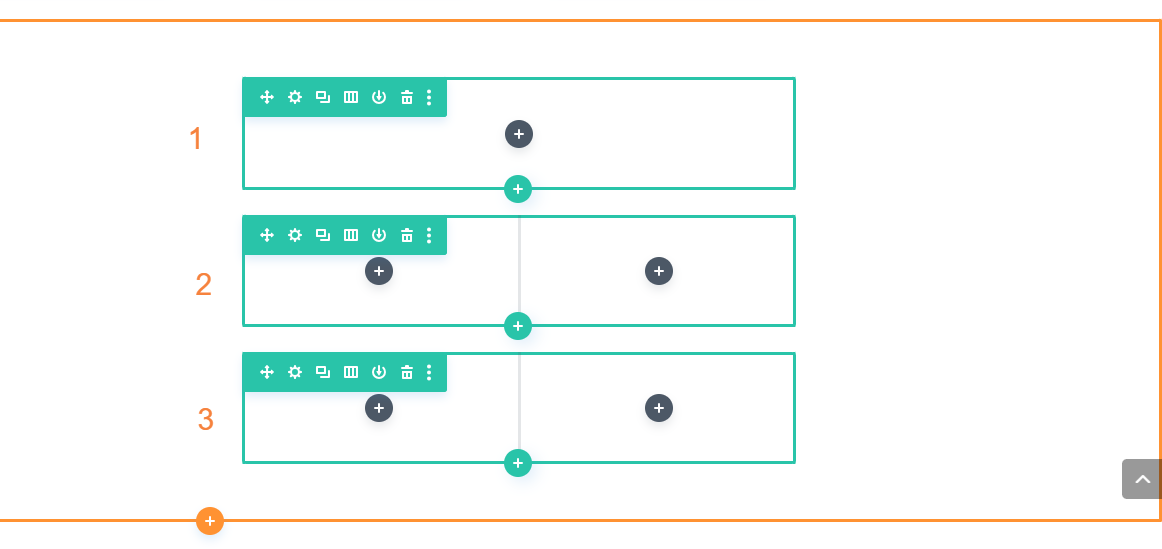
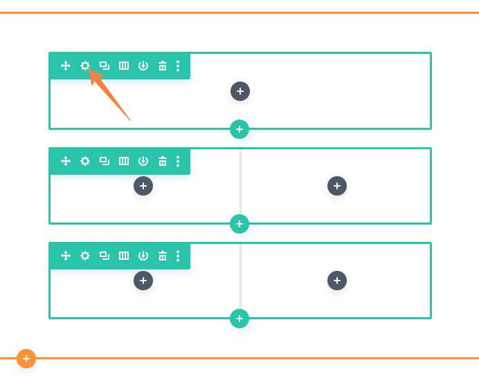
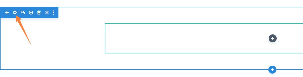
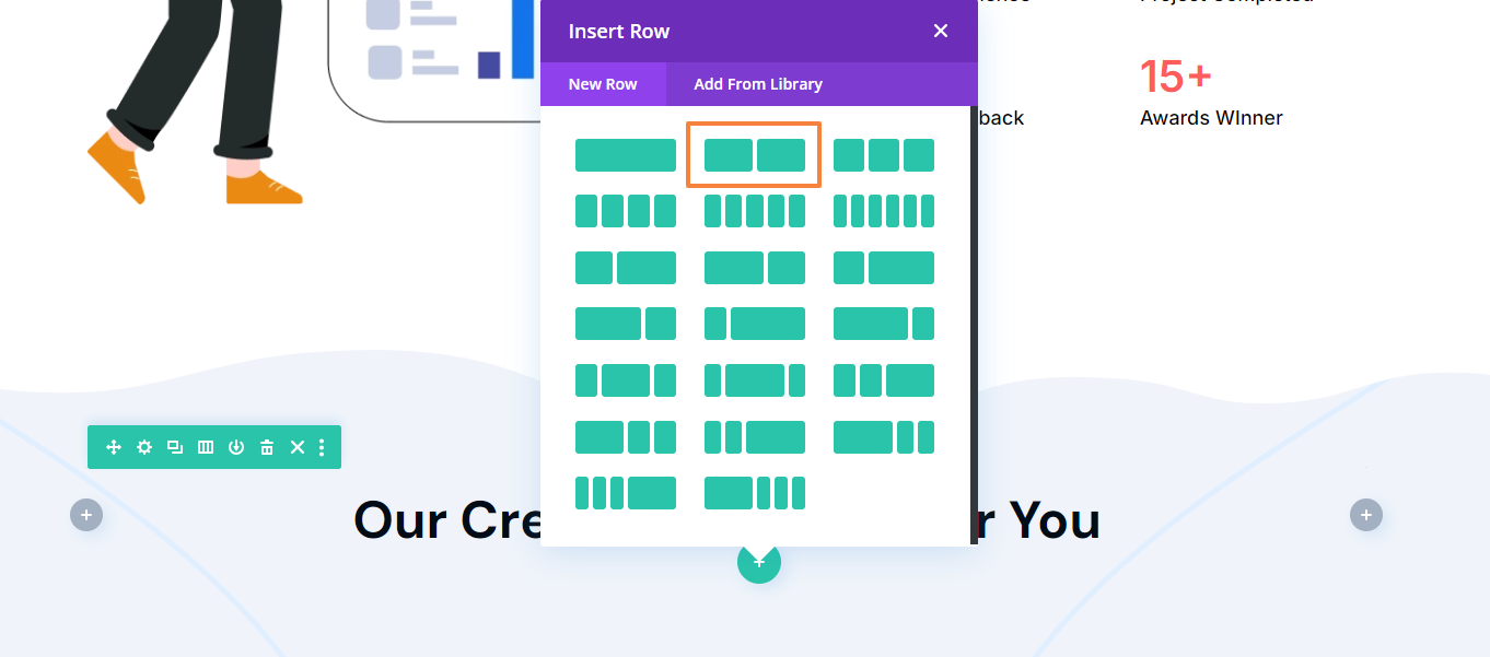
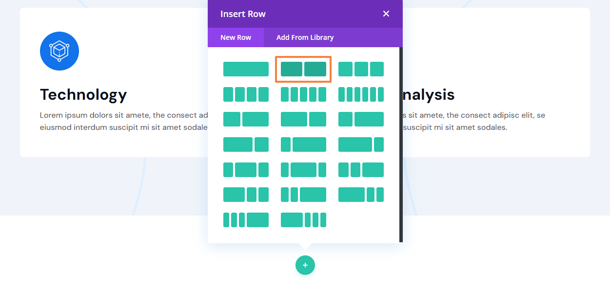
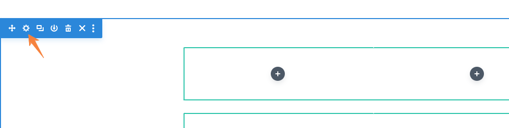
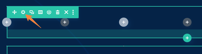
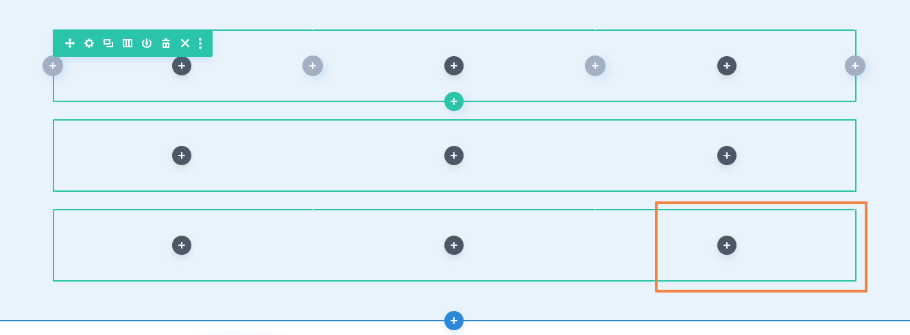
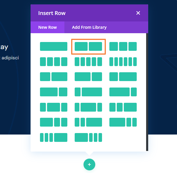
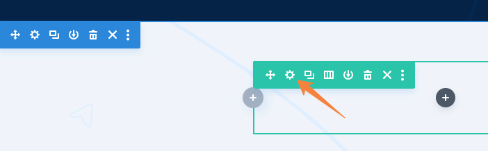
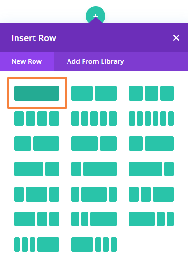
- Now to start designing your page you must insert a row. You can access this popup by clicking on the green plus icon.

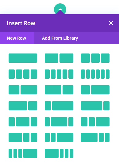
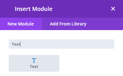
- Once you insert a row a popup will appear with the available module list. From here, you can select or search for the module you need. Clicking outside the popup will close it.
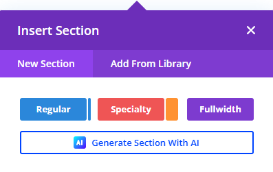
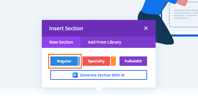
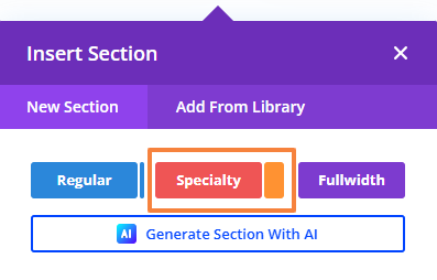
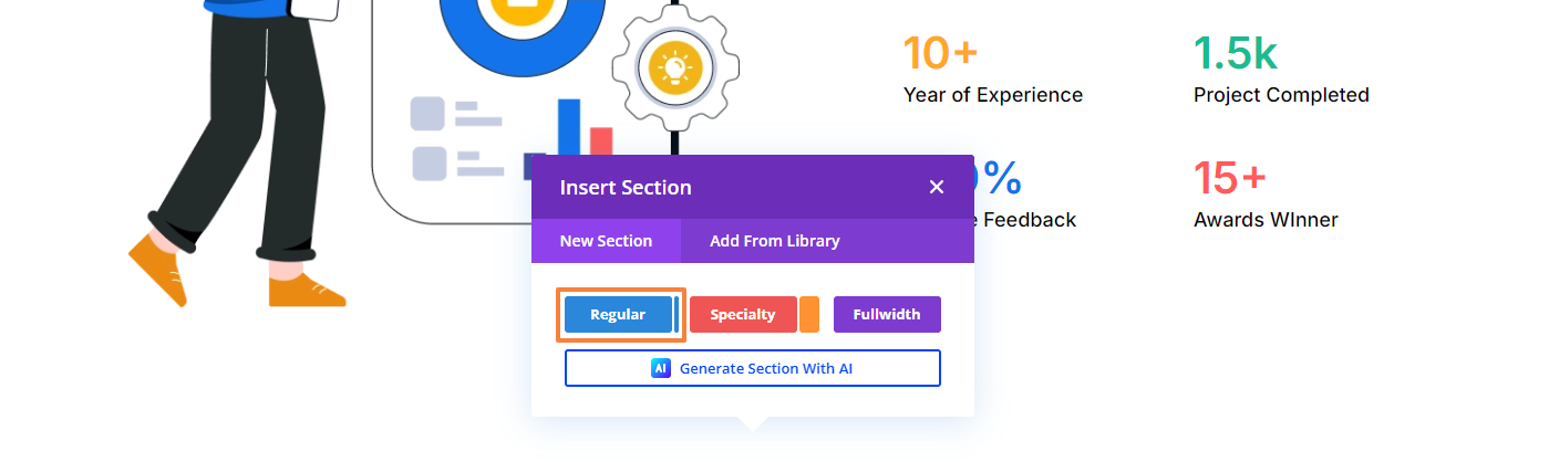
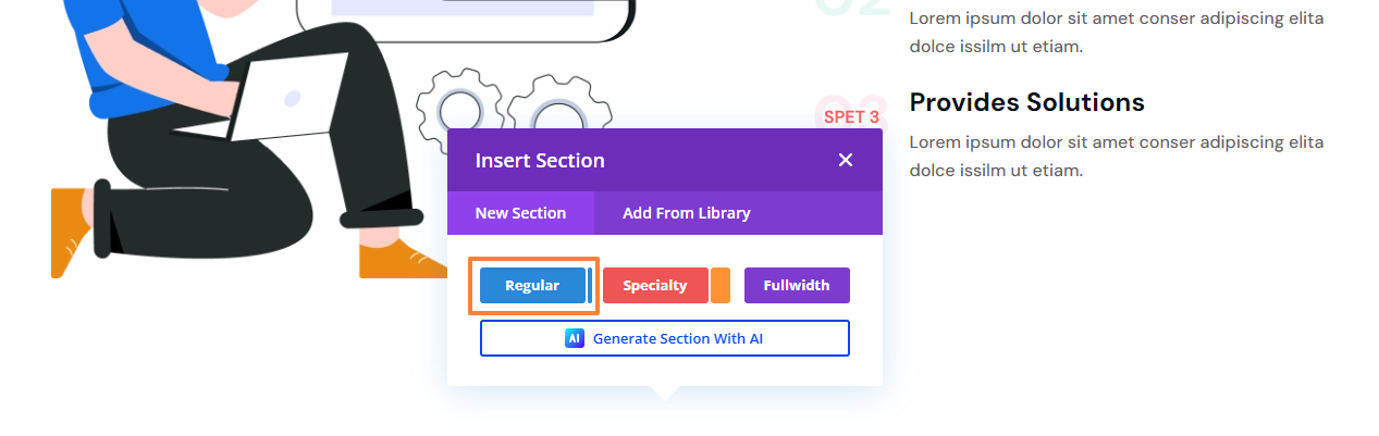
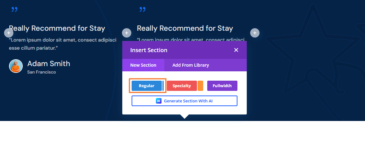
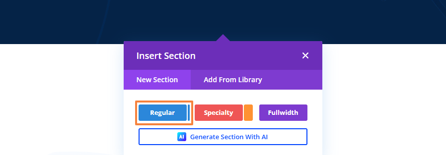
- If you want to add a new section, click on the blue plus icon. It will give you three options Regular, Specialty, and Fullwidth.

Now, follow our guide to create an agency layout with Divi.
7.1 Add a Hero Section
Let’s start by creating a hero section with a background, heading, image, and button. First, we will add a new Regular section and select a two-column row to add our hero section content.
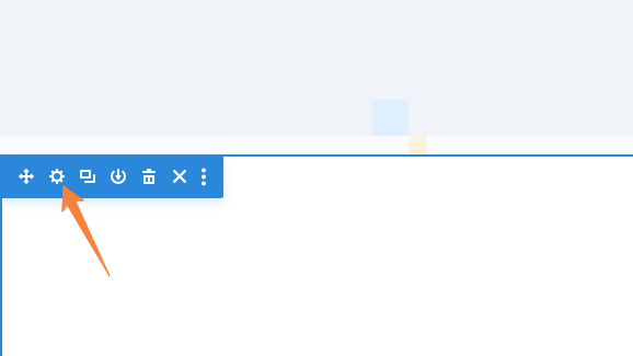
Section Setting
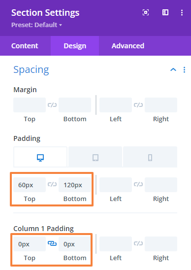
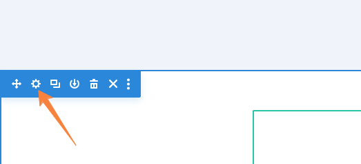
From the section’s setting, we will add a background and make some changes to the spacing.
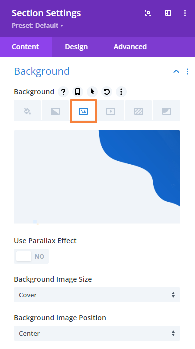
Add a Background
- From the background option upload your desired background image or color, and make sure the following settings,
Background Image Size: Cover
Background Image Position: Center
Add Spacing:
- Navigate to the Design tab > Spacing and change the value for the top margin and top and bottom Padding.
Top margin: -100px
Top padding: 86px (Desktop), 80px (Tablet), 40px (Mobile)
Bottom padding: 126px (Desktop), 80px (Tablet), 40px (Mobile)
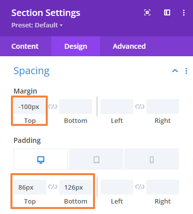
- Save changes and close the Section settings.
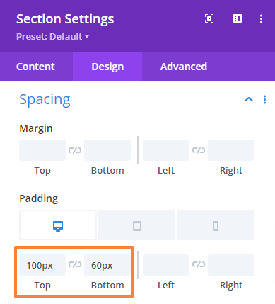
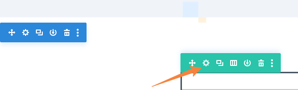
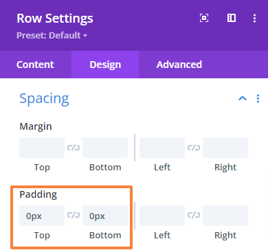
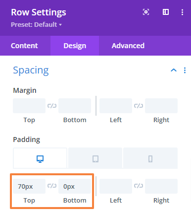
Row Settings:
- Open the Row setting, navigate to the Design tab > Spacing, and change the top and bottom padding.
Top Padding: 100px
Bottom Padding: 0px
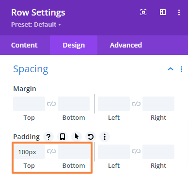
- Save changes and close the settings.
Add Text Content
We will add two headings in the left side column, a description, and a button using the text module.
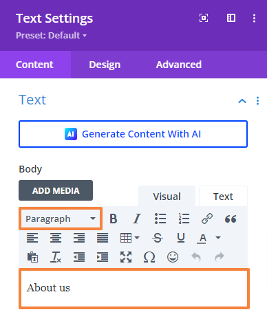
Add a Secondary Heading:
- First, add a Text module to the Row.
- Open the Text module setting and add your text in the Body. Then select text format to Paragraph.
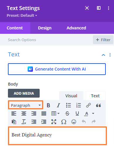
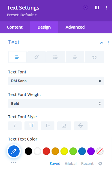
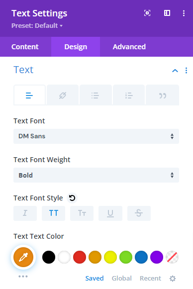
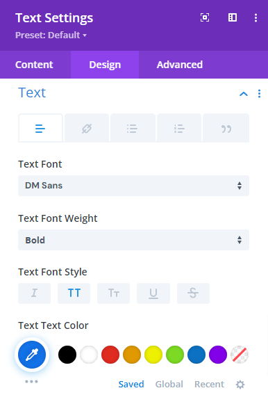
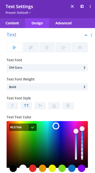
- Then go to the Design Tab > Text and make the following changes there,
Text font: DM Sans
Text font-weight: Bold
Text font style: All capital letters.
Text font color: #1273eb
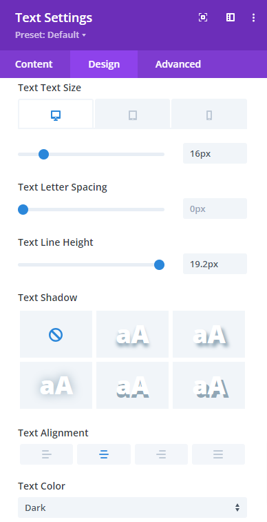
Text size: 16px (Desktop), 15px (Tablet), 14px (Mobile)
Text line-height: 19.2px (Desktop), 19.2px (Tablet), 19.2px (Mobile)
Text alignment: Left
Text Color: Light
 | 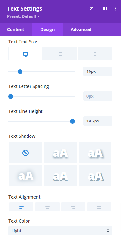 |
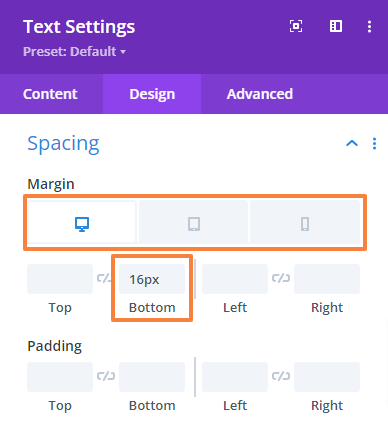
- Now, navigate to the Design Tab > Spacing and change the Bottom and Padding margin value,
Bottom margin: 16px (Desktop), 13px (Tablet), 10px (Mobile)
Bottom padding: 2px (Desktop), 2px (Tablet), 2px (Mobile)
- Save changes and close the module settings.
Add the Main Heading:
- Click on the Gray plus icon and add another Text module to the Row.
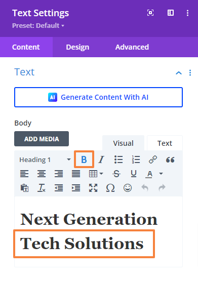
- Open the Text module setting and add your text there in the body. Then select text format to Heading 1. Also, make the second line Bold.
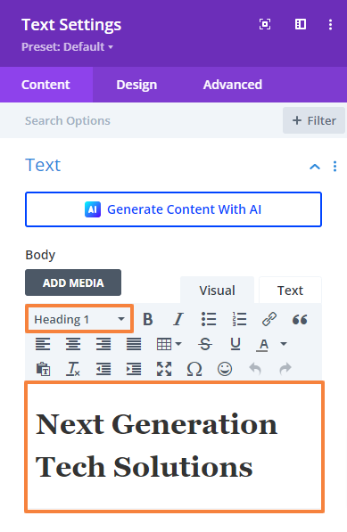 |  |
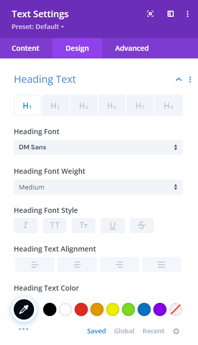
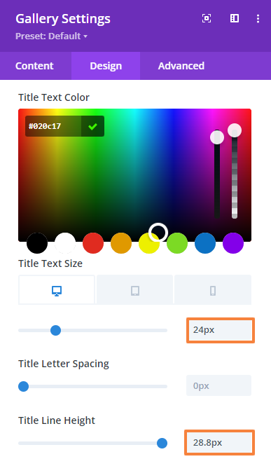
- Then go to the Design Tab > Heading Text and make the following changes there,
Heading level: H1
Heading font: DM Sans
Heading font-weight: Medium
Heading text color: #020c17
Heading text size: 64px (Desktop), 54px (Tablet), 42px (Mobile)
Heading letter-spacing: -0.75px (Desktop), 0px (Tablet), 0px (Mobile)
Heading line-height: 76px (Desktop), 64px (Tablet), 52px (Mobile)
 | 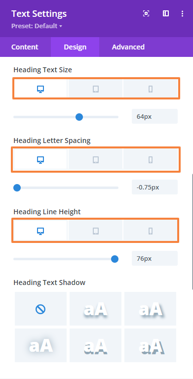 |
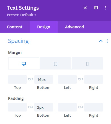
- Now, navigate to the Design Tab > Spacing and change the bottom margin value,
Bottom margin: 6px (Desktop), 3px (Tablet), 0px (Mobile)
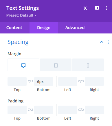
- Save changes and close the module settings.
Add a Description Under the Heading:
- Click on the Gray plus icon and add another Text module to the Row.
- Open the Text module setting and add your text there in the body. Then select text format to Paragraph.
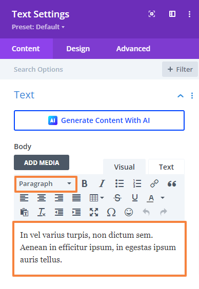
- Then go to the Design Tab > Text and make the following changes there,
Text font: DM Sans
Text font color: #5e6266
Text size: 16px (Desktop), 15px (Tablet), 14px (Mobile)
Text line-height: 25.6px (Desktop), 25px (Tablet), 24px (Mobile)
 | 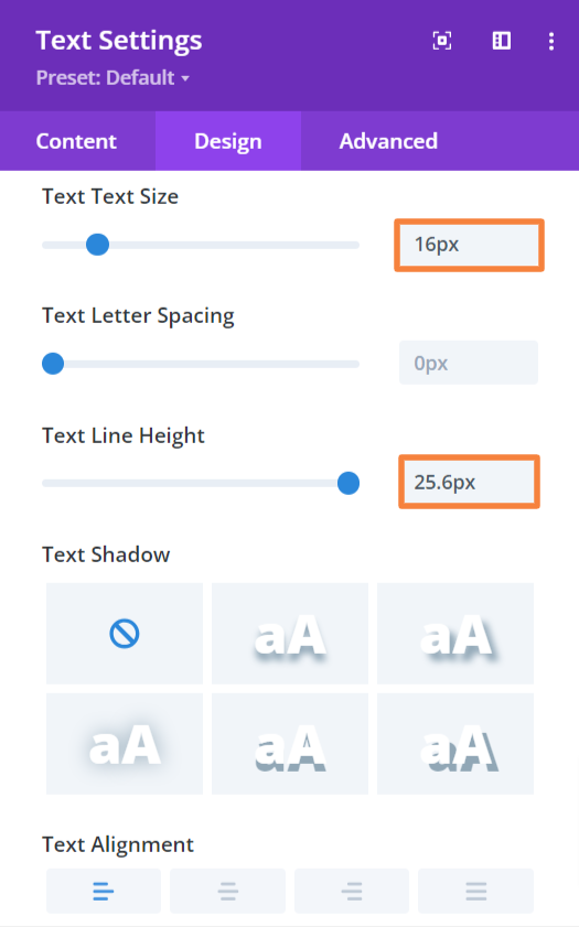 |
- Now, navigate to the Design Tab > Spacing and change the bottom margin value,
Bottom margin: 40px (Desktop), 30px (Tablet), 20px (Mobile)
- Save changes and close the module settings.
Add a Button
- Click on the Gray plus icon again and add a Button module to the Row.
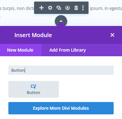
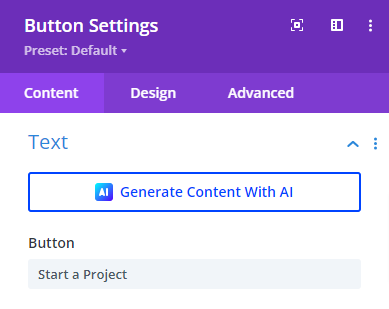
- Open the Button module setting and add your text there in the Button tab.
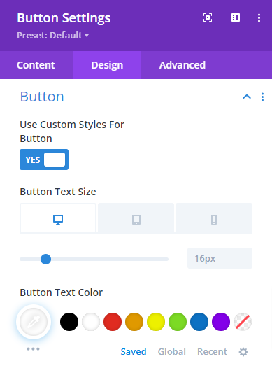
- Then go to the Design Tab > Button and make the following changes mention below.
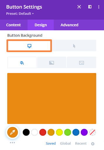
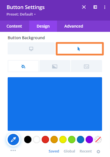
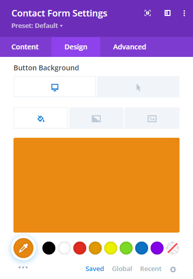
To design the button background the module gives you two options initially. One is “Desktop” which will be our default button background and another is “Hover” which is applicable at mouse hover.
Use custom style for button: Yes
Button text size: 16px (Desktop), 14px (Tablet), 12px (Mobile)
Button text color: #ffffff
Button background color (default): #eb8a12
Button background color (on hover): #1273eb
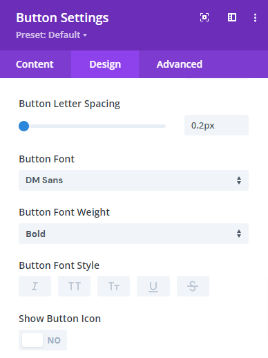
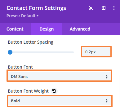
Button letter-spacing: 0.2px
Button font: DM Sans
Button font-weight: Bold
 |  |
 |  |
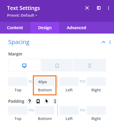
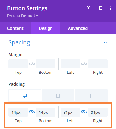
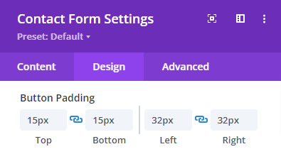
- Now, navigate to the Design Tab > Spacing and change the entire “Padding value”,
Top: 14px (Desktop), 12px (Tablet), 10px (Mobile)
Bottom: 14px (Desktop), 12px (Tablet), 10px (Mobile)
Left: 31px (Desktop), 28px (Tablet), 24px (Mobile)
Right: 31px (Desktop), 28px (Tablet), 24px (Mobile)
- Save changes and close the module settings.
Add Image
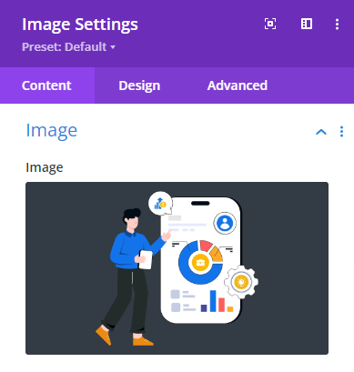
We will add an image using the image module in the right-side column.
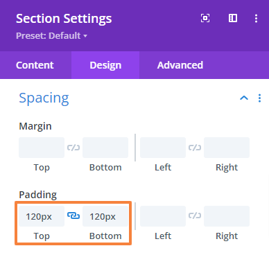
- First, add an Image module to the Row.
- In the Image module setting upload or select your image.
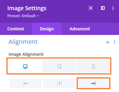
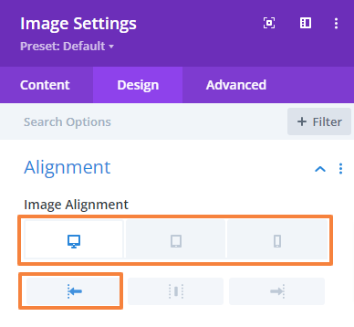
- Now, navigate to the Design Tab > Alignment and make the following changes there,
Image Alignment for Desktop: Right
Image Alignment for Tablet: Left
Image Alignment for Mobile: Left
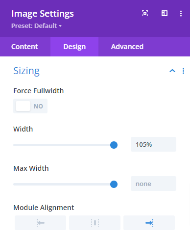
- Now we will adjust the sizing. Simply navigate to the Design Tab > Sizing and make the following changes there,
Width: 105%
Module alignment: Right
- Save changes and close the Image module settings.
Add Additional Design Elements (optional)
According to our design requirements, we will add some additional design elements. For example, we have an arrow navigating the CTA button to enhance conversion. Simply follow the steps below,
- From the row setting, open up the left column setting.
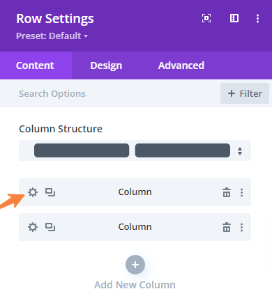
- Scroll down to Background and add the image. Now, make the following changes to fit it rightly,
Background image size: Actual Size
Background image position: Bottom Center
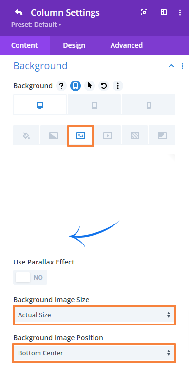
- Save changes and close the Row settings.
Preview the design. This is what our hero section will look like,

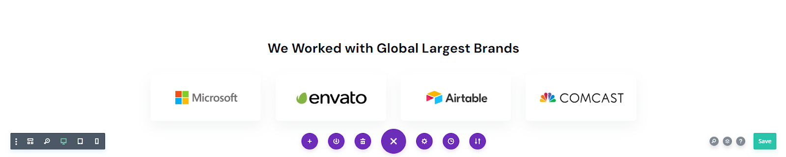
7.2 Add an Agency Partner Section
After the hero section, we’ll add a partner section with a heading and logos of the company the agencies worked with. First, add a new Regular section then add a single-column Row.
Section Settings
Open the section’s settings and adjust the spacing.
- Go to Design Tab > Spacing and change the top and bottom padding values. We will keep the background as it is.
Top Padding: 100px
Bottom Padding: 60px
- Save changes and close the section settings.
Add a Heading
To add the heading we will use the Heading module.
Row Settings:
- Open the Row setting, navigate to the Design tab > Spacing, and change the top and bottom padding.
Top Padding: 0px
Bottom Padding: 0px
- Save changes and close the settings.
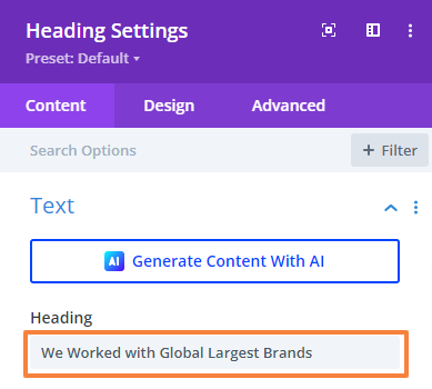
Add Heading Content:
- Click on the Gray plus icon and add the Heading module to the Row.
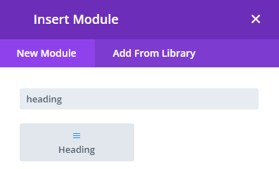
- Open the Heading module setting and add your text.
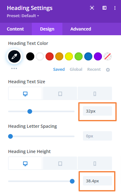
- Then go to the Design Tab > Heading Text and make the following changes there,
Heading format: H3
Heading font: DM Sans
Heading font-weight: Bold
Heading text alignment: Center
Heading text color: #020c17
Heading text size: 32px (Desktop), 28px (Tablet), 24px (Mobile)
Heading line-height: 38.4px (Desktop), 38.4px (Tablet), 32px (Mobile)
 |  |
- Save changes and close the module settings.
Add Partner Logos
Add a new four-column just below the heading. We will include four images using the Image module to each.
Row Settings:
- Open the Row setting, navigate to the Design tab > Spacing, and change the top and bottom padding.
Top Padding: 0px
Bottom Padding: 0px
- Save changes and close the settings.
Add Images:
Next, we will add the Image module to each column to add the agency partner logo. Click the gray plus icon and add your module.
- From the Image module setting upload or select your image.
- Now, navigate to the Design Tab > Alignment and make the following changes there,
Image Alignment for Desktop: Left
Image Alignment for Tablet: Middle
Image Alignment for Mobile: Middle
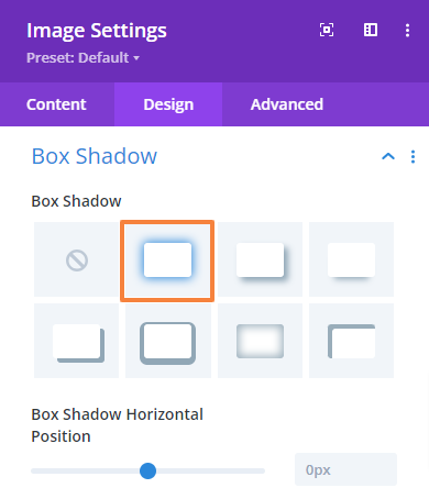
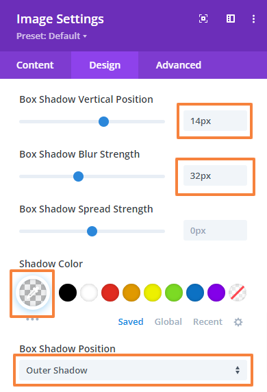
- Next, add a box shadow to improve the look. Go to the Design tab > Box Shadow and choose the first one out of the seven options. Then, make the following adjustments,
Box shadow vertical position: 14px
Box shadow blur strength: 32px
Shadow color: rgba(84,104,121,0.08)
 |  |
- Save changes and close the module settings.
Repeat the same process for the remaining three. Finally, this is what our section will look like,
7.3 Add an About Us Section
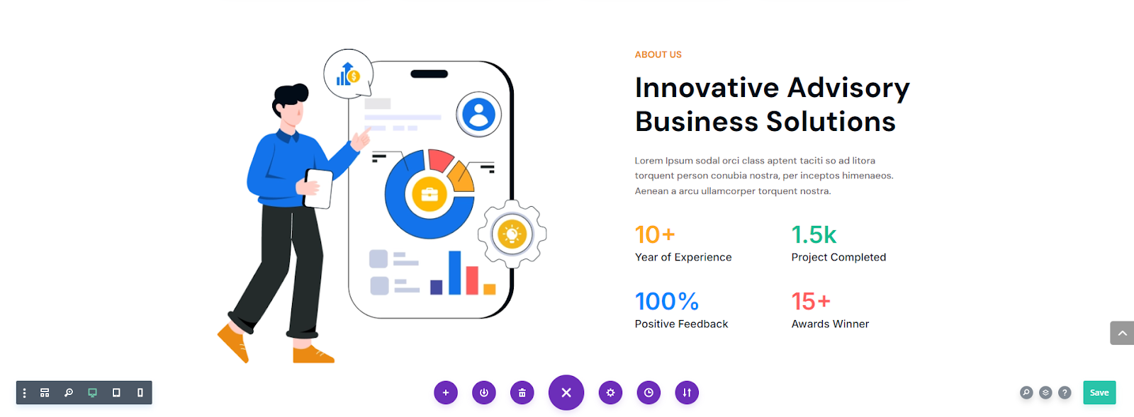
Next, we will create the About Us section of the layout. This section includes headings, text, images, and number counters to show some statistics.
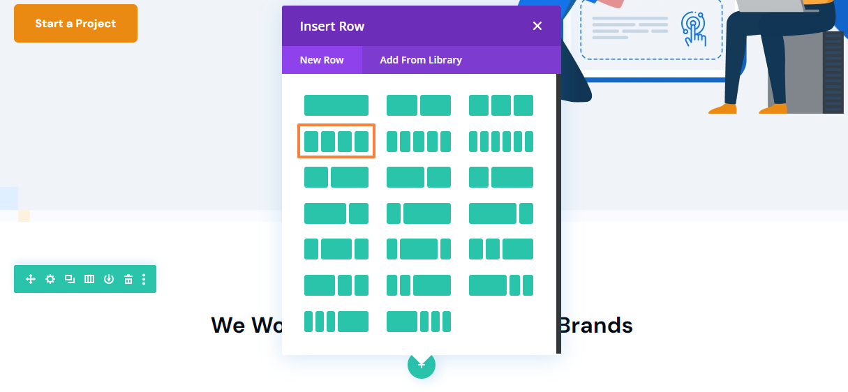
To meet our design needs, we need two one-column rows for headings and two two-column rows for the number counter. Regular sections can’t achieve this, so we must use the Specialty option. This allows us to add rows within rows and multiple modules in a single row. For more details, see Elegant Themes’ Specialty Section documentation.
- Click on the blue Plus icon and select the Specialty Section.
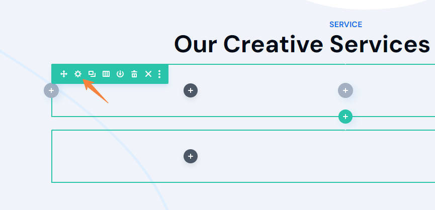
- While the other section lets you “Insert Row”, here you have to “Add Module” for your desired column structure. We will select one shown in the below image,
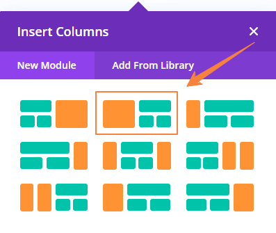

- Next, we’ll set up our column structure. In the left column, we will add our image.
- And in the right column, we will add a total of three rows where the first one will be single columns (Containing two headings and a description) and the last two will be double columns (for number counter)
Section Settings
In the Section settings, we will keep the background as it is and adjust the spacing a bit. To do so,
- Go to Design Tab > Spacing and change the default padding values along with column 1.
Top Padding: 60px (Desktop), 40px (Tablet), 20px (Mobile)
Bottom Padding: 120px (Desktop), 80px (Tablet), 40px (Mobile)
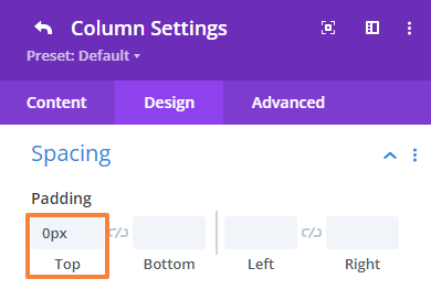
Column 1 Top Padding: 0px
Column 1 Bottom Padding: 0px
- Save changes and close the section settings.
Add Image
We will add an image using the image module in the left-side column.
- First, add an Image module to the Row.
- In the Image module setting upload or select your image.
- Now, navigate to the Design Tab > Alignment and make sure the following settings,
Image Alignment for Desktop: Left
Image Alignment for Tablet: Left
Image Alignment for Mobile: Left

- Save changes and close the module settings.
Add Text Content
We will add two headings in the right side column, a description, and four number counters. Our first row contains the secondary heading, the main heading, and a description.
Row Settings:
- Open the first Row setting, navigate to the Design tab > Spacing, and change the top and bottom padding.
Top Padding: 0px
Bottom Padding: 0px
- Save changes and close the settings.
Add a Secondary Heading:
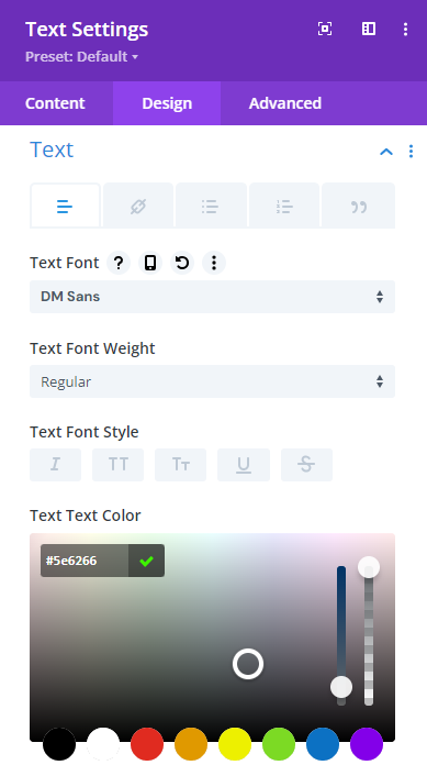
- First, add a Text module to the First Row.
- Open the Text module setting and add your text in the Body. Then select text format to Paragraph.
- Then go to the Design Tab > Text and make the following changes there,
Text font: DM Sans
Text font-weight: Bold
Text font style: All capital letters.
Text font color: #eb8a12
Text size: 16px (Desktop), 15px (Tablet), 14px (Mobile)
Text line-height: 19.2px (Desktop), 19.2px (Tablet), 19.2px (Mobile)
 | |
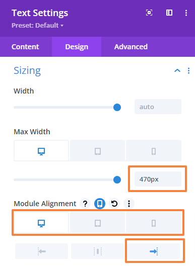
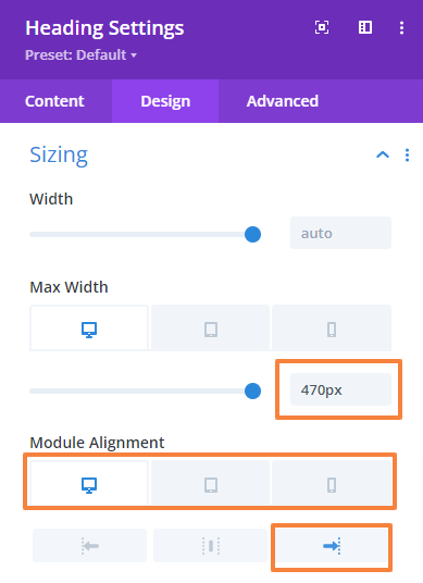
- Now, navigate to the Design Tab > Sizing and change the max width value and module alignment,
Max width: 470px (Desktop), 100% (Tablet), 0px (Mobile)
Module alignment: Right (Desktop), Left (Tablet), Left (Mobile)
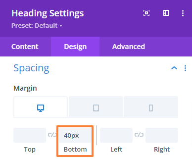
- Now, navigate to the Design Tab > Spacing and change the Bottom margin value,
Bottom margin: 16px (Desktop), 13px (Tablet), 10px (Mobile)
- Save changes and close the Text module settings.
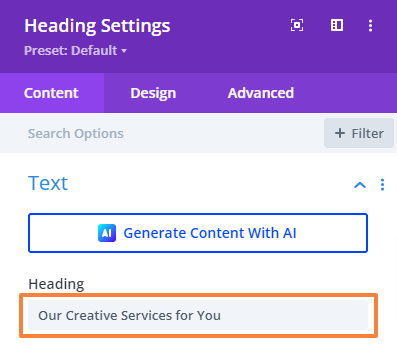
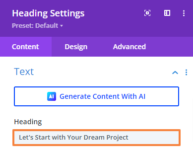
Add the Main Heading:
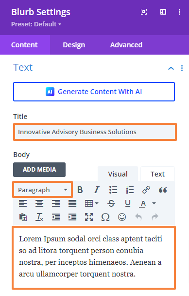
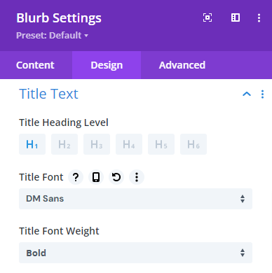
- Click on the Gray Plus icon and add a Blurb module to the Row.
- Open the Blurb module setting and add the heading text there in the body. Then add a description in the Body and select text format to Paragraph.
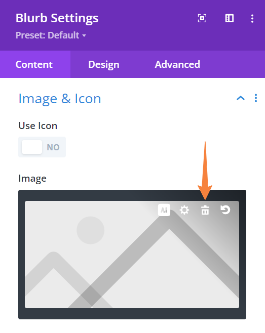
- Scroll down to Image Icon and delete the default image.
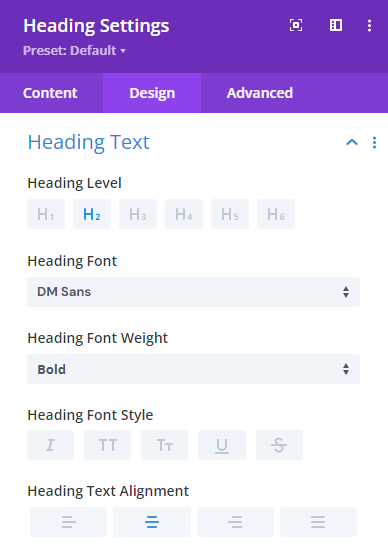
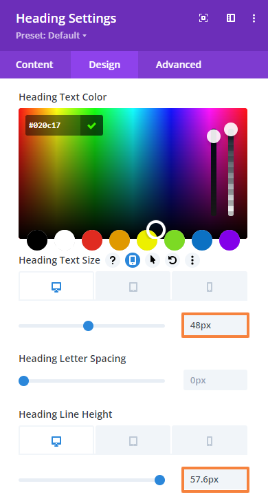
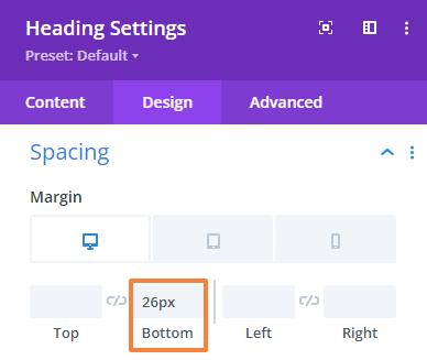
- Then go to the Design Tab > Title Text and make the following changes there,
Title heading level: H2
Title font: DM Sans
Title font-weight: Bold
Title font color: #020c17
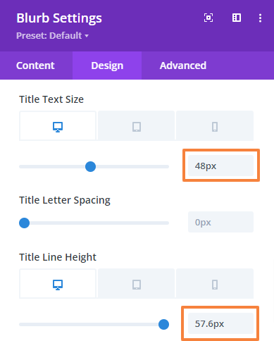
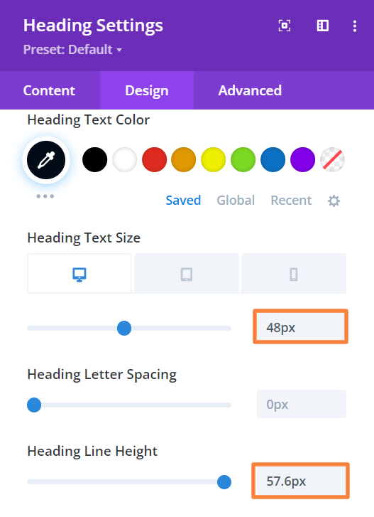
Text size: 48px (Desktop), 40px (Tablet), 32px (Mobile)
Text line-height: 57.6px (Desktop), 48px (Tablet), 40px (Mobile)
 |  |
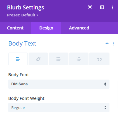
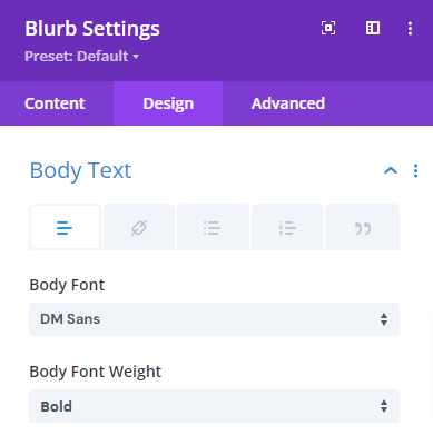
- Now, go to the Design Tab > Body Text and make the following changes there,
Body font: DM Sans
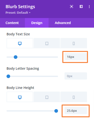
Body Text size: 16px (Desktop), 15px (Tablet), 14px (Mobile)
Body Text line-height: 25.6px (Desktop), 25px (Tablet), 24px (Mobile)
 |  |
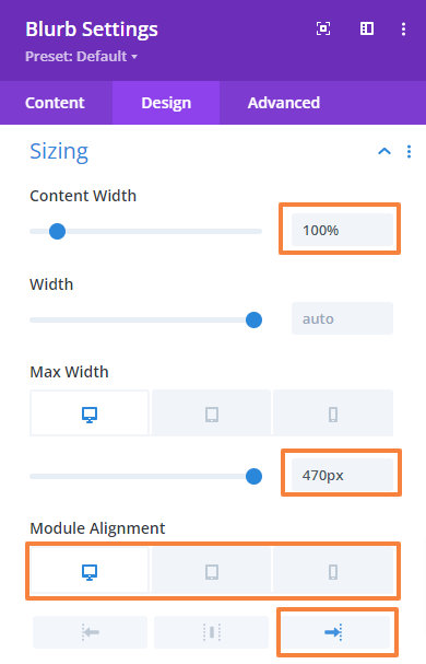
- Next, navigate to the Design Tab > Sizing and change the Content width, max width value, and module alignment,
Content width: 100%
Max width: 470px (Desktop), 100% (Tablet), 0px (Mobile)
Module alignment: Right (Desktop), Left (Tablet), Left (Mobile)
- Save changes and close the module settings.
Add Number Counter
Now, we will add some statistics related to the agency profile using the Number Counter module in the second and third rows.
Row settings
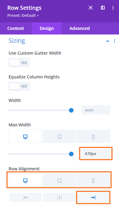
- Open the second Row setting, navigate to the Design tab > Sizing, and change the max width.
Max width: 470px (Desktop), 100% (Tablet), 0px (Mobile)
Row alignment: Right (Desktop), Left (Tablet), Left (Mobile)
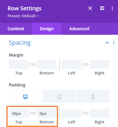
- Next, go to Design Tab > Spacing and change the top and bottom padding.
Top Padding: 36px (Desktop), 30px (Tablet), 24px (Mobile)
Bottom Padding: 0px
- Save changes and close the section settings.
- Apply the same settings for the third row as well.
Add Number Counters
- Click on the Gray plus icon and add the Number Counter module to the Row.
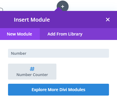
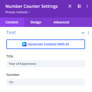
- Open the module setting and add your title and number there.
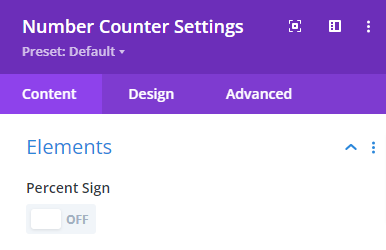
- From the Element option turn off the Percent Sign.
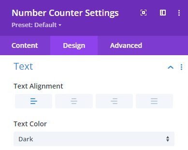
- Then go to the Design Tab > Text and make the following changes there,
Text alignment: Left
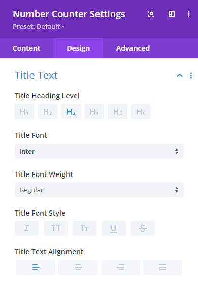
- After that, navigate to the Design Tab > Title Text and make the following changes,
Title heading level: H3
Title font: Inter
Title text alignment: Left
Title text color: #020c17
Text size: 18px (Desktop), 17px (Tablet), 16px (Mobile)
Text line-height: 28.8px (Desktop), 27px (Tablet), 26px (Mobile)
 |  |
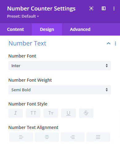
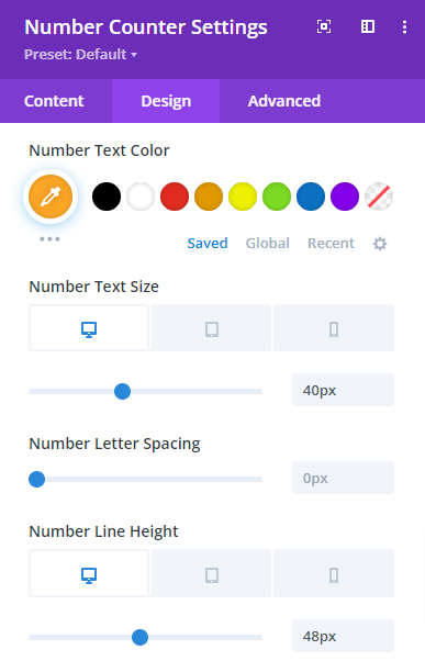
- Next, navigate to the Design Tab > Number Text and make the following changes,
Number font: Inter
Number font-weight: Semi Bold
Number text color: #ffa826
Number text size: 40px (Desktop), 36px (Tablet), 32px (Mobile)
Number line-height: 48px (Desktop), 46px (Tablet), 42px (Mobile)
 |  |
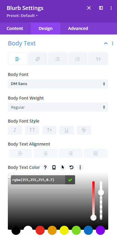
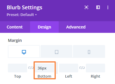
- Now, we have encountered a space issue between the number and text which directly contradicts our demo design. To fix this we need to add custom CSS, as we can’t adjust their spacing separately within the module.
Simply navigate to the Advanced tab > Custom CSS > Module Elements, and paste the following code snippet in “Percent” and “Number Counter Title” field.
height: 48px;
margin-bottom: 0px;
And
padding-bottom: 0px;
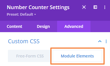
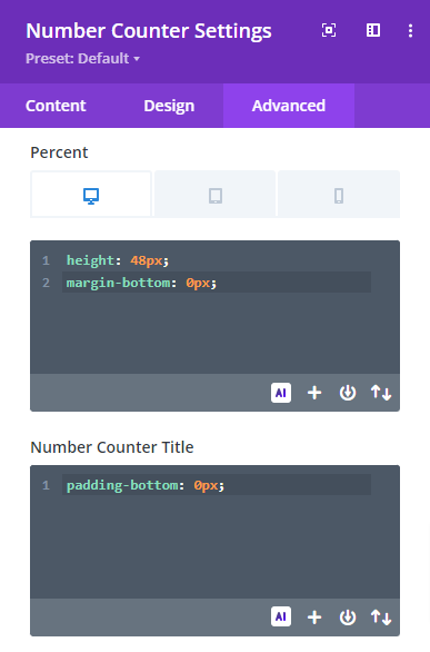
- Save changes and close the module settings.
- Repeat the process for the other three numbers. Only the content will change in those cases. You can duplicate the module and edit or design from scratch just like we did for the first number.
Preview the design. This is what our About Us section will look like,
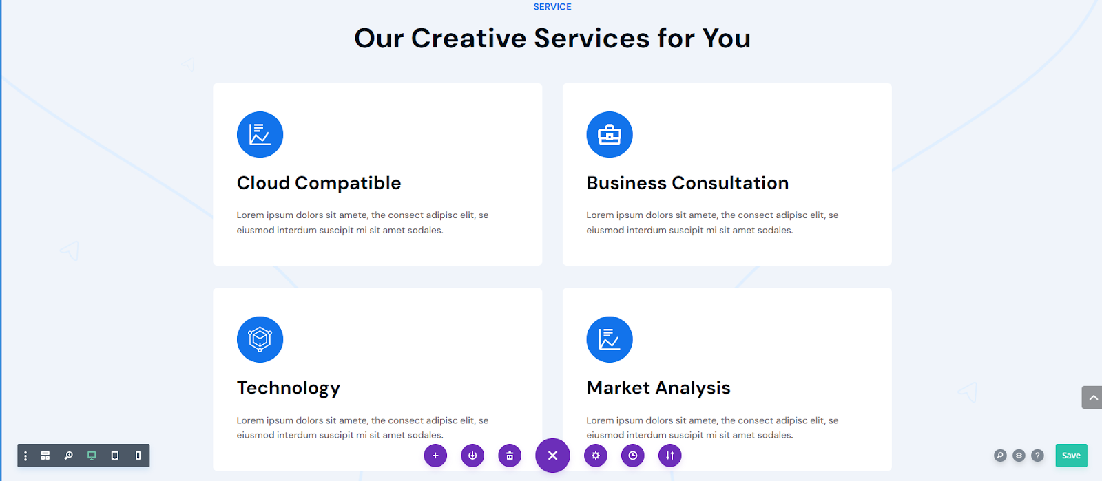
7.4 Add a Service Section
Next, we will design the Service section for your agency layout. It includes four services with two headings and a section background. First, add a new Regular section and add a row accordingly.
Section Settings
In the section setting, we will make multiple changes including the background image, background color, divider shape, and spacing.
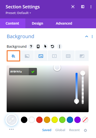
Add Background:
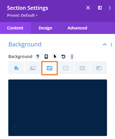
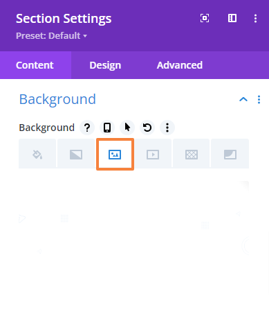
- Open the Section Settings and navigate to Background.
- From the Background option upload your desired background image or color and keep the rest of the settings unchanged.

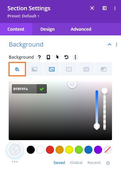
- We will also apply a Background Color (Color code: #f0f4fa) to make the section identical to the previous one.
Add Divider Shape:
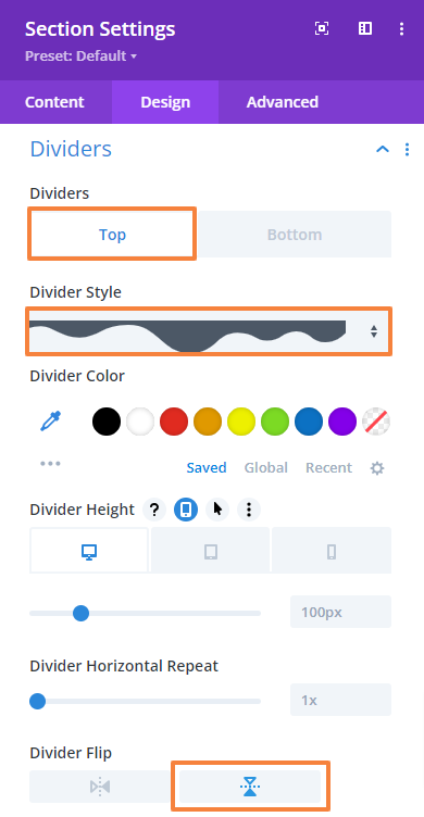
- Our design includes a curved shape in the background to make the section unique. To add this navigate to the Design tab > Dividers and add a shape on the top. Make the following changes,
Dividers: Top
Dividers style: (Select your own or the one shown below)
Divider flip: Horizontal
Add Spacing:
- Next, navigate to the Design tab > Spacing and change the top and bottom padding values as mentioned below.
Top Padding: 120px (Desktop), 80px (Tablet), 40px (Mobile)
Bottom Padding: 120px (Desktop), 80px (Tablet), 40px (Mobile)
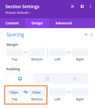
- Save changes and close the settings.
Add Text Content
We will add two headings in one row using the Text and Heading module.
Row Settings:
- From the Row setting, navigate to the Design tab > Spacing and change the top and bottom padding.
Top Padding: 0px
Bottom Padding: 0px
- Save changes and close the settings.
Add a Secondary Heading:
- First, add a Text module to the Row.
- Open the Text module setting and add your text in the Body. Then select text format to Paragraph.
- Then go to the Design Tab > Text and make the following changes there,
Text font: DM Sans
Text font-weight: Bold
Text font style: All capital letters.
Text font color: #1273eb
Text size: 16px (Desktop), 15px (Tablet), 14px (Mobile)
Text line-height: 19.2px (Desktop), 19.2px (Tablet), 19.2px (Mobile)
Text alignment: Middle
 |  |
- Now, navigate to the Design Tab > Spacing and change the Bottom margin value,
Bottom margin: 16px (Desktop), 13px (Tablet), 10px (Mobile)
- Save changes and close the Text module settings.
Add the Main Heading:
To add the heading we will use the Heading module.
- Click on the Gray plus icon and add the Heading module to the Row.
- Open the Heading module setting and add your text.
- Then go to the Design Tab > Heading Text and make the following changes there,
Heading format: H2
Heading font: DM Sans
Heading font-weight: Bold
Heading text alignment: Center
Heading text color: #020c17
Heading text size: 48px (Desktop), 40px (Tablet), 31px (Mobile)
Heading line-height: 57.6px (Desktop), 50px (Tablet), 41px (Mobile)
 |  |
- Now, navigate to the Design Tab > Spacing and change the Bottom margin value,
Bottom margin: 0px
- Save changes and close the module settings.
Add Services
In the following section, we will include four services using the Blurb module in two two-column rows. Since there are four of them, we need to insert the module four times.
Row Settings:
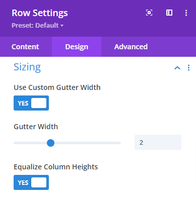
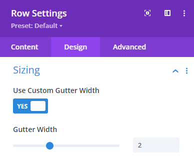
- From the Row setting, navigate to the Design tab > Sizing and make the following adjustment there,
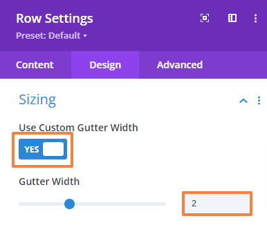
Use custom gutter width: Yes
Gutter width: 2
Equalize column heights: Yes
- After that, navigate to the Design tab > Spacing and change the top and bottom padding.
Top Padding: 38px
Bottom Padding: 0px
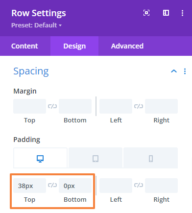
- Save changes and close the settings.
- Apply the same settings for the third row as well.
Column Settings:
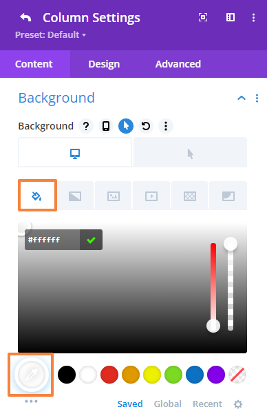
Now we will give our column a rounded box shape with a white background. Navigate to the Column setting from the Row settings. Apply the same settings for both columns.
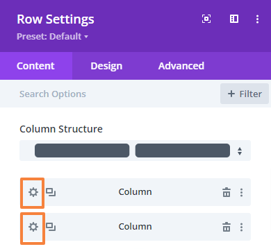
- Scroll down to the Background option and set the background color to white.
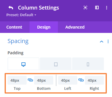
- After that, navigate to the Design tab > Spacing and change the entire padding value as mentioned below.
Top: 48px (Desktop), 36px (Tablet), 20px (Mobile)
Bottom: 48px (Desktop), 36px (Tablet), 20px (Mobile)
Left: 40px (Desktop), 36px (Tablet), 20px (Mobile)
Right: 40px (Desktop), 36px (Tablet), 20px (Mobile)
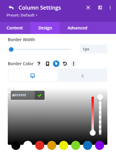
- Next, navigate to the Design tab > Border and change the entire rounded corner value as mentioned below.
Rounded corner: 8px
Border width: 1px
Border color: #ffffff
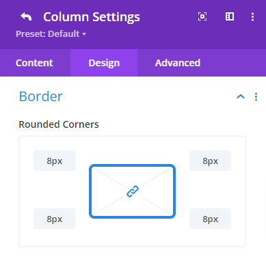 |  |
- Save changes and close the module settings.
Add Individual Services:
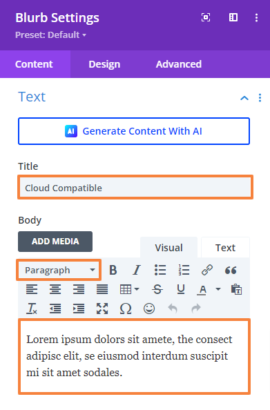
- Click on the Gray Plus icon and add a Blurb module to the Row.
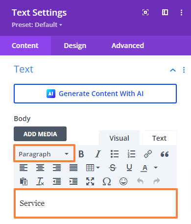
- Open the Blurb module setting and add the service name in the Title field. Then add a short description in the Body and select text format to Paragraph.
- Scroll down to the “Image & Icon” setting and upload the image that reflects the service. This will be more of an icon.
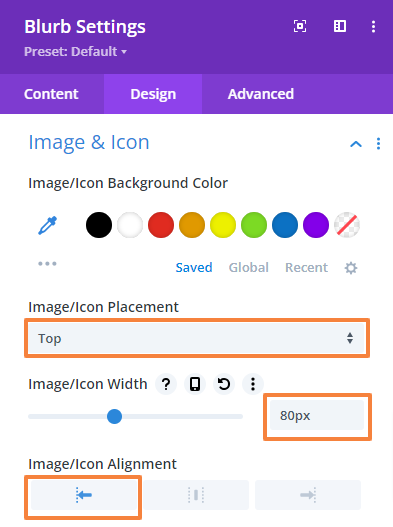
- Then go to the Design Tab > Image & Icon and make the following changes there,
Image/Icon width: 80px
Image/Icon alignment: Left
- Then go to the Design Tab > Title Text and make the following changes there,
Title heading level: H3
Title font: DM Sans
Title font-weight: Bold
Title font color: #020c17
Text size: 32px (Desktop), 28px (Tablet), 24px (Mobile)
Text line-height: 38.4px (Desktop), 38px (Tablet), 32px (Mobile)
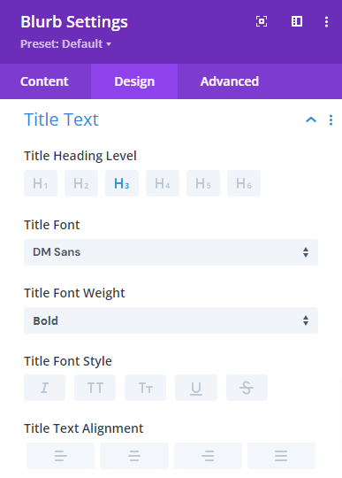 | 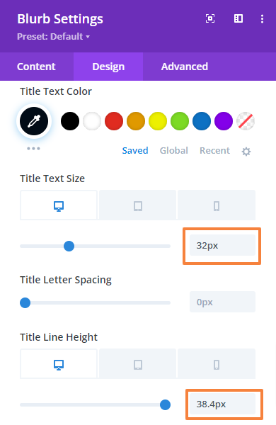 |
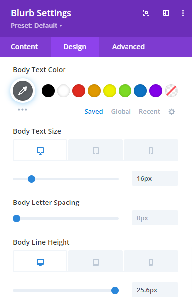
- Now, go to the Design Tab > Body Text and make the following changes there,
Body font: DM Sans
Body text color: #5e6266
Body Text size: 16px (Desktop), 15px (Tablet), 14px (Mobile)
Body Text line-height: 25.6px (Desktop), 25px (Tablet), 24px (Mobile)
|  |
- Next, navigate to the Design Tab > Sizing and change the Content width.
Content width: 100%
- Repeat the process for the other three services. Only the content and image will change in those cases. You can duplicate the module or row and edit or design from scratch just like we did for the first number.
- Save changes and close the module settings.
Preview the design. This is what our Service section will look like,
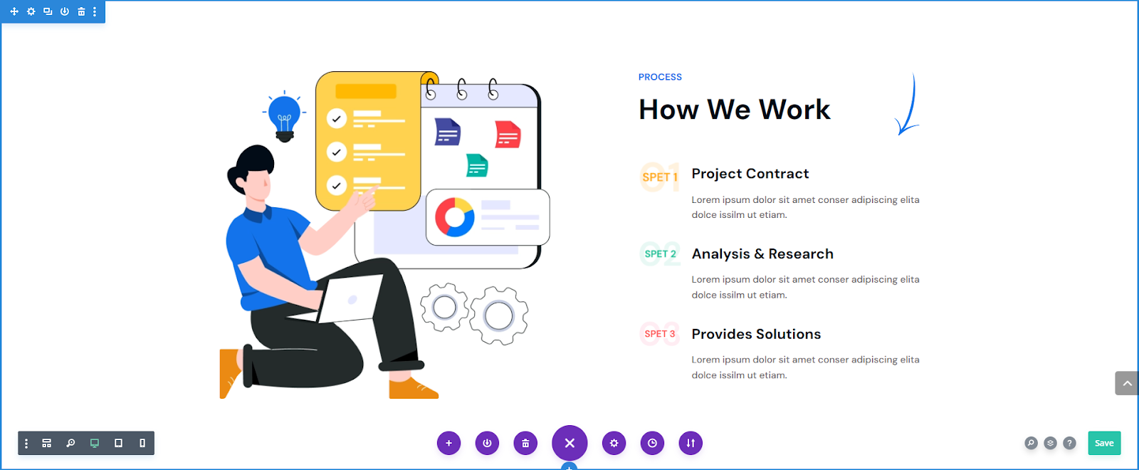
7.5 Add a Work Process Section
The work process section includes an image, heading, subheading, and work process steps. First, add a regular section then a two-column row: place the image in the left column and the rest of the content in the right column.
Section Settings
From the section’s setting, we will adjust the spacing.
- Go to Design Tab > Spacing and change the top and bottom padding values.
Top padding: 120px (Desktop), 80px (Tablet), 40px (Mobile)
Bottom padding: 120px (Desktop), 80px (Tablet), 40px (Mobile)
- Save changes and close the Section settings.
Row Settings
- Open the Row setting by navigating to the Design tab > Spacing, and change the top and bottom padding.
Top Padding: 0px
Bottom Padding: 0px
- Save changes and close the settings.
Add Image
We will add an image using the image module in the left-side column.
- First, add an Image module to the Row.
- In the Image module setting upload or select your image.
- Now, navigate to the Design Tab > Alignment and make sure the following settings,
Image Alignment for Desktop: Left
Image Alignment for Tablet: Left
Image Alignment for Mobile: Left
- Save changes and close the module settings.
Add Secondary Heading
- First, add a Text module to the right column first row.
- Open the Text module setting and add your text in the Body. Then select text format to Paragraph.
- Then go to the Design Tab > Text and make the following changes there,
Text font: DM Sans
Text font-weight: Bold
Text font style: All capital letters.
Text font color: #1273eb
Text size: 16px (Desktop), 15px (Tablet), 14px (Mobile)
Text line-height: 19.2px (Desktop), 19.2px (Tablet), 19.2px (Mobile)
Text alignment: Left
| |
- Now, navigate to the Design Tab > Sizing and change the max width value and module alignment,
Max width: 470px (Desktop), 100% (Tablet), 0px (Mobile)
Module alignment: Right (Desktop), Left (Tablet), Left (Mobile)
- Now, navigate to the Design Tab > Spacing and change the Bottom margin value,
Bottom margin: 16px (Desktop), 13px (Tablet), 10px (Mobile)
- Save changes and close the Text module settings.
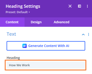
Add the Main Heading
- Click on the Gray Plus icon and add a Heading module.
- Open the Heading module setting and add your text.
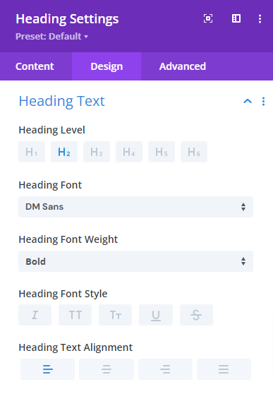
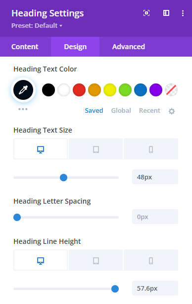
- Then go to the Design Tab > Heading Text and make the following changes there,
Heading level: H2
Heading font: DM Sans
Heading font-weight: Bold
Heading text alignment: Left
Heading text color: #020c17
Heading text size: 48px (Desktop), 40px (Tablet), 32px (Mobile)
Heading line-height: 57.6px (Desktop), 48px (Tablet), 40px (Mobile)
 |  |
- Now, navigate to the Design Tab > Sizing and change the max width value and module alignment,
Max width: 470px (Desktop), 100% (Tablet), 0px (Mobile)
Module alignment: Right (Desktop), Left (Tablet), Left (Mobile)
- Now, navigate to the Design Tab > Spacing and change the bottom margin,
Bottom margin: 40px (Desktop), 30px (Tablet), 20px (Mobile)
- Save changes and close the module settings.
Add Steps
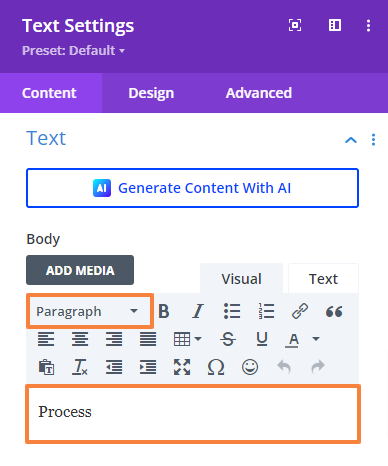
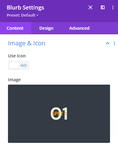
Now, we will add the actual work process in three steps using the Blurb module. Each process contains an image for step count, a title, and a short description.
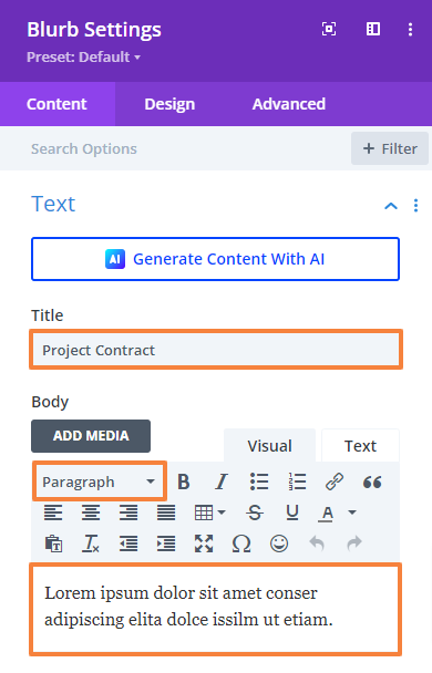
- Click on the Gray Plus icon and add a Blurb module to the Row.
- Open the Blurb module setting and add the Process title in the Title field. Then add a short description in the Body and select text format to Paragraph.
- Scroll down to the ‘Image & Icon’ setting and upload the image. For our design, we’ll use an image icon that combines the number “01” with the text “STEP 1.”
Note: This step is optional; you can skip it if you want.
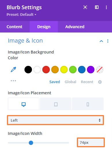
- Then go to the Design Tab > Image & Icon and make the following changes there,
Image/Icon Placement: Left
Image/Icon width: 74px
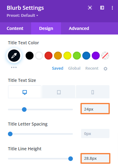
- Then go to the Design Tab > Title Text and make the following changes there,
Title heading level: H5
Title font: DM Sans
Title font-weight: Bold
Title font color: #020c17
Text size: 24px (Desktop), 22px (Tablet), 20px (Mobile)
Text line-height: 28.8px (Desktop), 28.8px (Tablet), 28.8px (Mobile)
 |  |
- Now, go to the Design Tab > Body Text and make the following changes there,
Body font: DM Sans
Body text color: #5e6266
Body Text size: 16px (Desktop), 15px (Tablet), 14px (Mobile)
Body Text line-height: 25.6px (Desktop), 25px (Tablet), 24px (Mobile)
| |
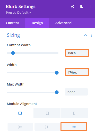
- Next, navigate to the Design Tab > Sizing and change the Content and Max widths.
Content width: 100%
Max Width: 470px
Module alignment: Right (Desktop), Left (Tablet), Left (Mobile)
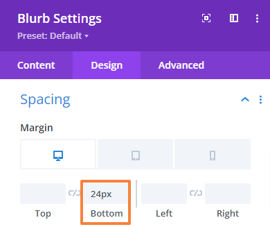
- Next, navigate to the Design Tab > Spacing and change the Bottom margin.
Bottom Margin: 24px (Desktop), 20px (Tablet), 16px (Mobile)
- Repeat the process for the other two steps. Only the title and image will change in those cases. You can duplicate the module or row and edit or design from scratch just like we did for the first number.
- Save changes and close the module settings.
Add Additional Design Elements (optional)
We’ll add some extra design elements based on our needs like an arrow to navigate the steps. Just follow the steps below.
- From the row setting, scroll down to Background and add the image. Now, make the following changes to fit it rightly,
Background image size: Actual Size
Background image position: Top right
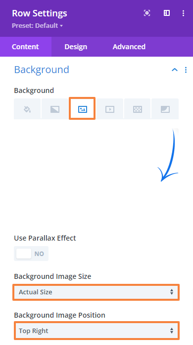
- Save changes and close the Row settings.
Preview the design. This is what our Work Process section will look like,
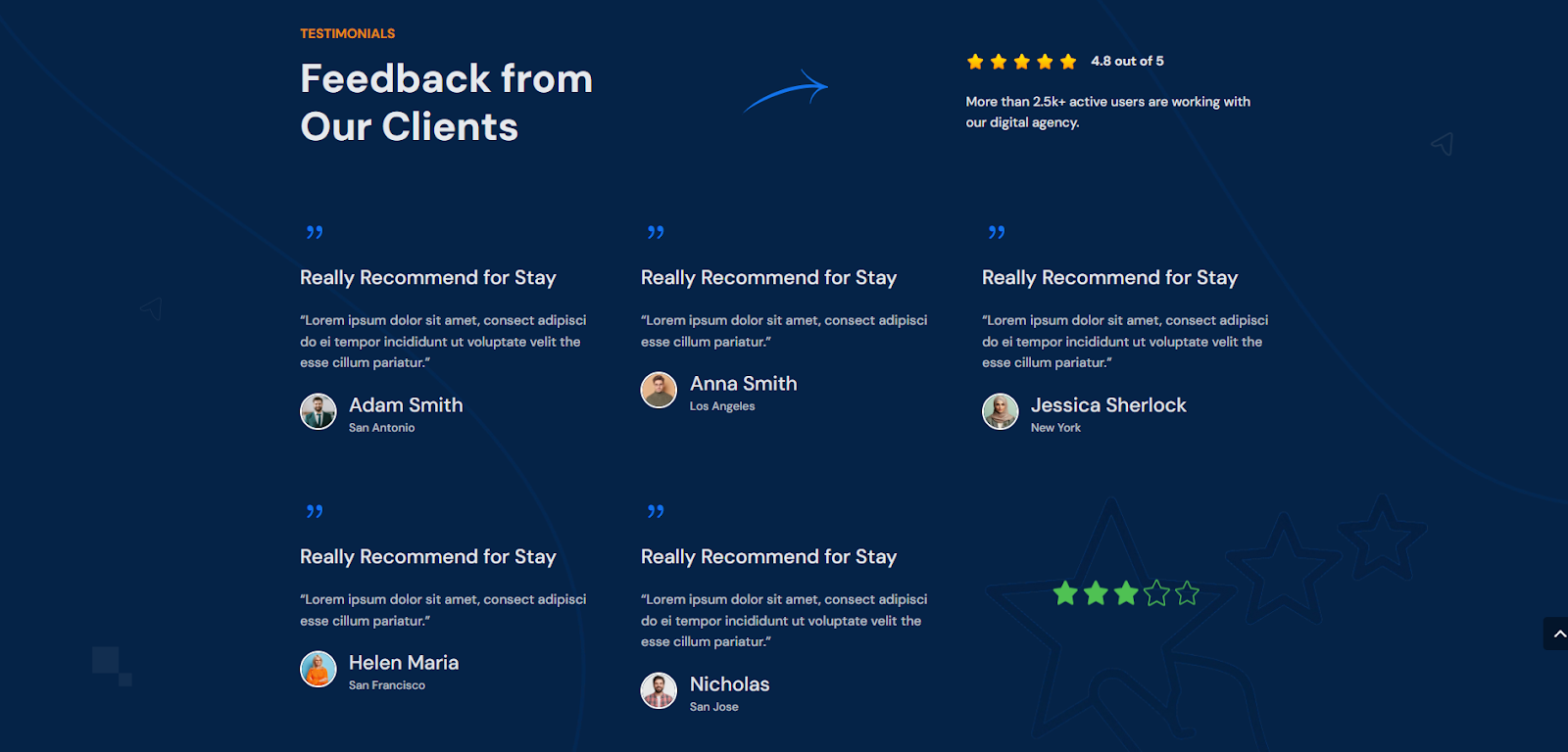
7.6 Add a Testimonial Section
Our testimonial section is a bit more detailed. It includes five testimonials, along with a heading, subheading, rating section, text, and a background image.
To fit everything into one section, we’ll need a regular section with three rows including three columns.
Section Settings
In the section settings, we’ll add a background image, choose a color, and adjust the spacing.
Add Background:
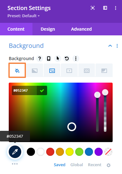
- Open the Section Settings and navigate to Background.
- From the Background option upload your desired background image (shape) or color and keep the rest of the settings unchanged.
- We will also apply a Background Color (Color code: #052347) to make the section a bit contrasty.
Add Spacing:
- Next, navigate to the Design tab > Spacing and change the top and bottom padding values as mentioned below.
Top Padding: 120px (Desktop), 80px (Tablet), 40px (Mobile)
Bottom Padding: 120px (Desktop), 80px (Tablet), 40px (Mobile)
- Save changes and close the settings.
Add Testimonial Content
Our first row contains all the testimonial content which requires multiple modules and 3 three-column structures.
In the left column we will add our headings, in the middle one we will add an arrow (additional design element), and finally in the right column we will add a star rating and a description.
Let’s add one by one.
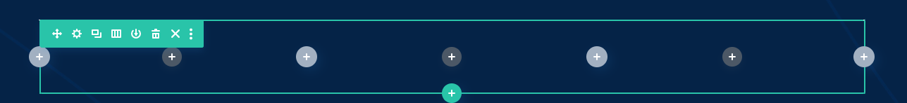
Row Settings:
- Open the Row setting and navigate to the Design tab > Sizing. Here, enable and change the gutter width value.
Gutter Width: 2
- Open the Row setting, navigate to the Design tab > Spacing, and change the top and bottom padding.
Top Padding: 0px
Bottom Padding: 0px
- Save changes and close the settings.
Add a Secondary Heading:
- First, add a Text module to the left Row.
- Open the Text module setting and add your text in the Body. Then select text format to Paragraph.
- Then go to the Design Tab > Text and make the following changes there,
Text font: DM Sans
Text font-weight: Bold
Text font style: All capital letters.
Text font color: #eb8a12
Text size: 16px (Desktop), 15px (Tablet), 14px (Mobile)
Text line-height: 19.2px (Desktop), 19.2px (Tablet), 19.2px (Mobile)
Text alignment: Left
| |
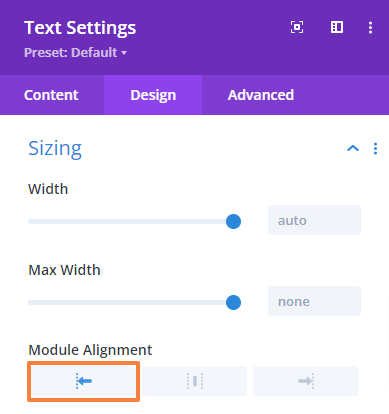
- Now, navigate to the Design Tab > Sizing and change the module alignment,
Module Alignment: Left
- Now, navigate to the Design Tab > Spacing and change the Bottom margin value,
Bottom margin: 16px (Desktop), 13px (Tablet), 10px (Mobile)
- Save changes and close the Text module settings.
Add the Main Heading:
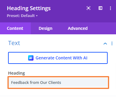
- Click on the Gray plus icon and add the Heading module just below the secondary heading.
- Open the Heading module setting and add your text.
- Then go to the Design Tab > Heading Text and make the following changes there,
Heading Level: H2
Heading font: DM Sans
Heading font-weight: Bold
Heading text alignment: Left
Heading text color: rgba(255,255,255,0.9)
Heading text size: 48px (Desktop), 40px (Tablet), 32px (Mobile)
Heading line-height: 57.6px (Desktop), 48px (Tablet), 40px (Mobile)
| 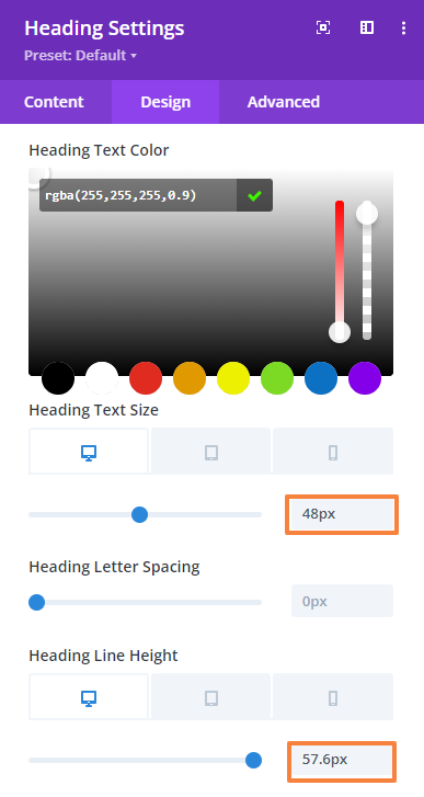 |
- Now, navigate to the Design Tab > Spacing and change the Bottom margin value to 0px.

- Save changes and close the module settings
Add an Image Shape as Additional Design Elements (optional)
In the middle column, we will add an arrow as an image. This is an additional design element that we are maintaining from the beginning of the layout.
- First, add an Image module to the Row.
- In the Image module setting upload or select your image.
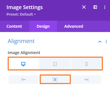
- Now, navigate to the Design Tab > Alignment and make the following adjustment there,
Image Alignment for Desktop: Center
Image Alignment for Tablet: Left
Image Alignment for Mobile: Left
- Save changes and close the module settings.
Add Customer Rating
Now, we’ll add a customer review section in the right column using the Blurb module, which includes a star rating and a score out of 5.
- Click on the Gray Plus icon and add a Blurb module to the Row.
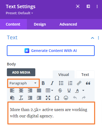
- Open the Blurb module setting. Then add a short description in the Body and select text format to Paragraph. Keep the Title field empty since we do not have a title to show.
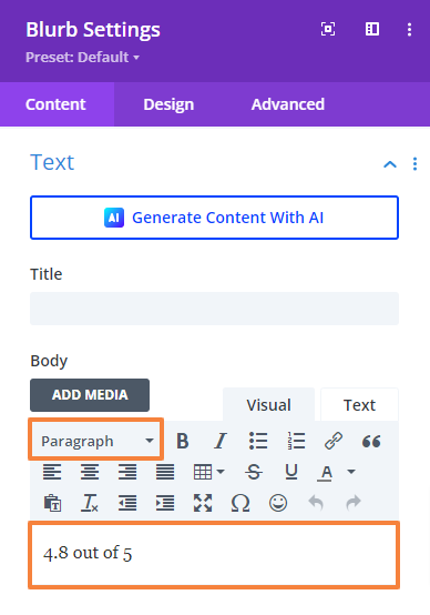
- Scroll down to the ‘Image & Icon’ setting and upload the star rating image.
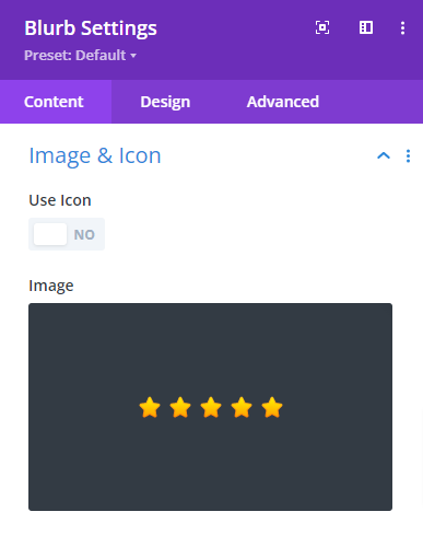
- Then go to the Design Tab > Image & Icon and make the following changes there,
Image/Icon Placement: Left
Image/Icon width: 136px

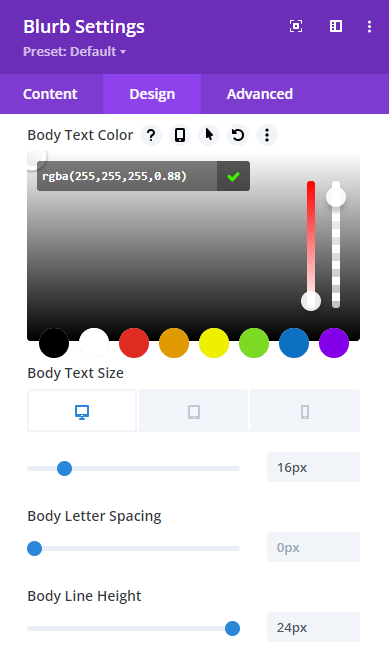
- Now, go to the Design Tab > Body Text and make the following changes there,
Body font: DM Sans
Body font-weight: Bold
Body text color: rgba(255,255,255,0.88)
Body Text size: 16px (Desktop), 15px (Tablet), 14px (Mobile)
Body Text line-height: 24px (Desktop), 25px (Tablet), 24px (Mobile)
 |  |
- Next, navigate to the Design Tab > Sizing and change the Content widths.
Content width: 100%
- Next, navigate to the Design Tab > Spacing and change the Bottom margin.
Bottom Margin: 24px (Desktop), 20px (Tablet), 16px (Mobile)
- Save changes and close the module settings.
Add a Description Under the Rating:
- Click on the Gray plus icon and add a Text module to the Row.
- Open the Text module setting and add your text there in the body. Then select text format to Paragraph.
- Then go to the Design Tab > Text and make the following changes there,
Text font: DM Sans
Text font-weight: Regular
Text font color: rgba(255,255,255,0.88)
Text size: 16px (Desktop), 15px (Tablet), 14px (Mobile)
Text letter-spacing: 0px (Desktop), 0px (Tablet), 0px (Mobile)
Text line-height: 25.6px (Desktop), 25px (Tablet), 24px (Mobile)
Text alignment: Left
 | |
- Save changes and close the module settings.
Add Testimonials
Now, we will include five testimonials using the Blurb module in the second and third rows. Also, for both of them we will keep the same Row settings.
Row Settings:
- From the Row setting, navigate to the Design tab > Spacing and change the top and bottom padding values.
Top Padding: 70px
Bottom Padding: 0px
- Save changes and close the settings.
Apply the same settings for the third row as well.
Add Individual Testimonial
For each testimonial, we need to use the Blurb module twice. Once for the quote, review title, and description, and again for the reviewer’s image, name, and address.
Add Review:
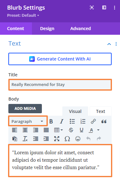
- Click on the Gray Plus icon and add the first Blurb module.
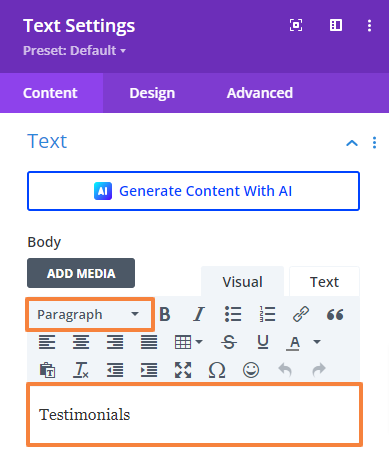
- Open the Blurb module setting and add the Review title in the Title field. Then add the content in the Body and select text format to Paragraph.
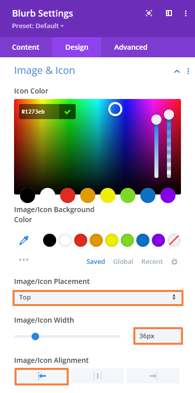
- Scroll down to the ‘Image & Icon’ setting and enable the Use Icon option. Then select the quote icon from the list.
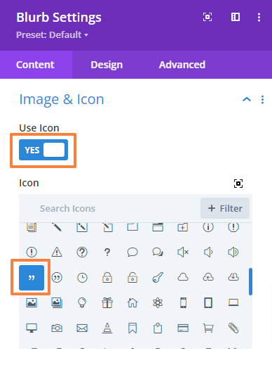
- Then go to the Design Tab > Image & Icon and make the following changes there,
Icon Color: #1273eb
Image/Icon width: 36px
Image/Icon Alignment: Left
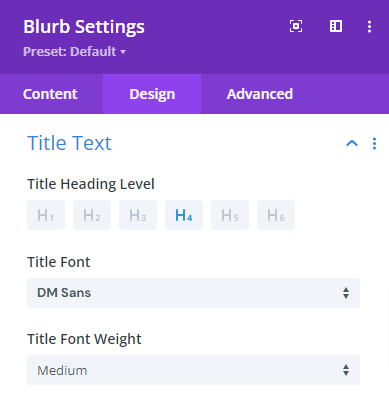
- Then go to the Design Tab > Title Text and make the following changes there,
Title heading level: H4
Title font: DM Sans
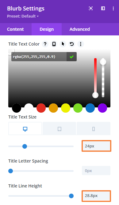
Title font-weight: Medium
Title font color: rgba(255,255,255,0.9)
Text size: 24px (Desktop), 22px (Tablet), 20px (Mobile)
Text line-height: 28.8px (Desktop), 28.8px (Tablet), 28.8px (Mobile)
 |  |
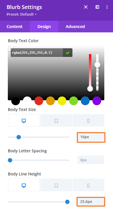
- Now, go to the Design Tab > Body Text and make the following changes there,
Body font: DM Sans
Body font-weight: Regular
Body text color: rgba(255,255,255,0.7)
Body Text size: 16px (Desktop), 15px (Tablet), 14px (Mobile)
Body Text line-height: 25.6px (Desktop), 25px (Tablet), 24px (Mobile)
|  |
- Next, navigate to the Design Tab > Sizing and change the Content and Max widths.
Content width: 100%
- Next, navigate to the Design Tab > Spacing and change the Bottom margin.
Bottom Margin: 24px (Desktop), 20px (Tablet), 16px (Mobile)
Add Review Information:
- Click on the Gray Plus icon and add the second Blurb module just under the previous one.
- Open the Blurb module setting. Then add the reviewer’s name in the Title field and address in the Body field. Also, select the body text text format to Paragraph.
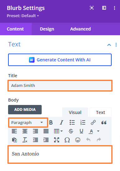
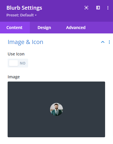
- Scroll down to the ‘Image & Icon’ setting and upload the reviewer’s image.
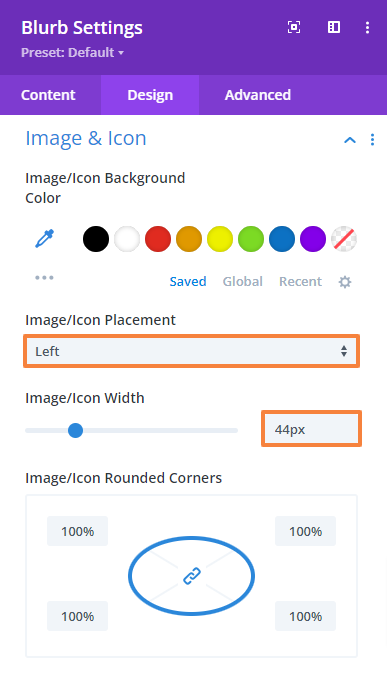
- Then go to the Design Tab > Image & Icon and make the following changes there,
Image/Icon Placement: Left
Image/Icon width: 44px
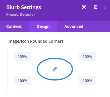
Image/Icon rounded corner: 100% each
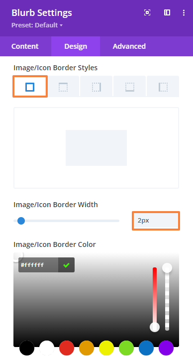
Image/Icon border width: 2px
Image/Icon border-color: #ffffff
 |  |
- Then go to the Design Tab > Title Text and make the following changes there,
Title heading level: H5
Title font: DM Sans
Title font-weight: Medium
Title font color: rgba(255,255,255,0.88)
Text size: 24px (Desktop), 22px (Tablet), 20px (Mobile)
Text line-height: 28.8px (Desktop), 28.8px (Tablet), 28.8px (Mobile)
|  |
- Now, go to the Design Tab > Body Text and make the following changes there,
Body font: DM Sans
Body font-weight: Regular
Body text color: rgba(255,255,255,0.7)
- Next, navigate to the Design Tab > Sizing and change the Content widths.
Content width: 100%
- Save changes and close the module settings.
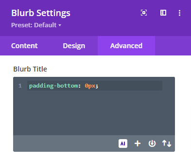
Adjust Spacing with CSS Code:
- Now, to reduce the space between the Title and the description we need to add custom CSS, as we can’t adjust their spacing separately within the module.
Simply navigate to the Advanced tab > Custom CSS > Module Elements > Blurb Title, and paste the following code snippet shown in the image below.
padding-bottom: 1px;
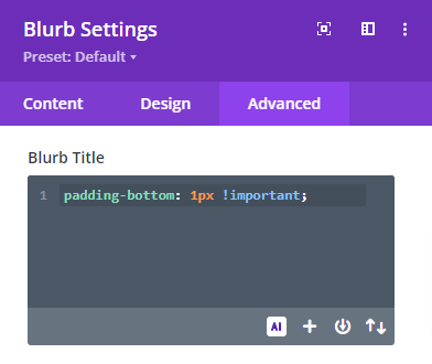
- Save changes and close the module settings.
- Repeat the process for the other four testimonials. Only the title and image will change in those cases. You can duplicate the module or row and edit or design from scratch just like we did for the first number.
Add additional design elements (SVG animation) (Optional)
In our third row and third column, we will add a rating animation to fulfill our design requirements. To do this we will use the Code module.
- Click on the Gray Plus icon and add the Code module.
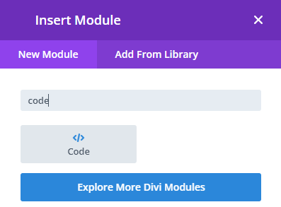
- Open the Code module setting and paste the below code in the Text field.
<script src=”https://unpkg.com/@dotlottie/player-component@latest/dist/dotlottie-player.mjs” type=”module”></script>
<dotlottie-player src=”https://lottie.host/8930c642-7b2a-4ee5-b627-15f8ffe23583/6e6TEJCup3.json” background=”transparent” speed=”1″ style=”width: 235px; height: 235px;” loop autoplay></dotlottie-player>
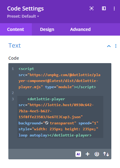
- Save changes and close the module settings.
Preview the design. This is what our Work Process section will look like,
7.7 Add a Portfolio Section
Now, let’s design the Portfolio section for the agency layout. It will feature four completed projects, each with an image, heading, and description, along with a section heading, subheading, and background. Start by adding a new Regular section and a single row.
Section Settings:
In the section setting, we will add a background image and adjust the spacing.
Add a Background
- Open the Section Settings and navigate to Background.
- From the Background option upload your desired background image or color and keep the rest of the settings unchanged.
Add Spacing:
- Next, navigate to the Design tab > Spacing and change the top and bottom padding values as mentioned below.
Top Padding: 120px (Desktop), 80px (Tablet), 40px (Mobile)
Bottom Padding: 120px (Desktop), 80px (Tablet), 40px (Mobile)
- Save changes and close the settings.
Row Settings
- From the Row setting, navigate to the Design tab > Sizing and make the following adjustment there,
Use custom gutter width: Yes
Gutter width: 2
- Now, navigate to the Design tab > Spacing and change the top and bottom padding.
Top Padding: 0px
Bottom Padding: 0px
- Save changes and close the settings.
Add Secondary Heading
- First, add a Text module to the Row.
- Open the Text module setting and add your text in the Body. Then select text format to Paragraph.

- Then go to the Design Tab > Text and make the following changes there,
Text font: DM Sans
Text font-weight: Bold
Text font style: All capital letters.
Text font color: #1273eb
Text size: 16px (Desktop), 15px (Tablet), 14px (Mobile)
Text letter-spacing: 0px (Desktop), 0px (Tablet), 0px (Mobile)
Text line-height: 19.2px (Desktop), 19.2px (Tablet), 19.2px (Mobile)
Text alignment: Middle
| |
- Now, navigate to the Design Tab > Spacing and change the Bottom margin value,
Bottom margin: 16px (Desktop), 13px (Tablet), 10px (Mobile)
- Save changes and close the Text module settings.
Add the MainHeading
To add the heading we will use the Heading module.
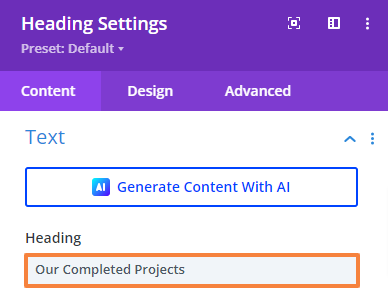
- Click on the Gray plus icon and add the Heading module to the Row.
- Open the Heading module setting and add your text.
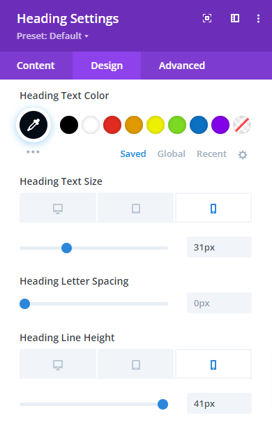
- Then go to the Design Tab > Heading Text and make the following changes there,
Heading format: H2
Heading font: DM Sans
Heading font-weight: Bold
Heading text alignment: Center
Heading text color: #020c17
Heading text size: 48px (Desktop), 40px (Tablet), 31px (Mobile)
Heading line-height: 57.6px (Desktop), 50px (Tablet), 41px (Mobile)
|  |
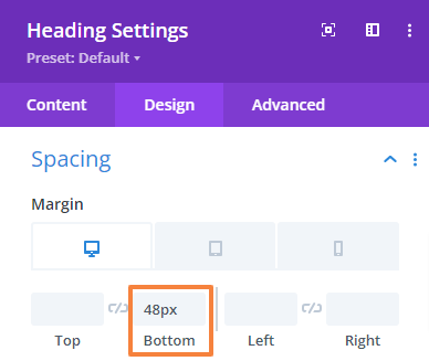
- Now, navigate to the Design Tab > Spacing and change the Bottom margin value,
Bottom margin: 48px
- Save changes and close the module settings.
Add Projects
Now we will add four projects using the gallery module.
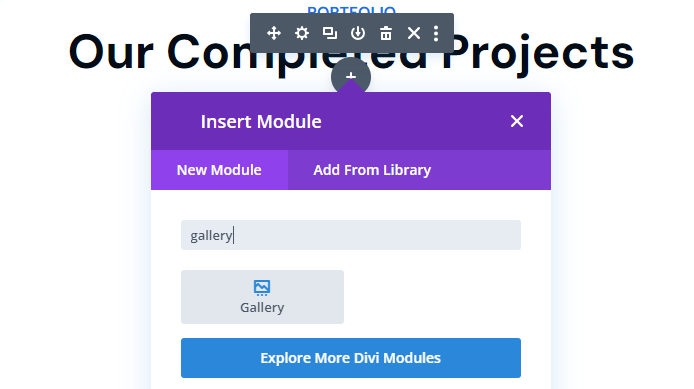
- Click on the Gray plus icon and add the Heading module to the Row.
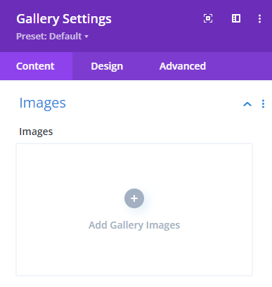
Gallery Settings:
- Open the Image module setting and add your images first.
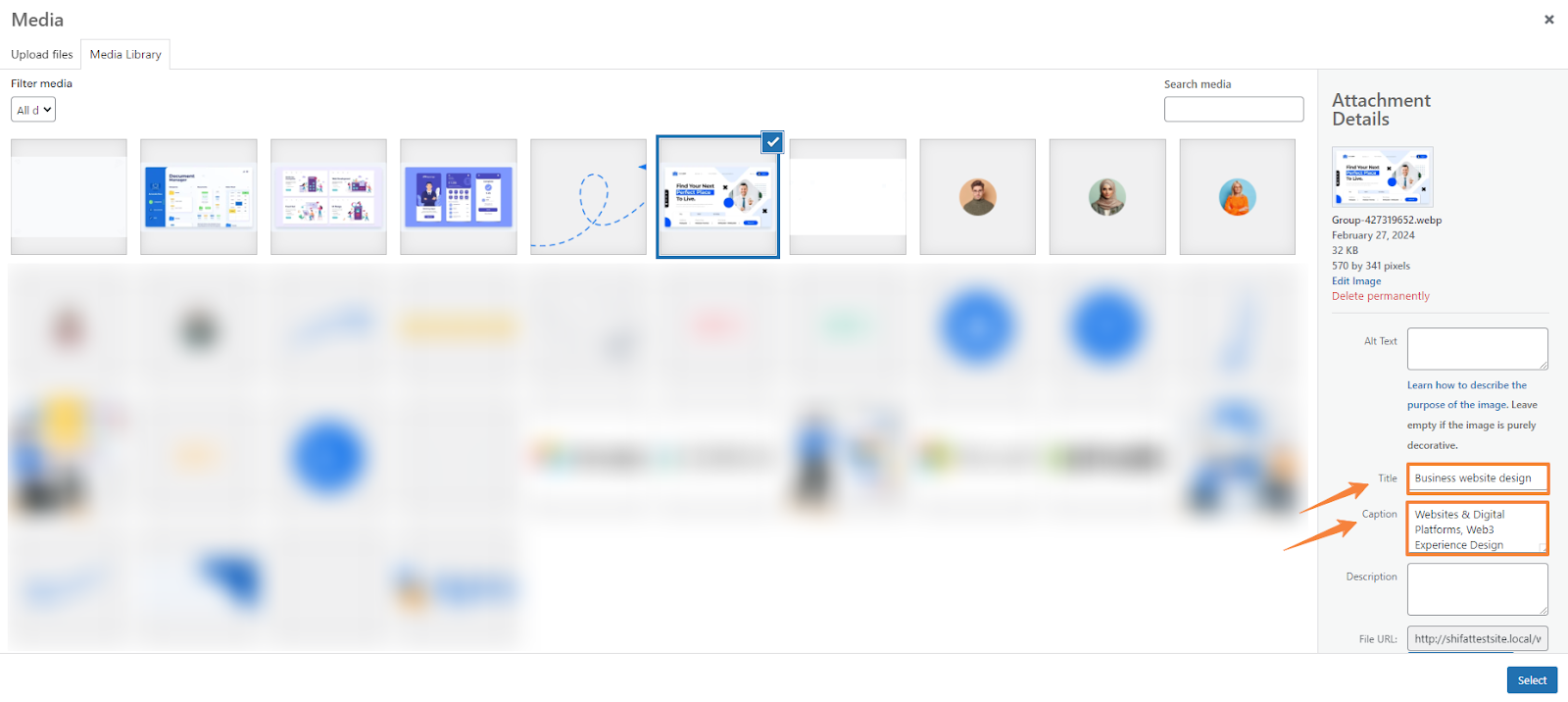
- Click Add Gallery Images to insert the images. You can either select the already uploaded image from the media library or upload it manually directly from your computer.
- To add image titles and descriptions in the gallery, select each image and fill in the title and caption fields on the right side while uploading your image from the media file.
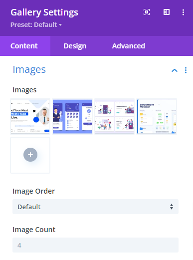
- Then select the Image Order as default.
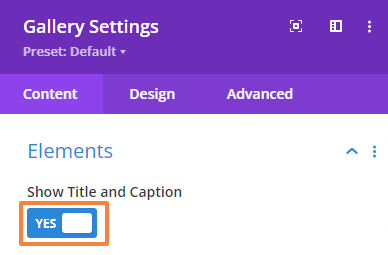
- Scroll down to the Element setting and make sure the Show Title and Caption option is enabled and the “Show Pagination” is Disabled.
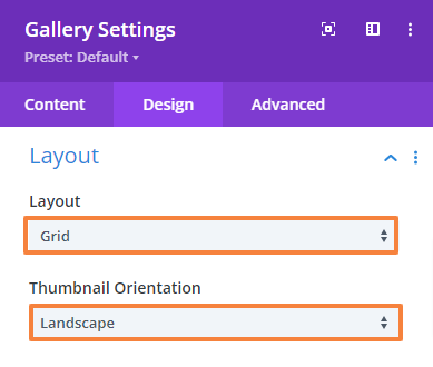
- Then go to the Design Tab > Layout and make sure the following settings there,
Layout: Grid
Thumbnail Orientation: Landscape
- Now add an overlay to the gallery images with an overlay icon. Again, go to the Design Tab > Overlay and make the following changes there,
Overlay icon color: #ffffff
Overlay background-color: rgba(2,12,23,0.62)
Overlay icon: Add an icon as your preference

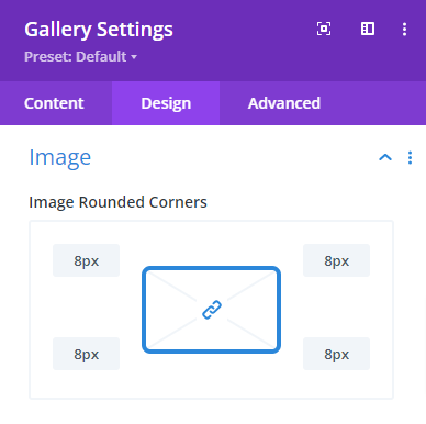
- Once you are done with the Overlay settings, navigate to Design Tab > Image and change the value of the image’s rounded corner,
Image rounded corners: 8px
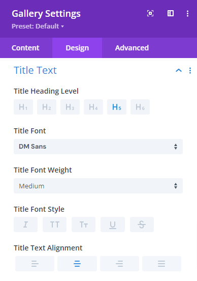
- After that, navigate to the Design Tab > Title Text and make the following changes,
Title heading level: H5
Title font: DM Sans
Title font-weight: Medium
Title text alignment: Center
Title text color: #020c17
Text size: 24px (Desktop), 22px (Tablet), 20px (Mobile)
Text line-height: 28.8px (Desktop), 27px (Tablet), 26px (Mobile)
 |  |
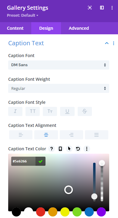
- Next, navigate to the Design Tab > Caption Text and make the following changes,
Caption font: DM Sans
Caption font-weight: Medium
Caption font alignment: Center
Caption text color: #5e6266
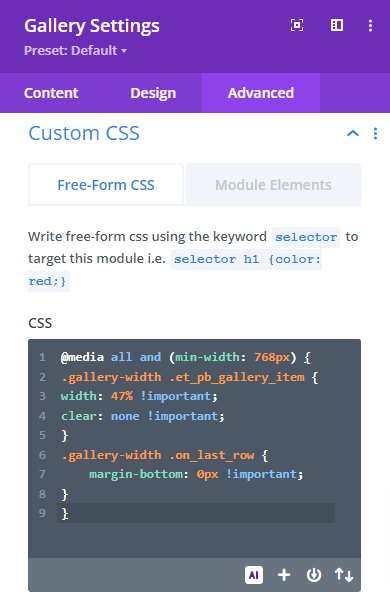
- To customize the gallery’s image spacing, we’ll add some CSS code since the module doesn’t allow separate spacing adjustments. By default, the module displays four images per column, but if you reduce it to two, it leaves empty space. We’ll use CSS to ensure the module shows two images per column at a certain width, with the rest moving to the next column.
Simply navigate to the Advanced tab > Custom CSS > Free-Form CSS, and paste the following code snippet shown in the image below.
@media all and (min-width: 768px) {
.gallery-width .et_pb_gallery_item {
width: 47% !important;
clear: none !important;
}
.gallery-width .on_last_row {
margin-bottom: 0px !important;
}
}
Note: This CSS code makes the gallery items width 47% for screen size 768 px and wider. It also ensures that there is no bottom margin for the items on the last row.
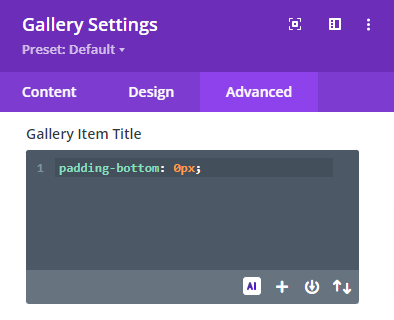
- Then, navigate to the Advanced tab > Custom CSS > Module Element > Gallery Item Title and paste the following code to make the padding value for the Title zero,
padding-bottom: 0px;
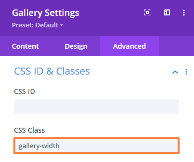
- Finally, navigate to the Advanced tab > CSS ID & Classes and define the CSS class,
CSS Class: gallery-width
- Save changes and close the Gallery module settings.
Also read: How to Create Dynamic Gallery in Divi?
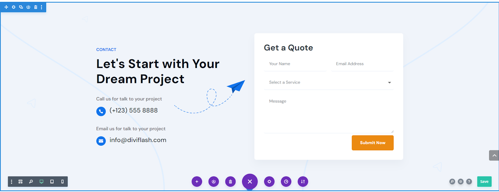
7.8 Add a Contact Form Section
The contact form section is the final section in our layout. It includes one main heading, one sub-heading similar to the previous section, a contact form, a background image and color, and some contact information; all within a double-column row.
First, add a new Regular section and a row with two columns.
Section Settings
In the section setting, we will add a background image and color, and adjust the spacing.
Add Background:
- Open the Section Settings and navigate to Background.
- From the Background option upload your desired background image or color and keep the rest of the settings unchanged.

- We will also apply a Background Color (Color code: #f0f4fa) to make the section look different from the previous one.
Add Spacing:
- Next, go to the Design tab > Spacing and change the top and bottom padding values as mentioned below.
Top Padding: 120px (Desktop), 80px (Tablet), 40px (Mobile)
Bottom Padding: 120px (Desktop), 80px (Tablet), 40px (Mobile)
- Save changes and close the settings.
Row Settings
- From the Row setting, first go the the Design tab > Sizing and enable custom gutter width and change its value,
Use custom gutter width: Yes
Gutter width: 2
- Next, go to the Design tab > Spacing and change the top and bottom padding.
Top Padding: 0px
Bottom Padding: 0px
- Now, we will add some CSS code to align the item vertically in the middle of their container. This way whatever we add in the left column To do this, navigate to the Advanced tab > Custom CSS > Module Element > Main Element, and paste the following code snippet shown in the image below.
display: flex;
align-items: center;
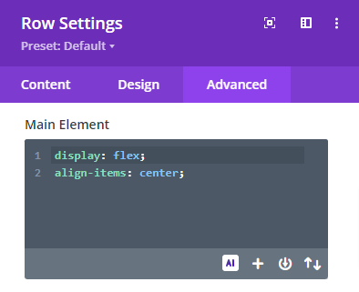
- Save changes and close the settings.
Add Secondary Heading
Now we will add a secondary heading just like we did in every section.
- First, add a Text module to the First Row.
- Open the Text module setting and add your text in the Body. Then select text format to Paragraph.

- Then go to the Design Tab > Text and make the following changes there,
Text font: DM Sans
Text font-weight: Bold
Text font style: All capital letters.
Text font color: #1273eb
Text size: 16px (Desktop), 15px (Tablet), 14px (Mobile)
Text line-height: 19.2px (Desktop), 19.2px (Tablet), 19.2px (Mobile)
Text alignment: Left
 | |
- Now, navigate to the Design Tab > Sizing and change the max width value and module alignment,
Module Alignment: Left
- Now, navigate to the Design Tab > Spacing and change the Bottom margin value,
Bottom margin: 16px (Desktop), 13px (Tablet), 10px (Mobile)
- Save changes and close the Text module settings.
Add the Main Heading
Again, we will add the main heading just like we did in every section.
- Click on the Gray plus icon and add the Heading module to the Row.
- Open the Heading module setting and add your text.
- Then go to the Design Tab > Heading Text and make the following changes there,
Heading Level: H2
Heading font: DM Sans
Heading font-weight: Bold
Heading text alignment: Left
Heading text color: #020c17
Heading text size: 48px (Desktop), 40px (Tablet), 32px (Mobile)
Heading line-height: 57.6px (Desktop), 48px (Tablet), 40px (Mobile)
|  |
- Now, navigate to the Design Tab > Spacing and change the Bottom margin value.
Bottom Margin: 26px (Desktop), 20px (Tablet), 15px (Mobile)
- Save changes and close the module settings
Add Contact Information
In the contact information section, we’ll use the blurb module to add a phone number with an icon and an email address with an icon. In both cases, there will be relevant text which we add using the text module.
Add Text Content:
- First, add a Text module just after the main heading.
- Open the Text module setting and add your text in the Body. Then select text format to Paragraph.

- Then go to the Design Tab > Text and make the following changes there,
Text font: DM Sans
Text font-weight: Regular
Text font color: #5e6266
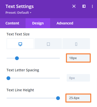
Text size: 18px (Desktop), 17px (Tablet), 16px (Mobile)
Text line-height: 25.6px (Desktop), 25px (Tablet), 24px (Mobile)
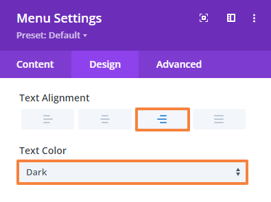
Text alignment: Left
Text Color: Dark
 |  |
- Now, navigate to the Design Tab > Spacing and change the Bottom margin value,
Bottom margin: 16px (Desktop), 13px (Tablet), 10px (Mobile)
- Save changes and close the Text module settings.
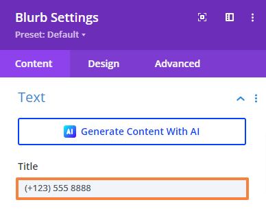
Add Contact Information:
- Click on the Gray Plus icon and add a Blurb module just under the previous one.
- Open the Blurb module setting. Then add the contact number in the Title field. Leave the content section empty since there’s nothing to add.
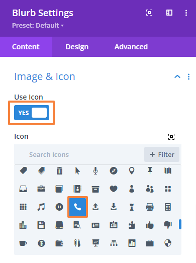
- Scroll down to the ‘Image & Icon’ setting and enable the Use Icon option then select the relevant icon from the list.
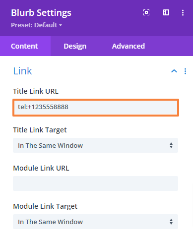
- Again, scroll down to the “Link” setting and put the destination URL in the title link URL field. In our example, we are keeping the telephone number.
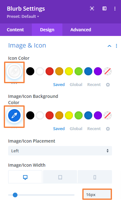
- Then go to the Design Tab > Image & Icon and make the following changes there,
Image/Icon color: #ffffff
Image/Icon background color: #1273eb
Image/Icon Placement: Left
Image/Icon width: 16px (Desktop), 14px (Tablet), 13px (Mobile)
Image/Icon rounded corner: 100% each
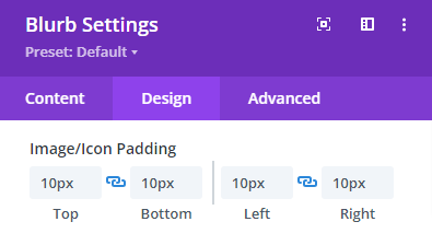
Image/Icon padding: 10px (Top), 10px (Bottom), 10px (Left), 10px (Right)
 |   |
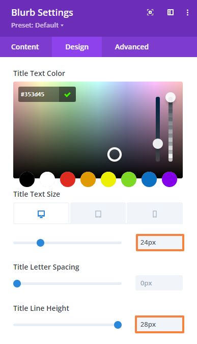
- Then go to the Design Tab > Title Text and make the following changes there,
Title heading level: H5
Title font: DM Sans
Title font-weight: Medium
Title font color: #353d45
Text size: 24px (Desktop), 22px (Tablet), 20px (Mobile)
Text line-height: 28px (Desktop), 28.8px (Tablet), 28.8px (Mobile)
|  |
- Next, navigate to the Design Tab > Sizing and change the Content widths.
Content width: 100%
- Next, navigate to the Design Tab > Spacing and change the Bottom margin.
Bottom margin: 36px (Desktop), 30px (Tablet), 24px (Mobile)
- Finally, we will add some custom CSS to add some custom padding under the title since we can’t do that inside the module. Navigate to Advanced tab > Custom CSS > Module Elements > Blurb Title, and paste the following code snippet shown in the image below.
padding-bottom: 0px;
- Save changes and close the module settings.
- Repeat the process to add the email information. Only the title and icon will change in those cases. You can duplicate the module or row and edit or design from scratch just like we did for the first number.
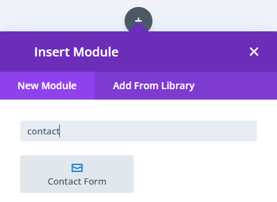
Add Contact Form
Now we will add a contact form using the contact form module.
- Click on the Gray Plus icon in the right column and add the Contact Form module.
Add Form Field
First, open the Contact Form settings to add fields. The module provides three default fields: Name, Email, and Message. You can keep these or add new ones by clicking “Add New Field.”
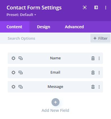
For our design, we are going to keep those and only add one additional field.
- Click “Add New Field” and create a field called “Services”. Then give it a title.
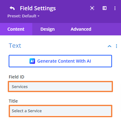
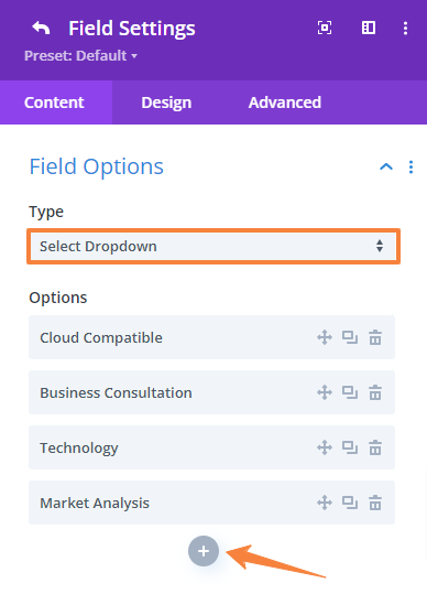
- Next, add dropdown options for different services. Scroll down to Field Options > Type, select “Select Dropdown” as the type, and add services by clicking the grey plus icon.
- Click the back button in the top left corner to return to the main settings panel.
- Now, we’ll move the services field above the message field.
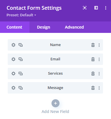
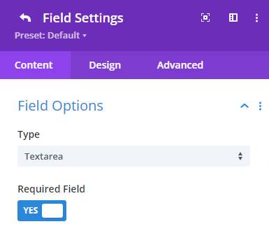
- Now, open the “Message” field setting and change it from “Field Options” to “Textarea”
- Finally, click the back button in the top left corner to return to the main settings panel.
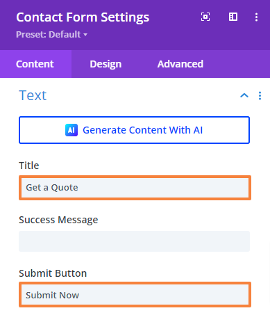
Add Title and Submit Button
- Next, we will add a form title and set the submit button text. Navigate to Content tab > Text setting and make the changes as you like
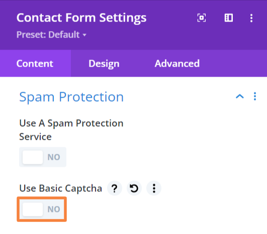
Turn off Spam Protection
- By default the Capcha has been turnd on. Navigate to Content tab > Spam protection and turn off the “Use Basic Capcha” option.
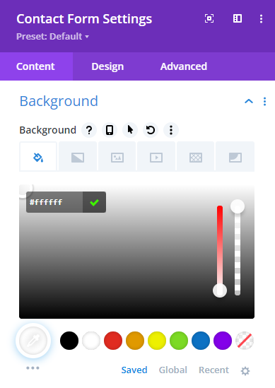
Add Background Color
- From the Content Tab navigate to Background and set your desired background color (Color code: #ffffff).
Now, we will design our form to meet the design requirements. Just make the following changes we have shown below.
Field Design
- Go to the Design tab > Fields and make the following changes there,
Fields background-color: #ffffff
Field text color: #81868b
Field focus background-color: #ffffff
Fielsd focus text color: #81886b
Field padding: 15px (Top and Bottom), 20px (Left and Right)
Field font: DM Sans
Field text size: 16px (Desktop), 15px (Tablet), 14px (Mobile)
Field line-height: 24px (Desktop), 25px (Tablet), 24px (Mobile)
 | 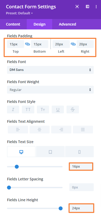 |
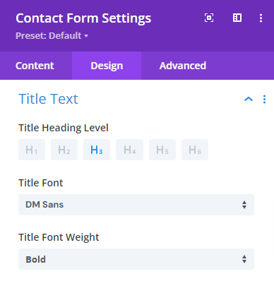
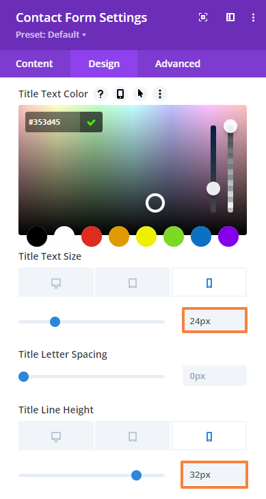
Title Text Design
- Then go to the Design Tab > Title Text and make the following changes there,
Title heading level: H3
Title font: DM Sans
Title font-weight: Bold
Title font color: #353d45
Text size: 32px (Desktop), 28px (Tablet), 24px (Mobile)
Text line-height: 38.4px (Desktop), 38.4px (Tablet), 32px (Mobile)
 |  |
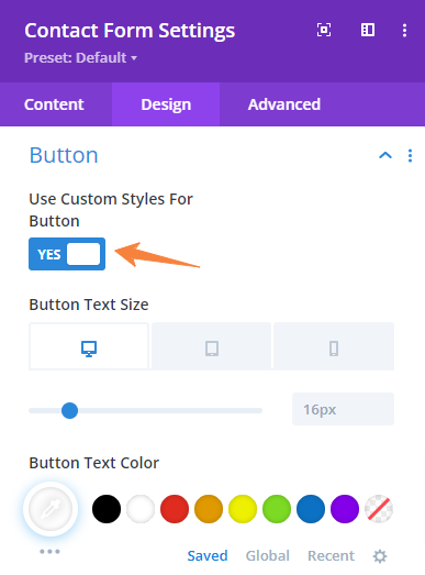
Button Design
- Next, go to the Design Tab > Button and enable the Use Custom Style For Button first. Then make the following changes there,
Button text color: #ffffff
Button background color: #eb8a12
Button letter-spacing: 0.2px
Button font: DM Sans
Button font-weight: Bold
Button padding: 15px (Top and Bottom), 32px (Left and Right)
 |  |
 |  |
Add Spacing
- Next, navigate to the Design tab > Spacing and change the entire padding values as mentioned below.
Top Padding: 36px (Desktop), 25px (Tablet), 15px (Mobile)
Bottom Padding: 36px (Desktop), 25px (Tablet), 15px (Mobile)
Left Padding: 36px (Desktop), 25px (Tablet), 15px (Mobile)
Right Padding: 36px (Desktop), 25px (Tablet), 15px (Mobile)
Add Border
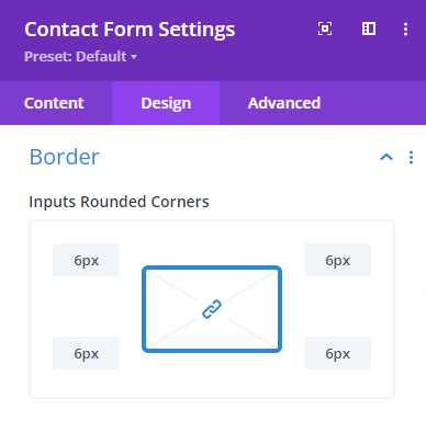
- Next, we will make the input field corner rounded. Navigate to the Design tab > Border and change the value for the input rounded corner to 6px.
- Next, change the input border style to Bottom Border, its width, and color,
Input Bottom Border Width: 2px
Input Bottom Border Color: #f0f4fa
Add CSS
- Finally, we’ll add custom CSS to apply a box shadow to the entire form since the module doesn’t offer this feature. Also, define the border radius. Go to Advanced tab > Custom CSS > Module Element > Main Element, and paste the following code snippet.
box-shadow: 0px 16px 32px rgba(84,104,121,0.06);
border-radius: 8px;
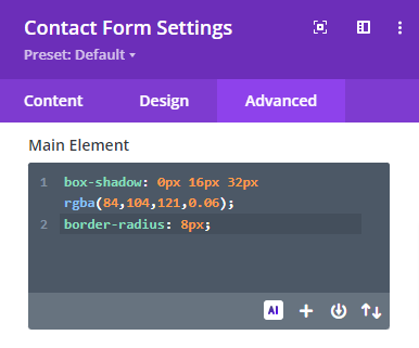
- Save changes and close the settings.
Add Additional Design Elements
According to our design requirements, we will add additional design elements in the middle of the contact information and the contact form. Simply follow the steps below,
- From the row setting, open up the left column setting.
- Scroll down to Background and add the image. Now, make the following changes to fit it rightly,
Background image size: Actual Size
Background image position: Center right
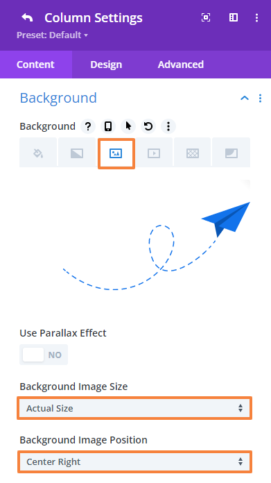
- Save changes and close the Row settings.
Preview the design. This is what our Contact section will look like,
7.9 Save Changes and Preview
In the Divi Builder, you can save your progress by clicking the “Save Draft” button. This option is useful if you want to continue editing later without losing your chances.

Preview the site now by clicking on the “Exit Visual Builder” option at the top,

Design the One Page Divi Website Using a Divi layout
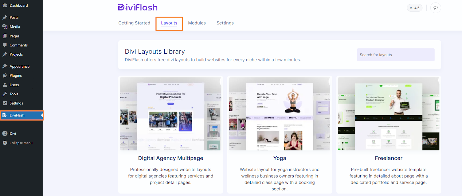
Using a premade Divi layout is one of the easiest ways to create a website with Divi. You just have to import it accordingly and then edit it as you prefer.
DiviFlash offers a huge collection of premade layouts for categories like restaurants, businesses, services, events, and more. You can access all of them for free from here, https://diviflash.com/layouts
Since we are using DiviFlash’s Agency layout, let’s see how can we import this. There are two main ways to import DiviFlash layout,
- Using the Divi layout importer. (You must purchase and install the DiviFlash plugin first)
- Import through Divi library. (You must download the layout from the DiviFlash layout page)
Import the Layout with Divi Layout Importer
- First, purchase and install the DIviFlash plugin from their website. (Check this guide to install the DiviFlash plugin)
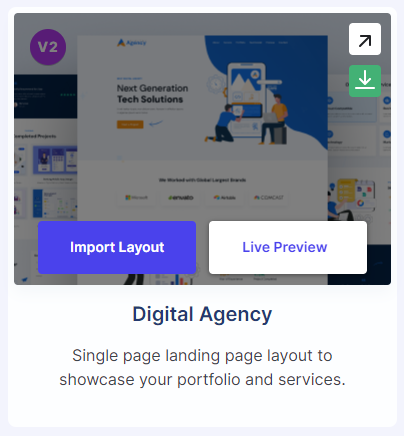
- After activating DiviFlash navigate to DiviFlash > Layouts from the WordPress dashboard.
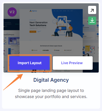
- Next, locate the Agency layout from the list. You’ll see two buttons, “Import Layout” and “Live Preview,” along with two arrows when you hover over the layouts.
- Click “Import Layout” and then click “Start Importing.” (Make sure your server meets the requirements)
- The import process will begin and may take a few minutes to complete. Once finished, a confirmation window will appear.
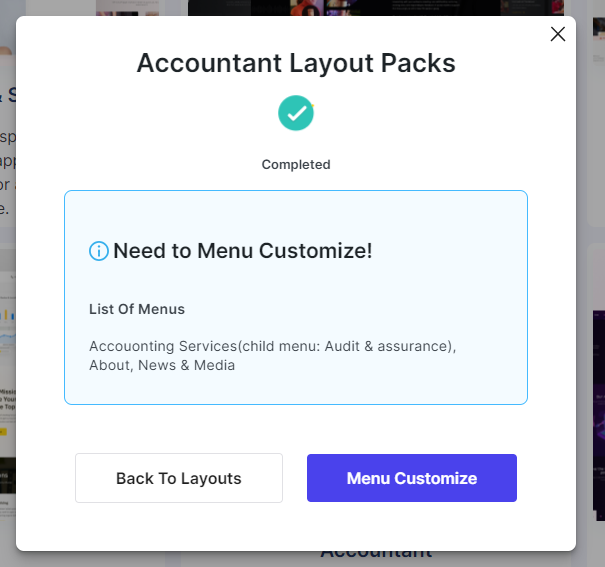
- The layout has been successfully imported. Now you’ll need to customize its menu.
Use and Customize the Layout
Now we have to insert the layout to an existing page. Since we already created our Homepage we will import it there.
- From your WordPress dashboard navigate to Pages > All Pages > Homepage.
- Click on “Edit with The Divi Builder” to open up the Divi Builder.
- From the three options choose “Browse Layouts”
- Click on “Your Saved Layouts” and select the Agency layout we imported earlier.
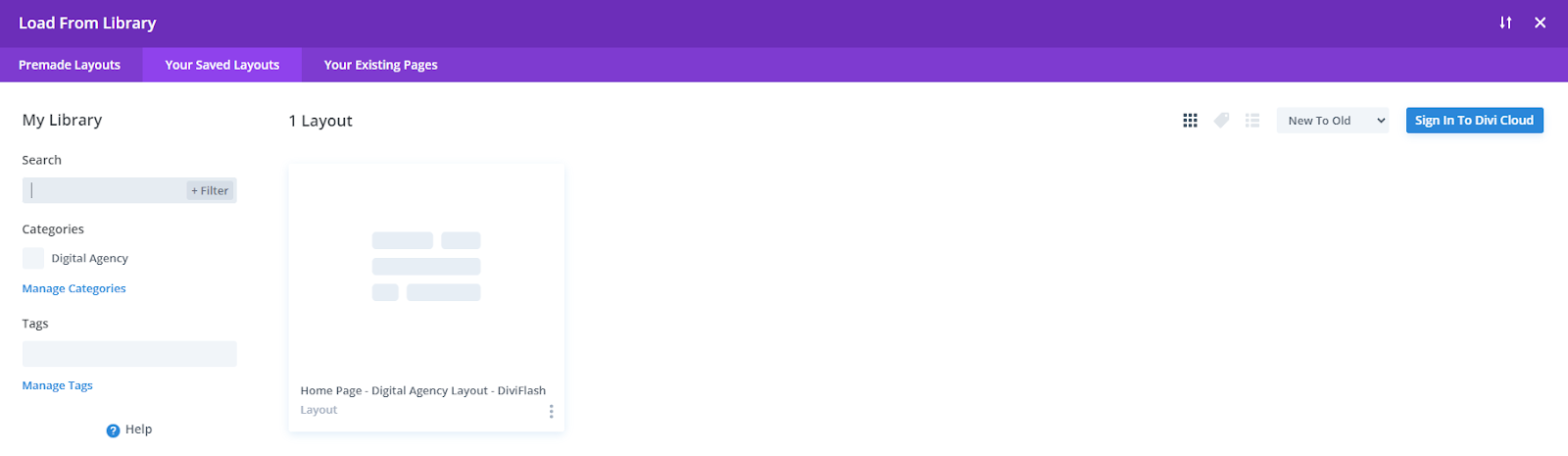
- Finally, click on “Use This Layouts” and you are done. The layout page is ready to be customized using the Divi builder.
Note: If you want to use the layout for free without purchasing DiviFlash, just download it from Diviflash’s layout page and import it through the Divi library. The rest of the process is the same as described above.
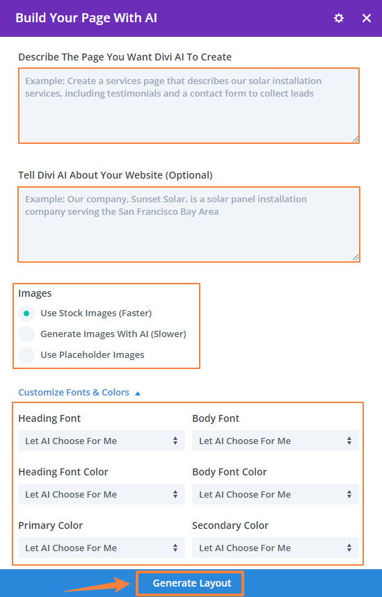
Build the One Page Divi Website with AI
Divi users can design web pages with Divi AI, a powerful tool that generates full pages from a text prompt. You just have to describe the page, provide details, choose fonts and colors, and let Divi AI create the layout, text, and images.
The starting process is the same as we described in the previous section. Start by following the same steps as before,
- Open the Homepage and click on “Edit with Divi.” This time, choose “Build With AI” instead of using premade layouts.
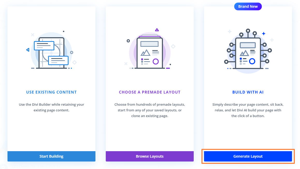
- When the Divi AI dialog box appears, describe your page, add details like your mission statement, and choose your fonts and colors (or let AI choose). Finally, click on “Generate Layout”.
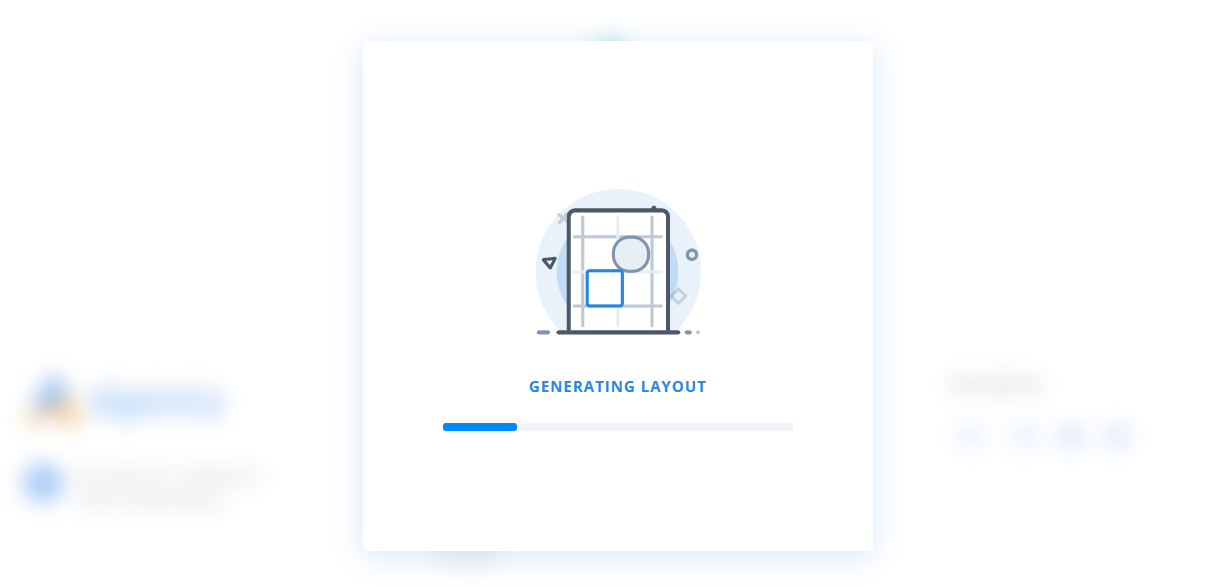
- Divi AI will create the page’s wireframe and add text and images within Divi modules in the next few minutes.
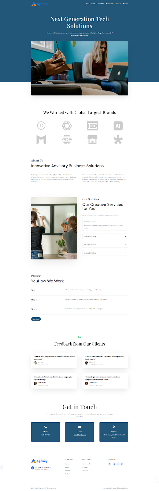
- Once done, you’ll have a fully functional web page ready for editing with the Visual Builder.
This way you can design an entire website also individual sections. Also, you can store all your designs, layouts, sections even modules in Divi Cloud. Later, you can import and export your favorite layouts and place them wherever you want.
Step 8: Create Navigation Menu
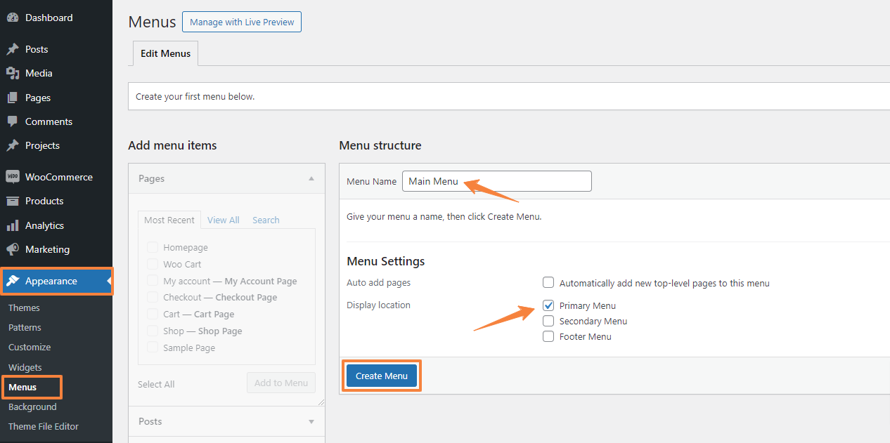
The navigation menu ensures a clear flow of information that your visitors use to navigate your site. To create a menu in Divi,
- Go to Appearance > Menus in the WordPress dashboard.
- Give the menu a name (e.g., Main Menu) and set the display location to Primary
- Click “Create Menu”.
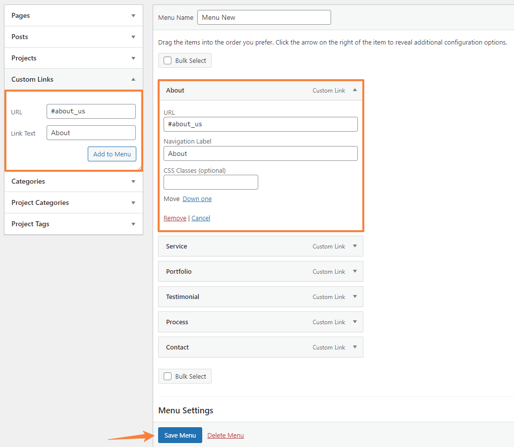
To add menu items, we will use the options in the column on the left. Also, to match our design we will add custom menu items here by clicking on the “Custom Links” tab.
Here you will get two field. In the “URL field” we will paste the section “CSS ID” from the layout and in the “Link Text” field we will enter the menu name.
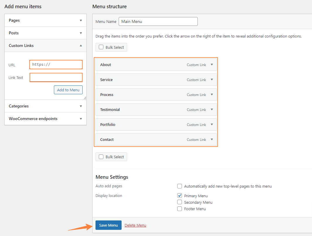
So, here’s how to do it,
- Let’s say we want to add the “About Section” to a menu name called “About”. First, navigate to the About section setting from the builder interface.

- Then navigate to Advanced > CSS ID & Classes. In the CSS ID field enter a unique name.
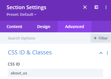
- Copy the CSS ID and paste it into the URL field of Custom Links with a “#” before. Now in the link text enter “About” which will be our menu name.
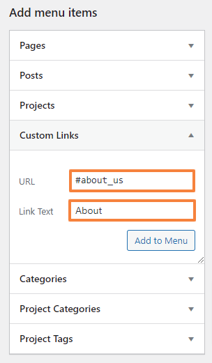
- Click the “Add to Menu” button.
- Repeat the process to add the remaining five menus.
- Finally, click “Save Menu”
This is what our menu structure will look like,
Also read: How to Create Mega Menu in Divi?
Step 9: Customize the Header and Footer in the Theme Builder
The Divi Theme Builder lets you add custom global headers and footers to your pages and posts.
Create a Global Header
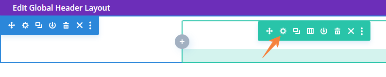
- Navigate to Divi > Theme Builder > Add Global Header.
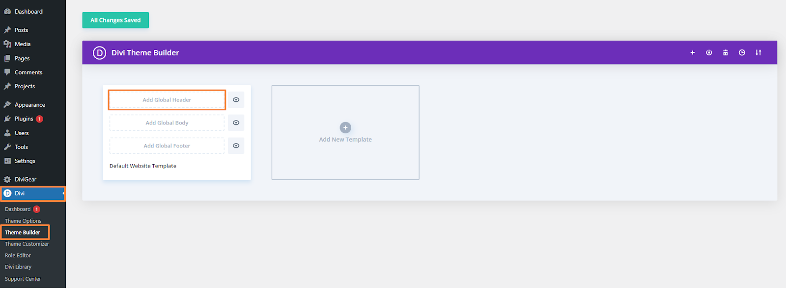
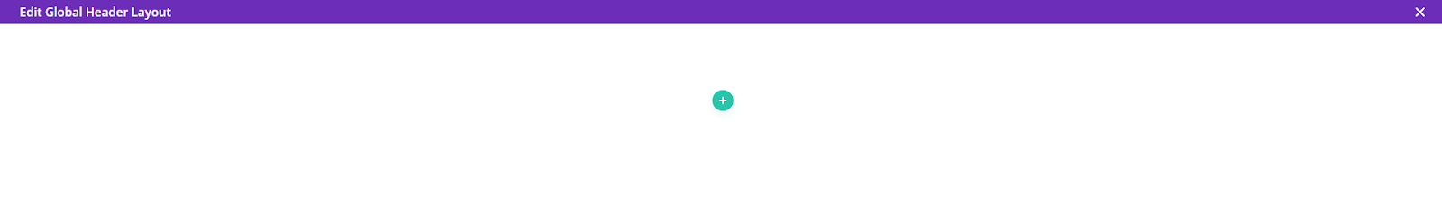
- You will find two options here, and from them choose “Build a global header”

- A blank page will appear just like this. Now we will design the header by adding modules, content, and rows.
Design and Customize the Header
First, add a single column row by clicking on the Green plus icon.
Section Settings
- From the section’s setting, open up the “Background” and set the background color as transparent.

- Now, navigate to the Design tab > Spacing and change the value for top and bottom Padding.
Top padding: 10px (Desktop), 8px (Tablet), 6px (Mobile)
Bottom Padding: 0px
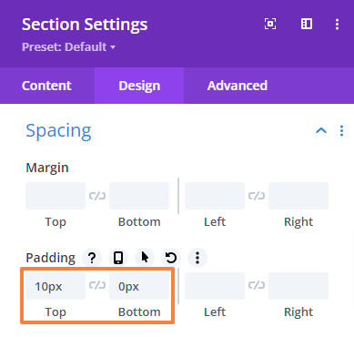
- Save changes and close the Section settings.
Row Settings
- Open the Row setting, go to the Design tab > Spacing and set the top and bottom padding value to “0px”,
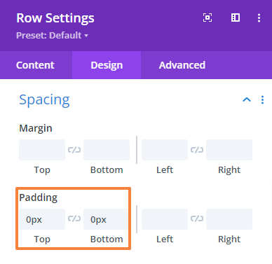
- Save changes and close the row settings.
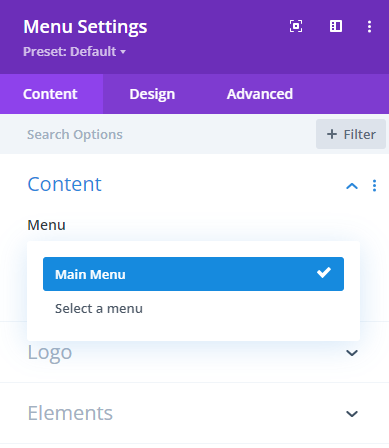
Add Menu
- Now, add the Menu module.
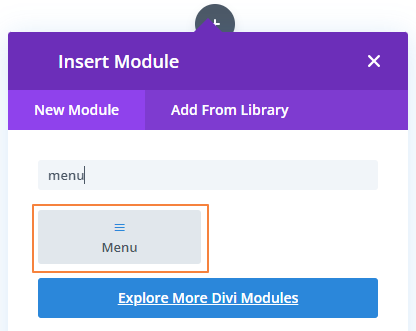
- Then select the menu we created earlier and add the logo from the Logo option.
 |  |
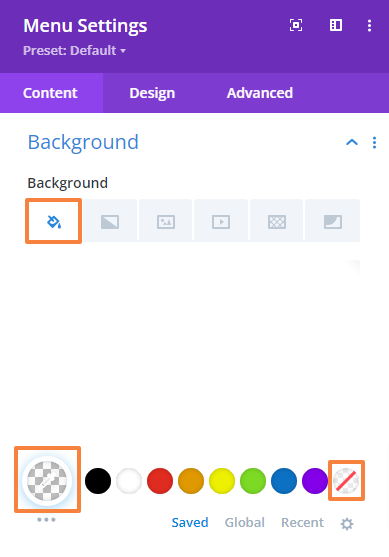
- Now, scroll down to the “Background” option and set the background color as transparent.
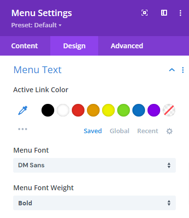
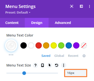
- Next, navigate to the Design tab > Menu Text and make the following changes,
Menu font: DM Sans
Menu font-weight: Bold
Menu Text Color: #ffffff
Menu text size: 16px
Text alignment: Right
- Finally, save changes both from the Visual Builder (bottom right corner) and the Theme Builder (top left corner) and we’re done!
Further Read: How to Create Mega Menu in Divi
Create a Global Footer
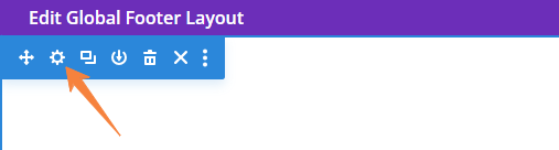
- Navigate to Divi > Theme Builder > Add Global Footer.
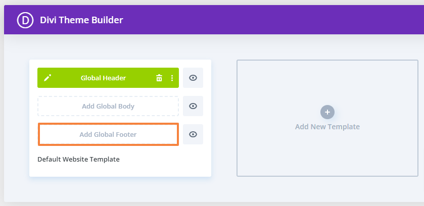
- Similarly, You will find two options here and select the “Build a global footer”
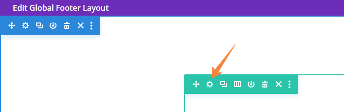
- A blank builder page will appear. Now we will design the footer by adding modules, content, and rows.
Design and Customize the Footer
First, add a four-column row to add our footer content. And then we will add another two column-row to add some additional content.
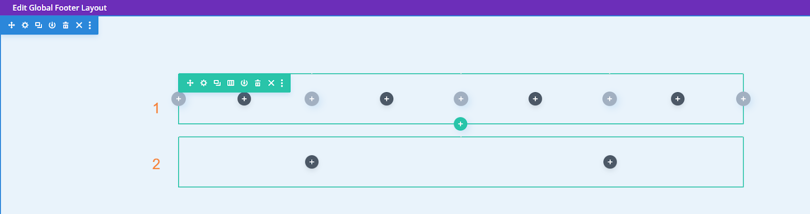
Section Setting:
- From the section’s setting, navigate to the Design tab > Spacing and change the value for top and bottom Padding.
Top padding: 120px (Desktop), 80px (Tablet), 40px (Mobile)
Bottom Padding: 0px (Desktop), 80px (Tablet), 40px (Mobile)
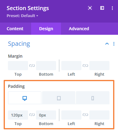
- Save changes and close the Section settings.
Add Main Footer Content
In the first column, we will add the logo using the Image module and the address with an icon using the Blurb module. In the second and third columns, we will add a Quick link (navigation menu) using the Blurb module. Finally, in the fourth column, we will add the social icon using the Social Media Follow module with a heading.
Row Settings:
- Open the Row setting and click on the first column setting. Then go to the Design tab > Spacing and change the top padding value to “0”,
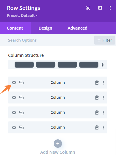
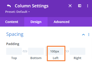
- Click on the back button and open up the second column setting. Then go to the Design tab > Spacing and change the left padding value to “100px”,
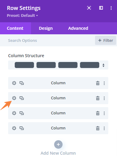
- Click on the back button to get back to the main setting panel.

- Now, navigate to the Design tab > Spacing, and change the top and bottom padding.
Top Padding: 100px (Desktop), 0px (Tablet)
Bottom Padding: 100px (Desktop), 0px (Tablet)
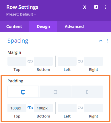
- Save changes and close the row settings.
Add the Logo
- First, add an Image module to the Row.
- In the Image module setting upload or select your image.
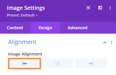
- Now, navigate to the Design Tab > Alignment and make the following changes there,
Image Alignment: Left
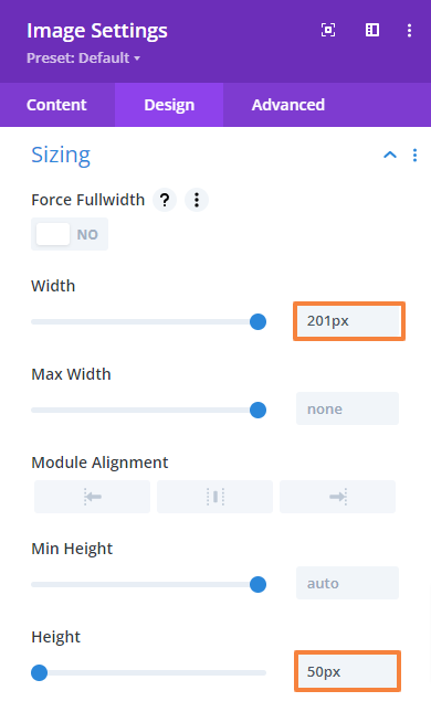
- Now we will adjust the sizing. Simply navigate to the Design Tab > Sizing and make the following changes there,
Width: 201px
Height: 50px
- Next, navigate to the Design Tab > Spacing and change the bottom margin value,
Bottom margin: 40px
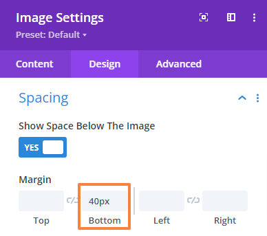
- Save changes and close the Image module settings.
Add the Address
- Now, add a Blurb module just under the previous one.
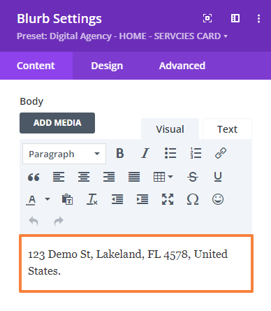
- Open the Blurb module setting. Then add the address in the Body field.
- Scroll down to the ‘Image & Icon’ setting and enable the Use Icon option then select the relevant icon from the list.

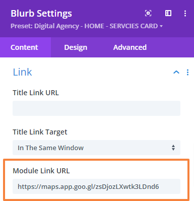
- Again, scroll down to the “Link” setting and put the map link in the Module Link URL field.
- Then go to the Design Tab > Image & Icon and make the following changes there,
Image/Icon color: #ffffff
Image/Icon background color: #1273eb
Image/Icon Placement: Left
Image/Icon width: 16px (Desktop), 14px (Tablet), 13px (Mobile)
Image/Icon rounded corner: 100% each
Image/Icon padding: 10px (Top), 10px (Bottom), 10px (Left), 10px (Right)
| |
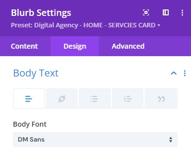
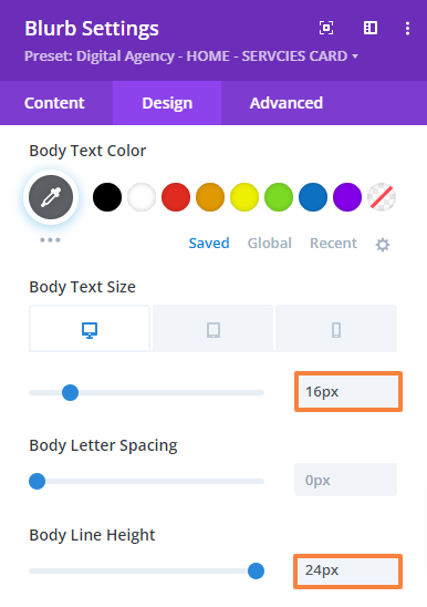
- Then go to the Design Tab > Body Text and make the following changes there,
Body font: DM Sans
Body font-weight: Medium
Body font color: #5e6266
Body font size: 16px (Desktop), 15px (Tablet), 14px (Mobile)
Body line-height: 24px
 |  |
- Next, navigate to the Design Tab > Sizing and make the following changes,
Content width: 100%
Max width: 295px
Module Alignment: Left
- Save changes and close the module settings.
Add Quick Links
In the 2nd and third columns, we will add the quick link which includes the seven inner sections. Since the process is the same for both we will show you only one.
- First, add a Blurb module to the row.
- Open the Blurb module setting > Text. Then add a Title in the Title field.
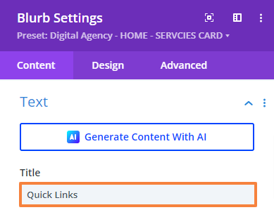
- Scroll down to the Body field. Here, we’ll add our section name and link back to them so users can navigate to the respective section when clicked. Also, choose the list format.
We’ll place four sections in the second column and the remaining three in the third column.
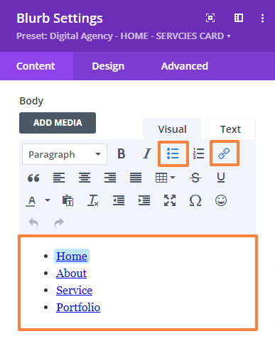
To add the link click link icon. A popup will appear just like the below image. Fill up the information accordingly then press “Ok”.
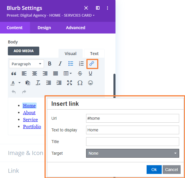
- Scroll down to Image & Icon and delete the default image.
- Then go to the Design Tab > Title Text and make the following changes there,
Title heading level: H6
Title font: DM Sans
Title font-weight: Bold
Title font color: #353d45
Text size: 16px
Text line-height: 19.2px
 | 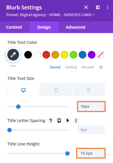 |
- Then go to the Design Tab > Body Text > Link and make the following changes there,
Link font: DM Sans
Link text color: #546879
Link text size: 16px (Desktop), 15px (Tablet), 14px (Mobile)
Link line-height: 24px
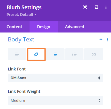 | 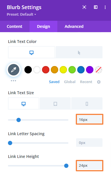 |
- Again go to the Design Tab > Body Text > List and make the following changes there,
Unordered list font: DM Sans
Unordered list text color: #5e6266
Unordered list text size: 16px (Desktop), 15px (Tablet), 14px (Mobile)
Unordered list line-height: 24px
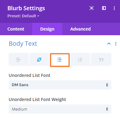 | 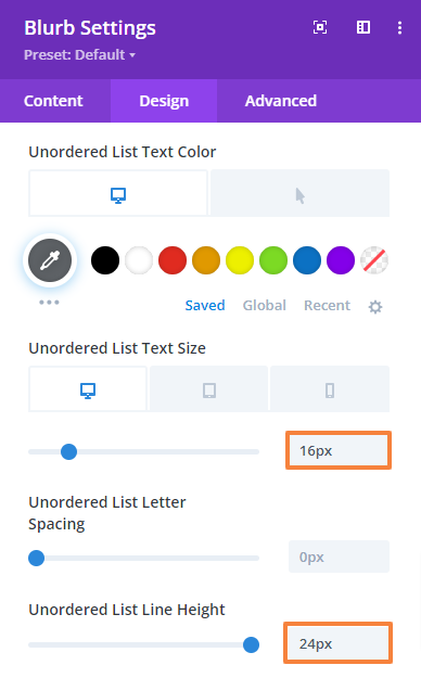 |
- Next, navigate to the Design Tab > Sizing and make the following changes,
Content width: 100%
- Now, navigate to the Advanced tab > Custom CSS > Free Form CSS and add the following CSS code,
.footer_blurb .et_pb_blurb_description ul {
padding-bottom: 0px;
}
.footer_blurb .et_pb_blurb_description ul li{
padding-bottom: 16px;
}
.footer_blurb .et_pb_blurb_description ul li:last-child{
padding-bottom: 0px;
}
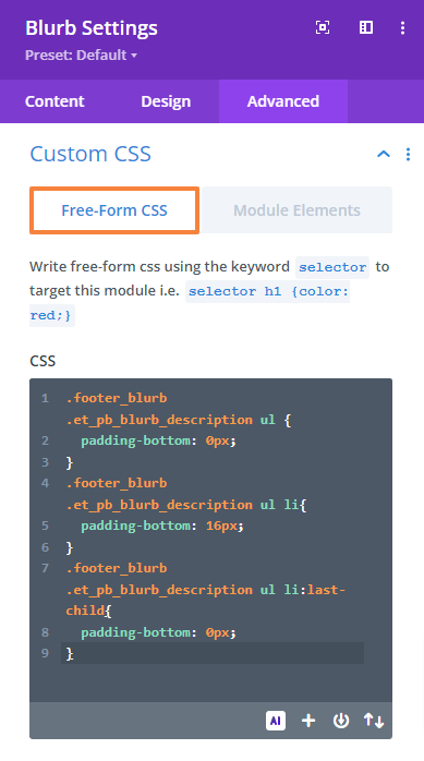
- Then, navigate to the Advanced tab > Custom CSS > Module Element > Blurb Title and paste the following code,
padding-bottom: 30px;
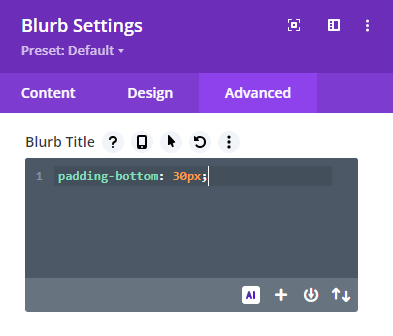
- Finally, navigate to the Advanced tab > CSS ID & Classes and define the CSS class,
CSS Class: footer_blurb
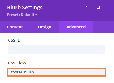
- Save changes and close the module settings.
- Follow the same process and add the remaining three Quick link sections in the third column.
Add Social Icon Heading
- Click on the Gray plus icon and add a Text module in the fourth column.
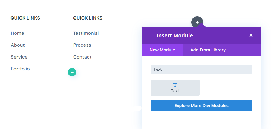
- Open the Text module setting and add your text there in the body.
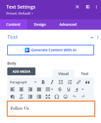
- Then go to the Design Tab > Text and make the following changes there,
Text font: DM Sans
Text font-weight: Bold
Text Font Weight: All Capital
Text font color: #353d45
Text size: 16px
Text line-height: 19.2px
Text alignment: Left
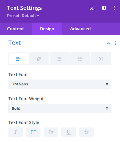 | 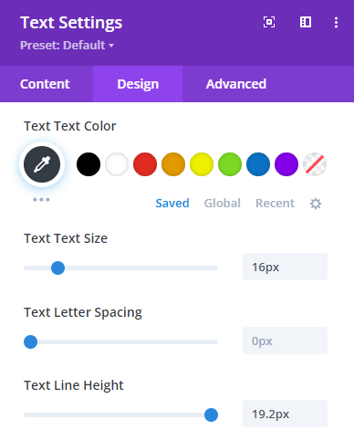 |
- Then go to the Design Tab > Spacing and change the bottom margin value,
Bottom margin: 24px
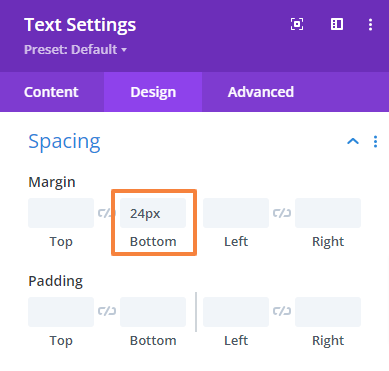
- Save changes and close the module settings.
Add Social Icon Heading
- Click on the Gray plus icon and add a “Social Media Follow” module just below the previous one.
- Open the module setting. By default, you will get 2 social networks (Facebook, X). For our design requirements, we will add two more (YouTube, and Instagram).
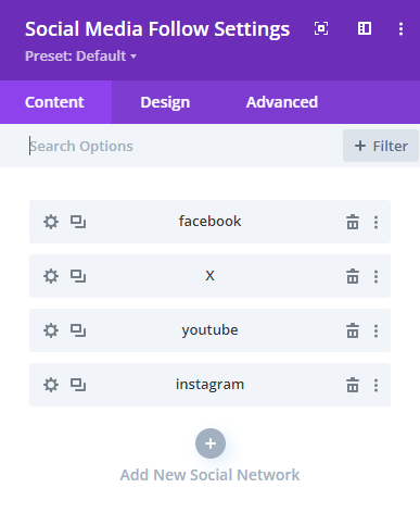
- Next, click on the setting option for individual social networks.
- Now from the Network setting set the social network from the dropdown option. For Facebook set the social network to “Facebook”.
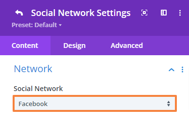
- Scroll down to the Background option and set the background color (Color code: #f0f4fa) for each
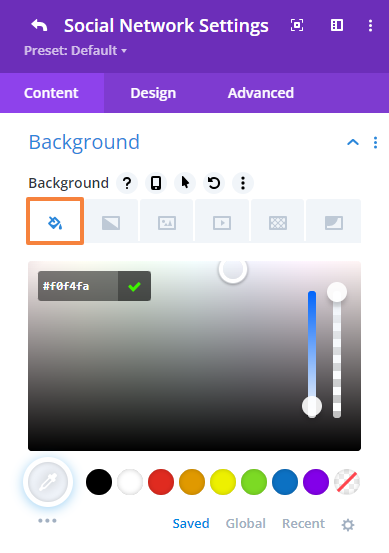
- Next, navigate to the Design tab > Icon and set the icon color as follows,
For Desktop: #1273eb
On Hover: #ffffff
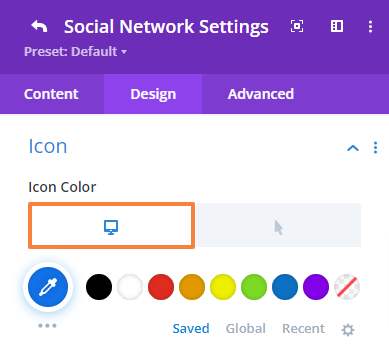 | 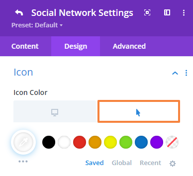 |
- Next, navigate to the Design tab > Spaicng and change the right Margin value.
Right Margin: 10px
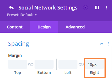
- Next, navigate to the Design tab > Border and change the rounded corner value.
Right corner: 50px
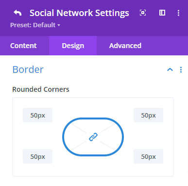
- Click on the back button.
- Apply the same setting for the rest of the three social networks respectively.
- Now navigate to the Advanced tab > Custom CSS > Module Elements and paste the following code to the “Social Follow” and “Social Icon” fields shown in the image below.
Social Follow: margin-bottom: 0px;
Social Icon: Padding:5px;
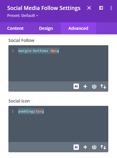
- Save changes and close the module settings.
Add Copyright and Privacy Section
First, we will add a two-column row with a separator by clicking the green plus icon. The left column will hold the copyright text, and the right column will display the policy terms and support text, both using the text module.
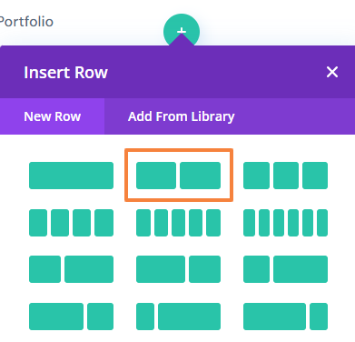
Row Settings
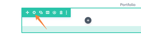
- Open the Row setting and click on the first column setting. Then go to the Design tab > Spacing and change the top padding value to “0”,
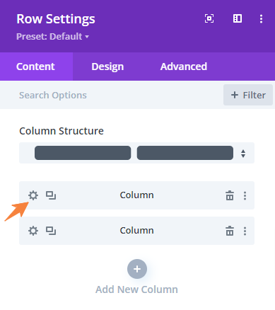
- Click on the back button and open up the second column setting. Then go to the Design tab > Spacing and change the left padding value to “100px”,
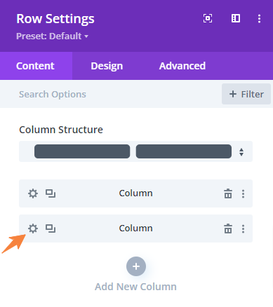
- Click on the back button to get back to the main setting panel.
- Now, navigate to the Design tab > Spacing, and change the top margin and top and bottom padding values,
Top Margin: 120px
Top Padding: 24pxpx
Bottom Padding: 24px
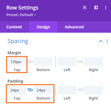
- Next, navigate to the Design tab > Border, and apply the top border to separate the row from the previous one,
Border style: Top
Top Border width: 2px
Top border color: #f0f4fa
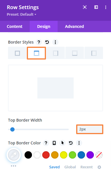
- Save changes and close the row settings.
Add the Copyright text
- In the left column add a text module.
- Open the Text module setting and add your text in the Body.
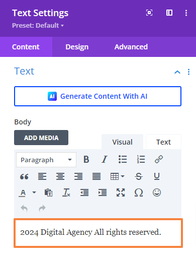
- Then go to the Design Tab > Text and make the following changes there,
Text font: DM Sans
Text font color: #5e6266
Text size: 16px (Desktop), 15px (Tablet), 14px (Mobile)
Text line-height: 24px
Text alignment: Left
Text Color: Dark
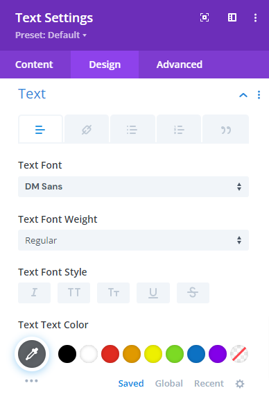 | 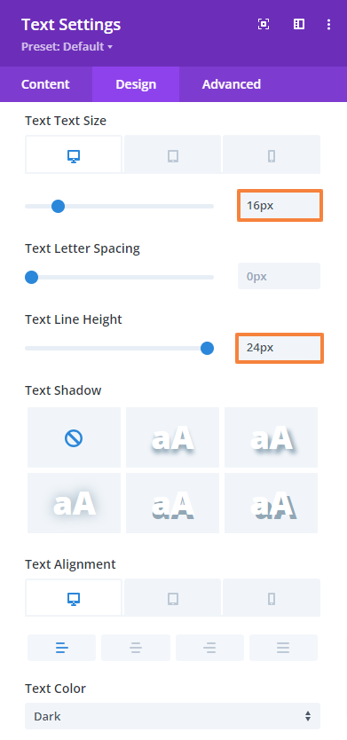 |
- Save changes and close the module settings.
Add the Policy, Terms, and Support Text
- In the right column add another text module.
- Open the Text module setting and add your text in the Body. Also, link back to them exactly as shown in the “Add Quick Links” section,
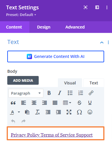
- Then go to the Design Tab > Text and make the following changes there,
Text font: DM Sans
Text font color: #5e6266
Text size: 16px (Desktop), 15px (Tablet), 14px (Mobile)
Text line-height: 24px
Text alignment: Right
Text Color: Dark
| 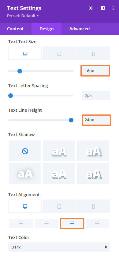 |
- Then open up the link option and make the following changes there,
Link text color: #5e6266
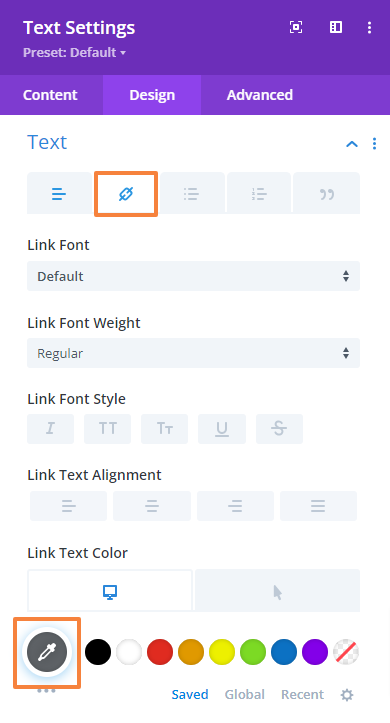
- Finally, open up the spacing setting and set the bottom margin value to “0”
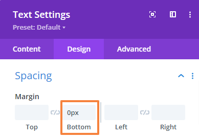
- Save changes and close the module settings.
- Finally, save changes both from the Visual Builder (bottom right corner) and the Theme Builder (top left corner) and we’re done!
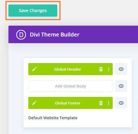
This is what our Footer will look like,
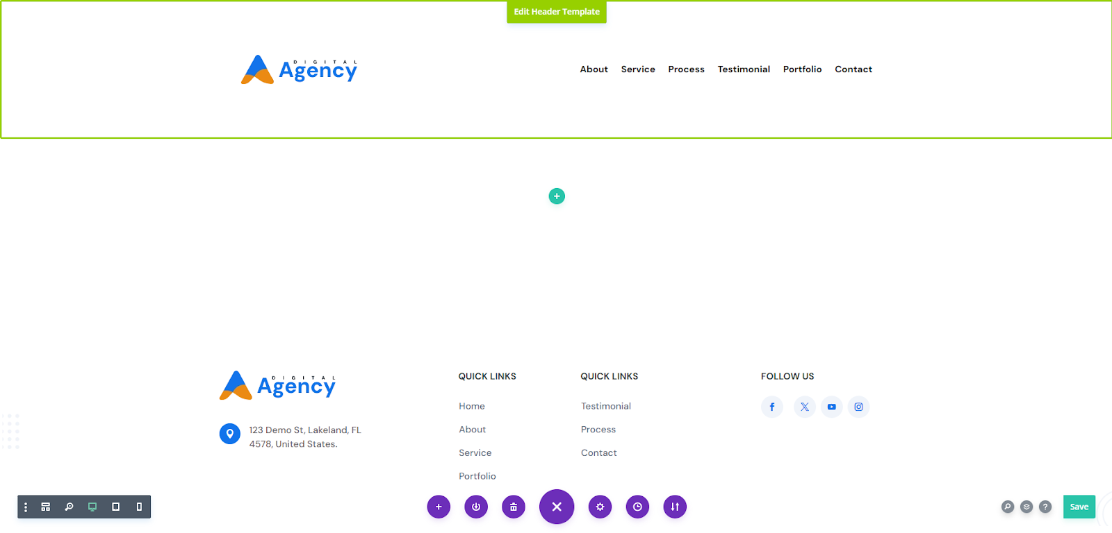
Step 10: Install Essential Plugins
While Divi is powerful on its own, plugins can significantly boost performance, SEO, and user experience. Installing additional plugins can enhance the functionality and performance of your one-page Divi website.
Key plugin categories include SEO plugins for better search engine visibility, performance plugins to speed up your site, eCommerce plugins for online stores, security plugins to protect against threats, form plugins for creating professional forms, dedicated Divi plugins, and more.
You can also check our best WordPress plugins article for specific recommendations.
Step 11: Publish Your Divi Website
When you’re ready to make your site live, click the Publish button located in the bottom right corner of the builder interface. This action will make your page accessible to the public.

Once published, exit the Visual Builder to view your live page. You can do this by clicking the “Exit Visual Builder” button at the top of the screen.
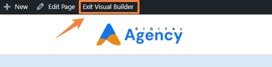
Note: Before publishing your Divi site, we recommend going through this website launch checklist to ensure everything is okay.
Step 12: Ongoing Maintenance & Optimization
A website is a living entity that requires ongoing care and attention. Once your Divi one-page website is live, it’s crucial to maintain and optimize it for optimal performance, security, and user experience.
Here are some key aspects to focus on:
- SEO: Monitor performance and update keywords, meta descriptions, and headings to maintain rankings. Check out our Divi SEO guide for tips.
- Regular Backups: Automate backups with plugins like UpdraftPlus to protect your site from data loss.
- Security Updates: Keep WordPress, Divi, and plugins updated to secure against vulnerabilities. Enable automatic updates if possible.
- Performance Monitoring: Use tools like Google PageSpeed Insights to improve speed by optimizing images, enabling caching, and using a CDN.
- Content Updates: Keep your site fresh by adding new content, case studies, or blog posts to engage visitors and attract clients.
- Analytics Review: Track traffic and engagement with Google Analytics to make data-driven improvements.
You can check our detailed article on the WordPress website maintenance checklist to keep your website up-to-date and running smoothly.
Final Thoughts
This was all about how to build a single page website with Divi. If you follow the step-by-step guide you will have a functional one-page Divi website.
While this guide provides a solid foundation, Divi offers endless possibilities for customization and experimentation. Don’t be afraid to explore different layouts, color schemes, and content formats to find your unique style.
If you need any further assistance regarding the creation process, just let us know in the comment section.
FAQs
What Is a One-Page Website?
A one-page website is a single web page that contains all the content and navigation of the site, usually divided into sections that users can scroll through.


0 Comments