This guide will help you enable the DiviFlash Popup extension, create your first popup, and design it using intuitive builder tools. Follow the steps below to get started!
Version Update: Popup extension got some update on version 1.4.7. Make sure your plugin is updated to access those features.
Enable the Popup Feature
- Go to your WordPress Dashboard.
- Navigate to DiviFlash → Settings.
- Scroll down to the Popup Enable option and toggle it ON.
👉 Once enabled, a new DF Popups menu will appear in your dashboard for quick access.
Create a New Popup

- Click on DF Popups → Add New.
- Choose your preferred builder:
- Standard Editor – Best for simple, text-based popups (ideal for quick edits).
- Divi Builder (Recommended) – Unlock full design flexibility with drag-and-drop modules.
👉 If you select Divi Builder, the visual editor will open, allowing you to design your popup in real time.
Designing Your Popup
Using the Divi Builder
- Click “Use The Divi Builder” to switch to the Divi Builder.
- You will be redirected to the Edit Popup page.
- Choose your preferred editing mode:
- Wireframe View – For a structured, backend layout.
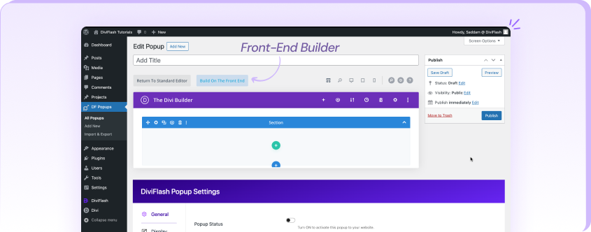
- Front-End Builder (Recommended) – For a real-time, visual editing experience.
- To use the Front-End Builder, click “Build On The Front End”.
Customizing Your Popup

Once inside the Divi Builder, you can design your popup using:
- Default Divi modules for a standard design.
- DiviFlash modules to enhance your popup with advanced elements tailored for Divi websites.
DiviFlash Popup Settings
From the Standard Editor or the Edit Popup page, scroll down to find the DiviFlash Popup Settings panel. Here, you can configure your popup using four main tabs:
- General – Control activation, triggers, and scheduling.
- Display – Manage where and how the popup appears.
- Design – Customize the popup’s appearance.
- Cookie – Set cookie-based behavior.
🔹 General Settings

- Popup Status – Enable this option to activate the popup.
- Popup Target ID – A unique ID generated to trigger the popup using a hyperlink (e.g., link it to a button or module).
- Trigger Type – Choose from 6 different trigger types to define how the popup appears.
- CSS Selector – Set a CSS class or ID to trigger the popup when clicked. (Only available if “Click” is selected as the Trigger Type.)
- Delay – Set a delay (in seconds) before the popup appears after page load. (Only available if “On Load” is selected.)
- Scrolling Trigger Offset – Define how far the user must scroll (in pixels or percentage) before the popup appears. (Only available if “On Scroll” is selected.)
- Scroll to Element Trigger Position – Choose where the popup should appear relative to a scrolling element (e.g., when the element reaches the top of the screen). (Only available if “Scroll to Element” is selected.)
- Scroll to Element Trigger Selector – Enter a CSS selector for the element that, when scrolled to, will trigger the popup. (Only available if “Scroll to Element” is selected.)
- Inactivity Duration – Set the idle time (in seconds) before the popup appears due to inactivity. (Only available if “On Inactivity” is selected.)
- Display Schedule – Choose when the popup should appear:
- Always
- During a specific time frame
- On a recurring schedule
- Start From – Set the start date & time for the popup. (Only available if “Date and Time” is selected.)
- Ends At – Set the end date & time for the popup. (Only available if “Date and Time”” is selected.)
- Recurring – Select which days of the week the popup should repeatedly appear. (Only available if “Recurring” is selected.)
- Closing CSS Selector – Define a CSS class or ID that will close the popup. Use this class or ID on anything to trigger close action for popup.
- Prevent Page Scroll – Disable page scrolling when the popup is visible.
- Popup Content Scroll – Enable scrolling inside the popup content if require.
🔹 Display Settings
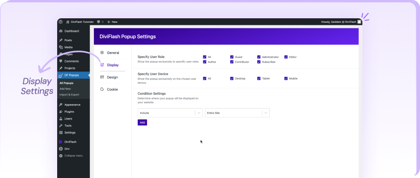
- Specify User Role – Choose which user roles (e.g., Administrator, Editor, Subscriber) should see the popup.
- Specify User Device – Select which devices (Desktop, Tablet, or Mobile) will display the popup.
- Condition Settings – Define conditions to include or exclude specific pages, posts, or other elements of your website.
👉 By default, one condition is set which is entire site. You can add multiple conditions for advanced targeting.
🔹 Design Settings

- Popup Position – Choose where the popup will appear on the screen.
🎭 Animation Settings
- Animation Style – Select from 8 preset animation styles for the popup reveal.
- Animation Duration – Set the speed of the animation.
- Animation Delay – Define a delay (in milliseconds) before the animation starts.
- Animation Timing Function – Control the easing effect for smoother animations.
- Close Animation – Enable a closing animation when the popup is dismissed.
- Close Animation Style – Choose from 8 preset closing animations.
- Close Animation Duration – Set the speed of the close animation.
- Close Animation Timing Function – Control the easing effect for smoother animations.
🎨 Overlay & Background
- Overlay Background Color – Set the solid color of the popup overlay.
- Overlay Background Gradient – Select gradient colors and choose a gradient type.
❌ Close Button Settings
- Hide Close Button – Disable the close button for the popup.
- Close Button Position – Set the close button’s position in 8 different places outside the popup.
- Move Close Button Inside Popup – Place the close button inside the popup container.
- Close Button Position (Inside Popup) – Choose where the button appears inside the popup (only available if the close button is moved inside).
- Close Button Design – Customize the color, icon, spacing, and border of the close button. (Reveals additional customization options when enabled.)
🖱️ Popup Interaction
- Clickable Outside Popup Area – Allow users to interact with content outside the popup.
- Close On Overlay Click – Close the popup when users click on the overlay or outside the popup.
🔹 Cookie Settings

🍪 Cookie Activity – Define how often the popup appears for each user:
- Never – The popup will display unlimited times for the same user.
- Per Period – The popup will show once per defined period (e.g., per hour, day, or month).
- Once Only – The popup will only appear once per user, then never show again.
⏳ Period Settings (Available only if “Per Period” is selected)
- Period Type – Choose between Hour, Day, or Month.
- Period Value – Set the duration for how often the popup should reappear.
📌 Note: The period settings are only available when “Per Period” is selected as the Cookie Activity option.
Final Thoughts
Need help? We’ve got you covered!
💬 Submit a comment on this documentation if you have feedback or questions.
🗨️ Chat with our support team—just click the chat icon for instant assistance.
📩 Still stuck? Click the support button to open a popup form titled “Still stuck? How can we help?” and let us know what you need!We’re here to help you get the most out of DiviFlash Popups! 🚀