The DiviFlash Breadcrumbs module provides a navigation path that helps users understand their location within your website structure.
Let’s see the settings in brief and how to make better use of it —
Content Tab
This tab contains the essential settings for configuring the breadcrumb navigation.
Home Link
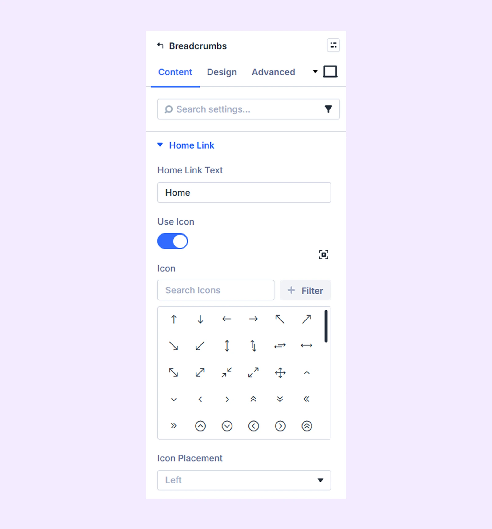
- Home Link Text: Enter the text that links to the homepage.
- Use Icon: Enable this option to display an icon alongside the home link text.
- Icon Placement: Choose whether the icon appears on the left or right side of the link text.
Separator
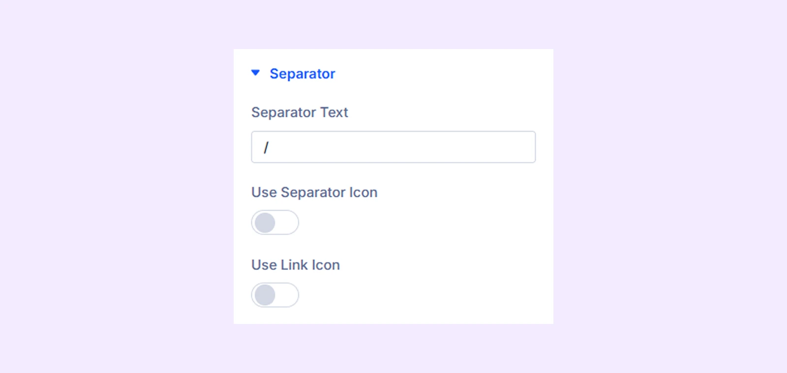
- Separator Text: Enter the text that will be used as the separator between breadcrumb items.
- Use Separator Icon: Enable this option to display an icon instead of text as the separator.
- Use Link Icon: Enable this option to display clickable icons for breadcrumb links, allowing users to directly navigate to the corresponding pages.
Breadcrumb Settings
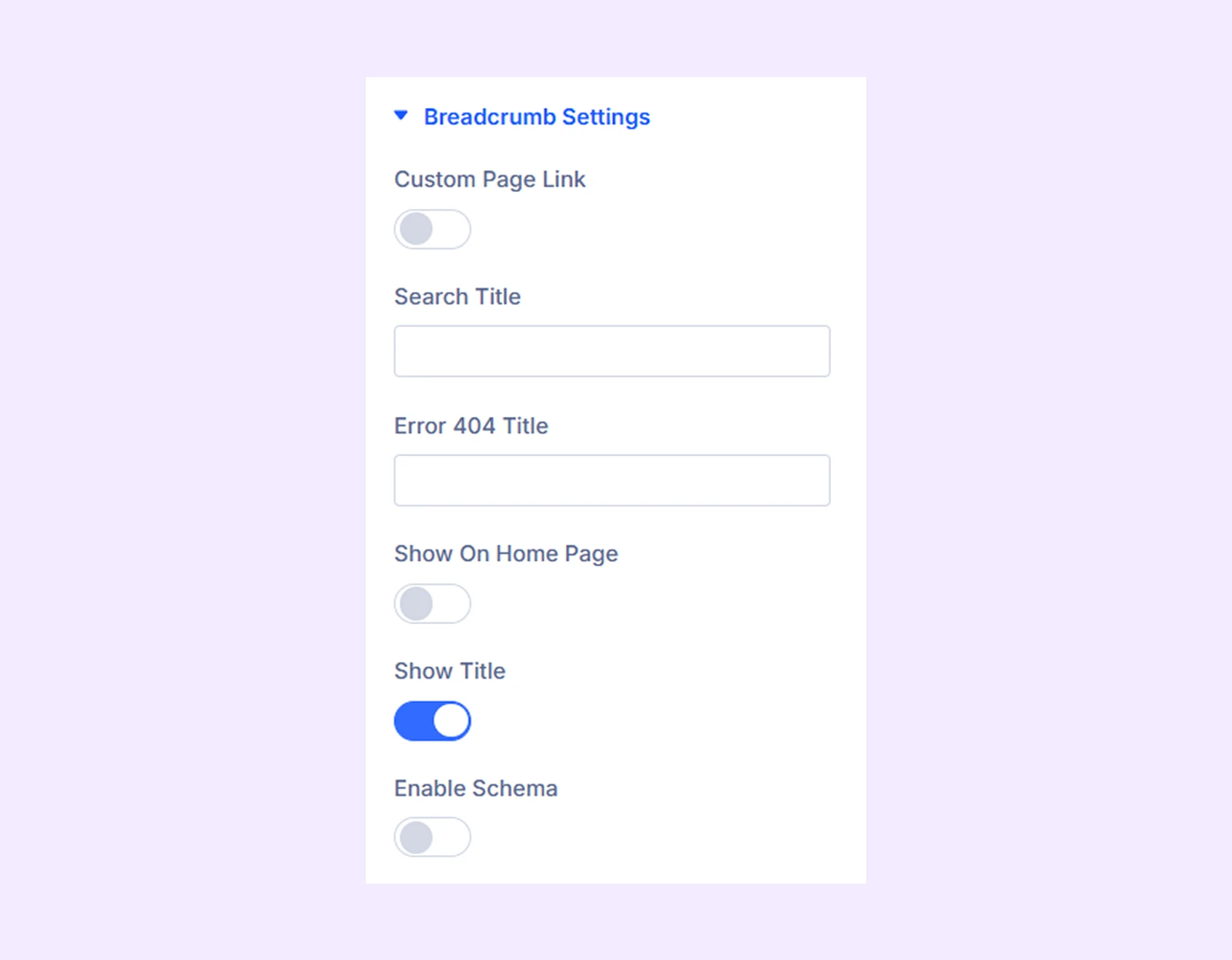
- Custom Page Link: Enable this option to add a custom page at the end of the breadcrumb.
- Page Link Text: Enter the text for the custom page link.
- Use Page URL: Enable this option to use a custom URL for the page link.
- Page URL: Enter the URL for the custom page.
- Page URL Target: Choose whether the custom page opens in the same tab or a new tab.
- Search Title: Enter the title that will appear in the breadcrumb for search result pages.
- Error 404 Title: Enter the title that will appear in the breadcrumb on 404 error pages.
- Show On Home Page: Enable this option to display the breadcrumb on the homepage.
- Show Title: Enable this option to display the current page title in the breadcrumb.
- Enable Schema: Enable this option to add structured schema markup for the breadcrumb navigation.
Background: Add a background color, gradient, image, video, pattern, or mask to the module.
Element Label: Rename the module to organize it more easily in the Divi Builder. (Only you can see this label.)
Design Tab
Use this tab to customize the visual appearance of the Breadcrumbs module.
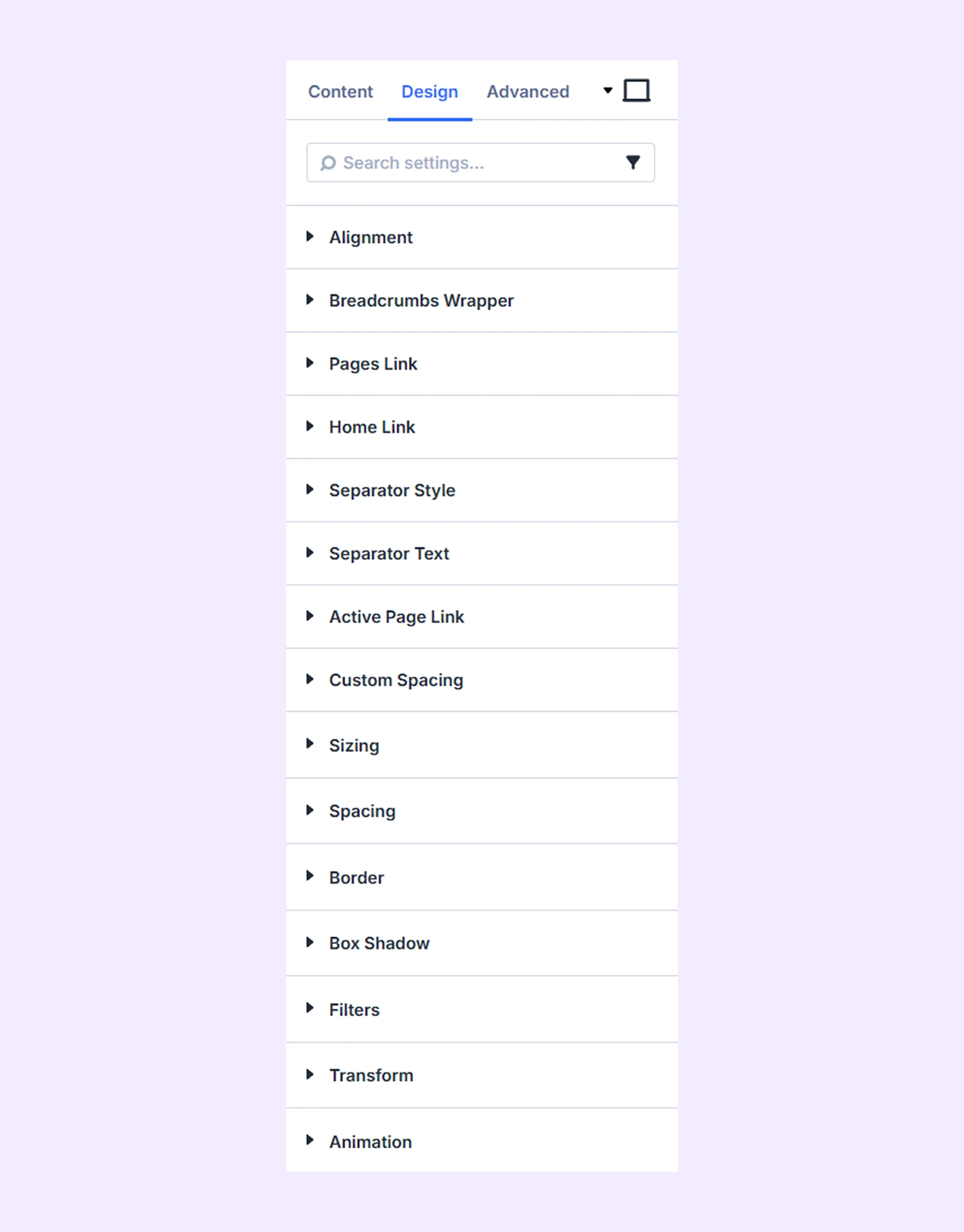
Alignment: Adjust the horizontal alignment of the breadcrumb navigation.
Breadcrumbs Wrapper: Customize the background and border of the breadcrumb wrapper.
Pages Link: Customize the background, typography, and border of breadcrumb page links.
Home Link: Customize the background, typography, and border of the homepage link.
Separator Style: Customize the background and border of the breadcrumb separator icon.
Separator Text: Customize the typography settings for the separator text.
Active Page Link: Customize the background, typography, and border of the active breadcrumb page.
Custom Spacing: Add custom margins and padding to individual breadcrumb elements.
Sizing: Adjust the width, height, and alignment of the module.
Spacing: Adjust the margins and padding of the module container.
Border: Customize the border using radius, style, width, and color settings.
Box Shadow: Add shadow effects to the module container.
Filters: Apply color filter effects to the module.
Transform: Adjust the scale, position, rotation, and size of the module.
Advanced Tab
This tab provides additional settings for advanced users who want greater control over the module with custom code, conditions, and more.
Need Help?
If you have any questions or need assistance, contact our support team: [email protected]