
Animated Navigation module, introduced in DiviFlash 5.3.0, lets you create dock or island-style navigation with icons, images, labels, separators, tooltips, and more.
Important Note: Animated Navigation module is built for Divi 5 only. Also, it will be disabled by default and to use it, you must enable it manually. Refer to our guide for step-by-step instructions.
Let’s see the settings in brief and how to make better use of it —
Content Tab
The Content tab contains the essential settings for adding navigation items and controlling the behavior of the animated navigation.
Add New Navigation Item
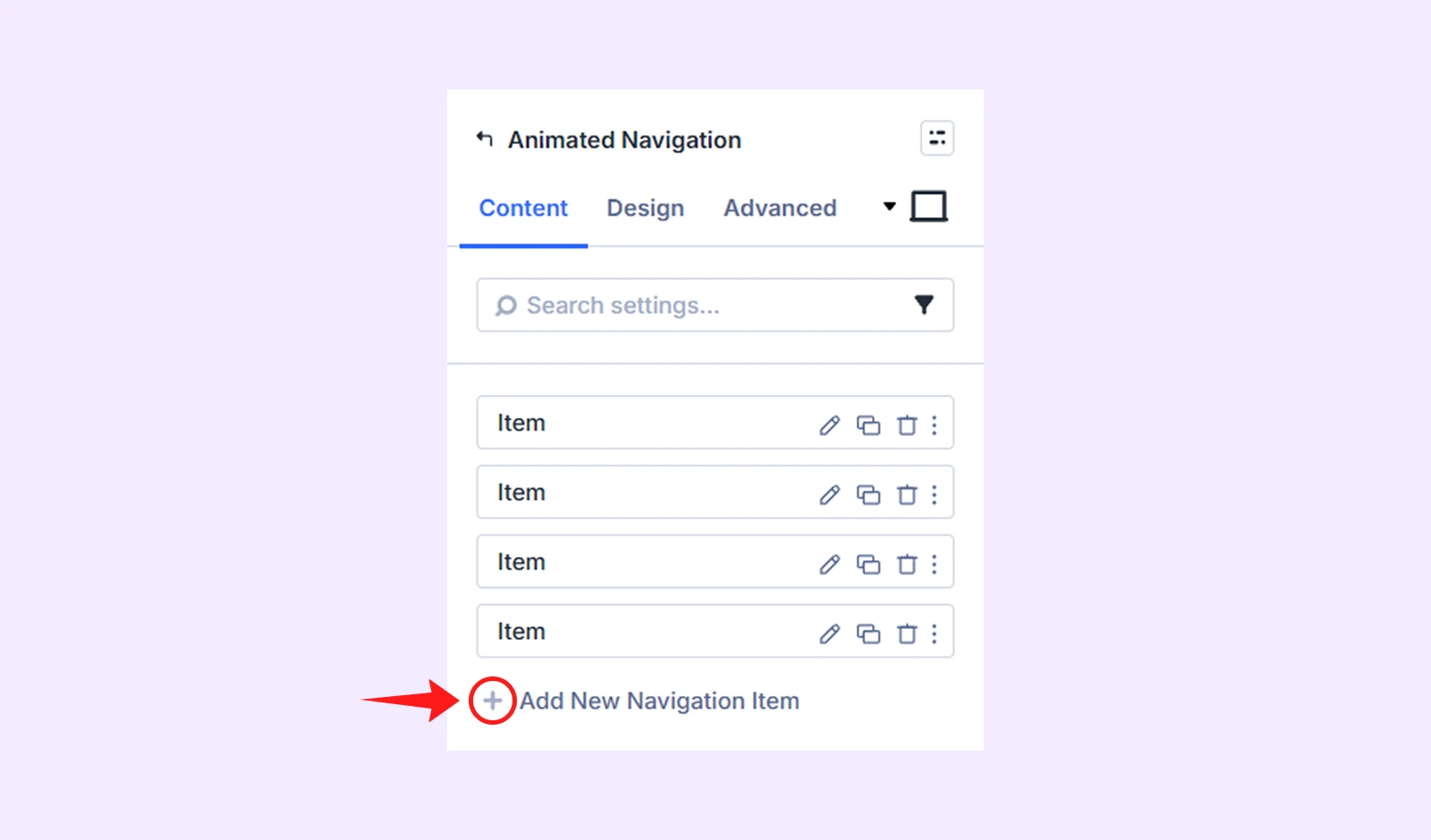
By default, the module includes four navigation items that you can edit or delete. Click Add New Navigation Item to create additional items. Each navigation item has its own settings. To learn more about them, check the Animated Navigation Child Item Settings section below.
Navigation Settings
- Type: Choose the navigation container style between Island and Dock.
If you chose Dock:
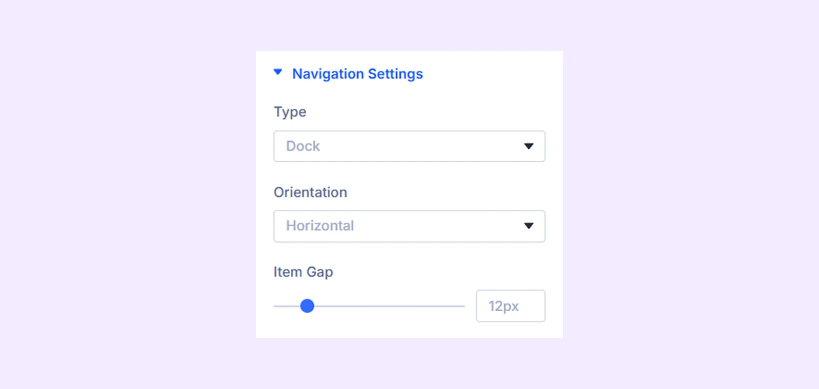
- Orientation: Display the navigation horizontally or vertically.
- Item Gap: Adjust the spacing between navigation items.
If you choose Island:
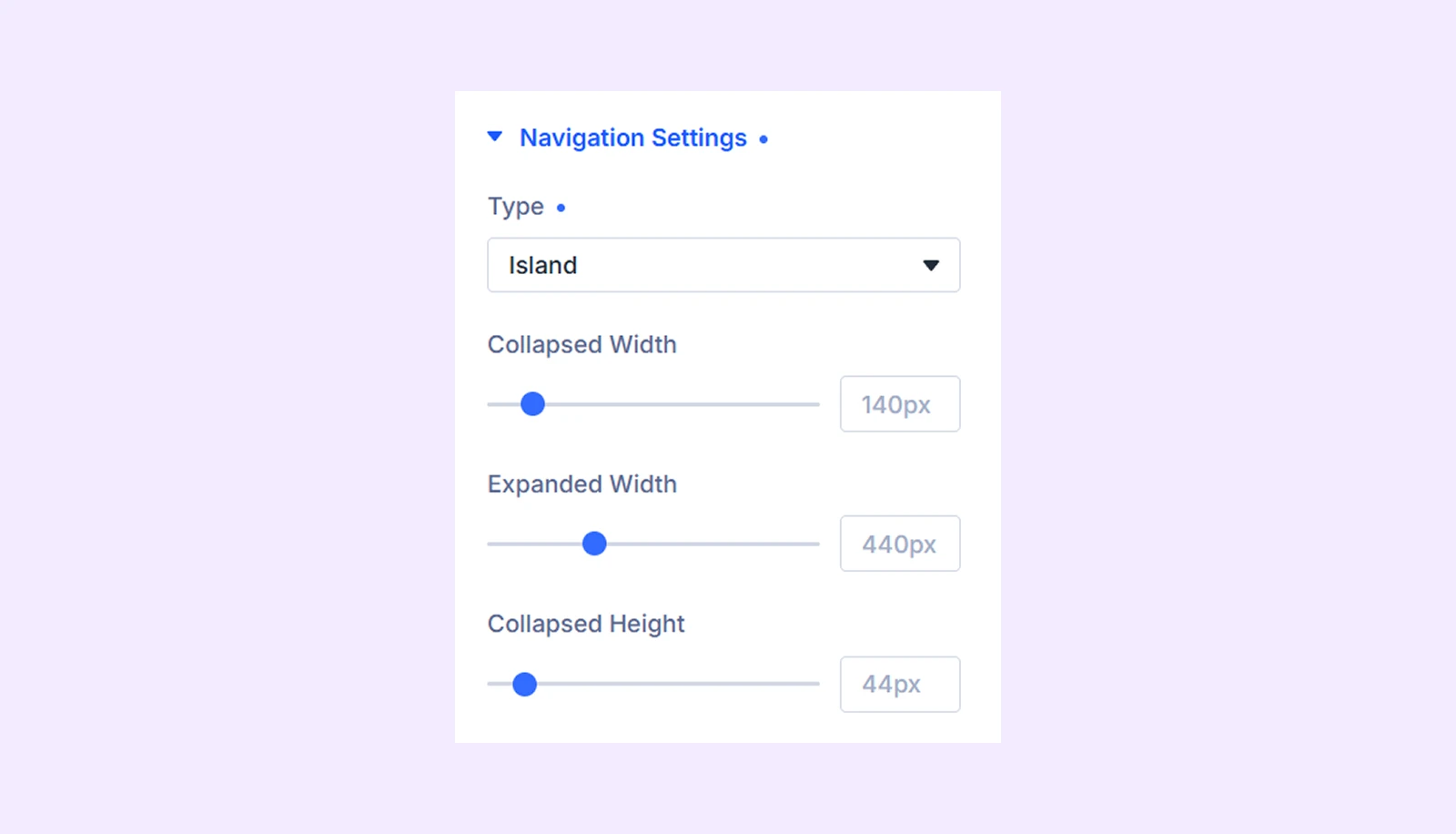
- Collapsed Width: Set the width of the island when it is closed.
- Expanded Width: Set the width of the island when it is expanded.
- Collapsed Height: Set the height of the island when it is closed.
Trigger Settings
These settings are available when you choose Island from Navigation Settings.
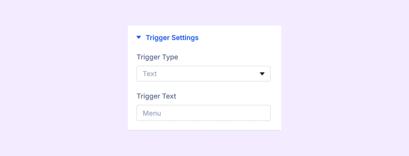
- Trigger Type: Choose between Text, Icon, or Icon & Text.
- Trigger Text: Enter the text displayed on the trigger button.
- Trigger Icon: Select an icon for the trigger button.
Island Animation
These settings are available when you choose Island from Navigation Settings.
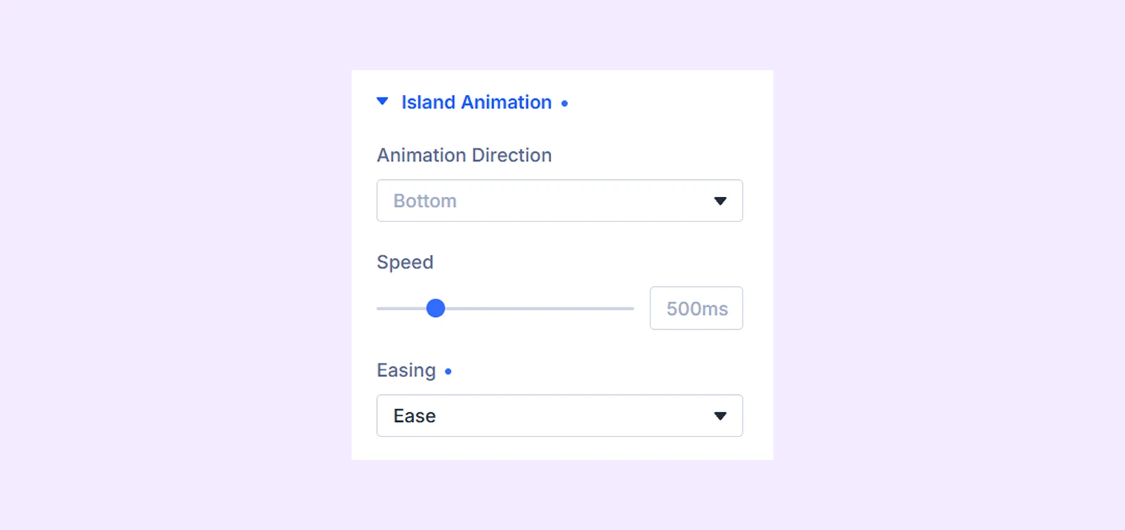
- Animation Direction: Choose whether the island expands toward the top, bottom, left, or right.
- Speed: Set the duration of the opening and closing animation.
- Easing: Choose an animation style such as Spring, Ease, Ease In Out, Ease Out, or Linear.
Hover Animation
This setting is available when you choose “Dock” from navigation settings.
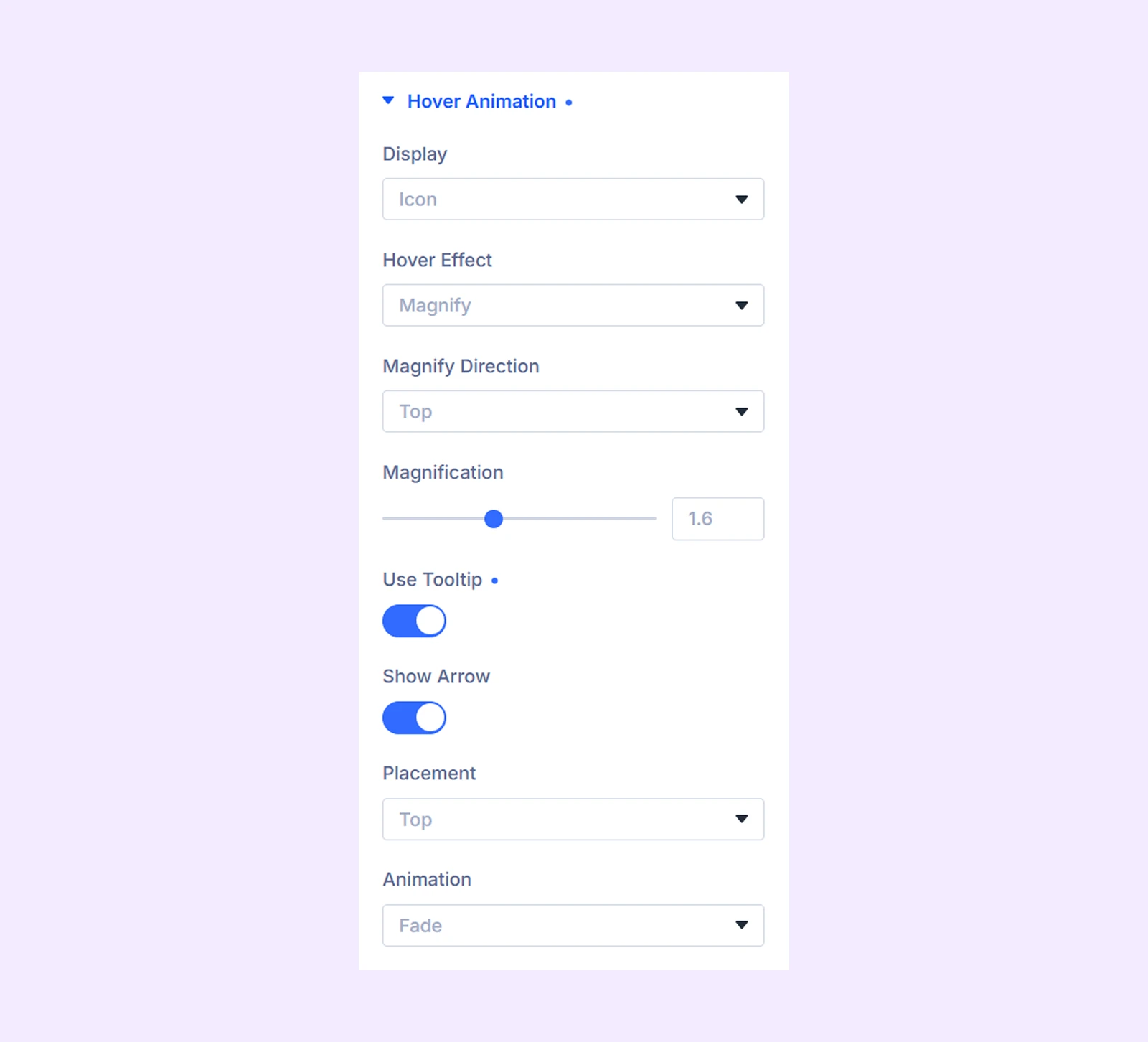
- Display: Choose whether to display the icon with its element or show only the icon.
- Title Position: Choose whether the label appears above, below, left, or right of the icon. (Available when Display is set to “Icon & Elements”.)
- Hover Effect: Select Magnify, Expand Elements, or None.
- Magnify Direction: Choose whether the magnified item expands toward the top, bottom, left, or right.
- Magnification: Control how much the navigation item enlarges on hover.
- Direction: Choose whether expanded elements appear from the left or right side of the icon. (Available when Display is set to “Icon” and “Expand Elements” is selected from “Hover Effect”)
- Use Tooltip: Enable a tooltip for each navigation item. (This setting is available when Display is set to Icon and Hover Effect is set to magnify or none.)
- Show Arrow: Display an arrow between the tooltip and the navigation item.
- Placement: Choose where the tooltip appears around the item.
- Animation: Select the tooltip entrance and exit animation.
Separator Setting
These settings are available when navigation Type is set to “Dock.”
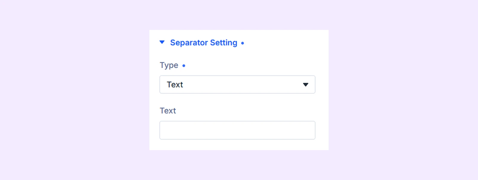
- Type: Choose whether to display a Text or Icon separator.
- Separator Icon: Select the icon displayed between navigation items.
- Separator Text: Enter the text used as the separator.
Background: Add a color, gradient, image, video, pattern, or mask behind the module.
Element Label: Rename the module for easier identification inside the Divi Builder. This label is only visible in the builder.
Design Tab
The Design tab contains settings for customizing the navigation container, items, labels, images, separators, tooltips, and active states.
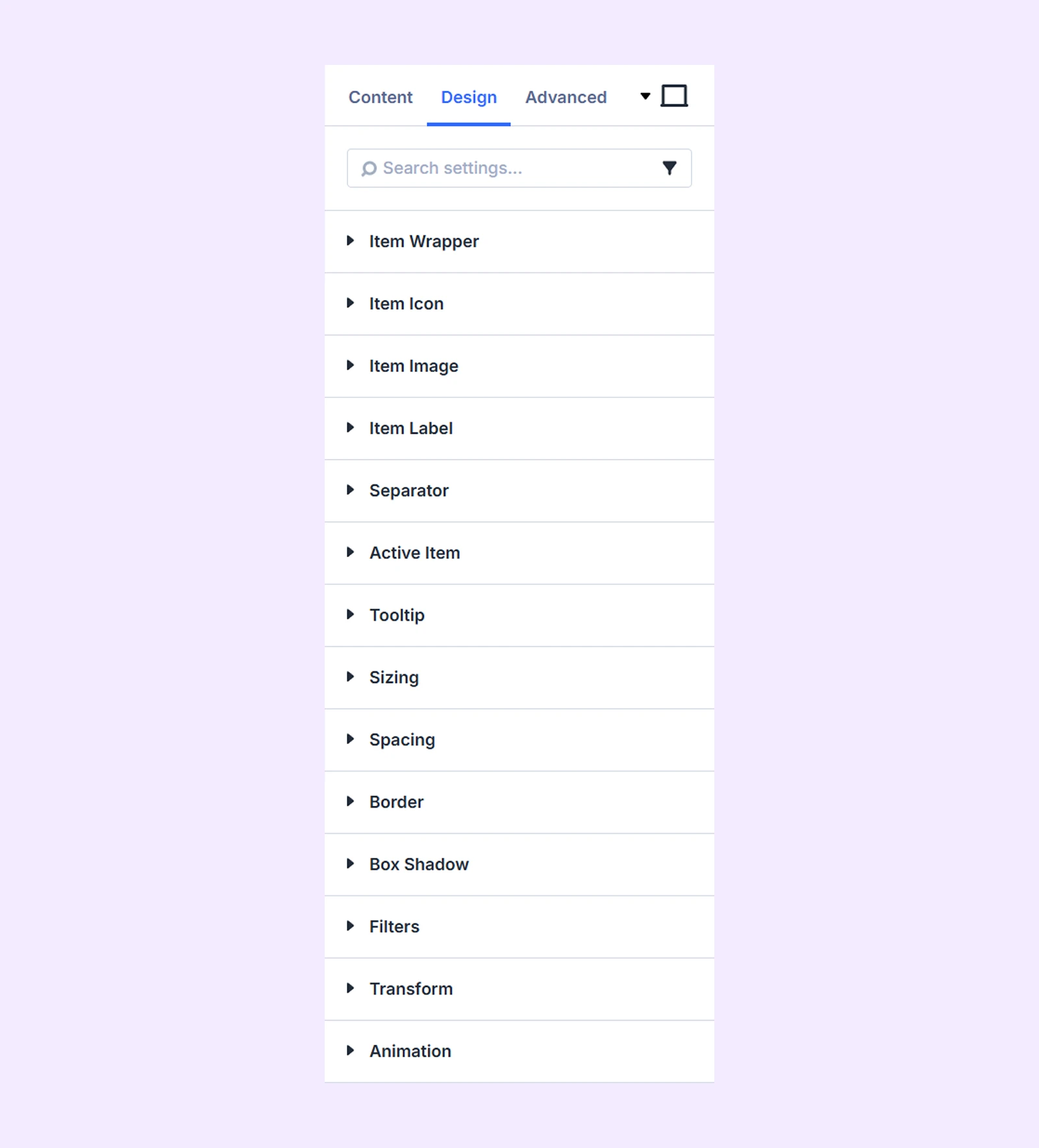
Layout: Use the Layout settings to control the structure and alignment of the island content. (This setting is available only when you select Island.)
Item Wrapper: Customize the background, border, spacing, and box shadow of the navigation item wrapper.
Item Icon
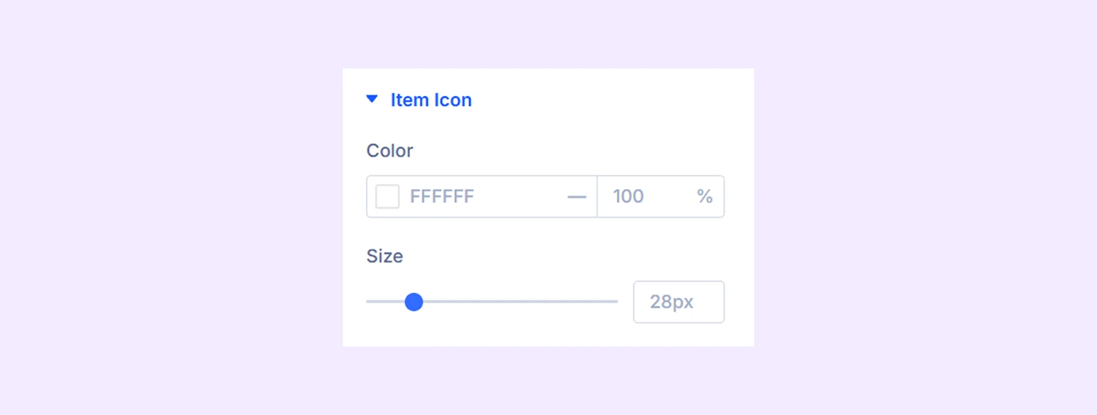
- Color: Set the icon color.
- Size: Adjust the icon size.
Item Image

- Max Width: Control the maximum width of navigation item images.
Item Label: Customize the font, size, color, spacing, alignment, and other typography settings of item labels.
Trigger: Customize the trigger text with typography settings. (Available only when Type is set to Island.)
Separator: Customize the appearance of separator text or icons, including color, size, spacing, and typography. (Available when Type is set to Dock and a separator type is selected.)
Active Item
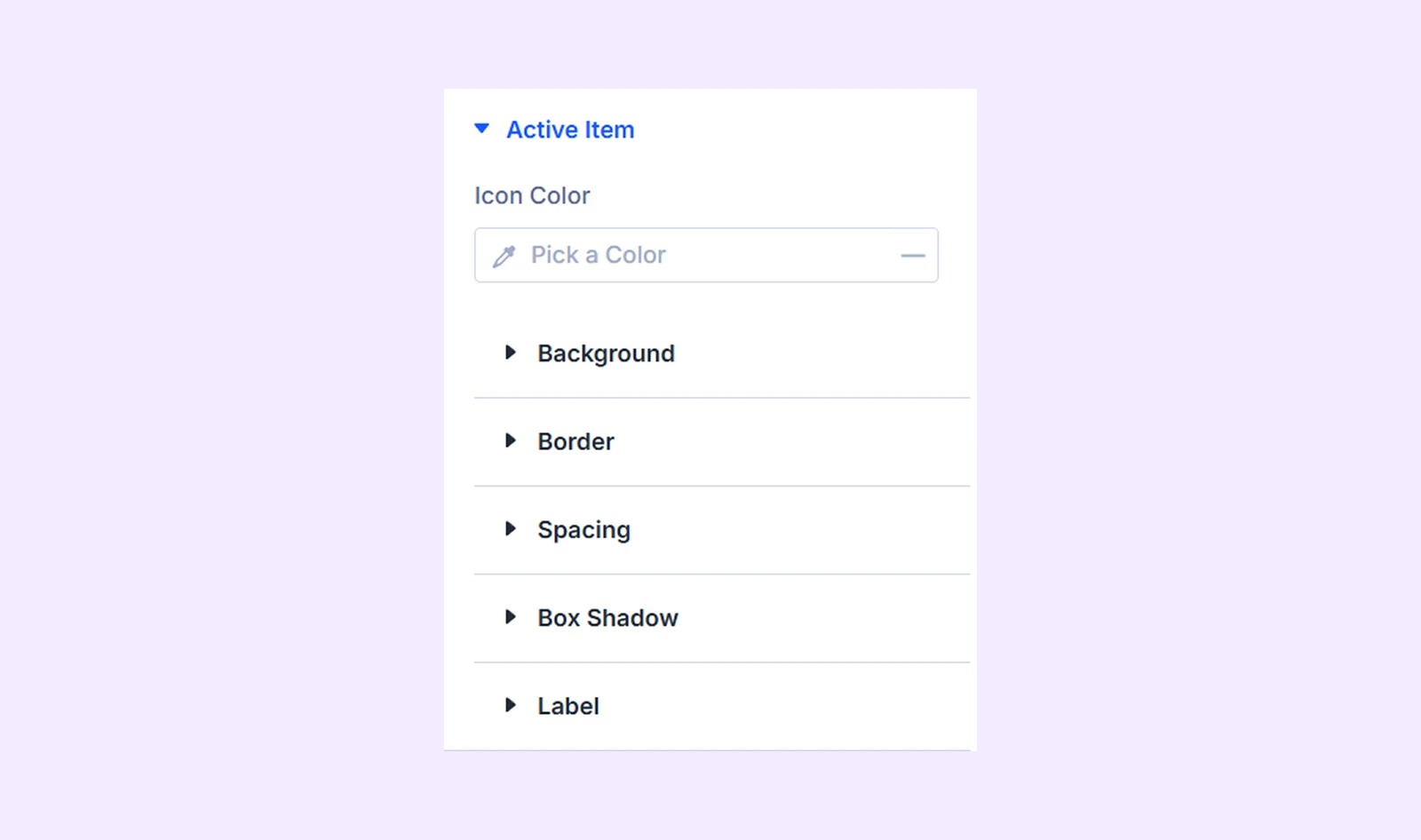
- Icon Color: Set a different icon color for the active navigation item.
You can also customize the active item’s background, border, spacing, box shadow, and label styles.
Tooltip
Tooltip is available when Tooltip is enabled in the Content tab.
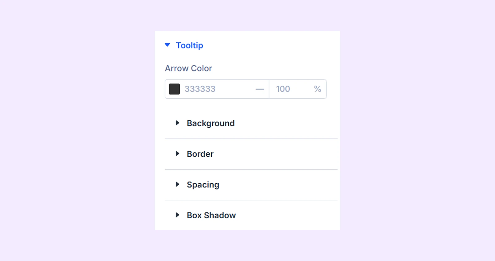
- Arrow Color: Set the color of the tooltip arrow.
You can also customize the tooltip background, border, spacing, box shadow, and label styles.
Sizing: Adjust the module’s width, height, alignment, and overflow behavior.
Spacing: Add custom margin and padding around the module.
Border: Customize the module’s border style, width, color, and corner radius.
Box Shadow: Add and customize shadow effects around the module.
Filters: Apply visual filters such as brightness, contrast, saturation, opacity, and blur.
Transform: Scale, move, rotate, or skew the module.
Animation: Apply Divi animation effects and control their direction, duration, delay, intensity, and repetition.
Advanced Tab
The Advanced tab provides additional options for adding custom CSS, conditions, visibility controls, attributes, and other advanced settings.
Animated Navigation Child Item Settings
Each navigation item includes its own Content, Design, and Advanced tabs. These settings let you configure and style each item separately.
Content Tab
This tab contains the settings for configuring an individual navigation item.
Item
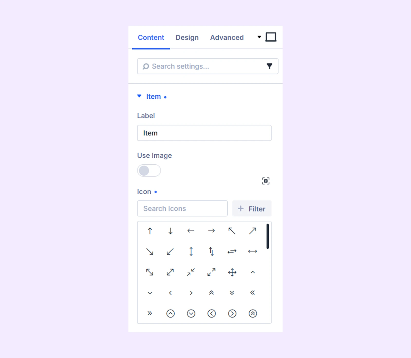
- Label: Enter the text displayed for the navigation item.
- Use Image: Enable this option to use an image instead of an icon.
- Image: Upload or select the image for the item.
- Icon: Select an icon for the navigation item.
Link: Add a URL and control how the link opens.
Elements: Add and manage additional content elements for the navigation item.
Background: Add a background color, gradient, image, video, pattern, or mask to the navigation item.
Meta: Add additional information to help identify and organize the item inside the Divi Builder
Design Tab
Use these settings to customize the appearance of an individual navigation item.
Icon
You will only see this setting, if you use the icon on the Item setting.
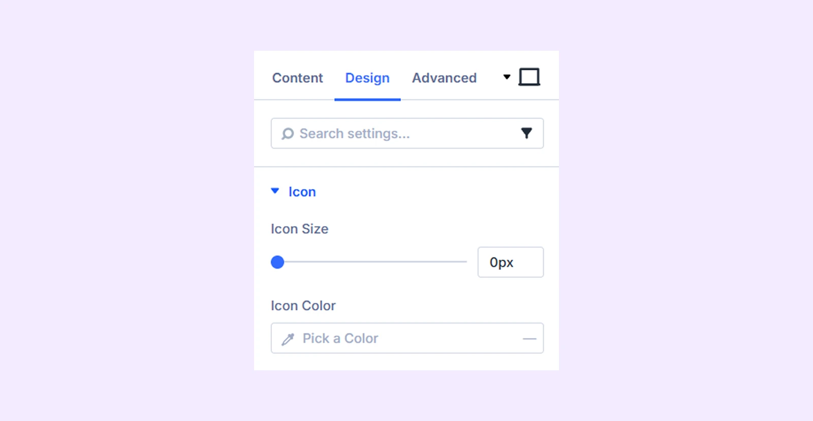
- Icon Size: Adjust the size of the icon.
- Icon Color: Choose the color of the icon.
Image

- Max Width: Control the maximum width of the item image.
Label: Customize the label’s font, size, color, alignment, spacing, and other typography settings.
Sizing: Adjust the width, height, alignment, and overflow behavior of the item.
Spacing: Add custom margin and padding around the item.
Border: Customize the item’s border style, width, color, and corner radius.
Box Shadow: Add a shadow effect around the navigation item.
Transform: Scale, move, rotate, or skew the item.
Animation: Apply an entrance animation and customize its timing and behavior.
Advanced Tab
Use the Advanced tab to add custom CSS, visibility conditions, attributes, and other advanced controls for the individual navigation item.
Need Help?
If you have any questions or need assistance, contact our support team: [email protected]