The DiviFlash Product Carousel module lets you display products in an interactive and customizable carousel layout.
Activation Required: This module is disabled by default. To use it, you need to enable it manually. Refer to our guide for step-by-step instructions.
Let’s see the settings in brief and how to make better use of it —
Content Tab
This tab contains the essential settings to add and configure product elements.
Add New Product Element
Click the + Add New Product Element button to choose which product elements you want to display. This opens the Product Child Element Settings, where you can customize each element individually. By default, you will see 4 product carousel items that you can edit or delete. To learn how to customize the product elements, click here.
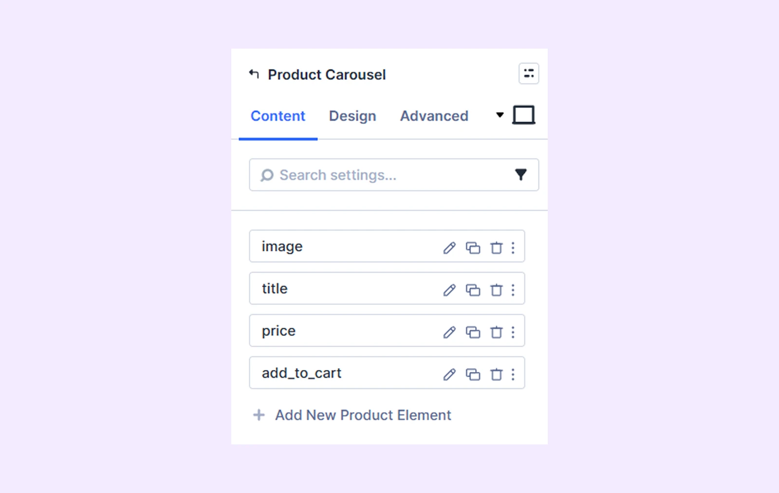
Note: You can change the ordering of the product elements by dragging the product element bars.
Settings
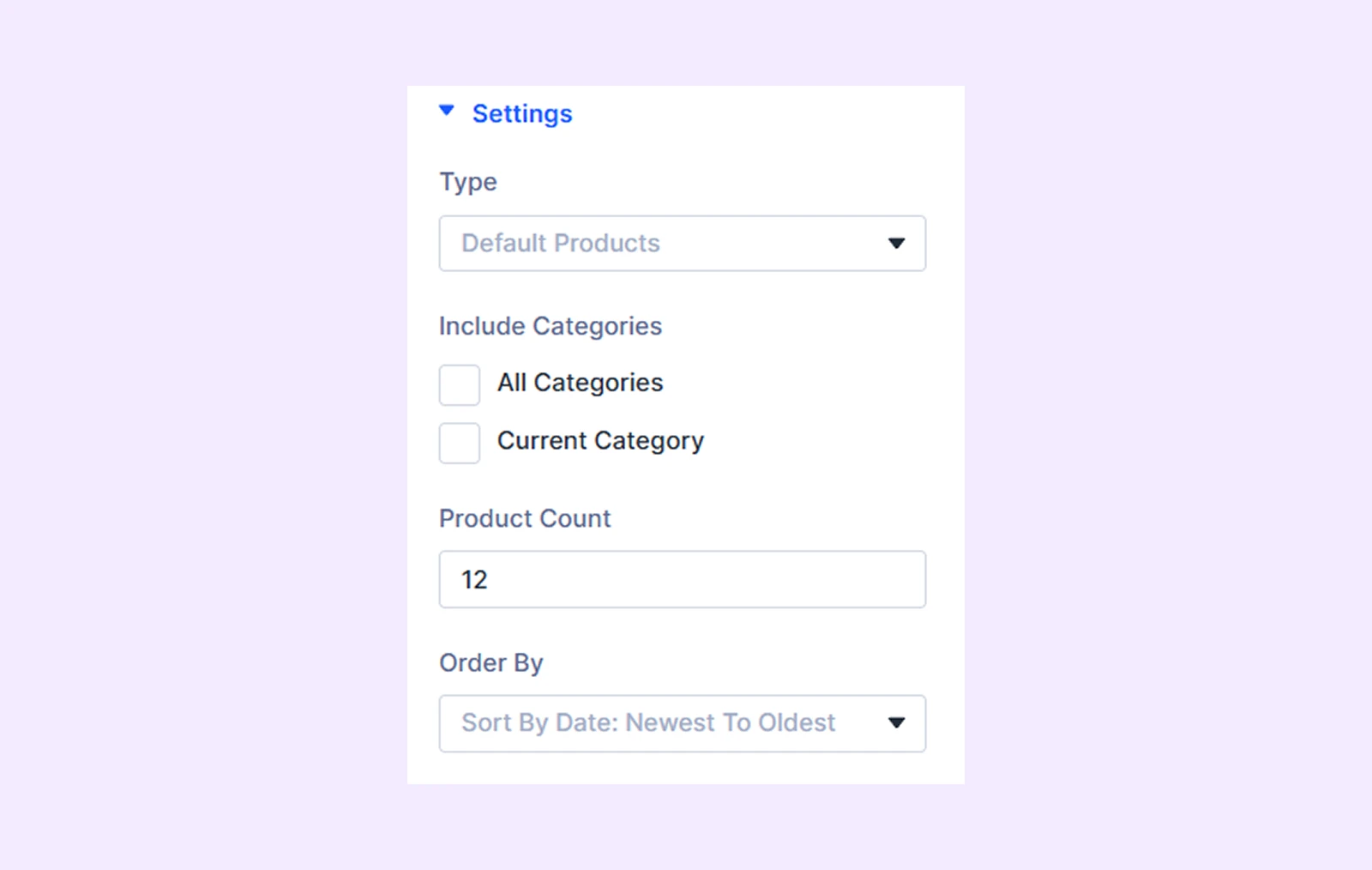
- Type: Choose which type of products you would like to display.
- Use Current Page: When enabled, the carousel will display products relevant to the current page (e.g., category page). (Available in Theme Builder only)
- Related Product: Enable this to show related products dynamically. (Theme Builder only)
- Include Categories: Select specific product categories to display. (Available when “Product Category” is selected as Type)
- Product Count: Define how many products will appear in the carousel.
- Order By: Set how the products should be sorted (e.g., date, popularity, price).
Carousel Settings
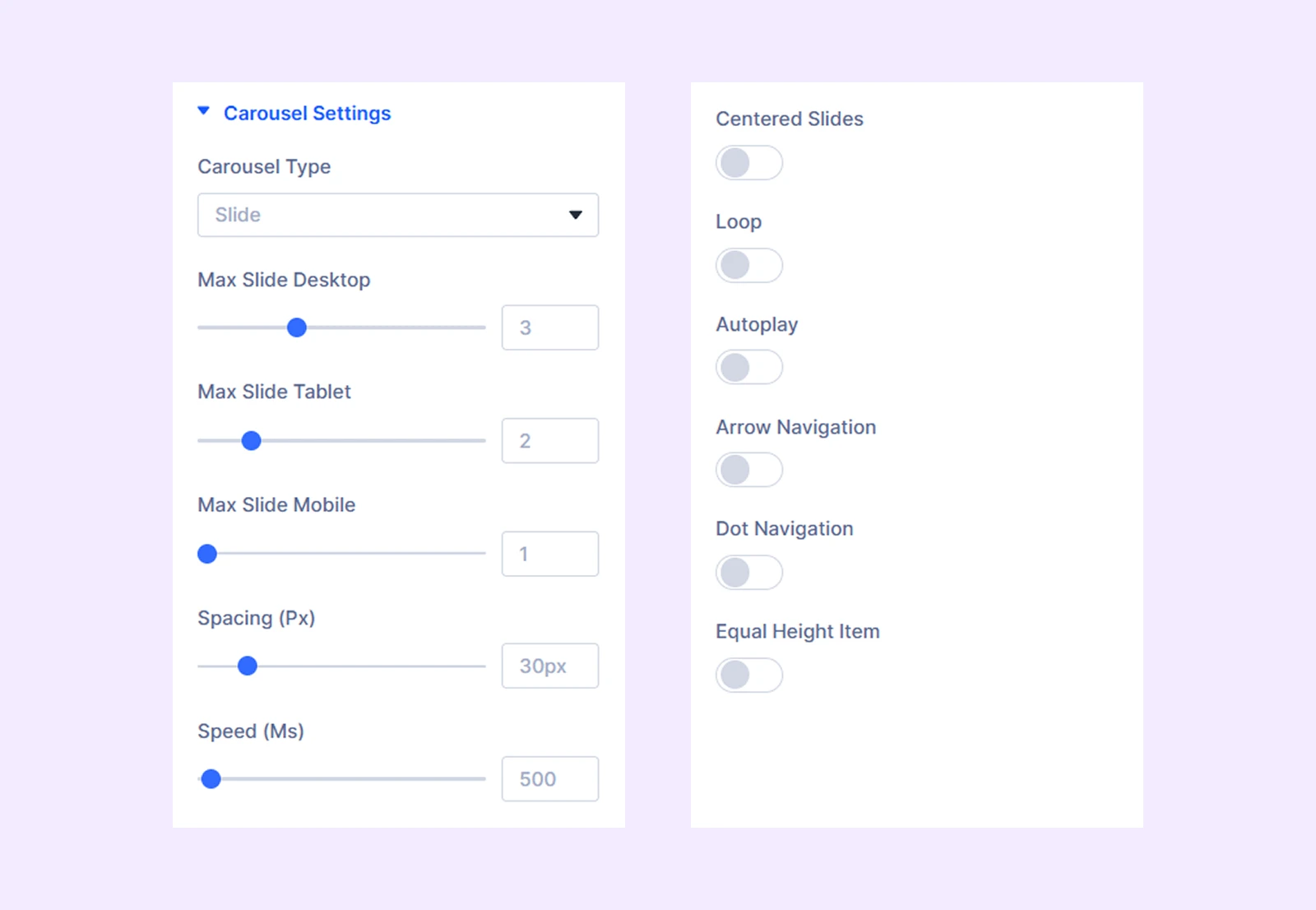
- Carousel Type: Choose between Slide (standard) or Coverflow (3D-style carousel).
- Max Slide Desktop: Choose the number of carousel items you want to display on desktop devices.
- Max Slide Tablet: Choose the number of carousel items you want to display on tablets.
- Max Slide Mobile: Choose the number of carousel items you want to display on mobile devices.
- Spacing: Adjust the space between the carousel items.
- Speed: Define the slide speed for the carousel items.
- Centered Slides: The first slide will be placed at the center when this option is toggled on.
- Loop: Enable this option to add a loop effect to the product carousel.
- Autoplay: Enable this option to have the sliders rotate automatically.
- Autoplay Speed: Define the speed of the autoplay effect. Only available when autoplay is enabled.
- Pause on Hover: When enabled, the auto-playing slide will pause when hovered. Only available when autoplay is enabled.
- Arrow Navigation: Turn on to enable arrows to navigate the product sliders.
- Dot Navigation: Turn on to enable dots to navigate the product sliders.
- Equal Height Item: Enable this to make all the product sliders equal in height.
Advanced Settings
If you select “Coverflow” as the “Carousel Type,” then you will see coverflow slider customization settings.
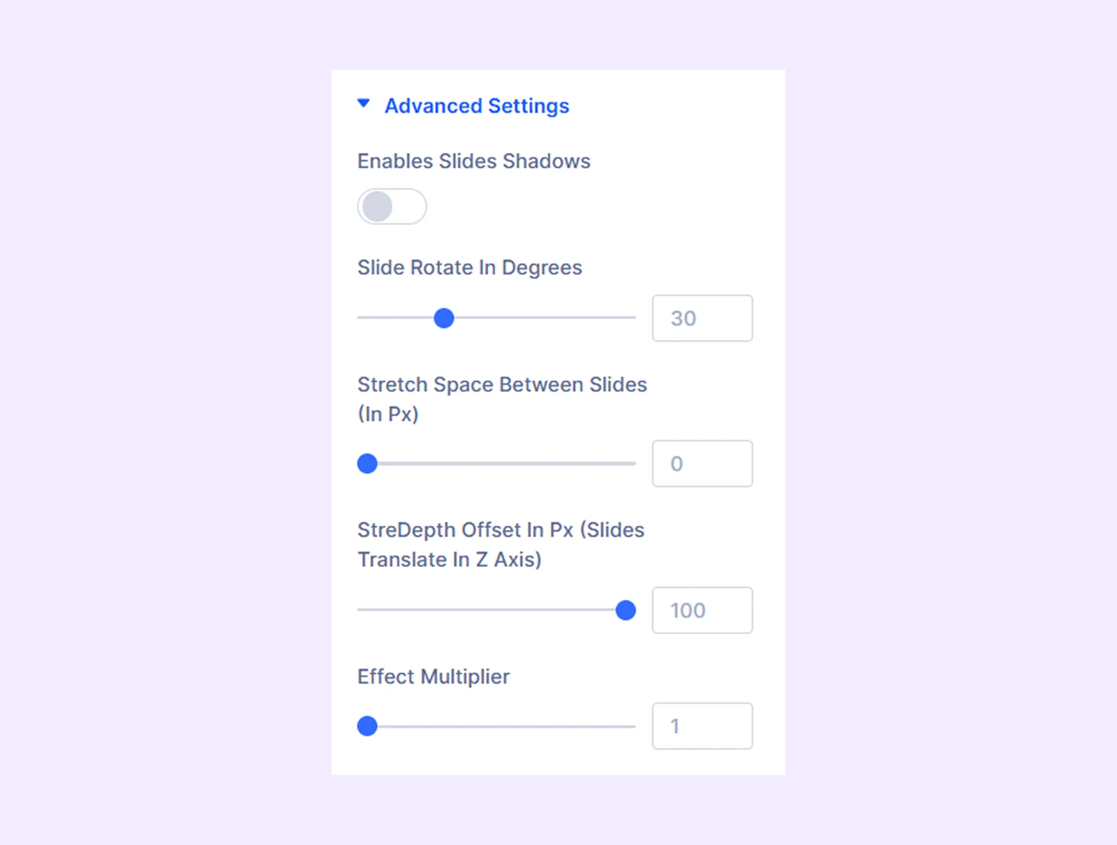
- Enables Slides Shadows: Turn on to add a shadow effect to the coverflow sliders.
- Shadow Color Dark: Choose the darker shade for the shadow effect.
- Shadow Color Light: Choose the lighter shade for the shadow effect.
- Slide Rotate in Degrees: Adjust the angle of the carousel items.
- Stretch Space Between the Slides (In Px): Adjust the gap between the slides.
- StreDepth Offset in Px (Slides Translate In Z Axis): Adjust the 3D depth positioning.
- Effect Multiplier: Determines how many times the carousel items will slide or rotate.
Sales Badge Settings
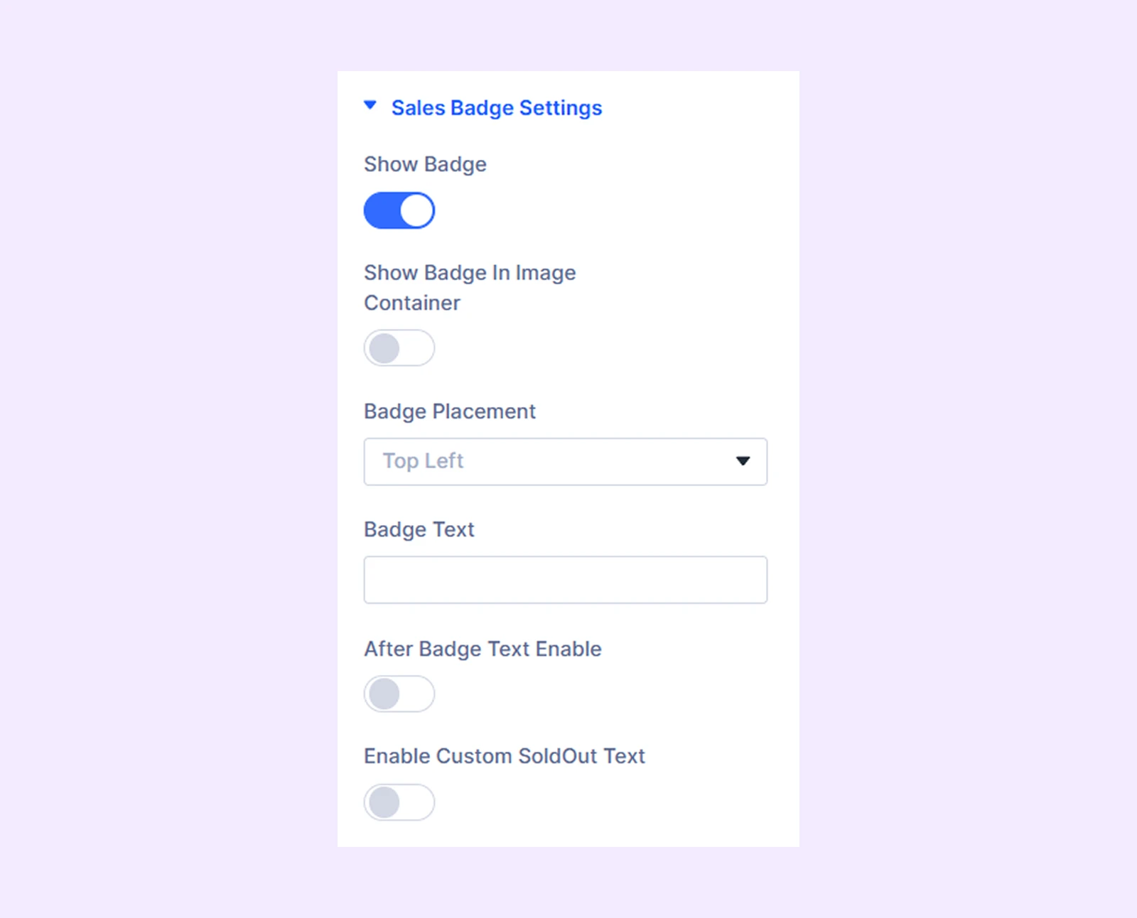
- Show Badge: Turn on to display a sale badge over the product carousel sliders.
- Show Badge In Image Container: Enable to place the sale badge over the image.
- Badge Placement: Choose where you want to place the sale badge.
- Badge Text: Type in the text you want to display on the badge.
- After Badge Text Enable: Enable the option to add text after the sale badge text.
- Suffix Badge Text: Enter the text you want to display after the sale badge. Available only if you turn on “After Badge Text Enable.”
- After Badge Text Type: Choose if you display the price difference, price percentage, or both. The price difference or price percentage will be calculated dynamically based on your product’s regular price and sale price.
- Enable Custom SoldOut Text: Enable to use a sold out text instead of the sales badge.
- SoldOut Text: Input the text for the sold out badge.
Note: The “Enable Custom SoldOut Text” option will not work if your product is in stock.
Item Background: Add a background color, gradient, or an image to all the carousel sliders. (Only available when you initiate the module from Divi theme builder.)
Background: Add a background color, gradient, image, video, pattern, or mask to the module.
Element Label: Rename the module to organize it more easily in the Divi Builder. (Only you can see this label.)
Design Tab
This tab allows you to style the overall appearance of the product carousel.
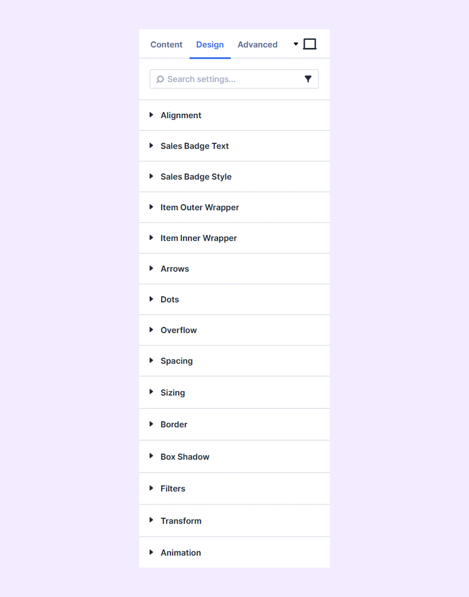
Alignment: Change the placement of all the product elements relative to the carousel sliders’ containers.
Sales Badge Text: Separate sets of typography options for the sales badge text, price difference, and the sales badge suffix text.
Sales Badge Style: Styling options for the sales badge container.
Item Outer Wrapper: Border customization options for the outer wrapper of the carousel sliders.
Item Inner Wrapper: Border customization options for the inner wrapper of the carousel sliders.
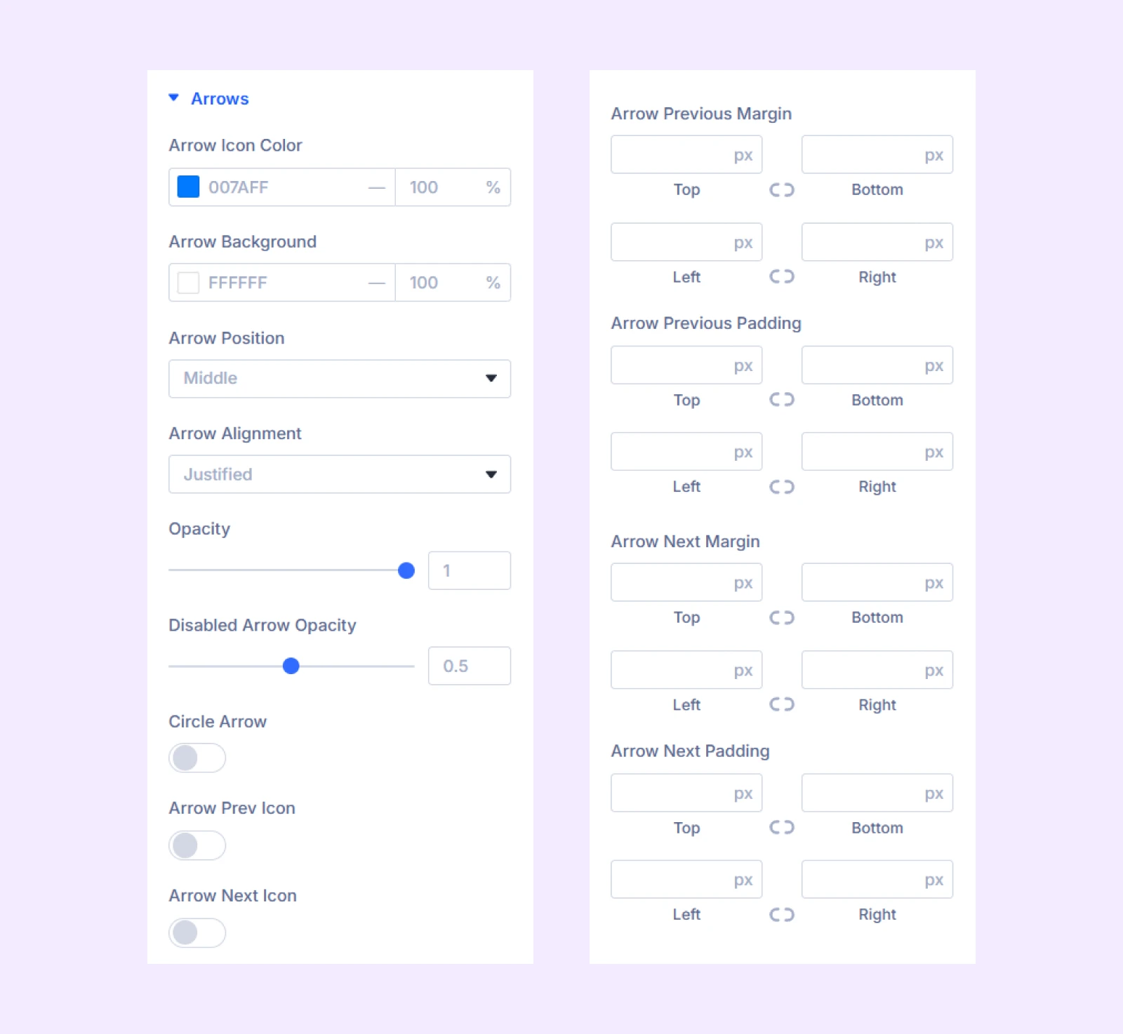
Arrows
- Arrow Icon Color: Pick a color for the arrow navigation icons.
- Arrow Background: Pick a background color for the arrow navigation icons.
- Arrow Position: Change the vertical position of the arrow buttons relative to the product sliders.
- Arrow Alignment: Change the horizontal position of the arrow buttons.
- Opacity: Adjust the transparency of the arrow buttons.
- Disabled Arrow Opacity: Adjust the transparency of the arrow buttons.
Note: The navigation arrows will be disabled when you reach the end of the carousel if the loop effect is not active.
- Circle Arrow: Enable to make the arrow buttons circular.
- Disable Arrow Style: Turn on to style the disabled arrows.
- Disabled Arrow Icon Color: Pick a color for the disabled arrows.
- Disabled Arrow Background: Pick a background color for the disabled arrows.
- Arrow Prev Icon: Toggle on to use a custom icon for the previous button.
- Arrow Next Icon: Toggle on to use a custom icon for the next button.
- Spacing: Add custom margin and padding to the arrow buttons.
The next options are to customize the borders of the arrow buttons.
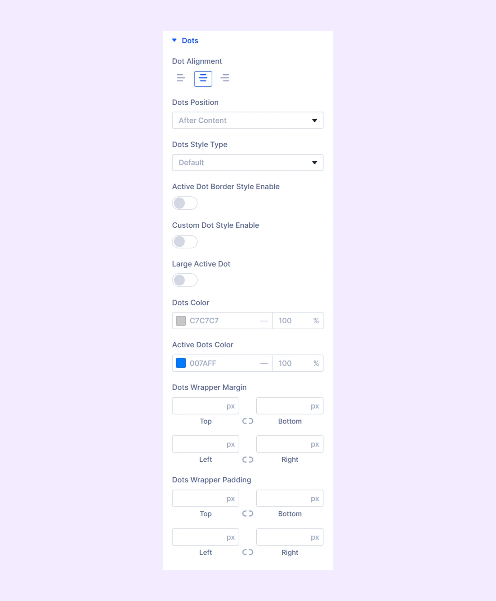
Dots
- Alignment: Change the horizontal position of the dots relative to the product sliders.
- Dots Position: Choose if you want to place the dots before or after the carousel.
- Dots Style Type: Choose from three different styles of dots.
- Active Dot Border Style Enable: Turn on this option to add a second border to the active dot.
- Custom Dot Style Enable: Enable to set a custom width to the dots.
- All Dot Width: Adjust the dot width. Only available when “Custom Dot Style Enable” is turned on.
- Large Active Dot: Make the active dot larger than the rest.
- Large Active Dot Width (Px):
- Dots Color: Pick a color for the dots.
- Active Dots: Pick a separate color for the active dot.
- Spacing: Add custom margin and padding to the dots.
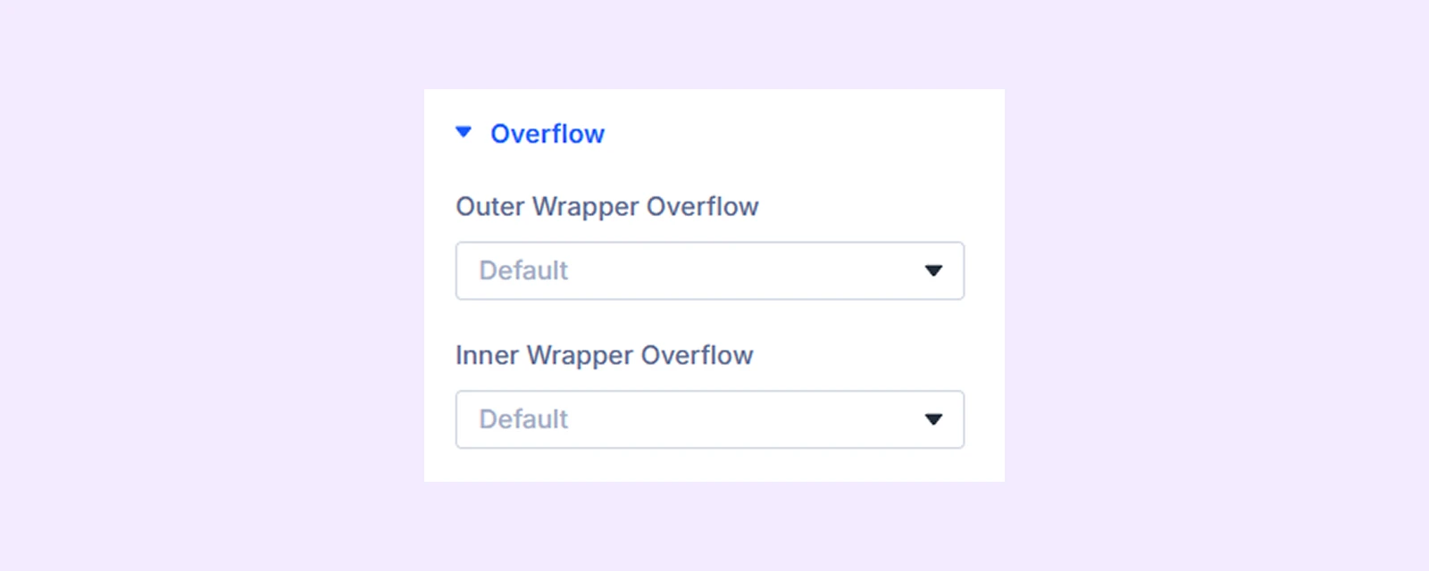
Overflow
- Outer Wrapper Overflow: Control how content within the outer container is handled when it exceeds its boundaries.
- Inner Wrapper Overflow: Control how content within the inner container is handled when it exceeds its boundaries.
Sizing: Adjust the width, height, and alignment of the module.
Spacing: Add custom margin and padding to the module’s container.
Border: Customize the border style, width, and color. And style each border separately or apply the same style to all sides.
Box Shadow: Add shadow effects to the module.
Filters: Apply color filters to enhance the appearance.
Transform: Scale, rotate, move, or skew the module.
Animation: Apply reveal animation effects and customize delay, duration, repeat settings, and animation type.
Advanced Tab
This tab provides additional settings for advanced users who want greater control over the module with custom code, conditions, and more.
Product Child Element Settings
From this settings tab, you can customize each product element separately. Any customization you make here will override the settings you make in the “Product Carousel Settings.”
Let’s see the settings in brief and how to make better use of it —
Content Tab
Element
Type: Choose the type of the product element. There are 11 different product elements to choose from.
If you choose “Product Image”
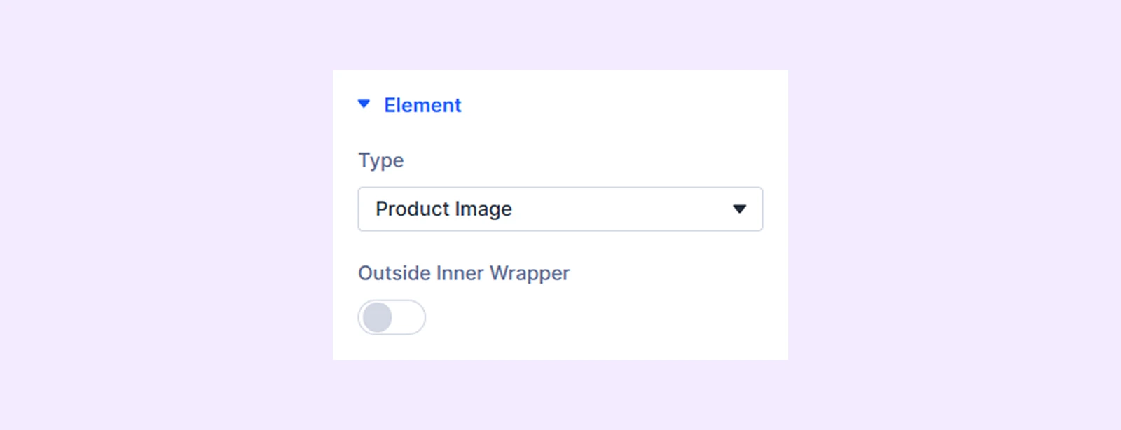
- Outside Inner Wrapper: Enable the featured image of the product to be placed outside the inner wrapper but inside the outer wrapper.
If you choose “Product Title”
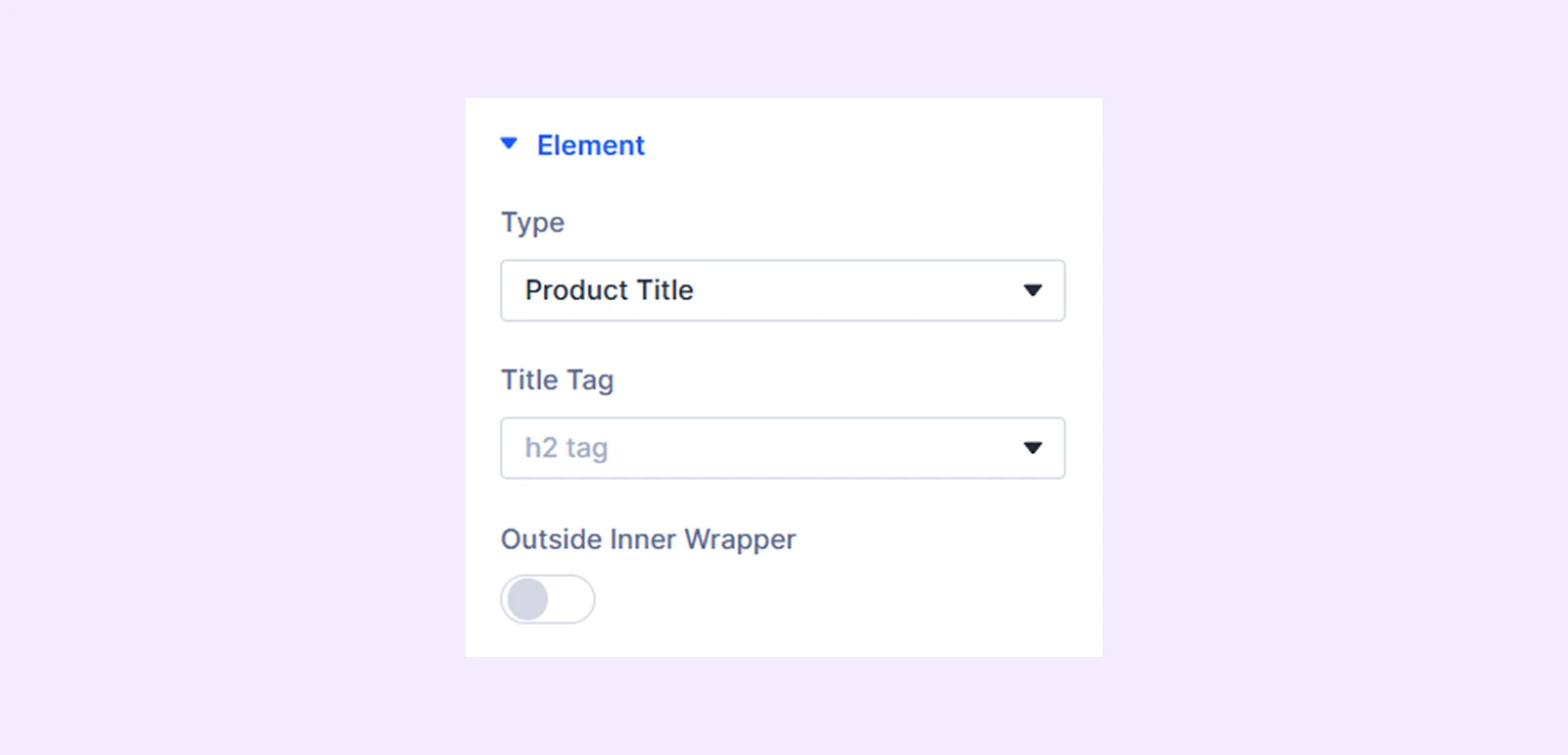
- Title Tag: Choose the HTML tag for the product title.
- Outside Inner Wrapper: Enable the title of the product to be placed outside the inner wrapper but inside the outer wrapper.
If you choose “Product Rating”
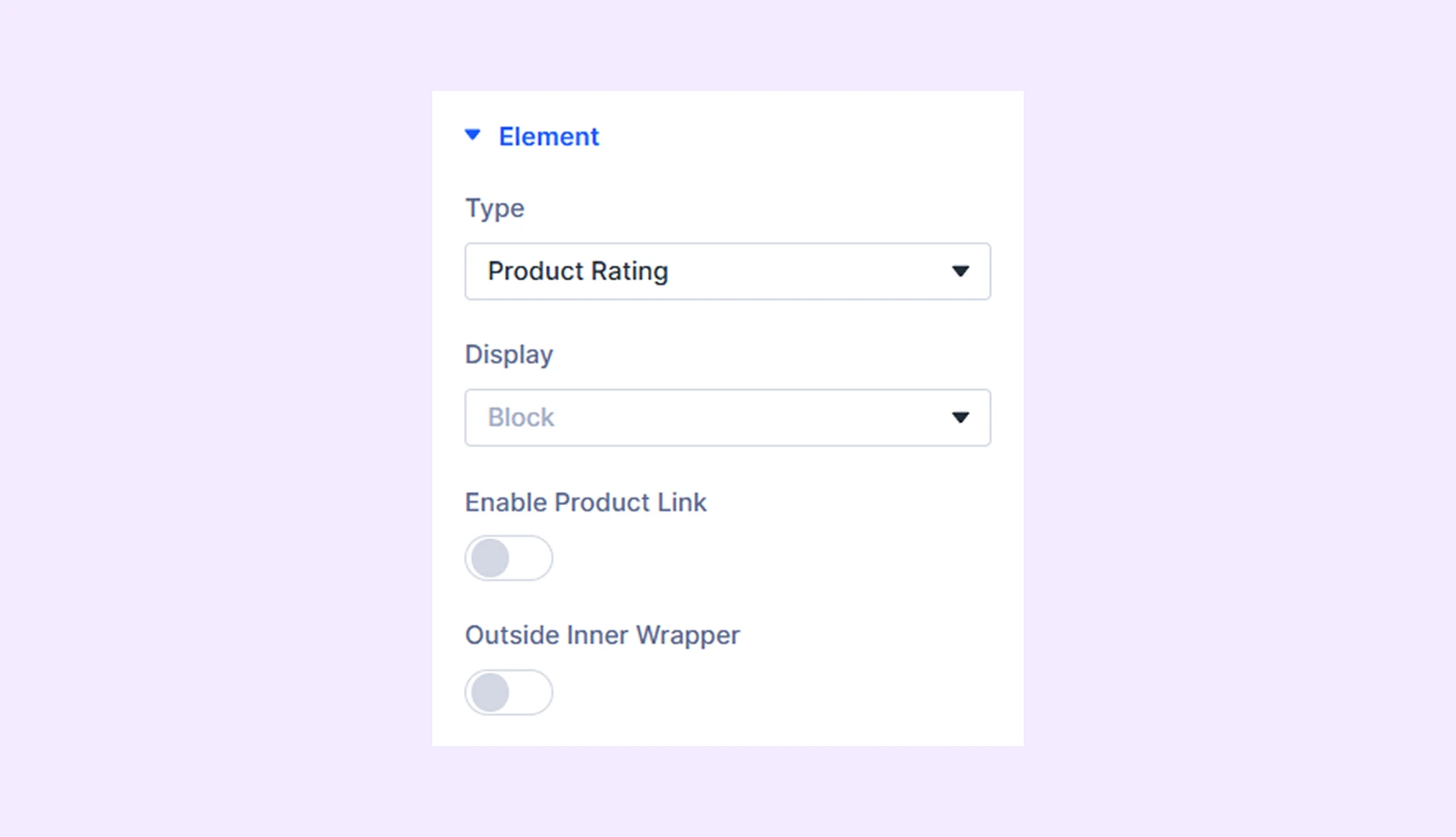
- Display: Select how to display the product element: inline (on the same line), inline block (next to each other with potential line breaks), or block (on separate lines).
- Enable Product Link:
- Outside Inner Wrapper: Enable the product rating to be placed outside the inner wrapper but inside the outer wrapper.
If you choose “Product Price”
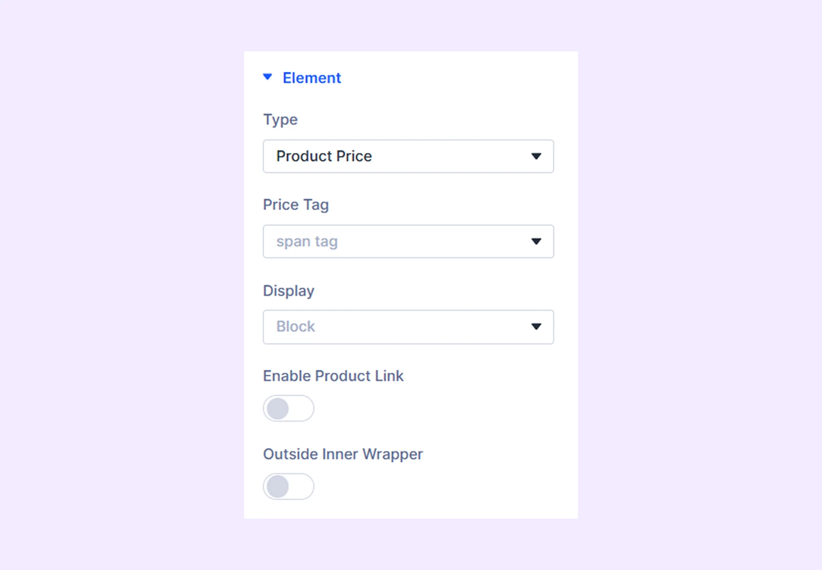
- Price Tag: Choose the HTML tag for the product price.
- Display: Select how to display the product element: inline (on the same line), inline block (next to each other with potential line breaks), or block (on separate lines).
- Enable Product Link:
- Outside Inner Wrapper: Enable the product price to be placed outside the inner wrapper but inside the outer wrapper.
If you choose “Product Short Description”
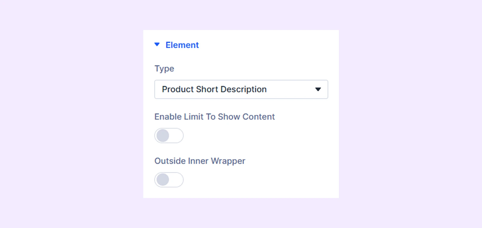
- Enable Limit to Show Product Description: Turn this option on to limit the character length of the product description.
- Short Description Length: Define the character length of the product description. Only available if “Enable Limit to Show Product Description” is on.
- Outside Inner Wrapper: Enable the product description to be placed outside the inner wrapper but inside the outer wrapper.
If you choose “Add to Cart”
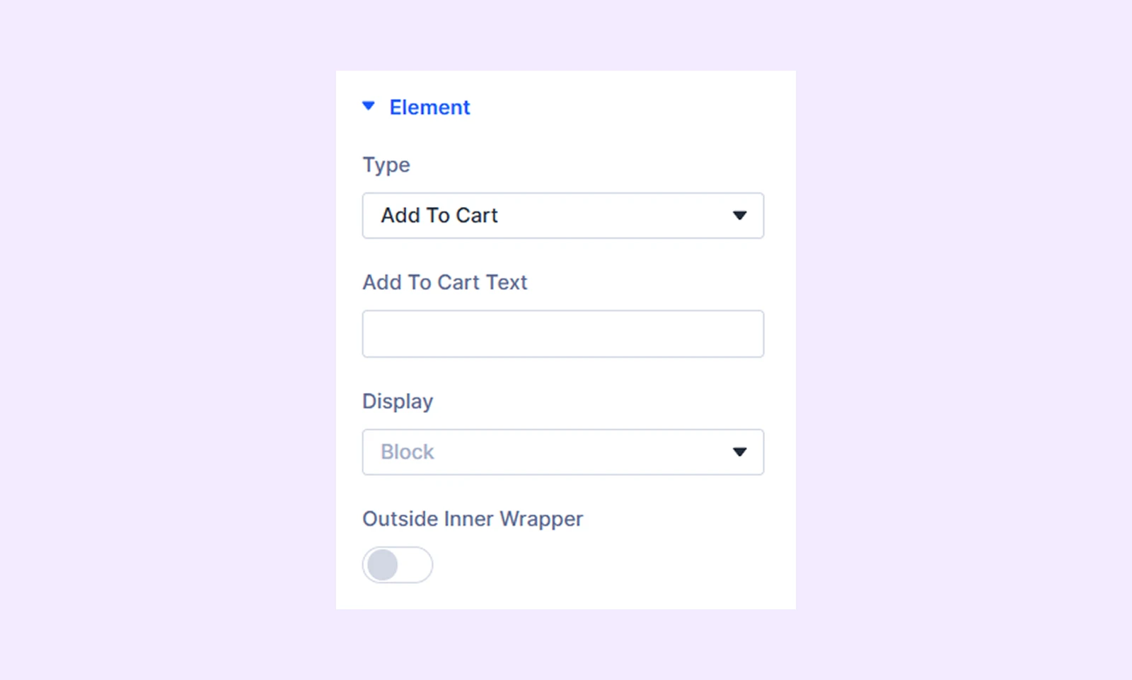
- Add to Cart Text: Input the text for the add to cart button.
- Display: Select how to display the product element: inline (on the same line), inline block (next to each other with potential line breaks), or block (on separate lines).
- Outside Inner Wrapper: Enable the add to cart button to be placed outside the inner wrapper but inside the outer wrapper.
If you choose “Categories” or “Tags”
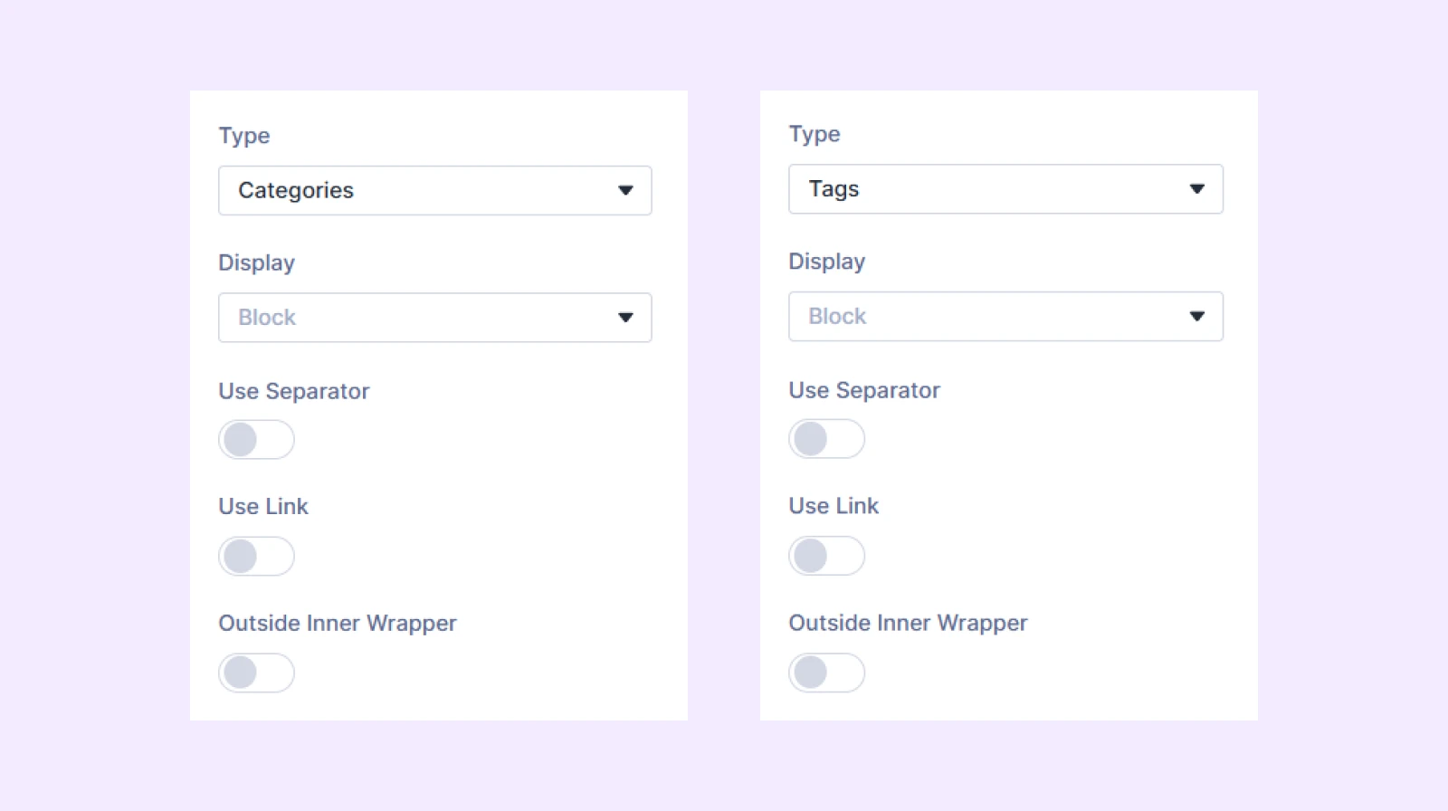
- Display: Select how to display the product element: inline (on the same line), inline block (next to each other with potential line breaks), or block (on separate lines).
- Use Separator: Enable this option to use separators between the product categories or tags.
- Separator: Define the symbol you want to use as the separator. Only available if “Use Separator” is on.
- Use Link: Enable this option to link the product categories or tags with their respective pages.
- Open on New Tab: Decide if the category or tag pages will open in a new tab or in the same tab. Only available if “Use Link” is on.
- Outside Inner Wrapper: Enable the categories or tags to be placed outside the inner wrapper but inside the outer wrapper.
If you choose “Button”
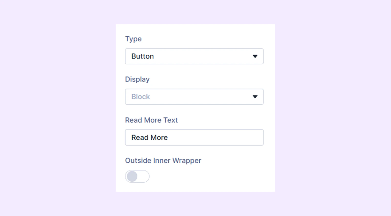
- Display: Select how to display the product element: inline (on the same line), inline block (next to each other with potential line breaks), or block (on separate lines).
- Read More Text: Input the text for the read more button.
- Outside Inner Wrapper: Enable the categories or tags to be placed outside the inner wrapper but inside the outer wrapper.
If you choose “Custom Text”
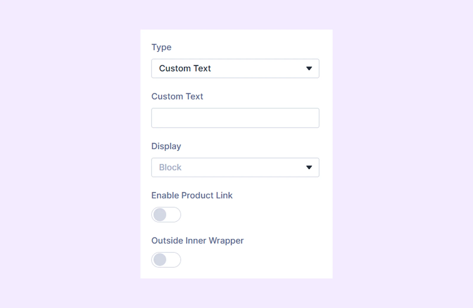
- Custom Text: Input the custom text you want to display.
- Display: Select how to display the product element: inline (on the same line), inline block (next to each other with potential line breaks), or block (on separate lines).
- Outside Inner Wrapper: Enable the custom text to be placed outside the inner wrapper but inside the outer wrapper.
If you choose “Divider”
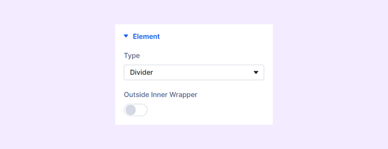
- Outside Inner Wrapper: Enable the divider to be placed outside the inner wrapper but inside the outer wrapper.
Overlay and Scale
If you choose “Product Image” as the “Product Element Type”, this additional section will show up.
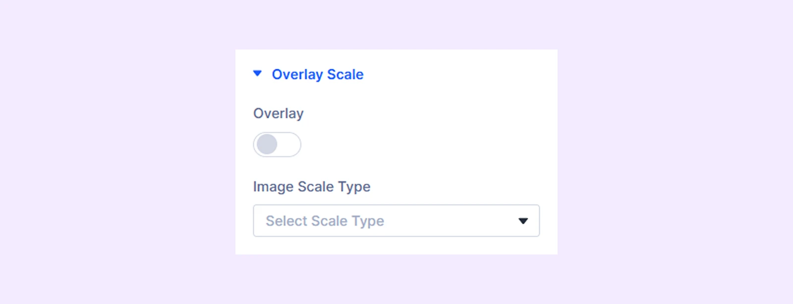
- Overlay: Enable to add a gradient over the product image on hover.
- Overlay Primary Color: Choose the primary color for the overlay gradient.
- Overlay Secondary Color: Choose the secondary color for the overlay gradient.
- Overlay Gradient Direction: Adjust the overlay gradient direction.
- Use Icon: Enable to use an icon on the overlay gradient.
- Icon Color: Choose a color for the overlay icon.
- Icon Size: Adjust the size of the overlay icon.
- Icon Reveal Type: Choose the reveal animation for the overlay icon.
- Image Scale Type: Choose how the product image will animate on hover.
- Disable Overlay on Mobile: Turn this option on to disable overlay on mobile devices.
Animation Settings
- Display Type: Select when to display the product element: always, on hover, or hide on hover.
- Always Show on Mobile: Activate this option to show the product element consistently on mobile.

Icon Settings
If you choose “Add to Cart” or “Button” as the product element, this additional section will appear.
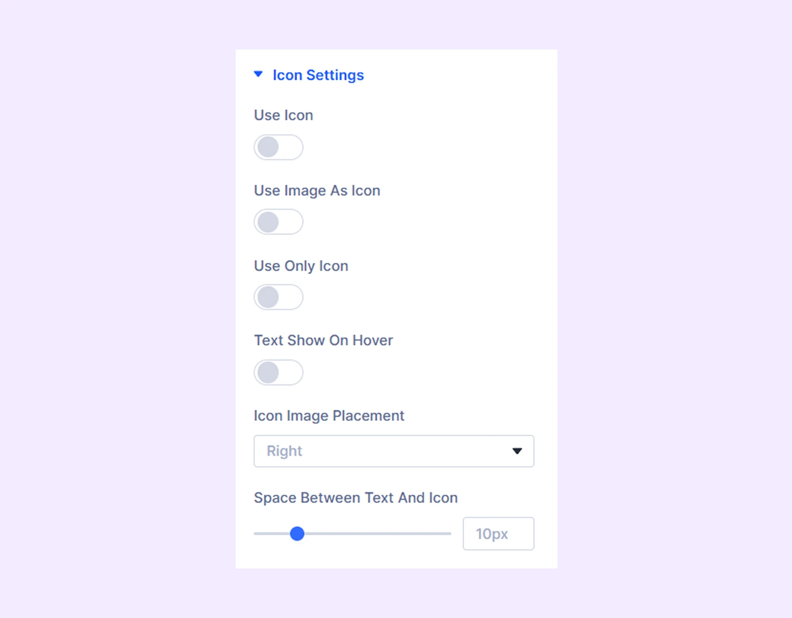
- Use Icon: Enable to use an icon for the selected product element.
- Icon Color: Choose a color for the icon.
- Icon Size: Adjust the size of the icon.
- Use Image as Icon: Turn on to use an image instead of an icon.
- Image Alt Text: Input the alt text for the image.
- Icon Image Width: Adjust the width of the image.
- Use Only Icon: Turn on to use only the icon without any text.
- Only Icon Position: Choose the placement of the icon if you decide to display only the icon. Available only when “Use Image As Icon” and “Use Only Icon” is enabled.
- Text Show on Hover: Turn on to display the text only on hover.
- Icon Image Placement: Choose the placement of the icon or the image.
- Space Between Text and Icon: Adjust the distance between the text and the icon.
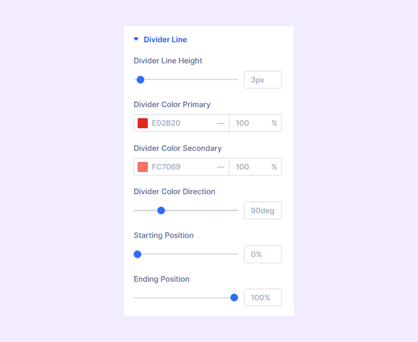
Divider Line
- Divider Line Height: Adjust the height of the divider line.
- Divider Color Primary: Choose the primary color for the divider gradient.
- Overlay Color Secondary: Choose the secondary color for the divider gradient.
- Divider Color Direction: Adjust the divider gradient direction.
- Starting Position: Adjust the starting position of the divider gradient.
- Ending Position: Adjust the ending position of the divider gradient.
Background: Add background specific to the element.
Element Label: Rename the element (visible only in builder).
Design Tab
Text: Options to change the alignment of the text in the product element and add a shadow effect to it.
Text Styles: Typography options for the text in the product element.
Pricing Styles: Typography options for the sale price and the regular price.
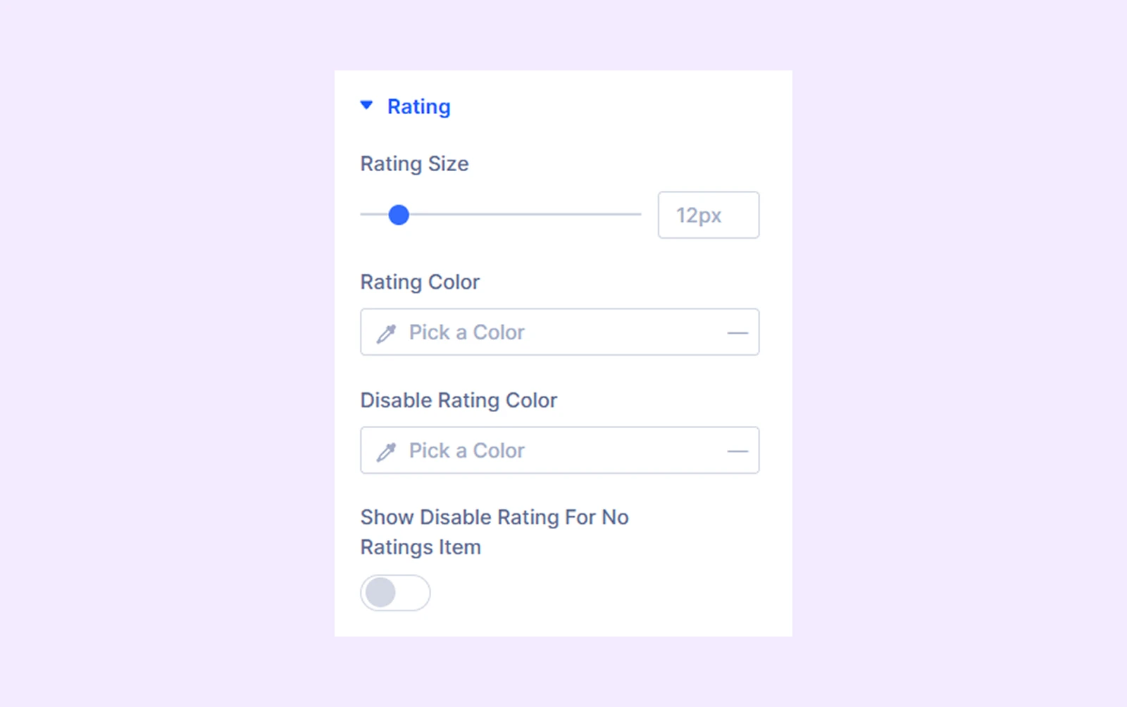
Rating
- Rating Size: Adjust the size of the product rating.
- Rating Color: Pick a color for the product rating.
- Disable Rating Color: Choose a color for the inactive stars in the rating system.
- Show Disable Rating for No Ratings Item: Enable this option to show inactive stars for products with no ratings.
Spacing: Add custom margins and padding to the product element.
Sizing: Adjust the width, height, and alignment of the product element.
Border: Border customization options for the product element. You have the option to style each border individually or all the borders together.
Box Shadow: Apply a shadow effect to the product element.
Filters: Add color filters to the product element.
Transform: Change the scale, placement, size, angle, etc. of the product element.
Advanced Tab
Provides custom CSS, conditions, visibility controls, and advanced styling options for individual elements.
Need Help?
If you have any questions or need assistance, contact our support team: [email protected]