The DiviFlash Table of Contents (TOC) module automatically generates a list of selected headings from your page content, helping users navigate long articles quickly and efficiently.
Activation Required: This module is disabled by default. To use it, you need to enable it manually. Refer to our guide for step-by-step instructions.
Let’s see the settings in brief and how to make better use of it —
Content Tab
The Content Tab includes the settings for creating and controlling the Table of Contents.
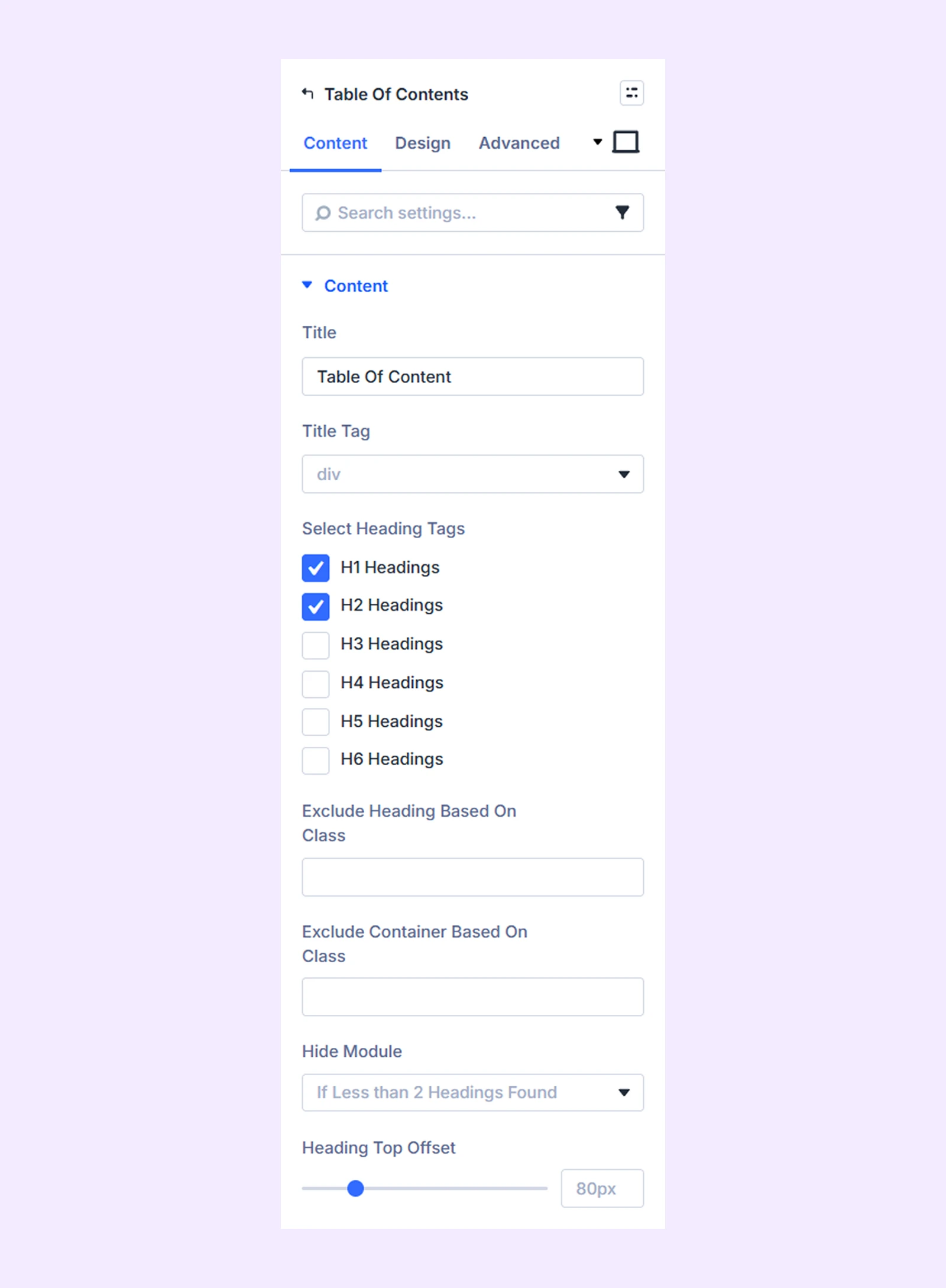
Content
- Title: Set the heading displayed at the top of the TOC.
- Title Tag: Choose the HTML tag for the title of the table of contents.
- Select Heading Tags: Choose which heading tags should appear in the table of contents.
- Exclude Heading Based on Class: Exclude specific headings from the table of contents by assigning a custom CSS class to them.
- Exclude Container Based on Class: Exclude headings from a specific container.
- Hide Module: Choose if you want to hide the table of contents module if it doesn’t have enough headings.
- Heading Top Offset: Adjust the vertical spacing between the top of the page and the heading of the table of contents.
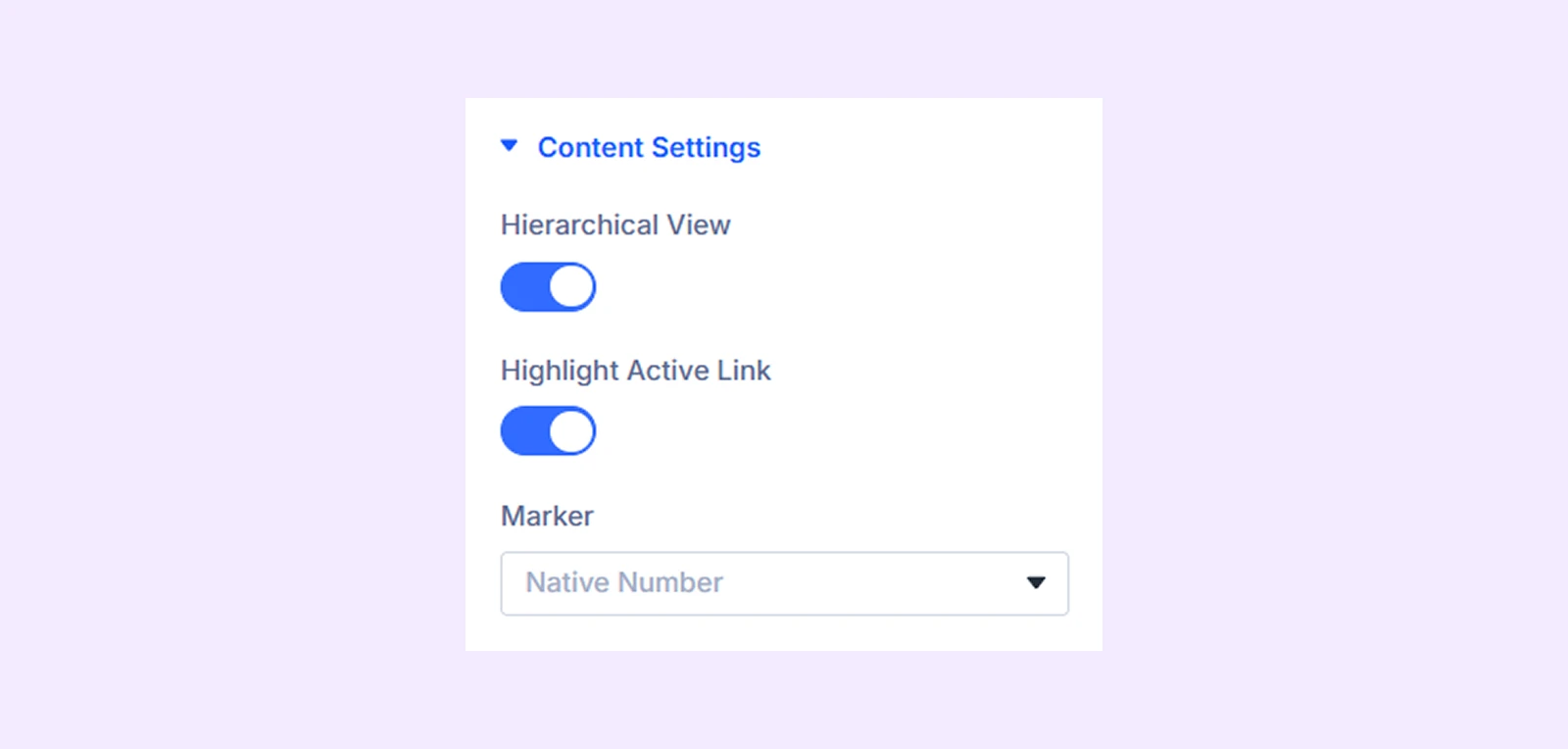
Content Settings
- Hierarchical View: Enable this option to maintain a hierarchical view between the headings on the table of contents.
- Highlight Active Link: Enable this option to highlight the active heading link.
- Marker: Choose what kind of marker you want to use to list all the headings.
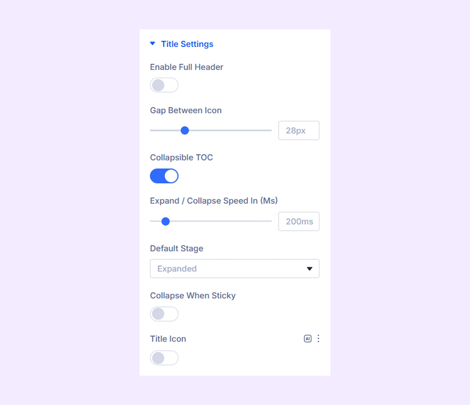
Title Settings
- Enable Full Header: Enable this option to make the table of contents title’s container full width.
- Gap Between Icon: Adjust the gap between the title and the icon.
- Collapsible TOC: Enable this option to make the table of contents collapsible.
- Expand/Collapse Speed In (Ms): Set the duration in milliseconds for the TOC to expand or collapse.
- Default Stage: Choose if the table of contents will be expanded or collapsed by default.
- Collapse When Sticky: Enable this option to keep the title of the table of contents fixed at the top of the page when it is collapsed.
- Title Icon: Enable this option to use an icon with the title of the table of contents.
- Expand Icon Color: Choose the color for the title icon when the table of contents is expanded.
- Expand Icon Size: Adjust the size of the title icon when the table of contents is expanded.
- Collapse Icon: Choose an icon for the title of the table of contents when it is collapsed.
- Collapse Icon Color: Set icon color for collapsed state.
- Collapse Icon Size: Adjust the size of the title icon when the table of contents is collapsed.
- Collapse Icon Only: Enable this option to only display the collapse icon when the table of contents is collapsed.
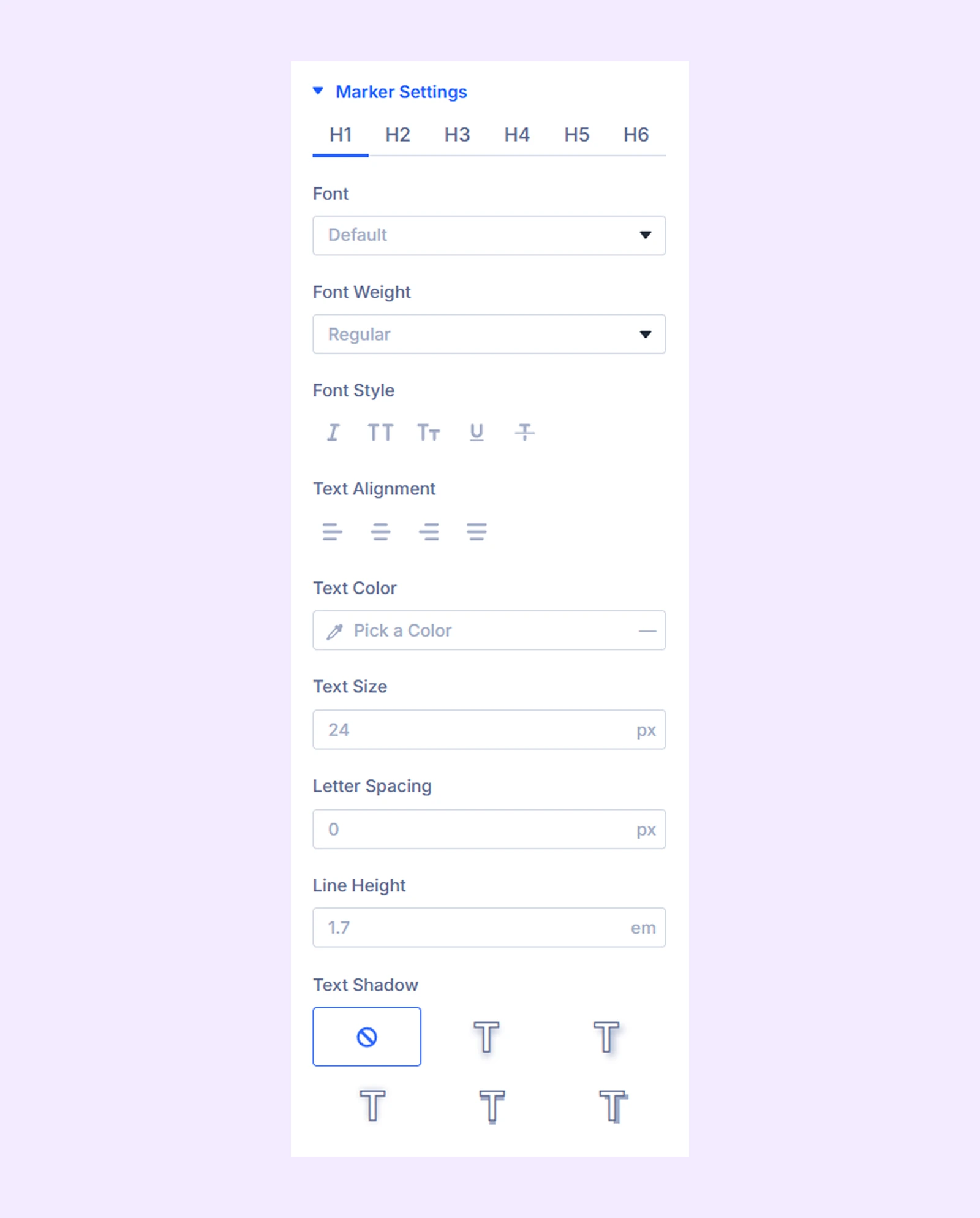
Marker Icon Settings
If you choose “Icon” as “Marker” in the “Content Settings”, this additional section will appear.
You can select an icon, adjust its size, change its color, and adjust the gap between the icon and the headings. You can choose different icons for different heading tags and apply different settings.
Link: Use this default Divi setting to add a link to the entire module.
Background: Add a background color, gradient, image, video, pattern, or mask to the module.
Element Label: Rename the module to organize it more easily in the Divi Builder. (Only you can see this label.)
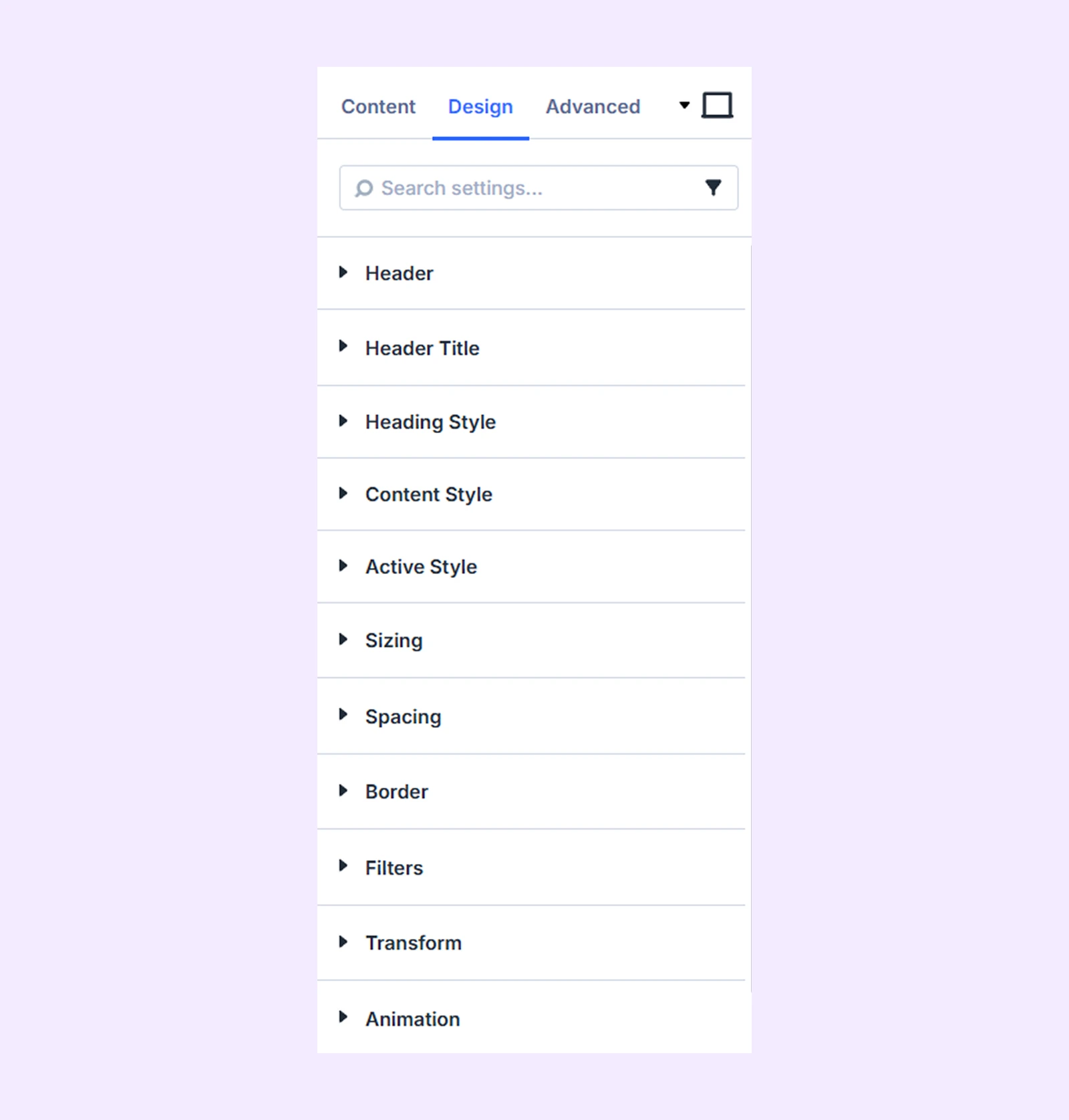
Design Tab
Use this tab to create and manage your table of contents.
Header: Color, spacing, and border options for the title of the table of contents.
Header Title: Typography options for the title of the table of contents.
Heading Style: Typography and spacing options for all the heading tags in the table of contents.
Content Style
- Enable Content Height: Enable this option to customize the height of the table of contents and make it scrollable.
- Content Height: Adjust the height of the table of contents.
- Content Background Color: Pick a color for the background of the table of contents.
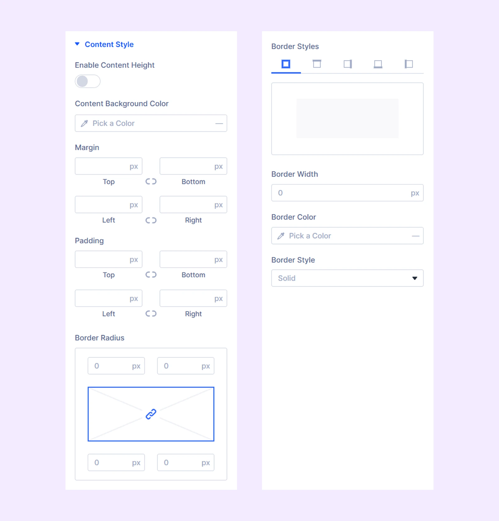
The rest of the options are for spacing and border of the table of contents.
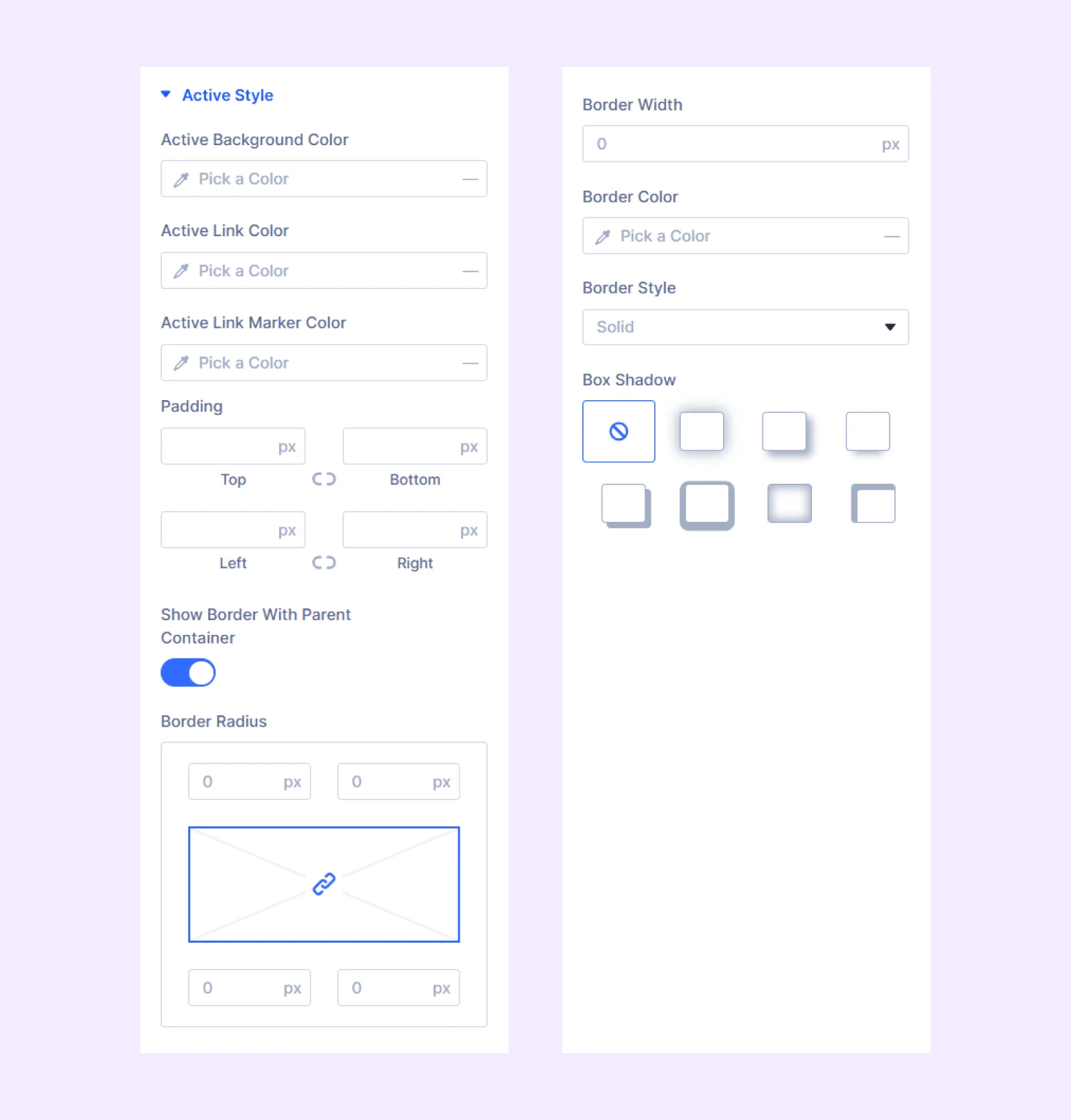
Active Style
- Active Background Color
- Active Link Color
- Active Link Maker Color
The rest of the options are for spacing and border of the table of contents.
Sizing: Adjust the width, height, and alignment of the module.
Spacing: Add custom margin and padding to the module’s container.
Border: Customize the border style, width, and color. And style each border separately or apply the same style to all sides.
Filters: Apply color filters to enhance the appearance.
Transform: Scale, rotate, move, or skew the module.
Animation: Apply reveal animation effects and customize delay, duration, repeat settings, and animation type.
Advanced Tab
This tab provides additional settings for advanced users who want greater control over the module with custom code, conditions, and more.
Need Help?
If you have any questions or need assistance, contact our support team: [email protected]