The Advanced Pricing Table module allows you to create dynamic, customizable, and visually appealing pricing tables for your products or services.
Activation Required: This module is disabled by default. To use it, you need to enable it manually. Refer to our guide for step-by-step instructions.
Let’s see the settings in brief and how to make better use of it —
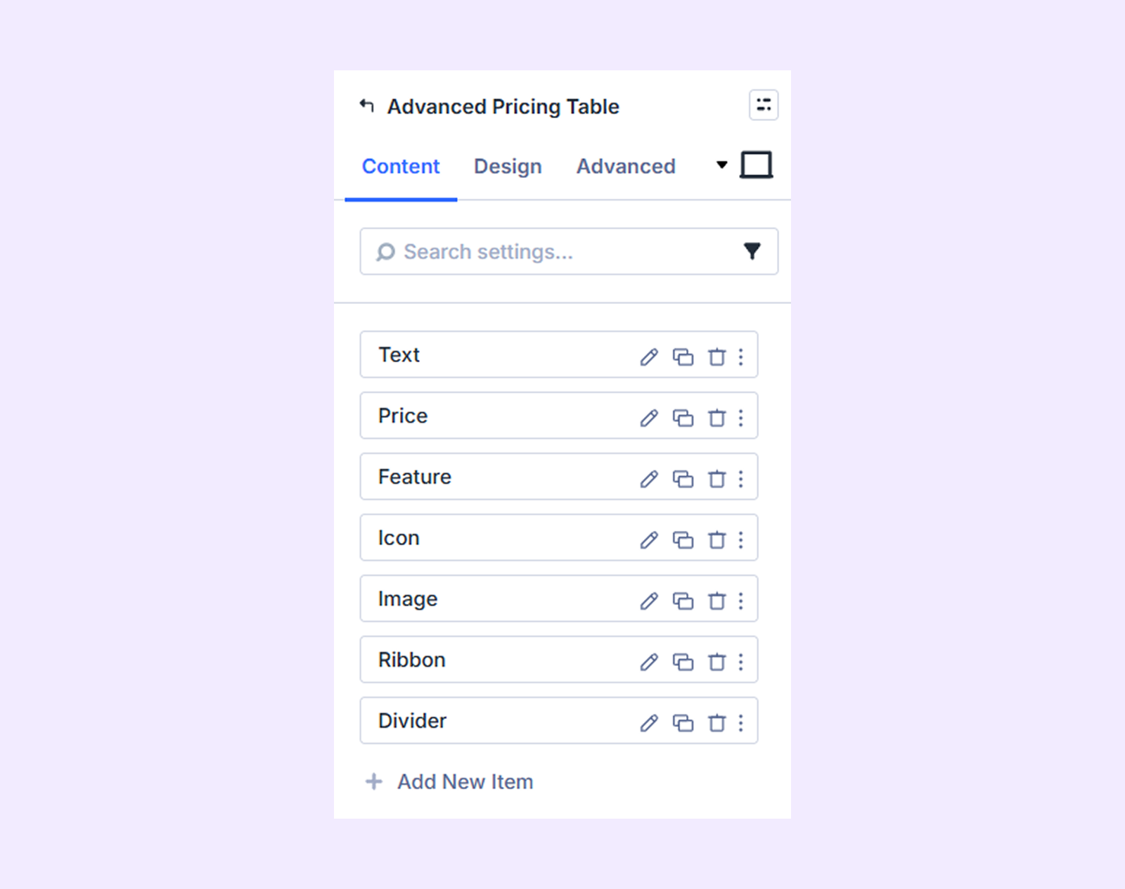
Content
This tab contains all the essential settings to add, manage, and organize your pricing table items.
Add New Pricing Item
Click the + Add New Pricing Item icon to open the “Advanced Pricing Table Item Settings” and add or customize your pricing table items. By default, 7 items are available, which you can edit or delete. To learn more about adding and customizing pricing table items, click here.
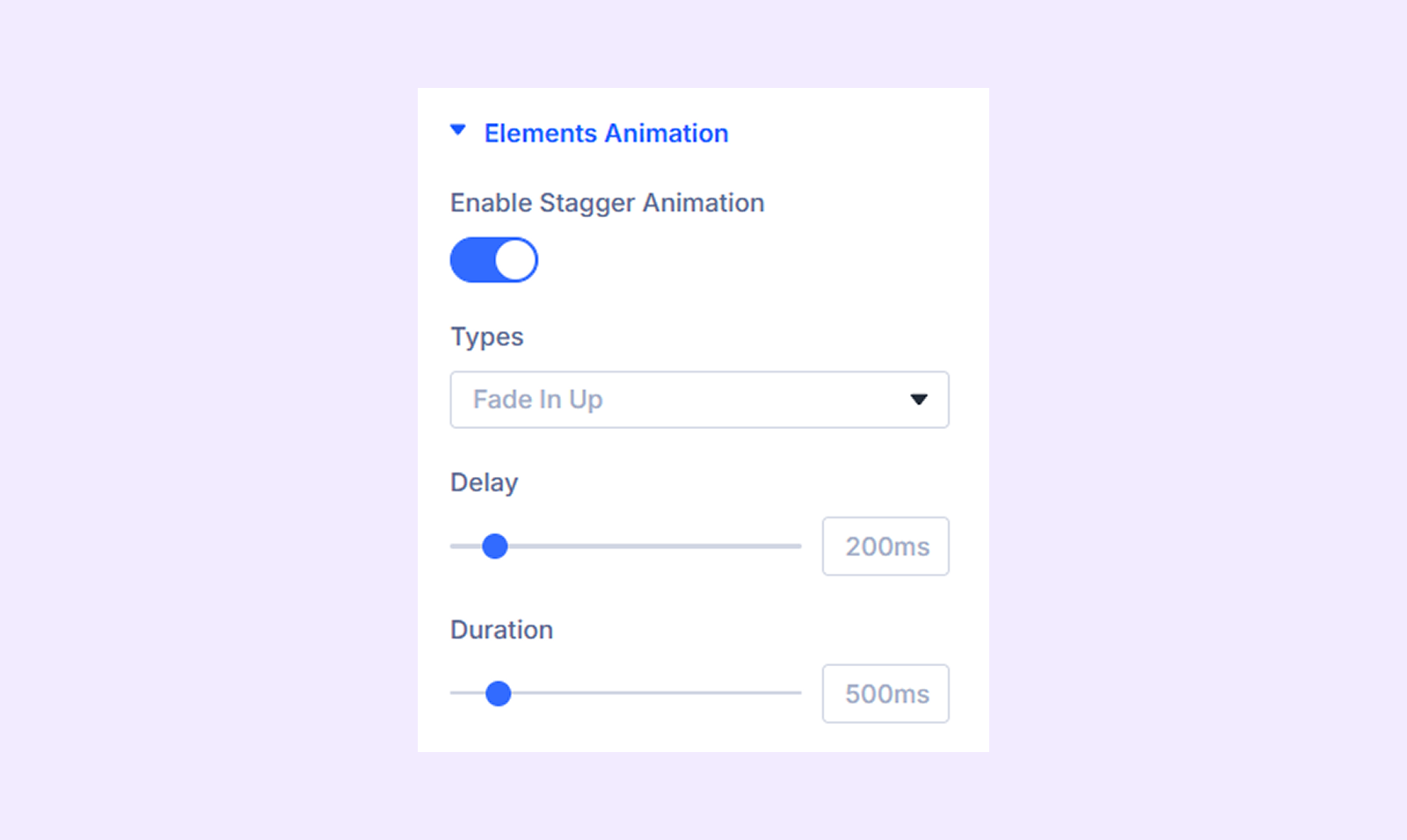
Elements Animation
- Enable Stagger Animation: Enable this option if you want the pricing table items to appear one after the other with a slight delay.
- Types: Choose the type of stagger animation from 19 different present animation options.
- Delay: Define the delay between the appearance of each pricing table item.
- Duration: Adjust the total duration of the animation.
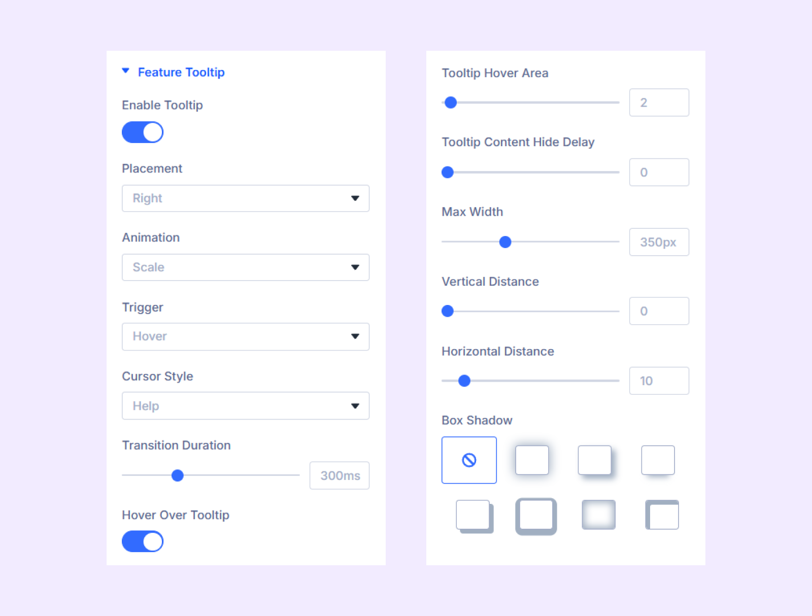
Feature Tooltip
- Enable Tooltip: Enable this option to show a tooltip over the features.
- Placement: Choose where the feature tooltips will appear.
- Animation: Pick a reveal animation for the tooltips.
- Trigger: Choose which action will trigger the tooltips, hover, click, or hover and click.
- Cursor Style: Choose how the cursor would look when hovering over the features.
- Transition Duration: Specify how long it will take for the feature tooltips to appear.
- Hover Over Tooltip: Enable this option to let your users hover over the tooltips.
- Tooltip Hover Area: Modify the size of the invisible hover area that triggers the tooltip.
- Tooltip Content Hide Delay: Set the time delay for the tooltip to hide.
- Max Width: Set a maximum width limit for the tooltip.
- Vertical Distance: Adjust the vertical distance of the tooltips from their respective features.
- Horizontal Distance: Adjust the horizontal distance of the tooltips from their respective features.
- Box Shadow: Select a shadow effect for the tooltips and customize different aspects of it.
Link: Use this default Divi setting to add a link to the entire module.
Background: Add a background color, gradient, image, video, pattern, or mask to the module.
Element Label: Rename the module to organize it more easily in the Divi Builder. (Only you can see this label.)
Design Tab
Customize the appearance of the Advanced Pricing Table module with advanced design settings.
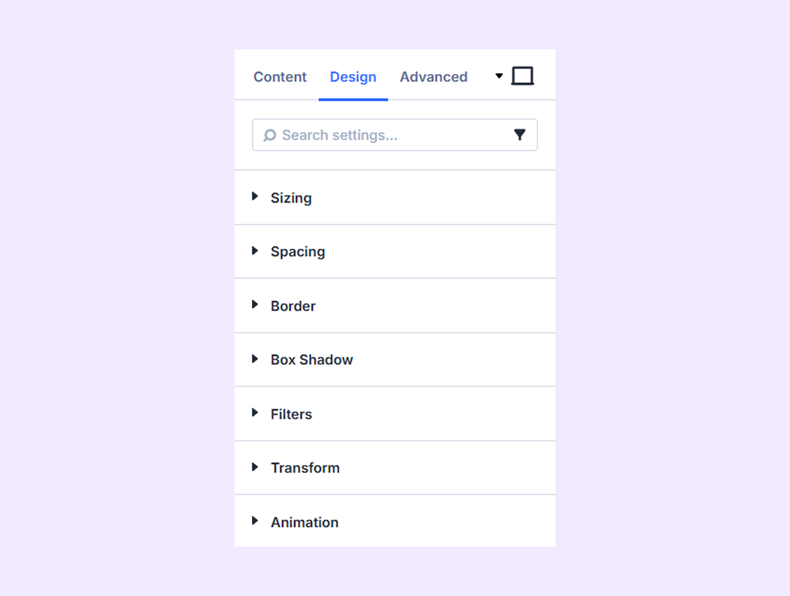
Sizing: Adjust the width, height, and alignment of the module.
Spacing: Add custom margin and padding to the module’s container.
Border: Customize the border style, width, and color. And style each border separately or apply the same style to all sides.
Box Shadow: Add shadow effects to the module.
Filters: Apply color filters to enhance the appearance.
Transform: Scale, rotate, move, or skew the module.
Animation: Apply reveal animation effects and customize delay, duration, repeat settings, and animation type.
Advanced Tab
This tab provides additional settings for advanced users who want greater control over the module with custom code, conditions, and more.
Advanced Pricing Table Item Settings
From here, you can add and customize each pricing table item separately. Keep in mind that, the settings you apply here will take precedence over the settings applied in the parent level.
Content Tab
Element
Element Type: Choose the type of element to add (9 options).
If you choose “Text”
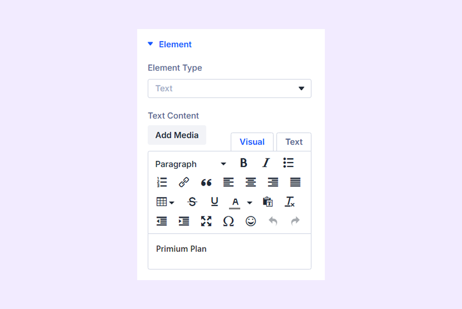
Text Content: Input the text you want to display in the pricing table.
If you choose “Price”
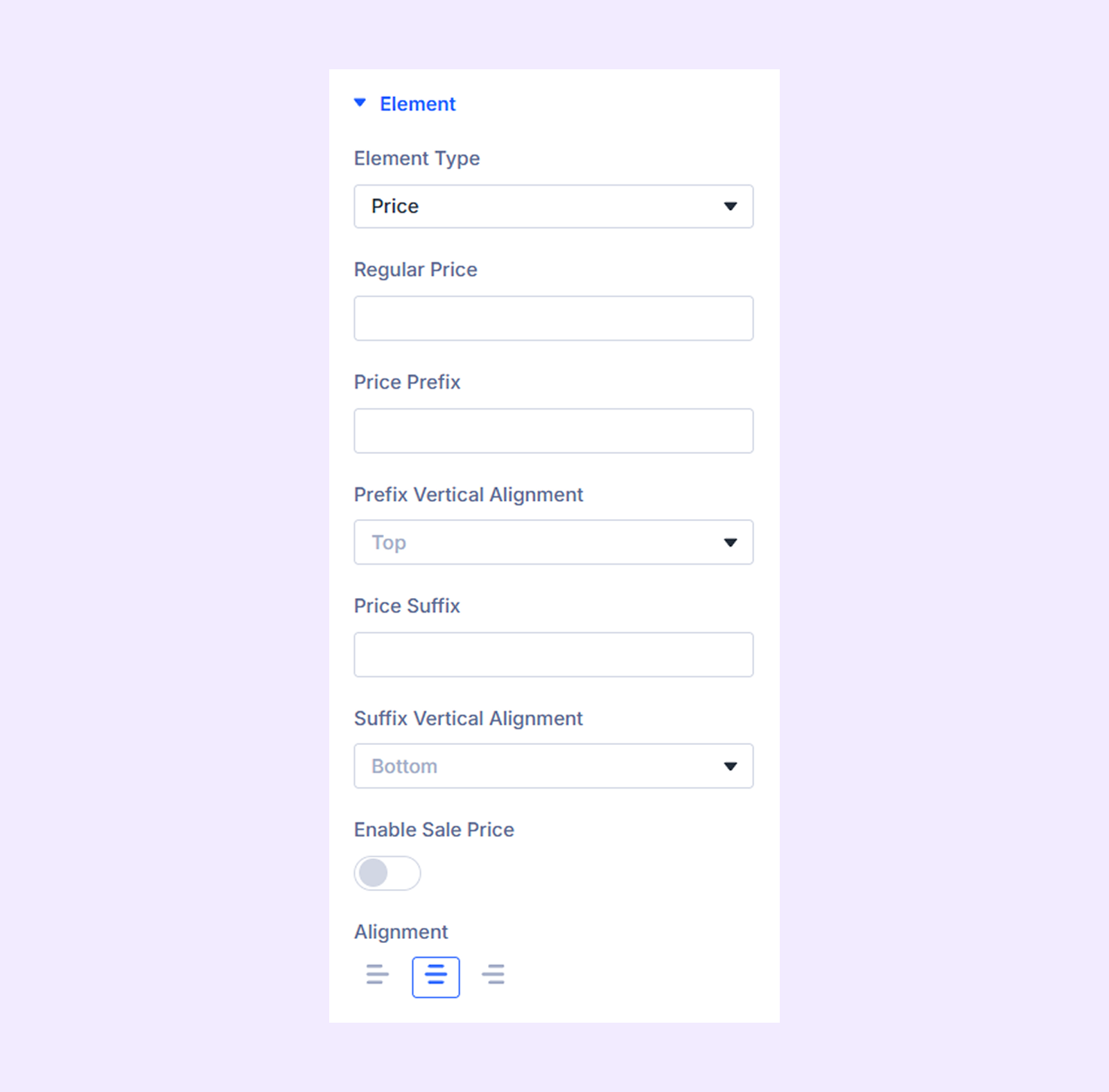
- Regular Price: Submit the regular price.
- Price Prefix: Add text, symbols, etc. which will be displayed before the regular price.
- Prefix Vertical Alignment: Change the vertical position of the price prefix relative to the regular price.
- Price Suffix: Add text, symbols, etc. which will be displayed after the regular price.
- Suffix Vertical Alignment: Change the vertical position of the price suffix relative to the regular price.
- Enable Sale Price: Enable this option to display a sale price along with the regular price.
- Gap Between Regular and Sale Price: Adjust the gap between sale and regular price.
- Sale Price Placement: Choose if you want to place the sale price before or after the regular price.
- Sale Price: Submit the sale price.
- Price Prefix: Add text, symbols, etc. which will be displayed before the sale price.
- Prefix Vertical Alignment: Change the vertical position of the sale price prefix relative to the sale price.
- Price Suffix: Add text, symbols, etc. which will be displayed after the sale price.
- Suffix Vertical Alignment: Change the vertical position of the sale price suffix relative to the sale price.
Note: The sale price-related options are only available if you enable “Sale Price.”
- Alignment: Change the horizontal position of the price element relative to the container of the pricing table.
If you choose “Feature”
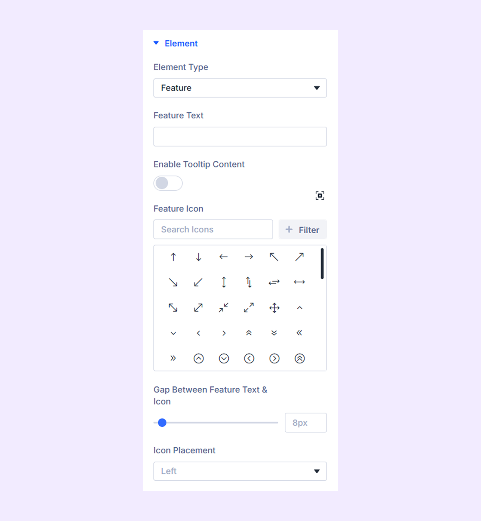
- Feature Text: Input the feature text.
- Enable Tooltip Content: Enable this option to add the content of the tooltip for this particular feature.
- Tooltip Content Area: Submit the content for the feature tooltip.
- Feature Icon: Choose an icon to display beside the feature.
- Gap Between the Feature Text and Icon: Adjust the gap between the feature text and its icon.
- Icon Placement: Decide if you want to place the feature icon on the left or the right side of the feature text.
If you choose “Icon”
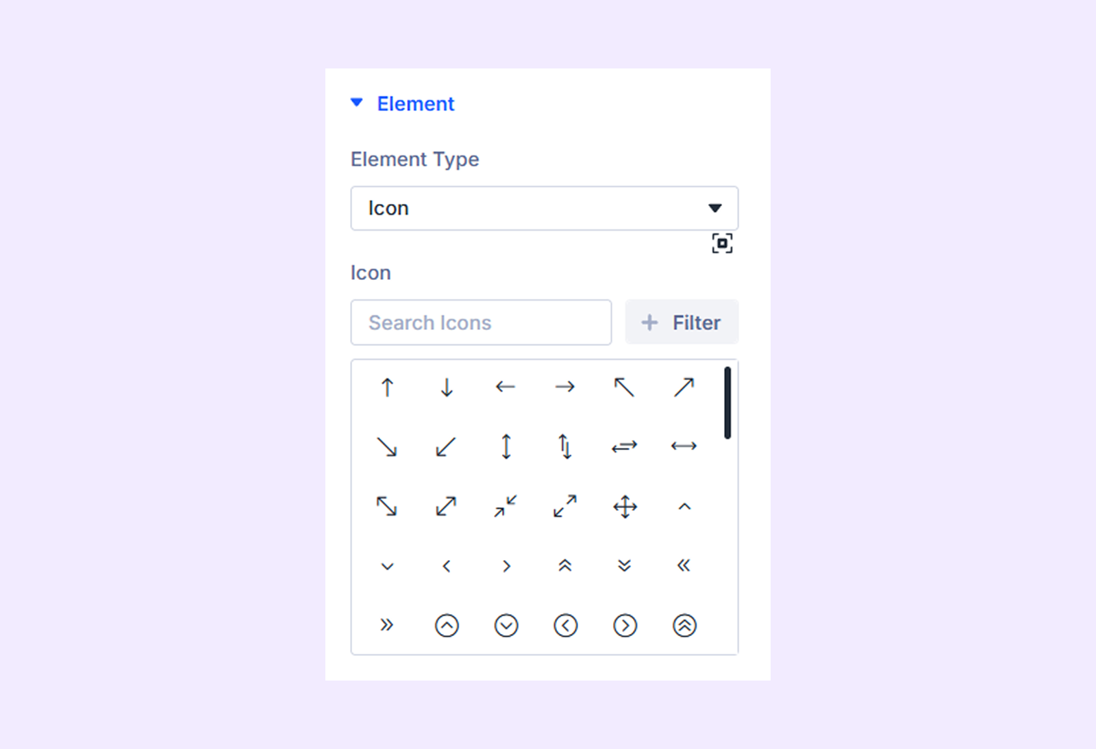
Icon: Choose the icon you want to display in the pricing table.
If you choose “Image”
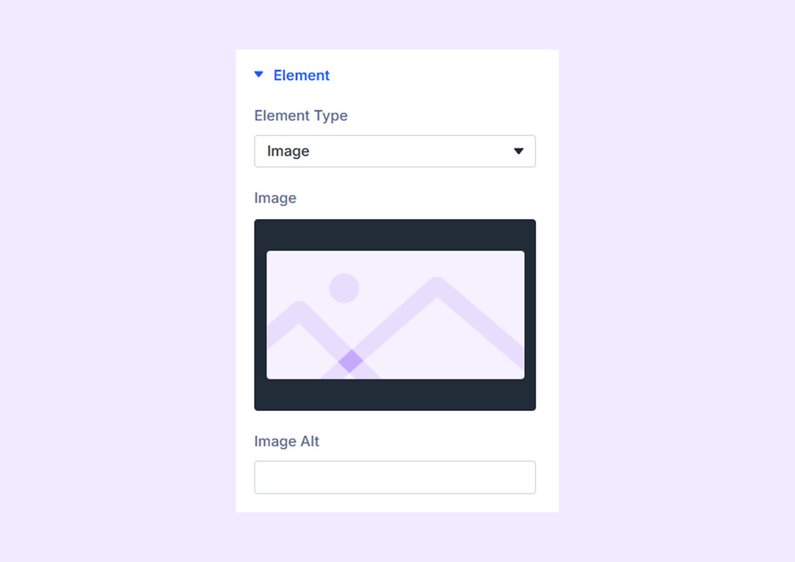
- Image: Upload the image you want to display in the pricing table.
- Image Alt: Submit the alt text for the image you uploaded.
If you choose “Ribbon”
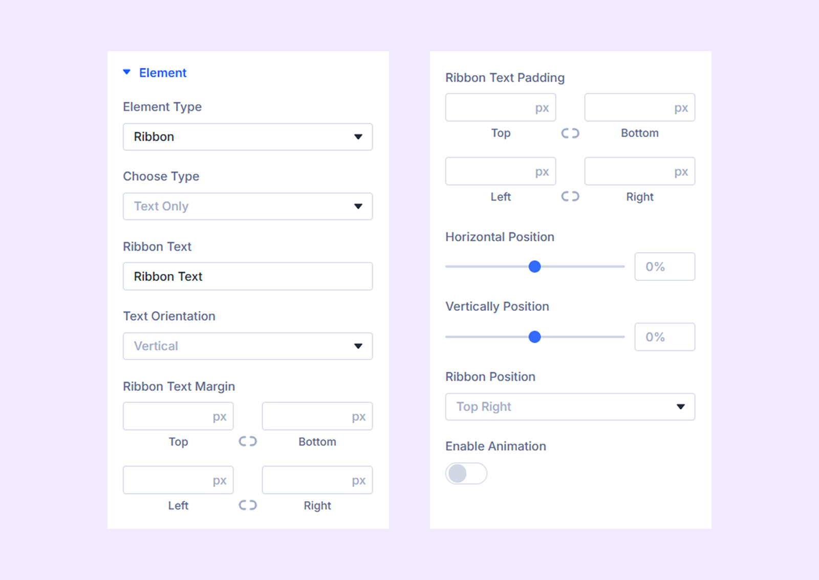
- Choose Type: Choose what type of ribbon you want to use in the pricing table. You have 5 options: Text Only, Text With Icon, Text With Image, Image Only, Icon Only. The customization options you get will depend on the type of ribbon you choose.
- Ribbon Text: Input the text you want to display as the ribbon.
- Text Orientation: Choose if you want to display the ribbon text horizontally or vertically.
- Ribbon Text Margin: Add custom margin to the ribbon text’s container.
- Ribbon Text Padding: Add custom padding to the ribbon text’s container.
- Ribbon Icon: Choose the icon you want to display with the ribbon.
- Icon Placement: Decide if you want to place the feature icon on the left or the right side of the ribbon.
- Icon Size: Adjust the size of the ribbon icon.
- Icon Color: Pick a color for the ribbon icon.
- Icon Background Color: Pick a background color for the ribbon icon.
- Ribbon Icon Margin: Add custom margin for the ribbon icon’s container.
- Ribbon Icon Padding: Add custom padding for the ribbon icon’s container.
- Ribbon Image: Upload the image you want to display with the ribbon.
- Image Alt: Submit the alt text for the ribbon image.
- Image Width: Adjust the width of the image.
- Horizontal Position: Adjust the horizontal position of the ribbon. Doesn’t work if you choose to display the ribbon vertically.
- Vertical Position: Adjust the vertical position of the ribbon. Doesn’t work if you choose to display the ribbon horizontally.
- Ribbon Position: Choose the placement of the ribbon.
- Enable Animation: Enable this option to animate the ribbon.
If you choose “Divider”
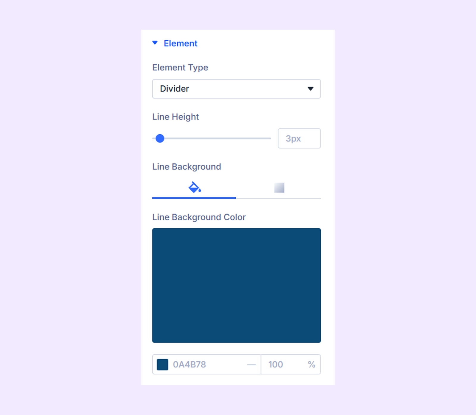
- Line Height: Adjust the width of the divider line.
- Line Color: Pick the color of the divider line.
If you choose “Button”
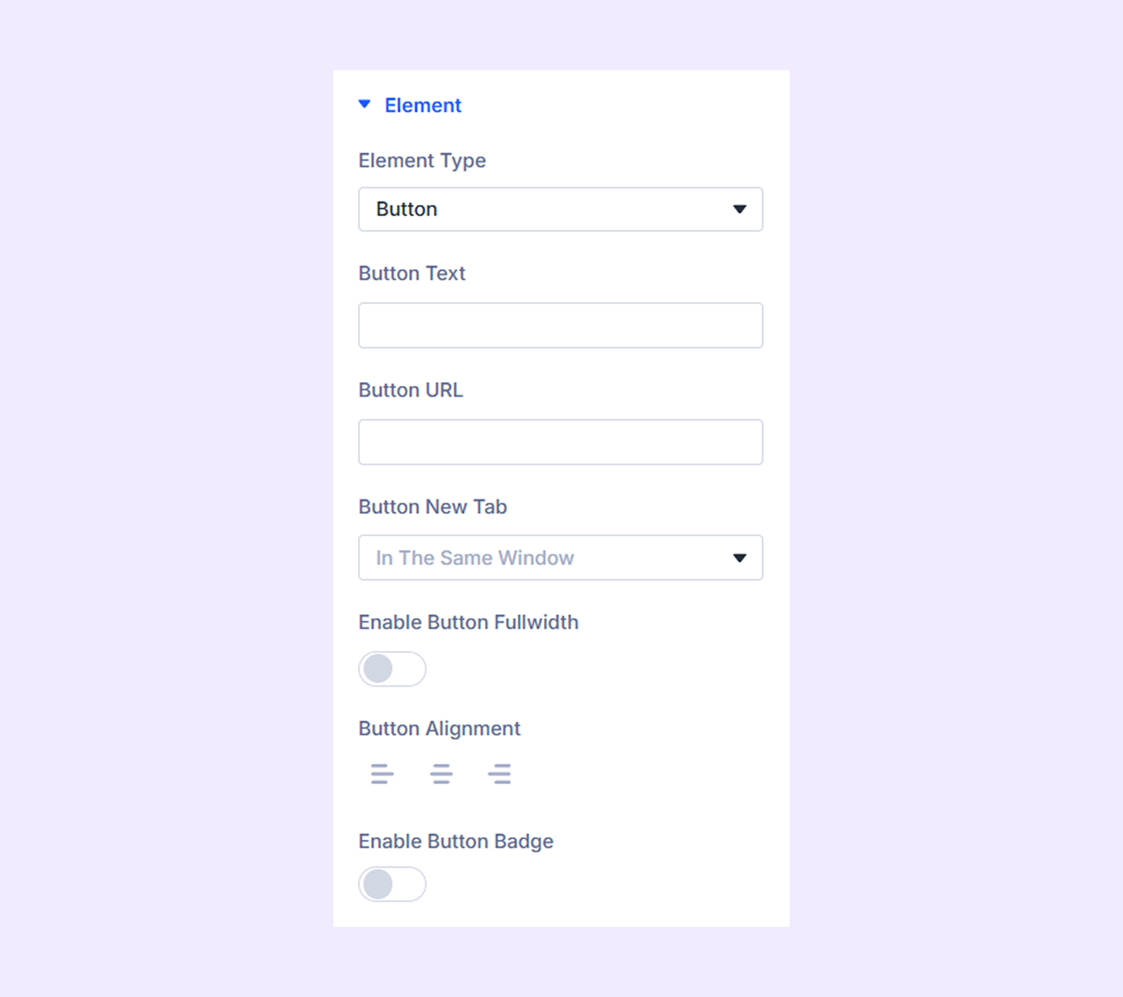
- Button Text: Input the button text.
- Button URL: Attach a link to the button.
- Button Link Target: Decide if the attached link will open in a new or the same tab.
- Enable Button Fullwidth: Enable this option to make the button fullwidth relative to the pricing table container.
- Button Alignment: Change the horizontal placement of the button relative to the container of the pricing table.
- Enable Button Badge: Toggle this option on to use a badge with the button.
- Badge Text: Input the text of the badge.
- Badge Position: Choose the position of the badge relative to the button.
- Badge Alignment: Change the vertical placement of the badge relative to the button.
- Enable Badge Animation: Toggle this option on to animate the button badge.
Note: The badge-related option will only be available if you turn on “Enable Badge.”
If you choose “Rating”
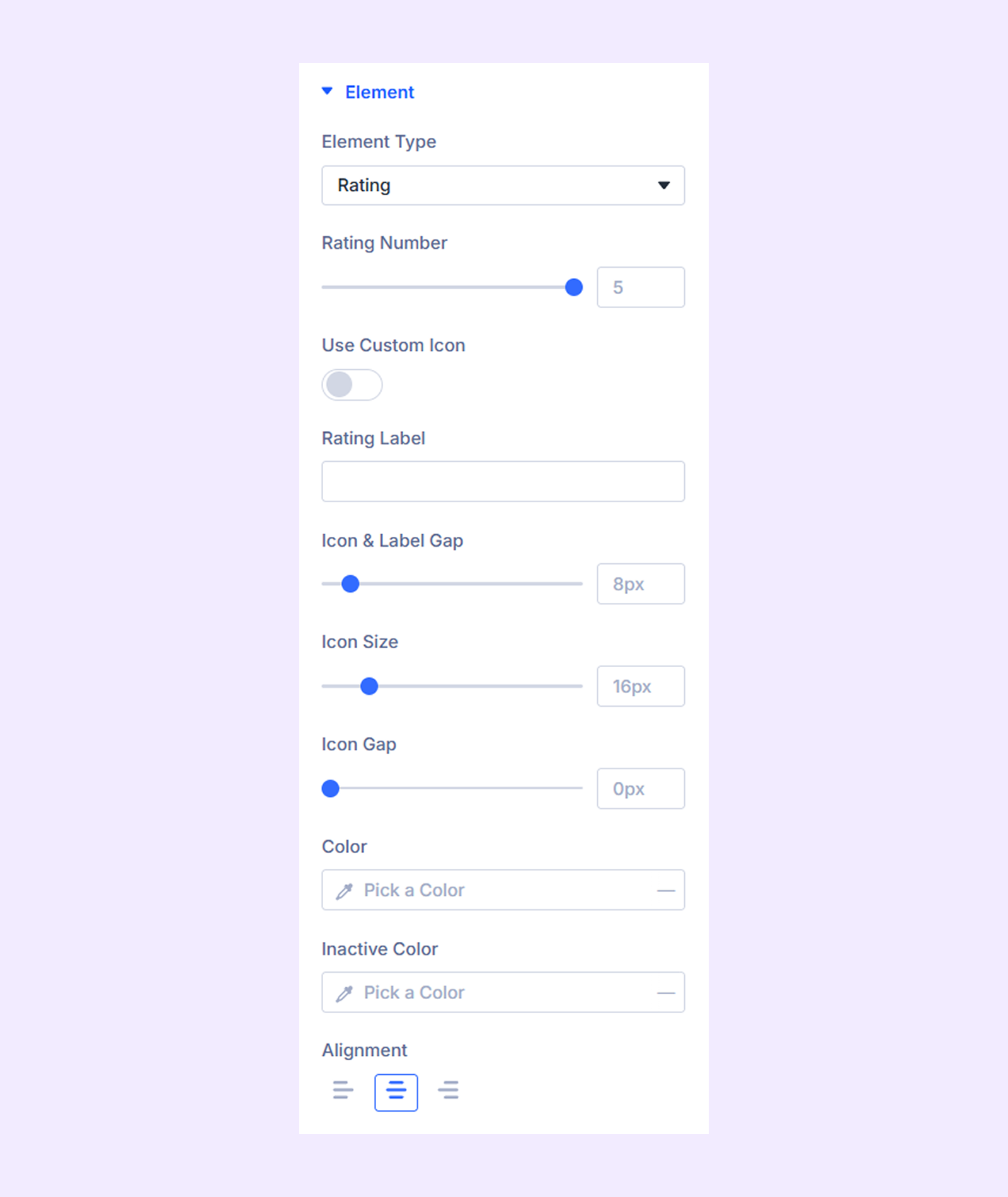
- Rating Number: Submit the rating number.
- Use Custom Icon: Enable this option to use a custom icon for the rating instead of stars.
- Rating Label: Input a label for the rating.
- Icon & label Gap: Adjust the gap between the label and the rating icons.
- Icon Size: Adjust the size of the rating icons.
- Icon Gap: Adjust the gap between the rating icons.
- Color: Pick a color for the rating icons.
- Inactive Color: Pick a color for the rating icons when they are inactive.
- Alignment: Change the horizontal placement of the rating icons relative to the container of the pricing table.
Link: Comes by default with Divi. No real use case.
Background: Add a background color, gradient, image, and more to the element.
Element Label: Change the module name or label if required which will only be visible to you.
Design Tab
Heading: Typography options for the heading text used in the pricing table item.
Element Text: Typography options for the text in the element.
Feature Icon: Border options for the feature icon.
Feature Tooltip: Border options for the feature tooltip.
Feature Tooltip Heading: Typography options for the heading text used in the feature tooltip.
Feature Tooltip Font: Typography options for the feature tooltip content.
Button Badge: Color, spacing, typography, and border options for the button badge.
Button Style: Enable Use Custom Styles for Button option to reveal color, size, icon, spacing, typography, and border options for the button.
Image & Icon: Color, size, border, and spacing options for the image and icon.
Sale Price Text: Typography options for the sale price.
Regular Price Prefix Text: Typography options for the regular price prefix text.
Regular Price Suffix Text: Typography options for the regular price suffix text.
Sale Price Prefix Text: Typography options for the sale price prefix text.
Regular Price Suffix Text: Typography options for the sale price suffix text.
Sizing: Adjust the width, height, and alignment of the element.
Spacing: Add custom margin and padding to the element’s container.
Border: Border customization options for the element’s container. You have the option to style each border individually or all the borders together.
Box Shadow: Add a shadow effect to the element.
Filters: Add color filters to the element.
Transform: Make changes to the scale and position of the module.
Advanced
Add custom CSS, visibility conditions, or other advanced controls for individual pricing table items.
Need Help?
If you have any questions or need assistance, contact our support team: [email protected]