DiviFlash Content Toggle module lets you switch between two sets of content using an interactive toggle.
Activation Required: This module is disabled by default. To use it, you need to enable it manually. Refer to our guide for step-by-step instructions.
Let’s see the settings in brief and how to make better use of it —
Content Tab
This tab contains settings for configuring the toggle labels, content, and animation behavior.
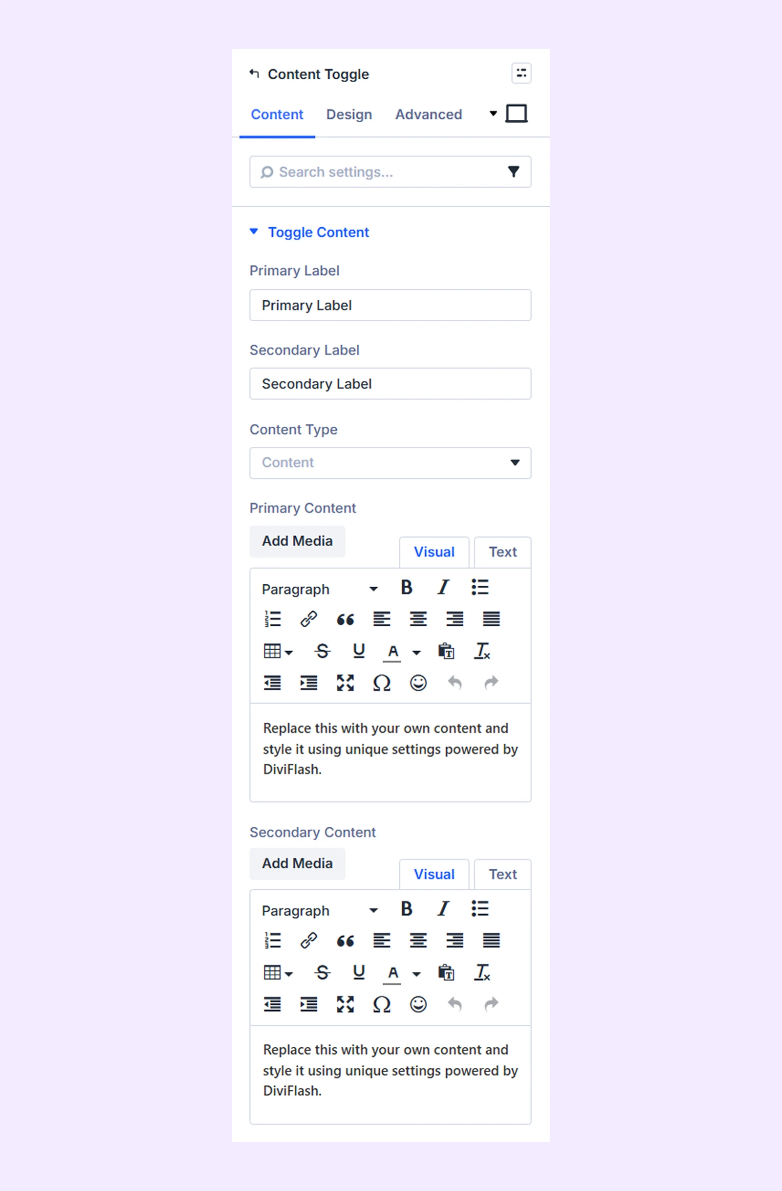
Toggle Content
- Primary Label: Enter the label text displayed for the first toggle state.
- Secondary Label: Enter the label text displayed for the second toggle state.
- Content Type: Choose the type of content to display. Four options are available:
- Content: Display text, images, or other media.
- Shortcode: For using shortcodes.
- Library: For using library content.
- HTML Class: Redirect users to a specific section using an HTML class.
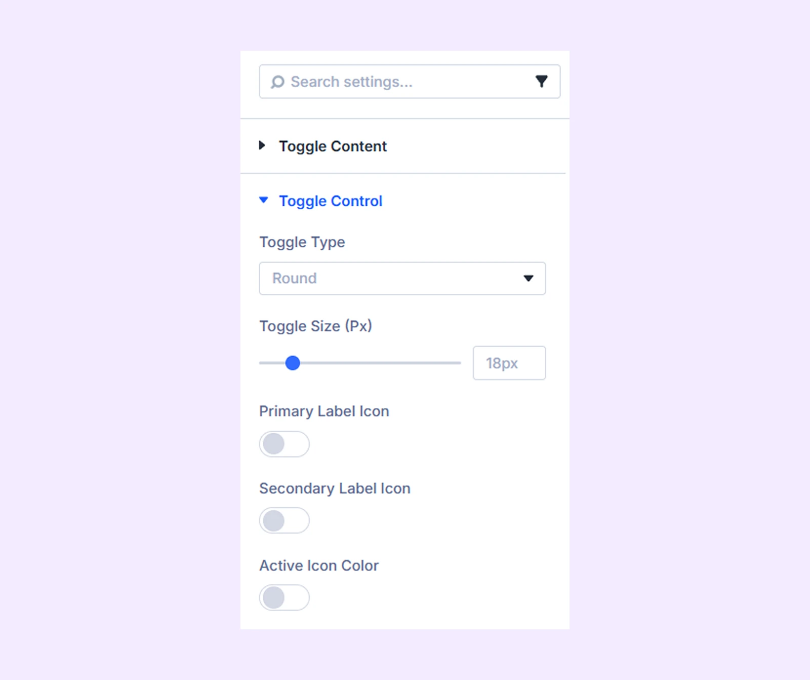
Toggle Control
- Toggle Type: Choose from five different toggle styles.
- Toggle Size: Adjust the size of the toggle switch.
- Primary Label Icon:
- Icon: Select an icon for the primary label.
- Icon Color: Choose the icon color.
- Icon Size: Adjust the size of the icon.
- Primary Icon Alignment: Choose the position of the icon relative to the label.
- Hide On Mobile: Hide the primary label icon on mobile devices.
- Secondary Label Icon: Contains the same settings as the Primary Label Icon, but applies them to the secondary label.
- Active Icon Color: Enable this option to change the icon color when the toggle is active.
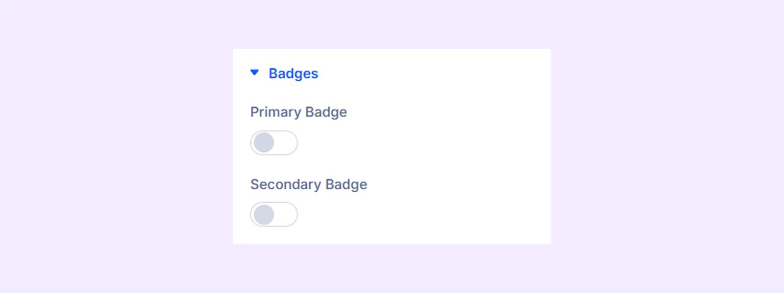
Badges
- Primary Badge: Enable this option to display a badge on the primary label.
- Primary Badge Text: Enter the text for the badge.
- Left/Right Position: Adjust the horizontal placement of the badge.
- Top/Bottom Position: Adjust the vertical placement of the badge.
- Arrow Placement: Choose which side of the badge displays the arrow.
- Arrow Size: Adjust the size of the badge arrow.
- Arrow Position: Adjust the position of the badge arrow.
- Secondary Badge: Contains the same settings as the Primary Badge, but applies them to the secondary label.
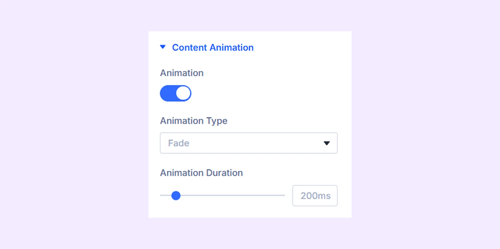
Content Animation
- Animation: Enable animation for the toggle content.
- Content Animation: Choose from eight animation styles.
- Animation Duration: Adjust the animation duration.
Link: Use this default Divi setting to add a link to the entire module.
Background: Add a background color, gradient, image, video, pattern, or mask to the module.
Element Label: Rename the module to organize it more easily in the Divi Builder. (Only you can see this label.)
Design Tab
Use this tab to customize the appearance of the toggle and its content.
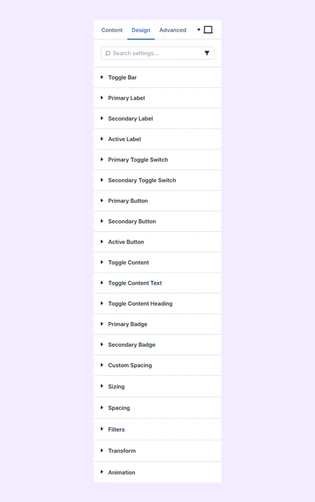
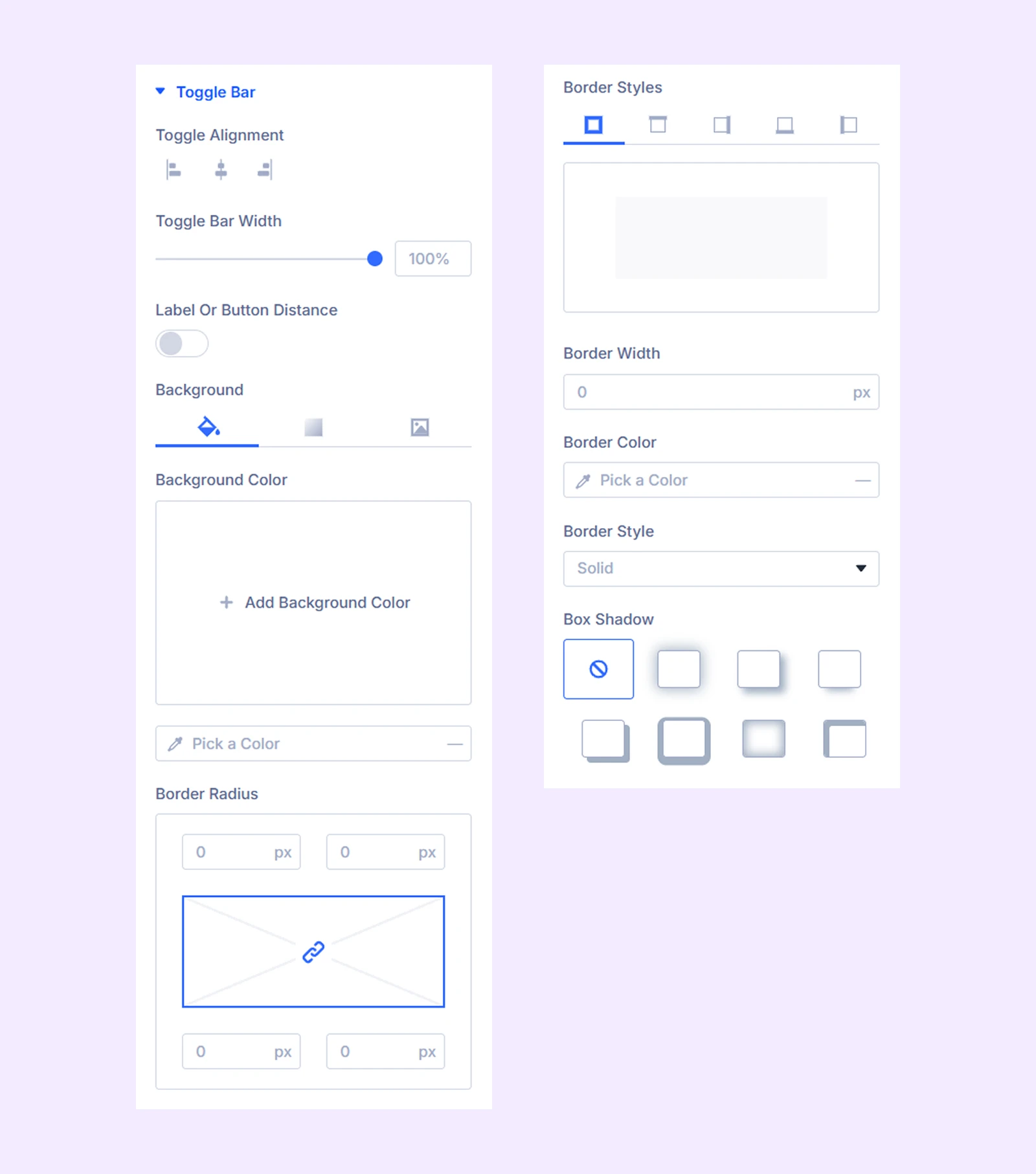
Toggle Bar
- Toggle Alignment: Adjust the horizontal alignment of the toggle button.
- Toggle bar Width: Adjust the width of the toggle container.
- Label Or Button Distance: Adjust the spacing between the labels and the toggle button.
Additional options allow you to customize the background and border of the toggle container.
Primary Label: Customize the typography of the primary label.
Secondary Label: Customize the typography of the secondary label.
Active Label: Customize the typography of the active label.
Primary Toggle Switch: Choose the color of the primary toggle switch.
Secondary Toggle Switch: Choose the color of the secondary toggle switch.
Primary Button: Customize the typography and border of the primary button.
Secondary Button: Customize the typography and border of the secondary button.
Active Button: Customize the typography and border of the active button.
Toggle Content: Customize the background and border of the content container.
Toggle Content Text: Customize the typography of the content text.
Toggle Content Heading: Customize the typography of content headings.
Primary Badge: Customize the color, typography, and border of the primary badge.
Secondary Badge: Customize the color, typography, and border of the secondary badge.
Custom Spacing: Adjust padding and margin for each module component.
Sizing: Adjust the width, height, and alignment of the module.
Spacing: Adjust the margins and padding of the module container.
Filters: Apply color filter effects to the module.
Transform: Adjust the scale, position, rotation, and size of the module.
Animation: Add reveal animation effects and control the animation style, delay, duration, and more.
Advanced Tab
This tab provides additional settings for advanced users who want greater control over the module with custom code, conditions, and more.
Need Help?
If you have any questions or need assistance, contact our support team: [email protected]