DiviFlash Dual Button module allows you to create two buttons that can link to different pages or actions.
Let’s see the settings in brief and how to make better use of it —
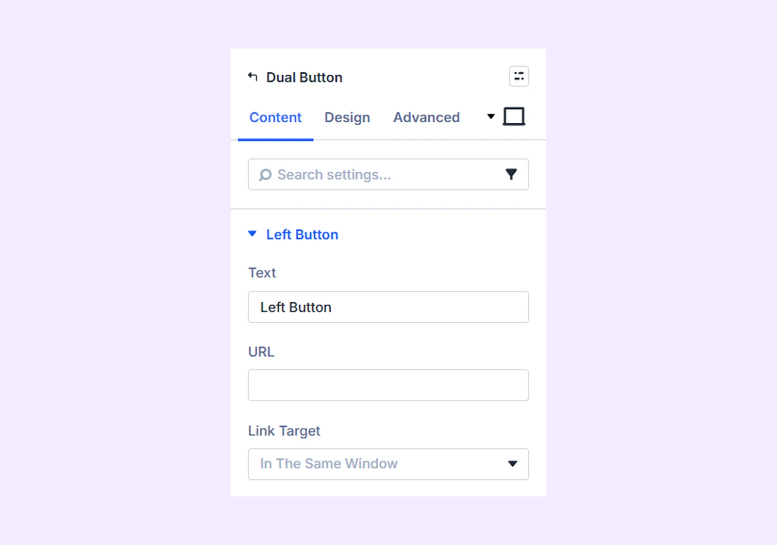
Content Tab
This tab contains the settings for configuring both buttons and the separator between them.
Left Button
Enter the text and URL for the left button and choose whether the link opens in the same tab or a new tab.
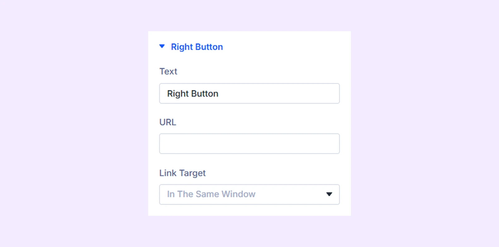
Right Button
Enter the text and URL for the right button and choose whether the link opens in the same tab or a new tab.
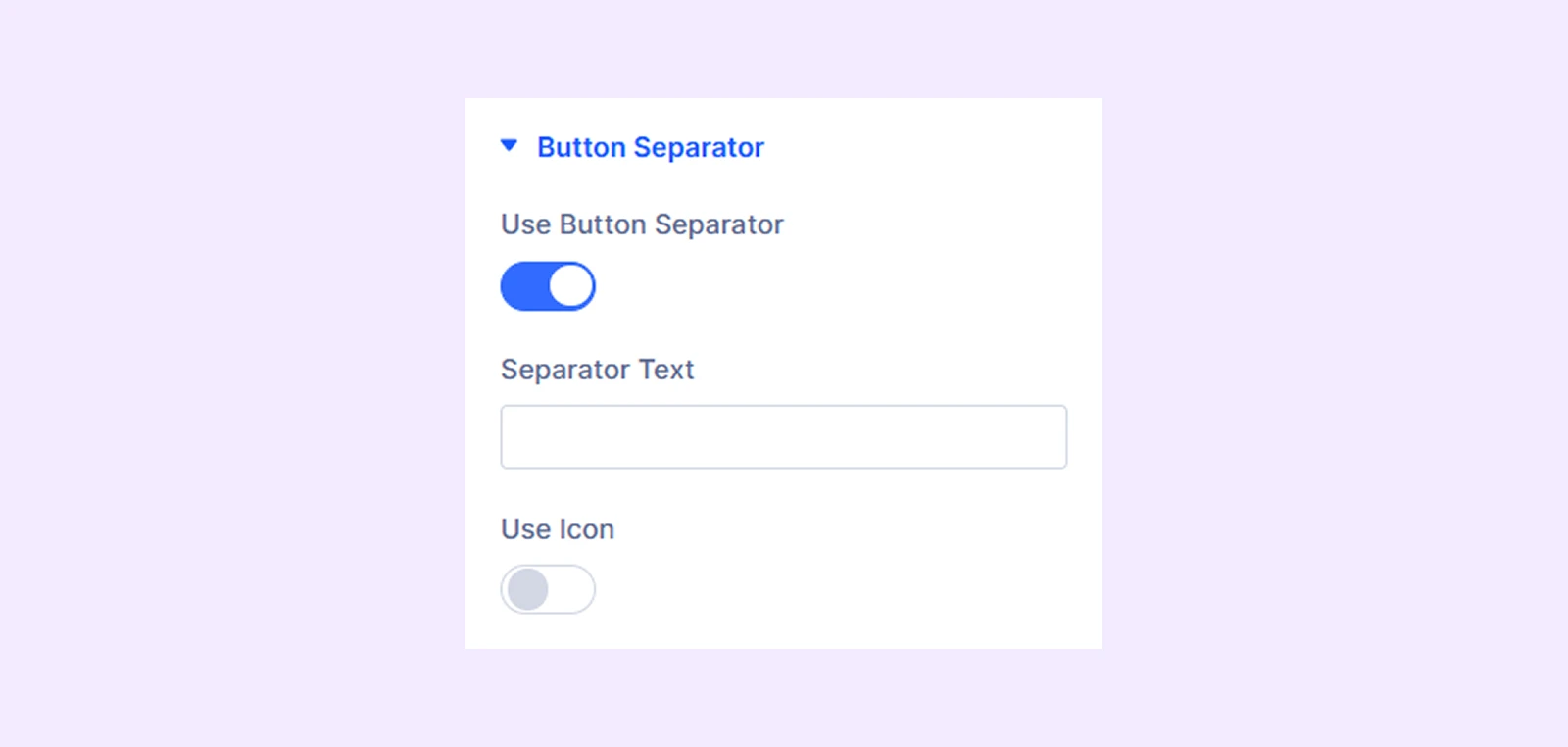
Button Separator
- Use Button Separator: Enable this option to display a separator between the two buttons.
- Separator Text: Enter the text you want to use as the separator.
- Use Icon: Enable this option to use an icon instead of text as the separator.
- Icon Color: Choose the color of the separator icon.
- Use Icon Font Size: Enable this option to control the icon size.
- Icon Font Size: Adjust the size of the icon.
Element Label: Rename the module to organize it more easily in the Divi Builder. (Only you can see this label.)
Design Tab
Use this tab to customize the appearance and layout of the dual buttons.
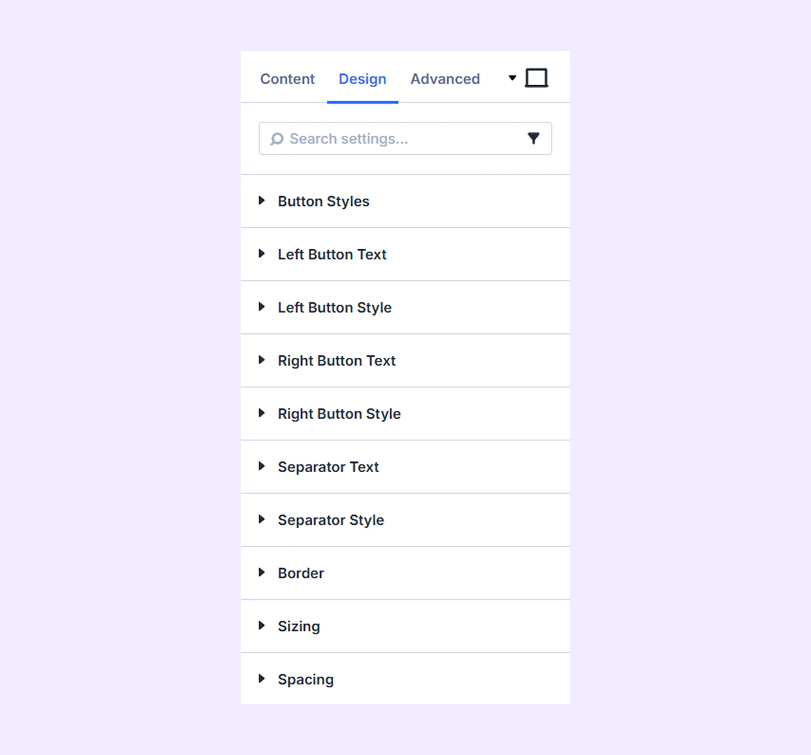
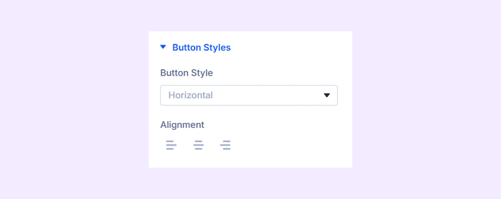
Button Styles
Choose whether the buttons appear vertically or horizontally and adjust their horizontal alignment.
Left Button Text: Customize the typography settings for the left button text.
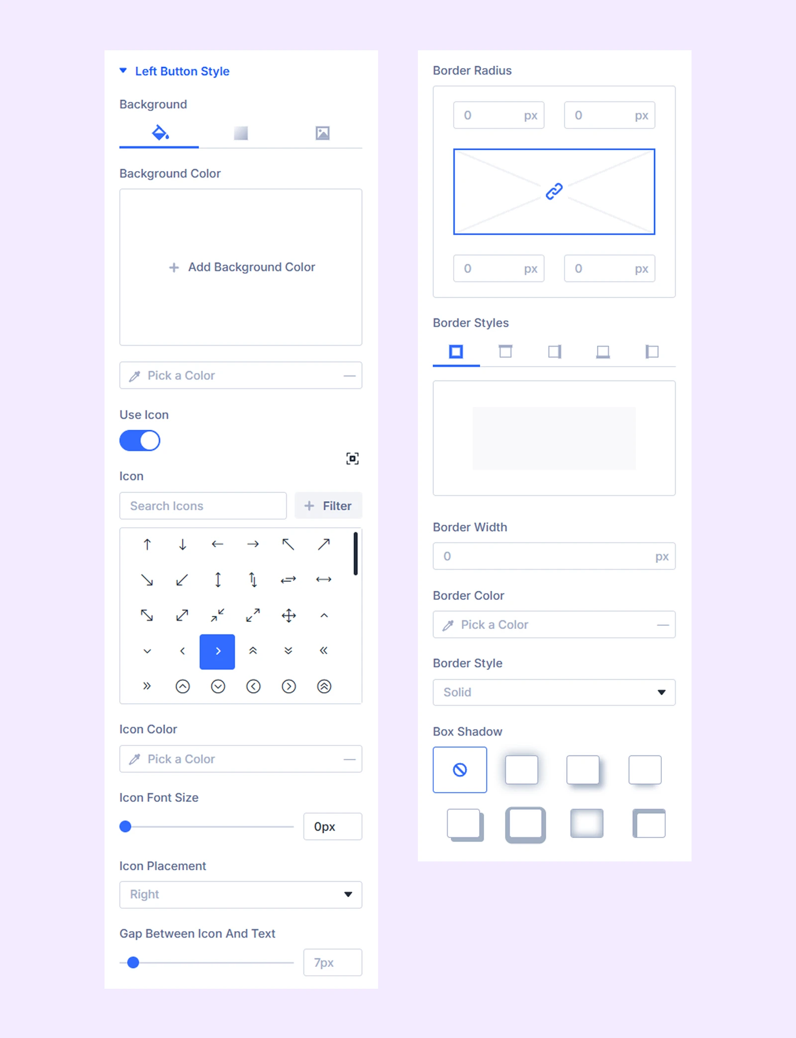
Left Button Style
- Left Button Background: Add a background color, gradient, or image to the left button.
- Use Icon: Enable this option to display an icon inside the left button.
- Icon Color: Choose the color of the icon.
- Icon Font Size: Adjust the size of the icon.
- Icon Placement: Choose whether the icon appears on the left or right side of the button text.
- Gap Between Icon and Text: Adjust the spacing between the icon and the button text.
Additional options allow you to customize the border of the left button.
Right Button Text: Customize the typography settings for the right button text.
Right Button Style: Use the same styling options available in Left Button Style to customize the right button.
Separator Text: Customize the typography settings for the separator text.
Separator Style: Customize the background and border of the button separator.
Border: Customize the border style, width, and color. And style each border separately or apply the same style to all sides.
Sizing: Adjust the width, height, and alignment of the module.
Spacing: Add custom margin and padding to the module’s container.
Advanced Tab
This tab provides additional settings for advanced users who want greater control over the module with custom code, conditions, and more.
Need Help?
If you have any questions or need assistance, contact our support team: [email protected]