
The DiviFlash Instagram Feed Carousel module allows you to display your Instagram posts on your website in a responsive carousel layout.
Let’s see the settings in brief and how to make better use of it —
Content Tab
This tab contains the settings for connecting your Instagram account and configuring the carousel behavior.
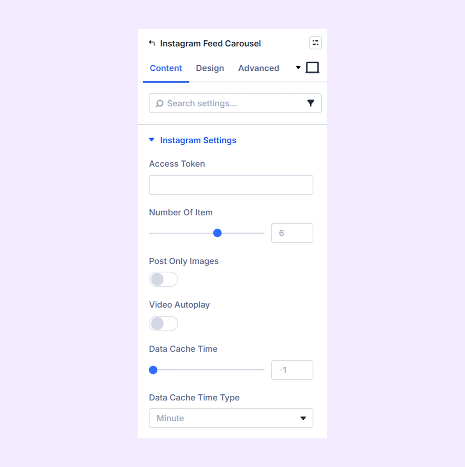
Instagram Settings
- Access Token: Enter the Instagram access token to import posts into the module. If you do not have an access token, the Instagram Feed Carousel module will not work.(To learn how to get the Instagram access token, click here.)
- Number of Items: Define how many Instagram posts will be displayed.
- Post Only Images: Display only posts that contain images.
- Video Autoplay: Automatically play videos in the feed. (Not available when "Post Only Images" is enabled.)
- Data Cache Time: Define how often the Instagram feed should refresh.
- Data Cache Time Type: Choose the time unit used for the cache interval (minutes, hours, or days).
Carousel Settings
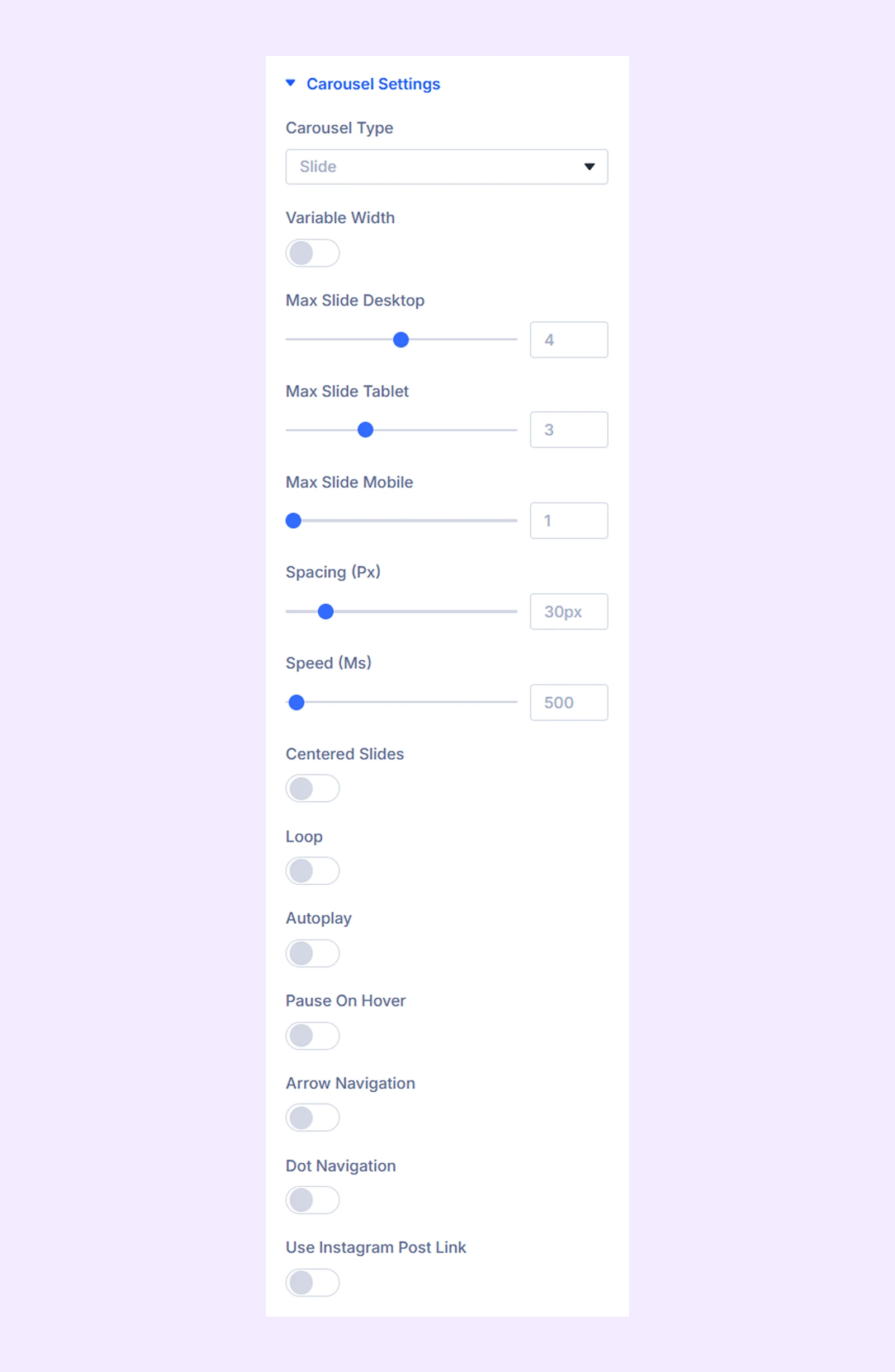
- Carousel Type: Choose the carousel animation type. Available options include Slide, Cube, Coverflow, and Flip.
If you choose “Slide”and “Coverflow”
- Variable Width: Enable to use the original width of the Instagram posts. Not available for “Coverflow.”
- Max Image Height: Set a maximum height for images. (Not available for Coverflow.)
- Max Slide Desktop: Define the number of posts shown on desktop devices.
- Max Slide Tablet: Define the number of posts shown on tablet devices.
- Max Slide Mobile: Define the number of posts shown on mobile devices.
- Spacing: Adjust the space between carousel items.
- Speed: Adjust the slide transition speed.
If you choose “Cube” or “Flip”-
- Speed: Define the speed at which the Instagram post images will rotate.
- Centered Slides: Place the first slide in the center. (Available for Slide and Coverflow.)
- Loop: Enable continuous carousel looping.
- Autoplay: Automatically rotate carousel items.
- Autoplay Speed: Define the autoplay interval.
- Pause on Hover: Pause autoplay when the cursor hovers over the carousel. (Available when Autoplay is enabled.)
- Arrow Navigation: Enable arrow buttons for navigation.
- Dot Navigation: Enable dot indicators for navigation. (Not available for Cube or Flip carousel types.)
- Use Instagram Post Link: Link each carousel item to its original Instagram post.
- Link Target: Choose whether links open in the same tab or a new tab.
Advanced Carousel Settings
These options appear when Coverflow is selected as the carousel type.
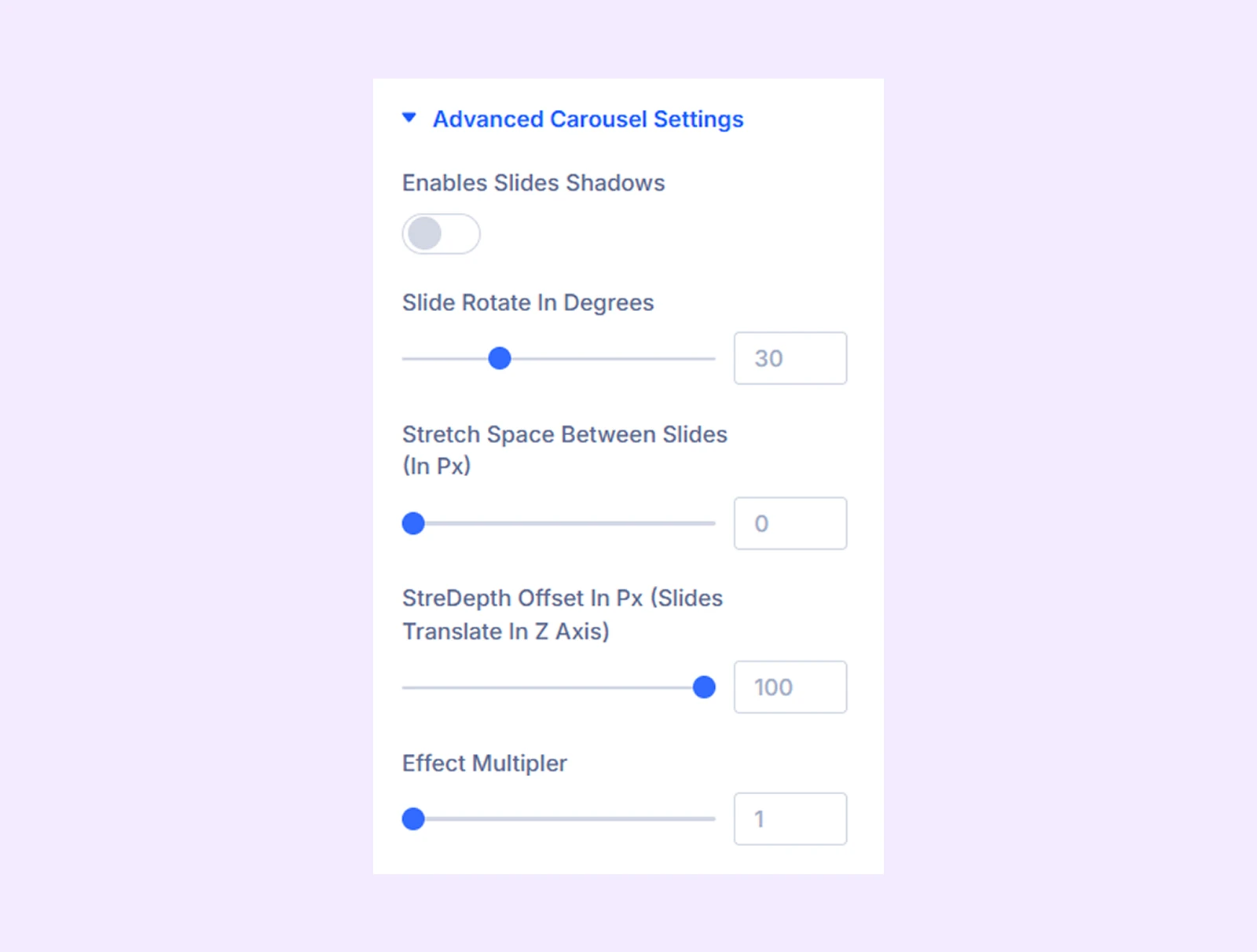
- Enables Slides Shadows: Add shadow effects to carousel items.
- Slide Rotate in Degrees: Adjust the rotation angle of items.
- Stretch Space Between the Slides: Adjust spacing between slides.
- Depth Offset: Control the depth effect of carousel items.
- Effect Multiplier: Adjust how strongly the coverflow effect is applied.
- Shadow Color Dark: Choose the darker shadow color. (Available when slide shadows are enabled.)
- Shadow Color Light: Choose the lighter shadow color. (Available when slide shadows are enabled.)
Content Area
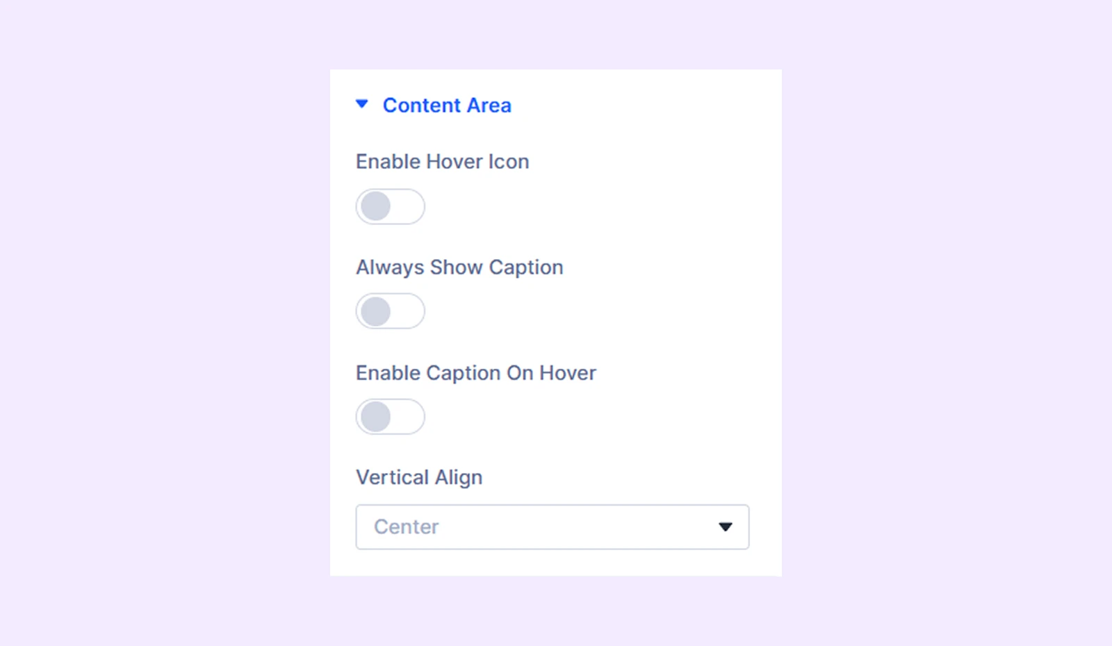
- Enable Hover Icon: Display an icon over posts on hover.
- Always Show Icon: Display the icon at all times.
- Vertical Align: Adjust the vertical position of the icon.
- Icon Animation Direction: Choose the animation direction of the icon.
- Always Show Caption: Display captions at all times.
- Vertical Align: Adjust the caption position. (Available when Always Show Caption is enabled.)
- Enable Caption on Hover: Display captions only on hover.
- Vertical Align: Change the vertical position of the caption relative to the post.
- Animation Direction: Choose the caption animation direction.
Caption Background: Add a background color, gradient, or image behind the caption.
Background: Add a background color, gradient, image, video, pattern, or mask to the module.
Element Label: Rename the module to organize it more easily in the Divi Builder. (Only you can see this label.)
Design Tab
Customize the appearance of the Instagram Feed Carousel module with advanced design settings.
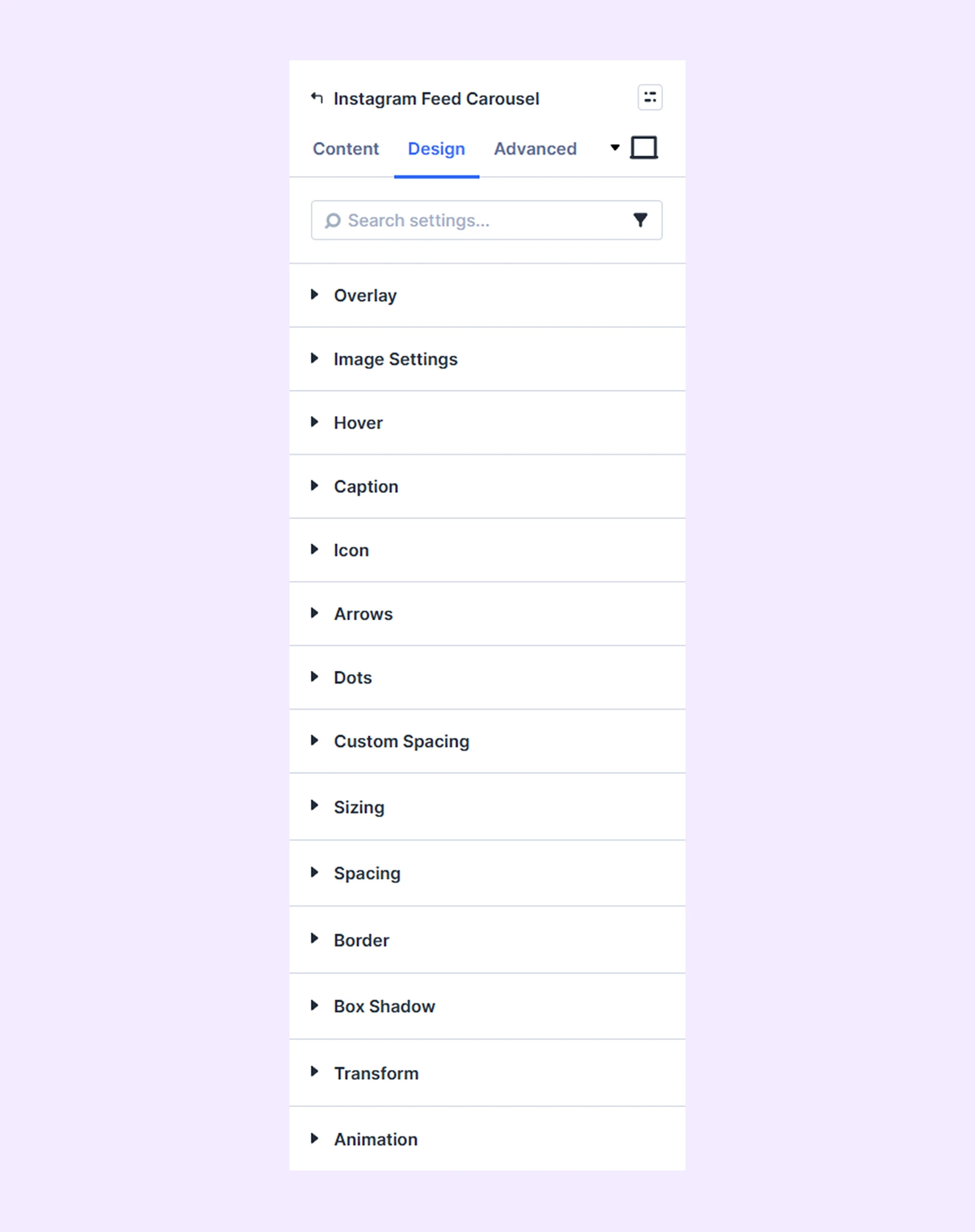
Overlay: Apply a color or gradient overlay to Instagram posts.
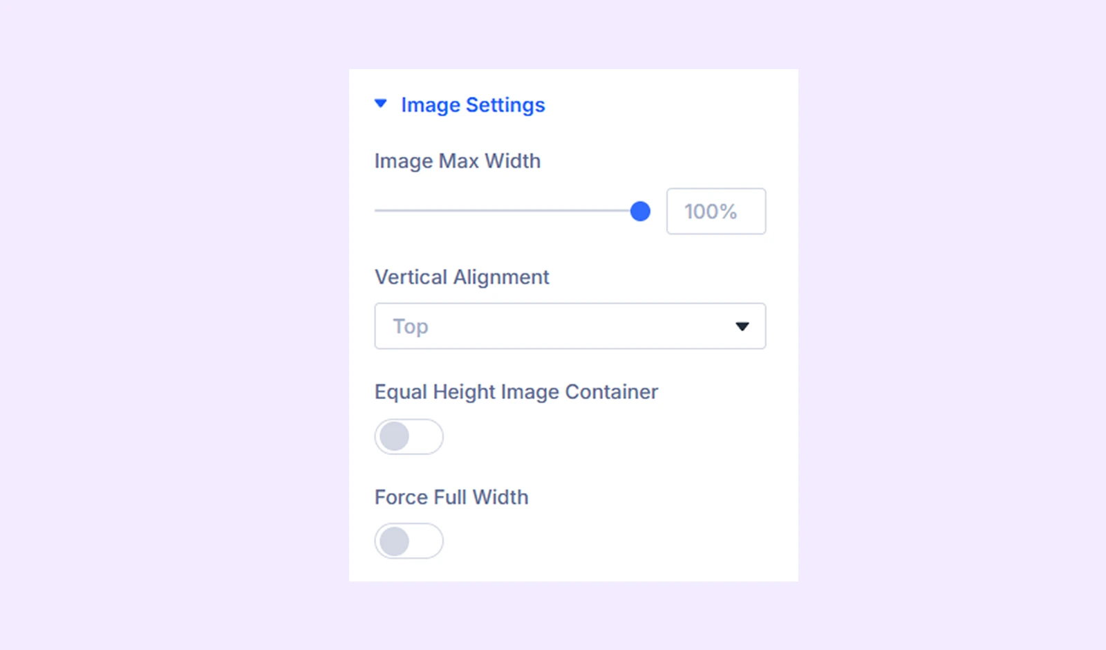
Image Settings
- Image Max Width: Set the maximum width of post images.
- Vertical Alignment: Adjust the vertical position of images inside their containers.
- Equal Height Image Container: Ensure all image containers have equal height.
- Force Full Width: Make images span the full container width.
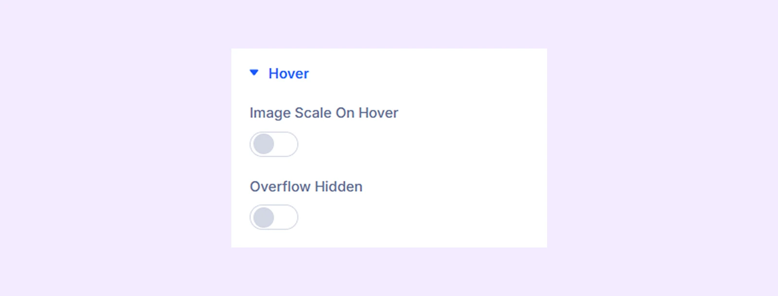
Hover
- Image Scale on Hover: Enable image zoom on hover.
- Image Scale Value on Hover: Define the zoom scale.
- Overflow Hidden: Prevent images from overflowing outside their container.
Caption: Customize the typography of Instagram captions.
Icon: Customize the alignment, size, and color of hover icons.
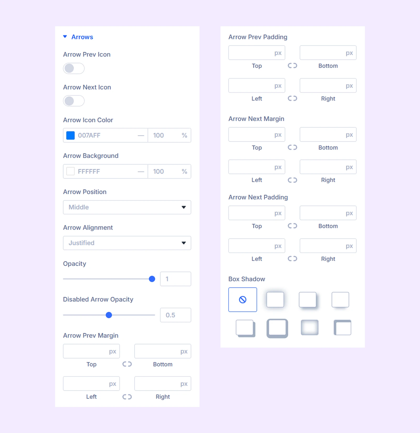
Arrows
- Arrow Prev Icon: Enable a custom icon for the previous button.
- Icon Size: Adjust arrow icon size.
- Arrow Next Icon: Enable a custom icon for the next button.
- Icon Size: Adjust arrow icon size.
- Arrow Icon Color: Choose the arrow icon color.
- Arrow Background: Choose the arrow background color.
- Arrow Position: Adjust the vertical position of the arrows.
- Arrow Alignment: Adjust the horizontal alignment of the arrows.
Note: When selecting any alignment option other than justified, the arrows will come together, while choosing justified will maintain their separation, with one arrow on each side of the carousel.
- Opacity: Adjust arrow transparency.
- Disabled Arrow Opacity: Adjust transparency for disabled arrows.
Note: The navigation arrows will be disabled when you reach the end of the carousel if the loop effect is not active.
- Spacing: Adjust margin and padding for arrow buttons.
- .Box Shadow: Add shadow effects to arrow buttons.
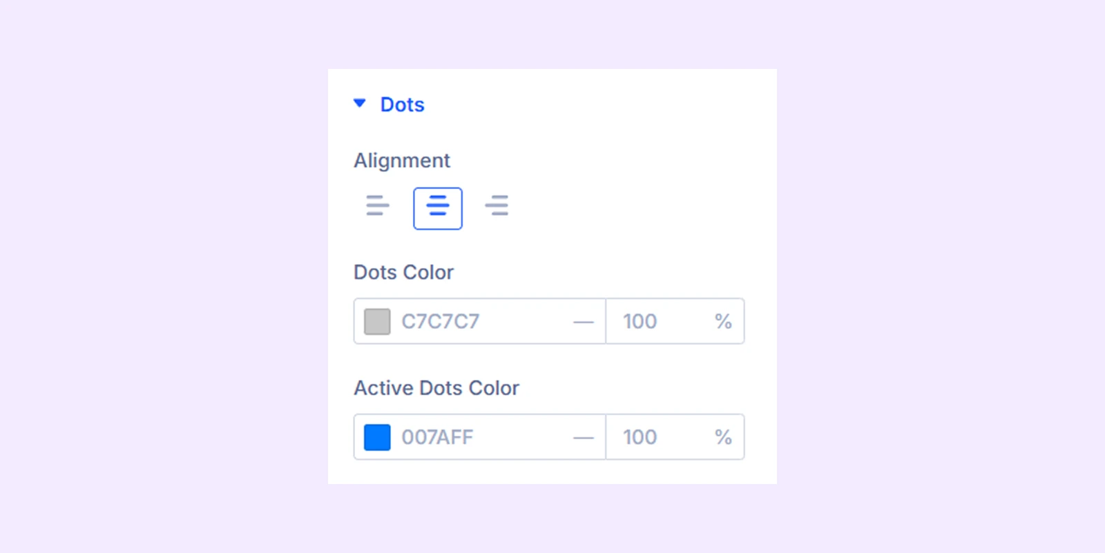
Dots
- Alignment: Adjust the horizontal alignment of the navigation dots.
- Dots Color: Choose the color of the dots.
- Active Dots: Choose the color of the active dot.
Custom Spacing: Add custom margin and padding to each item of the Instagram feed carousel.
Sizing: Adjust the width, height, and alignment of the module.
Spacing: Add custom margin and padding to the module’s container.
Border: Customize the border style, width, and color. And style each border separately or apply the same style to all sides.
Box Shadow: Add shadow effects to the module.
Transform: Scale, rotate, move, or skew the module.
Animation: Apply reveal animation effects and customize delay, duration, repeat settings, and animation type.
Advanced Tab
This tab provides additional settings for advanced users who want greater control over the module with custom code, conditions, and more.
Need Help?
If you have any questions or need assistance, contact our support team: [email protected]