
DiviFlash Typing Text module allows you to create engaging typing text effects on your website.
Important Note: This module is disabled by default. To use it, you must enable it manually. Refer to our guide for step-by-step instructions.
Let’s see the settings in brief and how to make better use of it —
Content Tab
This tab contains the settings to add the typing text content, configure typing effects, and more.
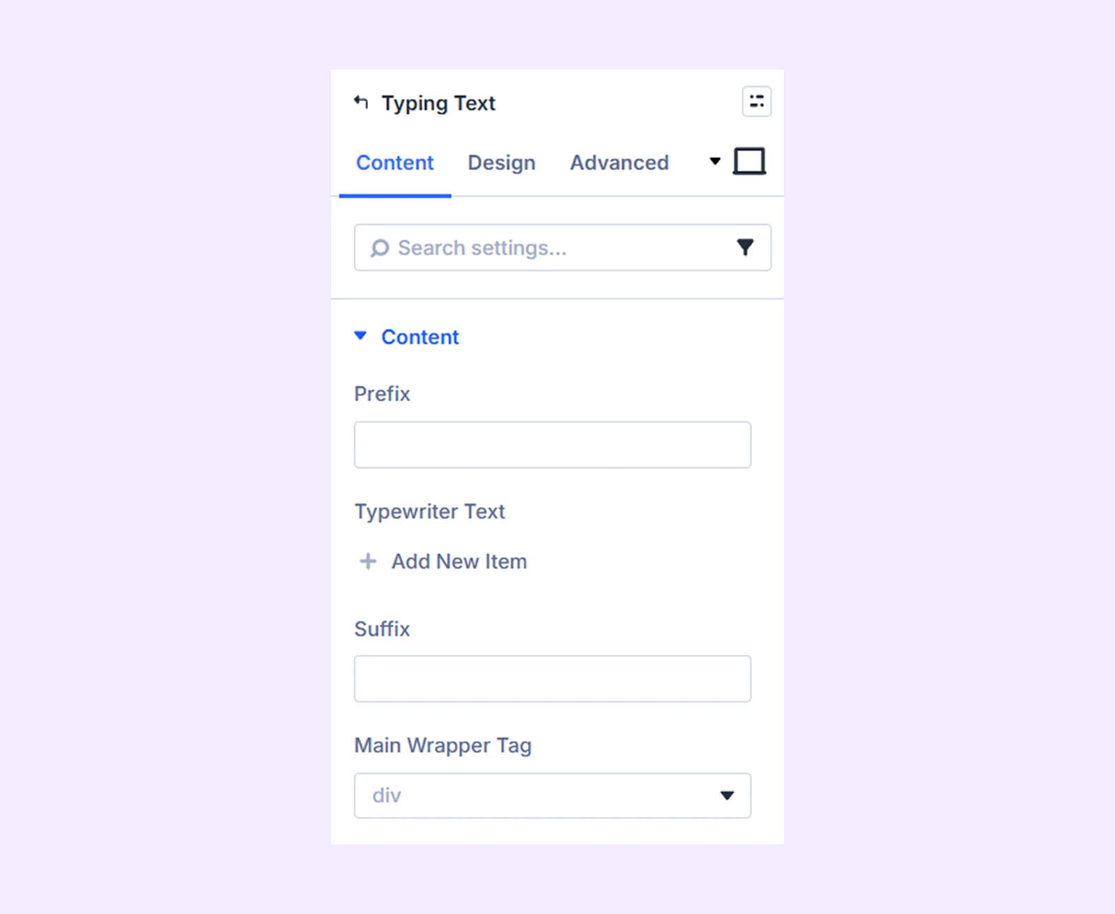
Content
- Prefix: Add text that appears before the typing animation.
- Typewriter Text: Input the animated typing text. You can add multiple text items using the “Add New Item” option.
- Suffix: Add text that appears after the typing animation.
- Main Wrapper Tag: Select the HTML tag for all the text.
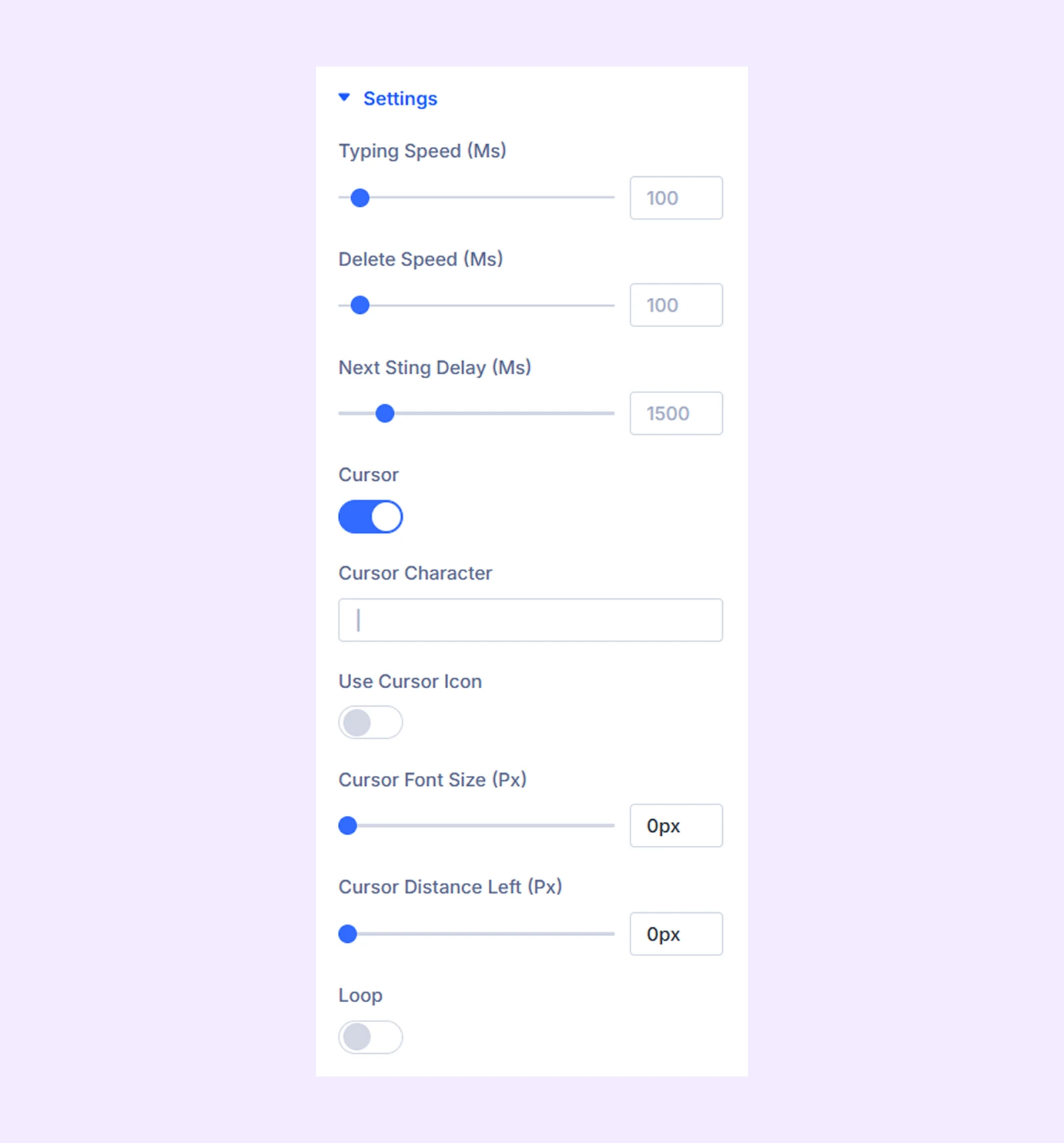
Settings
- Typing Speed (Ms): Set how fast the text is typed during the animation.
- Delete Speed (Ms): Set how fast the typed text is deleted.
- Next String Delay (Ms): Set the delay before the next text starts typing.
- Cursor: Enable this option to display a cursor next to the typing text.
- Cursor Character: Enter the character you want to use as the cursor.
- Use Cursor Icon: Enable this option to use an icon instead of a text cursor.
- Cursor Icon Color: Choose the color of the cursor icon.
- Cursor Font Size (Px): Adjust the size of the cursor.
- Cursor Distance Left (Px): Adjust the space between the cursor and the typing text.
- Loop: Enable this option to repeat the typing animation continuously.
Prefix Background: Add a color, gradient, or an image to the prefix text background.
Typed Text Background: Add a color, gradient, or an image to the typing text background.
Suffix Background: Add a color, gradient, or an image to the suffix text background.
Link: Use this default Divi setting to add a link to the entire module.
Background: Add a background color, gradient, image, video, pattern, or mask to the module.
Element Label: Rename the module to organize it more easily in the Divi Builder. (Only you can see this label.)
Design Tab
Customize the appearance of the Typing Text module with advanced design settings.
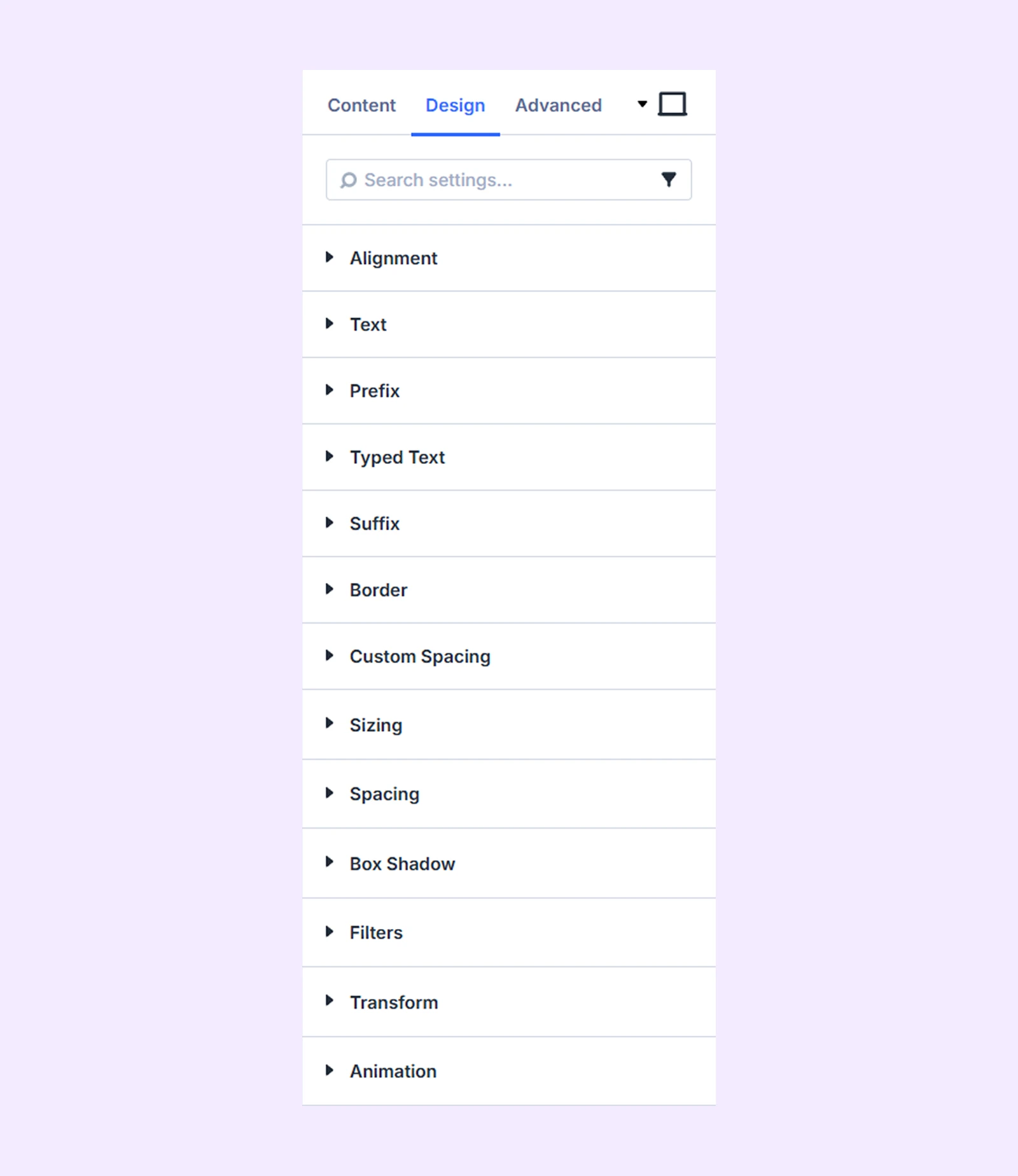
Alignment: Change the horizontal placement of the text within its container.
Text: Typography options for all the text.
Prefix
- Display Property: Choose how the prefix text is displayed relative to the typing text and suffix. You can choose from three options:
- Inline: Display the item on the same line.
- Inline Block: Place items next to each other, but allow them to move to the next line if needed.
- Block: Display each item on a separate line.
- Enable Clip: Enable this option to apply a clip effect to the prefix text.
- Enable Background Clip: Enable this option to apply the clip effect to the background of the prefix text.
- Fill Color: Choose the fill color for the clip effect.
- Stroke Color: Choose the stroke color for the clip effect.
- Stroke Width: Adjust the width of the stroke.
The remaining options allow you to customize the typography and borders of the prefix text.
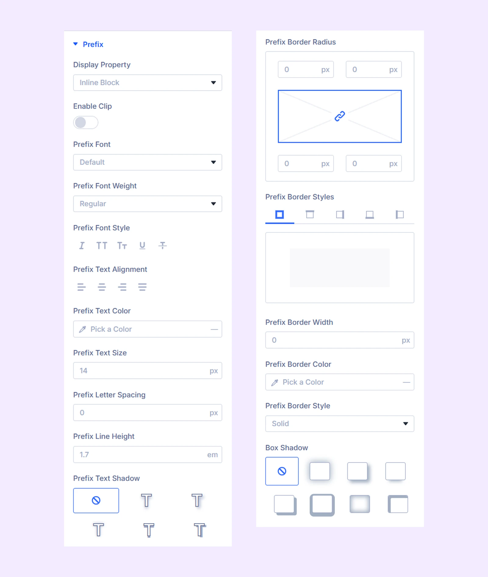
Typed Text: Contains the same settings as Prefix, but they apply to the typed text.
Suffix: Contains the same settings as Prefix, but they apply to the suffix text.
Border: Customize the border style, width, and color. And style each border separately or apply the same style to all sides.
Custom Spacing: Add custom padding and margins to the module elements.
Sizing: Adjust the width, height, and alignment of the module.
Spacing: Add custom margin and padding to the module’s container.
Box Shadow: Add shadow effects to the module.
Filters: Apply color filters to enhance the appearance.
Transform: Scale, rotate, move, or skew the module.
Animation: Apply reveal animation effects and customize delay, duration, repeat settings, and animation type.
Advanced Tab
This tab provides additional settings for advanced users who want greater control over the module with custom code, conditions, and more.
Need Help?
If you have any questions or need assistance, contact our support team: [email protected]