DiviFlash Tilt Card module allows you to create interactive card-style elements that respond to cursor movement.
Let’s see the settings in brief and how to make better use of it —
Content Tab
This tab contains the essential settings for configuring the tilt card content, media, and animation behavior.
Content
- Title: Enter the title for the tilt card.
- Content: Enter the descriptive text displayed inside the tilt card.
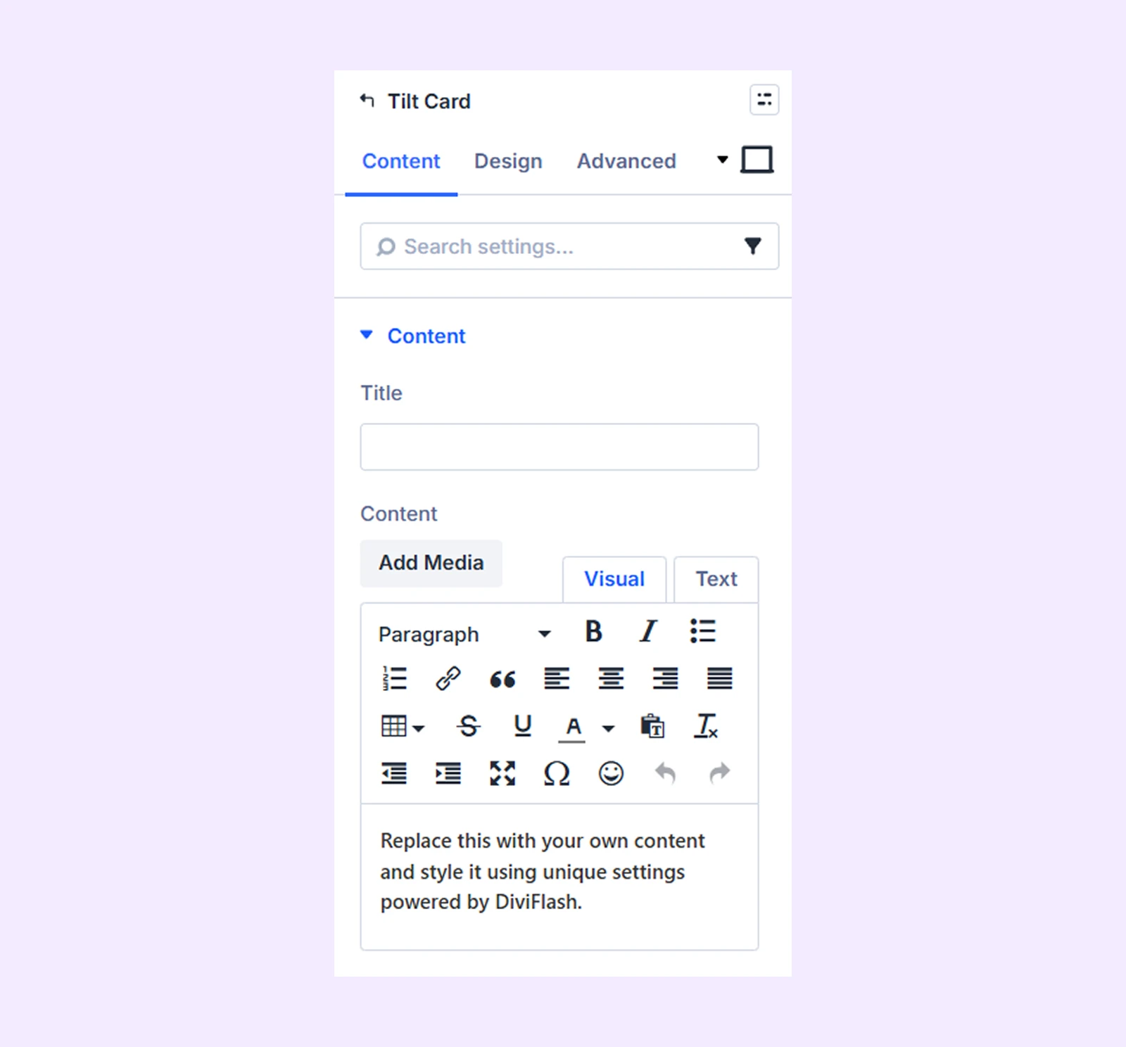
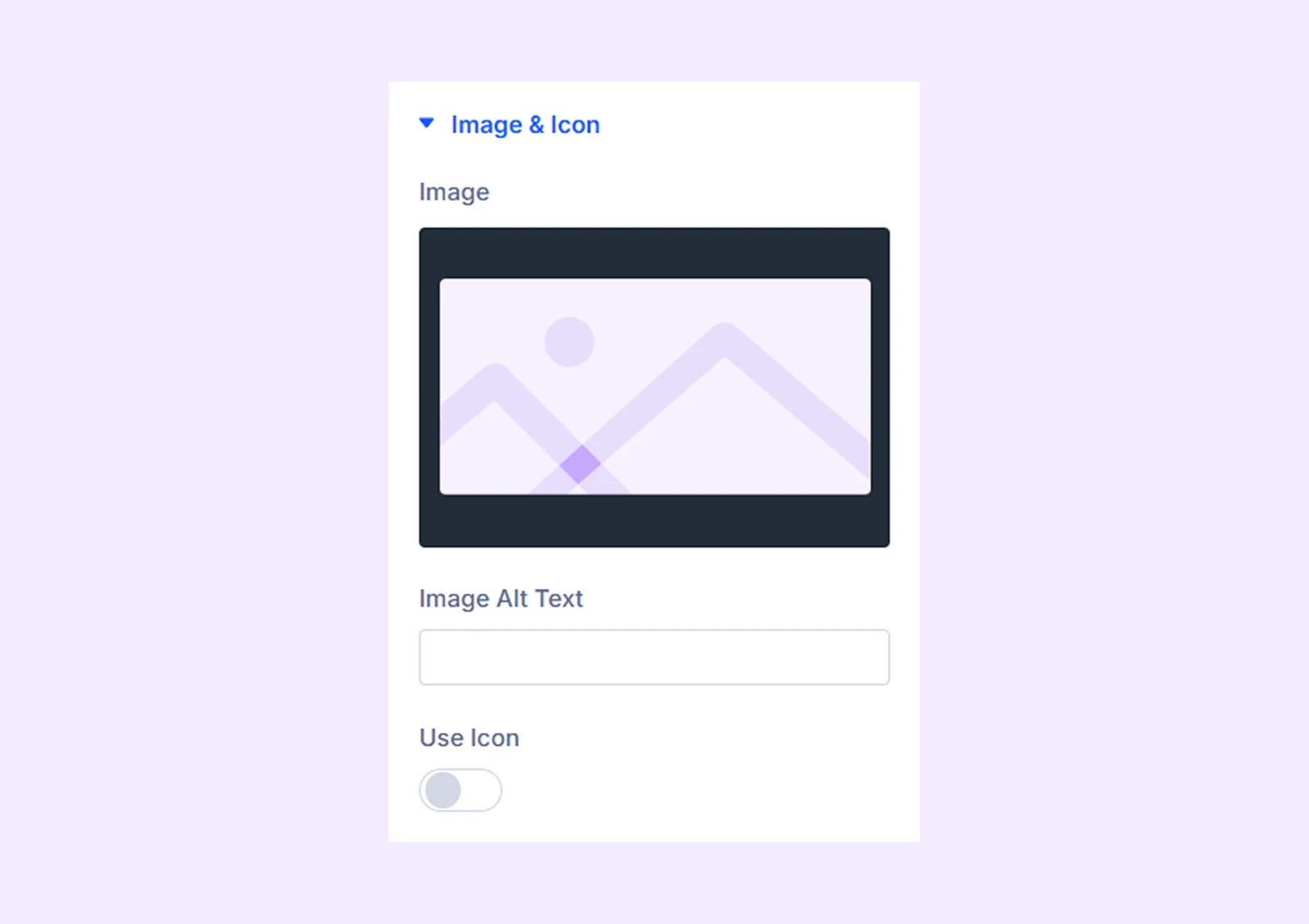
Image & Icon
- Image: Upload an image to display inside the tilt card.
- Image Alt Text: Add alternative text for the image for accessibility and SEO.
- Use Icon: Enable this option to display an icon instead of an image.
- Icon: Choose an icon from the icon library.
- Icon Color: Choose the color of the icon.
- Icon Size: Adjust the size of the icon.
- Alignment: Choose the horizontal alignment of the icon or image.
- Icon Background: Enable this option to add a background behind the icon.
- Circle Icon: Enable this option to display the icon inside a circular background.
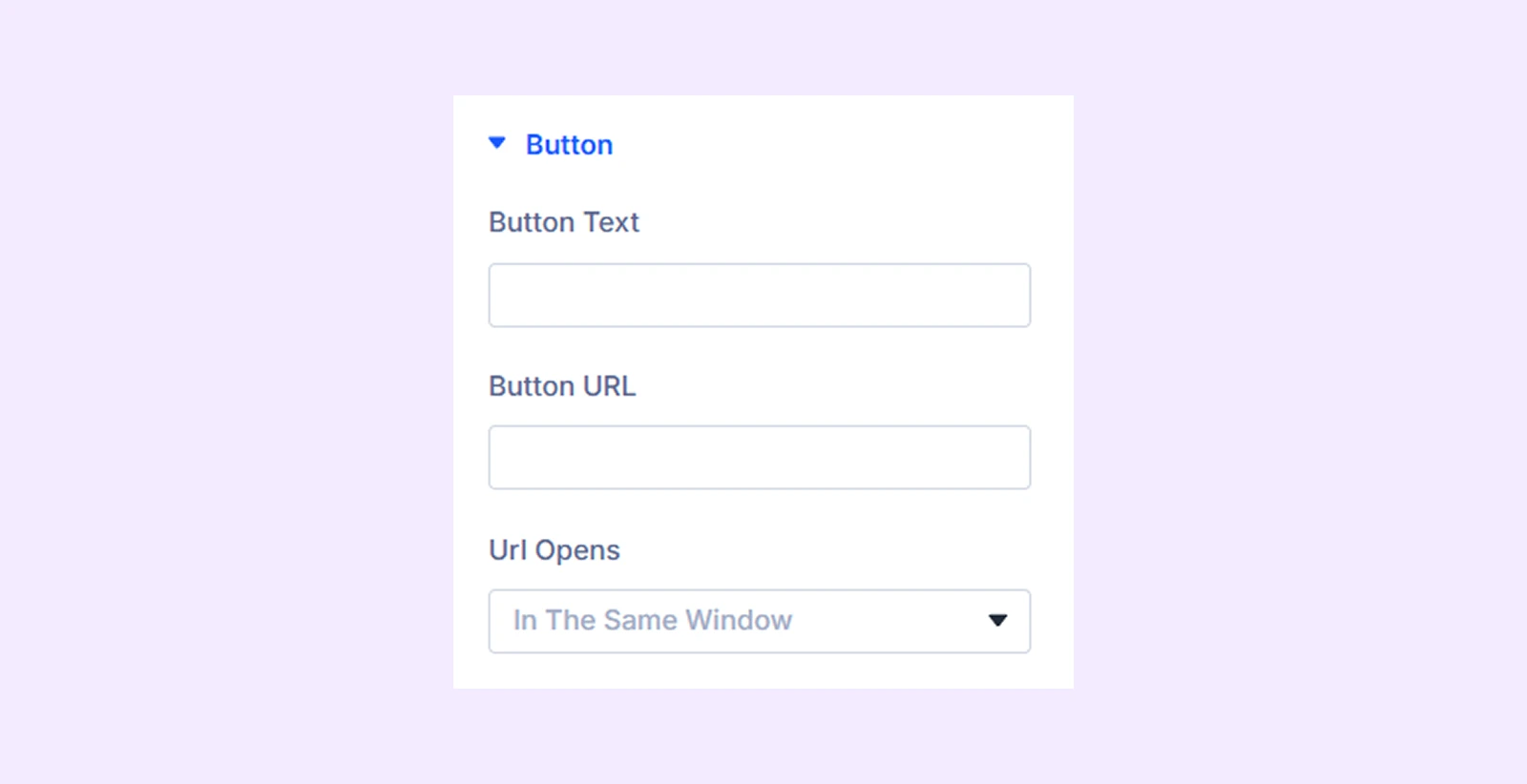
Button
- Button Text: Enter the text displayed on the button.
- Button URL: Add the link that the button will direct users to.
- URL Opens: Choose whether the link opens in the same tab or a new tab.
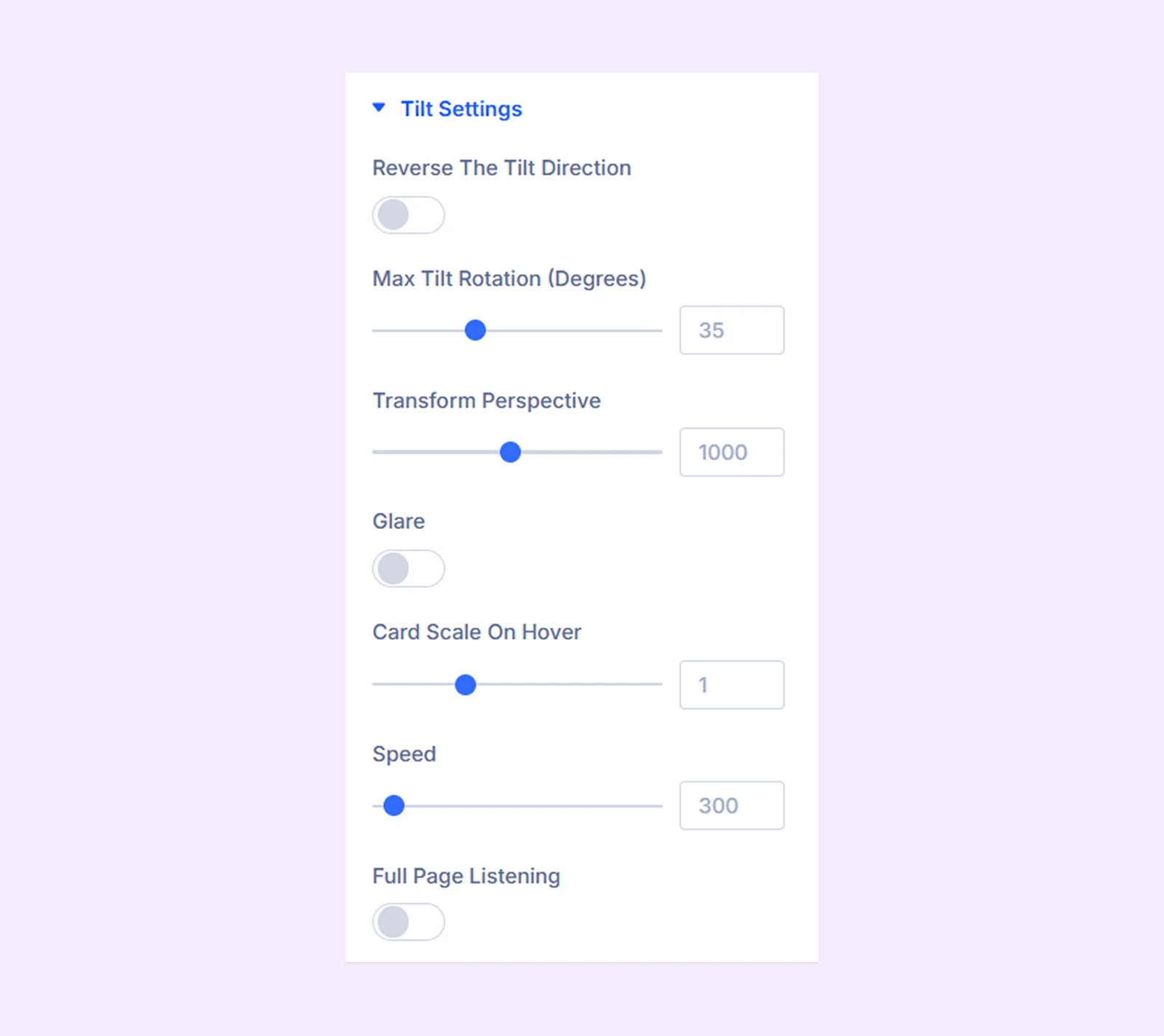
Tilt Settings
- Reverse the Tilt Direction: Enable this option to reverse the tilt animation direction.
- Max Tilt Rotation: Define the maximum rotation angle of the tilt effect.
- Transform Perspective: Control how intense the tilt effect appears. Lower values create a stronger tilt effect.
- Glare: Enable this option to add a glare reflection effect to the tilt card.
- Glare Opacity: Adjust the opacity of the glare effect.
- Card Scale On Hover: Adjust the scale of the card when hovered.
- Speed: Set the animation speed of the tilt effect.
- Full Page Listening: Enable this option to make the tilt card respond to mouse movement across the entire page.
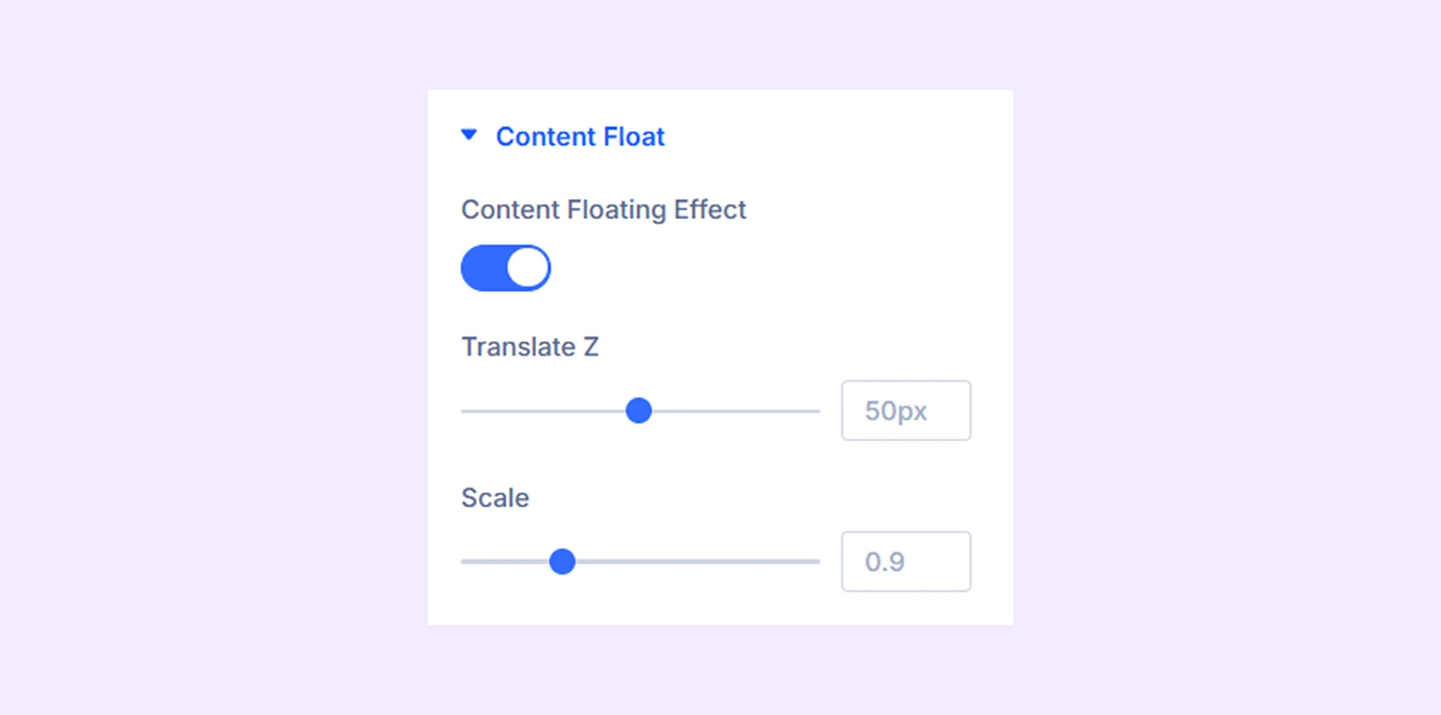
Content Float
- Content Floating Effect: Enable this option to add a floating animation to the card elements.
- Translate Z: Adjust the depth movement of the floating content.
- Scale: Adjust the scale of the floating content.
Link: Use this default Divi setting to add a link to the entire module.
Background: Add a background color, gradient, image, video, pattern, or mask to the module.
Element Label: Rename the module to organize it more easily in the Divi Builder. (Only you can see this label.)
Design Tab
Use this tab to customize the visual appearance of the Tilt Card module.
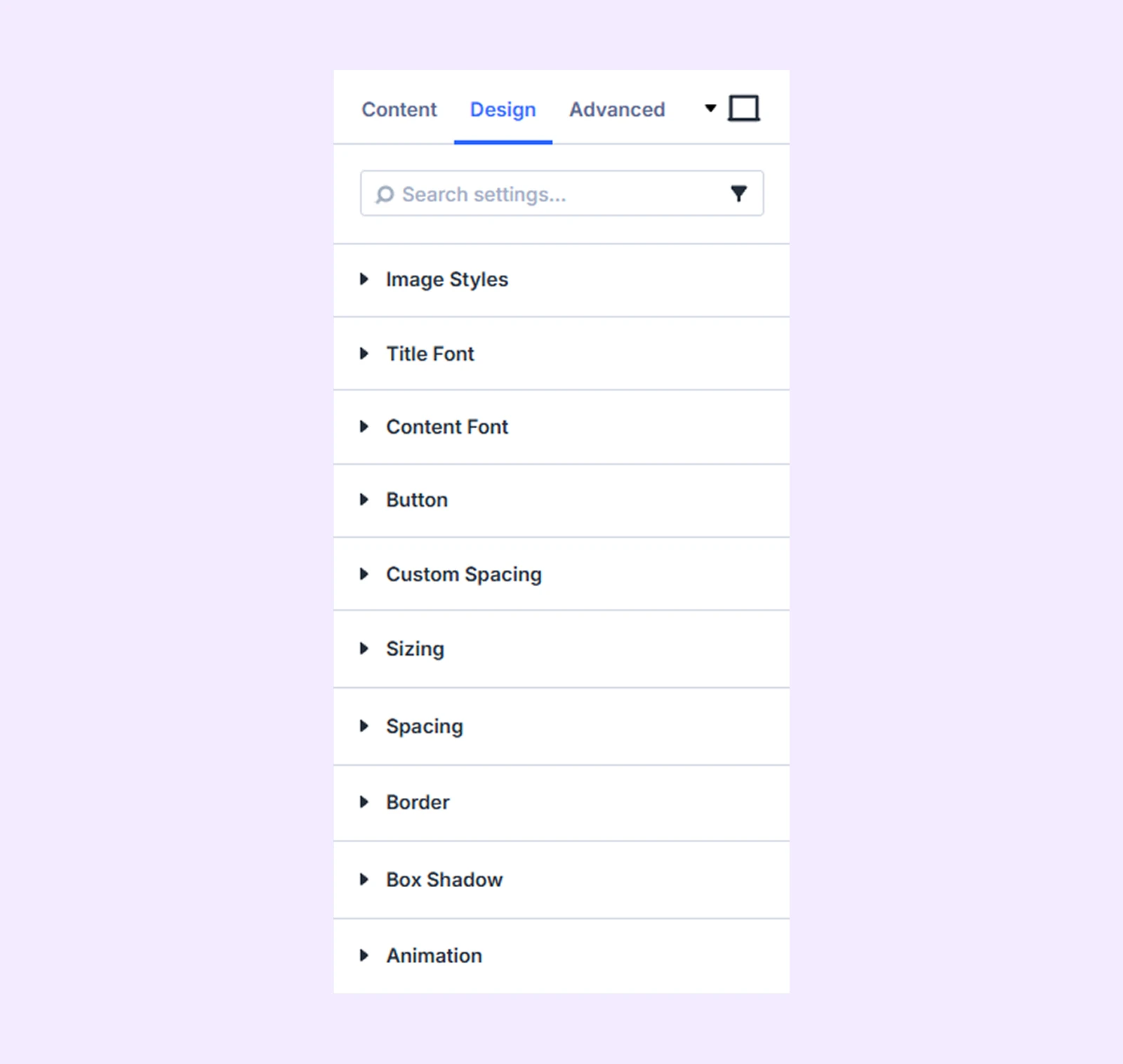
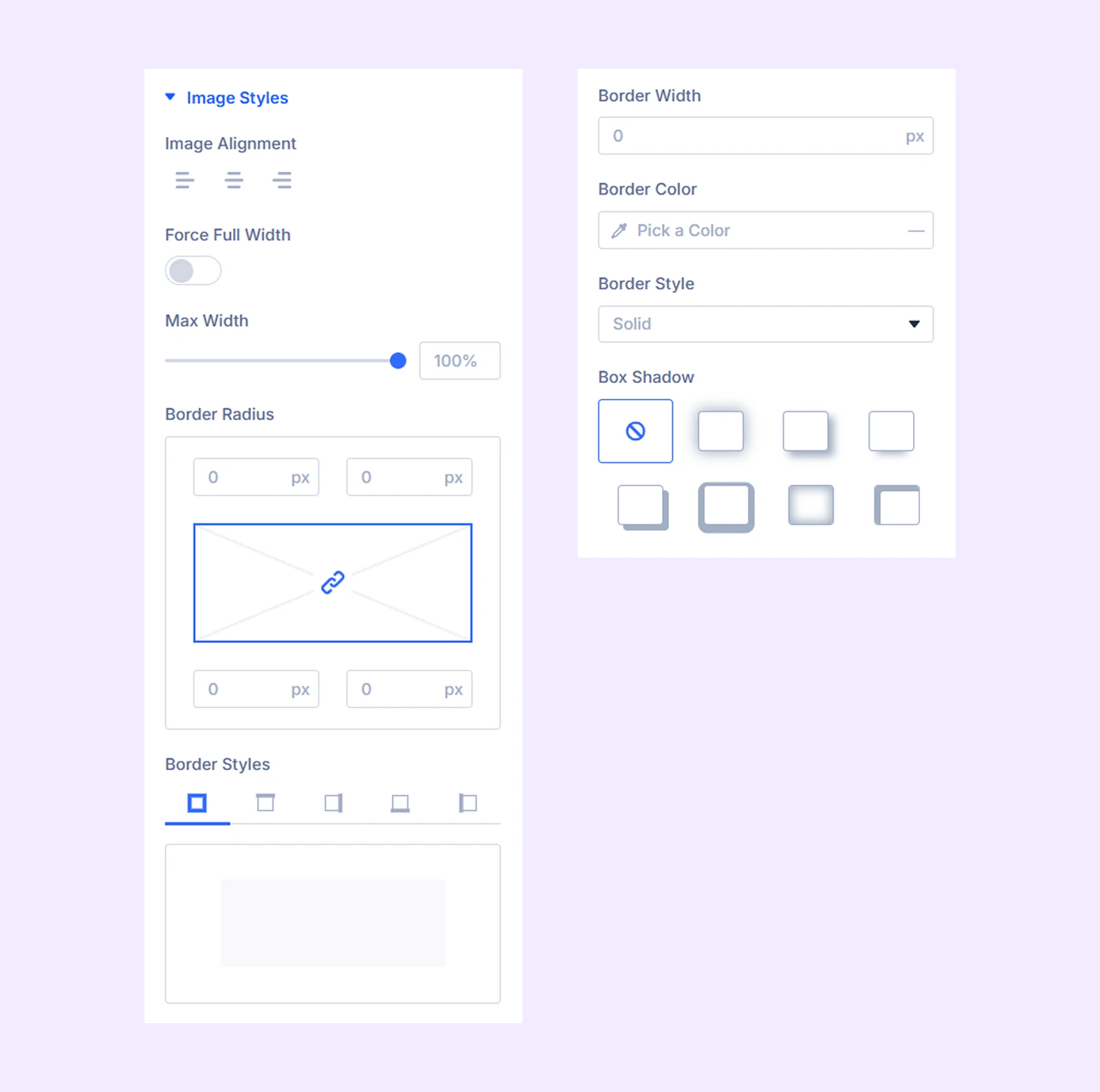
Image Styles
- Image Alignment: Adjust the horizontal alignment of the image.
- Force Full Width: Enable this option to make the image fill the width of its container.
- Max Width: Set the maximum width of the image.
You can also customize the image border, radius, and related styling options.
Title Font: Customize the typography settings for the tilt card title.
Content Font: Customize the typography settings for the tilt card content.
Button: Customize the alignment, background, typography, and border settings for the button.
Custom Spacing: Add custom margin and padding to individual components of the tilt card.
Sizing: Adjust the width, height, and alignment of the module.
Spacing: Add custom margin and padding to the module’s container.
Border: Customize the border style, width, and color. And style each border separately or apply the same style to all sides.
Box Shadow: Add shadow effects to the module.
Animation: Apply reveal animation effects and customize delay, duration, repeat settings, and animation type.
Advanced Tab
This tab provides additional settings for advanced users who want greater control over the module with custom code, conditions, and more.
Need Help?
If you have any questions or need assistance, contact our support team: [email protected]