The DiviFlash Table module allows you to create highly organized, responsive, and beautifully styled tables.
Let’s see the settings in brief and how to make better use of it —
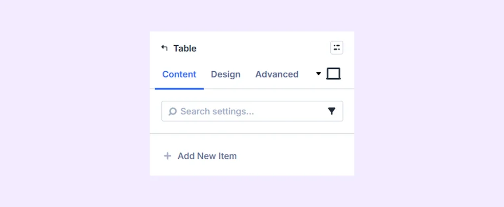
Content Tab
This tab contains the essential settings that control the content of the Table module.
Add New Item
Click the plus (+) icon labeled Add New Item to add a new row to your table. This opens the Table Row Settings, where you can enter content and style each row individually. To learn more, click here.
Settings: Enable this to ensure your table looks great on smaller devices.
Background: Add a background color, gradient, image, video, pattern, or mask to the module.
Element Label: Rename the module to organize it more easily in the Divi Builder. (Only you can see this label.)
Design Tab
Use this tab to customize the visual appearance of the Table module.
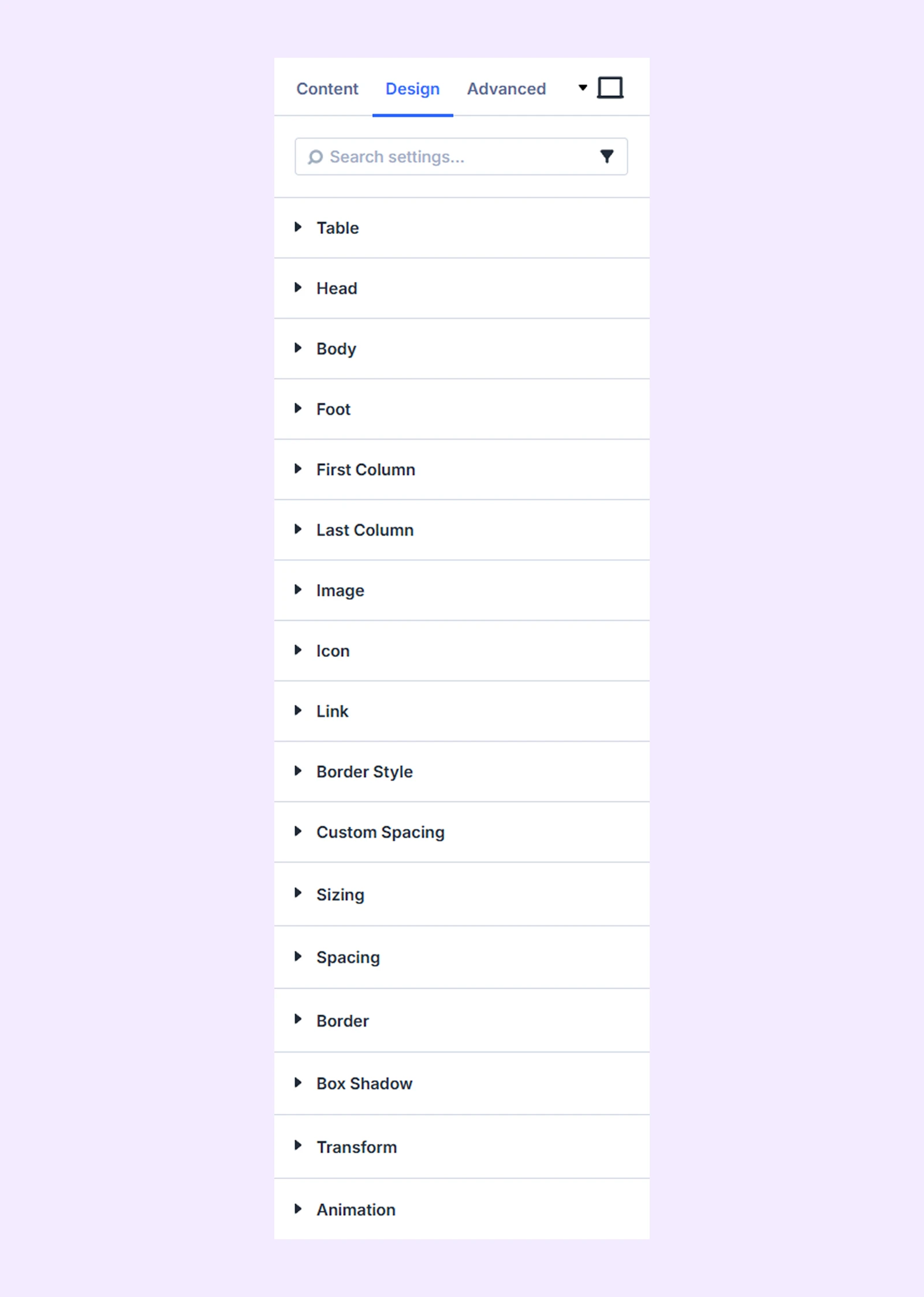
Table: Adjust the border settings for the main table container.
Head: Style the table header with background, typography, and border options
Body: Style the table body with background, typography, and border options. You can also set different backgrounds for even and odd rows.
Foot: Style the table footer with background, typography, and border options.
First Column: Style the first column with background, typography, and border options. You can also choose to exclude the header and footer from these settings.
Last Column: Style the last column with background, typography, and border options. You can also choose to exclude the header and footer from these settings.
Image
- Image Size: Adjust the size of images used in the table.
- Image Cell Margin: Add custom spacing around cells that contain images.
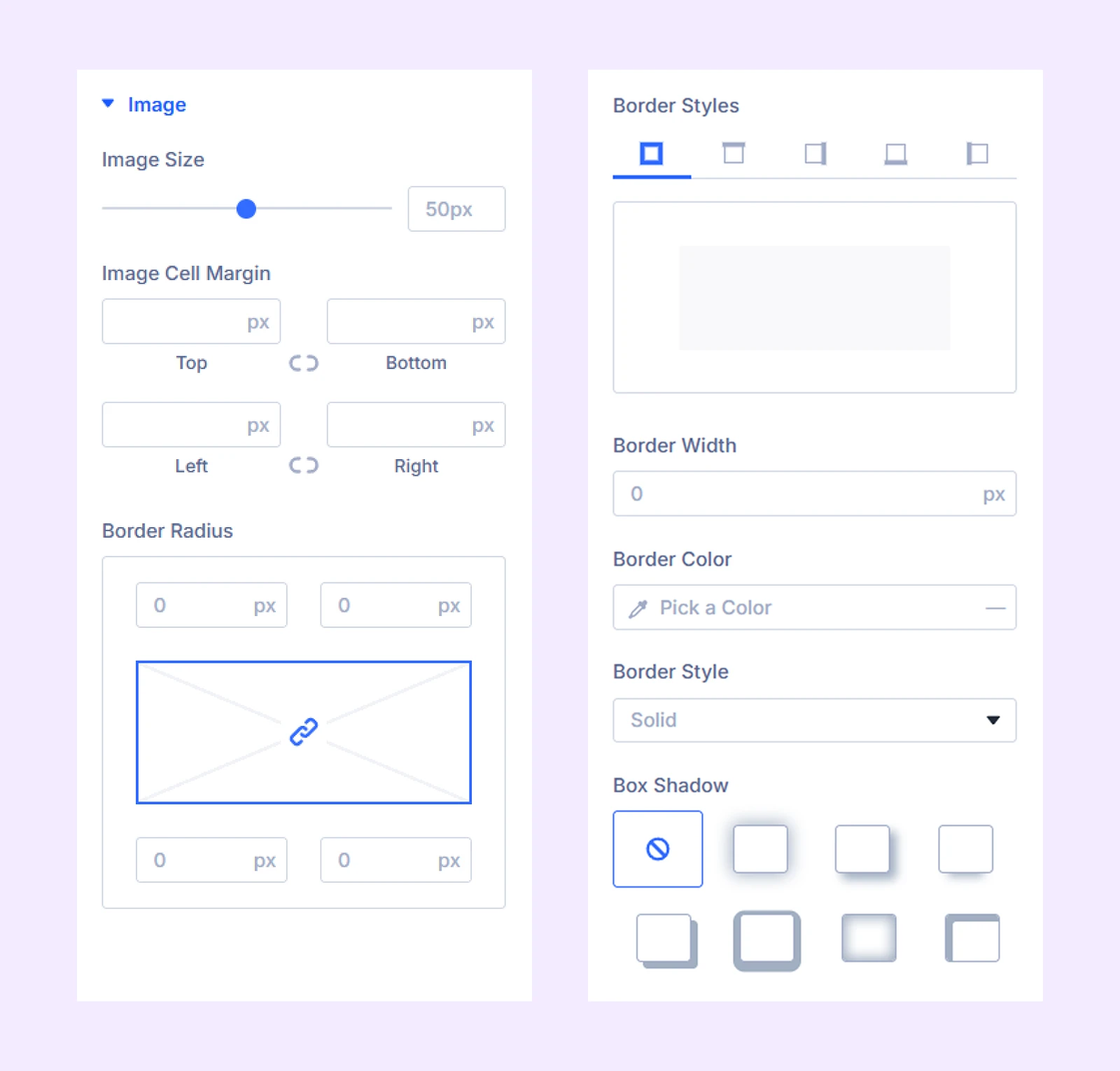
The remaining options let you style image borders.
Icon: Customize icons with options like size, color, spacing, and borders.
Link: Style link text with typography, background, and spacing options.
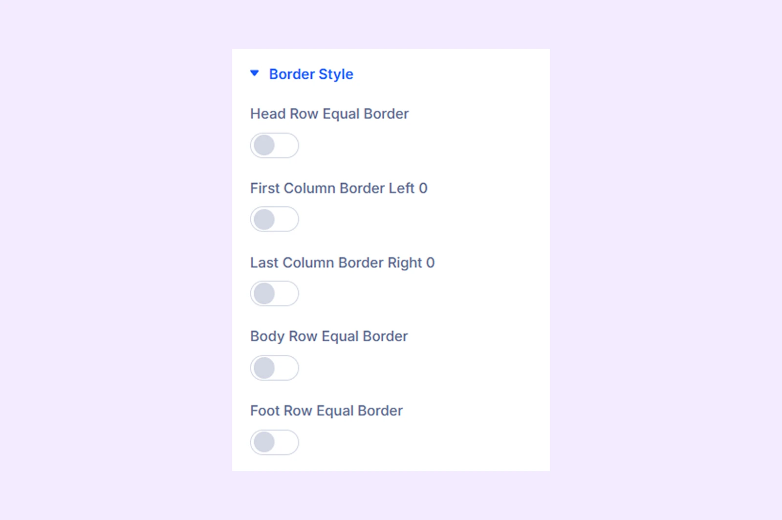
Border Style
Choose which table borders you want to show or hide.
Custom Spacing: Adjust the padding for table cells, footer cells, and the table itself.
Sizing: Adjust the width, height, and alignment of the module.
Spacing: Add custom margin and padding to the module’s container.
Border: Customize the border style, width, and color. And style each border separately or apply the same style to all sides.
Box Shadow: Add shadow effects to the module.
Transform: Scale, rotate, move, or skew the module.
Animation: Apply reveal animation effects and customize delay, duration, repeat settings, and animation type.
Advanced Tab
This tab provides additional settings for advanced users who want greater control over the module with custom code, conditions, and more.
Table Row Settings
When you click Add New Item, you will see the following options:
Content Tab
Content
- Columns: Enter the content for your table columns in the column editor. Type the first line for the first column, press Enter to create the next column, and continue adding your data in order. To add an empty column, use the HTML space code . To add an icon, use this code: <span class=”et-pb-icon”>icon code</span>. You can find a list of icon codes from here.
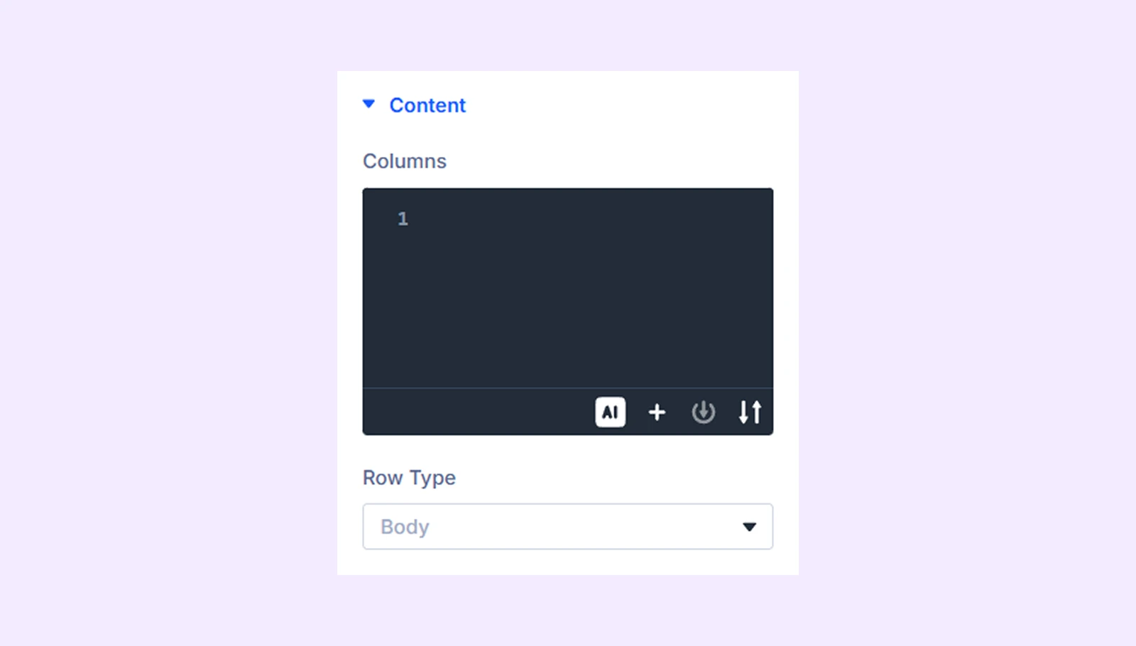
- Row Type: Choose the type of row you want it to be: a header, a footer, or a body.
- Use Badge: Enable to display a badge (available for header rows).
- Badge Text: Add the badge text.
- Badge Position: Choose where the badge should appear.
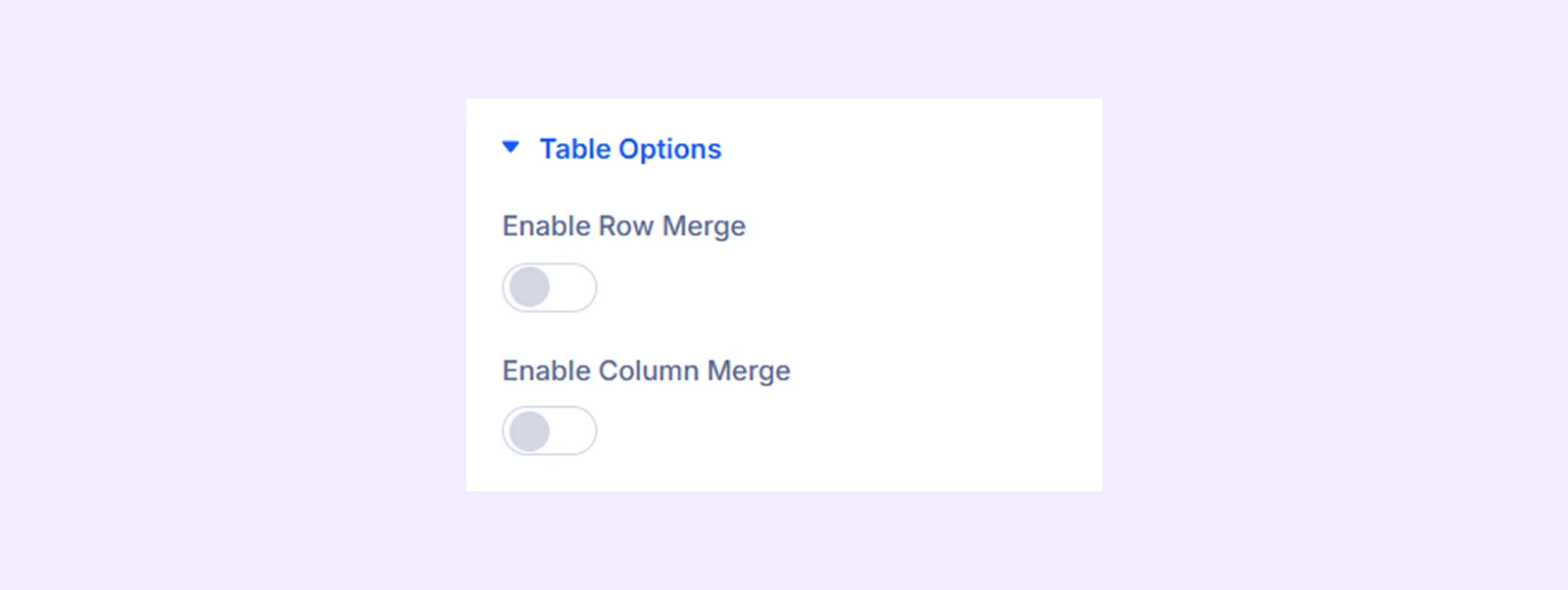
Table Options
- Enable Row Merge: Merge multiple rows into one. This option is available if you choose the body as a “Row Type.”
- Merge Row Item: Select which row to merge
- Merge Row Item Value: Choose how many rows to merge together
- Enable Column Merge: Merge multiple columns into one by choosing the column and how many columns to combine.
- Merge Column Item: Select which column to merge
- Merge Column Item Value: Choose how many columns to merge
Element Label: Change the name or label of the table row that you are currently working on.
Design Tab
Row: Customize the background and typography of the row.
Icon: Style icons using the same options as the main module.
Link: Style links using the same options as the main module.
Badge: Customize badge background, typography, and borders.
Advanced Tab
Use this tab to add custom CSS, set conditions, and control visibility for this specific row.
Need Help?
If you have any questions or need assistance, contact our support team: [email protected]