The DiviFlash Product Grid Module allows you to showcase your products in a flexible, visually appealing layout.
Activation Required: This module is disabled by default. To use it, you need to enable it manually. Refer to our guide for step-by-step instructions.
Let’s see the settings in brief and how to make better use of it —
Content Tab
This tab contains all the essential settings to add, organize, and configure your products.
Add New Product Element
Click the + Add New Product Element button to add product elements to your grid. This opens the Product Child Element Settings, where each element can be customized individually. By default, four product elements are included, which you can edit or delete. To learn how to customize the product elements, click here.
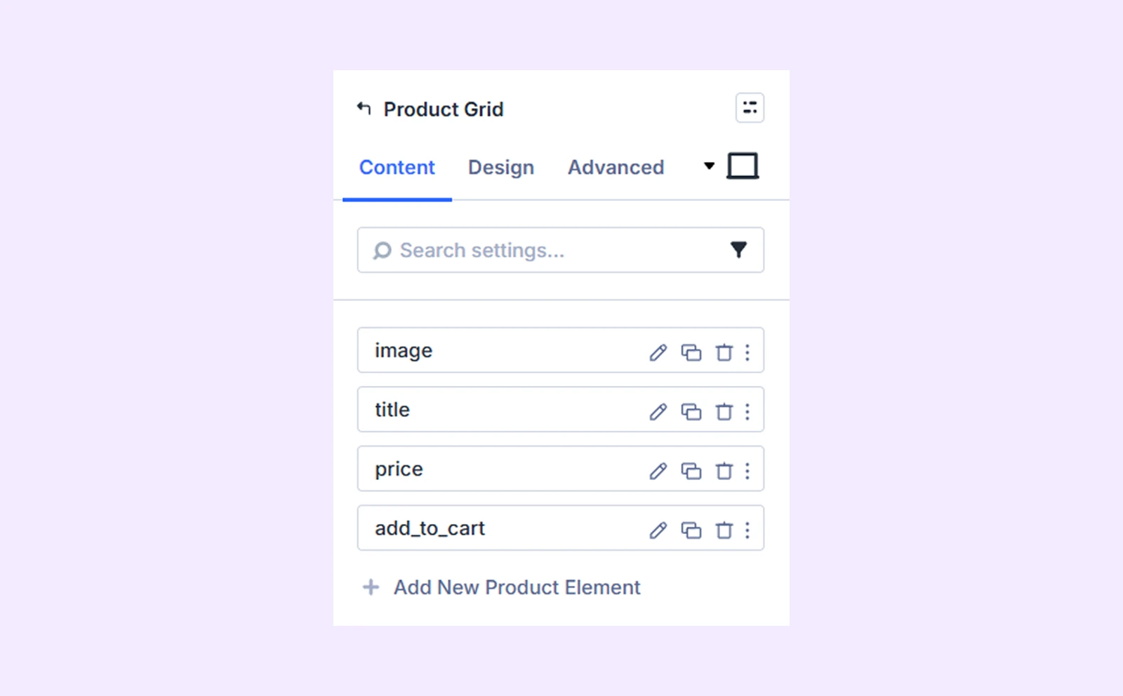
Note: You can change the ordering of the product elements by dragging the product element bars.
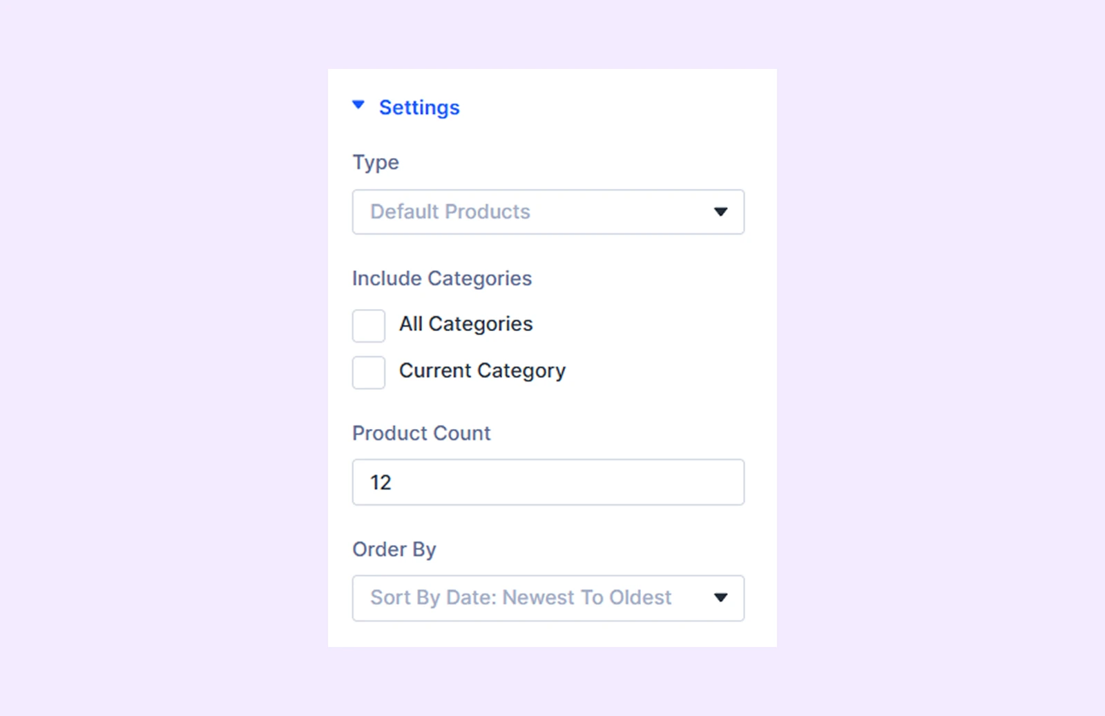
Settings
- Type: Choose the type of products you want to display in the product grid.
- Include Categories: Choose the categories of products that you want to display in the product grid. Only available if you choose “Product Category” as “Type.”
- Use Current Page: When enabled, only products related to the current page will display. For example, enabling this on a product category page will show only products from that category.
- Product Count: Define how many products you want to display in the product grid.
- Order By: Set the order of the displayed products.
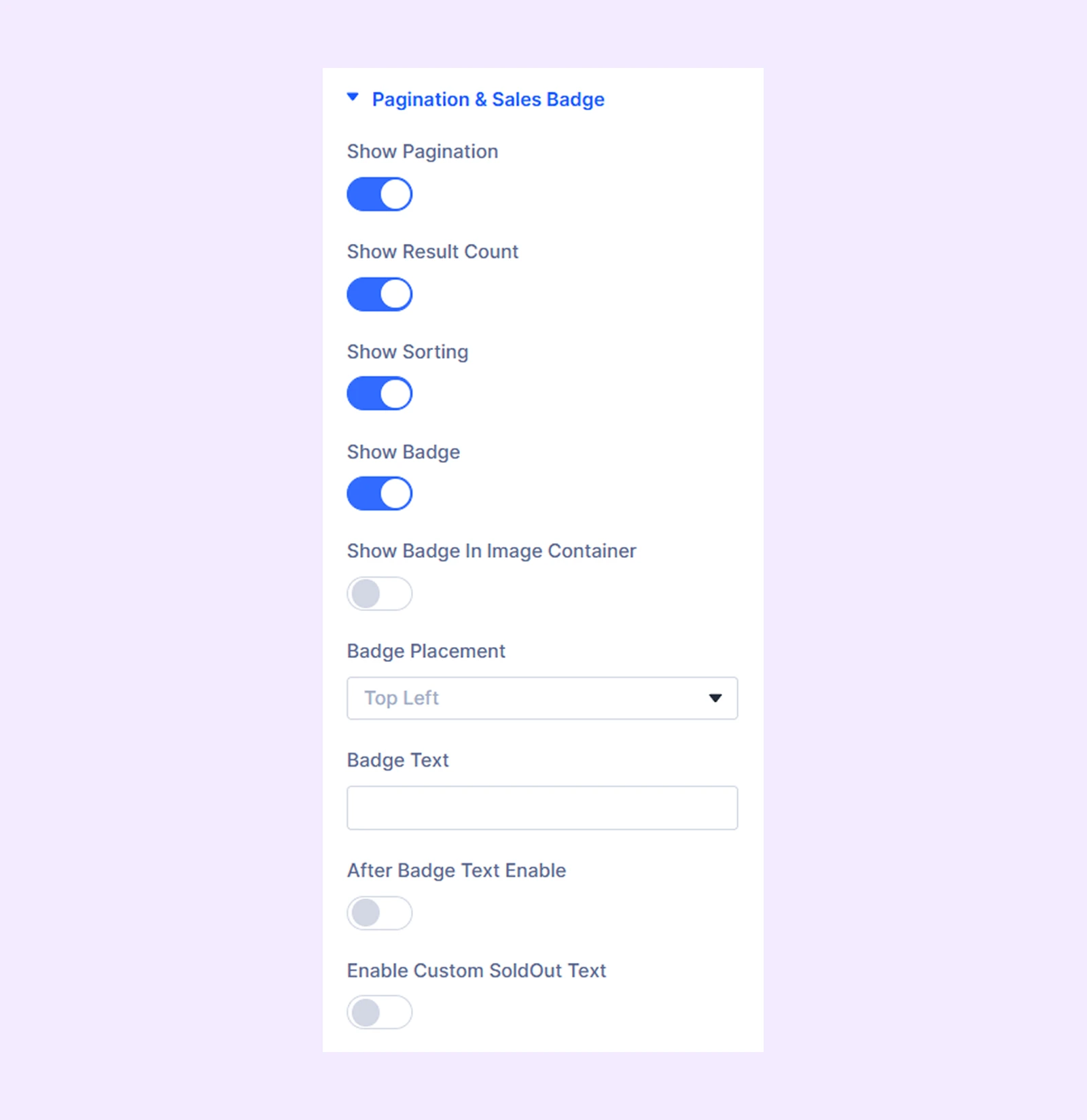
Pagination & Sales Badge
- Show Pagination: Toggle this option to enable pagination to navigate through products.
- Show Result Count: Enable this option to display the total number of products in the grid and the number of products currently visible on the page.
- Show Sorting: Enable a dropdown to sort the products on the grid.
- Show Badge: Enable this option to display a sales badge on the products.
- Show Badge In Image Container: Enable to display the sales badge within the image.
- Badge Placement: Choose where you want to display the sales badge inside or outside the image.
- Badge Text: Input the text of the sales badge.
- After Badge Text Enable: Enable this option to add more custom text to the sales badge.
- After Badge Text Type: Select whether to display the flat price difference, sale percentage, or both in the sale badge. The price difference or price percentage will be calculated dynamically based on your product’s regular price and sale price.
- Suffix Badge Text: Input the text you want to display after the “After Badge Text.”
- Enable Custom SoldOut Text: Toggle on to add custom text to denote sold out products.
- SoldOut Text: Input the sold out text.
Note: The “Enable Custom SoldOut Text” option will not work if your product is in stock.
Item Background: Add a background color, gradient, or an image to the products.
Background: Add a background color, gradient, image, video, pattern, or mask to the module.
Element Label: Rename the module to organize it more easily in the Divi Builder. (Only you can see this label.)
Design Tab
Customize the appearance of the Product Grid module with advanced design settings.
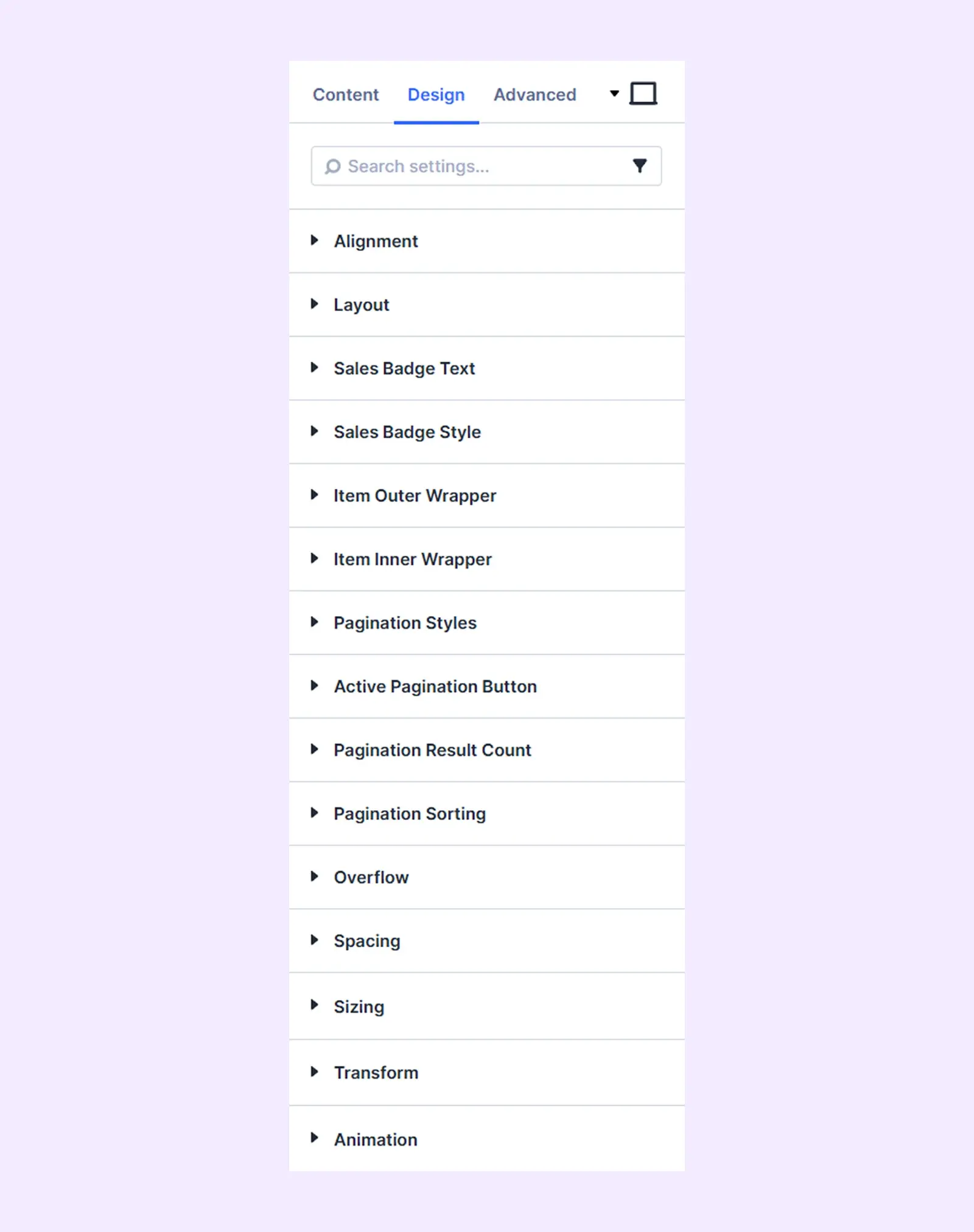
Alignment: Change the placement of all the product elements relative to the product grid containers.
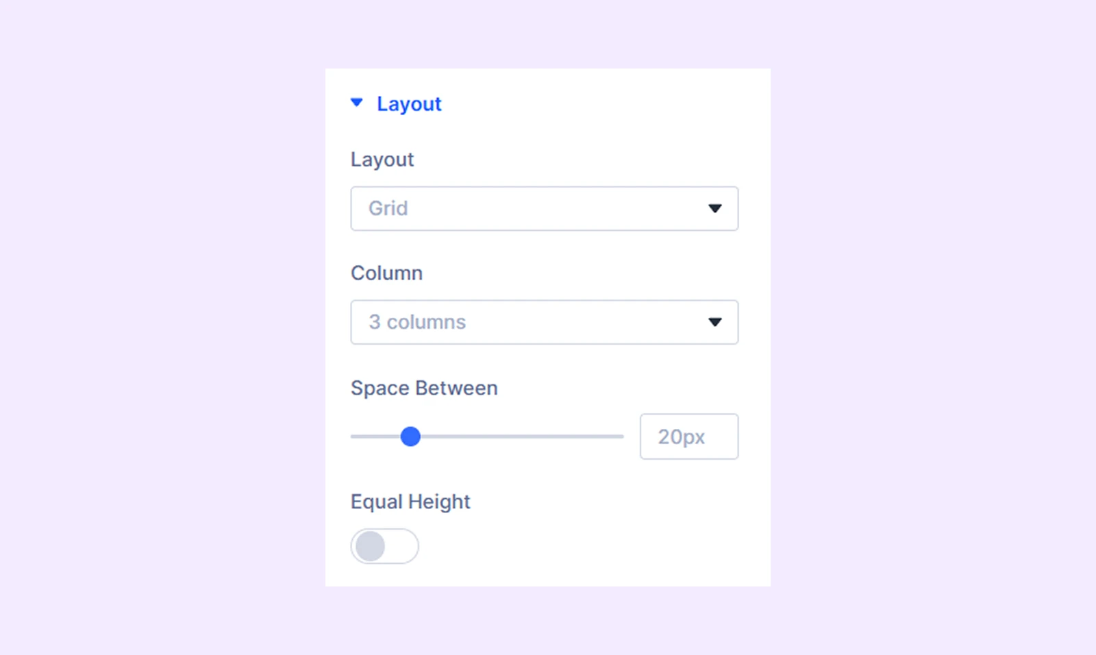
Layout
- Layout: Choose between a traditional grid layout or a modern masonry layout.
- Column: Select the number of columns to display in the product grid.
- Space Between: Adjust the space between the products.
- Equal Height: Enable equal height for all product items.
Sales Badge Text: Typography options for the sales badge, sales badge after text, and the suffix text.
Sales Badge Style: Border and background options for the sales badge.
Item Outer Wrapper: Border customization options for the outer wrapper of the product grid.
Item Inner Wrapper: Border customization options for the inner wrapper of the product grid.
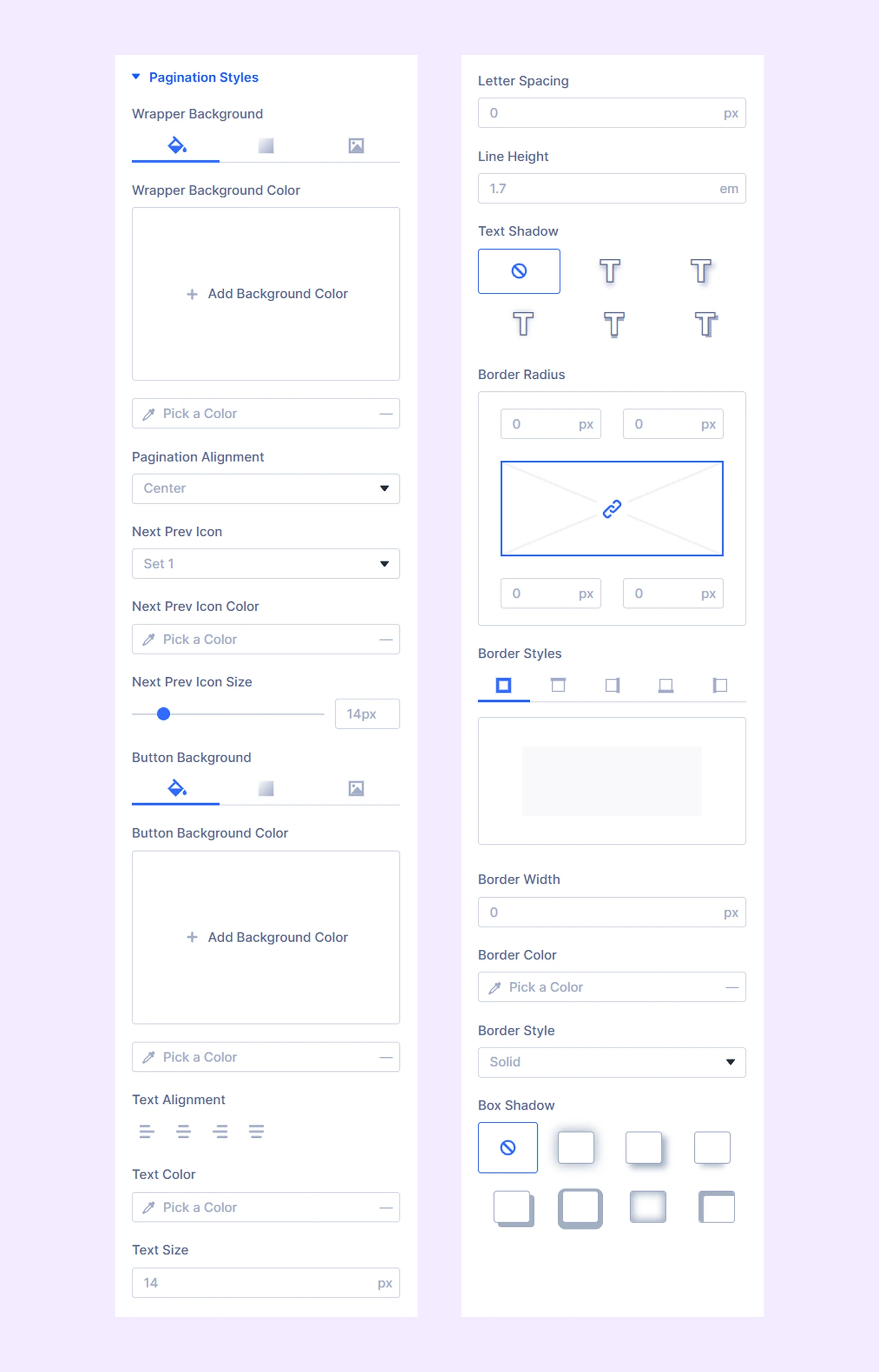
Pagination Styles
- Wrapper Background: Add a background color, gradient, or an image to the pagination wrapper.
- Pagination Alignment: Change the horizontal placement of the pagination buttons.
- Next & Prev Icon: Choose from 4 sets of previous and next icons for the pagination buttons.
- Next & Prev Icon Color: Choose a color for the next and previous icons.
- Next & Prev Icon Size: Adjust the size of the next and previous icons.
Additional options control background, typography, and borders of pagination buttons.
Active Pagination Button: Background and typography for the active pagination button.
Pagination Result Count: Background, typography, and border options for the pagination result count.
Pagination Sorting: Background, typography, and border options for the pagination sorting dropdown.
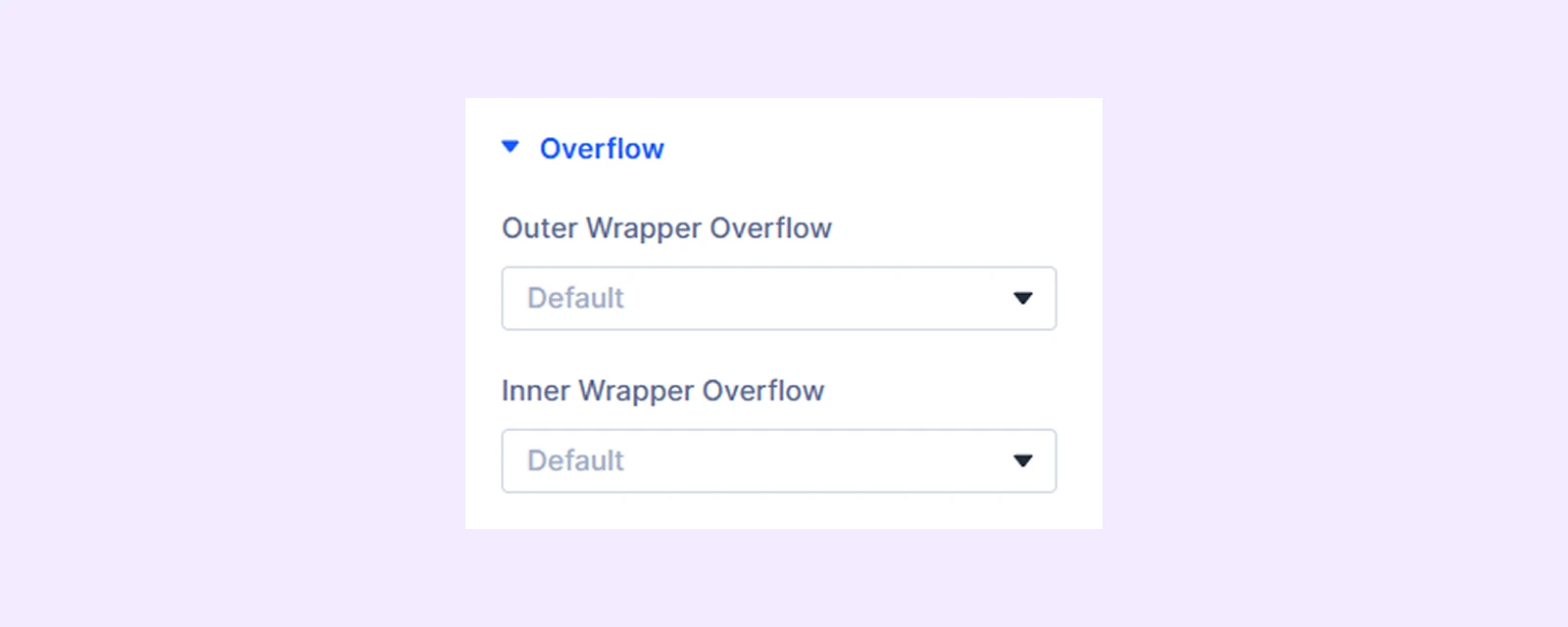
Overflow
- Outer Wrapper Overflow: Control how content within the outer container is handled when it exceeds its boundaries.
- Inner Wrapper Overflow: Control how content within the inner container is handled when it exceeds its boundaries.
Spacing: Add custom margin and padding to the module’s container.
Sizing: Adjust the width, height, and alignment of the module.
Transform: Scale, rotate, move, or skew the module.
Animation: Apply reveal animation effects and customize delay, duration, repeat settings, and animation type.
Advanced Tab
This tab provides additional settings for advanced users who want greater control over the module with custom code, conditions, and more.
Product Element Settings
These settings allow you to customize each product element individually. Any changes here override the main Product Grid settings.
Content Tab
Element
Type: Choose the type of the product element. There are 11 different product elements to choose from.
If you choose “Product Image”
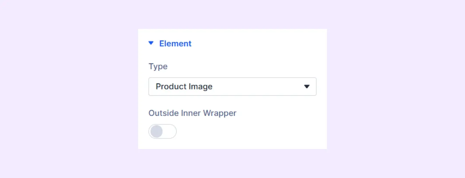
- Outside Inner Wrapper: Enable the featured image of the product to be placed outside the inner wrapper but inside the outer wrapper.
If you choose “Product Title”
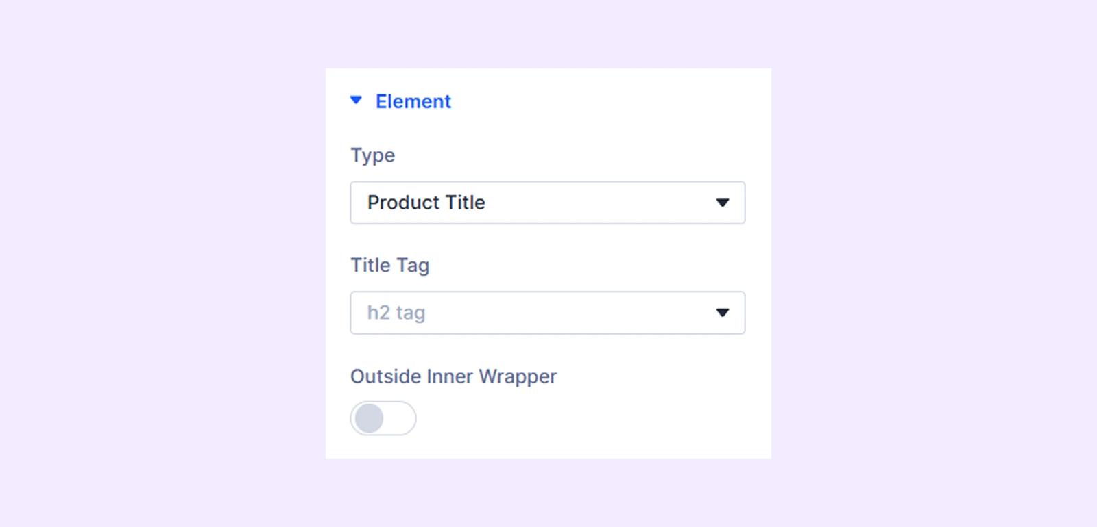
- Title Tag: Choose the HTML tag for the product title.
- Outside Inner Wrapper: Enable the title of the product to be placed outside the inner wrapper but inside the outer wrapper.
If you choose “Product Rating”
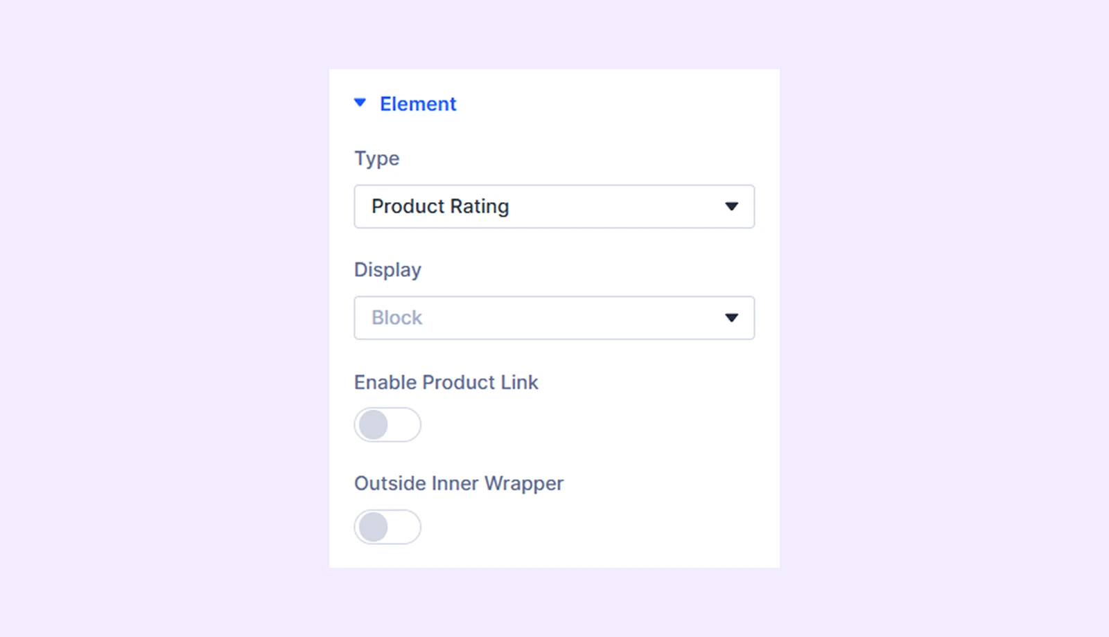
- Display: Select how to display the product element: inline (on the same line), inline block (next to each other with potential line breaks), or block (on separate lines).
- Outside Inner Wrapper: Enable the product rating to be placed outside the inner wrapper but inside the outer wrapper.
- Enable Product Link: Toggle link to product page.
- Outside Inner Wrapper:
If you choose “Product Price”
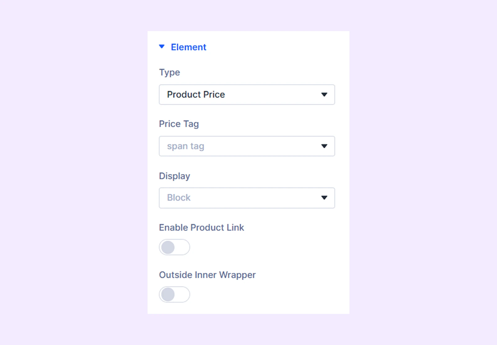
- Price Tag: Choose the HTML tag for the product price.
- Display: Select how to display the product element: inline (on the same line), inline block (next to each other with potential line breaks), or block (on separate lines).
- Enable Product Link: Toggle this option to make the product price clickable.
- Outside Inner Wrapper: Enable the product price to be placed outside the inner wrapper but inside the outer wrapper.
If you choose “Product Short Description”
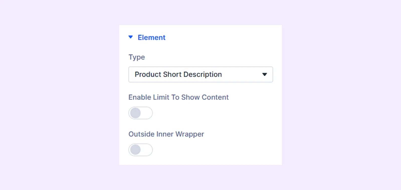
- Enable Limit to Show Product Description: Turn this option on to limit the character length of the product description.
- Short Description Length: Define the character length of the product description.
- Outside Inner Wrapper: Enable the product description to be placed outside the inner wrapper but inside the outer wrapper.
If you choose “Add to Cart”
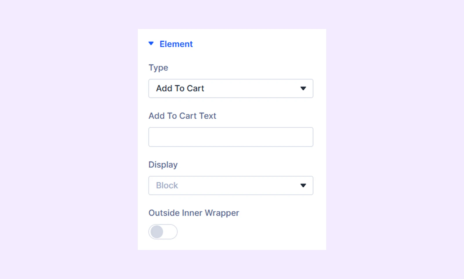
- Add to Cart Text: Input the text for the add to cart button.
- Display: Select how to display the product element: inline (on the same line), inline block (next to each other with potential line breaks), or block (on separate lines).
- Outside Inner Wrapper: Enable the add to cart button to be placed outside the inner wrapper but inside the outer wrapper.
If you choose “Categories” or “Tags”
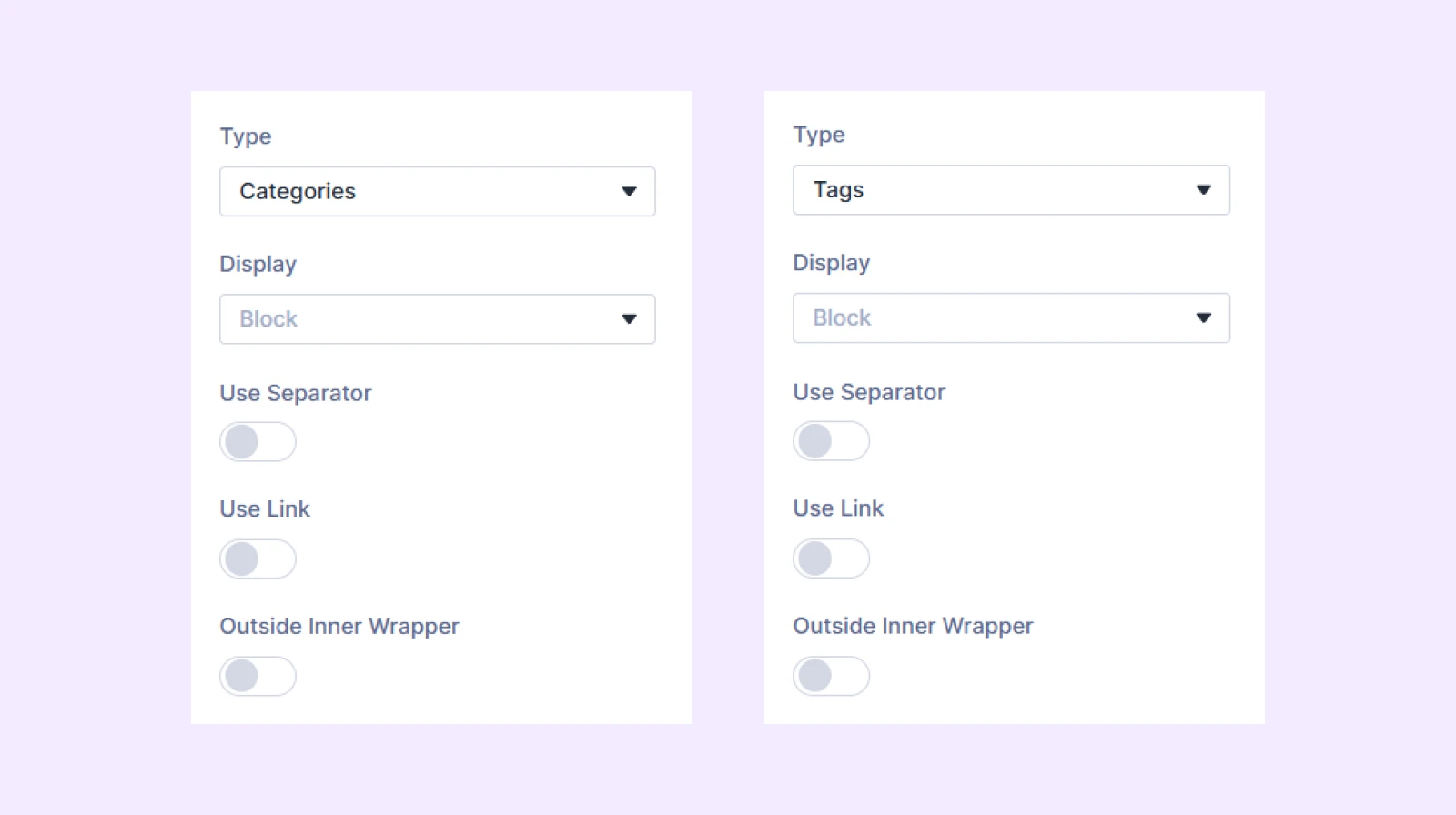
- Display: Select how to display the product element: inline (on the same line), inline block (next to each other with potential line breaks), or block (on separate lines).
- Use Separator: Enable this option to use separators between the product categories or tags.
- Separator: Define the symbol you want to use as the separator. Only available if “Use Separator” is on.
- Use Link: Enable this option to link the product categories or tags with their respective pages.
- Open on New Tab: Decide if the category or tag pages will open in a new tab or in the same tab. Only available if “Use Link” is on.
- Outside Inner Wrapper: Enable the categories or tags to be placed outside the inner wrapper but inside the outer wrapper.
If you choose “Button”
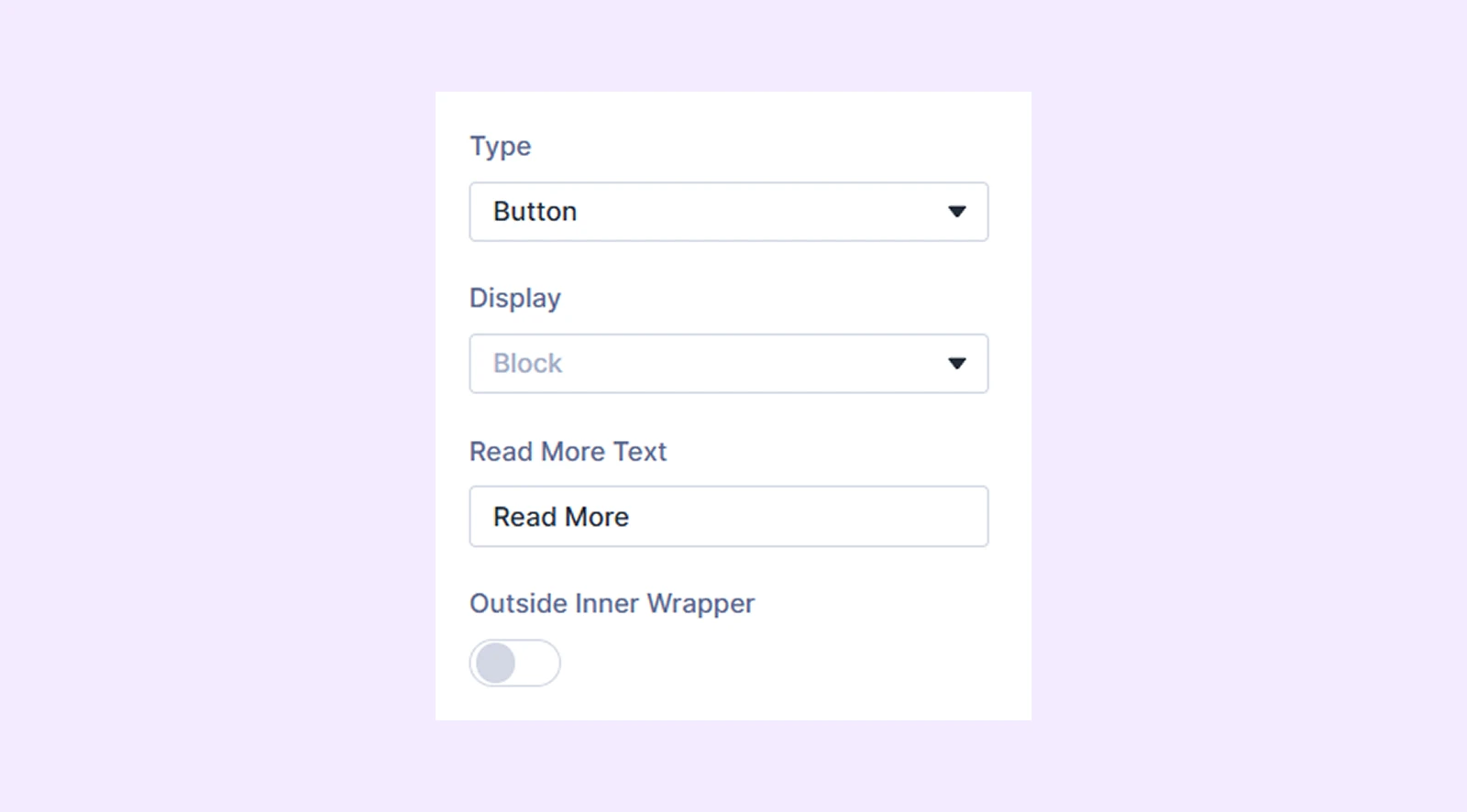
- Display: Select how to display the product element: inline (on the same line), inline block (next to each other with potential line breaks), or block (on separate lines).
- Read More Text: Input the text for the read more button.
- Outside Inner Wrapper: Enable the categories or tags to be placed outside the inner wrapper but inside the outer wrapper.
If you choose “Custom Text”
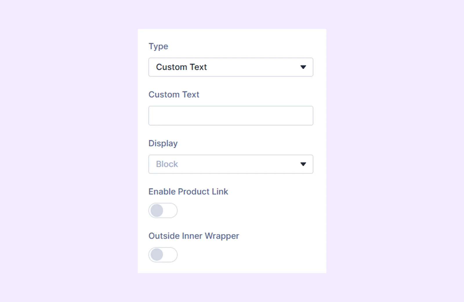
- Custom Text: Input the custom text you want to display.
- Display: Select how to display the product element: inline (on the same line), inline block (next to each other with potential line breaks), or block (on separate lines).
- Enable Product Link: Enable clickable links.
- Outside Inner Wrapper: Enable the custom text to be placed outside the inner wrapper but inside the outer wrapper.
If you choose “Divider”
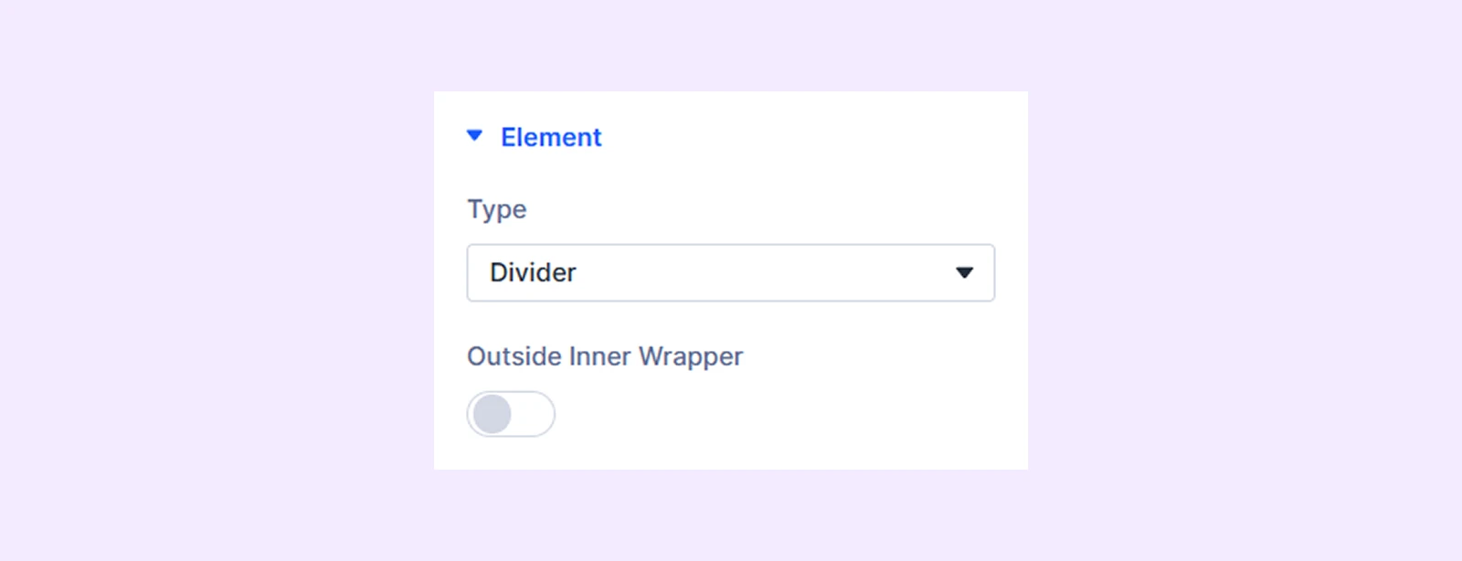
- Outside Inner Wrapper: Enable the divider to be placed outside the inner wrapper but inside the outer wrapper.
Overlay and Scale
If you choose “Product Image” as the “Type”, this addition section will show up.
- Overlay: Enable to add a gradient over the product image on hover.
- Overlay Primary Color: Choose the primary color for the overlay gradient.
- Overlay Secondary Color: Choose the secondary color for the overlay gradient.
- Overlay Gradient Direction: Adjust the overlay gradient direction.
- Use Icon: Enable to use an icon on the overlay gradient.
- Icon Color: Choose a color for the overlay icon.
- Icon Size: Adjust the size of the overlay icon.
- Icon Reveal Type: Choose the reveal animation for the overlay icon.
- Image Scale Type: Choose how the product image will animate on hover.
- Disable Overlay on Mobile: Turn this option on to disable overlay on mobile devices.
Animation Settings
Display Type: Specify the product element’s display behavior: Always Visible, Show on Hover, or Hide on Hover. While choosing show or hide on hover, you can enable always show on mobile.
Icon Settings
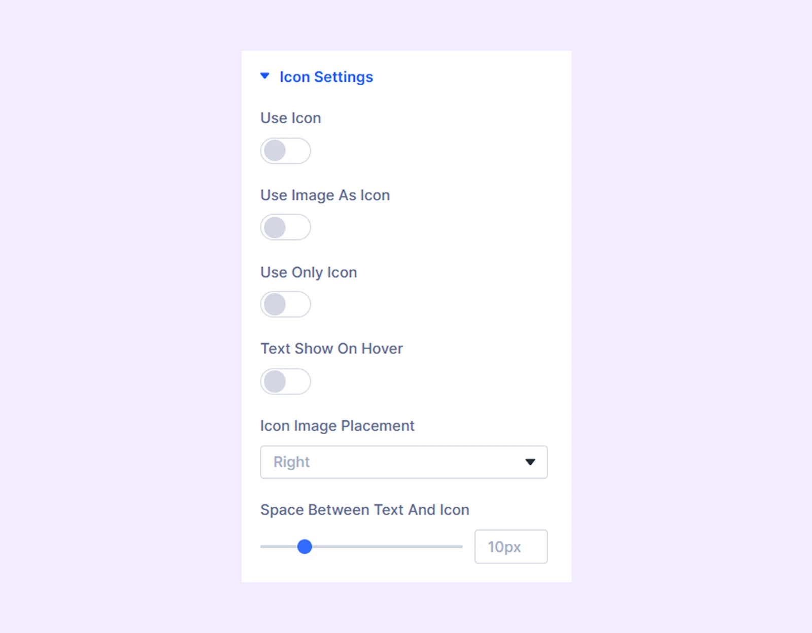
If you choose “Add To Cart”, “Categories”, “Tags”, or “Button” as the “Type”, this additional section will appear.
- Use Icon: Enable to use an icon for the selected product element.
- Icon Color: Choose a color for the icon.
- Icon Size: Adjust the size of the icon.
- Use Image as Icon: Turn on to use an image instead of an icon.
- Image Alt Text: Input the alt text for the image.
- Icon Image Width: Adjust the width of the image.
- Use Only Icon: Turn on to use only the icon without any text.
- Only Icon Position: Choose the placement of the icon if you decide to display only the icon. Available only when “Use Only Icon” is on.
- Text Show on Hover: Turn on to display the text only on hover.
- Icon Image Placement: Choose the placement of the icon or the image.
- Space Between Text and Icon: Adjust the distance between the text and the icon.
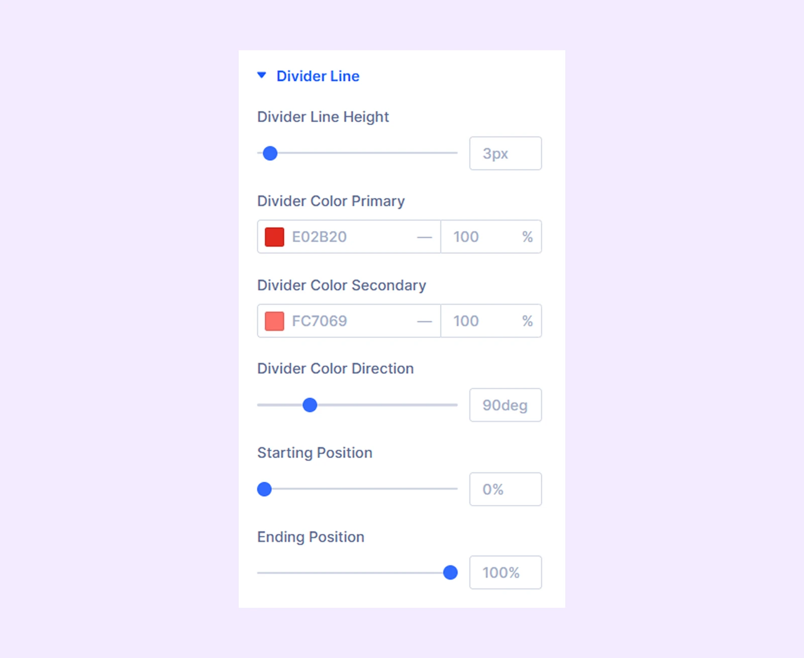
Divider Line
- Divider Line Height: Adjust the height of the divider line.
- Divider Color Primary: Choose the primary color for the divider gradient.
- Overlay Color Secondary: Choose the secondary color for the divider gradient.
- Divider Color Direction: Adjust the divider gradient direction.
- Starting Position: Adjust the starting position of the divider gradient.
- Ending Position: Adjust the ending position of the divider gradient.
Background: Set a background for the individual product element.
Element Label: Assign a custom label to the product element for easier identification in the Divi Builder.
Design Tab
Text: Options to change the alignment of the text in the product element and add a shadow effect to it.
Text Styles: Typography options for the text in the product element.
Pricing Styles: Typography options for the sale price and the regular price.
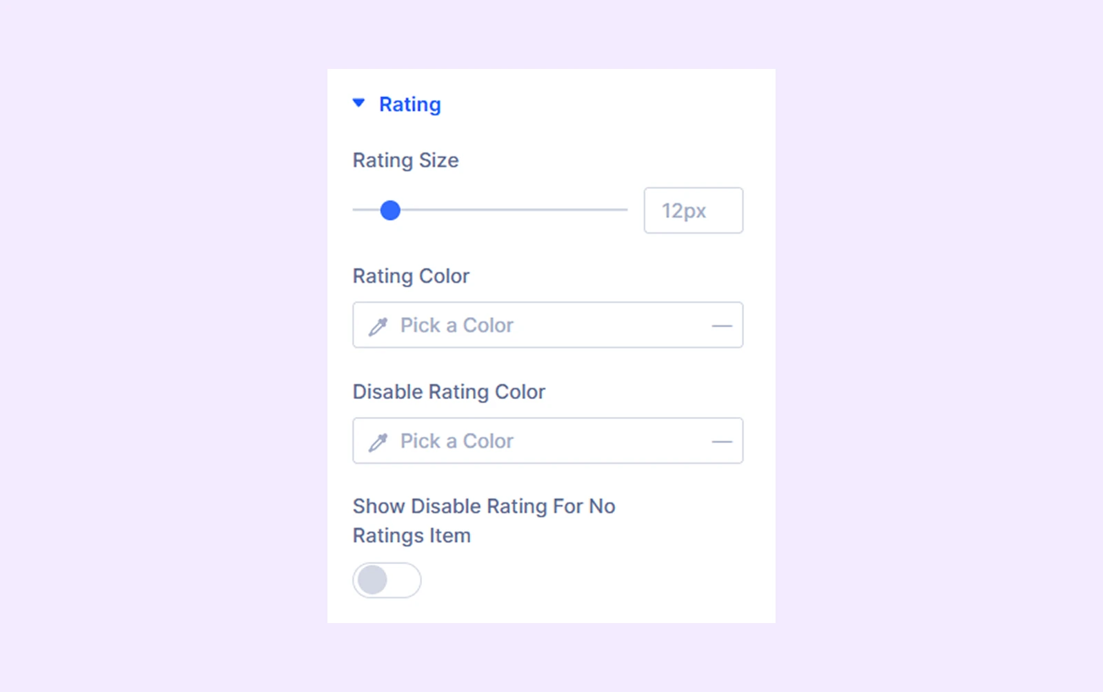
Rating
- Rating Size: Adjust the size of the product rating.
- Rating Color: Pick a color for the product rating.
- Disable Rating Color: Choose a color for the inactive stars in the rating system.
- Show Disable Rating for No Ratings Item: Enable this option to show inactive stars for products with no ratings.
Spacing: Add custom margins and padding to the product element.
Sizing: Adjust the width, height, and alignment of the product element.
Border: Border customization options for the product element. You have the option to style each border individually or all the borders together.
Box Shadow: Apply a shadow effect to the product element.
Filters: Add color filters to the product element.
Transform: Change the scale, placement, size, angle, etc. of the product element.
Advanced Tab
Use the Advanced Tab for Adding custom CSS, setting visibility conditions and controlling responsive behavior and other advanced options.
Need Help?
If you have any questions or need assistance, contact our support team: [email protected]