
DiviFlash X Feed (Twitter) module (introduced in DiviFlash 5.1.0) lets you embed and display X content directly on your Divi website.
Important Note: X Feed module is built for Divi 5 only. Also, it will be disabled by default and to use it, you must enable it manually. Refer to our guide for step-by-step instructions.
Let’s see the settings in brief and how to make better use of it —
Content Tab
This tab includes all the essential settings needed to configure your X feed.
General Tab
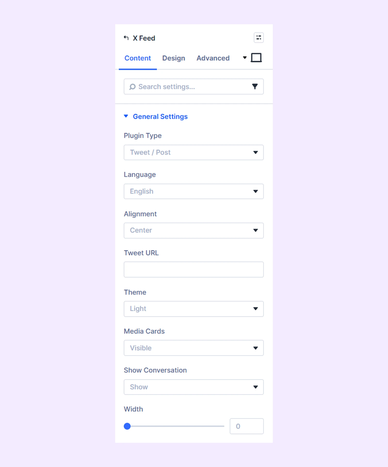
- Plugin Type: Choose what X content to display: Tweet/Post, Follow Button, or Share Button.
- Language: Set the display language for your embedded content.
- Alignment: Control how the feed is aligned within the module.
- Tweet URL: Enter the URL of the specific tweet you want to display.
- Theme: Select Light or Dark for the tweet embed.
- Media Cards: Enable or disable media previews within tweets.
- Show Conversation: Toggle to show or hide the conversation thread of a tweet.
- Width: Set the width of the embedded content.
- Username: Enter the X username for the Follow Button. (Only available with Follow Button)
- Show Username: Enable or disable the display of the username on the follow button. (Only available with Follow Button)
- Size: Choose the size of the follow button from small and large.
- URL To Share: Specify the link users will share. (Only available with Share Button)
- Pre-Filled Text: Add default text for shares. (Only available with Share Button)
- Hashtags: Include hashtags automatically when content is shared. (Only available with Share Button)
- Via (Credit Account): Give credit to your X account when users share content. (Only available with Share Button)
- Size: Set the size of the share button. (Only available with share button)
Background: Add a background color, gradient, image, video, pattern, or mask to the module.
Element Label: Rename the module to organize it more easily in the Divi Builder. (Only you can see this label.)
Design Tab
Use this tab to customize the visual appearance of the X Feed module.
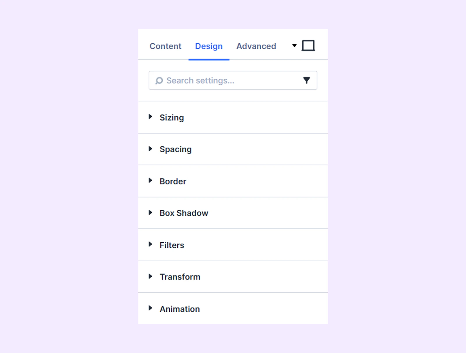
Sizing: Adjust the width, height, and alignment of the module.
Spacing: Add custom margin and padding to the module’s container.
Border: Customize the border style, width, and color. And style each border separately or apply the same style to all sides.
Box Shadow: Add shadow effects to the module.
Filters: Apply color filters to enhance the appearance.
Transform: Scale, rotate, move, or skew the module.
Animation: Apply reveal animation effects and customize delay, duration, repeat settings, and animation type.
Advanced Tab
This tab provides additional settings for advanced users who want greater control over the module with custom code, conditions, and more.
Need Help?
If you have any questions or need assistance, contact our support team: [email protected]