The Image Hover module lets you add engaging hover effects to your images using animations, overlays, and other styling options.
Let’s see the settings in brief and how to make better use of it —
Content Tab
This tab contains the essential settings that control the content of the Image Hover module.
Image: Add the image, its title, and the image alt text.
Icon: Add an icon on the image which will be displayed on hover.
Hover Settings
Hover Settings provides options to customize the hover effects for the module.
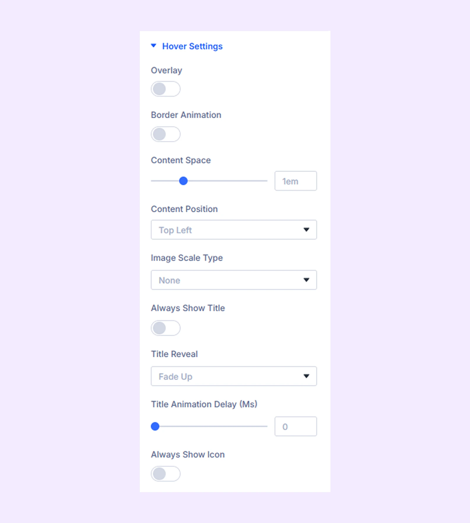
- Overlay: It lets you add a gradient over the image when hovering. You can also adjust the gradient’s direction.
- Border Animation: Enable this to add a border animation on hover. You can set the color, size, and animation style.
- Content Space: Change the space between image title and the image border.
- Content Position: Adjust the position of the content on the image.
- Image Scale Type: It controls how the image scales when hovered.
- Always Show Title: Enable this to always show the title, even when the image is not hovered.
- Always Show Icon: Enable this to always show the icon, even when the image is not hovered.
- Title Reveal: Select the animation style for revealing the title (this feature will not be available if you enable “Always Show Title”).
- Title Animation Delay: Set a delay to the title reveal animation (this feature will not be available if you enable “Always Show Title”).
- Icon Reveal: Select the animation style for revealing the icon (this feature will not be available if you enable “Always Show icon”).
- Icon Animation Delay: Set a delay to the icon reveal animation (this feature will not be available if you enable “Always Show Icon”).
Link: Use this default Divi setting to add a link to the entire module.
Background: Add a background color, gradient, image, video, pattern, or mask to the module.
Element Label: Rename the module to organize it more easily in the Divi Builder. (Only you can see this label.)
Design Tab
The Design tab controls the styling and visual appearance of the module.
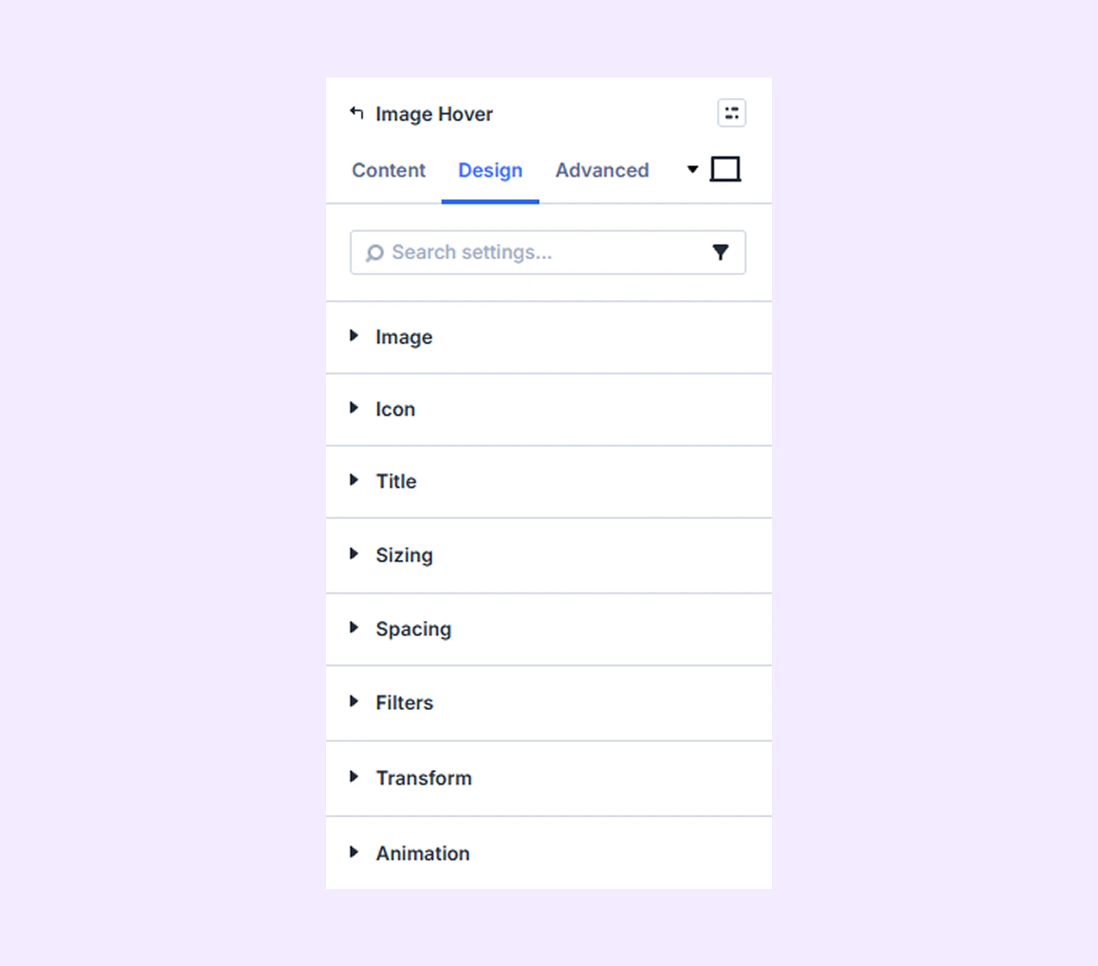
Image: Add a color filter to the image.
Icon: Options to change the icon’s color, size, background, and border.
Title: This section controls the title’s font, size, color, spacing, and other text styling options.
Sizing: Adjust the width, height, and alignment of the module.
Spacing: Adjust the margins and padding of the module container.
Filters: Apply color filter effects to the module.
Transform: Adjust the scale, position, rotation, and size of the module.
Animation: Add reveal animation effects and control the animation style, delay, duration, and more.
Advanced Tab
This tab provides additional settings for advanced users who want greater control over the module with custom code, conditions, and more.
Need Help?
If you have any questions or need assistance, contact our support team: [email protected]