The DiviFlash Image Carousel module lets you showcase images in an interactive and visually engaging carousel format.
Let’s see the settings in brief and how to make better use of it —
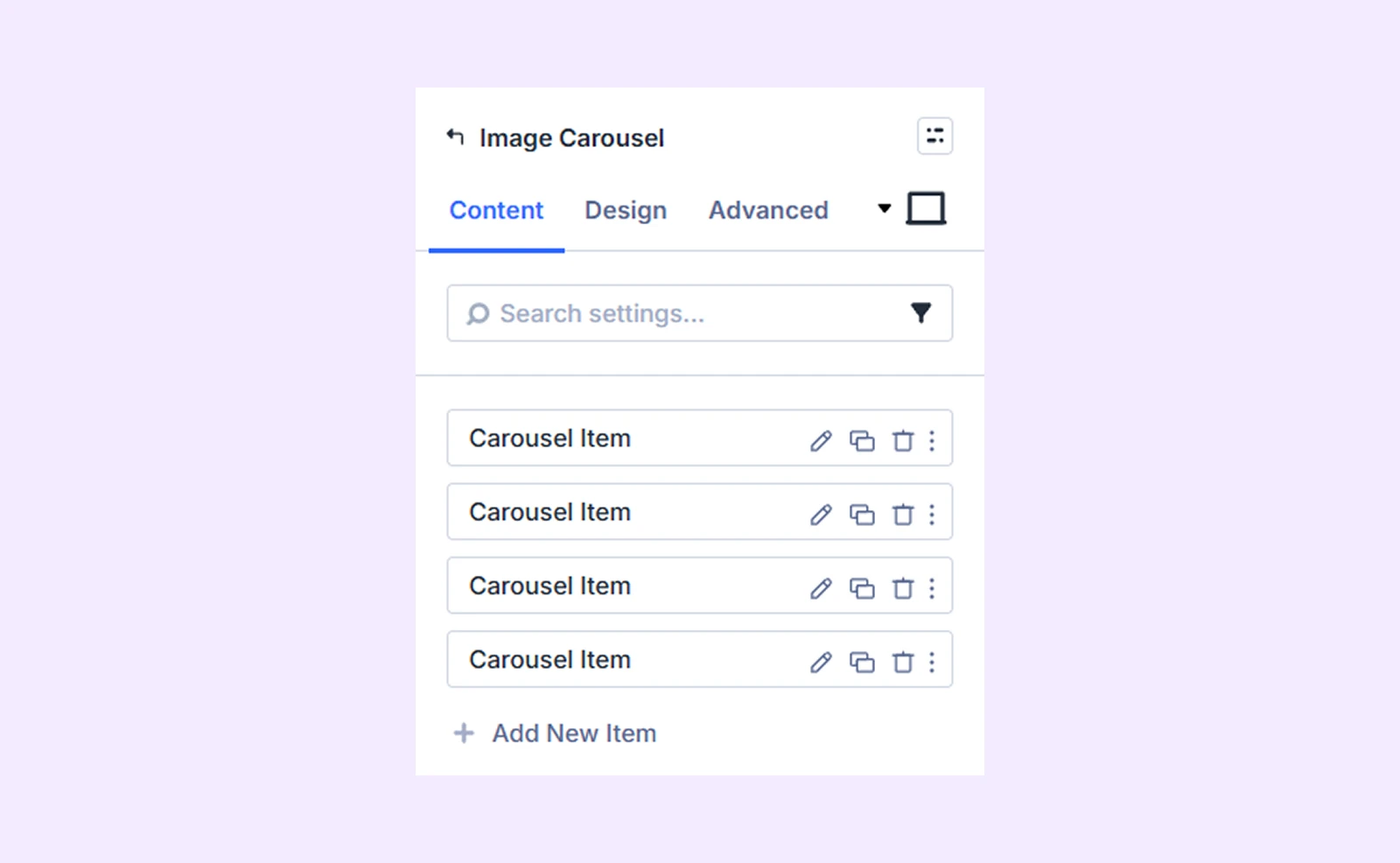
Content Tab
This tab contains all the essential settings to add and configure carousel items.
Add New Item
Click the + Add New Item button to create a new carousel slide. This opens the Image Carousel Item Settings, where you can add content and customize each slide individually. By default, four carousel items are included, which you can edit or remove. To learn more about customizing individual carousel items, click here.
Carousel Settings
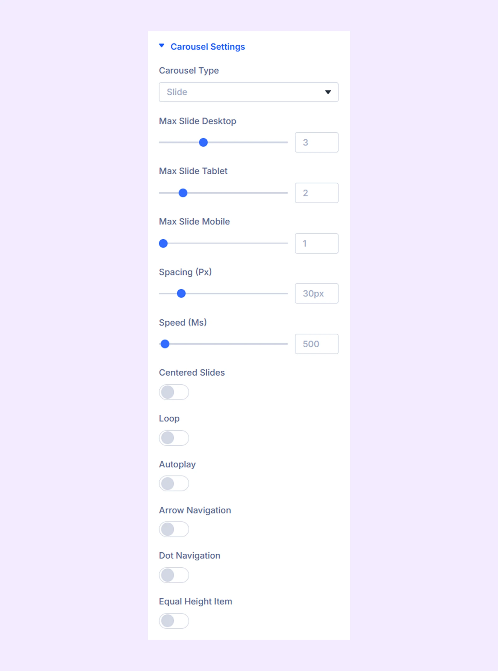
- Carousel Type: You can choose the type of carousel you want. You have four options to choose from: Slide, Cube, Coverflow, and Flip.
- Variable Width: Enable this option to allow images of different widths. Only available if you choose “Slide.”
- Max Slide Desktop: Choose the maximum number of slides you want to display at once on desktops.
- Max Slide Tablet: Choose the maximum number of slides you want to display at once on tablets.
- Max Slide Mobile: Choose the maximum number of slides you want to display at once on mobile phones.
- Max Image Height: Set the maximum height for the images. Available only if you enable “Variable Width”.
- Spacing (Ms): Set the spacing between carousel items.
- Speed: Set the speed at which the items in the carousel will slide.
- Centered Slides: This option allows the slides to begin at the center of the screen.
- Loop: Toggle on to create a loop with the items.
- Autoplay: Select this option to begin the slideshow automatically.
- Autoplay Speed: Define the speed of the autoplay effect. Only available when “Autoplay” is enabled.
- Pause on Hover: Allows the autoplay to be paused when hovered over. Only available if you enable autoplay.
- Arrow Navigation: Allow users to navigate using arrows.
- Dot Navigation: Allow users to navigate using dots.
- Use Lightbox: When you click on an image in your carousel, it will appear in a lightbox.
- Use Lightbox Caption: Enable to show the carousel title along with the image in Lightbox.
Advanced Carousel Settings
If you select “Coverflow” as the “Carousel Type,” you’ll gain access to coverflow slider customization settings.
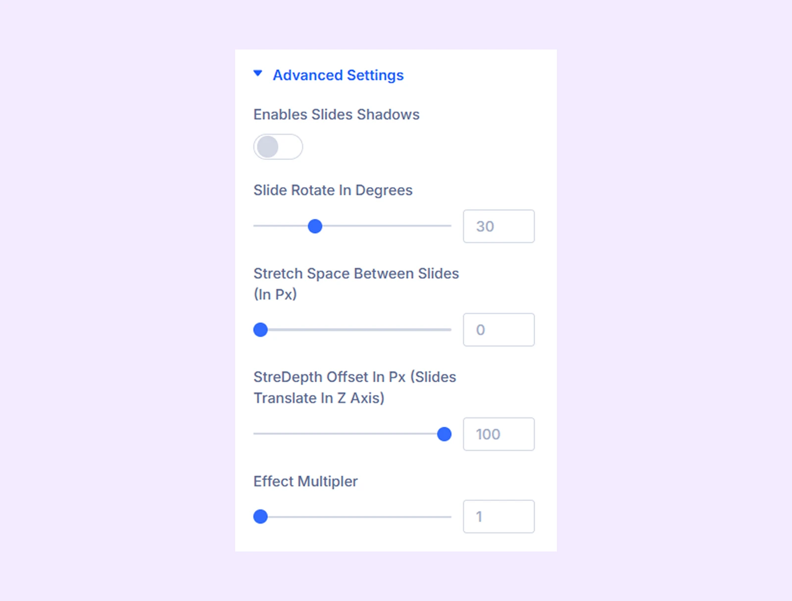
- Enables Slides Shadows: Turn on to add a shadow effect to the coverflow sliders.
- Slide Rotate in Degrees: Adjust the angle of the carousel items.
- Stretch Space Between the Slides (In Px): Adjust the gap between the slides.
- Stredepth Offset In Px (Slides Translate In Z Axis): Adjust the depth position of slides by moving them forward or backward along the Z-axis,
- Effect Multiplier: Determines how many times the carousel items will slide or rotate.
- Shadow Color Dark: Choose the darker shade for the shadow effect.
- Shadow Color Light: Choose the lighter shade for the shadow effect.
Note: The shadow color options are only available if the “Enables Slides Shadows” option is enabled.
Content Area Background: Choose a background color, gradient, or image specifically for the content area.
Background: Add a background color, gradient, image, video, pattern, or mask to the module.
Element Label: Rename the module to organize it more easily in the Divi Builder. (Only you can see this label.)
Design Tab
Use this tab to customize the visual styling of your carousel.
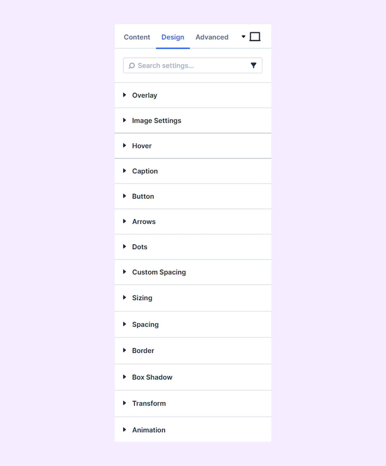
Overlay
- Overlay: Add a color or a gradient as the overlay for the image sliders.
- Content Vertical Align: Adjust the vertical alignment of the caption and button text on the image.
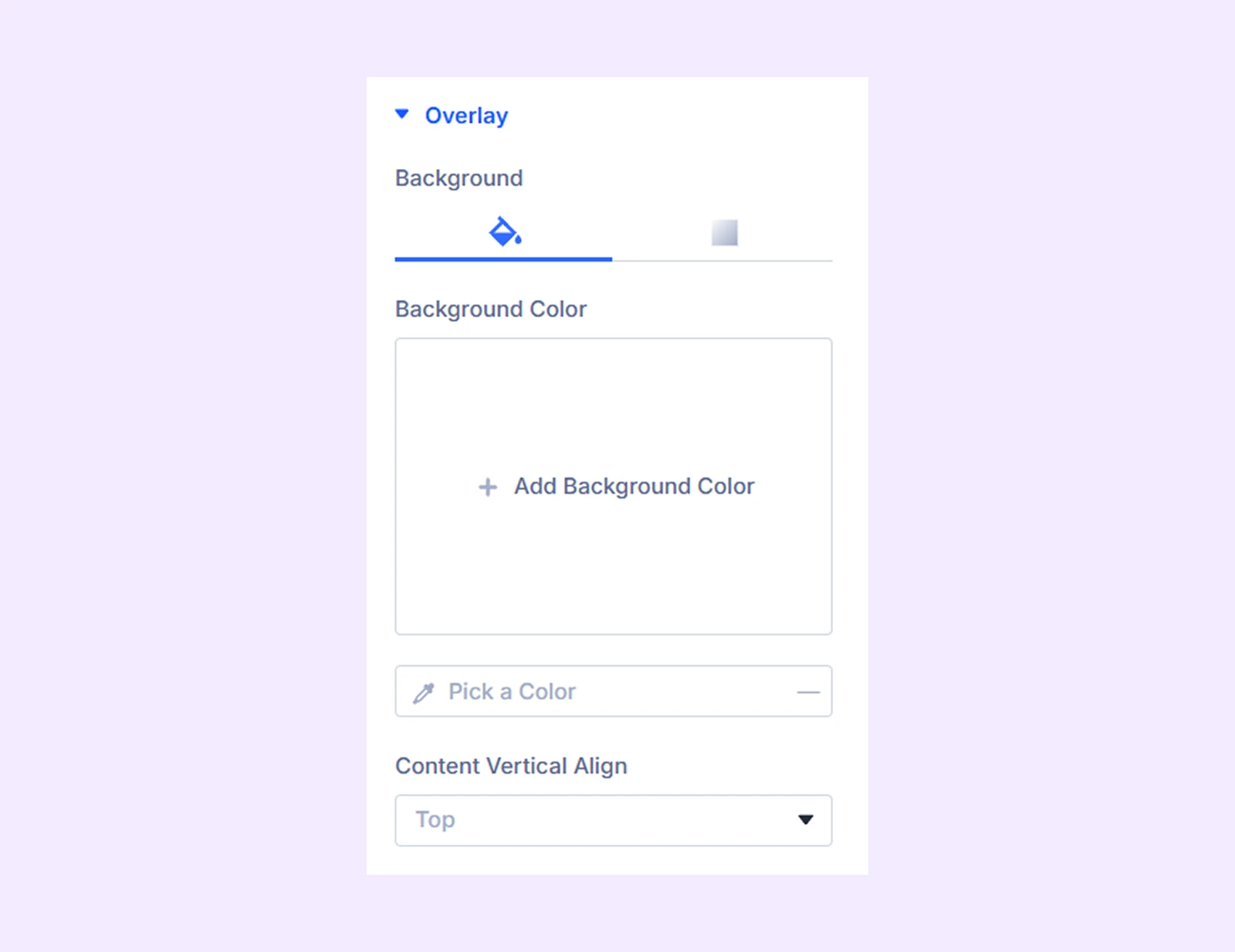
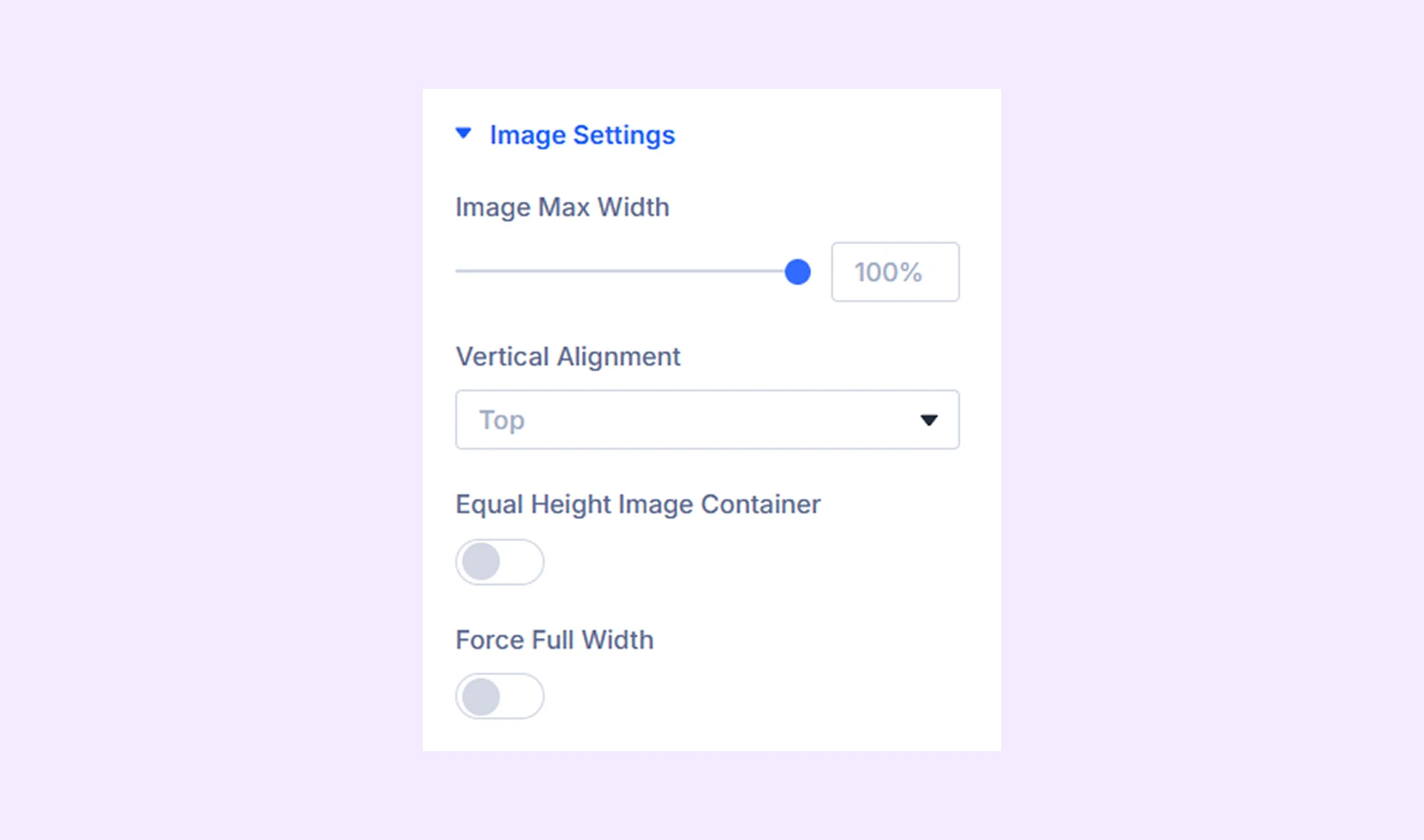
Image Settings
- Image Max Width: Set the max width of all the images in the carousel.
- Vertical Alignment: Make adjustments to the images’ vertical alignment.
- Equal Height Image Container: Enable this option to make all the image containers the same height.
- Force Full Width: Set all images to their maximum width.
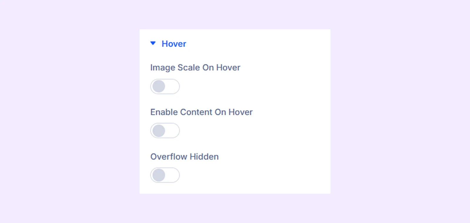
Hover
- Image Scale on Hover: Enable this option to make the image zoom in when hovered.
- Image Scale Value on Hover: Adjust how much the image will zoom in when hovered. Only available if “Image Scale on Hover” is on.
- Enable Content on Hover: You can make the caption and the button text appear on hover.
- Animation Direction: Choose the direction of the content hover animation.
- Overflow Hidden: Turn this option on to prevent scaled images from overflowing the image container.
Caption: Typography options for the caption of the images.
Button: Alignment, typography, and border options for the carousel buttons.
Arrows
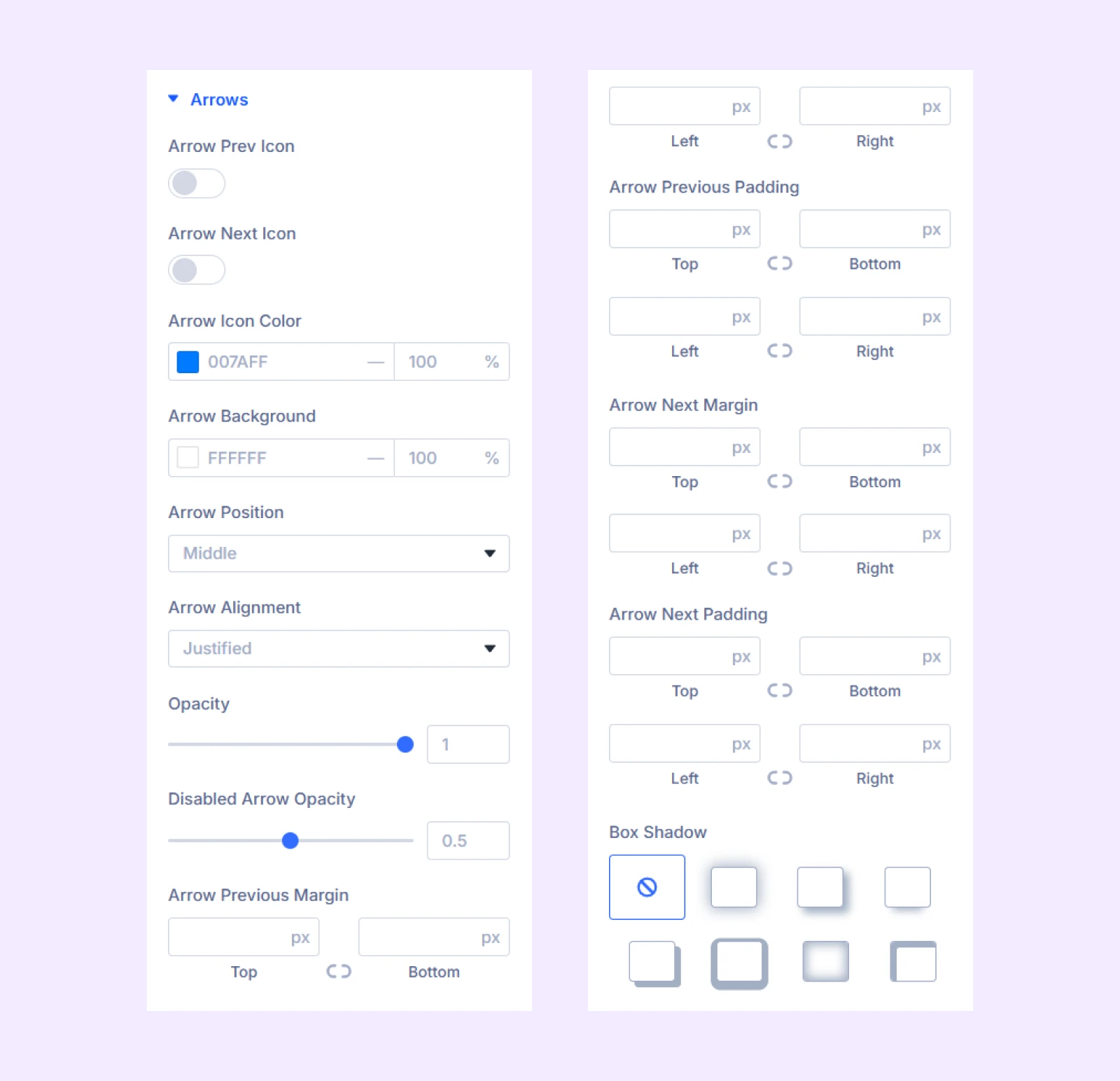
- Arrow Prev Icon: Use a custom icon and adjust size for the “previous” button.
- Arrow Next Icon: Use a custom icon and adjust size for the “next” button.
- Arrow Icon Color: Select a different color for the arrows.
- Arrow Background: Select a different color for the arrow background.
- Arrow Position: Adjust the position of the navigation arrows.
- Arrow Alignment: Reposition the navigation arrows.
- Opacity: Select how transparent you want the arrow background to be.
- Arrow Margin and Padding: Set the margin and padding separately for the previous and next arrow buttons.
- Box Shadow: Add a shadow effect to the arrow buttons and modify the shadow’s position, strength, and color.
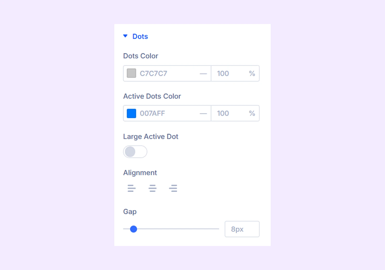
Dots
Keep the dot navigation on to use those design options described below-
- Dots Color: Select a color for all the dots.
- Active Dots Color: Indicate the active dot with a different color.
- Large Active Dot: Select this option to use a large dot to indicate the active item in the carousel.
- Alignment: Adjust the horizontal placement of the dots.
- Gap: Adjust the gap between the dots.
Custom Spacing
- Wrapper: You can customize the padding and margin of the wrapper for the entire carousel, the items, and the content area.
- Content: You can customize the padding and margin for the buttons as well as the captions in the carousel.
Sizing: Adjust the width, height, and alignment of the module.
Spacing: Add custom margin and padding to the module’s container.
Border: Customize the border style, width, and color. And style each border separately or apply the same style to all sides.
Box Shadow: Add shadow effects to the module.
Transform: Scale, rotate, move, or skew the module.
Animation: Apply reveal animation effects and customize delay, duration, repeat settings, and animation type.
Advanced Tab
This tab provides additional settings for advanced users who want greater control over the module with custom code, conditions, and more.
Image Carousel Item Settings
Each carousel item is a child of the main module. Customizations here will override the parent Image Carousel Settings.
Content Tab
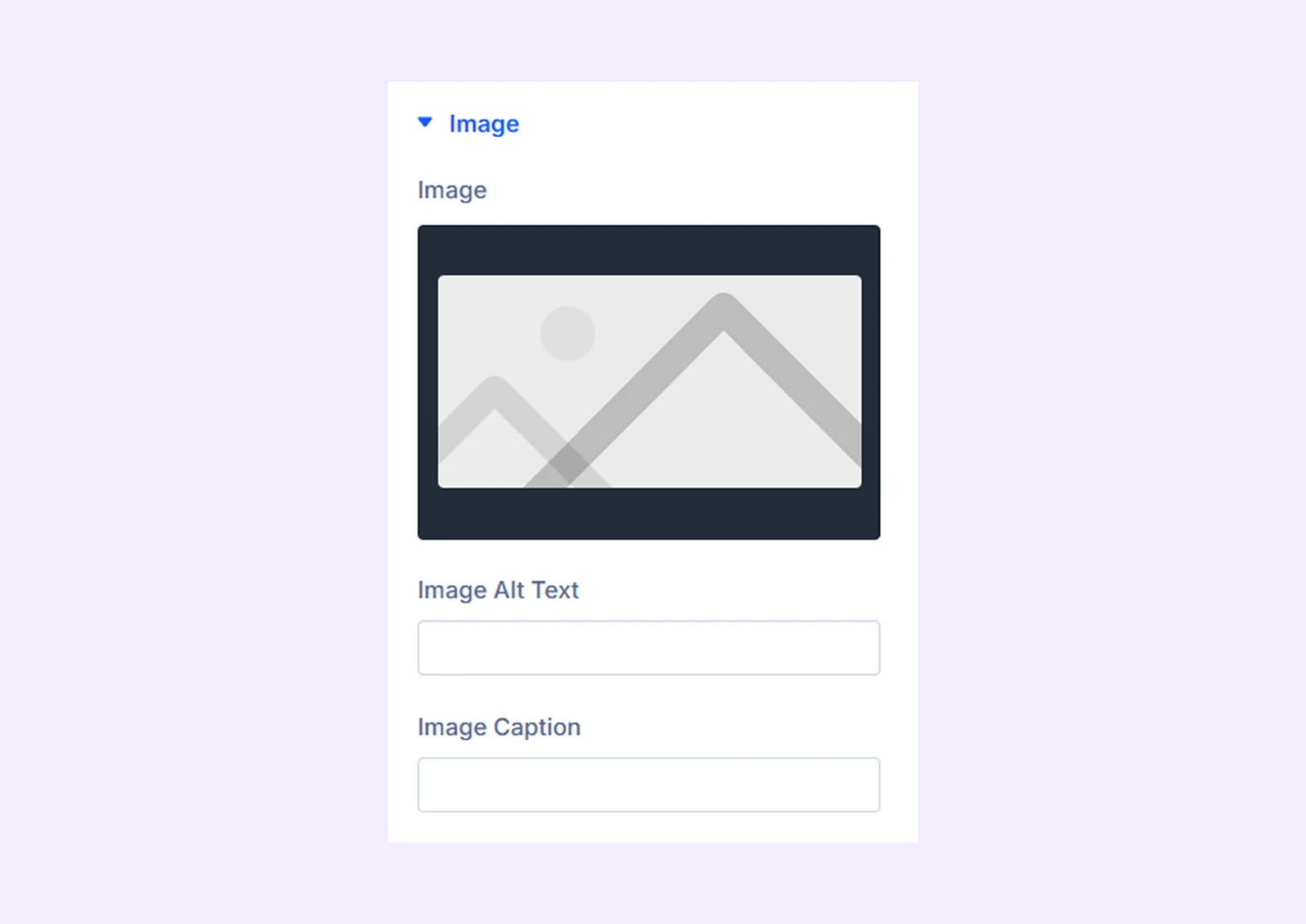
Image
- Image: Upload the image for this slider.
- Image Alt Text: Type in the Alt Text for the image.
- Image Caption: Enter the image caption here. The caption will appear over the image.
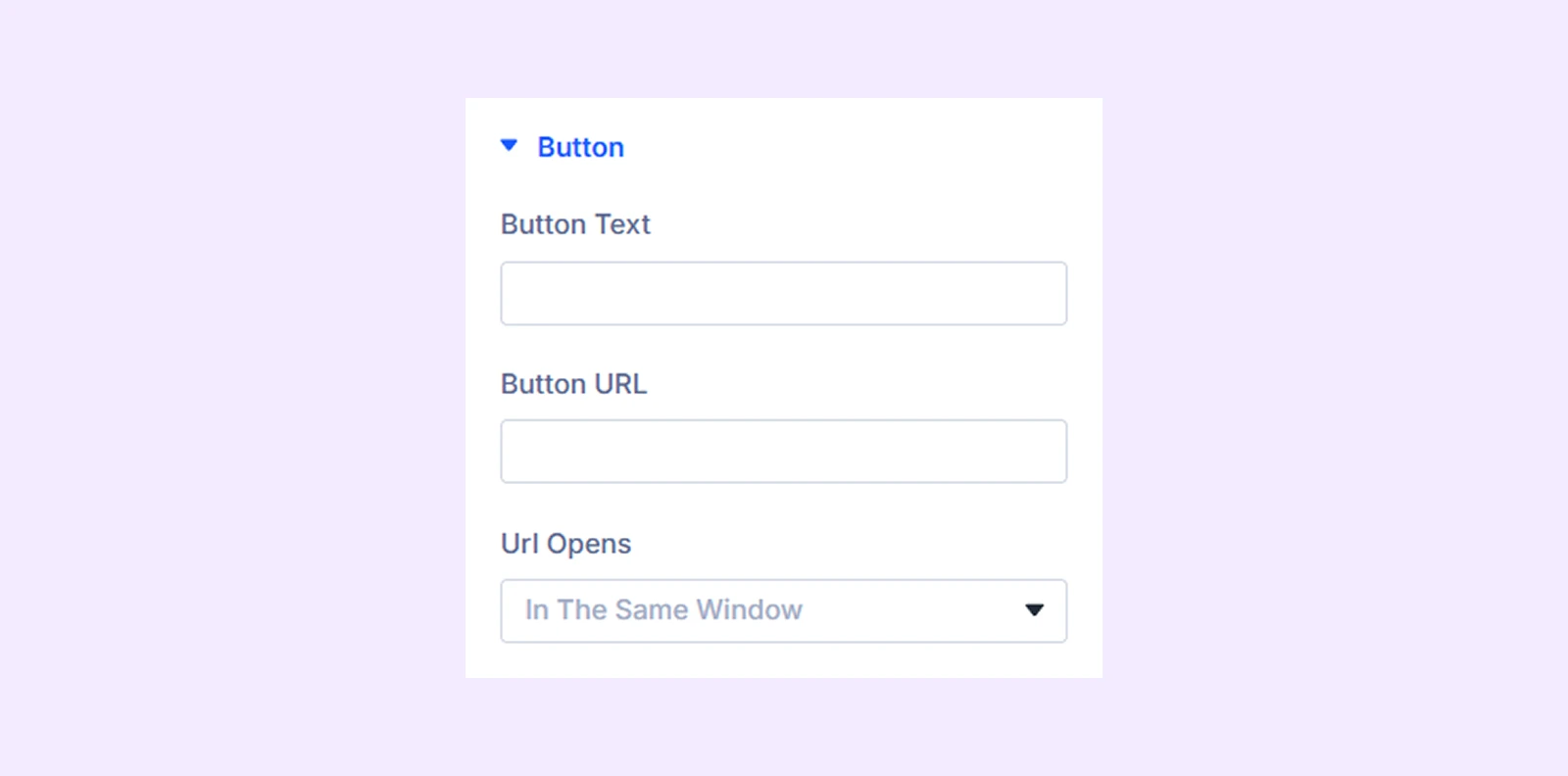
Button
- Button Text: Input the button text.
- Button URL: Attach a link to the button.
- URL Opens: Choose whether to open the attached link in the same or new window.
Link: Use this option to assign a link specifically to this carousel item.
Background: Add a background color, gradient, image, or other styling to this individual carousel item.
Element Label: Rename this carousel item for easier identification within the Divi Builder.
Design Tab
Provides the same styling options as the main module but applies them to individual carousel items.
Advanced Tab
Use for custom CSS, conditions, visibility rules, and advanced configurations for each item.
Need Help?
If you have any questions or need assistance, contact our support team: [email protected]