
DiviFlash Advanced Divider module lets you add stylish divider lines between sections to improve layout structure and visual separation.
Activation Required: This module is disabled by default. To use it, you need to enable it manually. Refer to our guide for step-by-step instructions.
Let’s see the settings in brief and how to make better use of it —
Content Tab
This tab contains the settings for configuring the divider line and separator.
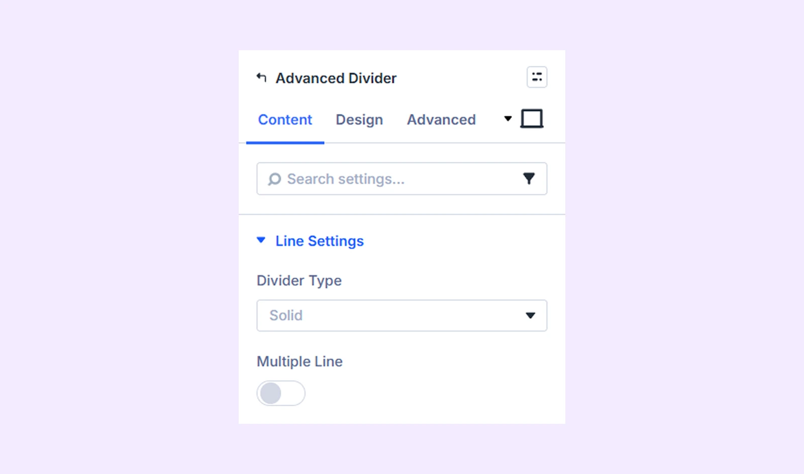
Line Settings
- Divider Type: Choose from 10 different divider presets.
- Multiple Line: Enable this option to display multiple divider lines.
- Line Number: Define how many divider lines will appear.
- Line Gap: Adjust the spacing between the divider lines.
Separator Settings
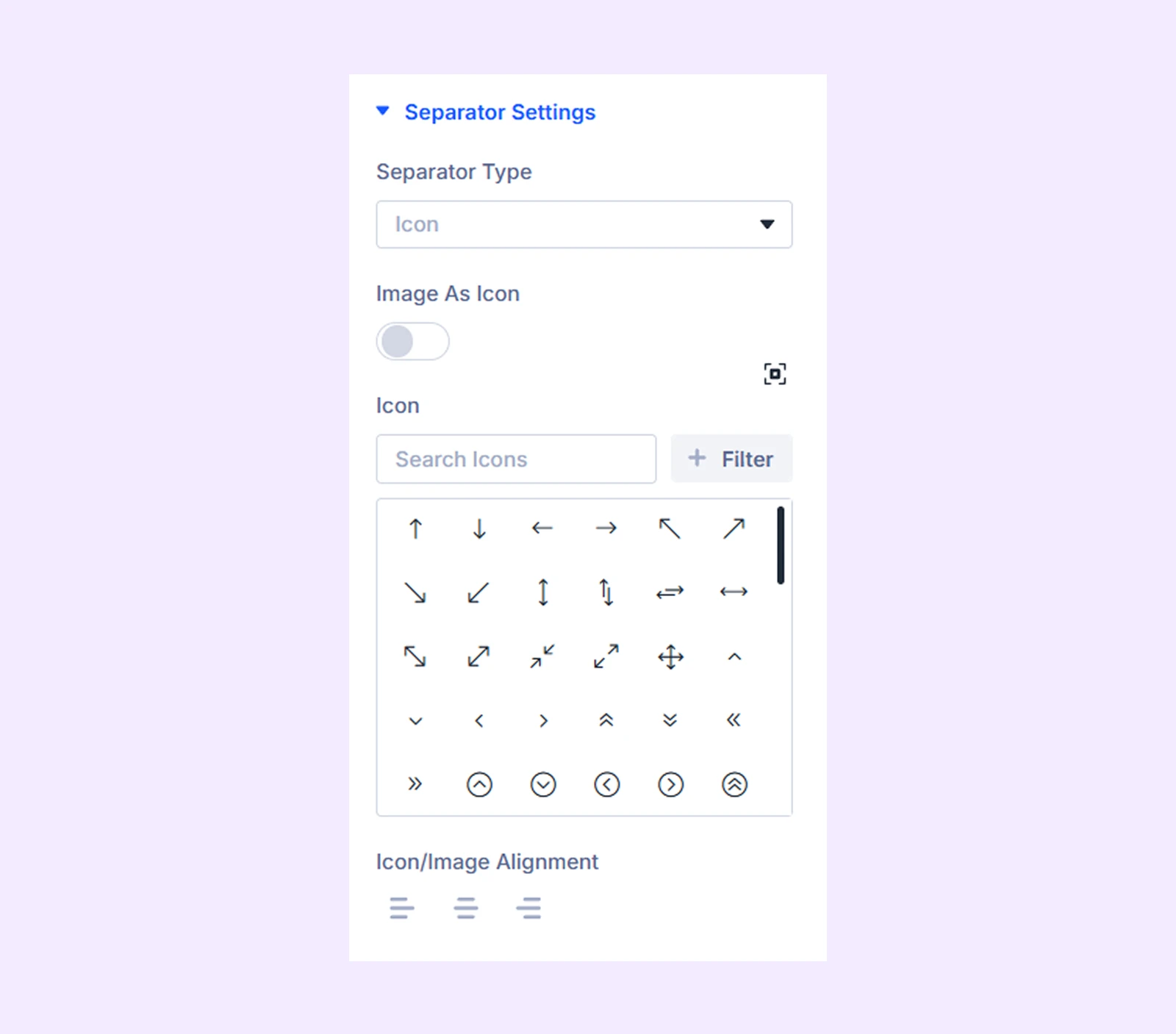
- Separator Settings: Choose whether the separator will use an icon, text, or Lottie animation.
If you choose “Icon”
- Image as Icon: Enable this option to use an image instead of an icon. You will be able to upload an image and submit its alt text after enabling this.
- Icon/Image Alignment: Adjust the horizontal alignment of the icon or image relative to the divider line.
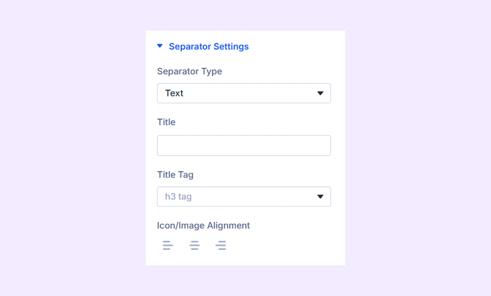
If you choose “Text”
- Title: Enter the text that will appear as the separator.
- Title Tag: Choose the heading tag for the separator text.
- Icon/Image Alignment: Adjust the horizontal placement of the separator text.
If you choose “Lottie”
- Lottie File Location: Choose whether to load the Lottie animation from an external URL or upload it from the media library.
- Icon/Image Alignment: Adjust the horizontal placement of the Lottie file.
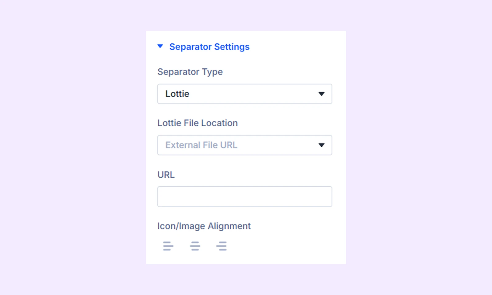
Note: If you choose to upload the Lottie file from media, you must enable the “JSON file upload” option from the DiviFlash dashboard.
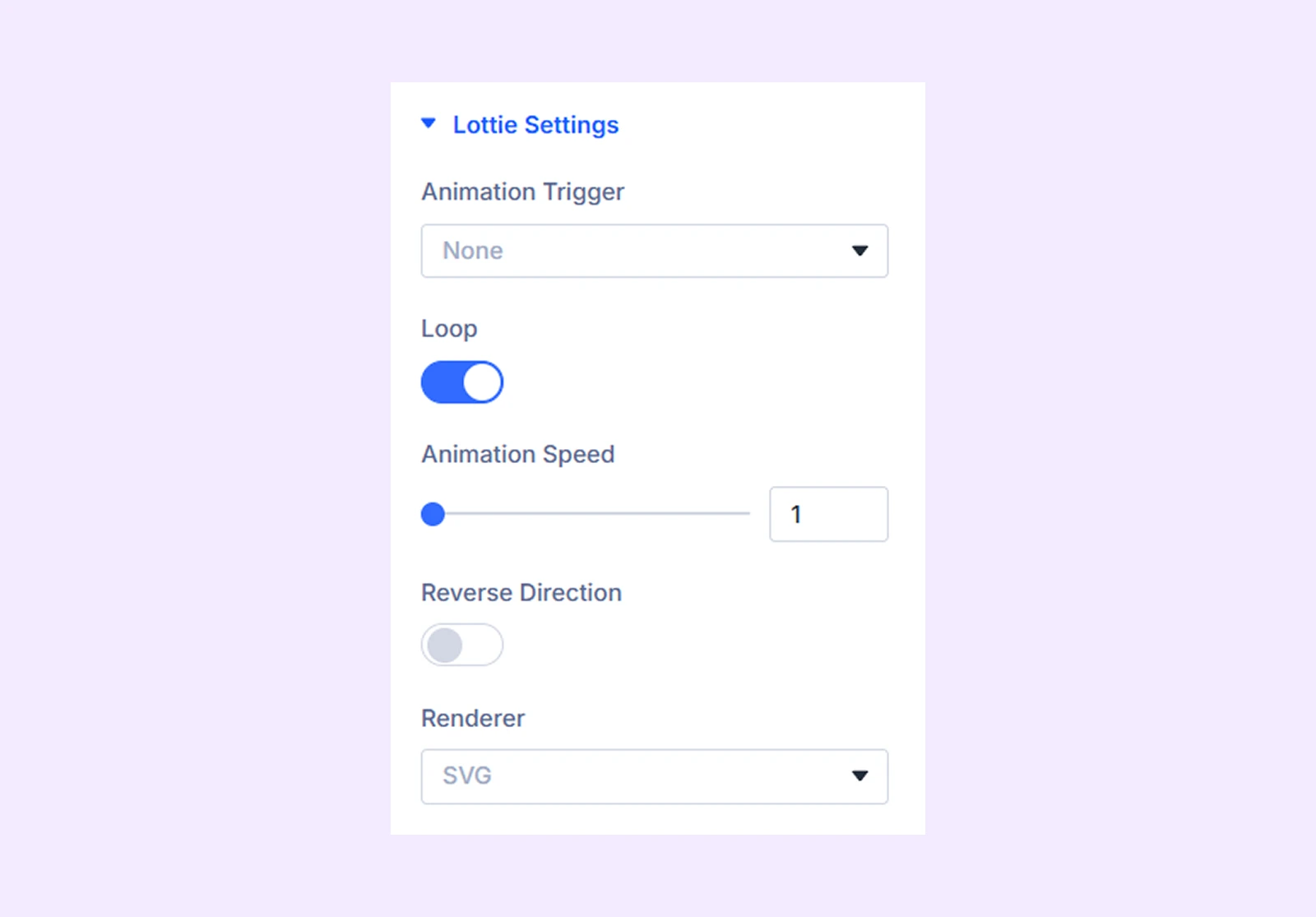
Lottie Settings
If you choose “Lottie” as the separator, this section will appear.
- Animation Trigger: Choose the interaction that will trigger the animation.
- Threshold: Set the viewport threshold required to start the animation. (Available only when “Viewport” is selected as the animation trigger.)
- Pause Animation Mouse Leave: Pause the animation when the cursor leaves the module. (Available only when “On Hover” is selected as the animation trigger.)
- Loop: Enable continuous looping of the animation.
- Animation Speed: Adjust the playback speed of the animation.
- Reverse Direction: Enable this option to reverse the animation direction.
- Renderer: Choose the rendering format used for the Lottie animation.
Link: Use this default Divi setting to add a link to the entire module.
Background: Add a background color, gradient, image, video, pattern, or mask to the module.
Element Label: Rename the module to organize it more easily in the Divi Builder. (Only you can see this label.)
Design Tab
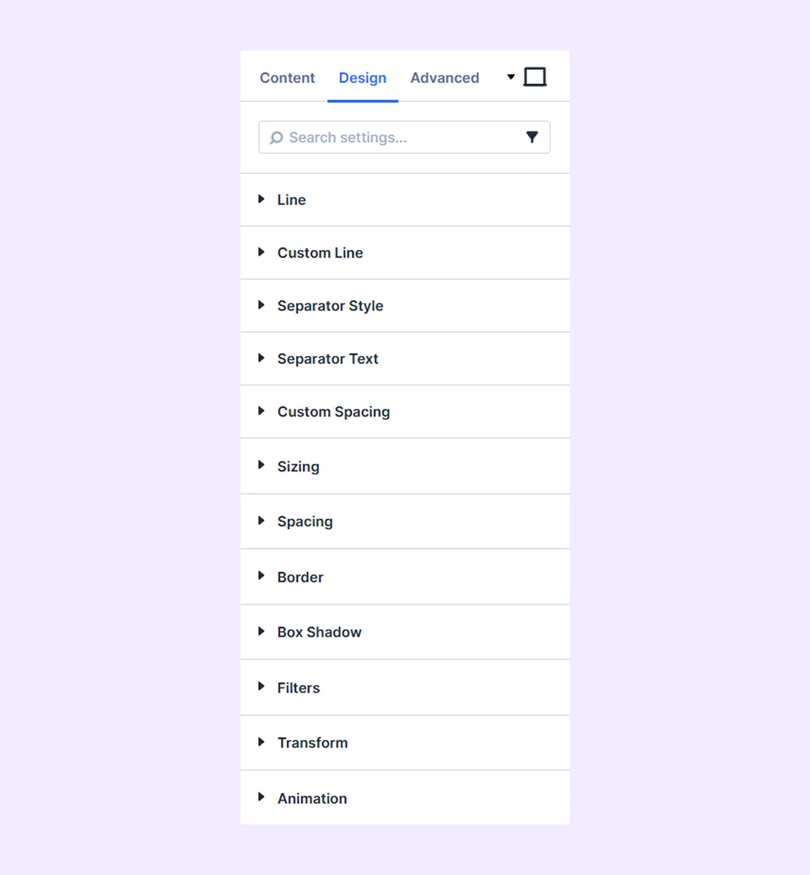
Line
- Color: Choose the color of the divider line.
- Right Color: Apply a different color to the right side of the divider line.
Note: Some design options change depending on the selected divider type. For example, gradient dividers will show background settings instead of simple color options.
- Size: Adjust the thickness of the divider lines.
- Width: Adjust the width of the divider lines.
- Line Alignment: Adjust the horizontal alignment of the divider lines. (Not applicable when width is set to 100%.)
- Left Offset: Adjust the left section of the divider line.
- Right Offset: Adjust the right section of the divider line.
- Space Between Line: Control the spacing between the left and right portions of the divider.
- Line Placement: Choose where the divider line appears relative to the separator.
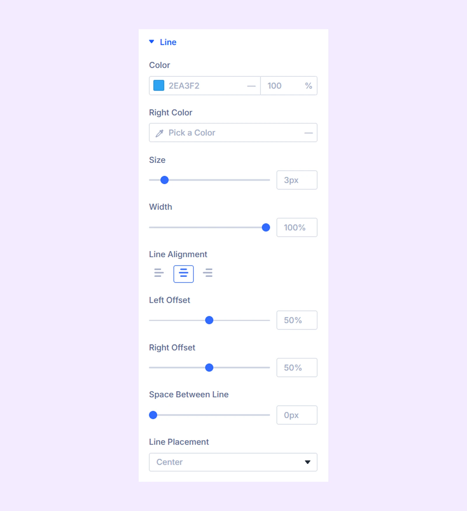
Custom Line: Customize the border styling of the divider lines.(This option works only when Divider Type is set to Custom.)
Separator Style: Customize the color, size, and border of the separator.
Separator Settings: Customize the typography of the separator text.
Custom Spacing: Add custom paddings and margins to the separator.
Sizing: Adjust the width, height, and alignment of the module.
Spacing: Add custom margin and padding to the module’s container.
Border: Customize the border style, width, and color. And style each border separately or apply the same style to all sides.
Box Shadow: Add shadow effects to the module.
Filters: Apply color filters to enhance the appearance.
Transform: Scale, rotate, move, or skew the module.
Animation: Apply reveal animation effects and customize delay, duration, repeat settings, and animation type.
Advanced Tab
This tab provides additional settings for advanced users who want greater control over the module with custom code, conditions, and more.
Need Help?
If you have any questions or need assistance, contact our support team: [email protected]