DiviFlash Advanced Blurb is a content display module that combines an icon or image with a title, subtitle, description, and button into one informational card.
Let’s see the settings in brief and how to make better use of it —
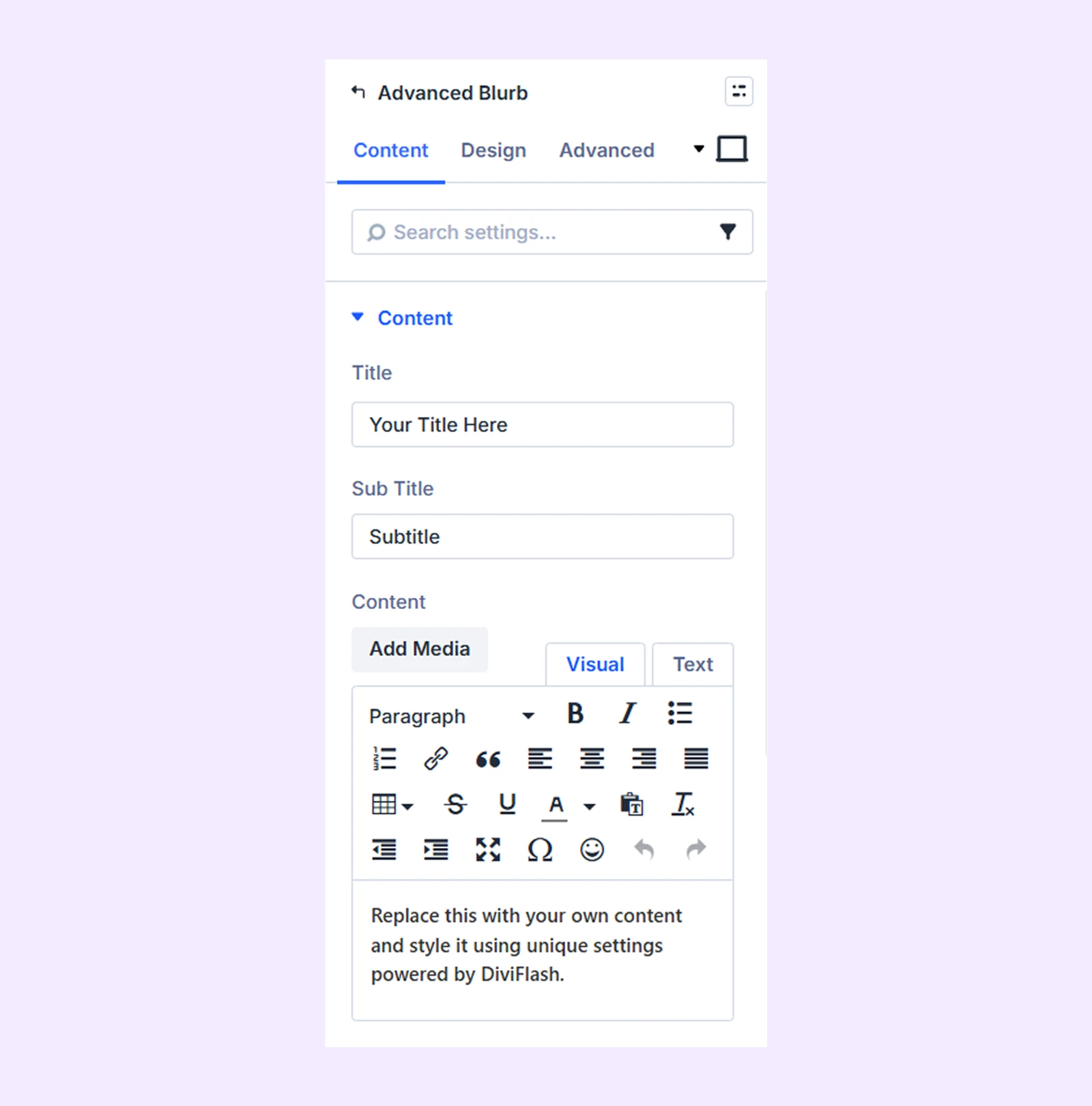
Content Tab
This tab contains the essential settings that control the content of the Advanced Blurb module.
Content
- Title: Enter the main title you want to display.
- Sub Title: Add a subtitle to provide additional context for the title.
- Content: Enter the main text or description you want to display.
Button
- Button Text: Enter the text that will appear on the button.
- Button URL: Add the link the button should direct users to.
- Button New Tab: Choose whether the link opens in the same window or in a new tab.
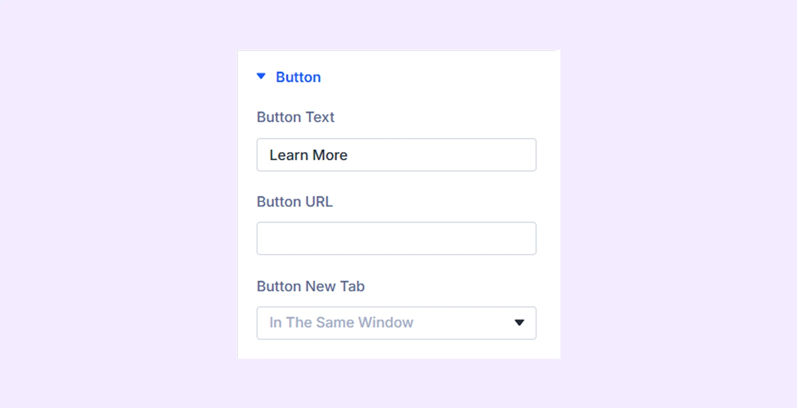
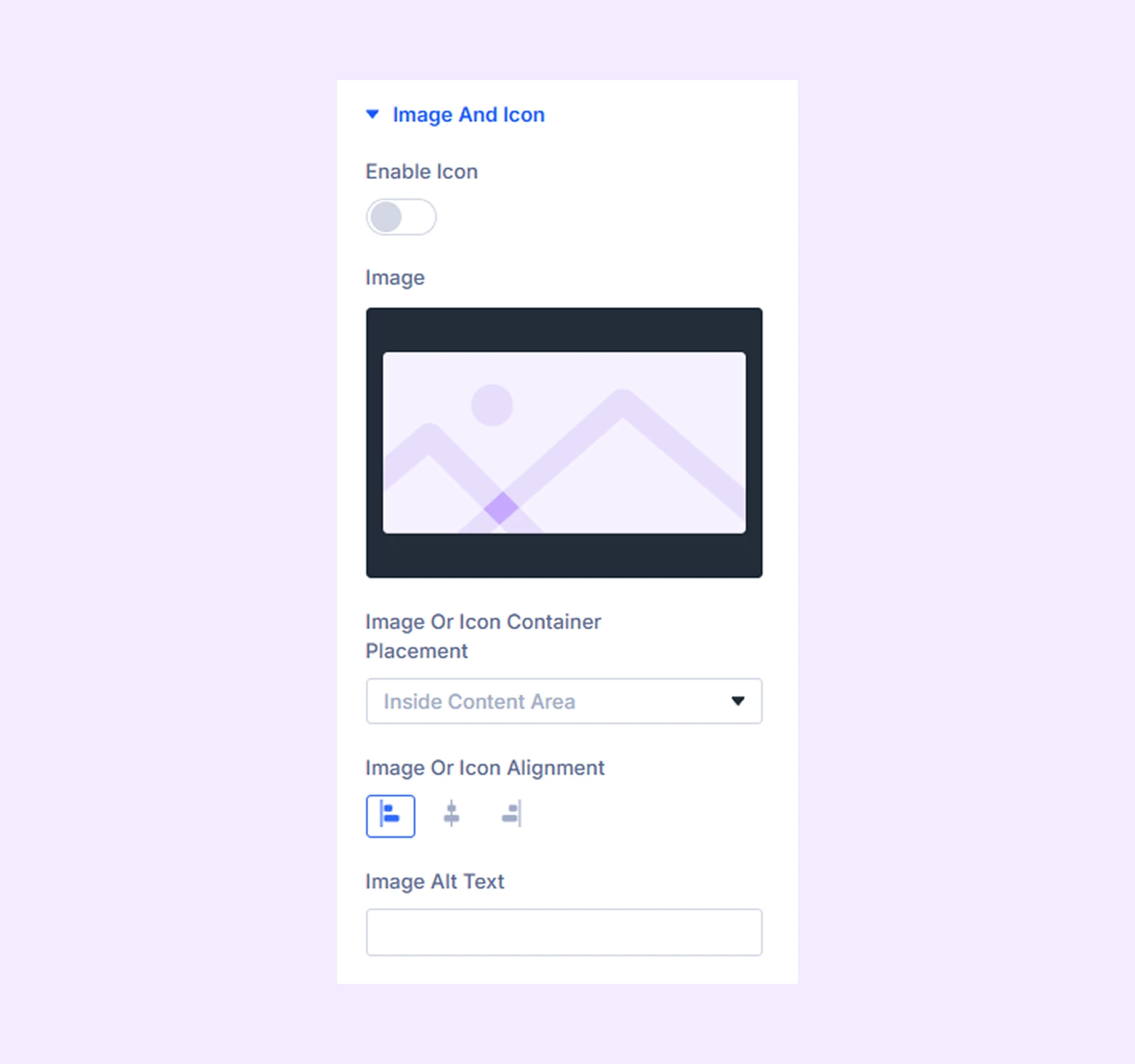
Image and Icon
- Enable Icon: Turn this option on to use an icon instead of an image.
- Icon: Choose an icon from the icon library.
- Image: Upload an image for the blurb. (This option appears only when you disable Enable Icon.)
- Image or Icon Container Placement: Choose whether the image or icon appears inside or outside the content area.
- Image or Icon Position: Choose the position of the image or icon. (This option appears only when you place the element outside the content area.)
- Image or Icon Alignment: Choose the horizontal alignment of the image or icon.
- Image or Icon Item Align: Choose the vertical alignment of the image or icon. (This option appears when you set the position to Left or Right.)
- Image Alt Text: Add alternative text to the image.
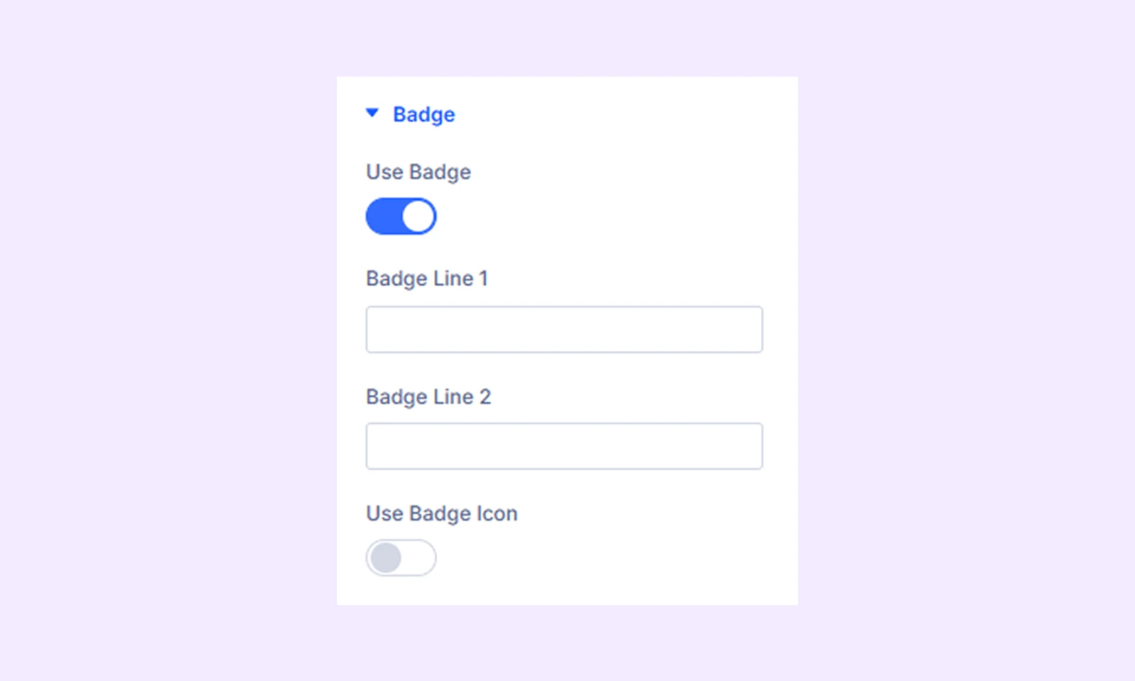
Badge
- Use Badge: Turn this option on to display a badge in the blurb.
- Badge Line: Add the badge text. You can add two lines.
- Use Badge Icon: Turn this option on to display an icon instead of text inside the badge.
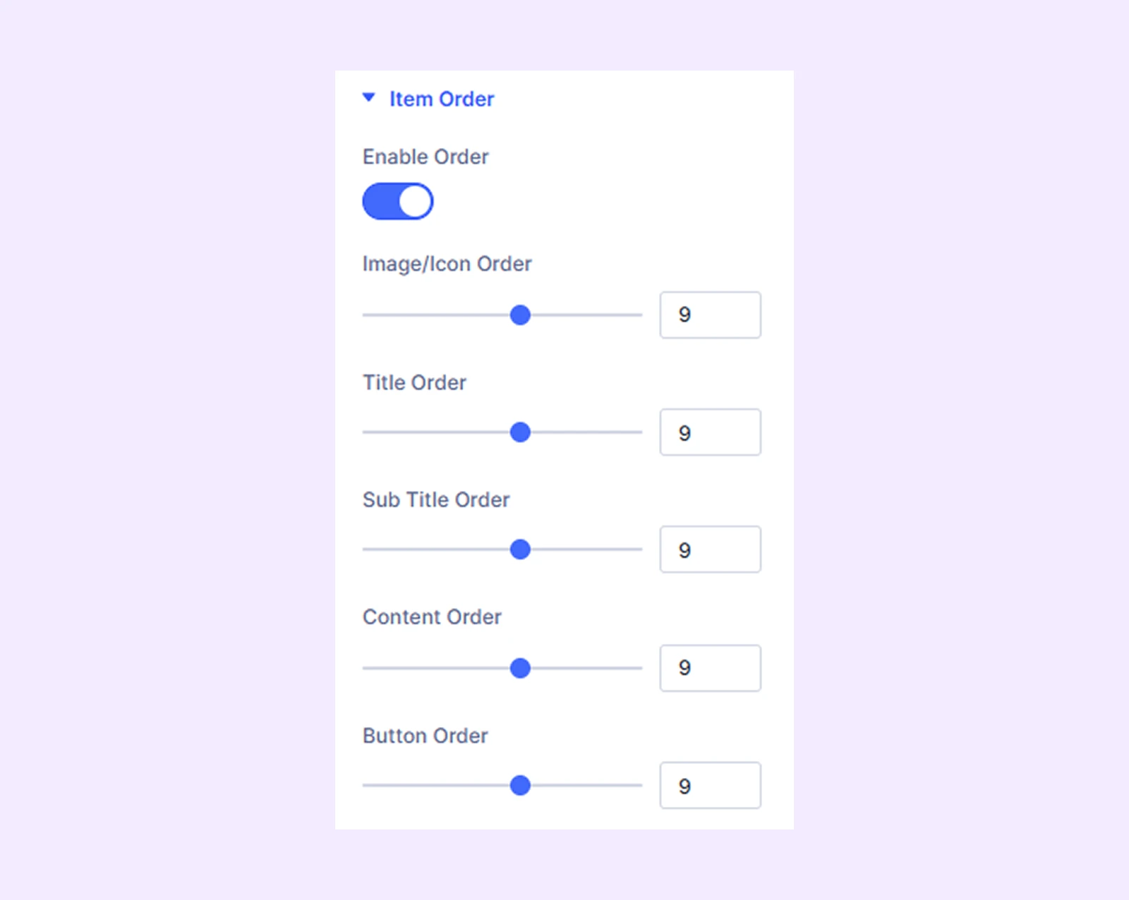
Item Order: Enable this option to control the display order of the blurb elements.
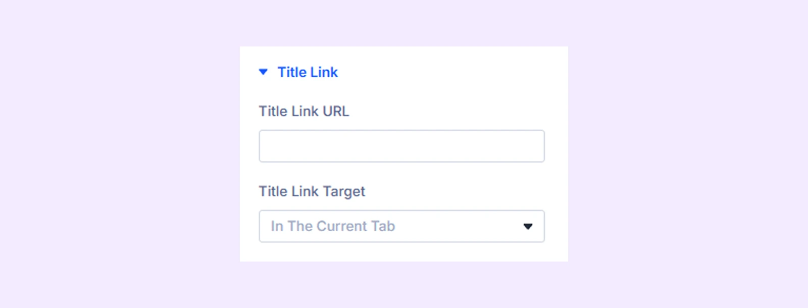
Title Link
Add a link to the blurb title and choose whether the link opens in the same tab or a new tab.
Link: Use this default Divi setting to add a link to the entire module.
Background: Add a background color, gradient, image, video, pattern, or mask to the module.
Element Label: Rename the module to organize it more easily in the Divi Builder. (Only you can see this label.)
Design Tab
Use this tab to customize the visual appearance of the Advanced Blurb module.
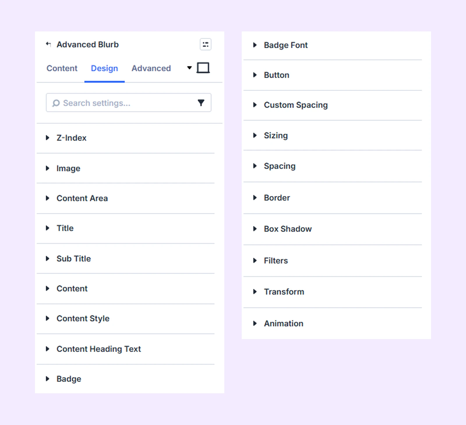
Z-index: Control the stacking order of the blurb elements. Elements with higher values appear in front of those with lower values.
Image: Customize the image using background, border, box shadow, and color filter settings.
Icon: Customize the icon using color, size, background, border, and shadow settings. (Available only when the icon option is enabled.)
Content Area: Customize the alignment, background, and border settings of the content area.
Title: Customize the title using typography, background, and border settings.
Subtitle: Customize the subtitle using typography, background, and border settings.
Content: Customize the typography settings of the content text.
Content Style: Customize the background and border settings of the content area.
Content Heading Text: Customize the typography settings of the heading text inside the content area.
Badge: Customize the alignment, appearance, and placement of the badge.
Badge Font: Customize the typography settings of the badge text.
Button
Customize the appearance and behavior of the button.
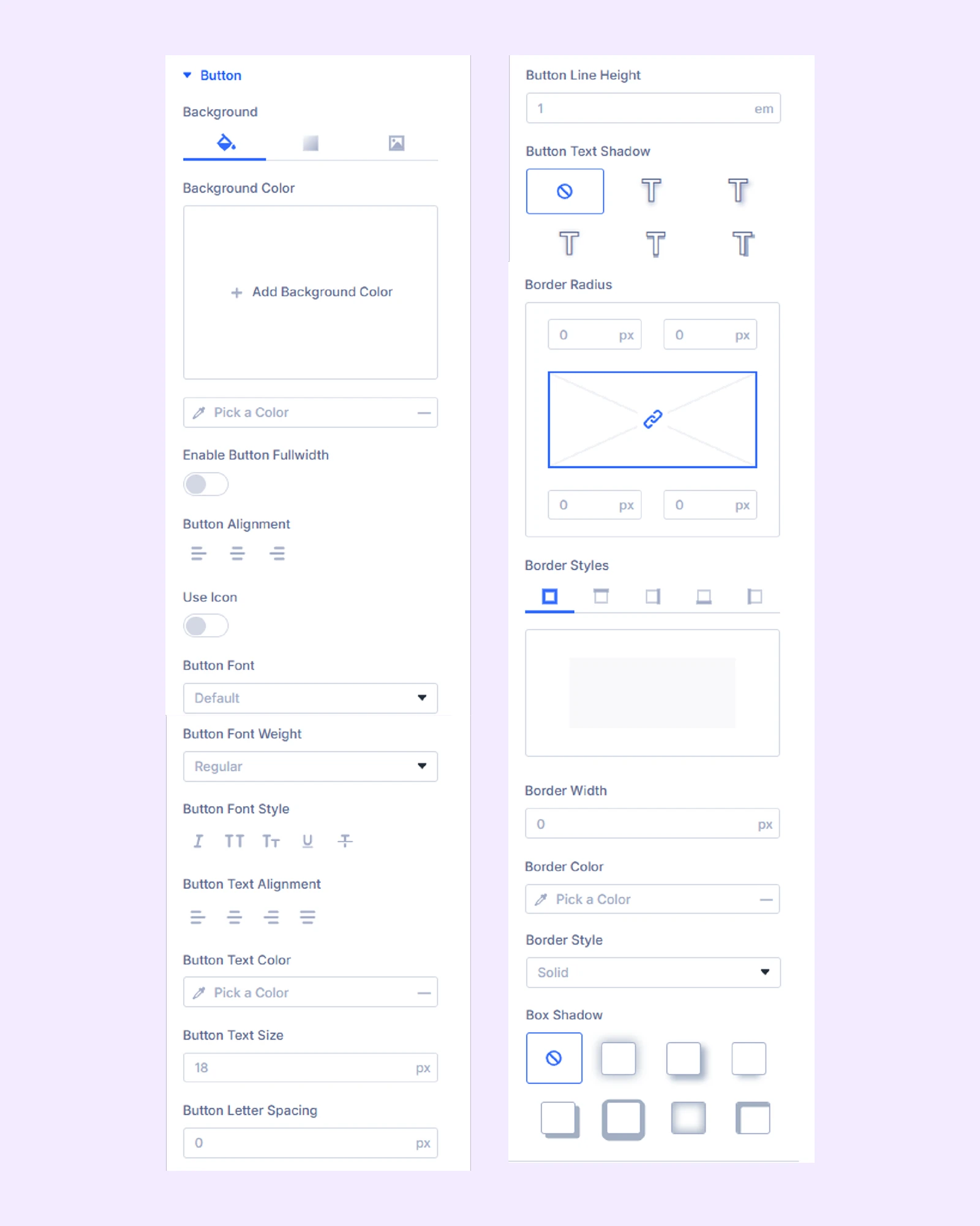
- Button Background: Add a background color, gradient, or image to the button.
- Enable Button Fullwidth: Make the button span the full width of the blurb container.
- Button Alignment: Choose the horizontal alignment of the button inside the blurb container. (This option is not available when Fullwidth is enabled.)
- Use Icon: Enable this option to display an icon inside the button.
You can also customize the button typography, text size, alignment, border, and shadow.
Custom Spacing: Adjust the margins and padding of the container and content elements.
Sizing: Adjust the width, height, and alignment of the module.
Spacing: Add custom margin and padding to the module’s container.
Border: Customize the border style, width, and color. And style each border separately or apply the same style to all sides.
Box Shadow: Add shadow effects to the module.
Filters: Apply color filters to enhance the appearance.
Transform: Scale, rotate, move, or skew the module.
Animation: Apply reveal animation effects and customize delay, duration, repeat settings, and animation type.
Advanced Tab
This tab provides additional settings for advanced users who want greater control over the module with custom code, conditions, and more.
Need Help?
If you have any questions or need assistance, contact our support team: [email protected]