The Divi ACF Gallery module lets you display image galleries created with the Advanced Custom Fields (ACF) plugin directly inside the Divi Builder.
Activation Required: This module is disabled by default. To use it, you need to enable it manually. Refer to our guide for step-by-step instructions.
Note: The ACF Pro plugin must be installed and activated first. Then create an ACF gallery field to use this module.
Let’s see the settings in brief and how to make better use of it —
Content Tab
This tab contains all the settings for selecting your gallery and controlling how images are displayed.
Gallery Settings
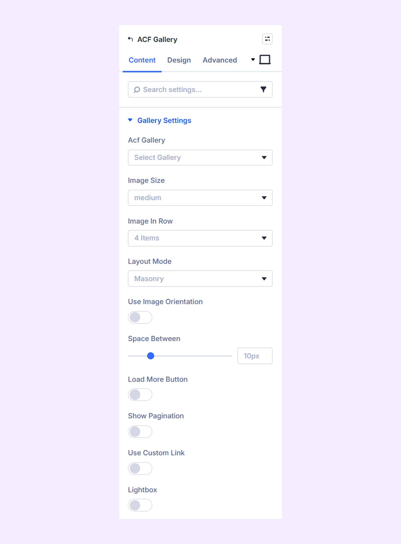
- Acf Gallery: Select the ACF gallery you want to display.
- Image Size: Choose the image size for your gallery.
- Image in Row: Set how many images appear in each row.
- Layout Mode: Select the layout style for displaying the gallery.
- Use Image Orientation: Enable this to adjust images based on their shape.
- Image Orientation: Choose between portrait or landscape.
- Space Between: Control the spacing between images.
- Load More Button: Enable this to add a button that loads additional images.
- Initial Image load: Set how many images appear initially.
- Load More Image Count: Choose how many images load per click.
- Load More Button Text: Enter the button text.
- Show Pagination: Enable pagination (available when Load More is disabled).
- Pagination Image Count: Set how many images appear per page.
- Use Number Pagination: Show numbered pagination instead of simple navigation.
- Use Icon Only In Next And Previous Button: Display only icons instead of text.
- Older Entries Button Text: Customize pagination’s older entries button text.
- Next Entries Button Text: Customize pagination’s next entries button text.
- Use Custom Link: Enable this option to make gallery images clickable using their assigned custom URLs instead of the default behavior.
- Link Target: Choose whether links open in the same tab or a new tab.
- Lightbox: Open images in a popup when clicked (works when custom link is disabled).
- Lightbox Download Button: Show a download option inside the lightbox.
- Lightbox Content: Display captions and descriptions in the lightbox.
Hover Settings
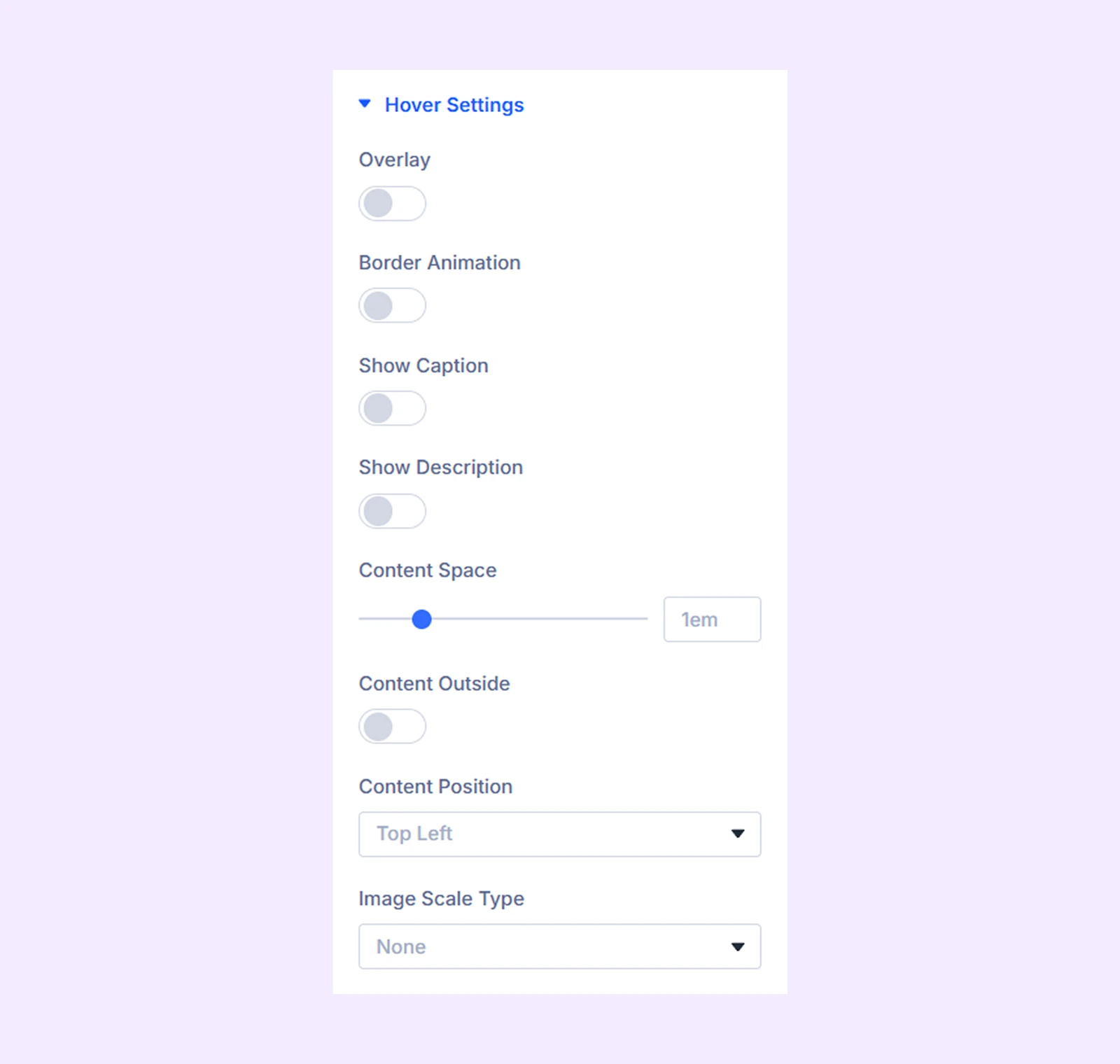
- Overlay: Add a gradient overlay on hover.
- Overlay Primary Color: Choose the starting color of the overlay gradient.
- Overlay Secondary Color: Choose the ending color of the overlay gradient.
- Overlay Gradient Direction: Adjust the gradient direction.
- Border Animation: Enable a border animation on hover.
- Border Color: Choose the border color.
- Border Width: Adjust the border thickness.
- Border Space: Adjust the distance between the border and the image.
- Border Animation Style: Choose from multiple border animation styles.
- Show Caption: Display the image caption.
- Always Show Caption: Keep captions visible without hover.
- Caption Reveal: Choose the animation style used to reveal the caption.
- Show Description: Same settings like caption settings, but for description only.
- Content Space: Adjust spacing for the caption and description.
- Content Outside: Display caption and description outside the image.
- Content Position: Choose where the content appears inside the image.
- Image Scale Type: Choose the hover scaling animation style.
- Scale: Adjust the scaling value. (Available only for Rotate Left and Rotate Right effects.)
Link: Use this default Divi setting to add a link to the entire module.
Background: Add a background color, gradient, image, video, pattern, or mask to the module.
Element Label: Rename the module to organize it more easily in the Divi Builder. (Only you can see this label.)
Design Tab
Use this tab to customize the appearance of the ACF Gallery module.
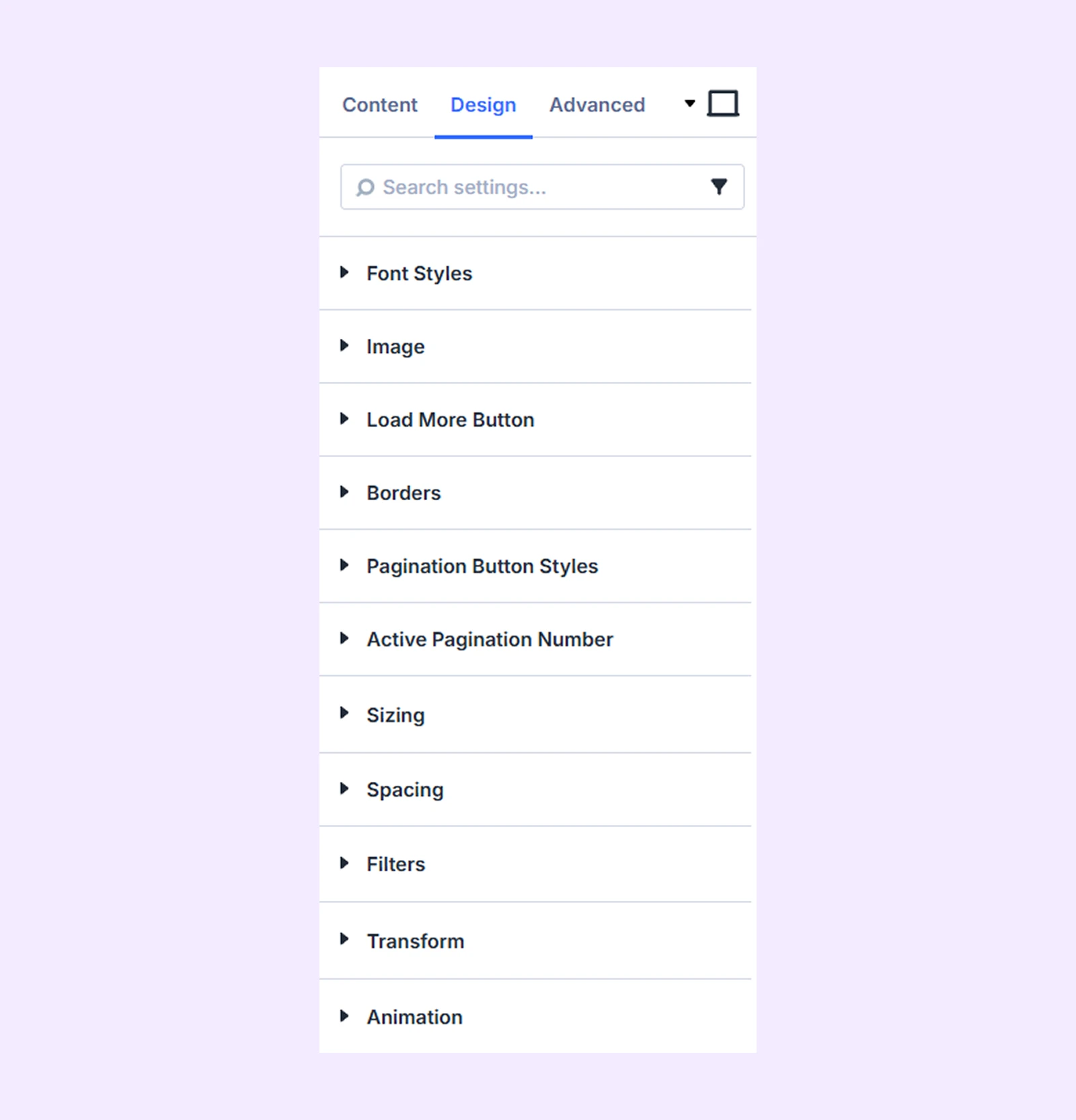
Font Styles: Customize caption and description typography.
Image: Apply filters, shadows, and visual effects to images.
Load More Button
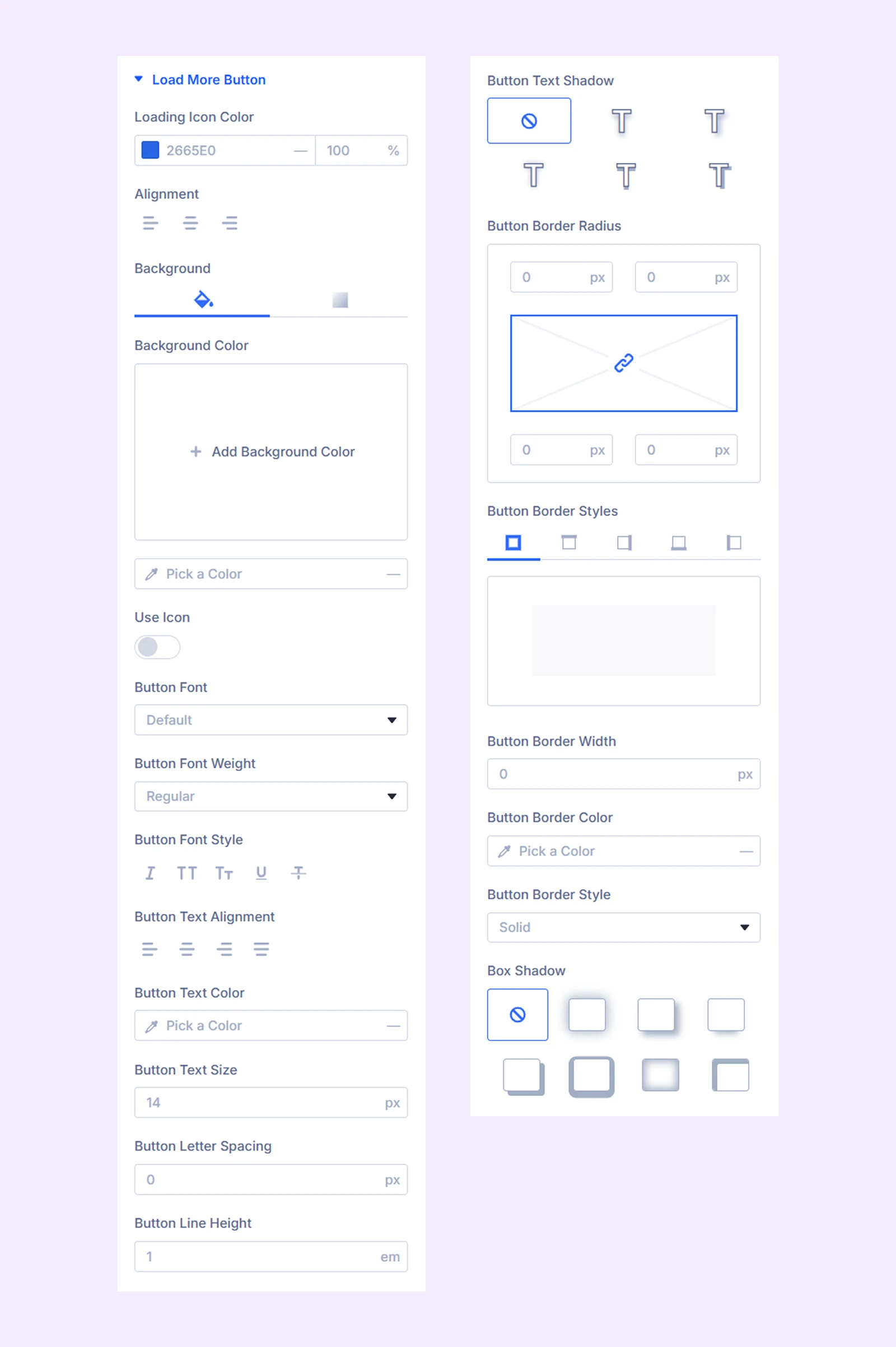
- Loading Icon color: Choose the color of the loading icon.
- Alignment: Adjust the horizontal alignment of the button.
- Background: Choose the button background.
- Use Icon: Enable an icon inside the button.
Additional settings allow you to customize button typography and border styles.
Border: Customize image borders using border radius, border style, border width, and color options.
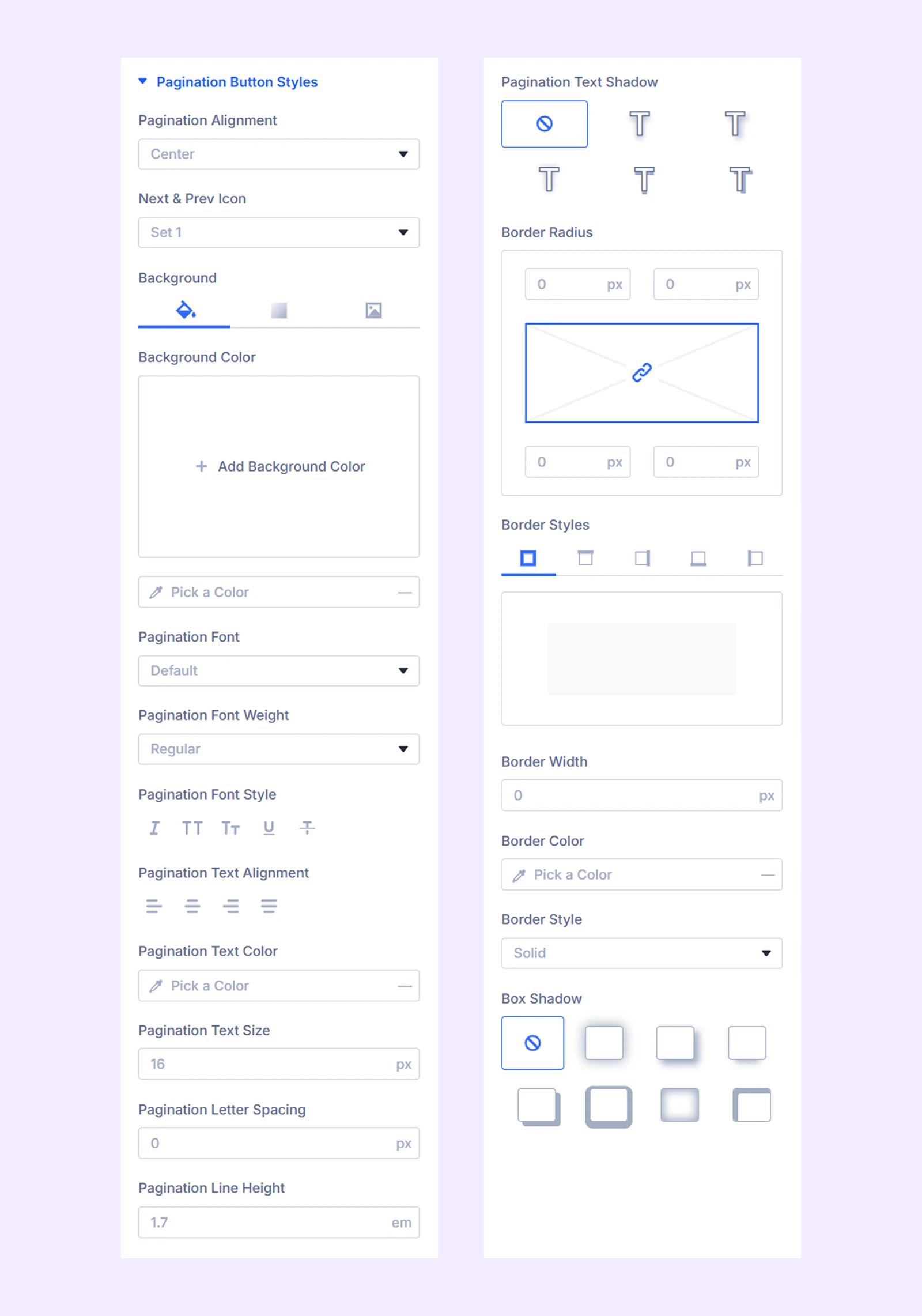
Pagination Button Styles
- Pagination Alignment: Adjust the alignment of the pagination buttons.
- Next & Prev Icon: Choose icons for the next and previous buttons.
Additional options allow you to customize pagination background, typography, and borders.
Active Pagination Number: Customize the background, typography, and border of the active pagination number.
Sizing: Adjust the width, height, and alignment of the module.
Spacing: Adjust the margins and padding of the module container.
Filters: Apply color filter effects to the module.
Transform: Adjust the scale, position, rotation, and size of the module.
Animation: Add reveal animation effects and control the animation style, delay, duration, and more.
Advanced Tab
This tab provides additional settings for advanced users who want greater control over the module with custom code, conditions, and more.
Need Help?
If you have any questions or need assistance, contact our support team: [email protected]