
The Advanced Bar Counter module, introduced in DiviFlash 5.3.0, displays progress indicators in multiple styles, including horizontal bars, circles, half circles, segmented bars, and multi-step counters.
Important Note: Advanced Bar Counter module is built for Divi 5 only. Also, it will be disabled by default and to use it, you must enable it manually. Refer to our guide for step-by-step instructions.
Let’s see the settings in brief and how to make better use of it —
Content Tab
The Content tab contains the essential settings for adding bar counter items and controlling the appearance and behavior of the counter.
Add New Bar Item
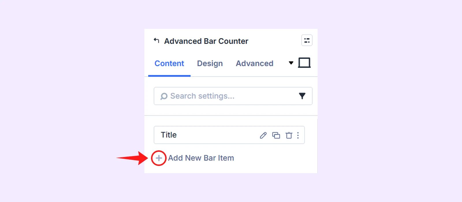
By default, the module includes one bar item that you can edit or delete. Click Add New Bar Item to add another item. To learn more about the available settings for each item, refer to the Advanced Bar Counter Child Item Settings section below.
Bar Counter Settings
Layout: Choose the overall counter layout. The available layouts are:
- Line
- Circle
- Half Circle
- Segment
- Multi Step
Depending on the selected layout, additional settings become available.
If you choose Line:
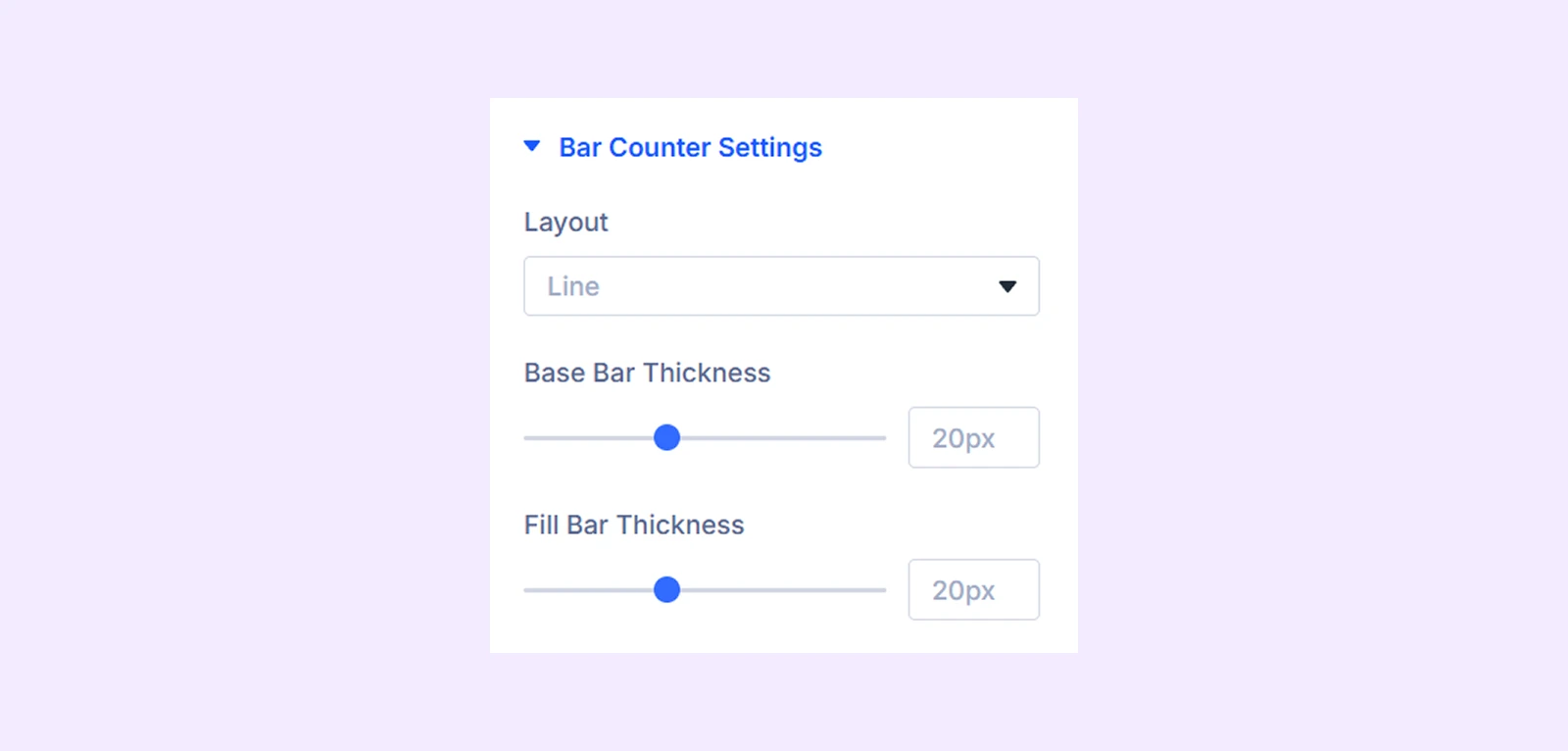
- Base Bar Thickness: Adjust the thickness of the background bar.
- Fill Bar Thickness: Adjust the thickness of the progress bar.
If you choose Circle:
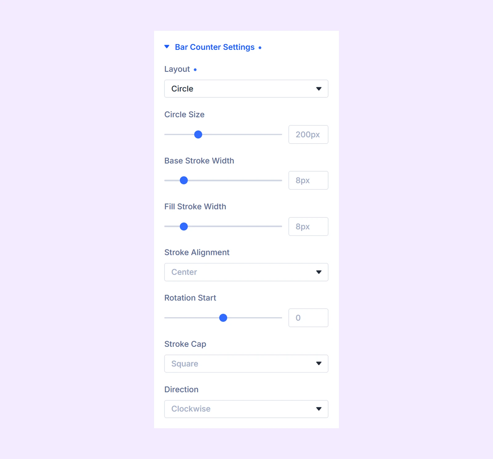
- Circle Size: Set the overall size of the circle.
- Base Stroke Width: Adjust the thickness of the background stroke.
- Fill Stroke Width: Adjust the thickness of the progress stroke.
- Stroke Alignment: Choose the stroke position (Center, Outer, or Inner).
- Rotation Start: Define where the progress stroke begins.
- Stroke Cap: Choose Square or Round stroke endings.
- Direction: Set the progress direction to Clockwise or Anti-Clockwise.
If you choose Half Circle:
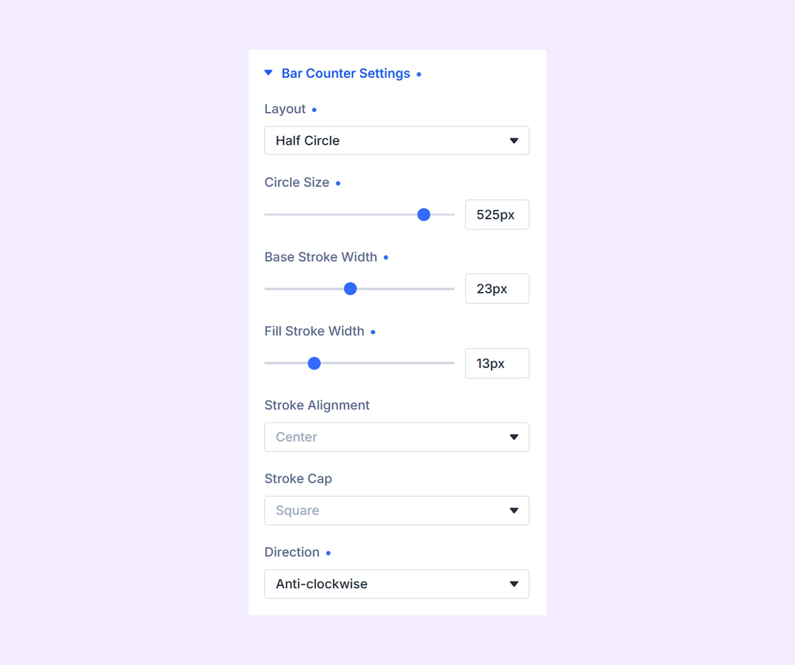
- Circle Size: Set the overall size of the half circle.
- Base Stroke Width: Adjust the thickness of the background stroke.
- Fill Stroke Width: Adjust the thickness of the progress stroke.
- Stroke Alignment: Choose the stroke position (Center, Outer, or Inner).
- Stroke Cap: Choose Square or Round stroke endings.
- Direction: Set the progress direction to Clockwise or Anti-Clockwise.
If you choose Segment:
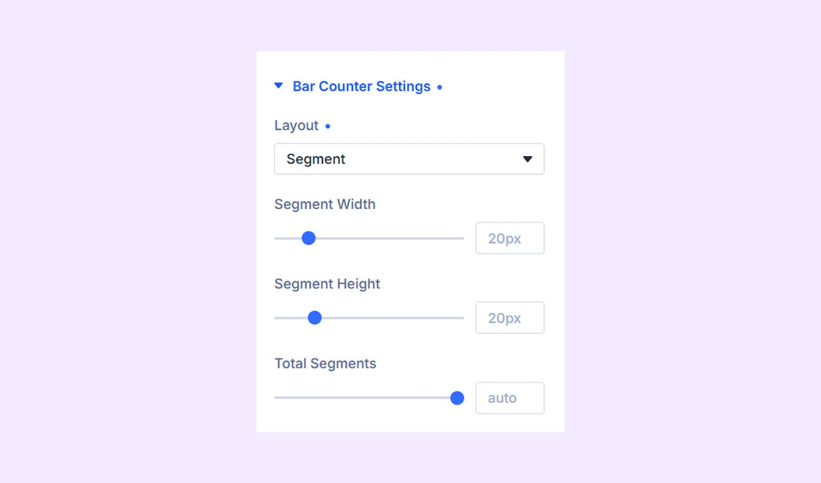
- Segment Width: Define the width of each segment.
- Segment Height: Define the height of each segment.
- Total Segments: Set the number of segments displayed.
If you choose Multi Step:
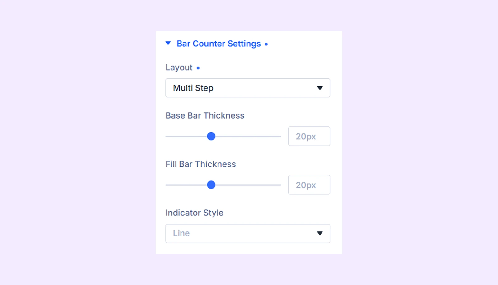
- Base Bar Thickness: Adjust the thickness of the background bar.
- Fill Bar Thickness: Adjust the thickness of the progress bar.
- Indicator Style: Choose between Line, Triangle, or Diamond indicators.
Content Settings
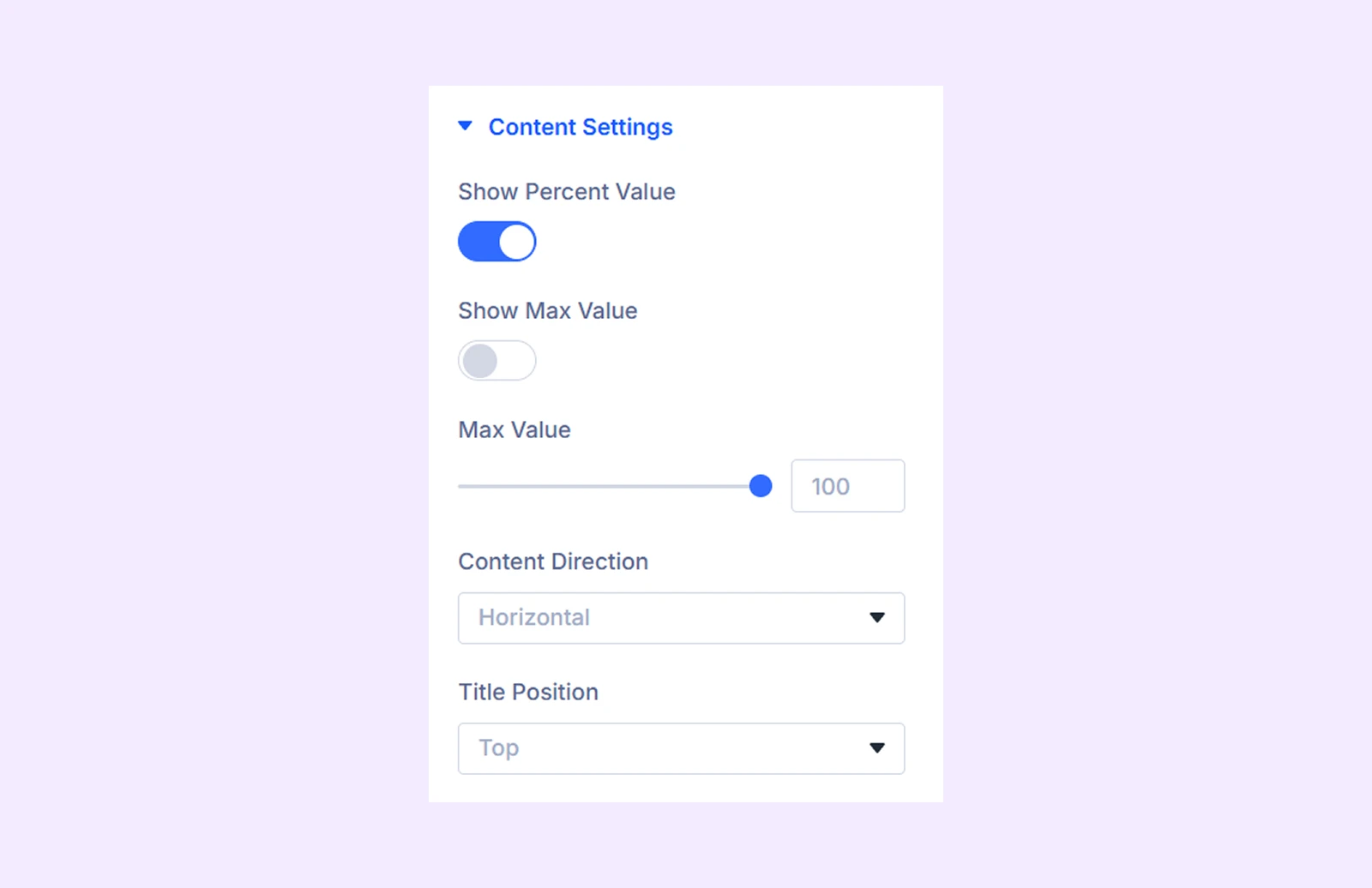
- Show Percent Value: Show or hide the percentage.
- Show Max Value: Display the value as a fraction. (Available only when Show Percent Value is enabled.)
- Max Value: Define the maximum value used for the counter calculation and fraction display.
- Line Content Position: Choose whether Line layout content appears above, below, or inside the bar.
- Content Alignment: Align content to the Left, Center, Right, or Justified position. (Available only for Line and Segment layouts.)
- Percent In Bar Right: Display the percentage value on the right side of the bar. (Available only for Line and Segment layouts when Show Percent Value is enabled.)
- Track Percent With Fill: Attach the percentage value to the moving progress indicator so it follows the fill progress. (Available only for Line layout.)
- Bar Percent Style: Choose the percentage display style for Line layout.
- Percent Position: Choose where the percentage value appears when using Default, Marker, or Marker (Outline) styles.
- Swap Title and Percent: Swap the position of the title and percentage inside Circle and Half Circle layouts. (Available with circle and half circle layout.)
- Content Direction: Choose whether Multi Step labels are displayed horizontally or vertically. (Available only for Multi Step layout.)
- Title Position: Display Multi Step labels above or below the progress bar. (Available only for Multi Step layout.)
- Segment Content Position: Choose from top and bottom. (Available with Segment layout type.)
Bar Animation
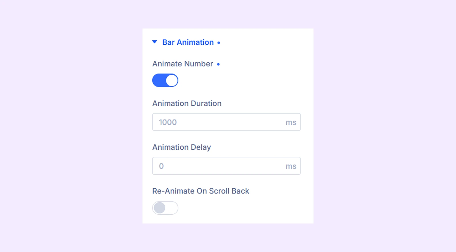
- Animate Number: Animate the percentage value when the counter enters the viewport.
- Animation Duration: Control how long the fill animation takes to complete.
- Animation Delay: Add a delay before the animation begins.
- Re-Animate On Scroll Back: Replay the animation when visitors scroll away and return to the module.
Link: Add a URL and configure how it opens.
Background: Add a background color, gradient, image, video, pattern, or mask to the module.
Order: Control the display order of the module within its parent container.
Element Label: Rename the module inside the Divi Builder for easier identification.
Design Tab
The Design tab contains settings for customizing the appearance of the counter, bars, typography, and other visual elements.
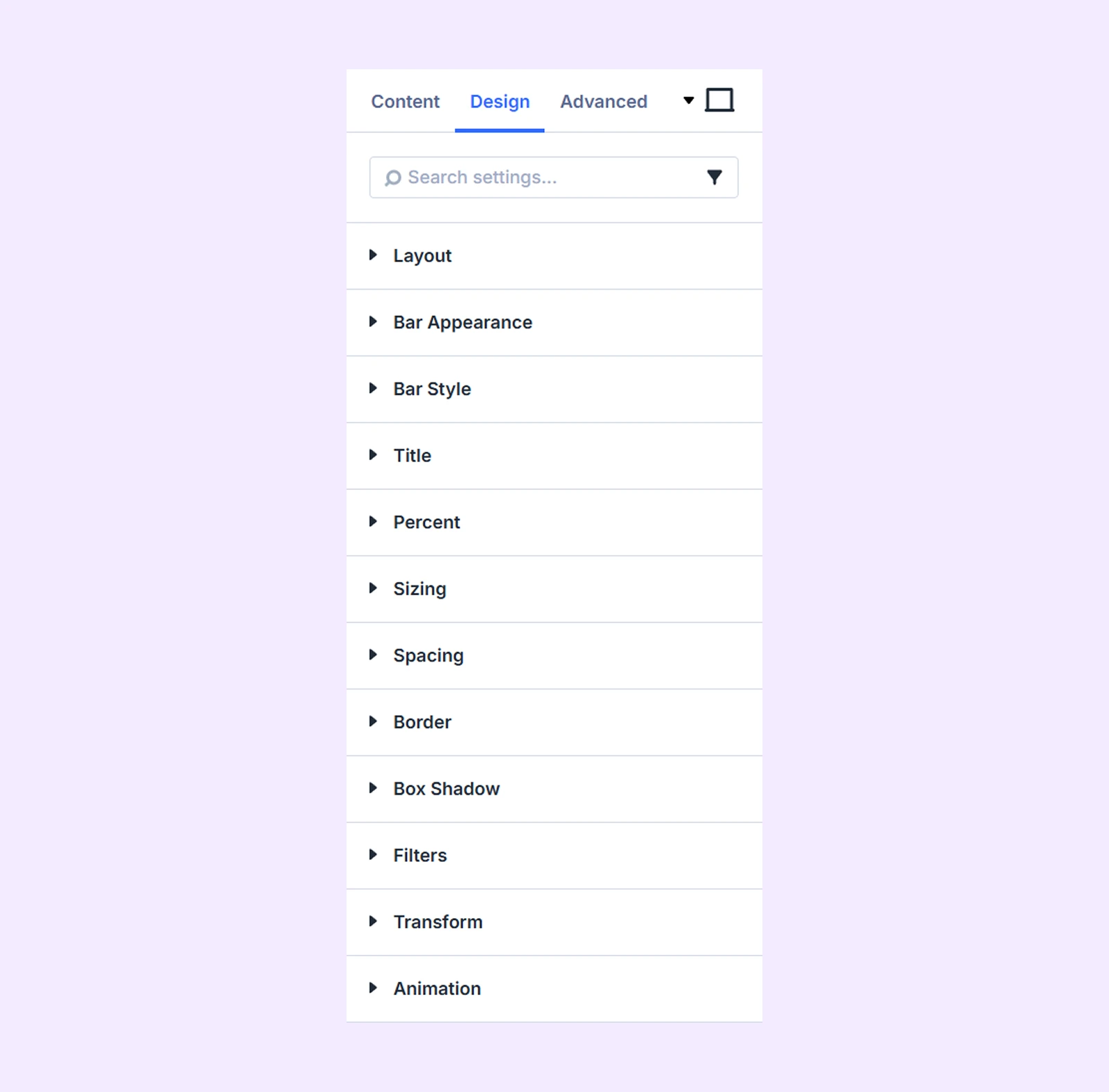
Layout: Control the arrangement and spacing of the bar counter items.
Bar Appearance
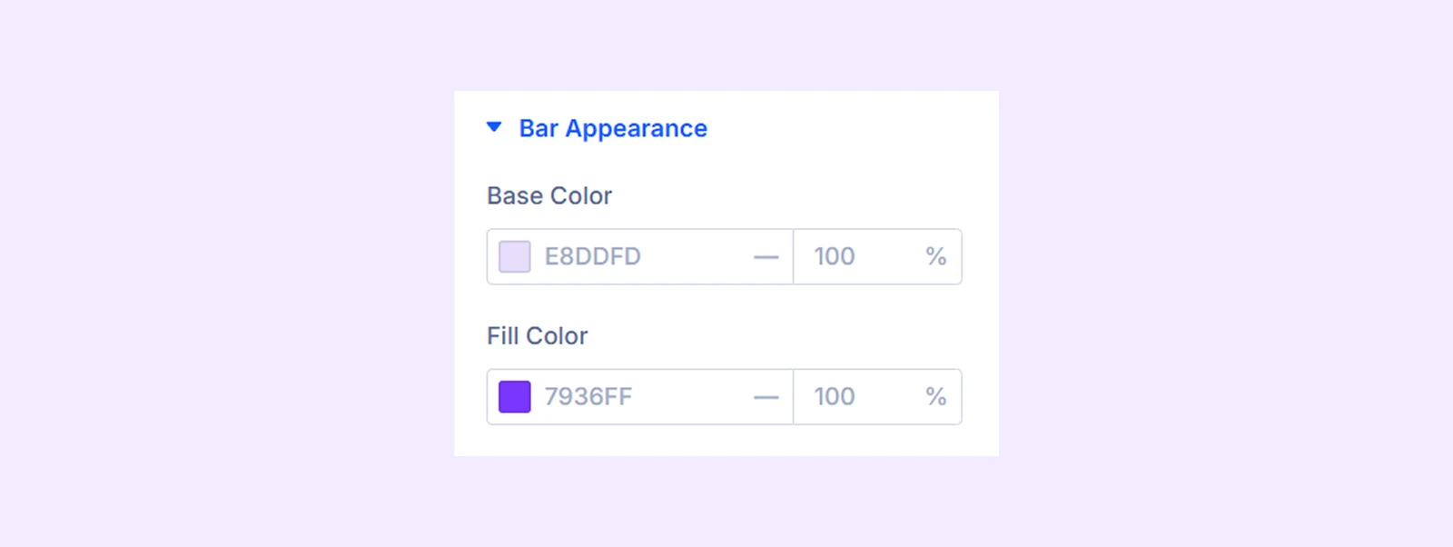
- Base Color: Choose the default color of the background bar or stroke.
- Fill Color: Choose the default color of the progress bar or stroke.
Bar Style
Available only for Line and Multi Step layouts.
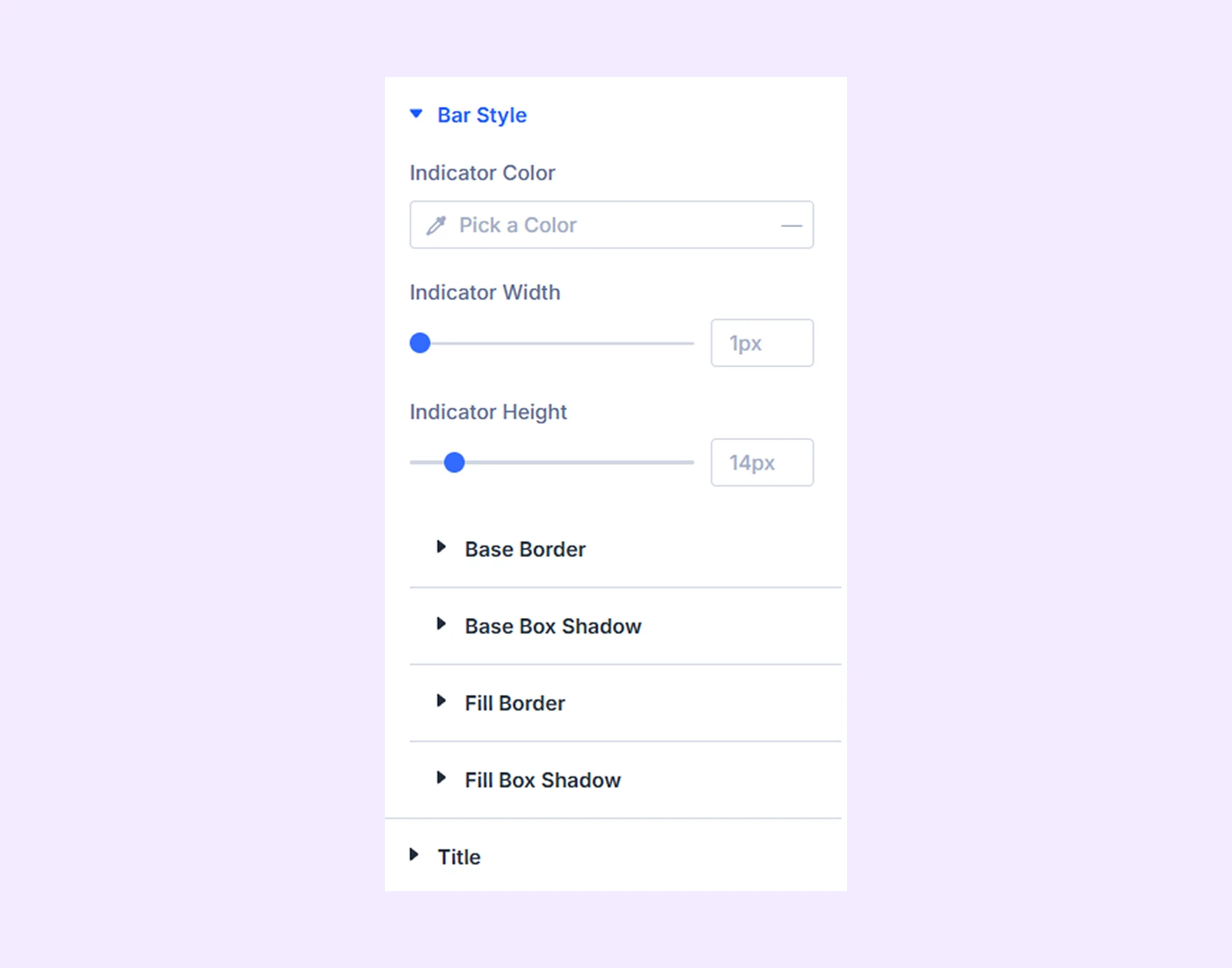
- Indicator Color: Choose the default indicator color.
- Indicator Width: Adjust the width of line indicators.
- Indicator Height: Adjust the height of line indicators.
- Indicator Size: Adjust the size of triangle and diamond indicators.
You will see these when you choose the “Multi-step” layout. If you choose “Line,” you will get settings like Base Border, Base Box Shadow, Fill Border, and Fill Box Shadow.
Circle Style
Available only for Circle and Half Circle layouts.

- Inner Background Gap: Adjust the spacing between the circle stroke and inner background.
- Inner Background: Customize the inner area using background colors, gradients, images, videos, patterns, or masks.
Segment Bar Style: Customize the border and corner radius of segmented bars. (Available only for Segment layout.)
Title: Customize the typography and appearance of the title.
Percent: Customize percent font, prefix font, suffix font. Based on your selected layout and percentage style, you will see additional settings.
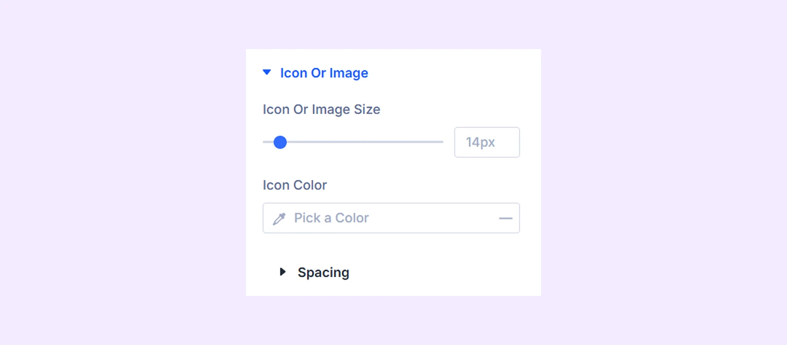
Icon Or Image
Available when the selected layout is not Multi Step.
- Icon or Image Size: Adjust the size of icons or images.
- Icon Color: Choose the icon color. (Available only when Icon Type is set to Icon.)
- Spacing: Adjust the spacing around the icon or image.
Start & End Label: Customize the typography and spacing of the start and end labels. (Available only for the Half Circle layout.)
Sizing: Adjust the width, height, alignment, and overflow behavior of the module.
Spacing: Add custom margin and padding around the module.
Border: Customize the border style, width, color, and corner radius.
Box Shadow: Add and customize shadow effects around the module.
Filters: Apply visual effects such as brightness, contrast, saturation, opacity, and blur.
Transform: Scale, move, rotate, or skew the module.
Animation: Apply Divi animation effects and control their timing and behavior.
Advanced Tab
The Advanced tab provides the standard Divi settings for custom CSS, visibility conditions, transitions, attributes, positioning, and other advanced controls.
Advanced Bar Counter Child Item Settings
Each bar item includes its own Content, Design, and Advanced tabs for individual customization. (Child items inherit many settings from the parent module but can override colors, styles, and other visual settings as needed.)
Content Tab
This tab contains the main settings for configuring an individual bar counter item.
Content
The available settings in this section depend on the Layout selected in the parent Advanced Bar Counter module.
If the parent Layout is set to Line, Circle, or Segment:
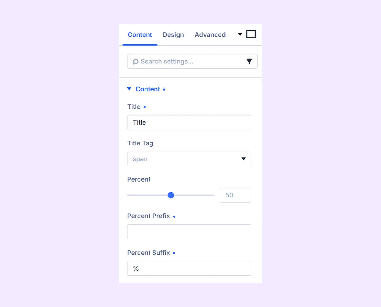
- Title: Enter the title displayed for the counter item.
- Title Tag: Choose the HTML tag used for the title.
- Percent: Enter the percentage or progress value.
- Percent Prefix: Add text before the percentage value.
- Percent Suffix: Add text after the percentage value.
If the parent Layout is set to Half Circle:
Here you will find all the settings available in Line, Circle, or Segment with these two additional settings:
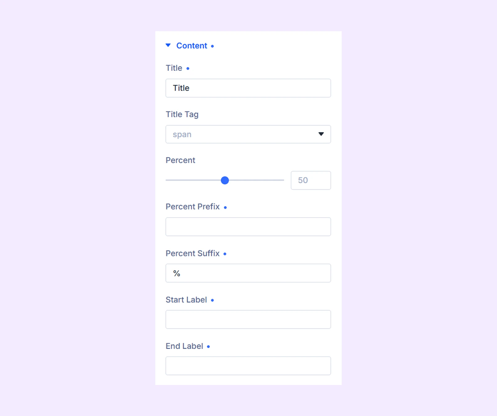
- Start Label: Add a label to the beginning of the half-circle counter.
- End Label: Add a label to the end of the half-circle counter.
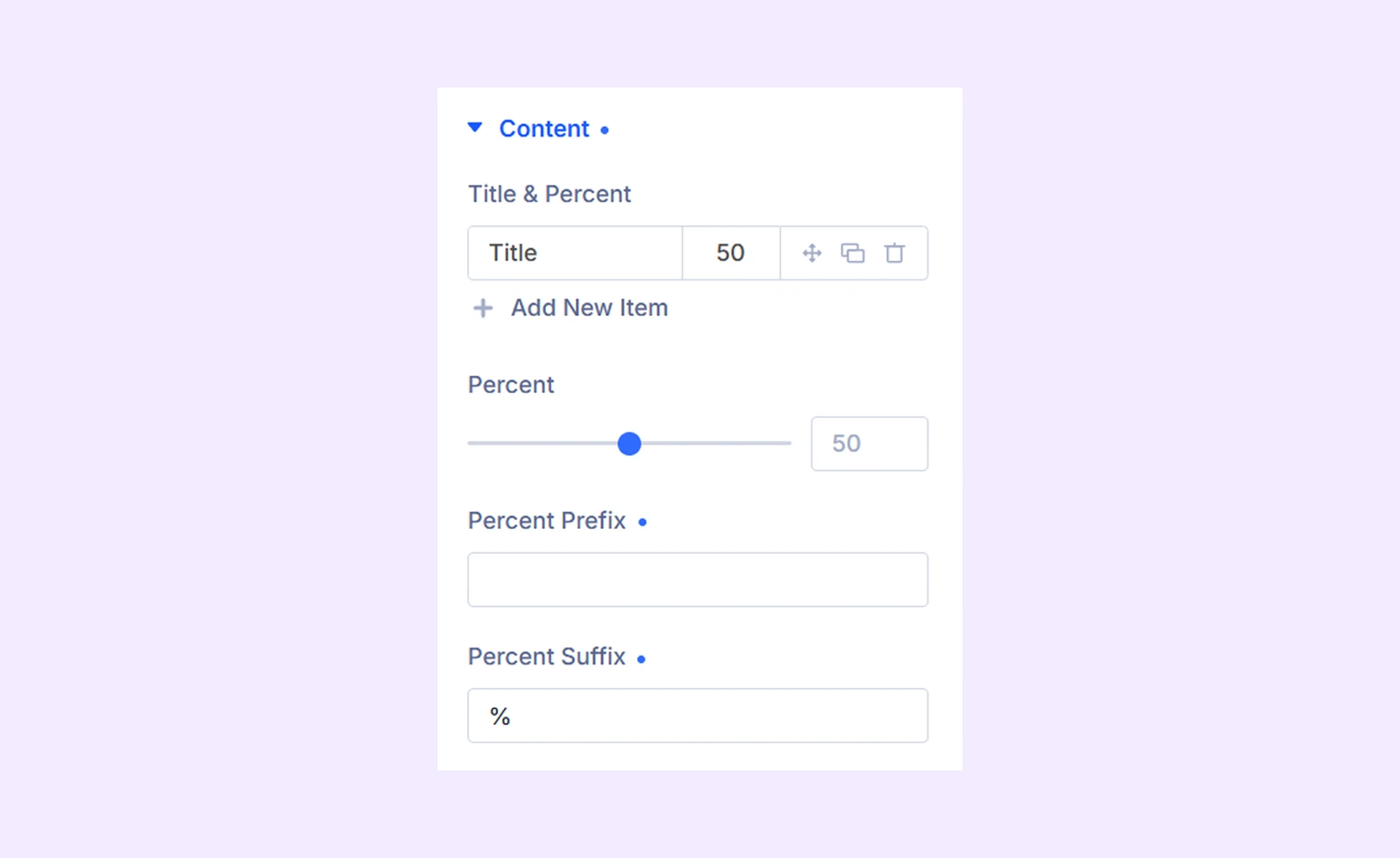
If the parent Layout is set to Multi Step:
Here you will find Percent, Prefix, and Suffix that are available with other layout types. Also you will find one unique feature:
- Title & Percent: Add and manage multiple labeled markers. Each marker can have its own title and position along the progress bar.
Icon Or Image
Available when the parent layout is not Multi Step.
- Icon Type: Choose None, Icon, or Image.
- If you choose Icon: Select an icon to display.
- If you choose Image: Upload an image to display.
Link: Add a URL and configure how the link opens.
Element: Add and manage additional content elements inside the bar counter item.
Background: Add a background color, gradient, image, video, pattern, or mask to the item.
Element Label: Rename the item for easier identification inside the Divi Builder.
Design Tab
Use these settings to customize the appearance of an individual bar counter item.
Bar Appearance: Customize the bar colors and style. (Line and Multi Step layouts support Default, Gradient, Stripe, Animated Stripe, and Animated Gradient styles, while Circle and Half Circle layouts support Default, Gradient, and Animated Gradient styles.)
Bar Style: Customize indicator styling, borders, shadows, and indicator colors. (Available only for Line and Multi Step layouts.)
Segment Bar Style: Customize border-related settings for segmented bars. (Available only for Segment layout.)
Circle Style: Customize the inner background and related styling options. (Available only for Circle and Half Circle layouts.)
Title: Customize the typography and appearance of the title.
Percent: Customize percentage typography, prefix styling, suffix styling, and indicator. Depending on the selected parent settings like Bar Percent Style, Background Color will also be available.
Icon Or Image: Customize the appearance of icons and images. This section is available only when the parent Layout is not set to Multi Step, and Icon Color appears only when Icon Type is set to Icon.
Start & End Label: Customize the appearance of the start and end labels. (Available only when the parent Layout is Half Circle.)
You will also find settings such as Sizing, Spacing, Border, Box Shadow, Filters, Transform, and Animation, which work the same way as in the parent module.
Advanced Tab
Use the Advanced tab to add custom CSS, display conditions, transitions, attributes, visibility settings, and other advanced controls to the item.
Need Help?
If you have any questions or need assistance, contact our support team: [email protected]