
The Content Unfold extension (introduced in v5.6.0) lets you collapse Sections, Rows, Columns, Groups, and modules to a set height, then reveal the hidden content with a button. You can also add a fade effect and automatically expand the content when scrolled into view or on hover.
Important Note:
- Works only with Divi 5 and adds Content Unfold settings directly to existing Divi and DiviFlash elements.
- Content Unfold doesn’t work with every Divi element. You can find the list of unsupported elements at the end of this section.
Let’s see how to set it up and use the available effects.
Enable the Content Unfold Extension
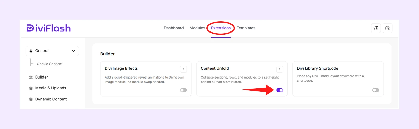
- From your WordPress Dashboard, navigate to DiviFlash > Extensions > Builder.
- Find Content Unfold and toggle it ON.
Apply Content Unfold to an Element
- Open a page with the Divi Visual Builder.
- Open the settings of a Section, Row, Column, Group, or module.
- Go to Content tab > Content Unfold.
- Enable Enable Content Unfold.
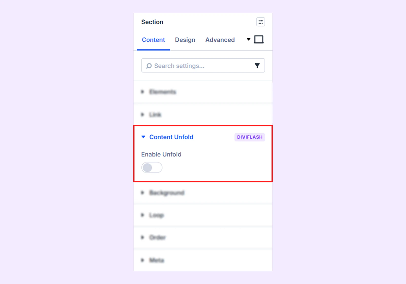
Once enabled, a Content Unfold setting will also become available under the element’s Content and Design tab.
Content Tab
Use the Content Unfold settings in the Content tab to control the fade, button behavior, automatic expansion, labels, icons, and animation.
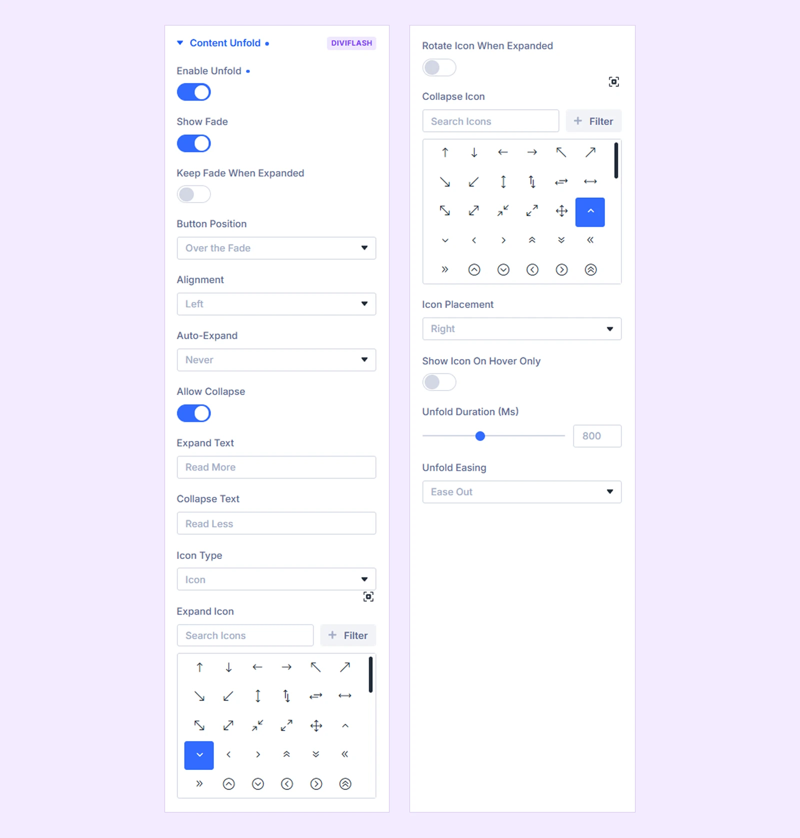
- Enable Content Unfold: Enable or disable the Content Unfold effect for the element.
- Show Fade: Add a gradient fade over the bottom of the collapsed content.
- Keep Fade When Expanded: Keep the fade visible after the content is expanded.
- Button Position: Choose where the Content Unfold button appears. You can choose from:
- Over the Fade: Place the button over the bottom edge of the collapsed content.
- Below Content: Place the button below the content.
- Above Content: Place the button above the content.
- Alignment: Control the horizontal alignment of the button. You can choose from:
- Left
- Center
- Right
- Full Width
- Auto-Expand: Choose whether the content should open automatically without the visitor clicking the button. You can choose from:
- Never: The content opens only when the visitor uses the button.
- When Scrolled Into View: Opens the content when it reaches the selected point in the viewport.
- On Hover: Opens the content when the visitor hovers over the element.
- Auto-Expand Threshold: Set the point in the viewport that the element must reach before automatically expanding. (Available only when Auto-Expand is set to When Scrolled Into View.)
- Allow Collapse: Allow visitors to collapse the content again after expanding it. When disabled, the content opens once and the button is removed.
- Expand Text: Enter the button text shown while the content is collapsed.
- Collapse Text: Enter the button text shown while the content is expanded. (Available only when Allow Collapse is enabled.)
- Icon Type: Choose what appears beside the button text. You can choose from:
- Icon
- Image
- None
- Expand Icon: Choose the icon displayed while the content is collapsed. (Available only when Icon Type is set to Icon.)
- Rotate Icon When Expanded: Rotate the expand icon when the content opens instead of using a separate collapse icon or image. (Available only when Allow Collapse is enabled)
- Rotation Angle: Set how far the icon rotates when the content is expanded.
- Expand Image: Upload the image displayed while the content is collapsed. (Available only when Icon Type is set to Image.)
- Collapse Icon: Choose the icon displayed while the content is expanded. (Available only when Allow Collapse is enabled, Icon Type is set to Icon, and Rotate Icon When Expanded is disabled.)
- Collapse Image: Upload the image displayed while the content is expanded. (Available only when Allow Collapse is enabled, Icon Type is set to Image, and Rotate Icon When Expanded is disabled.)
- Icon Placement: Choose whether the icon or image appears to the Left or Right of the button text. (Available only when Icon Type is not set to None.)
- Show Icon on Hover Only: Hide the icon or image until visitors hover over or focus on the button. (Available only when Icon Type is not set to None.)
- Content Unfold Duration (ms): Set how long the expand and collapse animation takes.
- Content Unfold Easing: Choose how the expand and collapse animation speeds up and slows down. You can choose from:
- Ease
- Ease In
- Ease Out
- Ease In Out
- Linear
These Content settings and their conditions follow the current Content Unfold UI.
Design Tab
Use the Content Unfold settings in the Design tab to control the collapsed height, fade appearance, icon or image styling, and button design.
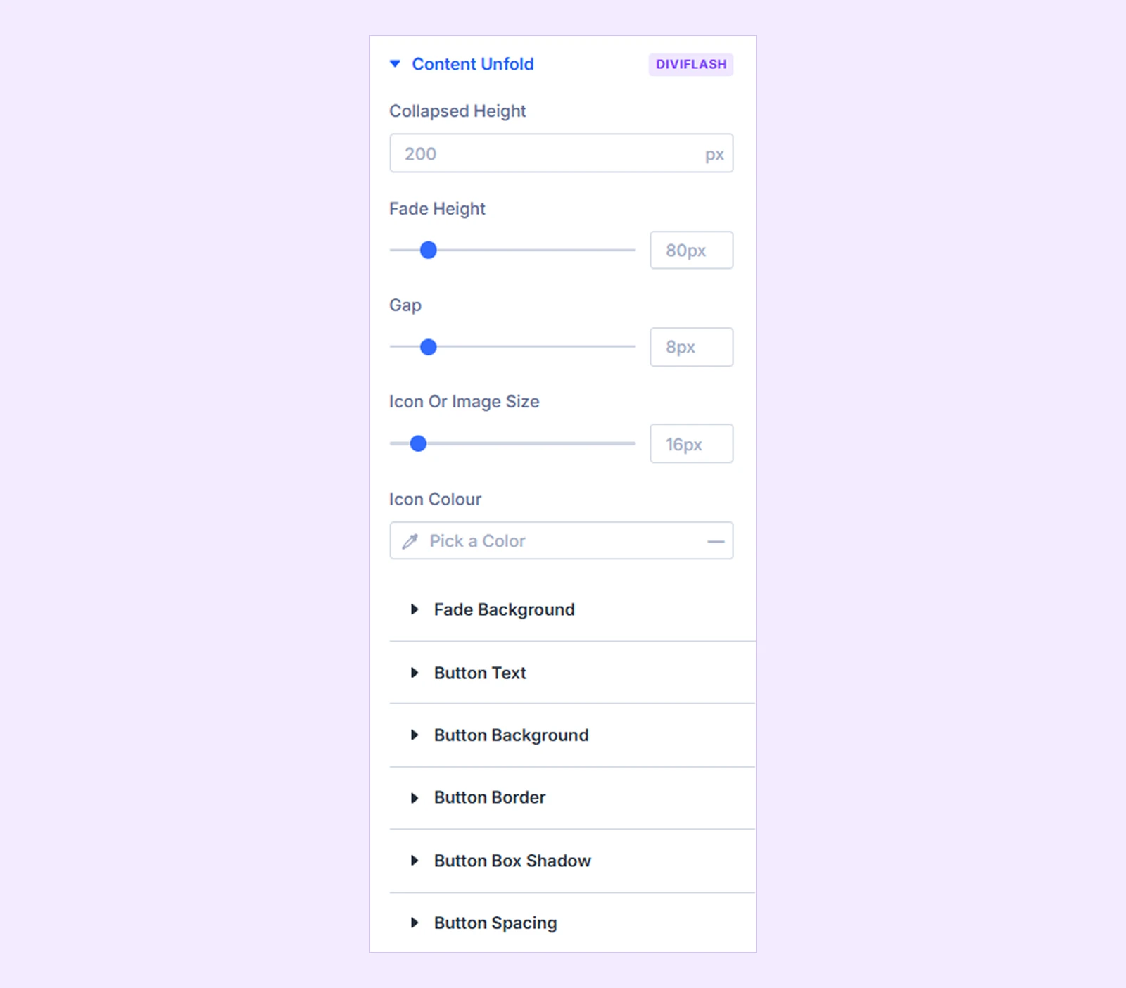
- Collapsed Height: Set the height of the element while it is collapsed.
- Fade Height: Set the height of the fade area. (Available only when Show Fade is enabled.)
- Gap: Set the space between the icon or image and the button text. (Available only when Icon Type is not set to None.)
- Icon or Image Size: Control the size of the icon or the height of the uploaded image. (Available only when Icon Type is not set to None.)
- Icon Colour: Set the icon color. (Available only when Icon Type is not set to None.) You can set different colors for responsive devices and hover states.
- Fade Background: Customize the color or gradient used for the fade. (Available only when Show Fade is enabled.)
- Button Text: Customize the button typography, including font, weight, size, color, line height, letter spacing, and other text settings.
- Button Background: Customize the button background using a color, gradient, or image.
- Button Border: Customize the button border and corner radius.
- Button Box Shadow: Add and customize a box shadow for the button.
- Button Spacing: Control the button's margin and padding.
The button design groups support Divi's standard responsive and hover controls where applicable.
Elements Content Unfold Doesn’t Support
Content Unfold works with Sections, Rows, Columns, Groups, and most Divi and DiviFlash modules. But it does not support:
- Fullwidth Header
- Post Title
- Fullwidth Post Title
- Post Navigation
- Search
- Signup (Email Optin)
- Divider
- Breadcrumbs
- WooCommerce Product Title
- WooCommerce Product Price
- WooCommerce Breadcrumb
- Child items such as Accordion Items, Tab items, Slides, Pricing Table items, and DiviFlash child items
- Third-party modules
- Elements using Divi's Sticky position
For child items, apply Content Unfold to the parent element instead.
Need Help?
If you have any questions or need assistance, contact our support team at [email protected].