The DiviFlash Pie Chart module (introduced in DiviFlash 5.2.0) lets you display data in an interactive pie or doughnut chart.
Important Note: Pie Chart module is built for Divi 5 only. Also, it will be disabled by default and to use it, you must enable it manually. Refer to our guide for step-by-step instructions.
Let’s see the settings in brief and how to make better use of it —
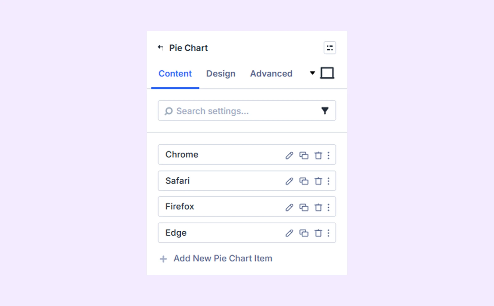
Content Tab
This tab contains all the essential settings to manage your pie chart data and control how the chart is structured and displayed.
Add New Pie Chart Item
By default, the module includes 4 chart items that you can edit or delete. If you need more, click “Add New Pie Chart Item” to add a new slice. Each item has its own settings. To know about item settings, click here.
Data Source
You can choose how your chart gets data:
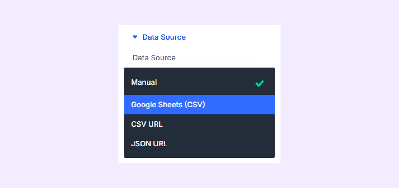
- Manual: Enter values directly inside the module.
- Google Sheets: Pull live data from a Google Sheet (must be published to the web).
- CSV URL: Fetch data from an external CSV file via public URL
- JSON URL: Fetch data from a public JSON endpoint data source.
Cache Duration: Set how often the data updates, such as 1 hour, 6 hours, 24 hours, or on every page load.
Note: Cache Duration only applies to external data sources: Google Sheets, CSV URL, and JSON URL
General Settings
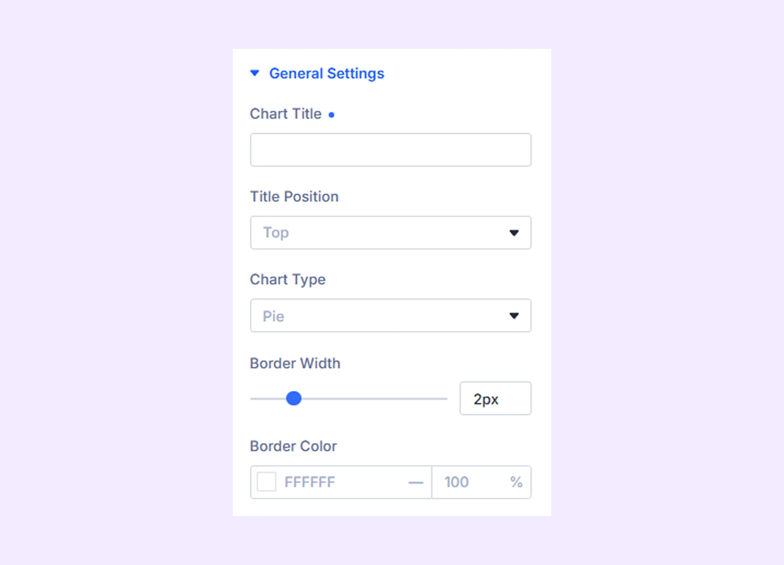
- Chart Title: Add a heading to describe what the chart shows.
- Title Position: Choose where the title appears (top, right, bottom, or left).
- Chart Type: Select between Pie (full circle) or Doughnut (circle with a center hole).
- Cutout Percentage: Adjust the size of the center hole (only applies to doughnut charts).
- Border Width: Set the thickness of the border between each chart segment.
- Border Color: Choose the color of the border between chart segments.
Legend
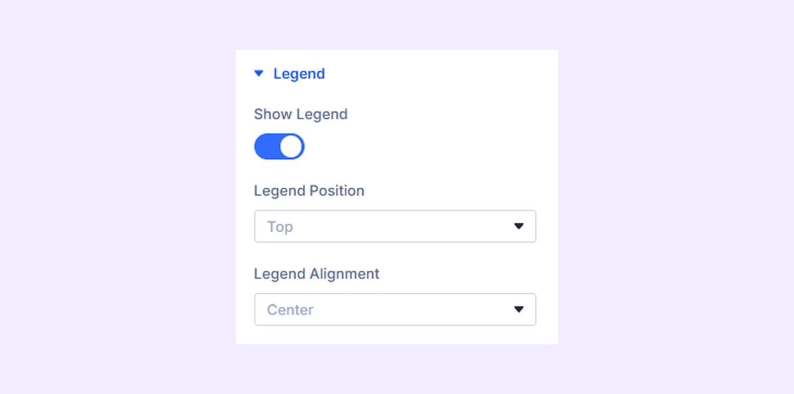
- Show Legend: Enable or disable the legend to show or hide the full legend section of the chart.
- Legend Position: Choose where the legend appears (top, bottom, left, or right).
- Legend Alignment: Align the legend horizontally (start, center, or end) for better layout control.
Tooltip & Values
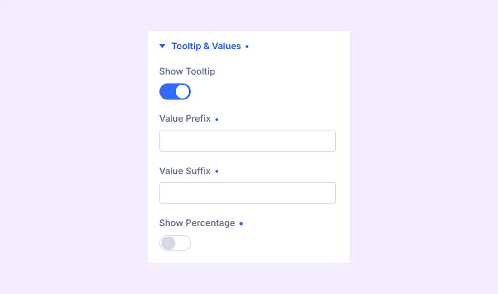
- Show Tooltip: Display detailed information when users hover over a chart element. This helps users view exact values easily.
- Value Prefix: Add text before values (for example: $, €, or “Total:”).
- Value Suffix: Add text after values (for example: %, users, or “sales”).
- Show Percentage: Display how much each part contributes to the total in percentage form.
Link: Use this default Divi setting to add a link to the entire module.
Background: Add a background color, gradient, image, video, pattern, or mask to the module.
Meta: Rename the module to organize it more easily in the Divi Builder. (Only you can see this label.)
Design Tab
Customize the visual appearance of the Pie Chart module.
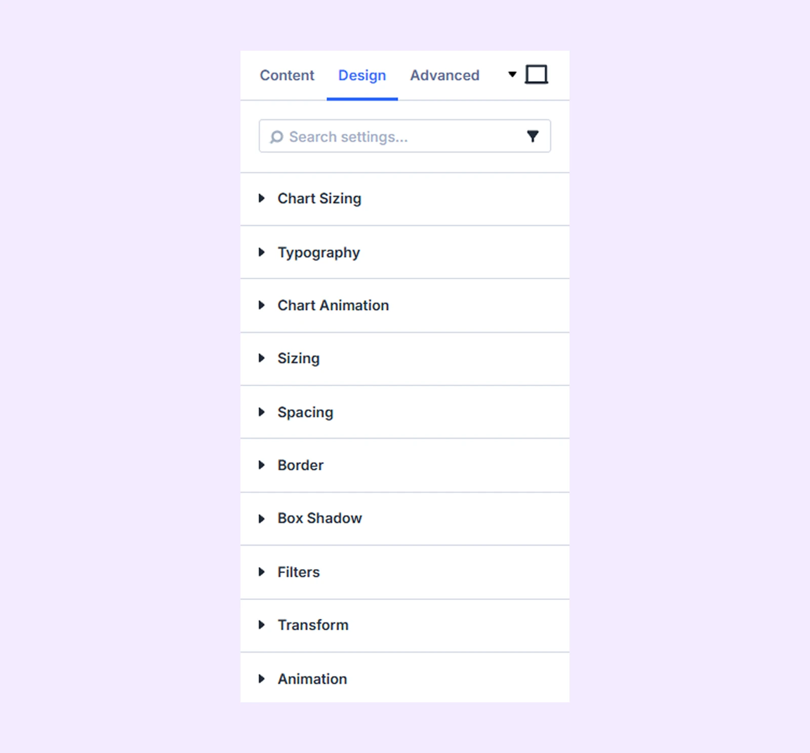
Chart Sizing: Adjust the overall height of the chart within the module container.
Typography: Customize the text style for the title, legend, and tooltip using typography options.
Chart Animation
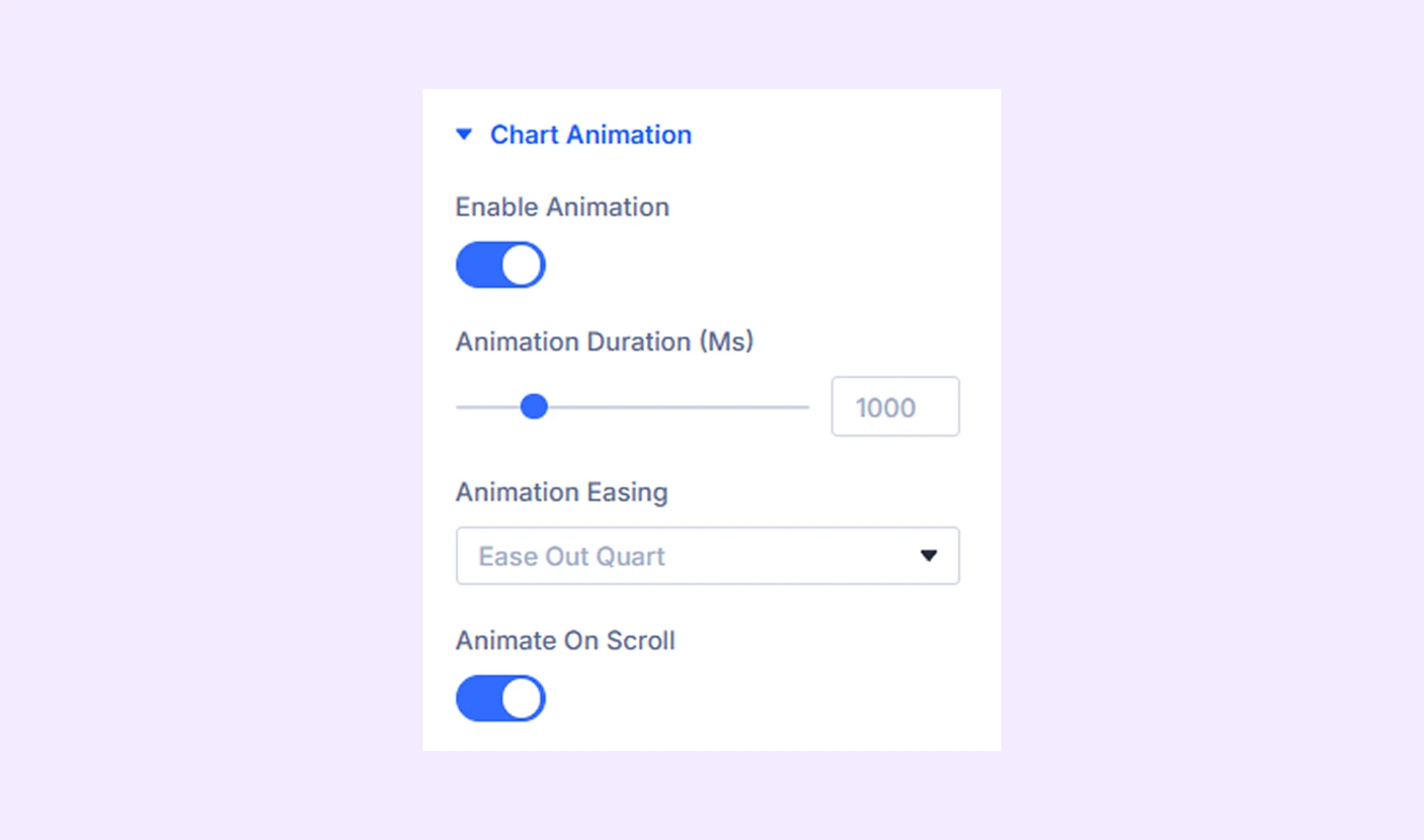
- Enable Animation: Turn animation on or off. The chart will animate when it first loads.
- Animation Duration (Ms): Control how fast or slow the animation plays.
- Animation Easing: Adjust the smoothness of the animation using 9 available easing styles.
- Animate On Scroll: Trigger the animation only when the chart comes into view while scrolling.
Sizing: Adjust the width, height, and alignment of the module.
Spacing: Add custom margin and padding to the module’s container.
Border: Customize the border style, width, and color. And style each border separately or apply the same style to all sides.
Box Shadow: Add shadow effects to the module.
Filters: Apply color filters to enhance the appearance.
Transform: Scale, rotate, move, or skew the module.
Animation: Apply reveal animation effects and customize delay, duration, repeat settings, and animation type.
Advanced Tab
This tab provides additional settings for advanced users who want greater control over the module with custom code, conditions, and more.
Pie Chart Child Item Settings
Each dataset includes its own Content, Design, and Advanced tabs. These settings are used when adding or editing datasets manually.
Content Tab
Slice Content
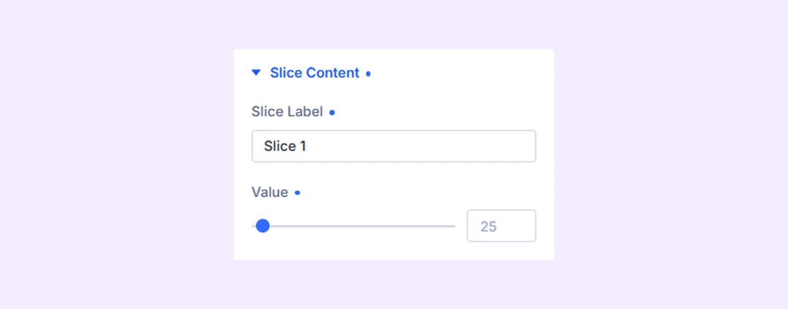
- Slice Label: Set the name of this slice. It will appear in the legend and tooltip to help identify it.
- Value: Enter the numeric value for this slice. It determines the size of the slice (higher value = larger slice, lower value = smaller slice).
Meta: Change the slice label name to keep things organized inside the builder.
Design Tab
Slice Style
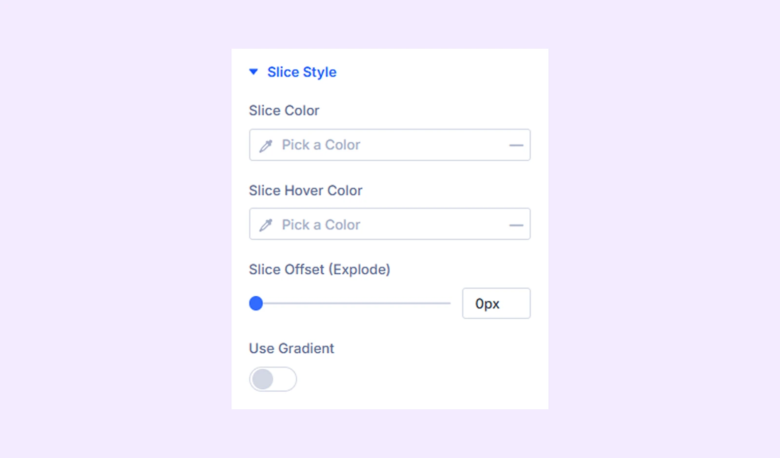
- Slice Color: Set the main color of the slice.
- Slice Hover Color: Choose the color shown when users hover over the slice.
- Slice Offset (Explode): Move the slice slightly outward to highlight it.
- Use Gradient: Enable gradient colors instead of a solid color.
- Gradient From: Set the starting color of the gradient.
- Gradient To: Set the ending color of the gradient.
Advanced Tab
Provides advanced styling options for each slice item.
Need Help?
If you have any questions or need assistance, contact our support team: [email protected]