
The DiviFlash Image Accordion module lets you create interactive image accordion items.
Let’s see the settings in brief and how to make better use of it —
Content Tab
This tab contains the essential settings to add and configure accordion items.
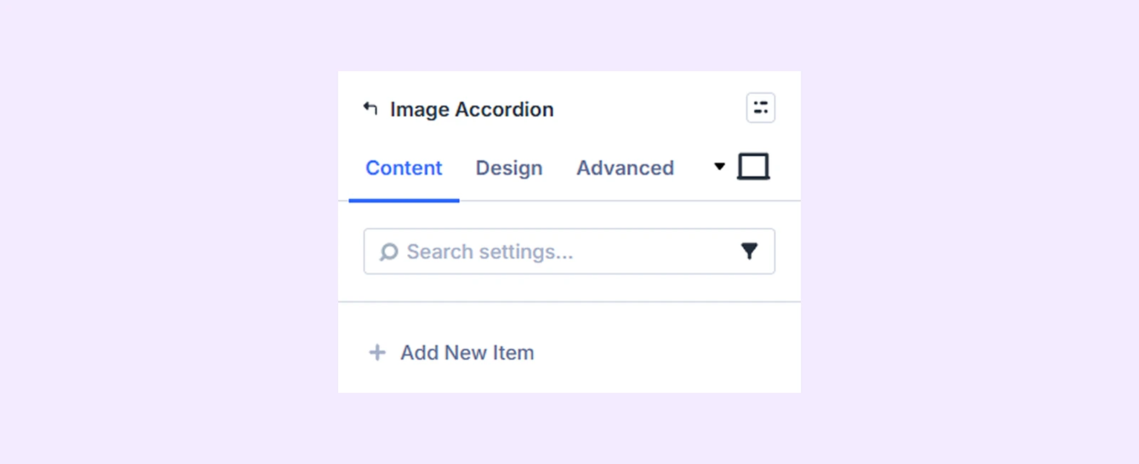
Add New Item
Click the + Add New Item button to create a new accordion item. This opens the Image Accordion Item Settings, where you can add content and style each item individually. To learn more, click here.
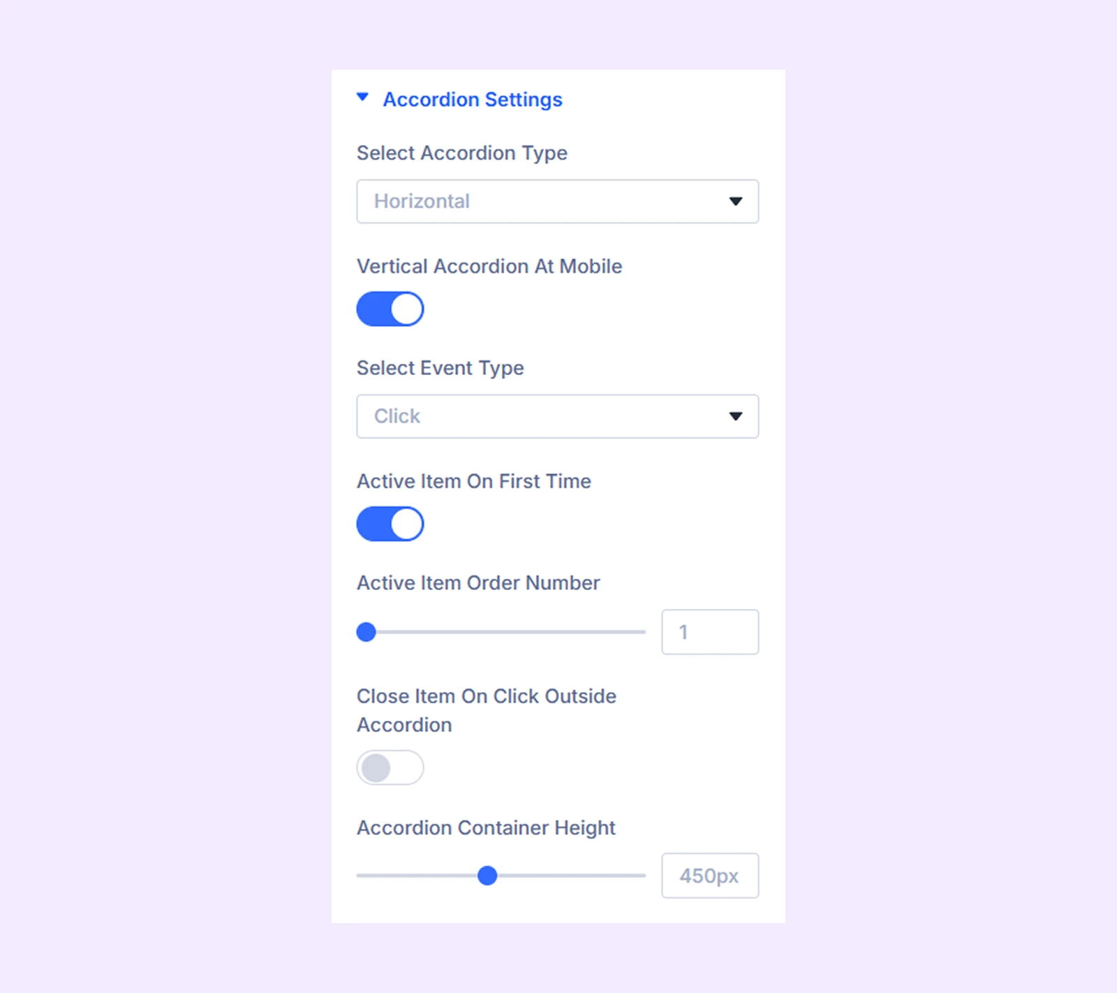
Accordion Settings
- Select Accordion Type: Choose if you want a vertical or horizontal accordion.
- Vertical Accordion at Mobile: Enable this option to display a vertical accordion on mobile while you have a horizontal accordion on desktop. Only available if you choose “Horizontal” as “Accordion Type.”
- Select Event Type: Choose if you want the accordions to expand on click or hover.
- Active Item on First Time: Enable this option to expand an accordion item automatically when the page loads.
- Active Item Order Number: Choose which accordion item you want to expand by default.
- Close Item on Click Outside Accordion: Enable this option to contract the expanded accordion item when the user clicks outside of the accordion container.
- Accordion Container Height: Adjust the height of the accordion container.
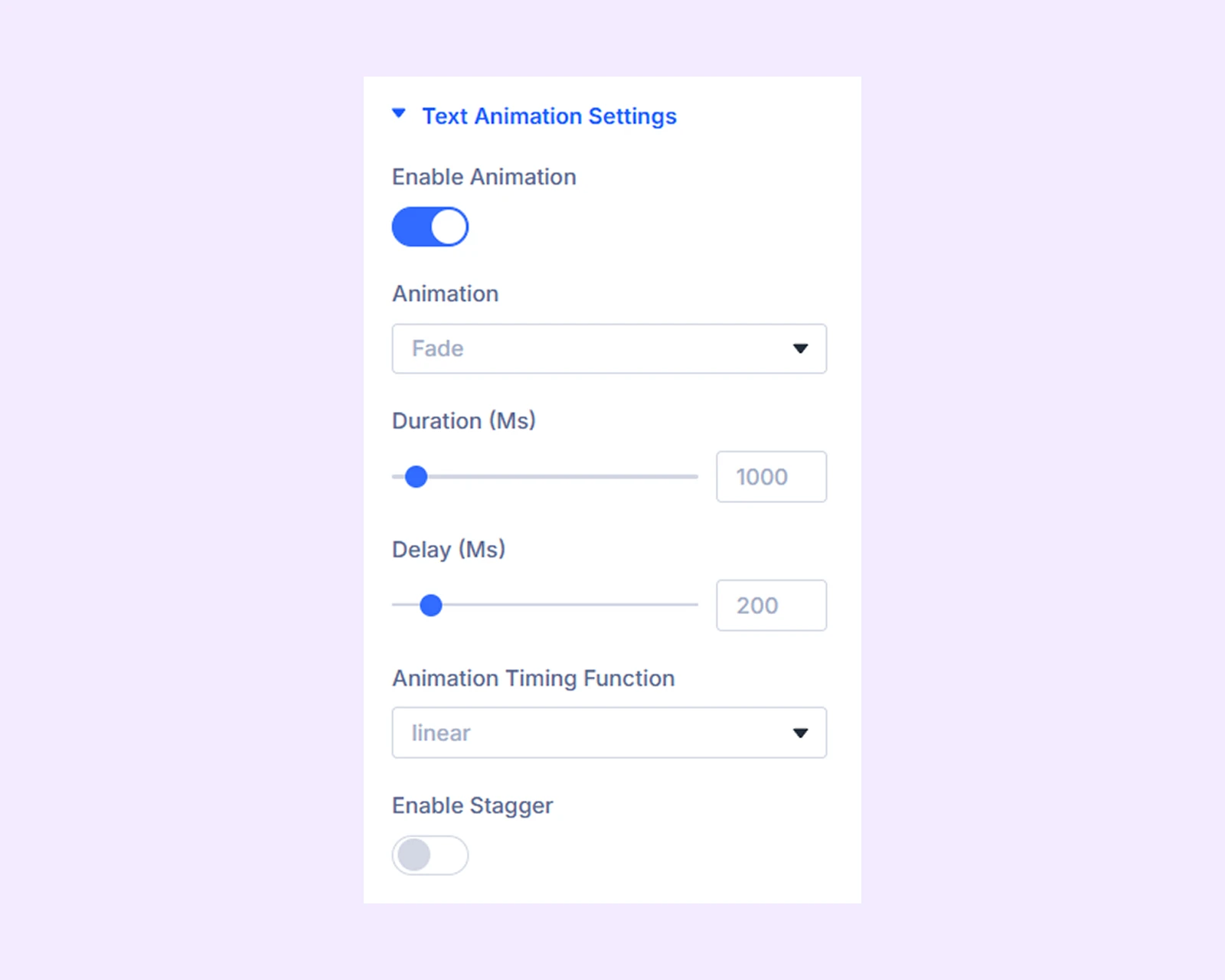
Text Animation Settings
- Enable Animation: Enable this to apply animation to accordion content.
- Animation: Choose the animation style.
- Duration (Ms): Set animation speed.
- Delay (Ms): Add delay before animation starts.
- Animation Timing Function: Choose how the animation effect will progress over time.
- Enable Stagger: Enabling this option will apply a stagger effect on the image accordion content. You can also adjust the level of the stagger effect.
Background: Add a background color, gradient, image, video, pattern, or mask to the module.
Element Label: Rename the module to organize it more easily in the Divi Builder. (Only you can see this label.)
Design Tab
Use this tab to style and customize the overall appearance of the Image Accordion module.
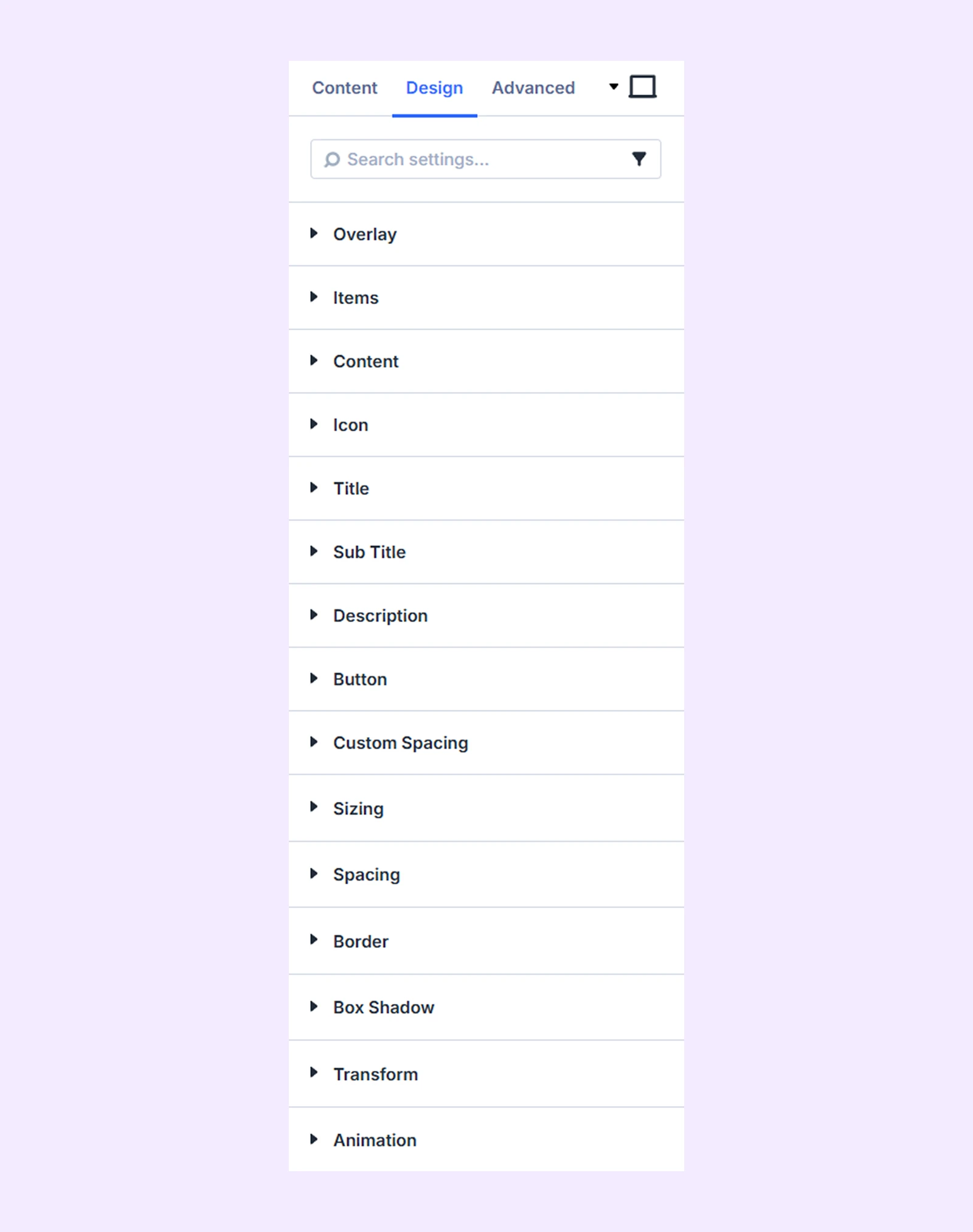
Overlay: Color customization options for the image accordion overlay.
Items: Border customization options for all the image accordion items.
Content: Alignment, background, and border options for the image accordion content.
Icon: Color, size, and border options for the icons of the image accordion items.
Title: Typography options for the image accordion item titles.
Sub title: Typography options for the image accordion item subtitles.
Description: Typography options for the image accordion item body content.
Button: Alignment, background, typography, and border options for the image accordion item buttons.
Custom Spacing: Add custom margins and paddings to each component of the image accordion individually.
Sizing: Adjust the width, height, and alignment of the module.
Spacing: Add custom margin and padding to the module’s container.
Border: Customize the border style, width, and color. And style each border separately or apply the same style to all sides.
Box Shadow: Add shadow effects to the module.
Transform: Scale, rotate, move, or skew the module.
Animation: Apply reveal animation effects and customize delay, duration, repeat settings, and animation type.
Advanced Tab
This tab provides additional settings for advanced users who want greater control over the module with custom code, conditions, and more.
Image Accordion Item Settings
Each accordion item works as a child of the main module. You can customize each item individually, and these settings will override the parent (module) settings when applied.
Content Tab
Image
- Image: Upload the image, choose a gradient, or plain color for the image accordion item background.
- Background Image Size: Choose the size of the image relative to the background. You can choose a custom size and adjust the height and width of the image.
- Background Image Position: Choose the position of the image relative to the background.
- Background Image Repeat: Choose if you want the image to be repeated over the background.
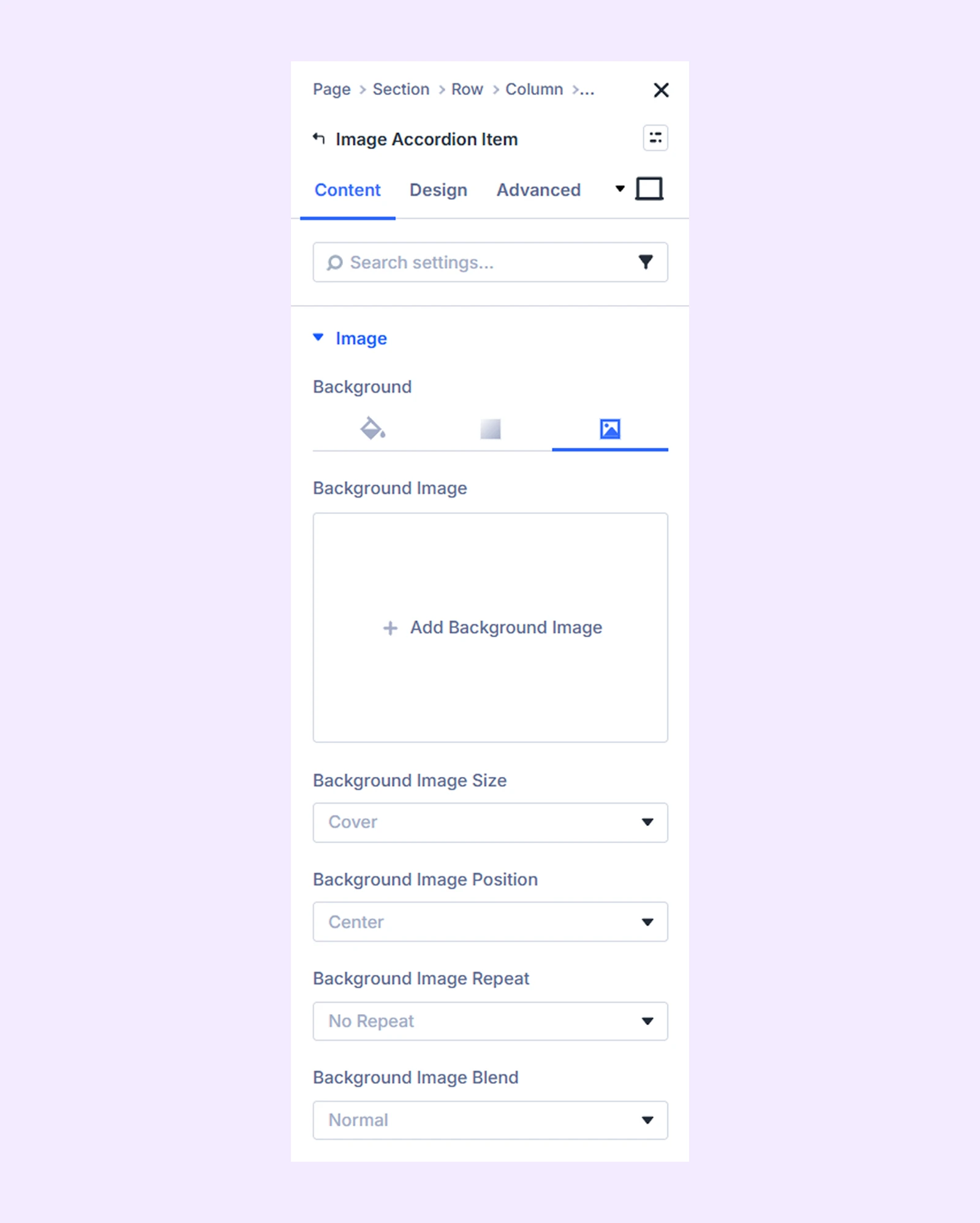
Note: If you select a color or gradient, relevant customization options will appear instead of image settings.
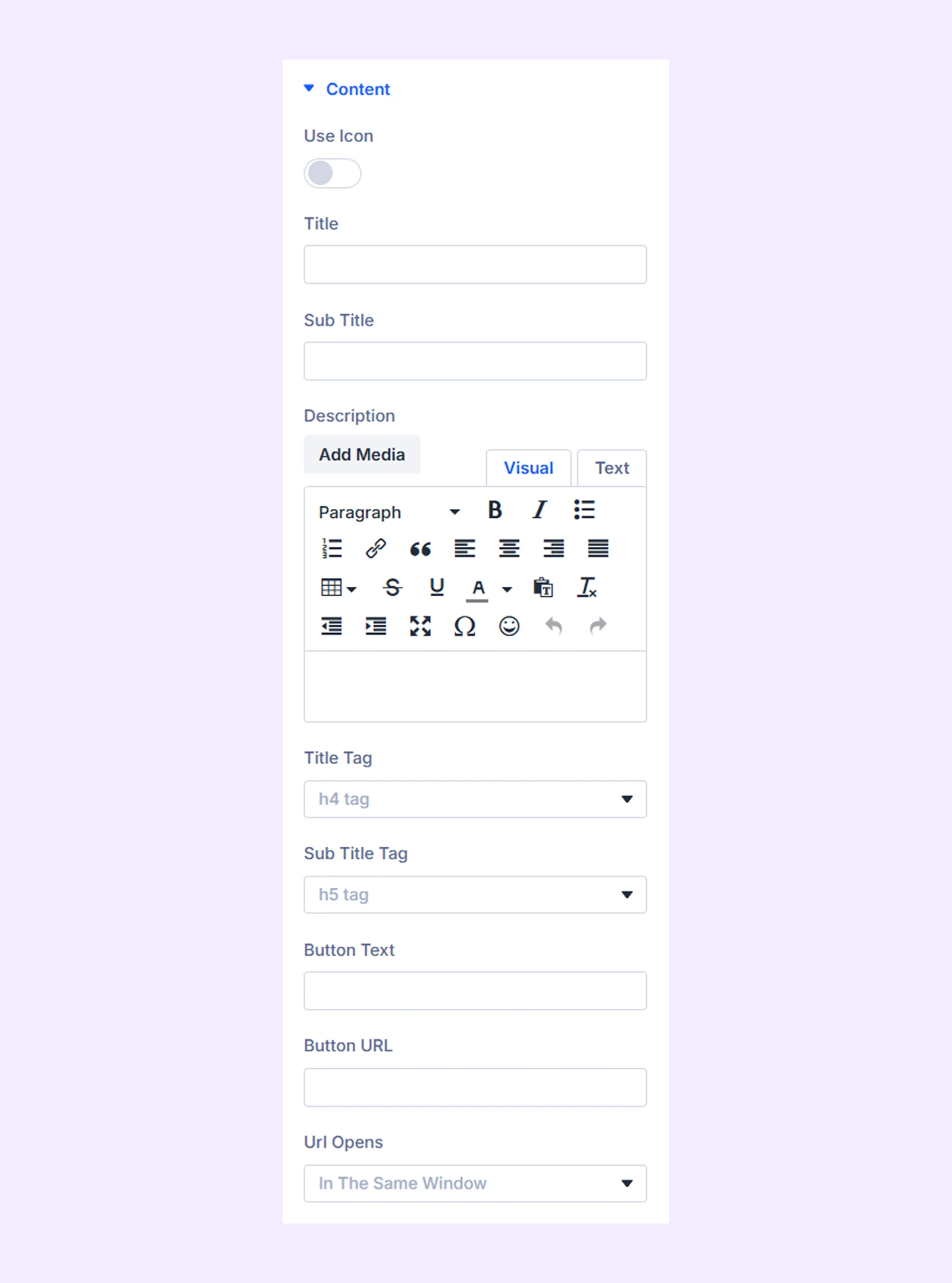
Content
- Use Icon: Enable an icon for the item.
- Use Image As Icon: Use the image as an icon.
- Title: Add the item title.
- Sub Title: Add supporting text.
Additional typography and button settings are available for further customization.
Element Label: Rename the accordion item for easier identification in the builder (visible only to you).
Design Tab
This tab lets you style each accordion item individually. While many options are similar to the main module settings, some are specific to the item level for more precise control.
Advanced Tab
This tab provides additional settings for advanced users to control each accordion item individually.
Need Help?
If you have any questions or need assistance, contact our support team: [email protected]