The DiviFlash Instagram Feed Gallery module allows you to display your Instagram content directly on your Divi website.
Let’s see the settings in brief and how to make better use of it —
Content Tab
This tab includes all essential settings for connecting and displaying your Instagram feed.
Instagram Settings
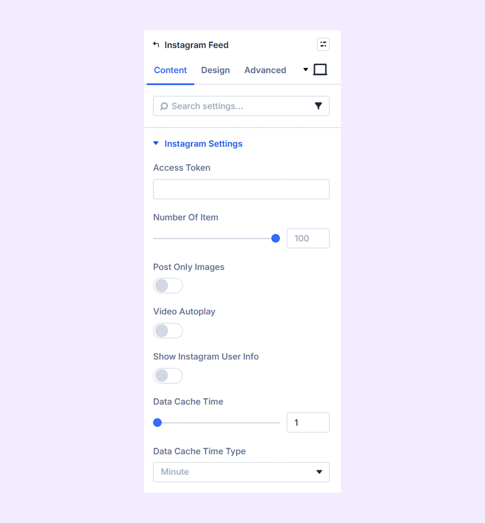
- Access Token: Enter your Instagram access token to connect and import your feed. This is required for the module to function. To learn how to get the Instagram access token, click here.
- Number of Items: Define the number of Instagram posts you want to display.
- Post Only Images: Toggle on to display posts that only contain images.
- Video Autoplay: Toggle on to automatically play the videos in the feed.
- Show Instagram User Info: Enable this option to display your Instagram account information.
- User Profile Picture: Upload the image you want to display as your Instagram profile picture.
- Username Text: Input the text you want to display as your Instagram username.
- Post Date Format: Define the format of the date. Use any combination from here.
- Use Instagram Icon: Toggle this option to use an icon in the gallery images.
- Data Cache Time: Specify the interval at which the Instagram feed is automatically refreshed to display the latest content.
- Data Cache Time Type: Specifies the unit of measurement (e.g. minutes, hours, days) used to determine the frequency of Instagram feed refreshes.
Gallery Settings
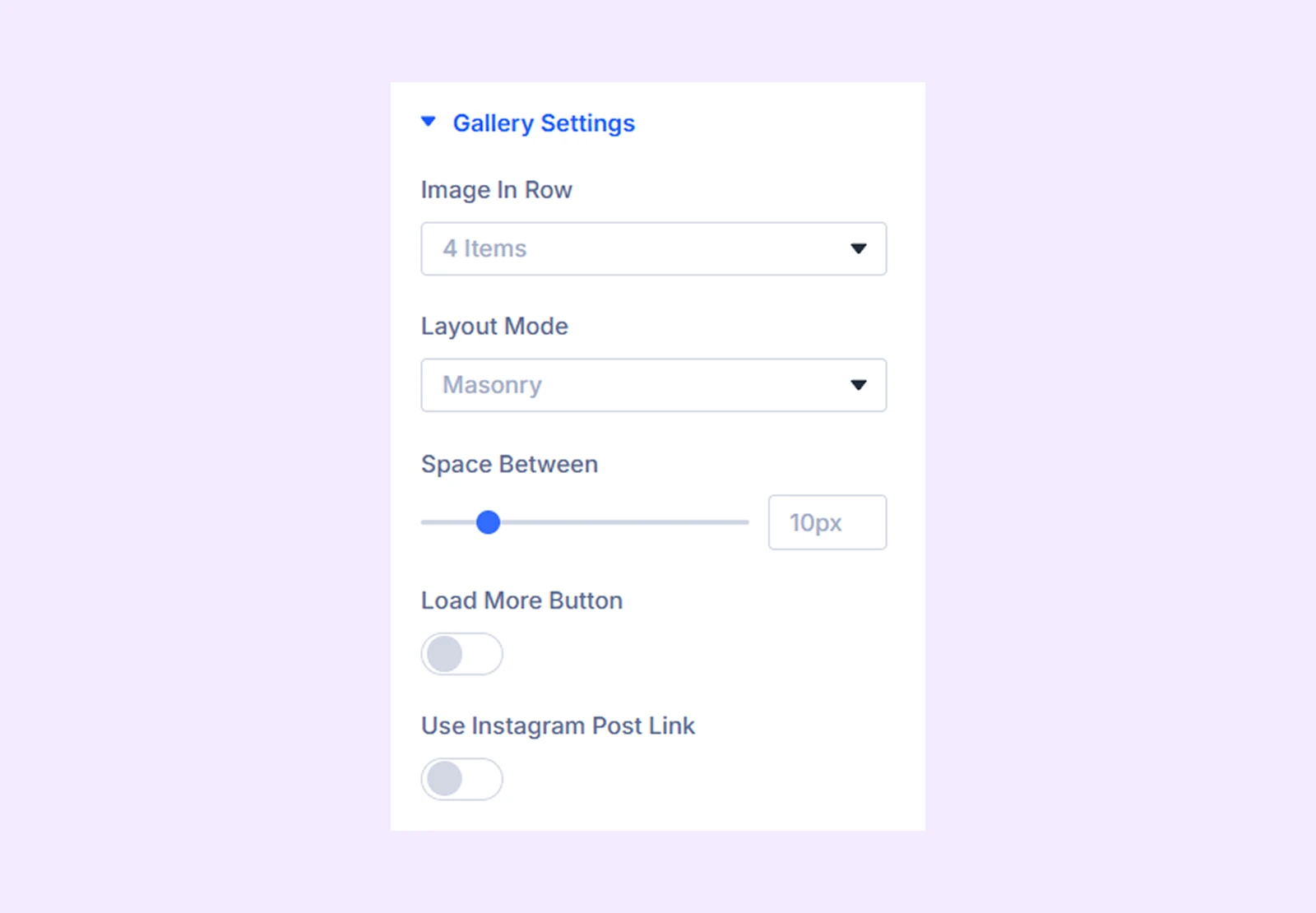
- Image in Row: Choose how many images you want to display in each row of the gallery.
- Layout Mode: Choose between a modern masonry layout or a traditional grid layout for your Instagram gallery.
- Space Between: Adjust the space between the images of the gallery.
- Load More Button: Enable this option to use a load more button.
- Initial Image Load: Define how many images will load in the image gallery at first.
- Load More Image Count: Define how many images will load after clicking on the load more button.
- Load More Button Text: Input the text for the load more button.
- Use Instagram Post Link: Activate this setting to link each post slider to its original Instagram post.
- Link Target: Choose whether to open linked Instagram posts in the same tab or a new tab.
Hover Settings
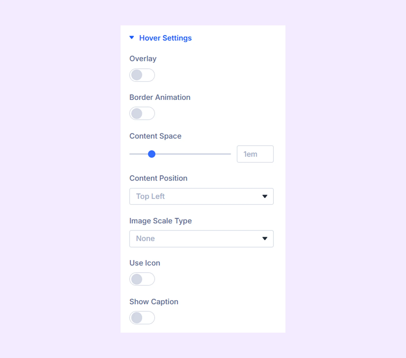
- Overlay: Enable to add a color gradient over the gallery images.
- Overlay Primary Color: Choose the primary color for the overlay gradient.
- Overlay Secondary Color: Choose the secondary color for the overlay gradient.
- Overlay Gradient Direction: Adjust the gradient direction.
- Border Animation: Enable to add a border and a border reveal animation to the overlay.
- Border Color: Pick a color for the border.
- Border Width: Adjust the border width.
- Border Space: Adjust how much space the border will leave from the image border.
- Border Animation Style: Choose a border animation style from 19 different options.
- Content Space: Adjust the placement of the image caption and description over the image.
- Content Position: Select the placement of image content within the image border.
- Image Scale Type: Choose how the image will scale on hover. You have 9 different options to choose from.
- Use Icon: Toggle on to use an icon on the overlay.
- Show Caption: Enable to show the image caption in the overlay on hover.
- Always Show Caption: Enable to always show image caption over the image.
- Caption Reveal: Choose an animation effect for the caption reveal. You have 12 different animation options to choose from.
Link: Use this default Divi setting to add a link to the entire module.
Background: Add a background color, gradient, image, video, pattern, or mask to the module.
Element Label: Rename the module to organize it more easily in the Divi Builder. (Only you can see this label.)
Design Tab
Customize the appearance of the Instagram Feed module with advanced design settings.
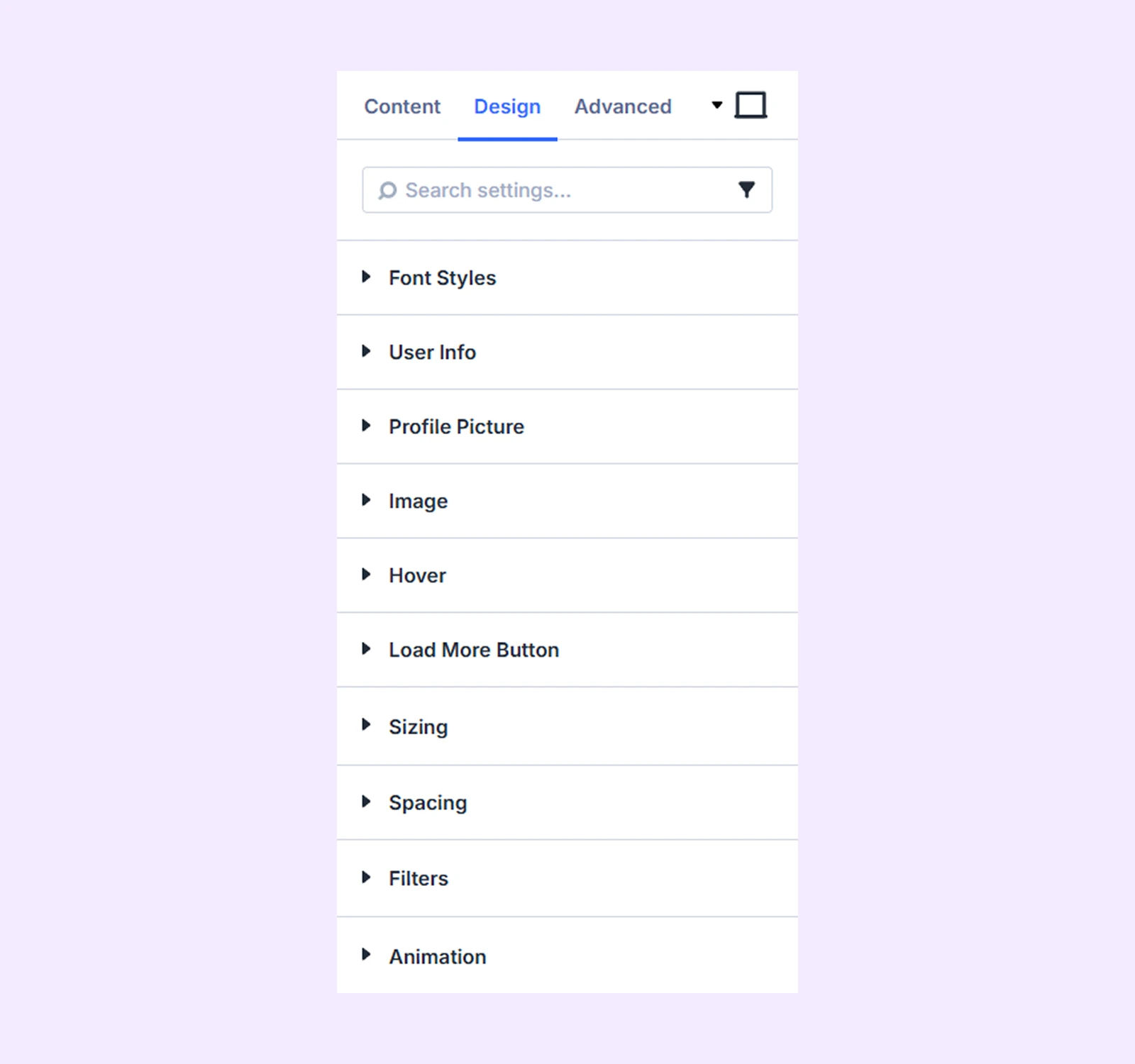
Font Styles: Typography options for the Instagram post caption, username, and date.
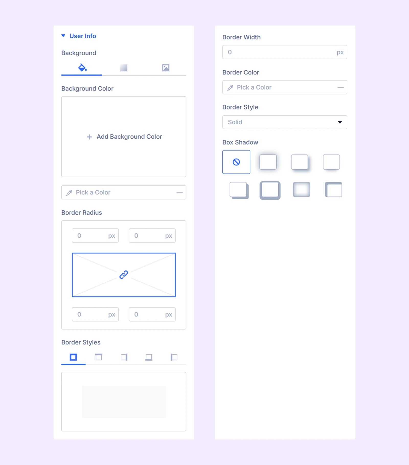
User Info
- Background: Set a background color, gradient, or image for the user info section.
- User Info Show At Bottom: Enable this option to display the user info section at the bottom.
- User Info Width: Adjust the width of the user info container to control how much horizontal space it occupies.
- Profile Picture Width: Define the size of the profile picture displayed in the user info section.
- Icon Alignment: Control the horizontal alignment of icons within the user info section.
- Icon Position: Choose where the icon appears relative to other elements.
- Icon Size: Adjust the size of the icon.
- Icon Color: Select the color of the icon.
- Border Options: Customize the border of the user info section, including style, width, color, and radius.
- Box Shadow: Apply a shadow effect to the user info section.
Profile Picture: Border customization options for Instagram user profile picture.
Image: Border customization and color filter options for Instagram post images.
Hover: Icon size and color customization options for the overlay hover icon.
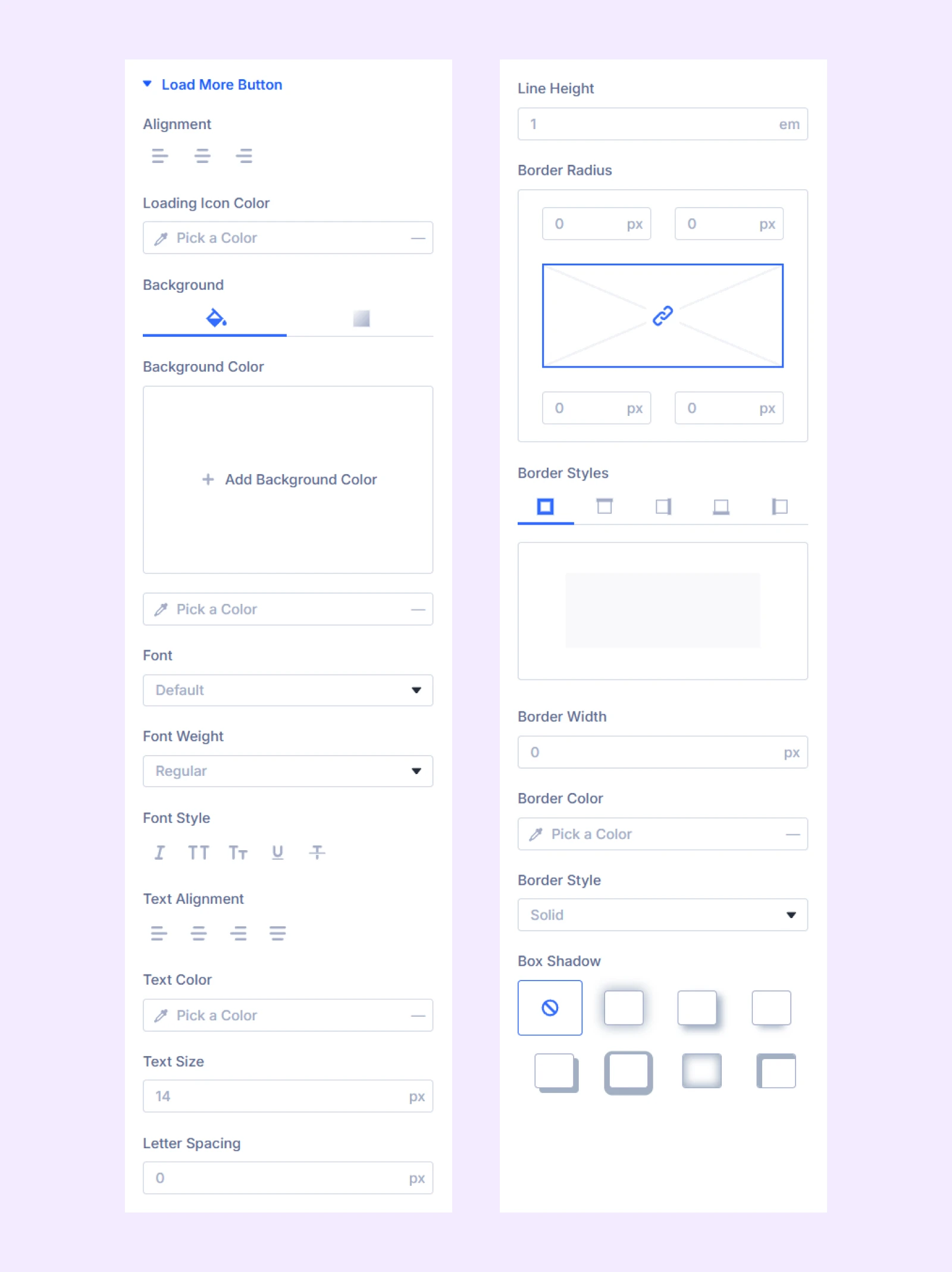
Load More Button
Turn on load more button to use the functionalities here.
- Alignment: Change the horizontal placement of the Load More button.
- Loading Icon Color: Pick a color for the loading icon.
The rest of the options are typography and border options for the load more button.
Sizing: Adjust the width, height, and alignment of the module.
Spacing: Add custom margin and padding to the module’s container.
Filters: Apply color filters to enhance the appearance.
Animation: Apply reveal animation effects and customize delay, duration, repeat settings, and animation type.
Advanced Tab
This tab provides additional settings for advanced users who want greater control over the module with custom code, conditions, and more.
Need Help?
If you have any questions or need assistance, contact our support team: [email protected]