
The Alert module provides a flexible solution to display inline notification boxes, announcement bars, floating viewport toasts, and interactive popup alerts triggered by external buttons.
Important Note: The Alert module is built for Divi 5 only. It is disabled by default, so you must enable it manually before using it.
Let’s see the settings in brief and how to make better use of it.
Content Tab
This tab contains all the essential settings to manage your pie chart data and control how the chart is structured and displayed.
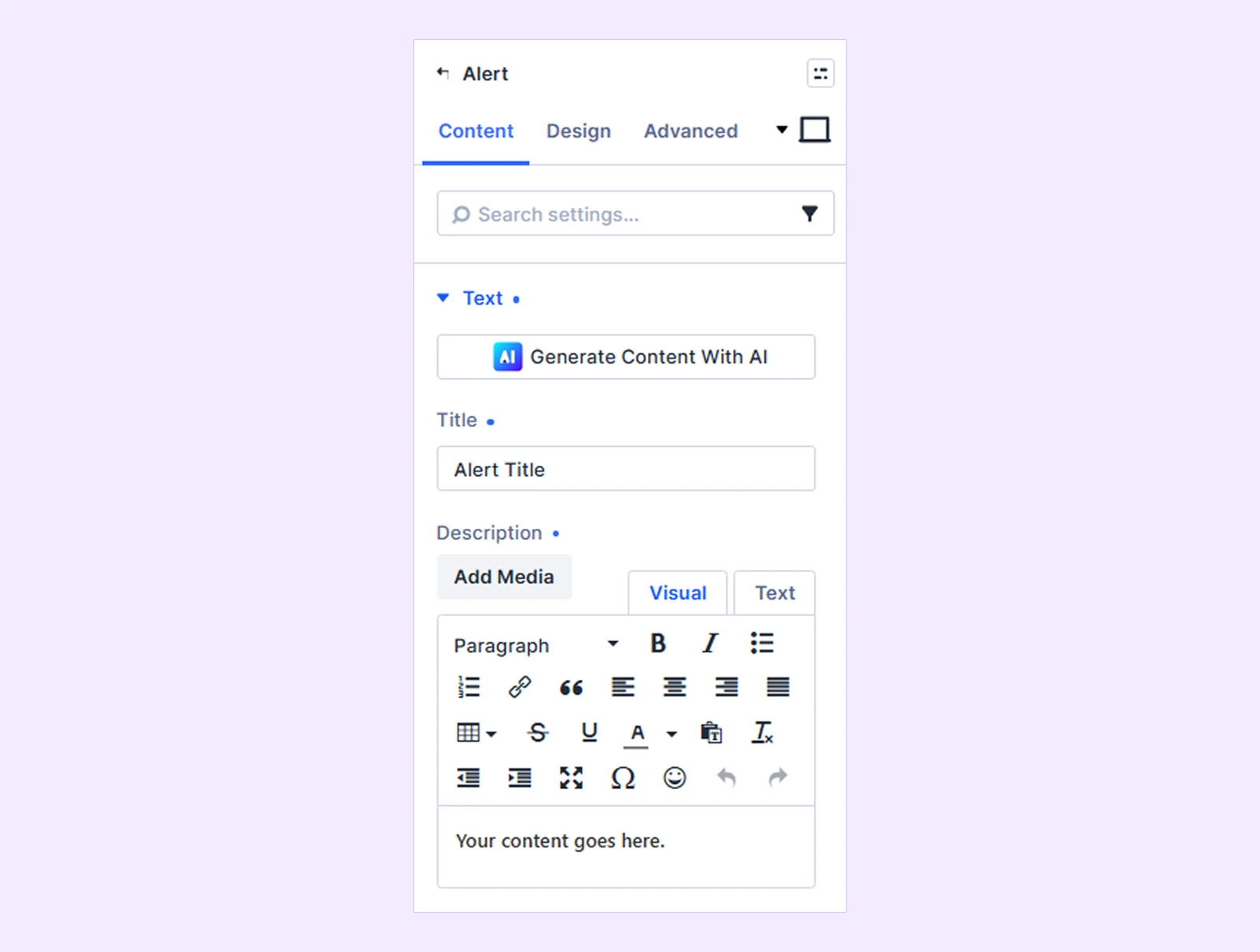
Text
- Title: The main heading text for the alert. Supports Dynamic Content.
- Description: Rich-text editor for the alert body content.
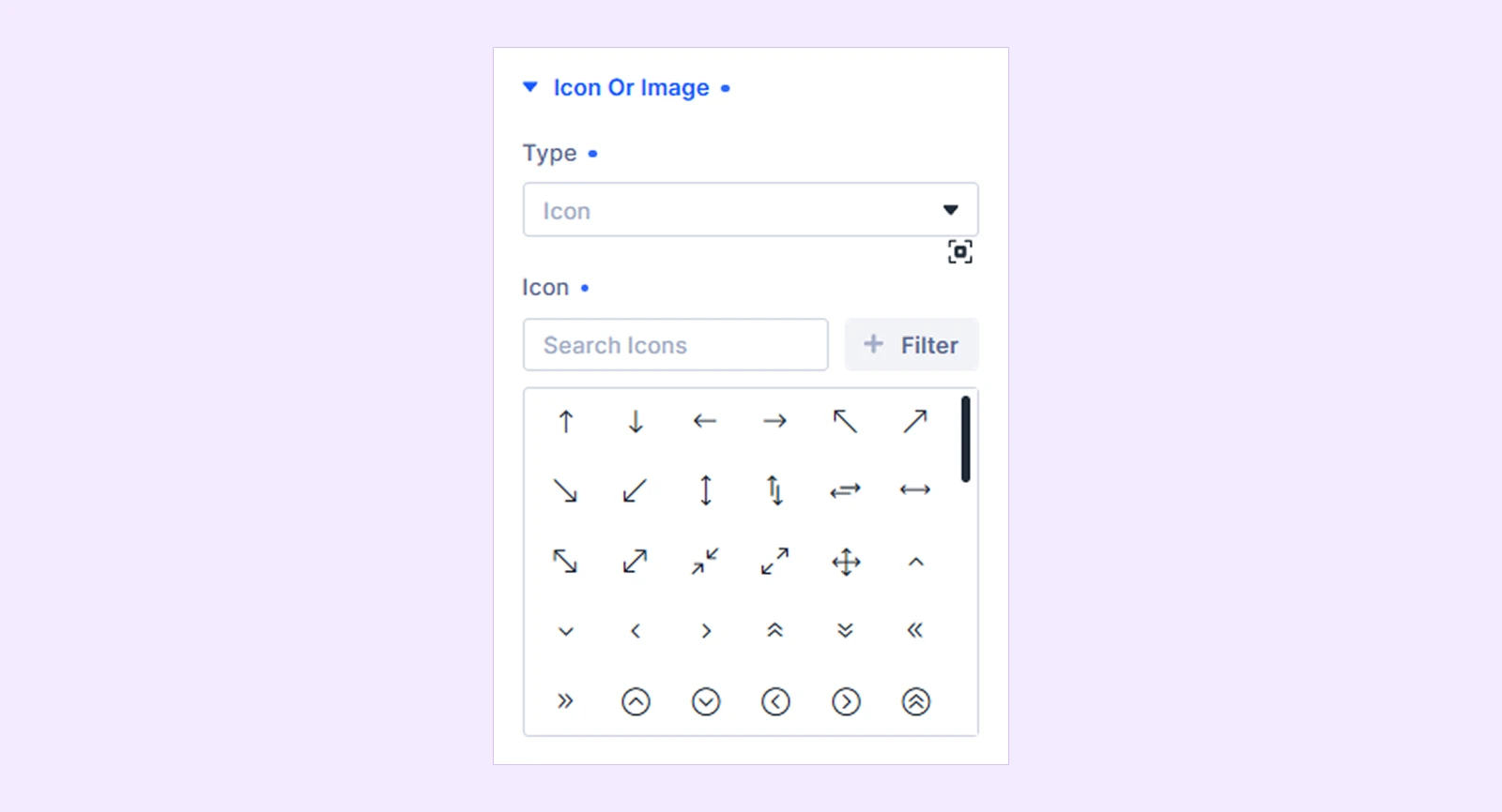
Icon Or Image
- Type: Choose between None, Icon, or Image.
- Icon: Divi icon picker for the graphic icon. Default: Info circle. (Only visible when the type is set to Icon).
- Icon Image: Media upload field to select a custom image. Supports dynamic image sources. (Only visible when Type is set to Image).
Elements
- Elements: The standard Divi + Add Element area to nest child modules directly inside the alert (e.g., Buttons, Images, Blurbs).
- Place Elements Beside Content: Toggle switch to place nested elements next to the title and description block in a multi-column flex layout.

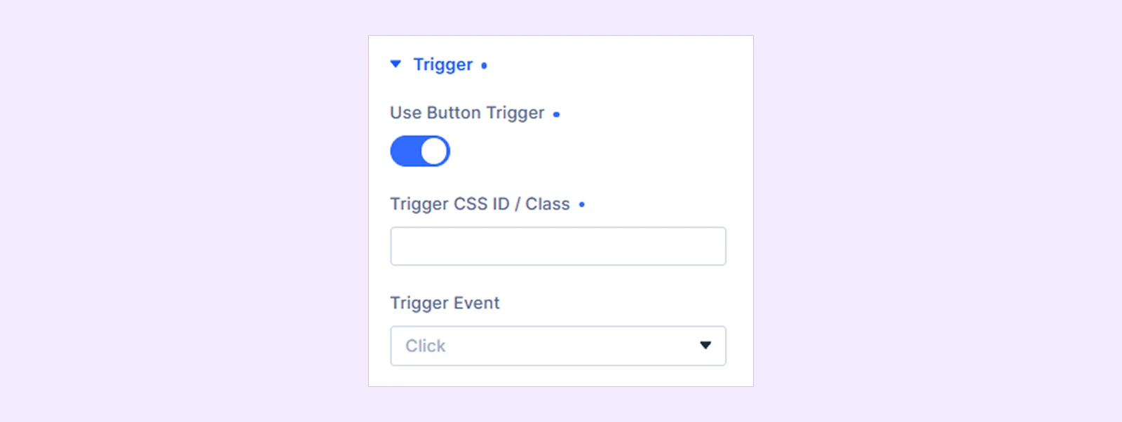
Trigger
- Use Button Trigger: Toggle switch to hide the alert on initial page load and reveal it only when a linked element fires.
- Trigger CSS ID / Class: Enter the target selector to get assigned to any button or module on the page. ( This option is only available when Use Button Trigger is On).
- Trigger Event: Choose whether the alert opens on Click or Hover. (This option is only available Use Button Trigger is On).
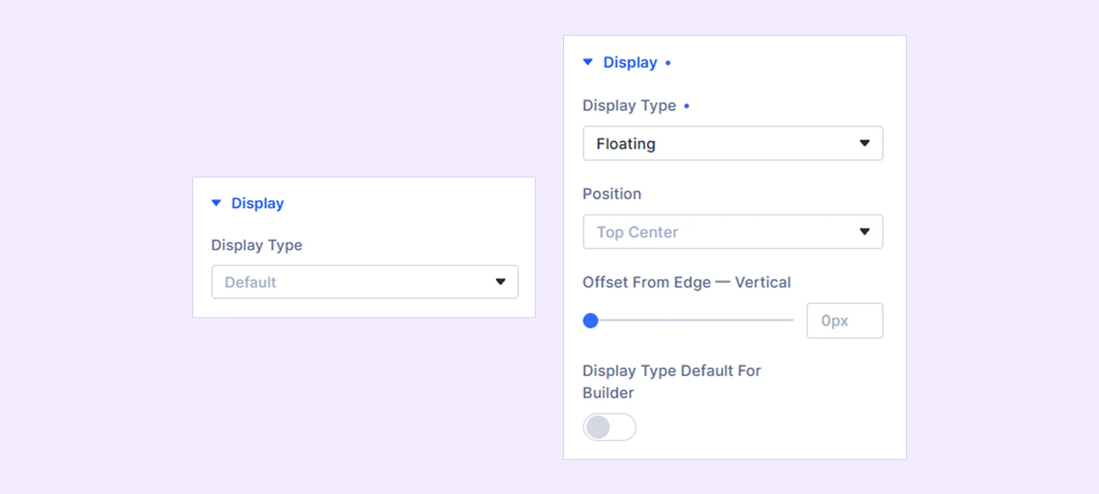
Display
- Display Type: Select how the alert is placed on the page. Choose Default or Floating
- Position: Anchor the alert across 9 positions:
- Top Left
- Top Center
- Top Right
- Center Left
- Center
- Center Right
- Bottom Left
- Bottom Center
- Bottom Right.
- Offset From Edge Horizontal: Fine-tune edge distance for non-centered floating anchors.
- Offset From Edge Vertical: Fine-tune edge distance for top and bottom floating anchors.
- Display type default for Builder Toggle switch to keep floating alerts inline while editing inside the Visual Builder to prevent canvas obstruction.
(All these options are only visible when Display Type Floating is selected)
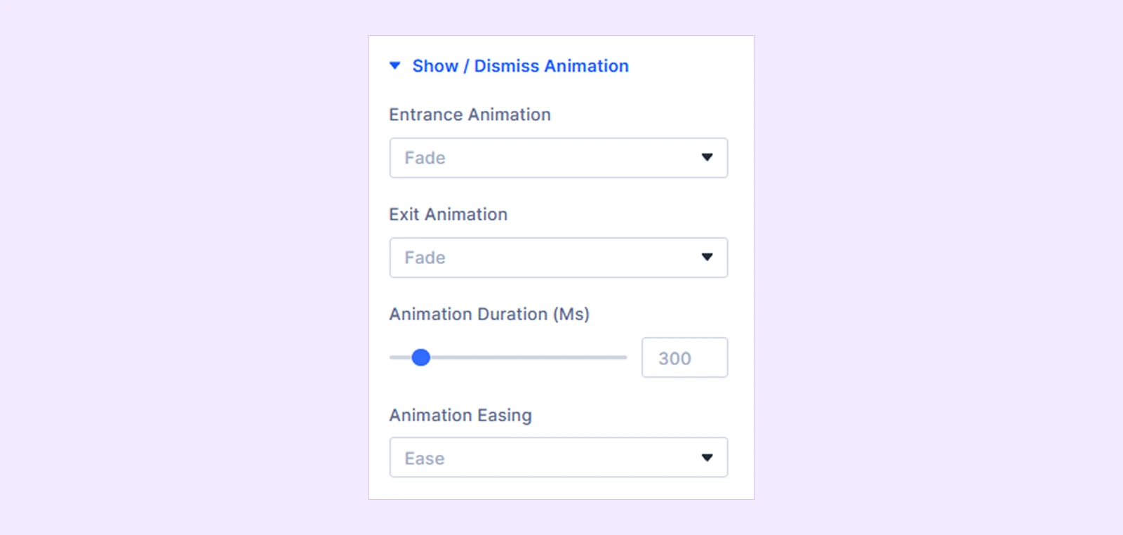
Show / Dismiss Animation
- Entrance Animation: Select the reveal effect on load or trigger:
- None
- Fade
- Slide Top
- Slide Bottom
- Slide Left
- Slide Right
- Zoom,
- Bounce.
- Exit Animation: Select the transition effect when the alert closes. You’ll find the same animations available from the entrance animation set.
- Animation Duration (ms): Set animation speed from 100ms to 2000ms.
- Animation Easing: Select timing curves:
- Ease
- Linear
- Ease In
- Ease Out
- Ease In Out.
Dismiss
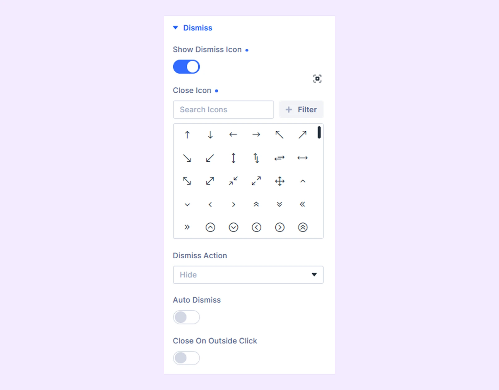
- Show Dismiss Icon: Toggle the close button on or off.
- Close Icon: Choose the glyph used for the close button. (Only visible when the Show Dismiss Icon toggle is On).
- Dismiss Action: Select Hide or Remove
- Remove Scope: Choose Module Only or Module + Container (Only visible when the Dismiss Action is selected to Remove).
- Auto Dismiss: Automatically closes the alert after a set duration.
- Auto Dismiss Delay (seconds) Define display time before closing. (Only visible when Auto Dismiss toggle is On).
- Close on Outside Click: Dismisses floating alerts when the user clicks anywhere outside the alert box. (Visible only when Display Type is set to Floating).
- Remember Dismissal: Saves dismissal states to local browser storage so returning visitors do not see the alert again. (Only visible when Use Button Trigger is Off).
- Remember For: Set duration value (0–365). 0 keeps the alert hidden permanently. (Only visible when Use Button Trigger is On).
- Duration Unit: Select duration measurement: Minutes, Hours, or Days. (Only visible when Remember Dismissal is On).
Background: Configure the item’s background settings.
Link: Add a custom link to the switcher item.
Loop: Turn any Divi design element into a dynamic loop that repeats and displays database content like posts, products, categories, or authors.
Order: Adjust the item order and arrangement.
Meta: Rename the item for easier identification inside the Divi Builder. (Visible only to you.)
Design Tab
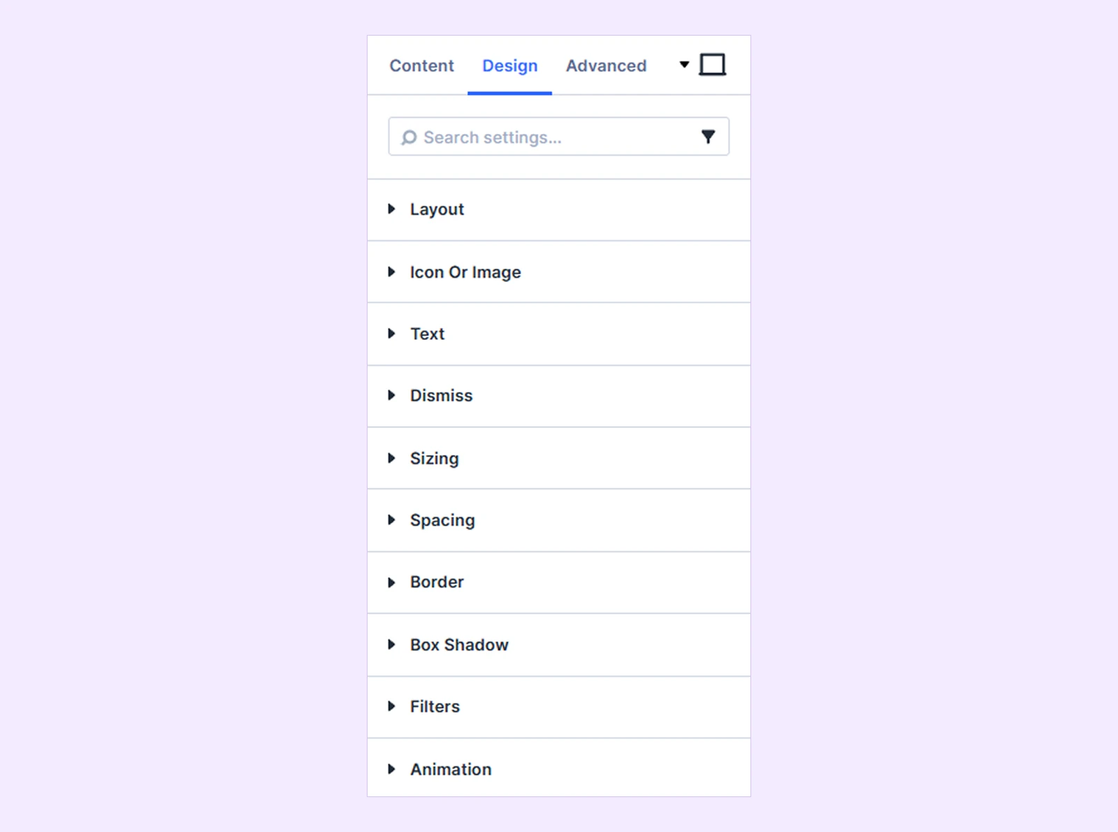
Layout: Control flexbox positioning for child elements within the alert container.
Icon Or Image
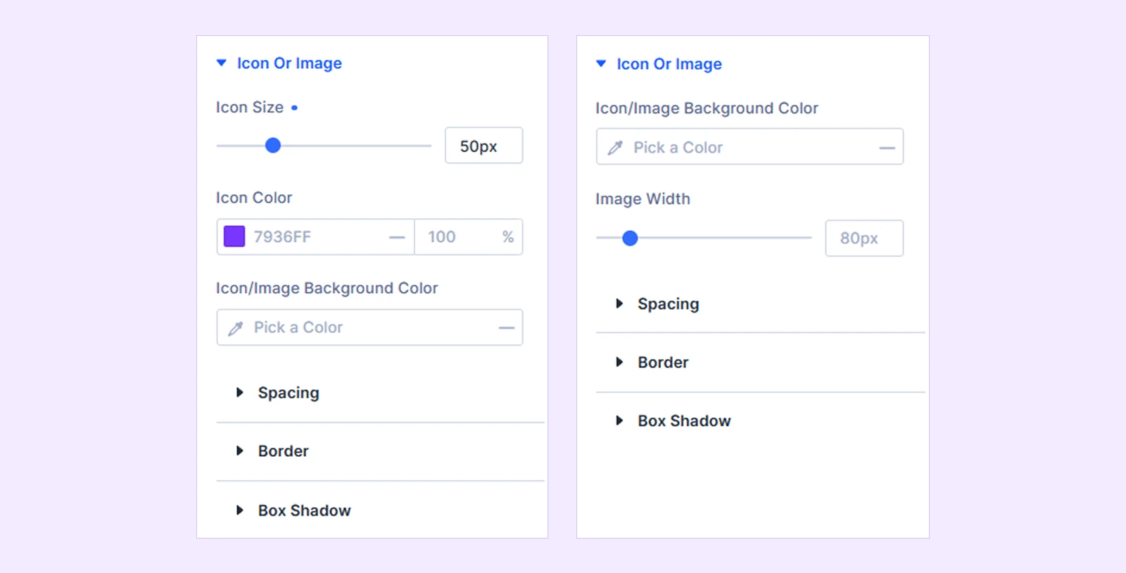
- Icon Size: With this setting, you will also find a slider to adjust the icon's dimensions in pixels. (This option is available when icon is selected)
- Icon Color: With this setting, you will also find a color picker to customize the icon's hue. (This option is available when icon is selected)
- Icon/Image Background Color: With this setting, you will also find an option to set a background color for the icon or image.
- Image Width: Set the width of the image as you need. (This option is available when Image is selected)
You will also find Spacing, Border, and Box Shadow for further customization.
Text: Customize the typography and appearance of the alert title and description.
Dismiss
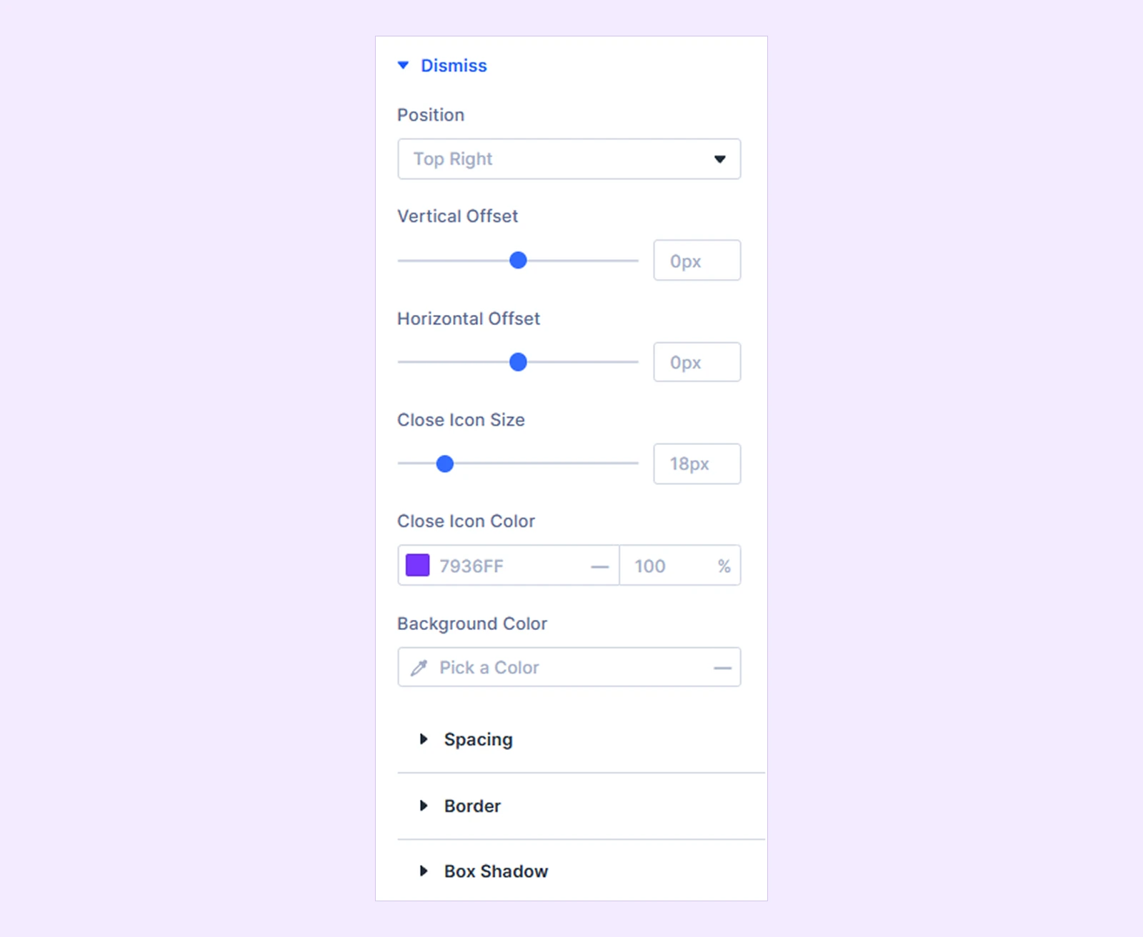
- Position: Anchor the dismiss icon using the dropdown (e.g., Top Right).
- Vertical Offset: Adjust the close icon’s vertical positioning with this slider.
- Horizontal Offset: Adjust the close icon’s horizontal positioning with this slider.
- Close Icon Size: Set the close icon’s dimensions in pixels.
- Close Icon Color: Customize the close icon’s hue using the color picker.
- Background Color: Set the dismiss area's background color.
You will also find Spacing, Border, and Box Shadow for further customization.
Sizing: Adjust the width, height, and alignment of the module.
Spacing: Add custom margin and padding to the module’s container.
Border: Customize the border style, width, and color. And style each border separately or apply the same style to all sides.
Box Shadow: Add shadow effects to the module.
Filters: Apply color filters to enhance the appearance.
Animation: Apply reveal animation effects and customize delay, duration, repeat settings, and animation type.
Advanced Tab
Use the Advanced tab to add custom CSS, display conditions, transitions, attributes, visibility settings, and other advanced controls to the individual switcher item.
Need Help?
If you have any questions or need assistance, contact our support team: [email protected]