The DiviFlash Testimonial Carousel Module lets you showcase customer feedback in an engaging and interactive carousel format.
Let’s see the settings in brief and how to make better use of it —
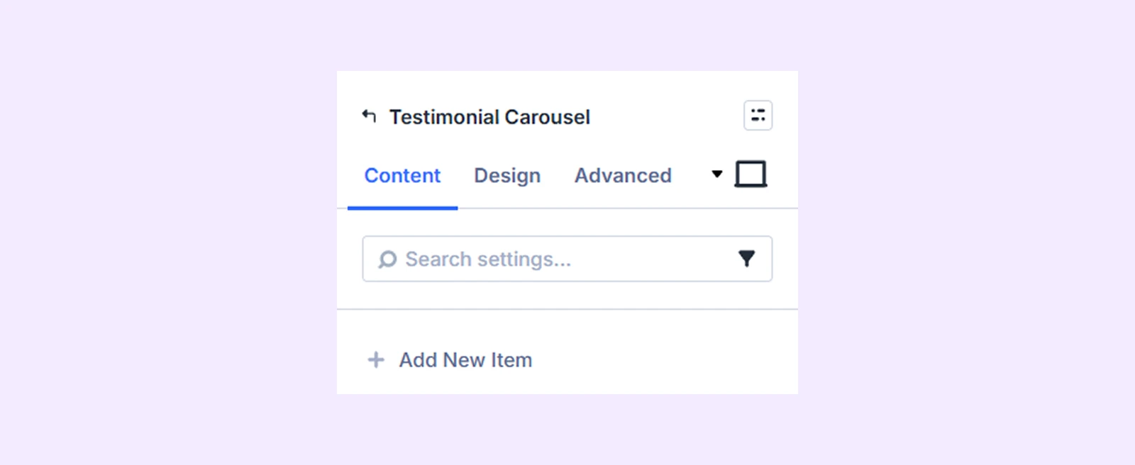
Content Tab
Use this tab to add testimonial items and configure carousel functionality.
Add New Item
Click the + Add New Item button to create a new testimonial. This opens the Testimonial Carousel Item Settings, where you can add and customize each testimonial individually. To learn more about customizing testimonial items separately, click here.
Carousel Settings
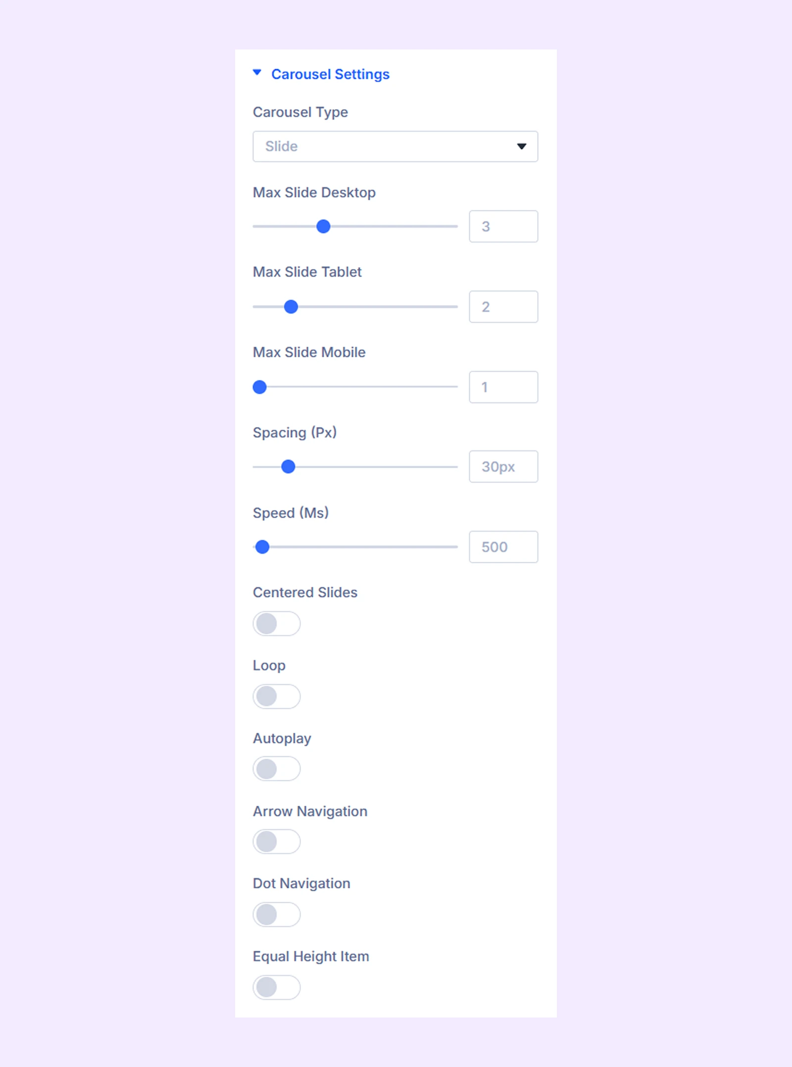
- Carousel Type: Choose between Slide or Coverflow layout.
- Max Slide Desktop: Choose the number of carousel items you want to display on desktop devices.
- Max Slide Tablet: Choose the number of carousel items you want to display on tablets.
- Max Slide Mobile: Choose the number of carousel items you want to display on mobile devices.
- Spacing: Adjust the space between the carousel items.
- Speed: Define the slide speed for the carousel items.
- Centered Slides: The first slide will be placed at the center when this option is toggled on.
- Loop: Enable this option to add a loop effect to the testimonial carousel.
- Autoplay: Enable this option to have the sliders rotate automatically.
- Autoplay Speed (Ms): Define the speed of the autoplay effect. Only available when autoplay is enabled.
- Pause on Hover: When enabled, the auto-playing slide will pause when hovered. Only available when autoplay is enabled.
- Arrow Navigation: Turn on to enable arrows to navigate the testimonial sliders.
- Dot Navigation: Turn on to enable dots to navigate the testimonial sliders.
- Equal Height Item: Enable this to make all the testimonial sliders equal in height.
Coverflow Settings
If you select “Coverflow” as the “Carousel Type,” you’ll gain access to coverflow slider customization settings.
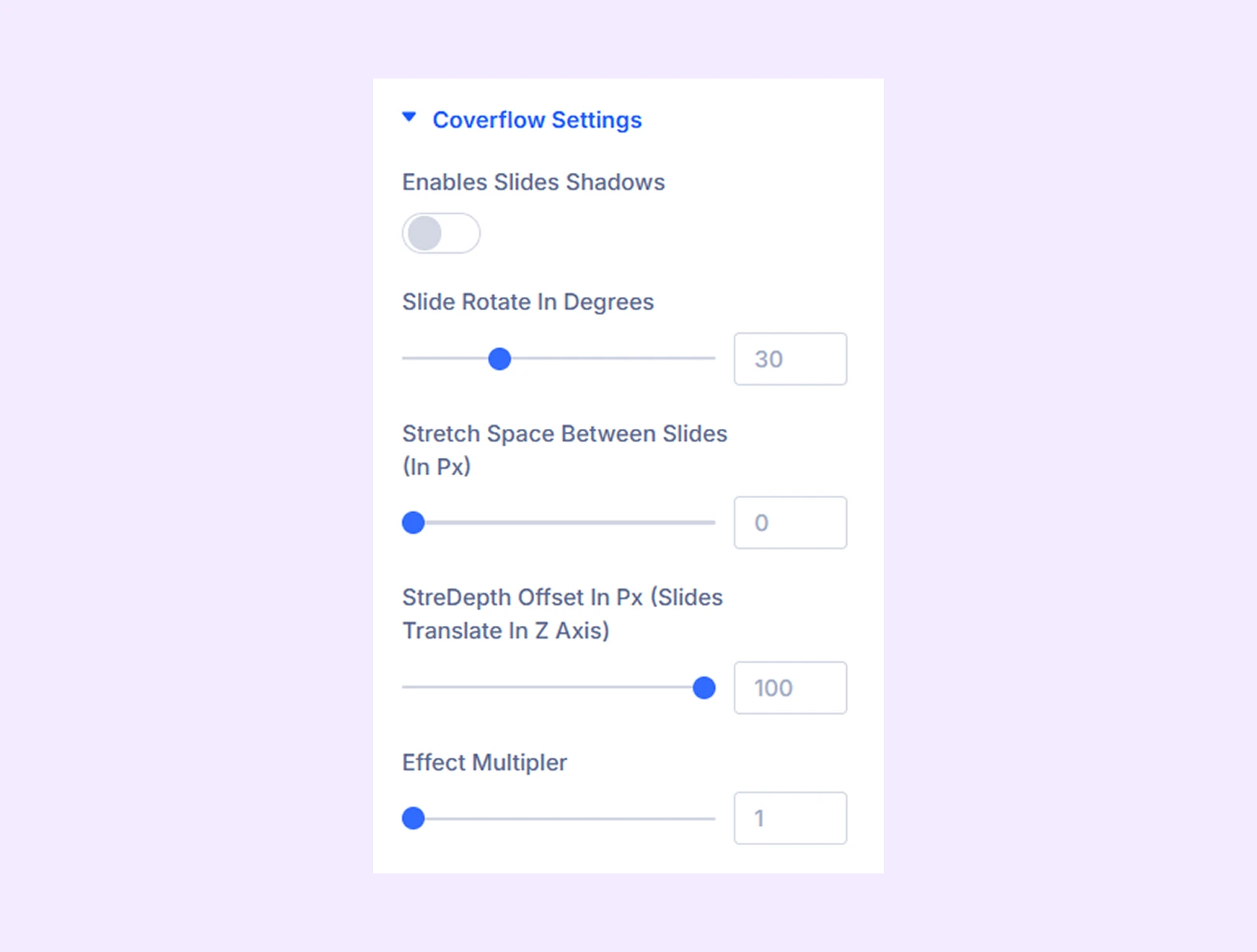
- Enables Slides Shadows: Turn on to add a shadow effect to the coverflow sliders.
- Slide Rotate in Degrees: Adjust the angle of the carousel items.
- Stretch Space Between the Slides (In Px): Adjust the gap between the slides.
- StreDepth Offset In Px (Sliders Translate In Z Axis): Adjust how far slides move along the Z-axis to create a deeper or flatter 3D perspective effect.
- Effect Multiplier: Determines how many times the carousel items will slide or rotate.
- Shadow Color Dark: Choose the darker shade for the shadow effect.
- Shadow Color Light: Choose the lighter shade for the shadow effect.
Note: The shadow color options are only available if the “Enables Slides Shadows” option is enabled.
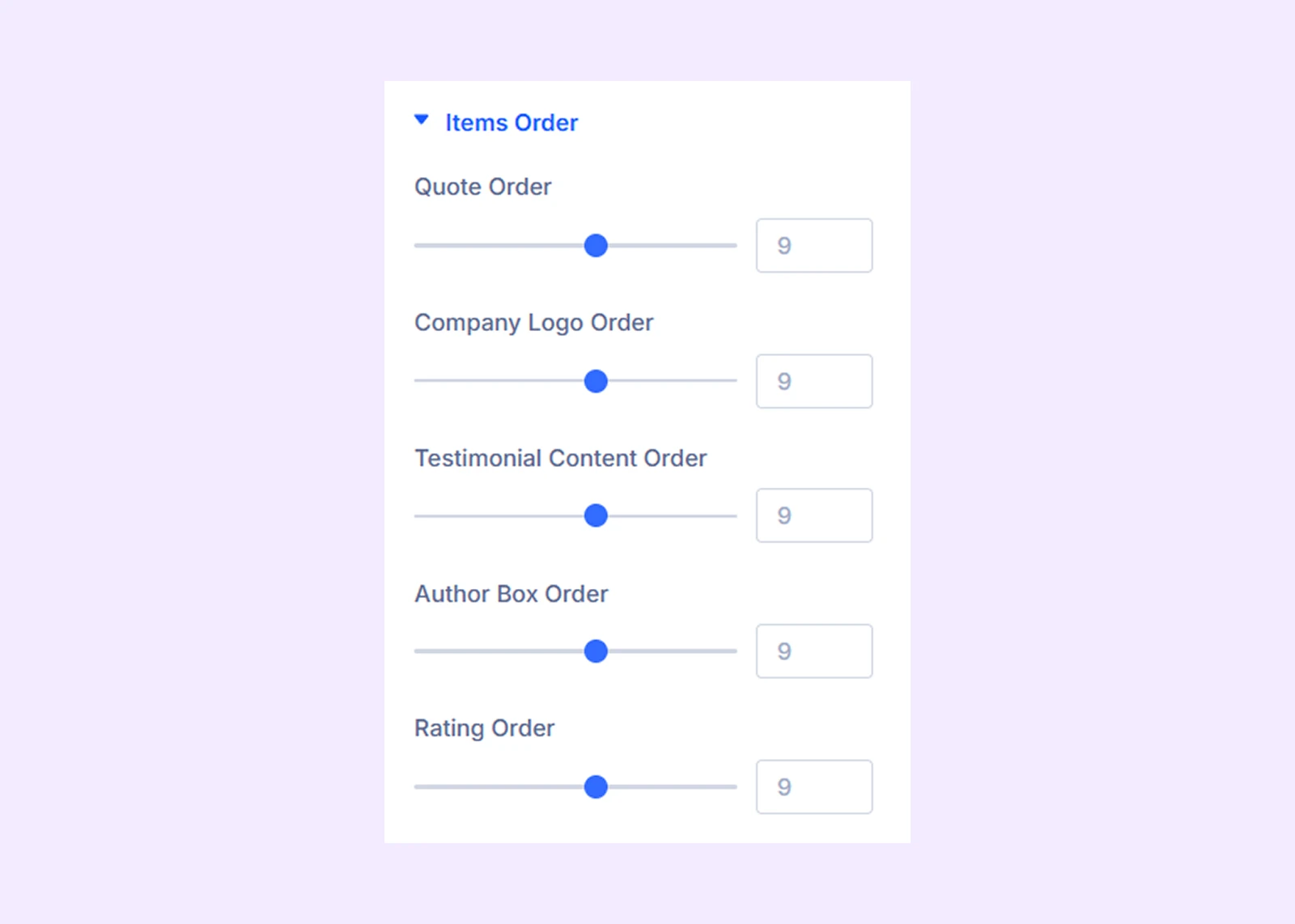
Items Order
Define the order of testimonial components by assigning numeric values. Available components include: Quote, Company Logo, Testimonial Content, Author Box, and Rating.
Textarea Background: Add a background color, gradient, or an image to all the testimonial sliders’ textarea.
Author Box Background: Add a background color, gradient, or image to all the testimonial sliders’ author boxes.
Rating Container Background: Add a background color, gradient, or image to all the testimonial sliders’ ratings.
Background: Add a background color, gradient, image, video, pattern, or mask to the module.
Element Label: Rename the module to organize it more easily in the Divi Builder. (Only you can see this label.)
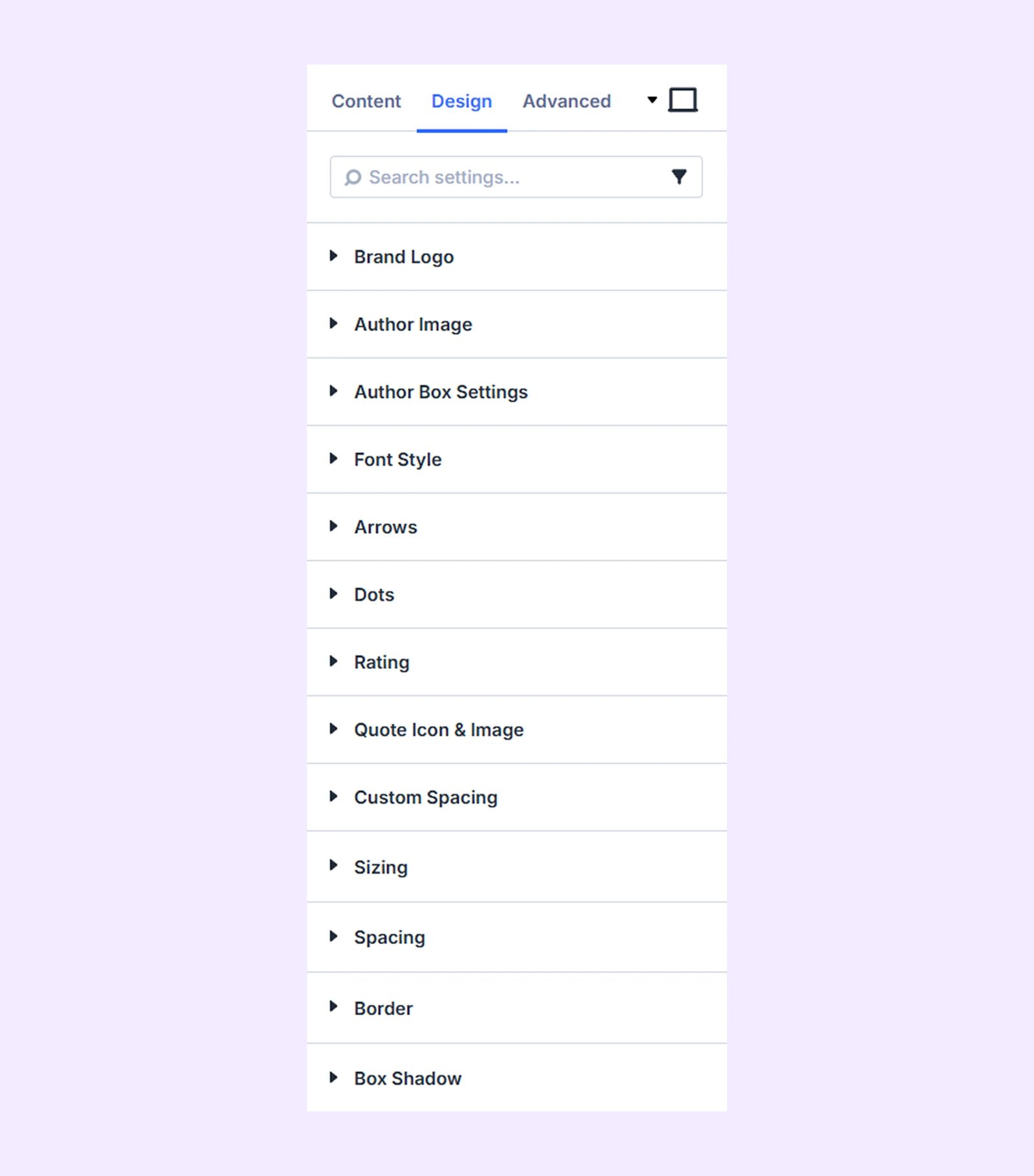
Design Tab
Use this tab to customize the visual appearance of the testimonial carousel.
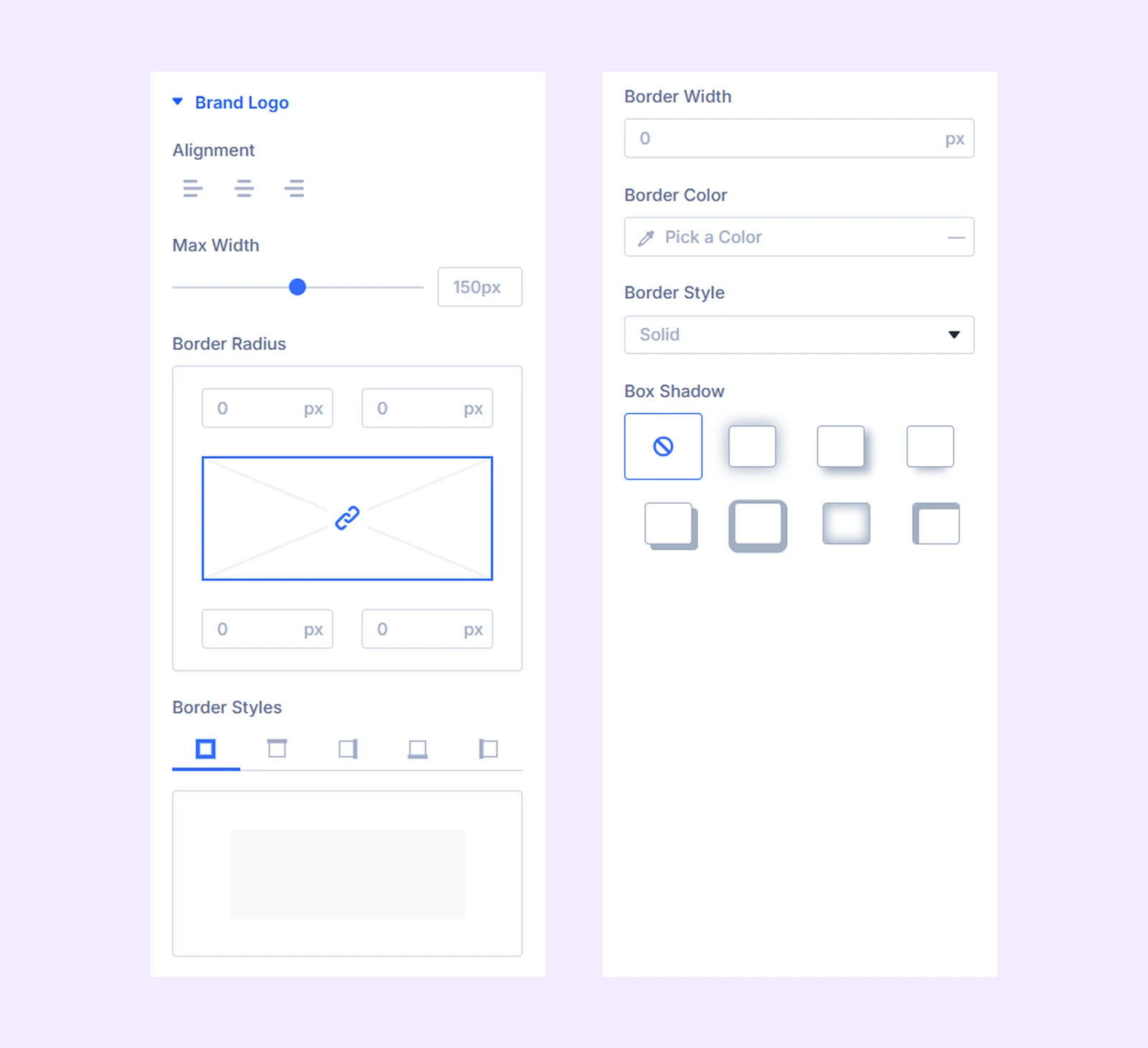
Brand Logo
- Alignment: Change the placement of the company logo in the testimonial slider.
- Max Width: Limit the maximum width of the company logo.
The next options are for customizing the border of the company logo which includes changing the border style, color, width, sharpness, and more.
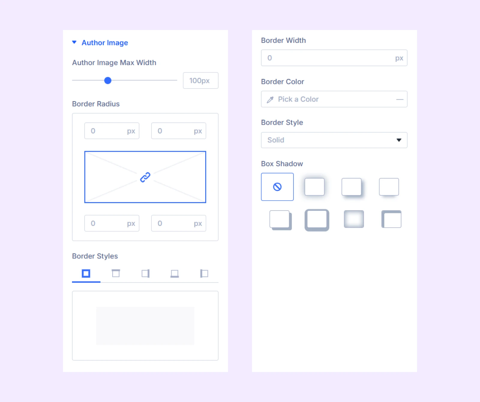
Author Image
- Author Image Max Width: Set a maximum width for the author image.
The next options are for customizing the border of the author’s image which includes changing the border style, color, width, sharpness, and more.
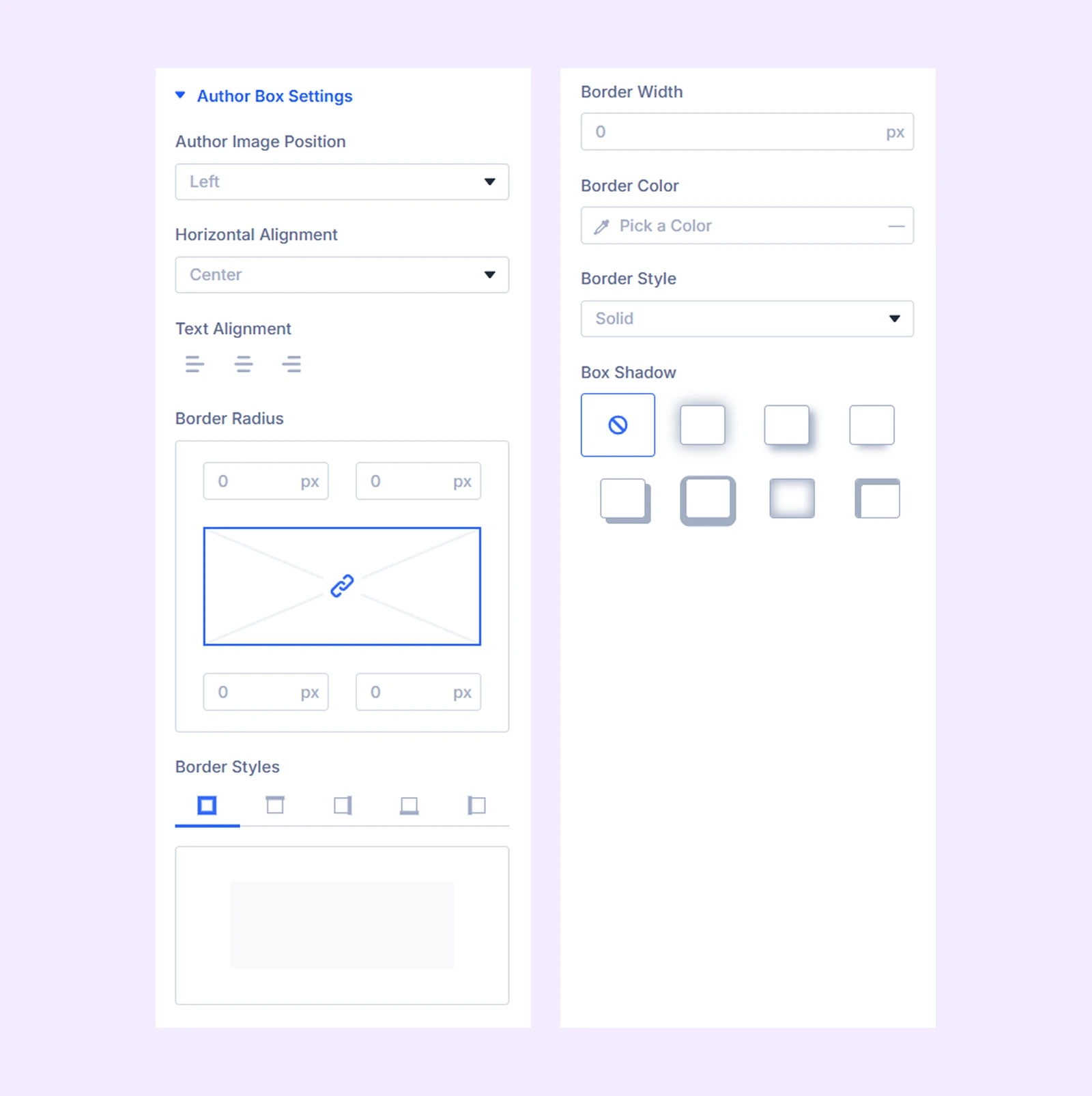
Author Box Settings
- Author Image Position: Change the position of the author box relative to the testimonial content.
- Horizontal Alignment: Move the author box (which contains the author name, job title, and company) to the left, right, or center within the testimonial slider.
- Text Alignment: Change the placement of the author name, job title, and company name respective to the author image.
The next options are for customizing the border of the author box which includes changing the border style, color, width, sharpness, and more.
Font Style: Different sets of typography options for the author name, job title, company name, and testimonial content.
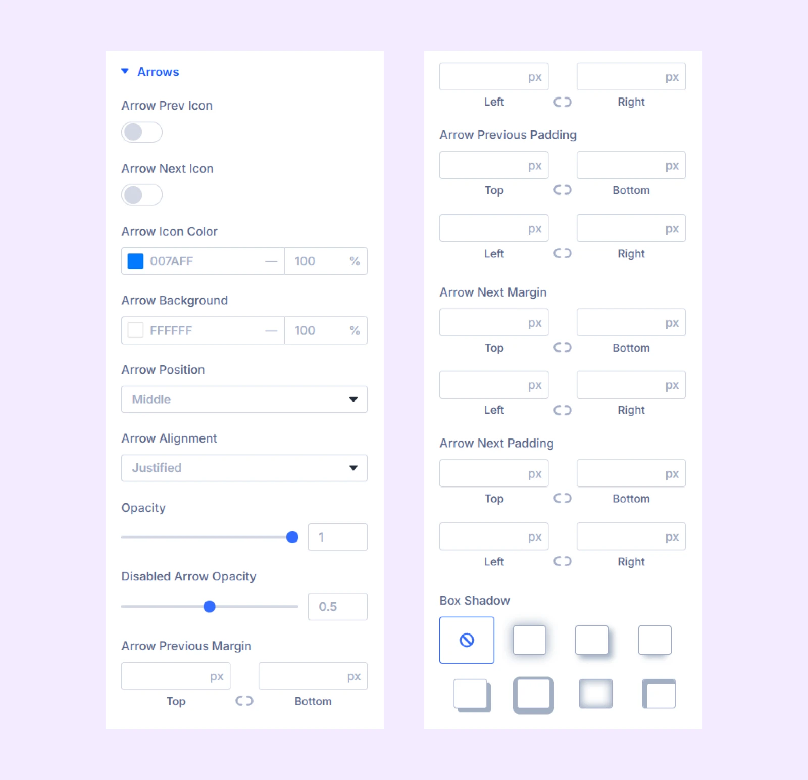
Arrows
- Arrow Prev Icon: Toggle on to use a custom icon for the previous button.
- Arrow Next Icon: Toggle on to use a custom icon for the next button.
- Arrow Icon Color: Pick a color for the arrow navigation icons.
- Arrow Background: Pick a background color for the arrow navigation icons.
- Arrow Position: Adjust vertical placement.
- Arrow Alignment: Adjust horizontal placement.
- Opacity: Adjust the transparency of the arrow buttons.
- Spacing: Add custom margin and padding to the arrow buttons.
- Circle Arrow: Enable to make the arrow buttons circular.
- Box Shadow: Add a shadow effect to the arrows.
Additional spacing controls are available for fine-tuning arrow positioning.
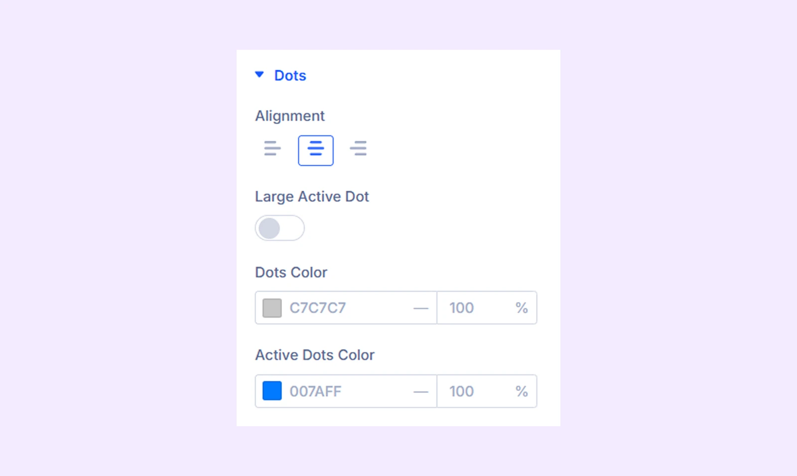
Dots
- Alignment: Change the horizontal position of the dots relative to the testimonial sliders.
- Large Active Dot: Make the active dot larger than the rest.
- Dots Color: Pick a color for the dots.
- Active Dots: Pick a separate color for the active dot.
Rating: Change the rating icon’s color, horizontal position, icon size, and the space between the icons.
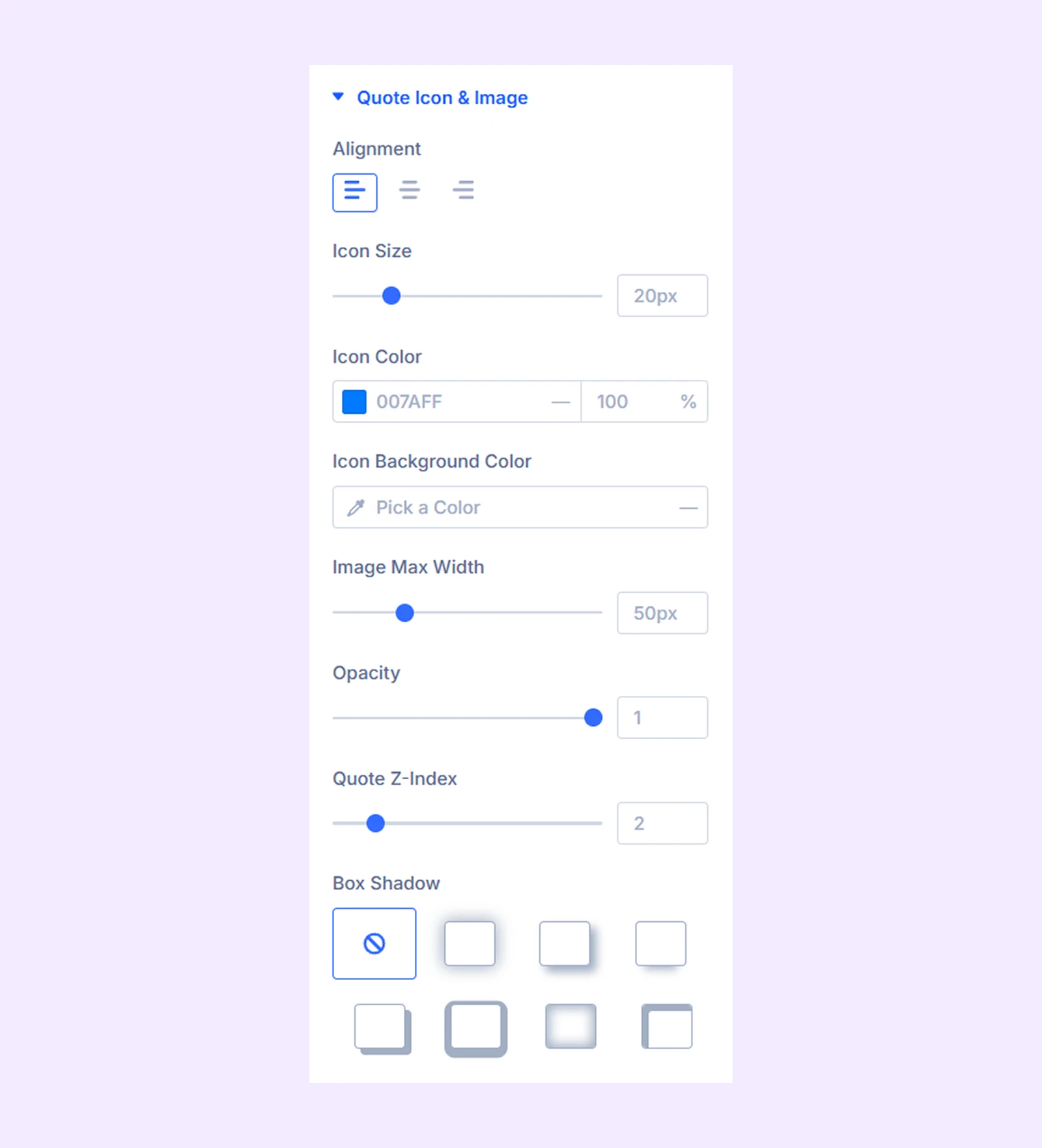
Quote Icon and Image
- Alignment: Change the horizontal position of the quote icon or image respective to the testimonial content.
- Icon Size: Adjust the size of the quote icons.
- Icon Color: Change the color of the quote icons.
- Icon Background Color: Add a color to the quote icons’ background.
- Image Max Width: Set the maximum width of the quote images.
- Opacity: Adjust the transparency of the quote icons and images.
- Quote Z-index: Increase the z-index to make the quote icons or images appear over the testimonial content and vice versa.
- Box Shadow: Apply a shadow effect to the quote icons or images.
Custom Spacing: Add custom margin and padding to each item of the carousel, including testimonial content, author’s name, brand logo, and more.
Sizing: Adjust the width, height, and alignment of the module.
Spacing: Add custom margin and padding to the module’s container.
Border: Customize the border style, width, and color. And style each border separately or apply the same style to all sides.
Box Shadow: Add shadow effects to the module.
Advanced Tab
This tab provides additional settings for advanced users who want greater control over the module with custom code, conditions, and more.
Testimonial Carousel Item Settings
Each testimonial item can be customized individually. Settings here override the main module settings.
Content Tab
Content
Add content to the testimonial slider, such as author name, job title, company name, testimonial, and more.
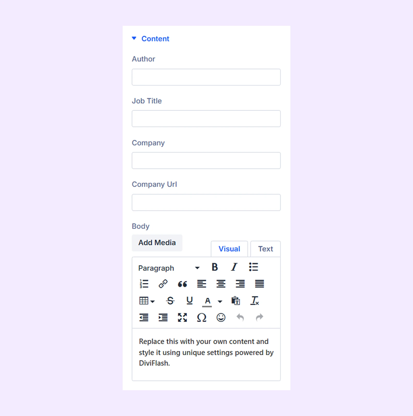
Images: Add the author image, company logo, and their respective alt text.
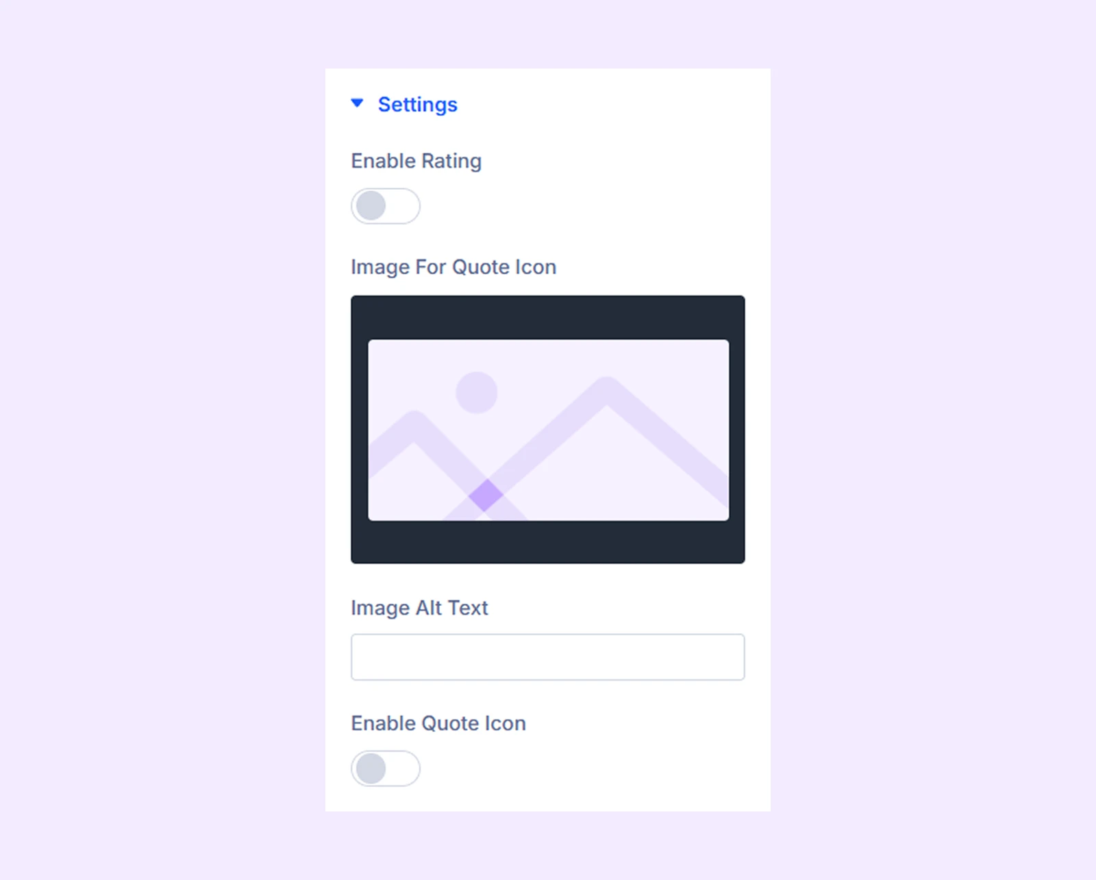
Settings
- Enable Rating: Turn on to show ratings in the testimonial slider.
- Rating Scale Type: Choose between a 5-star or a 10-star rating type.
- Rating Value: Adjust the star rating to your desired score.
- Enable Quote Icon: Enable to use of an icon to denote the testimonial quote.
Link: Comes by default with Divi. No real use case.
Background: Add a background color, gradient, image, and more to the carousel items separately.
Admin Label: Change the module name or label if required which will only be visible to you.
Design Tab
Provides styling options similar to those in the main module but applied to individual testimonial items.
Advanced Tab
The default tab for all Divi modules is used to add custom CSS code, conditions, visibilities, etc.
Need Help?
If you have any questions or need assistance, contact our support team: [email protected]