DiviFlash Flip Box module lets you create interactive boxes that flip to reveal hidden content when hovered over.
Let’s see the settings in brief and how to make better use of it —
Content Tab
This tab contains the settings for configuring the front and back sides of the flip box.
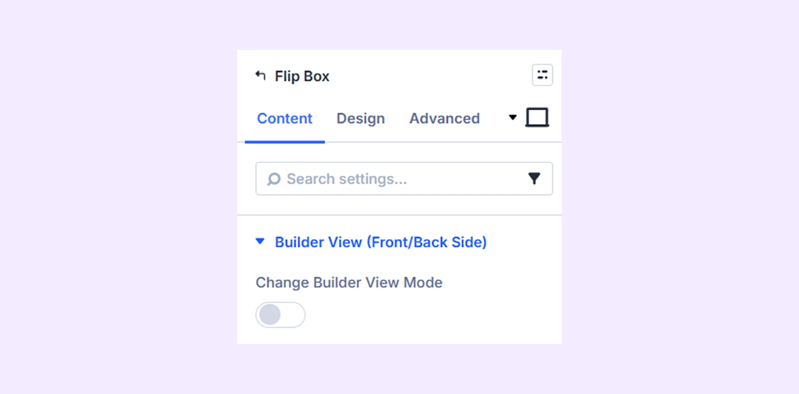
Builder View (Front/Back Side)
Change Builder View Mode: Use this toggle to switch between the front and back sides of the flip box while editing. This will help you edit both sides in the builder.
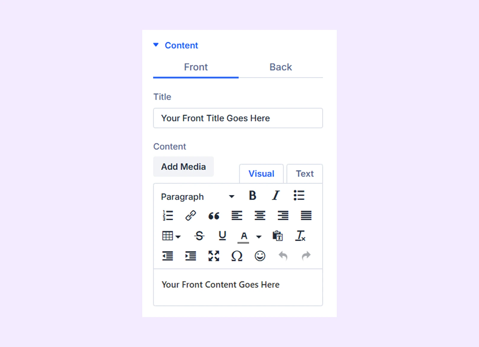
Content
Enter the title and content for both the front and back sides of the flip box.
Button For Back Side: Enter the button text, URL, and link target for the back side of the flip box.
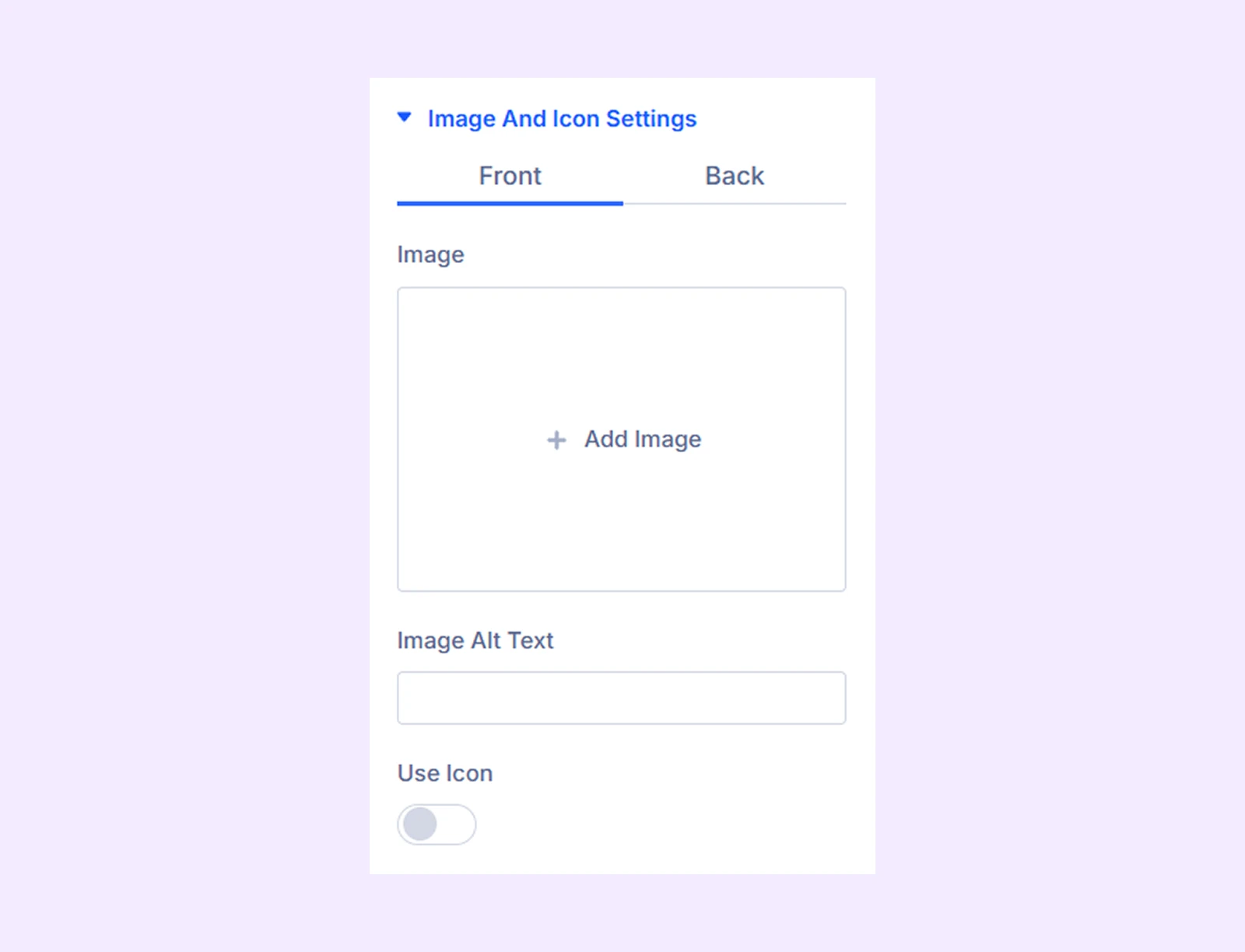
Image and Icon Settings
Upload an image for the front and back sides of the flip box or use an icon instead. You can also customize the icon size, color, and related settings.
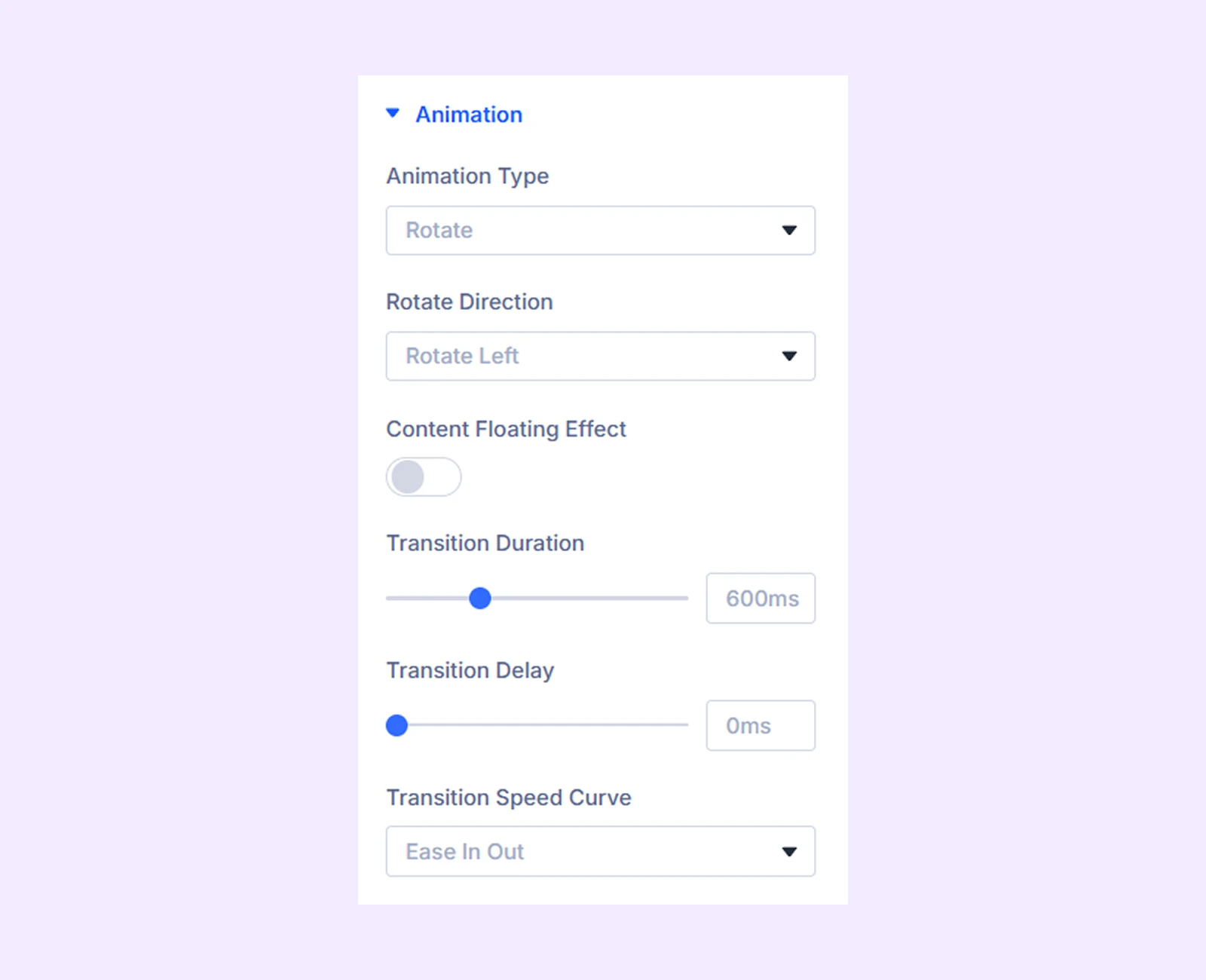
Animation
- Animation Type: Choose the animation style for the flip box.
- Rotate Direction: Choose the direction of the rotation animation. (Available when “Rotate” is selected as Animation Type.)
- Content Floating Effect: Enable this option to add a floating effect to the animation. (Available when “Rotate” is selected as Animation Type.)
- Translate Z: Control the depth of the floating effect.
- Scale: Adjust the size of the floating content.
- Transition Duration: Set the duration of the animation.
- Transition Speed Curve: Choose the easing style that controls how the animation moves over time.
- Zoom Direction: Choose the direction of the zoom animation. (Available when “Zoom” is selected as Animation Type.)
- Slide Direction: Choose the direction of the slide animation. (Available when “Slide” is selected as Animation Type.)
- Transition Duration: Adjust the speed of the animation effect.
- Transition Delay: Set the delay before the animation begins.
- Transition Speed Curve: Choose the easing style that controls how the animation progresses.
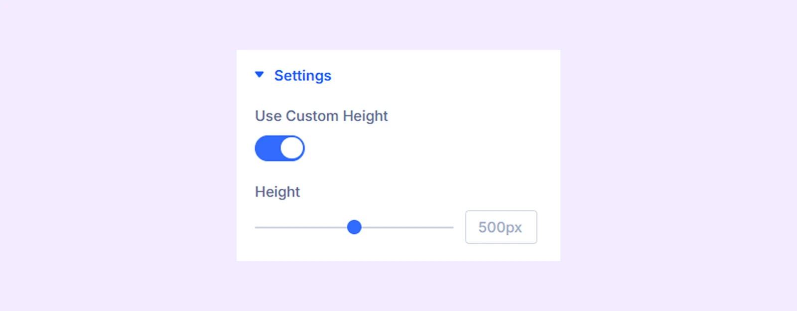
Settings
Use Custom Height: Enable this option to set a custom height for the flip box.
Background Front Side: Add background color options for the front side of the flip box.
Background Back Side: Add background color options for the back side of the flip box.
Link: Use this default Divi setting to add a link to the entire module.
Background: Add a background color, gradient, image, video, pattern, or mask to the module.
Element Label: Rename the module to organize it more easily in the Divi Builder. (Only you can see this label.)
Design Tab
Use this tab to customize the visual appearance of the flip box.
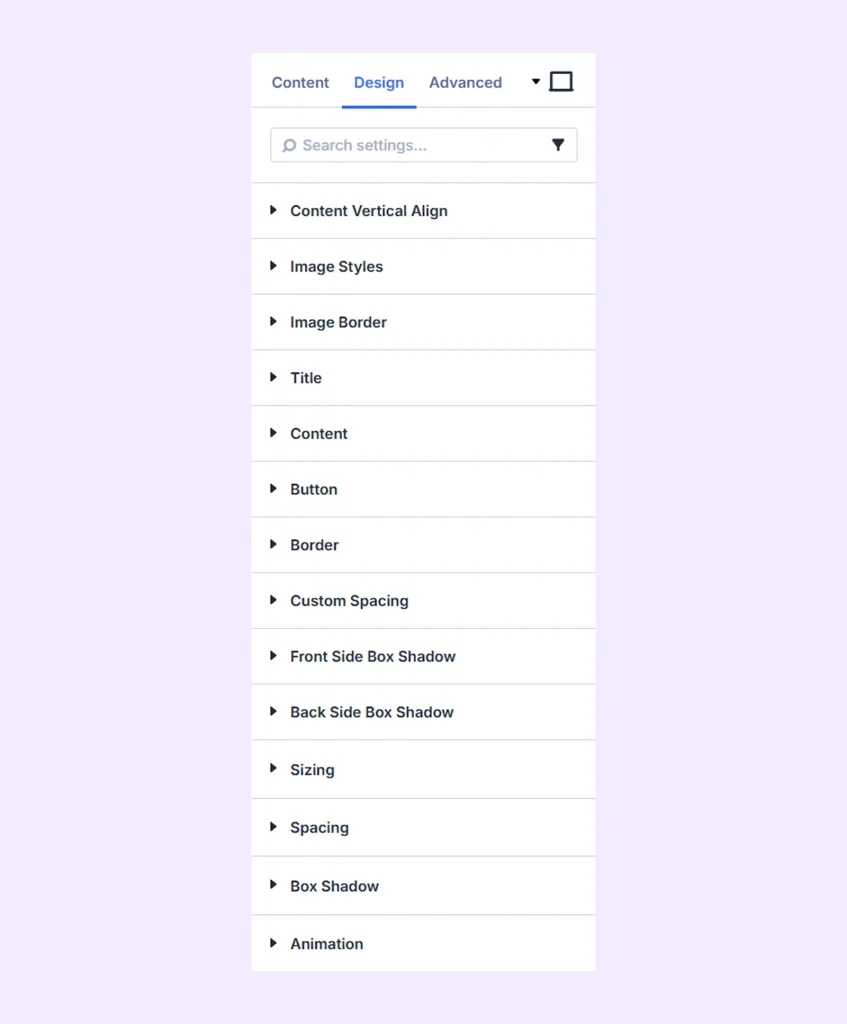
Content Vertical Align
Adjust the vertical alignment of the content for both the front and back sides of the flip box.
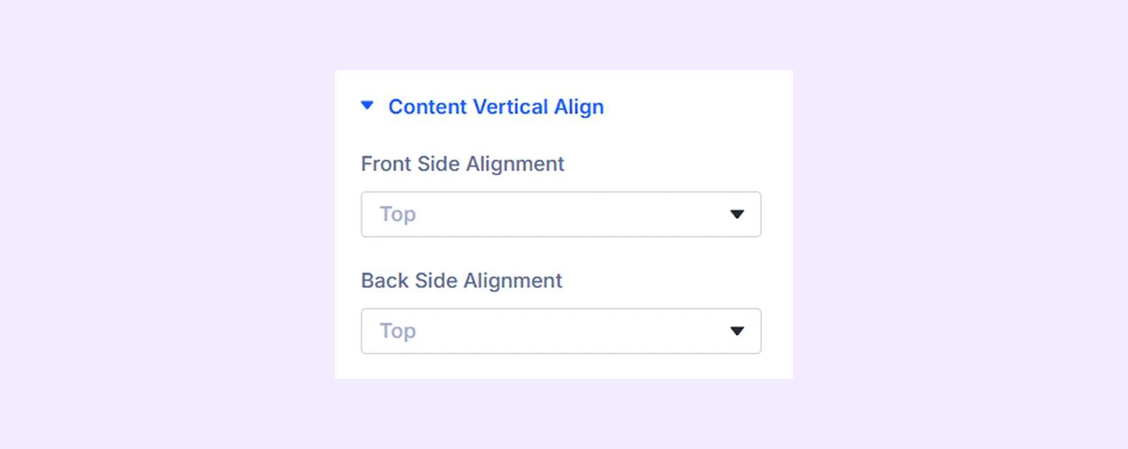
Image Styles
- Image Alignment: Adjust the horizontal alignment of the image on the front side.
- Force Full Width: Enable this option to make the image full width according to its container.
- Max Width: Set a maximum width limit for the flip box image.
Note: The same options are available for the backside image of the flip box.
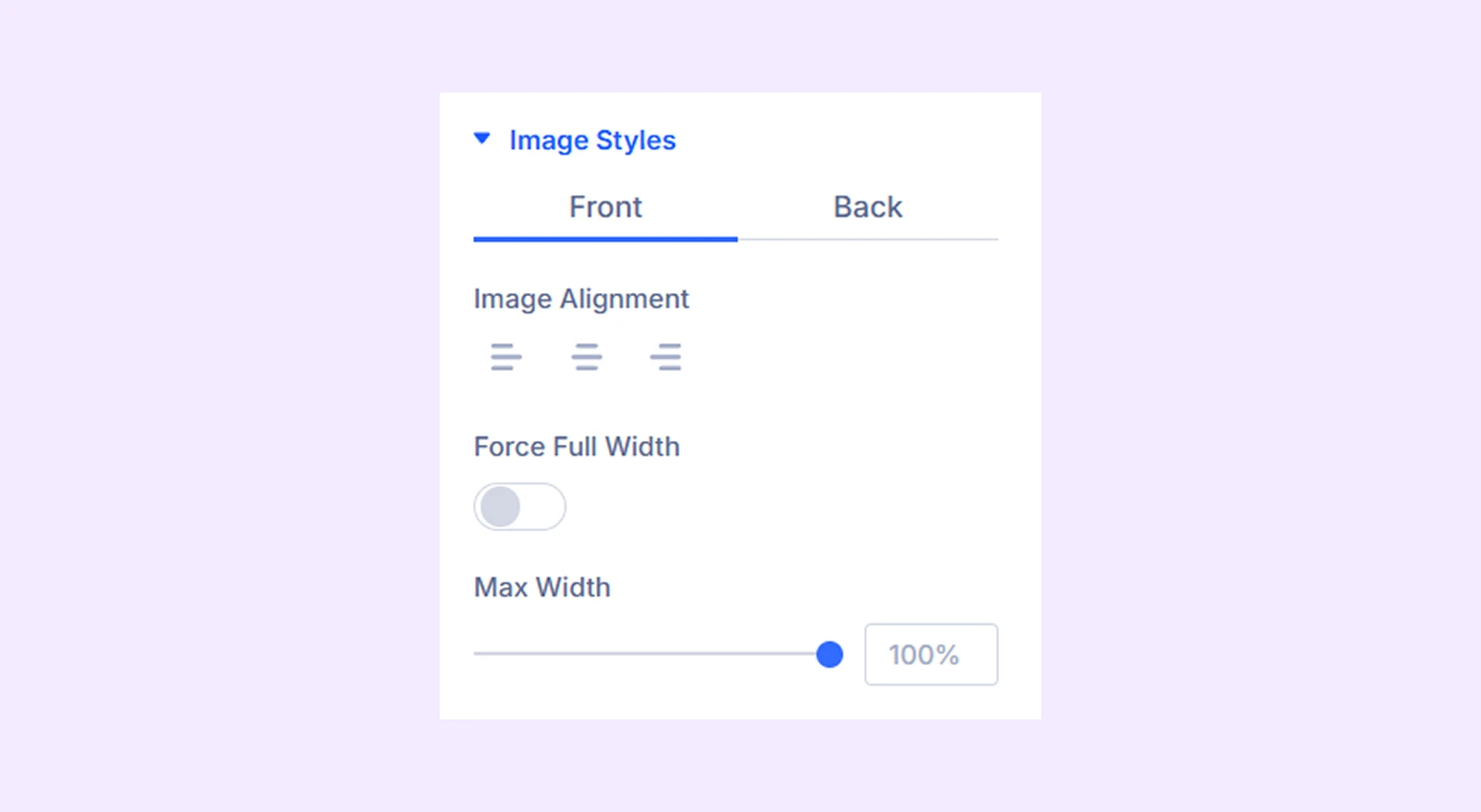
Image Border: Customize the border settings for the images on both sides of the flip box.
Title: Customize the typography settings for the title on both the front and back sides.
Content: Customize the typography settings for the content on both sides of the flip box.
Button: Customize the alignment, background, typography, and border settings for the back side button.
Border: Customize the border settings for both sides of the flip box.
Custom Spacing: Adjust the margin and padding for each component of the flip box.
Front Side Box Shadow: Add shadow effects to the front side of the flip box.
Back Side Box Shadow: Add shadow effects to the back side of the flip box.
Sizing: Adjust the width, height, and alignment of the module.
Spacing: Add custom margin and padding to the module’s container.
Box Shadow: Add shadow effects to the module.
Animation: Apply reveal animation effects and customize delay, duration, repeat settings, and animation type.
Advanced Tab
This tab provides additional settings for advanced users who want greater control over the module with custom code, conditions, and more.
Need Help?
If you have any questions or need assistance, contact our support team: [email protected]