DiviFlash Before-After Image Slider module lets you visually compare two images side-by-side using an interactive slider.
Activation Required: This module is disabled by default. To use it, you must enable it manually. Refer to our guide for step-by-step instructions.
Let’s see the settings in brief and how to make better use of it —
Content Tab
This tab contains the settings for adding images and configuring the slider behavior.
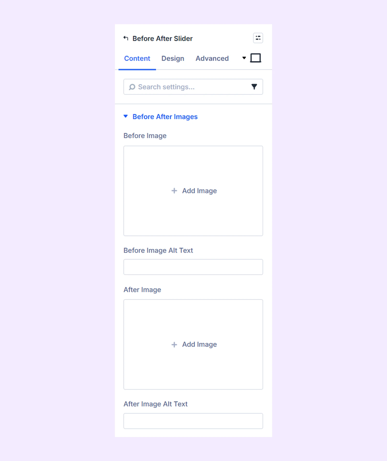
Before After Images
- Before Image: Upload the image that will appear in the “Before” view.
- Before Image Alt Text: Add alternative text for the before image.
- After Image: Upload the image that will appear in the “After” view.
- After Image Alt Text: Add alternative text for the after image.
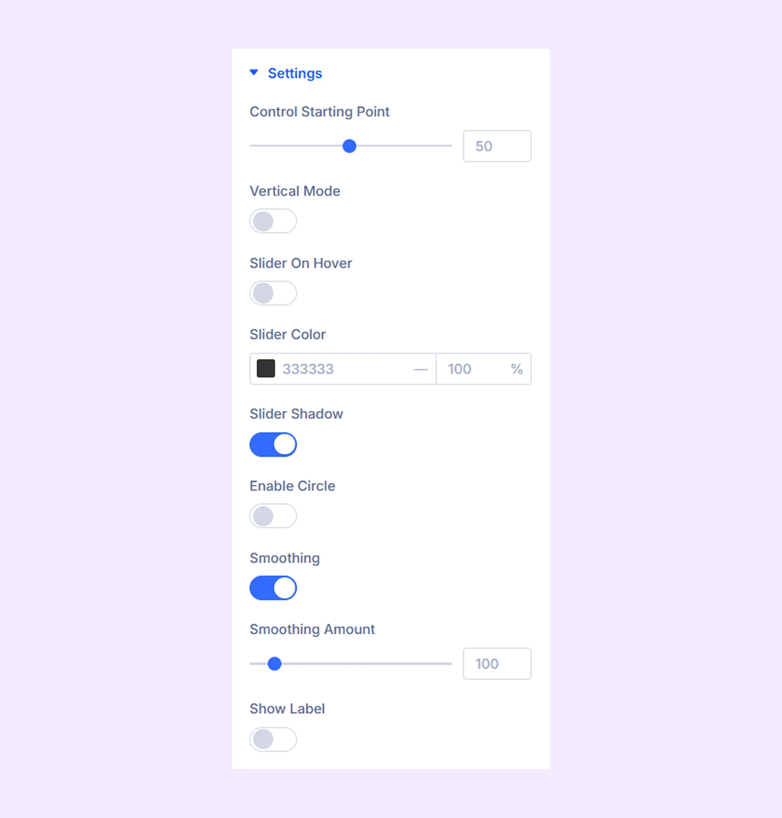
Settings
- Control Starting Point: Set the initial position of the slider between the before and after images.
- Vertical Mode: Enable this option to switch the slider orientation to vertical.
- Slider on Hover: Enable this option to move the slider with the mouse cursor on hover.
- Slider Color: Choose the color of the slider line.
- Slider Shadow: Add a shadow effect to the slider line.
- Enable Circle:Display a circular handle for the slider indicator.
- Enable Circle Blur: Blur the background behind the circular handle.
- Smoothing: Enable smooth movement while dragging the slider.
- Show Label:Display “Before” and “After” labels on the images. You can also use custom label text.
- Label Show on Hover: Show labels only when hovering over the slider.
- Use Horizontal Position: Adjust the horizontal position of the labels.
Background: Add a background color, gradient, image, video, pattern, or mask to the module.
Element Label: Rename the module to organize it more easily in the Divi Builder. (Only you can see this label.)
Design Tab
Use this tab to customize the visual appearance of the before-after slider module.
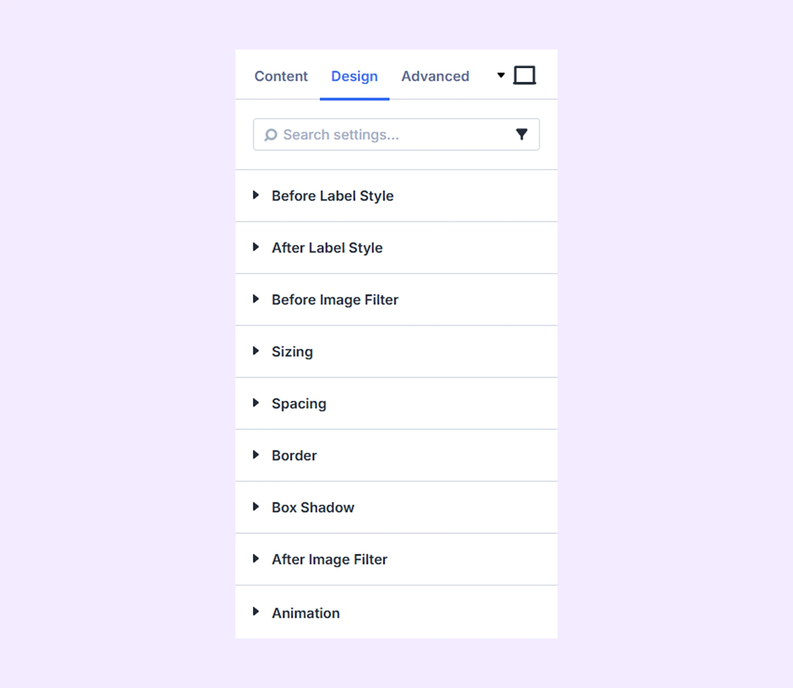
Before Label Style: Customize the background, typography, and border of the “Before” label.
After Label Style: Customize the background, typography, and border of the “After” label.
Before Image Filter: Apply color filter effects to the before image.
Sizing: Adjust the width, height, and alignment of the module.
Spacing: Add custom margin and padding to the module’s container.
Border: Customize the border style, width, and color. And style each border separately or apply the same style to all sides.
Box Shadow: Add shadow effects to the module.
After Image Filter: Apply different color filters to the after image.
Animation: Add reveal animation effects and control the animation style, delay, duration, and more.
Advanced Tab
This tab provides additional settings for advanced users who want greater control over the module with custom code, conditions, and more.
Need Help?
If you have any questions or need assistance, contact our support team: [email protected]