DiviFlash Advanced Heading module lets you create stylish and customizable headings for your Divi website.
Let’s see the settings in brief and how to make better use of it —
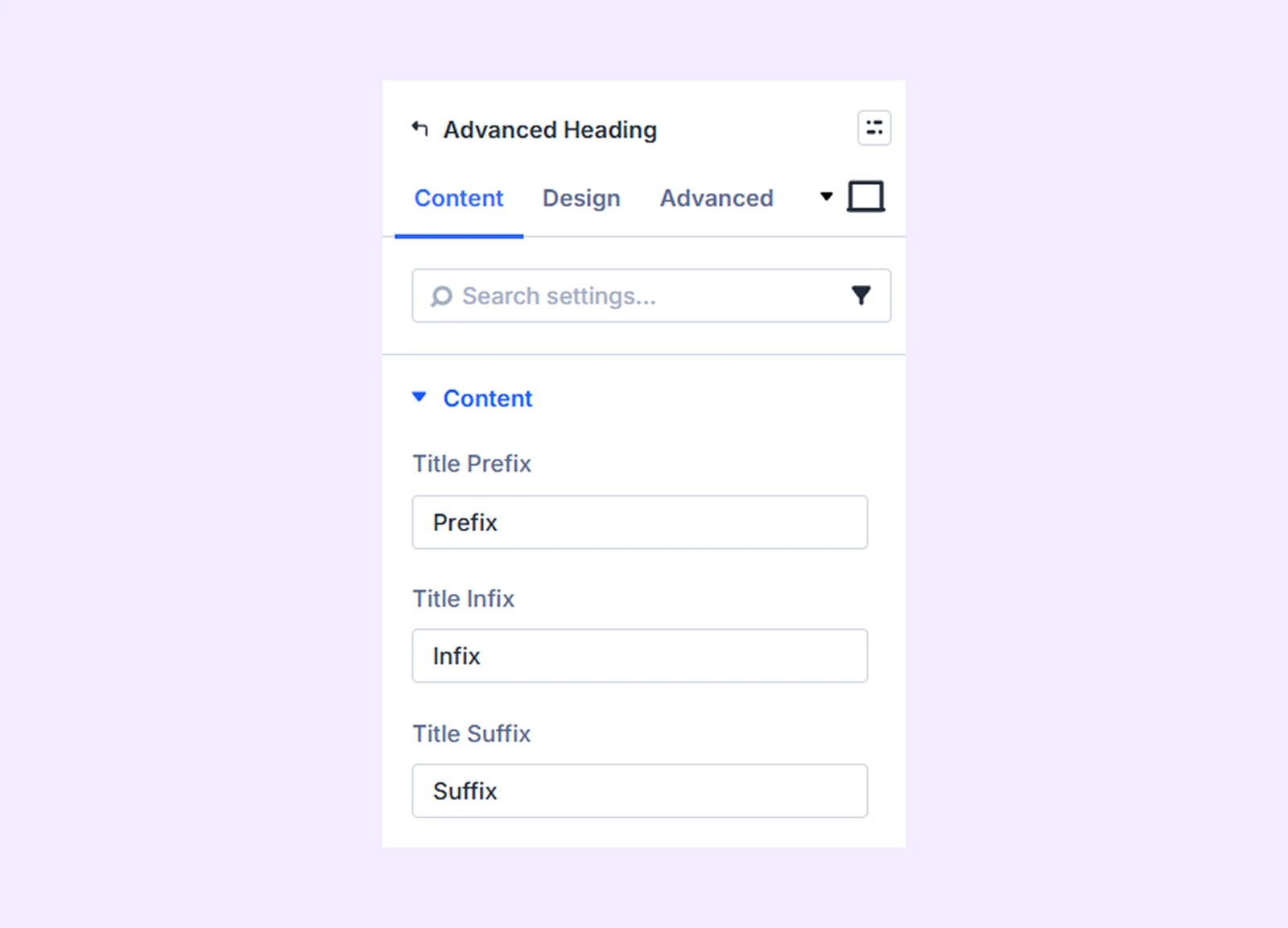
Content Tab
This tab contains the settings for adding and configuring the heading content.
Content
Enter the heading text. For styling flexibility, the heading is divided into three parts:
- Prefix
- Infix
- Suffix
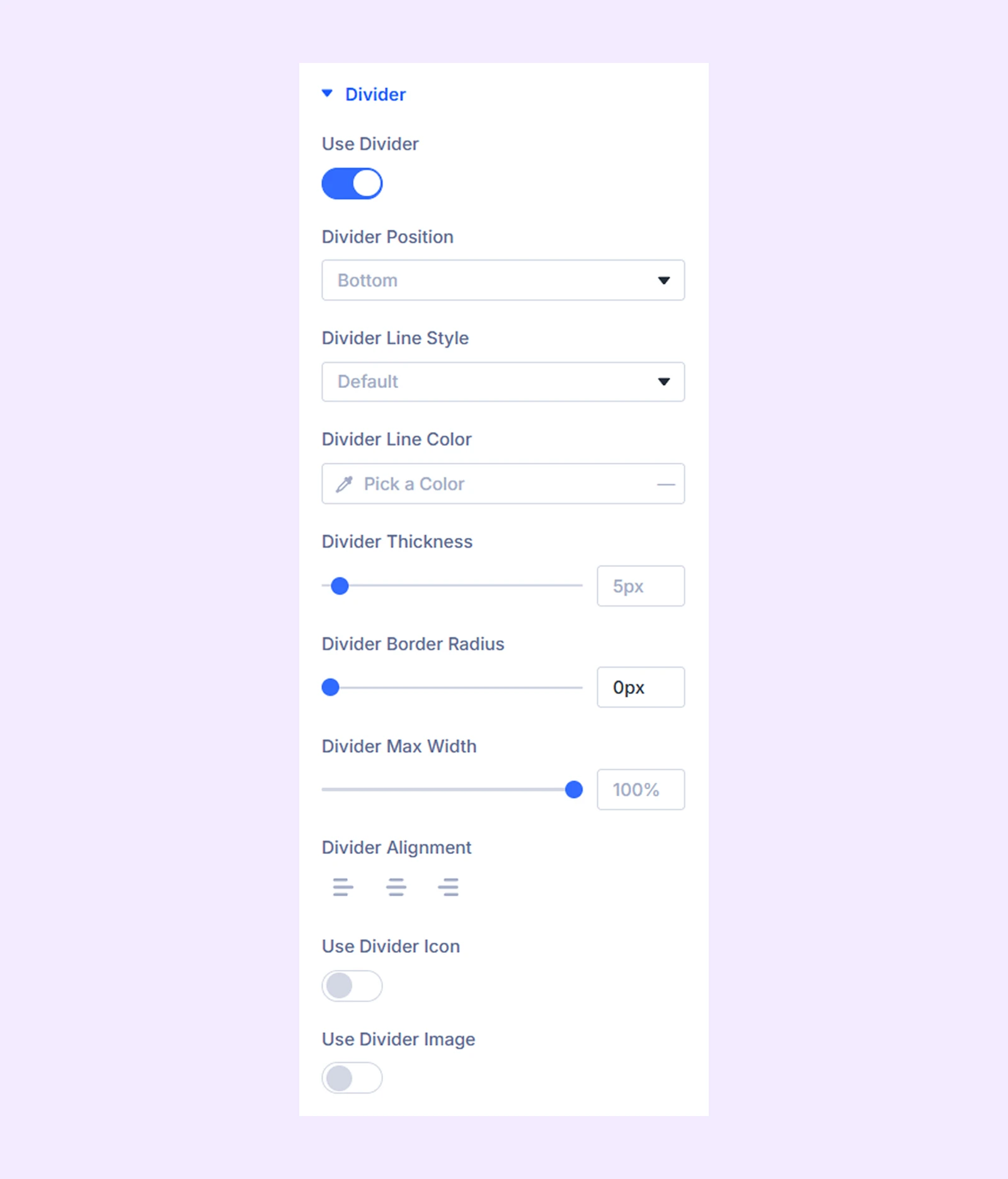
Divider
- Use Divider: Enable this option to display a divider with the heading. THe following settings will appear as you enable divider:
- Divider Position: Choose whether the divider appears above or below the heading.
- Divider Line Style: Select one of the available divider styles.
- Divider Color: Choose the color of the divider line.
- Divider Thickness: Adjust the thickness of the divider line.
- Divider Border Radius: Control the roundness of the divider edges.
- Divider Max Width: Set the maximum width of the divider line.
- Divider Alignment: Adjust the horizontal alignment of the divider. (Available only when the Divider Max Width is less than 100%.)
- Use Divider Icon: Enable this option to display an icon in the divider.
- Divider Icon Alignment: Adjust the horizontal alignment of the icon relative to the divider line.
- Divider Icon Color: Choose the color of the divider icon.
- Divider Icon Background Color: Choose the background color for the icon.
- Icon Circle: Enable this option to display the icon inside a circular container.
- Divider Icon Size: Adjust the size of the divider icon.
- Use Divider Image: Enable this option to use an image instead of an icon in the divider.(This option is not available when “Use Divider Icon” is enabled.)
- Image Alt text: Add alternative text for the divider image.
- Divider Image Max Width: Set the maximum width of the divider image.
- Divider Image Alignment: Adjust the horizontal alignment of the divider image.
- Divider Image Background Color: Choose the background color behind the divider image.
- Image Circle: Enable this option to display the image inside a circular container.
Divider Line Background: Add a background color, gradient, or image to the divider line.
Prefix, Infix, and Suffix Background: Add background styling to each heading segment.
Link: Use this default Divi setting to add a link to the entire module.
Background: Add a background color, gradient, image, video, pattern, or mask to the module.
Element Label: Rename the module to organize it more easily in the Divi Builder. (Only you can see this label.)
Design Tab
Use this tab to customize the appearance and layout of the heading.
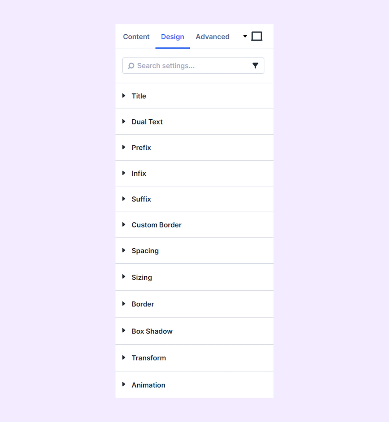
Title: Customize the typography settings for the heading text.
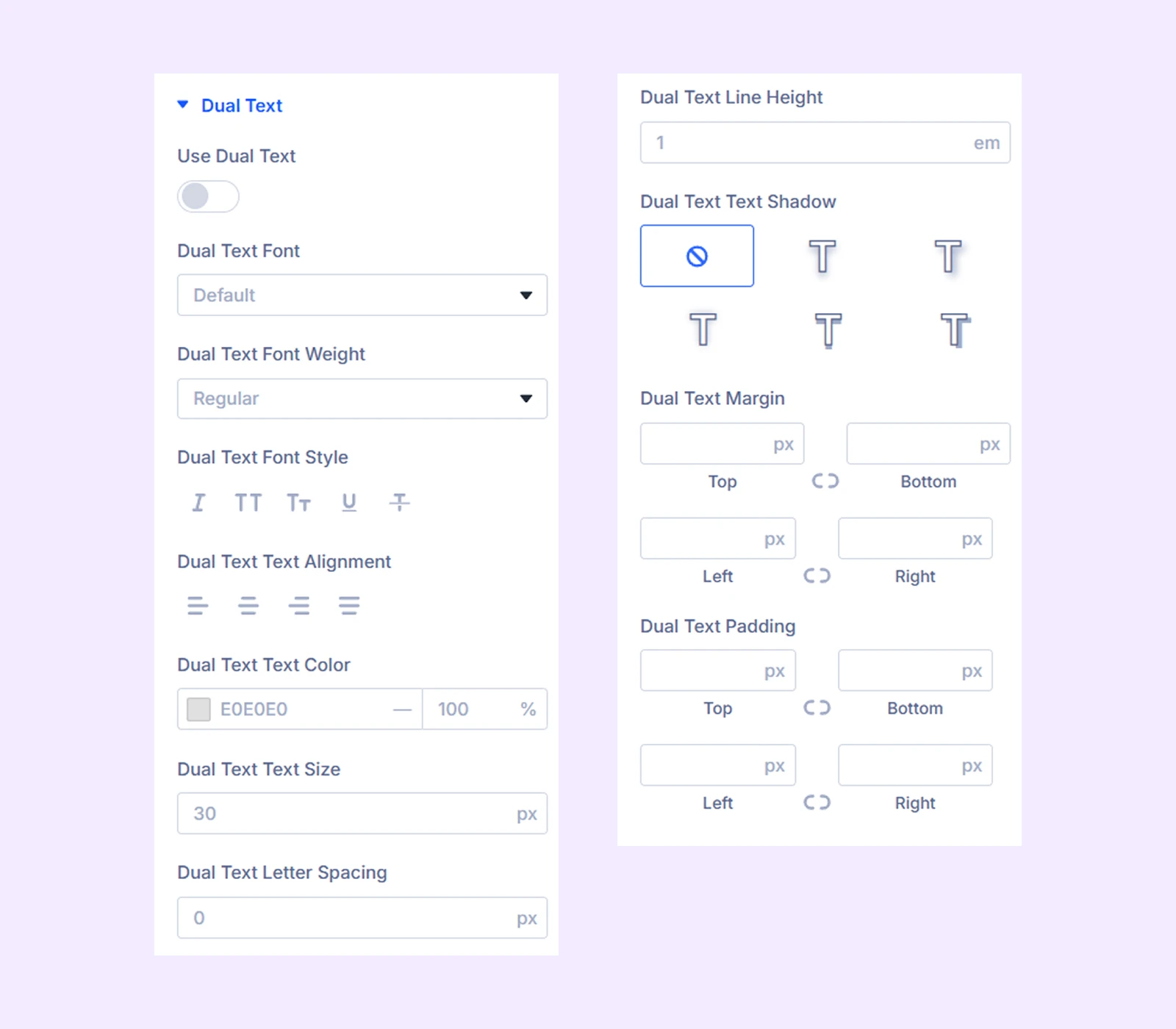
Dual Text
- Use Dual Text: Enable this option to display dual text styling.
- Custom Text: Enable this option to replace the heading with custom text.
- Custom Text Input: Enter the custom text to display.
Additional settings allow you to adjust spacing and typography for the dual text.
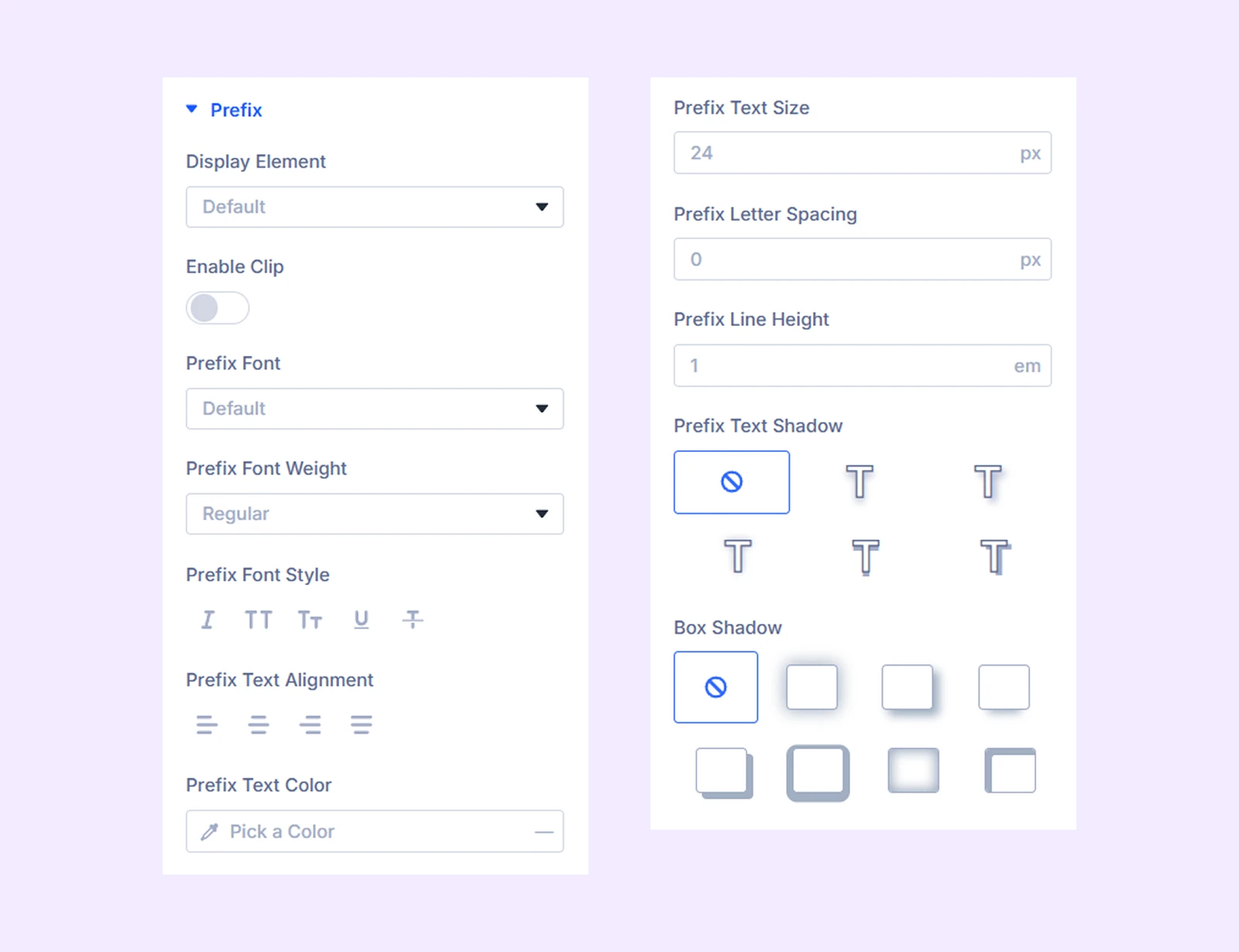
Prefix
- Display Element: Choose whether the prefix displays as inline text or block text.
- Max Width: Set the maximum width of the prefix container. (Available when Display Element is set to Block.)
- Alignment: Adjust the horizontal alignment of the prefix container. (Available when Display Element is set to Block.)
- Enable Clip: Enable this option to apply a clip effect to the heading text.
- Enable Background Clip: Enable this option to apply a clip effect to the background.
- Fill Color: Choose the fill color of the clip effect.
- Stroke Color: Choose the stroke color of the clip effect.
- Stroke Width: Adjust the width of the stroke.
Additional settings allow you to customize the typography of the prefix.
Infix: The Infix section contains the same styling options as the Prefix section, but applies them to the infix text.
Suffix: The Suffix section contains the same styling options as the Prefix section, but applies them to the suffix text.
Custom Border: Customize the border styling for the prefix, infix, and suffix.
Spacing: Add custom margin and padding to the module’s container.
Sizing: Adjust the width, height, and alignment of the module.
Border: Customize the border style, width, and color. And style each border separately or apply the same style to all sides.
Box Shadow: Add shadow effects to the module.
Transform: Scale, rotate, move, or skew the module.
Animation: Apply reveal animation effects and customize delay, duration, repeat settings, and animation type.
Advanced Tab
This tab provides additional settings for advanced users who want greater control over the module with custom code, conditions, and more.
Need Help?
If you have any questions or need assistance, contact our support team: [email protected]