DiviFlash Vertical Menu module lets you create vertical navigation menus on your Divi website.
Activation Required: This module is disabled by default. To use it, you need to enable it manually. Refer to our guide for step-by-step instructions.
Let’s see the settings in brief and how to make better use of it —
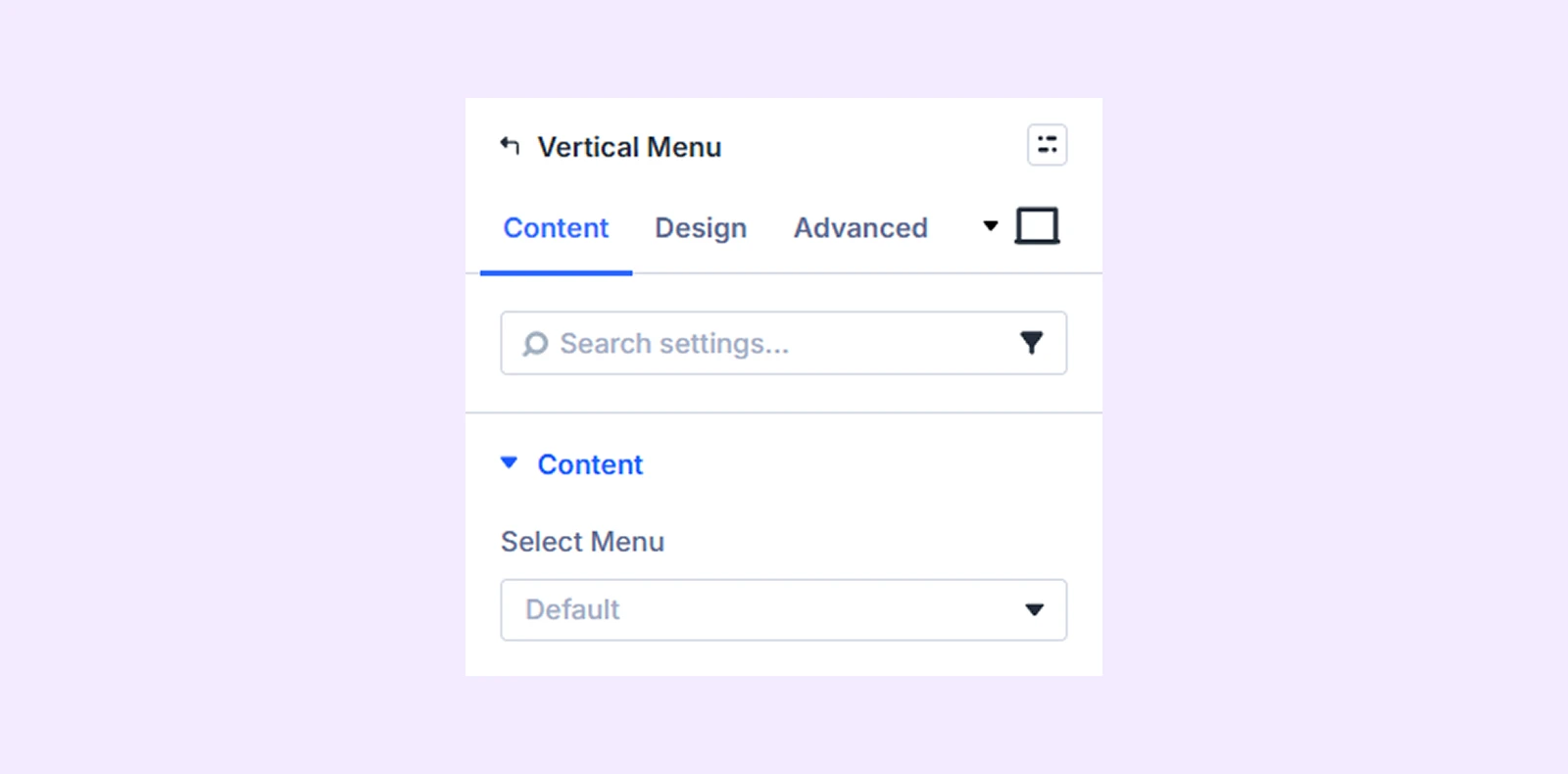
Content Tab
This tab contains the settings for selecting and configuring the vertical menu.
Content
Select Menu: Choose the menu you want to display as a vertical menu. You must create a menu beforehand to use this module.
Builder View
Show Submenu on Builder: Enable this option to see a preview of the nested submenu in the builder.

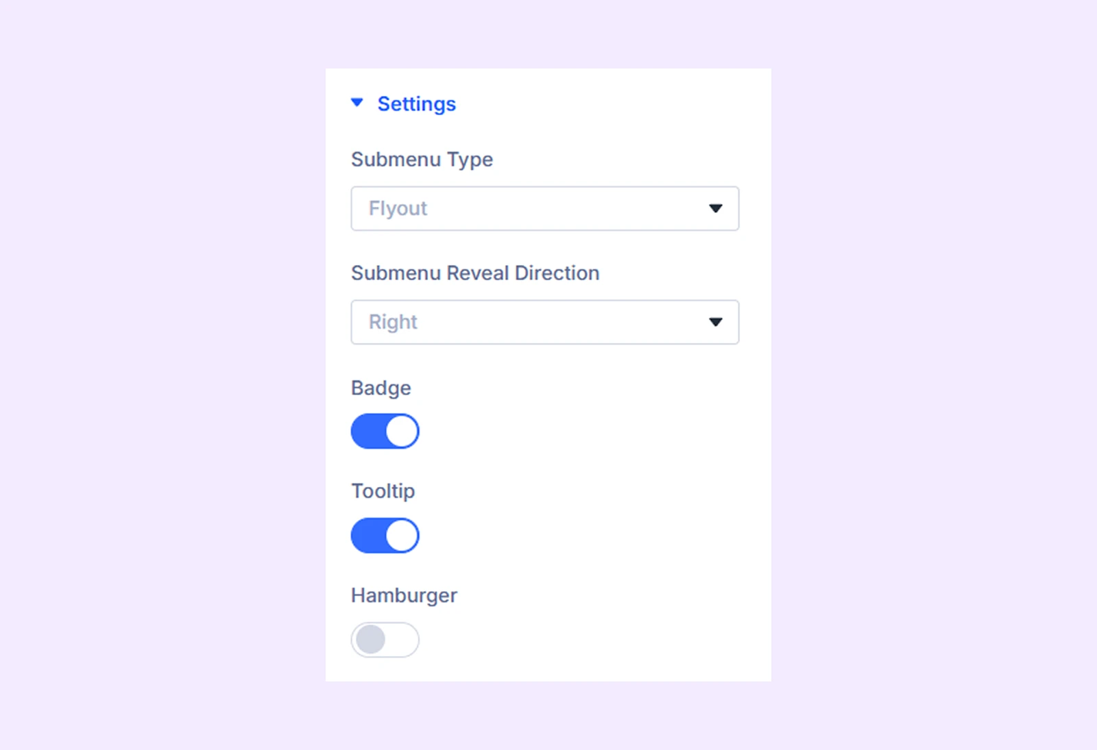
Settings
- Submenu Type: Choose how the submenu appears in the vertical menu.
- Submenu Reveal Direction: Choose the direction in which the submenu opens. (Available only when Flyout is selected as the submenu type.)
- Active State Style on Clicked: Enable this option to highlight the active menu item with a different color. (Available only when Stack is selected as the submenu type.)
- Badge: Enable this option to display a badge on menu items when hovering over the vertical menu.
- Tooltip: Enable this option to show tooltips when hovering over menu items.
- Hamburger: Enable this option to display the menu as a hamburger toggle.
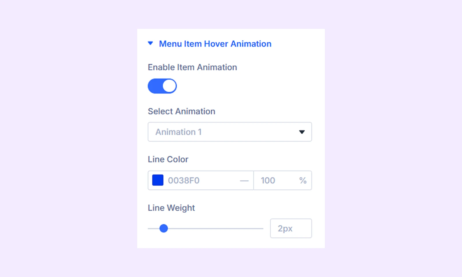
Menu Item Hover Animation
- Enable Item Animation: Enable this option to apply hover animation to menu items.
- Select Animation: Choose from three different line animation presets for the vertical menu.
- Line Color: Choose the color of the line animation.
- Line Weight: Adjust the width of the animation line.
Background: Add a background color, gradient, image, video, pattern, or mask to the module.
Element Label: Rename the module to organize it more easily in the Divi Builder. (Only you can see this label.)
Design Tab
Use this tab to customize the visual appearance of the vertical menu.
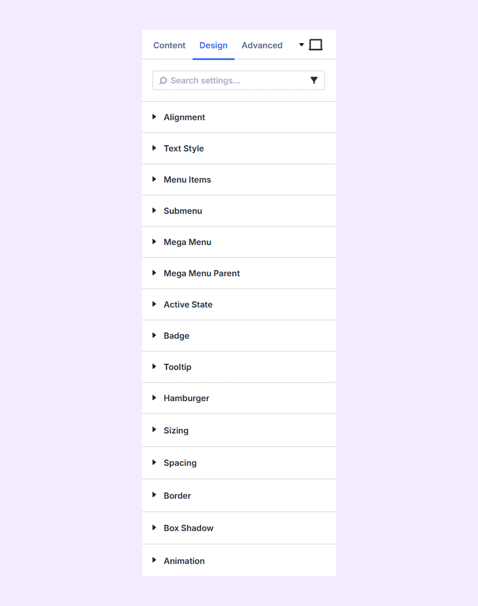
Alignment: Adjust the horizontal alignment of the vertical menu relative to its container.
Text Style: Customize the typography settings for the menu text.
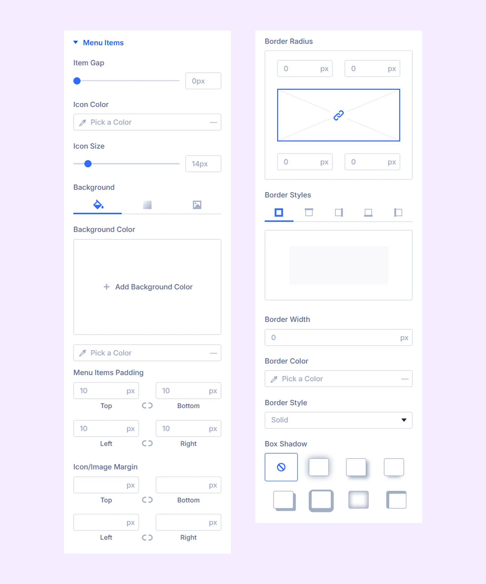
Menu Items
- Item Gap: Adjust the spacing between menu items.
Additional options allow you to customize the icon size and color, as well as the menu container’s background, spacing, and border.
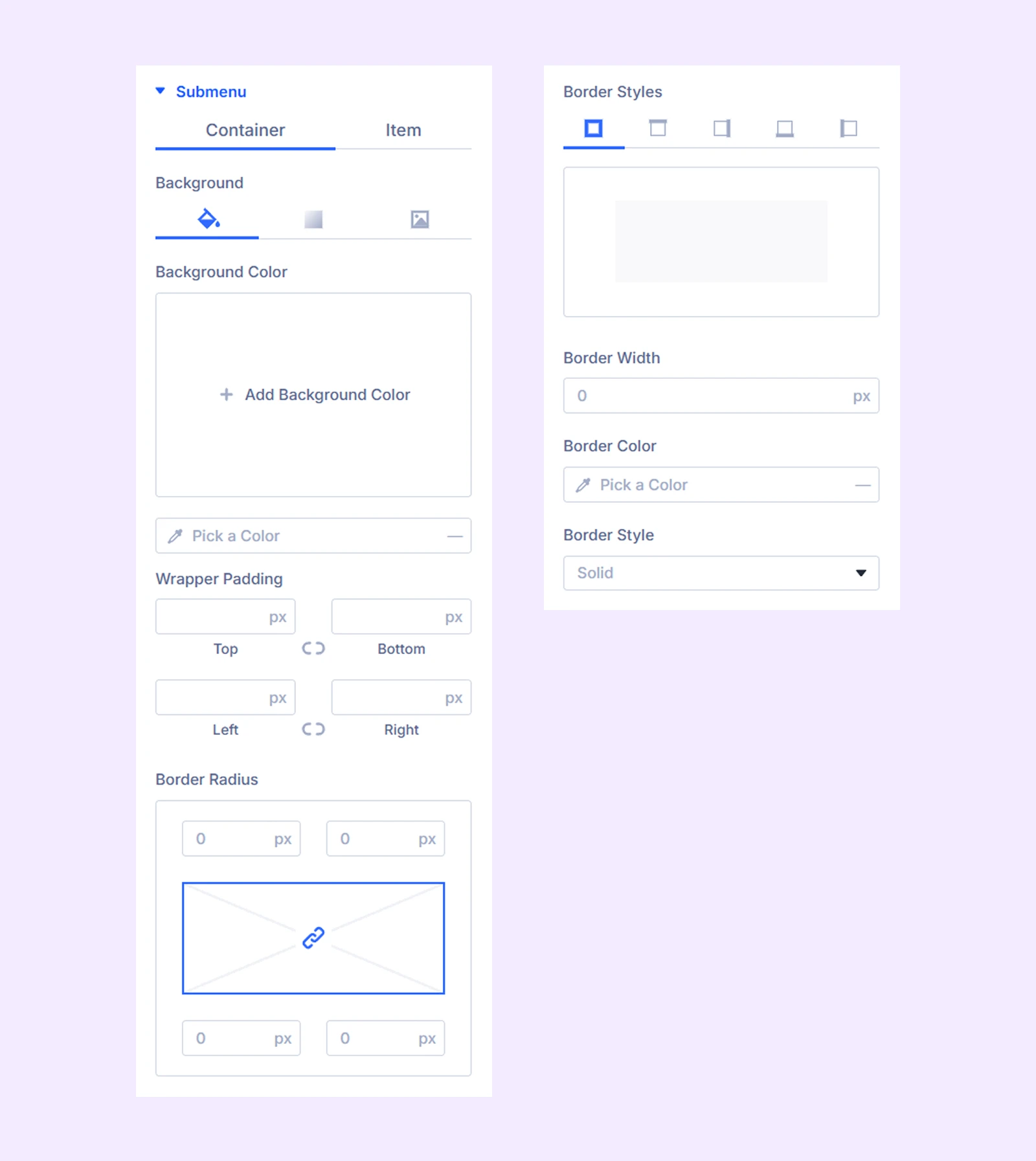
Submenu
- Container: Customize the spacing and border settings of the submenu container.
- Item: Customize the spacing, color, and typography of submenu items.
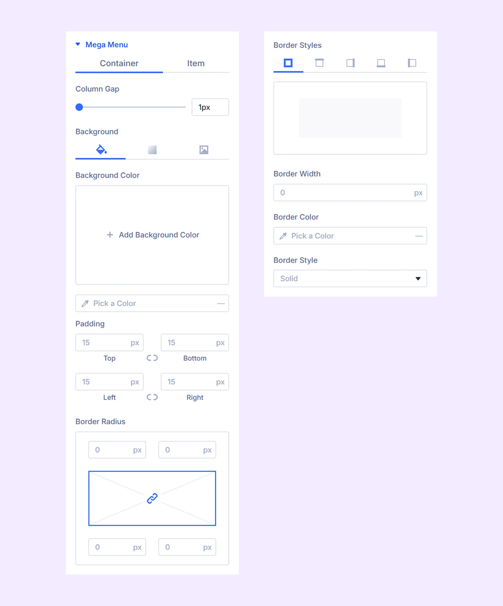
Mega Menu
To use these options, you must enable the Mega Menu from your WordPress dashboard. To learn more, click here.
Container
- Column Gap: Adjust the spacing between mega menu columns.
- Column Width: Adjust the width of the mega menu columns.
Additional options allow you to customize the background, spacing, and border of the mega menu container.
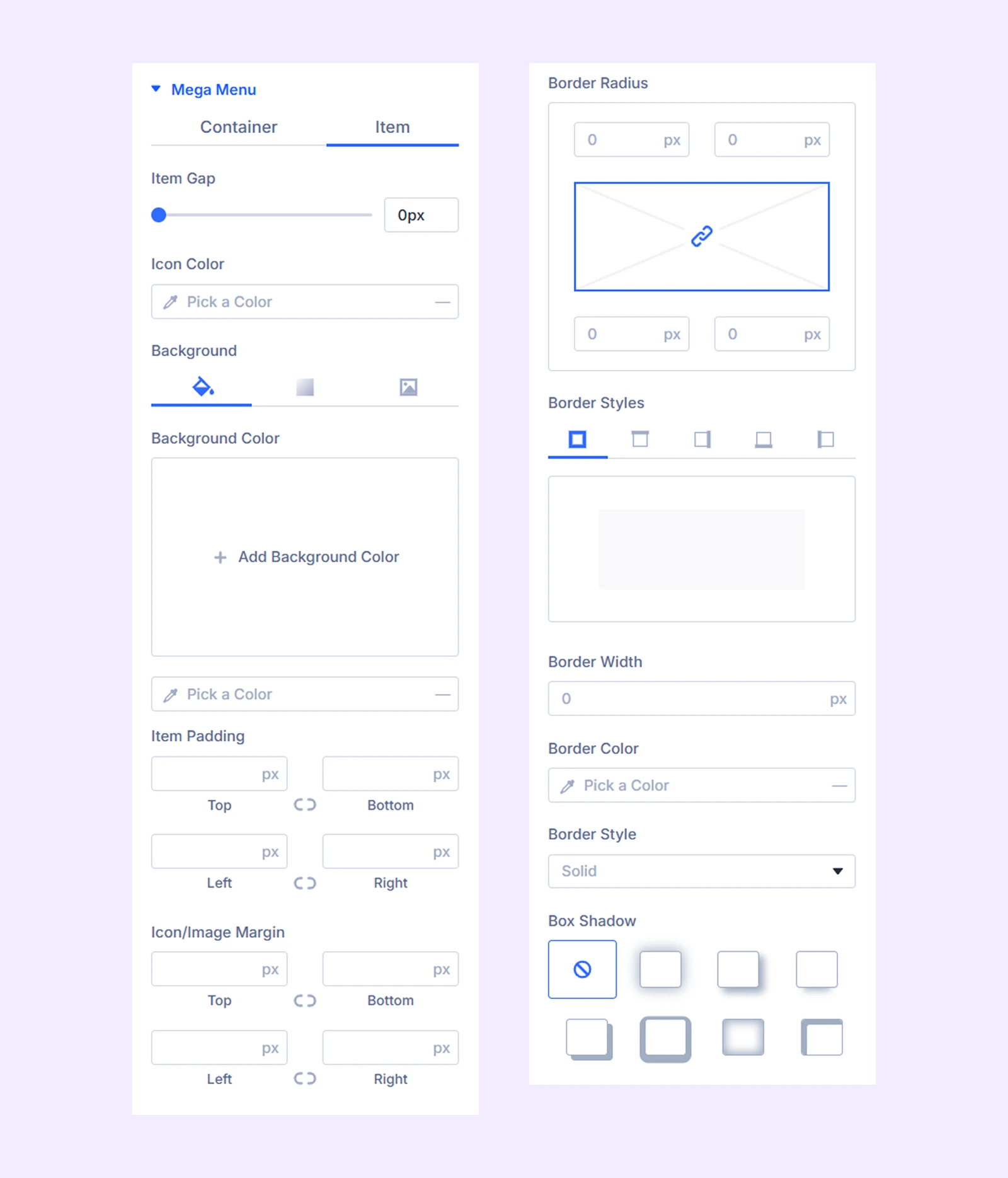
Item
- Item Gap: Adjust the spacing between mega menu items.
Additional options allow you to customize the icon size and color, as well as the typography, spacing, and border of mega menu items.
Mega Menu Parent: Customize the typography settings of the mega menu parent item.
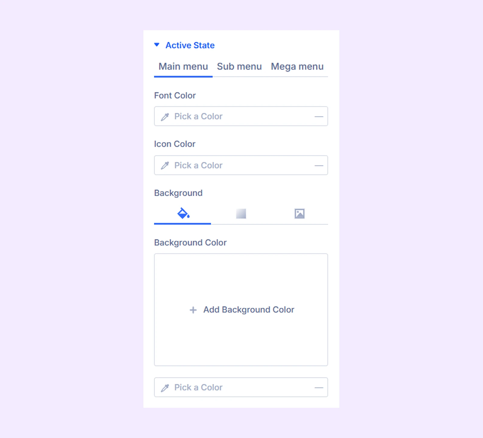
Active State
Choose a different color to highlight the active state of the main menu, submenu, and mega menu items.
Badge

- General: Customize the alignment, typography, and background of badges used in main menu items.
- Submenu: Customize the typography and background of submenu badges.
Tooltips: Customize the typography and background of tooltips used in main menu and submenu items.
Hamburger
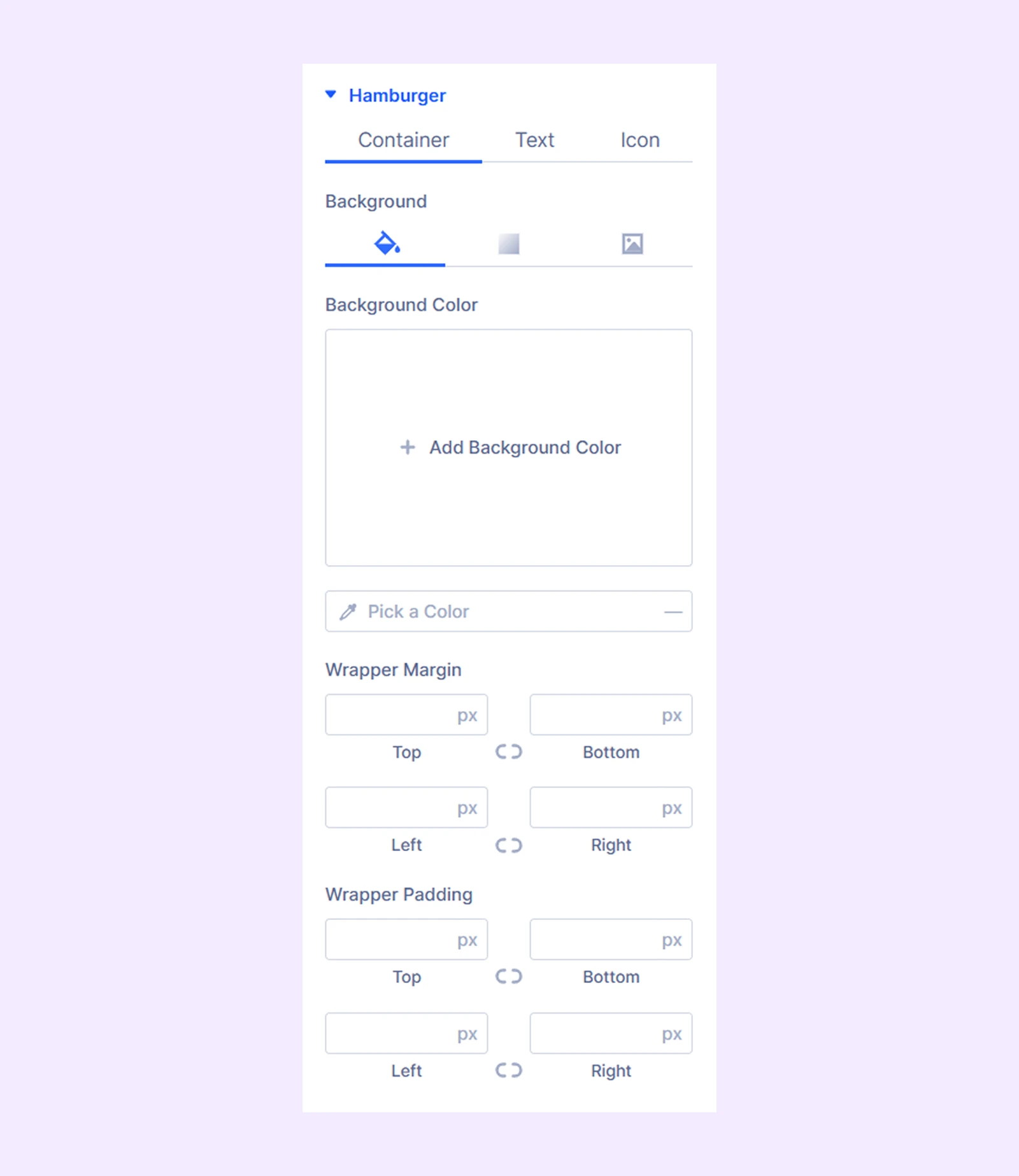
- Container: Customize the background of the hamburger menu and adjust the wrapper spacing, including margin and padding.
- Text: Configure the typography of the hamburger menu text, including font, size, weight, and style.
- Icon: Adjust the appearance of the hamburger menu icon, including its size and color.
Sizing: Adjust the width, height, and alignment of the module.
Spacing: Adjust the margins and padding of the module container.
Border: Customize the border using radius, style, width, and color settings.
Box Shadow: Add shadow effects to the module container.
Animation: Add reveal animation effects and control the animation style, delay, duration, and more.
Advanced Tab
This tab provides additional settings for advanced users who want greater control over the module with custom code, conditions, and more.
Need Help?
If you have any questions or need assistance, contact our support team: [email protected]