
The DiviFlash Advanced List module lets you create stunning lists of content with advanced customization options.
Activation Required: This module is disabled by default. To use it, you need to enable it manually. Refer to our guide for step-by-step instructions.
Let’s see the settings in brief and how to make better use of it —
Content Tab
This tab contains the essential settings for adding and configuring list items.
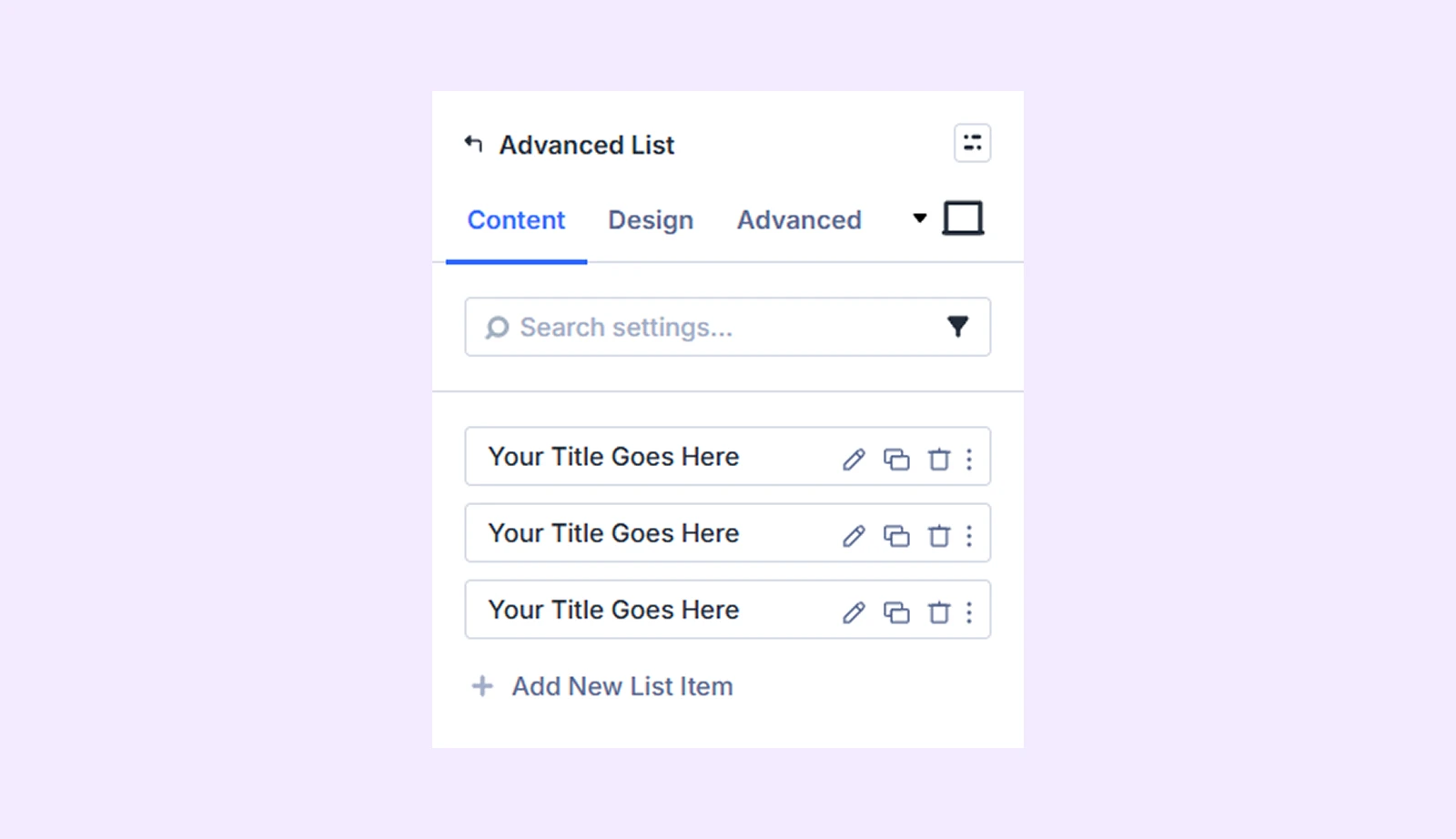
Add New List Item
Click the + Add New List Item button to add new items. By default, the module includes three list items. Adding a new item opens the List Item Settings, where you can populate content and style the item individually. To learn more about adding content and customizing the list items, click here.
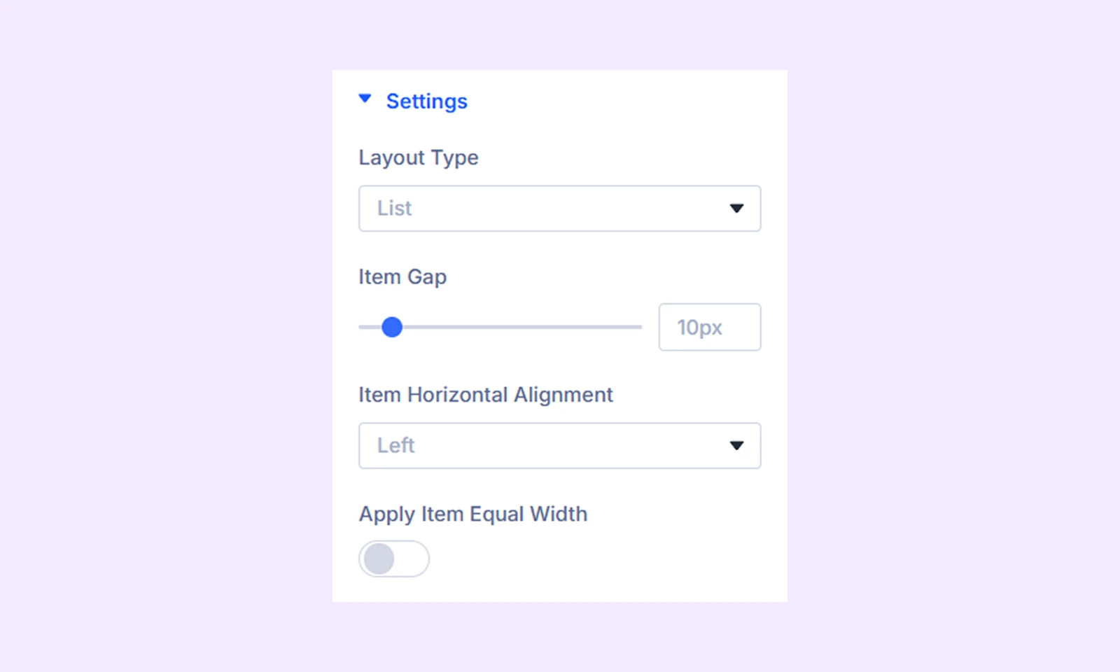
Settings
- Layout Type: Choose between a list or grid for the layout.
- Item Gap: Adjust the gap between the list items.
- Item Horizontal Alignment: Change the horizontal placement of the list items respective to its container.
- Apply Item Equal Width: Enable this option to make all the list items wrapper equal width.
- Layout Columns: Choose how many columns there will be for the grid. Only available if you choose “Grid” as “Layout Type.”
- Item Vertical Alignment: Change the vertical placement of the list items. Only available if you choose “Grid” as “Layout Type.”
- Apply Vertical Alignment for Elements: Vertically align all the items placed inside the container. Only available if you choose “Grid” as “Layout Type.”
Background: Add a background color, gradient, image, video, pattern, or mask to the module.
Element Label: Rename the module to organize it more easily in the Divi Builder. (Only you can see this label.)
Design Tab
Use this tab to customize the module appearance.
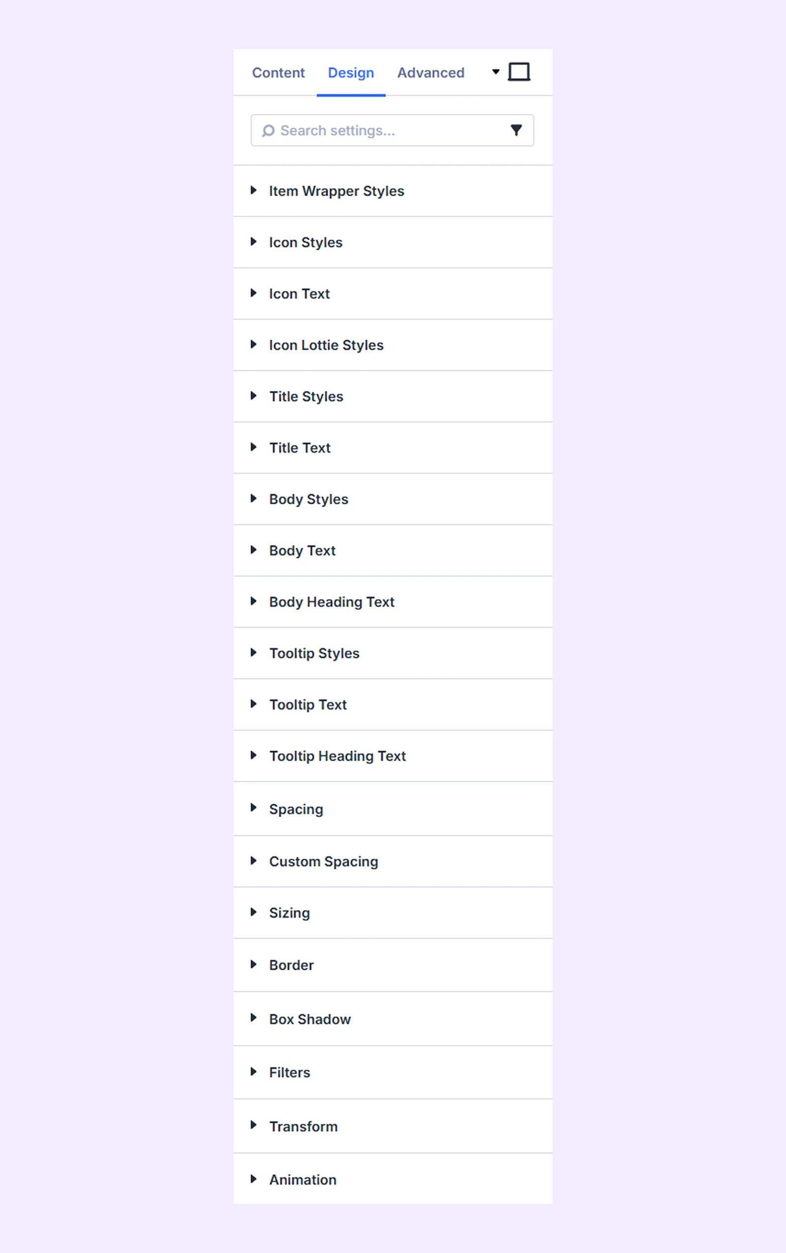
Item Wrapper Styles: Color, text alignment, and border options for the list item wrappers.
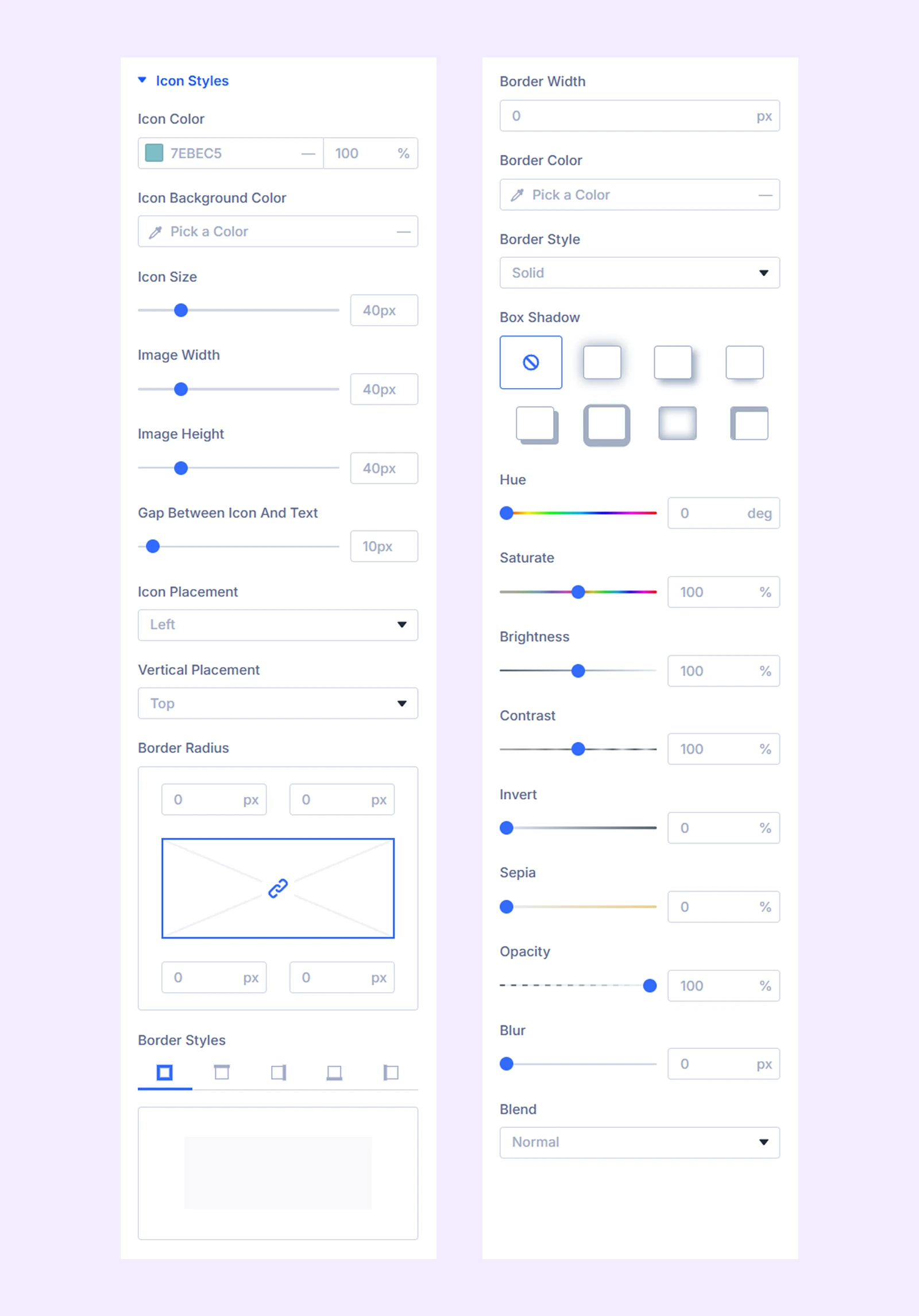
Icon Styles
- Icon Color: Change the color of the icons.
- Icon Background Color: Change the background color of the icons.
- Icon Size: Adjust the size of the icons.
- Image Width: Adjust the width of the images if you use images instead of icons.
- Image Height: Adjust the height of the images if you use images instead of icons.
- Gap Between Icon and Text: Adjust the gap between the icons and the text.
- Icon Placement: Choose if you want to place the icon on the left, right, or top of the text.
- Icon Alignment: Change the horizontal placement of the icon. Only available if you choose “Top” as “Icon Placement.”
- Vertical Placement: Change the vertical placement of the icon.
The rest of the options are for styling the icon borders and adding color filters to images.
Icon Text: Typography options for the icon if you use text instead of icons.
Icon Lottie Styles: Color, width, and height options for the Lottie icon.
Title Styles: Color and border options for the list titles containers.
Title Text: Typography options for the list titles.
Body Styles: Color and border options for the body text containers.
Body Text: Typography options for the body text.
Body Heading Text: Typography options for the body heading text.
Tooltip Styles: Color and border options for the tooltip container.
Tooltip Text: Typography options for the tooltip text.
Tooltip Heading Text: Typography options for the tooltip heading text.
Spacing: Adjust the width, height, and alignment of the module.
Custom Spacing: Add custom paddings and margins to each component of the module.
Sizing: Adjust the width, height, and alignment of the module.
Border: Customize the border style, width, and color. And style each border separately or apply the same style to all sides.
Box Shadow: Add shadow effects to the module.
Filters: Apply color filters to enhance the appearance.
Transform: Scale, rotate, move, or skew the module.
Animation: Apply reveal animation effects and customize delay, duration, repeat settings, and animation type.
Advanced Tab
This tab provides additional settings for advanced users who want greater control over the module with custom code, conditions, and more.
List Item Settings
Each list item acts as a child of the module, and item-level settings override module-level settings.
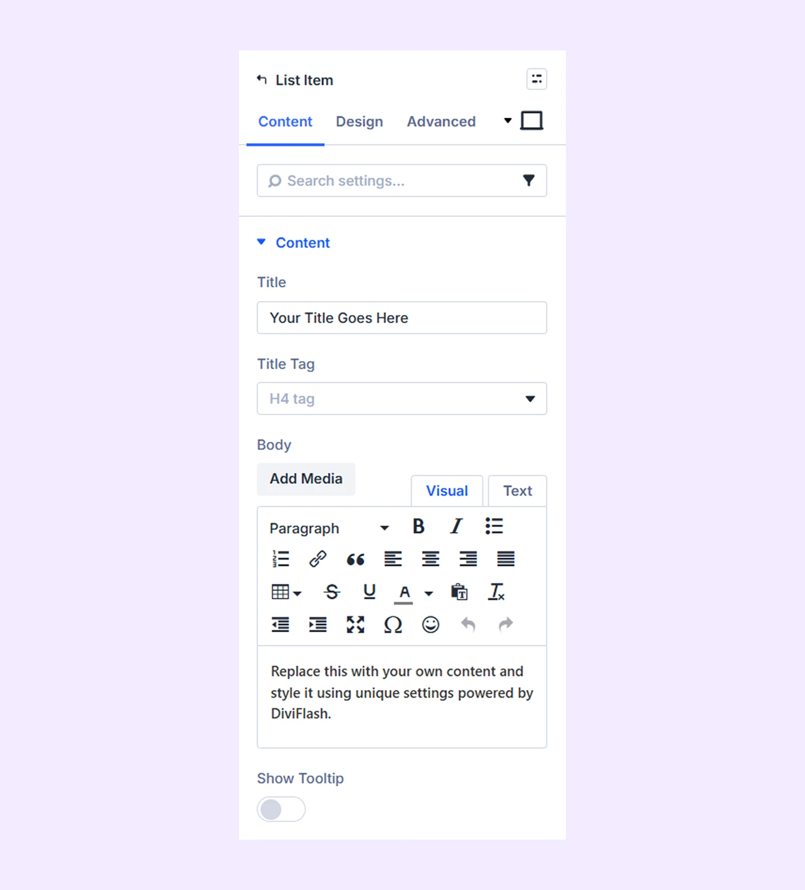
Content Tab
Content
- Title: Add the title of the list item
- Body: Add the content of the list item.
- Title Tag: Choose the h-tag for the list title.
- Show Tooltip: Enable to use a tooltip for this list item.
- Tooltip Content: Add the tooltip content.
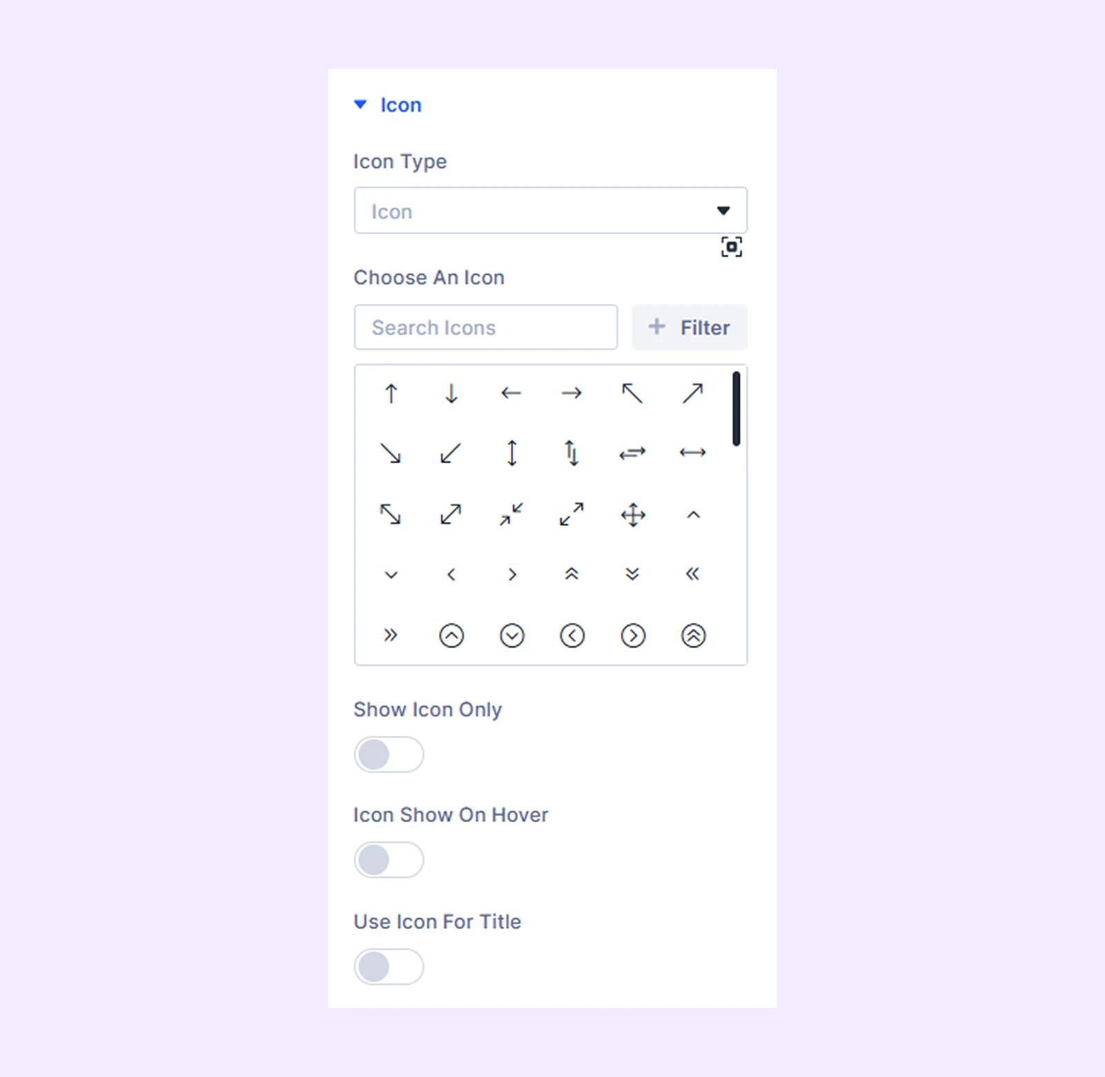
Icon
- Icon Type: Choose the type of icon you want to use for the list item. You can use an icon, image, text, or Lottie as the icon.
- Show Icon Only: Enable this option to show only the icon instead of the list content.
- Icon Show on Hover: Enable this option only to show the icon on hover.
- Use Icon for Title: Enable this option to use an icon along with the title.
- Title Icon Show on Hover: Enable this option to only display the title icon on hover. Only available if you enable “Use Icon for Title.”
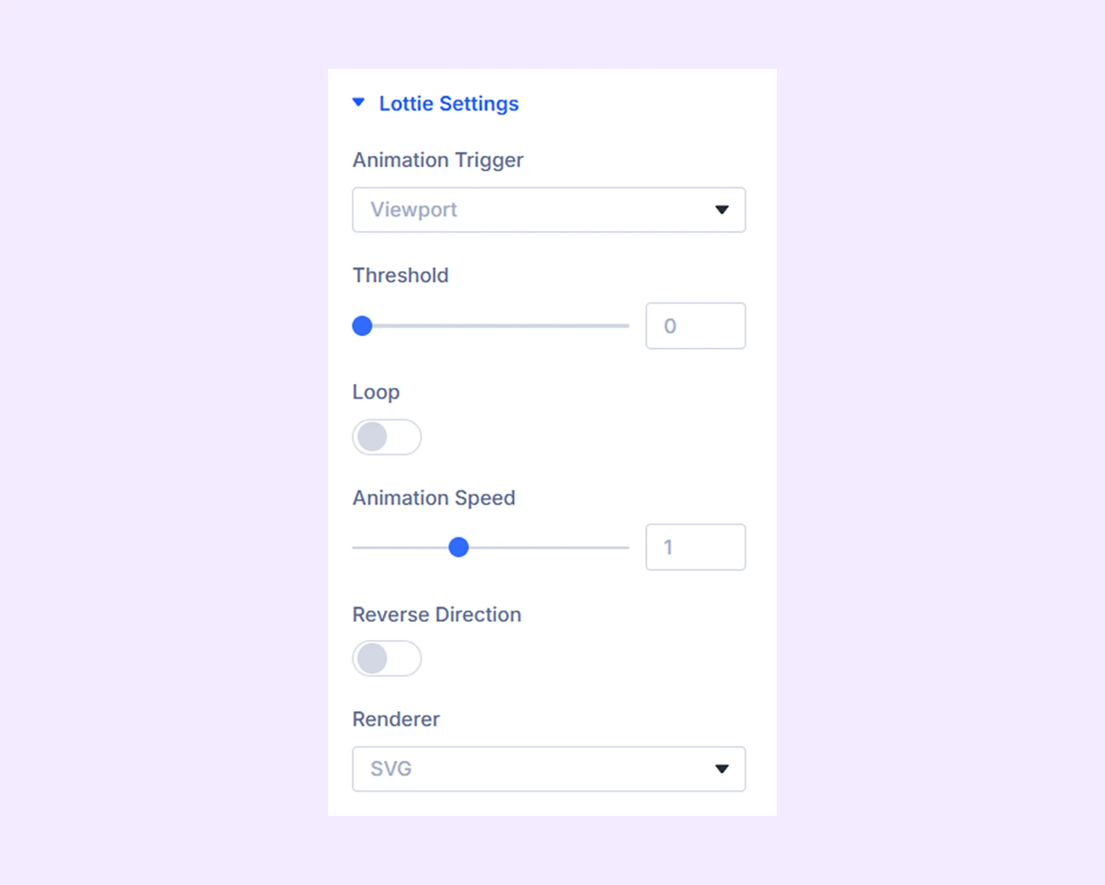
Lottie Settings
If you choose “Lottie” as the icon type, this additional section will appear.
- Animation Trigger: Choose which action will trigger the Lottie animation.
- Threshold:
- Loop: Enable to apply a loop effect to the Lottie animation.
- Animation Speed: Adjust the speed of the animation.
- Reverse Direction: Enable to reverse the direction of the animation.
- Renderer: Choose what type of format the Lottie will be rendered in.
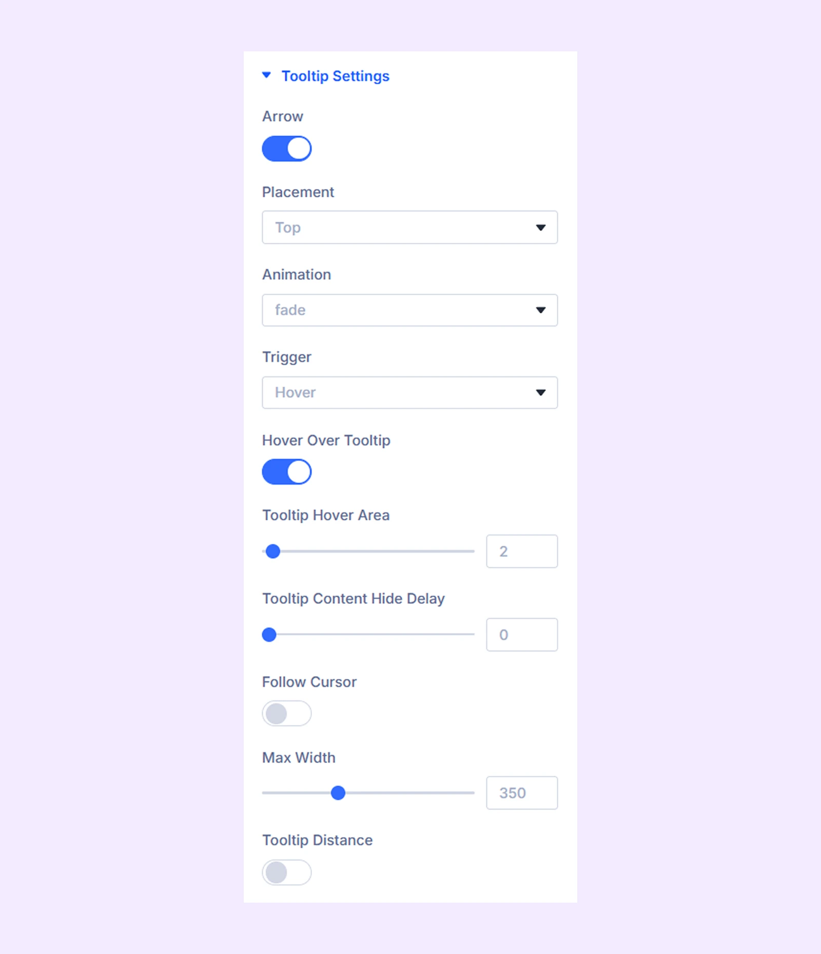
Tooltip Settings
If you enable “Show Tooltip” from the content setting, this additional section will appear.
- Arrow: Toggle this option to enable or disable the tooltip arrow.
- Placement: Choose where you want to place the tooltip.
- Animation: Choose a closing animation for the tooltip.
- Trigger: Choose how the tooltip will be triggered.
- Hover Over Tooltip: Enable this option to allow your users to hover over the tooltip and click on it.
- Tooltip Hover Area: Determines the size of the invisible border around the tooltip that will prevent it from hiding if the cursor leaves it.
- Tooltip Content Hide Delay: Determines the time in milliseconds (ms) to debounce the Tooltip content hide handler when the cursor leaves.
- Follow Cursor: Enable this option to make the tooltip follow the cursor.
- Max Width: Set a maximum width limit for the tooltip.
- Tooltip Distance: Enable this option to adjust the distance between the tooltip and the list item.
- Tooltip Arrow Move: Adjust the vertical distance between the tooltip and the list item.
- Tooltip Distance: Adjust the horizontal distance between the tooltip and the list item.
Link: Default Divi link (rarely used).
Background: Add background color, gradient, image, etc.
Element Label: Rename the item for identification (visible only to you).
Design Tab
The sections in the design tab offer the same functionalities as their counterparts in “Advanced List Settings.”
Advanced
Add custom CSS, visibility rules, or conditions for each individual list item.
Need Help?
If you have any questions or need assistance, contact our support team: [email protected]