DiviFlash Image Reveal module lets you create image reveal effects on your Divi website.
Let’s see the settings in brief and how to make better use of it —
Content Tab
This tab contains the settings to upload the image, configure reveal animations, and manage overlay, hover and more.
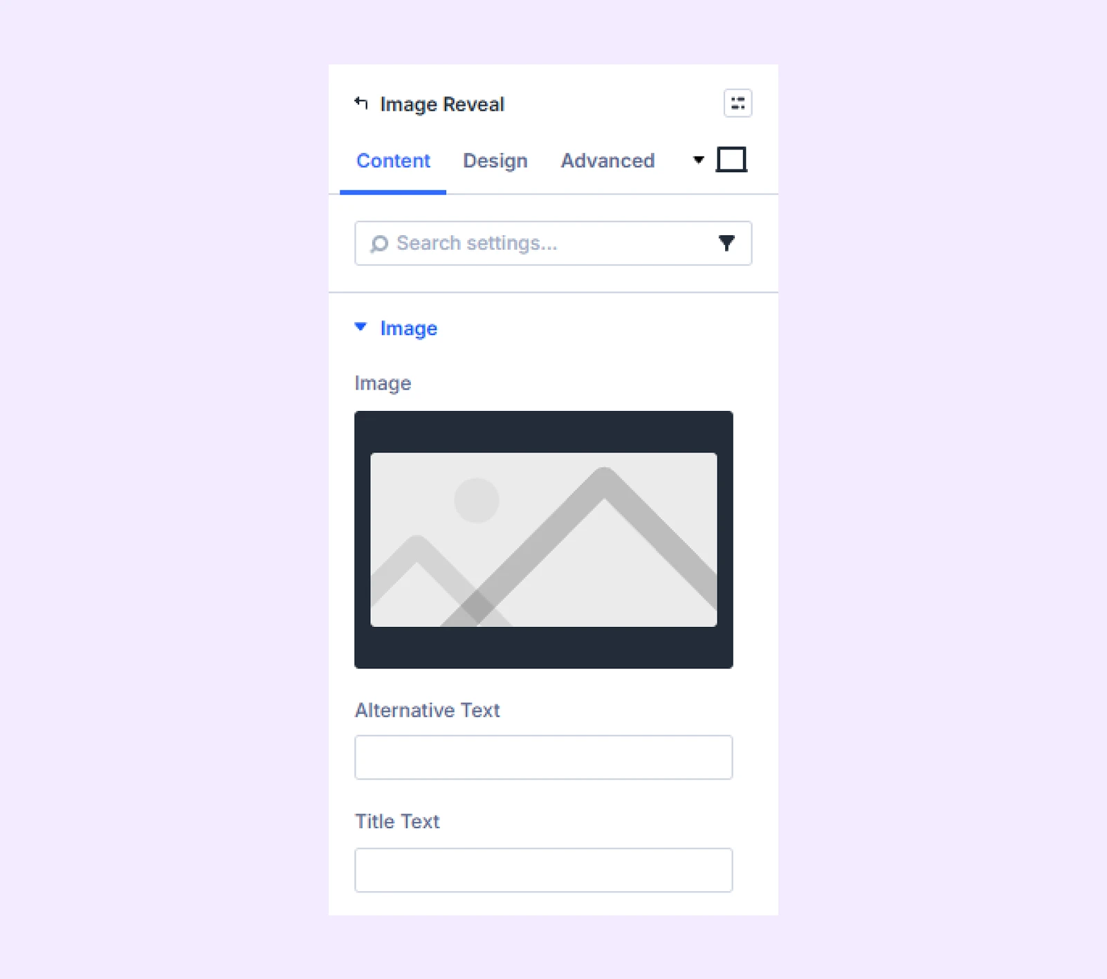
Image
- Image: Upload the image you want to display in the module.
- Alternative Text: Add descriptive alt text for the image.
- Title Text: Add a title for the image that will appear on hover.
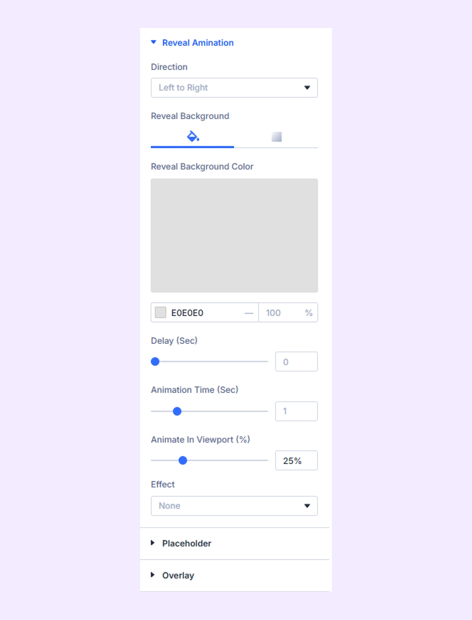
Reveal Animation
- Direction: Choose the direction from which the image will be revealed.
- Reveal Color: Select the color of the cover that reveals the image. You can use a solid color or a gradient.
- Delay (Sec): Set the delay before the reveal animation starts.
- Animation Time (Sec): Adjust how long the reveal animation takes to complete.
- Animate in Viewport (%): Set the viewport percentage at which the reveal animation starts.
- Effect: Choose the animation style for the image reveal. (There are 15 animation effects available.)
- Effect Delay (Sec): Set the delay before the selected animation effect begins.
- Effect Time (Sec): Adjust how long the animation effect lasts.
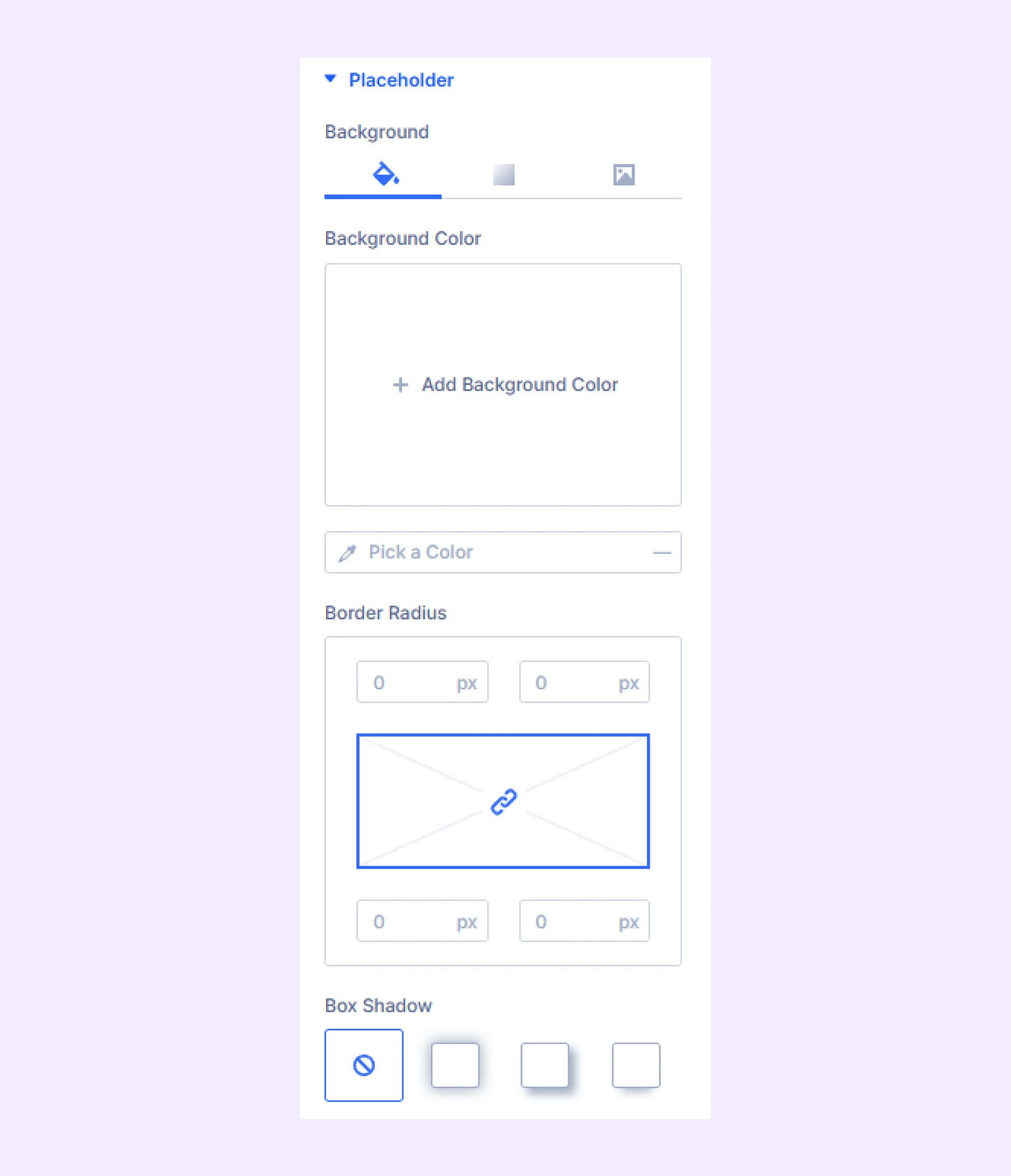
Placeholder
Set a placeholder that will appear before the image reveal animation starts. You can use a background color, gradient, or another image as the placeholder. You can also customize its border settings.
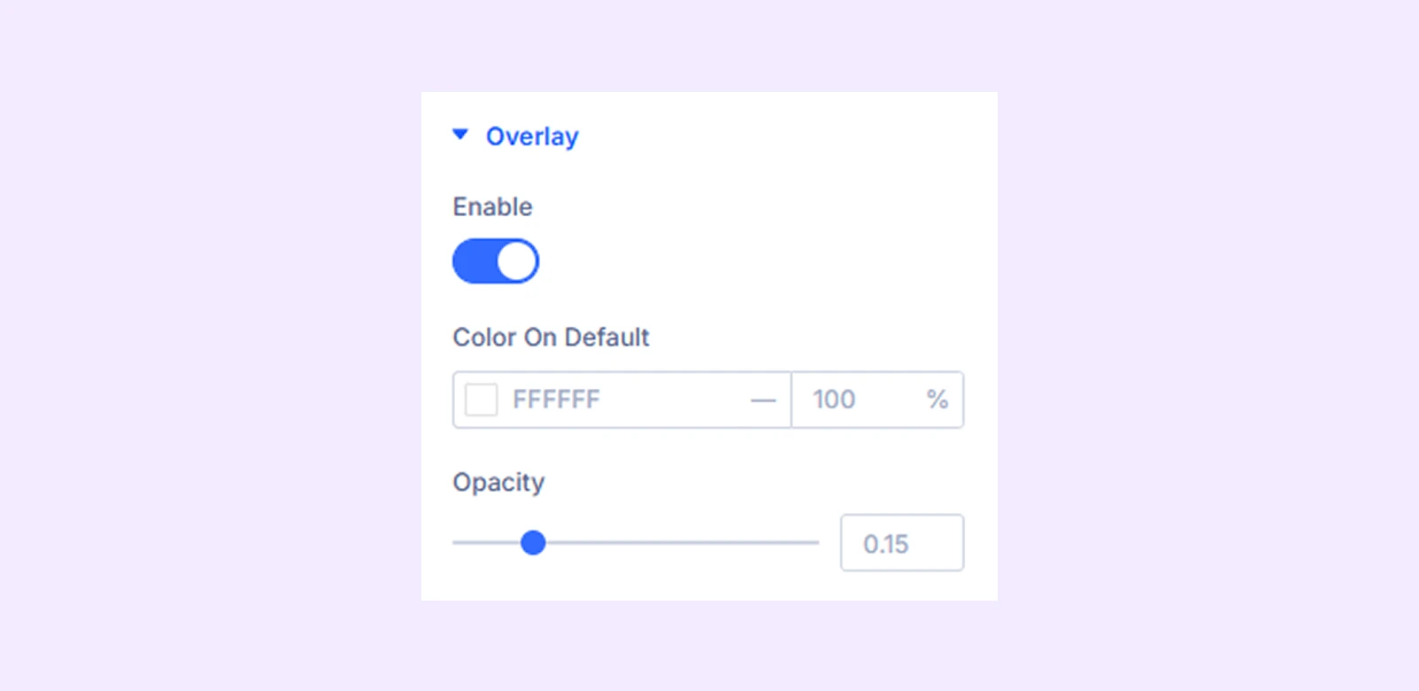
Overlay
Enable this option to add a color overlay on top of the image. You can customize the overlay color and opacity.
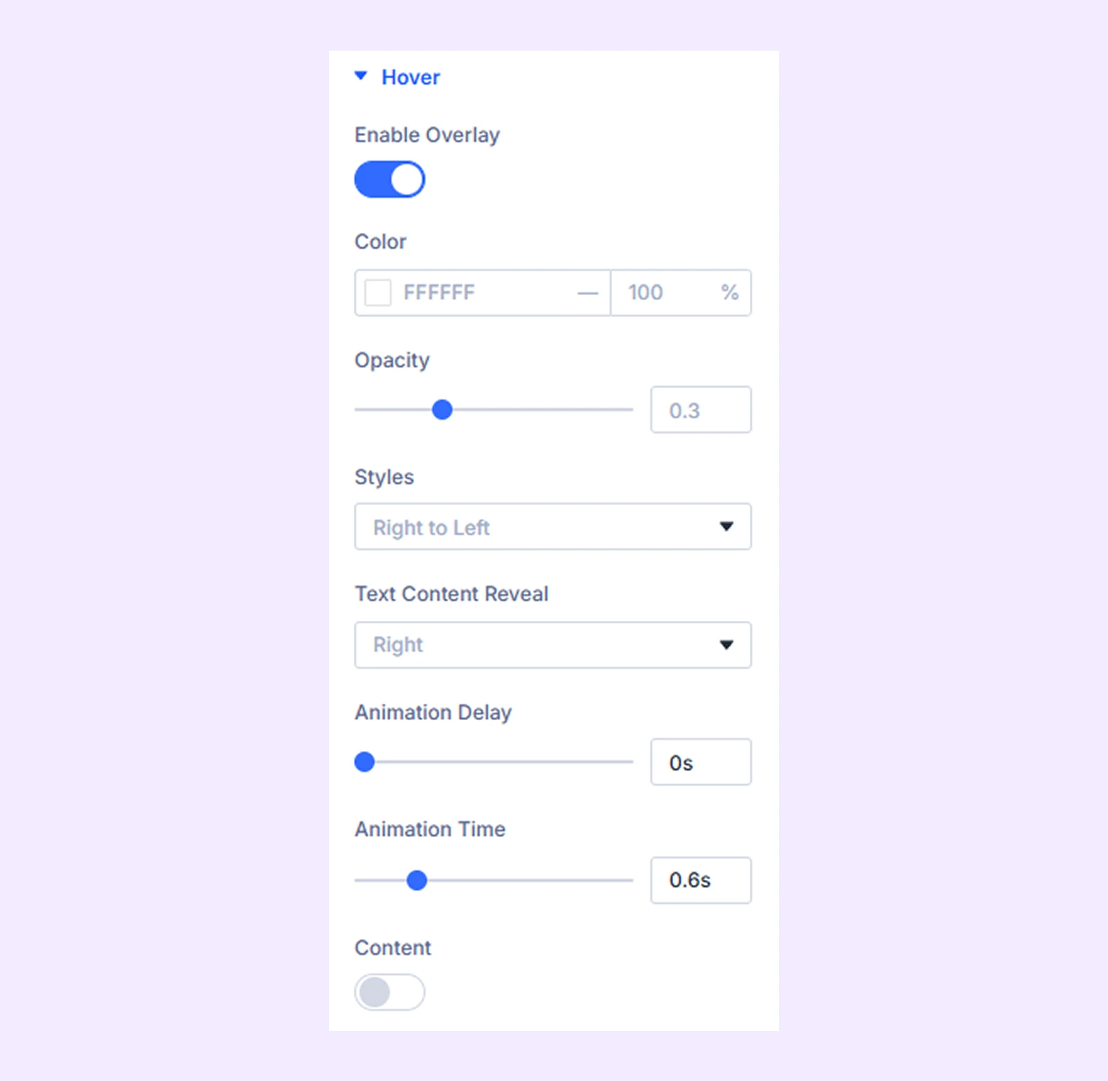
Hover
- Enable Overlay: Enable this option to show an overlay when hovering over the image. Enabling this will bring these settings:
- Color: Choose the color of the hover overlay.
- Opacity: Adjust the opacity of the hover overlay.
- Styles: Choose the animation style used for the hover overlay.
- Text Content Reveal: Choose how the text content appears during the hover animation.
- Animation Delay: Set the delay before the hover animation starts.
- Animation Time: Set the duration of the hover animation.
- Content: Enable this option to add text content to the hover overlay. You can include a title and description with placement, alignment and padding controls.
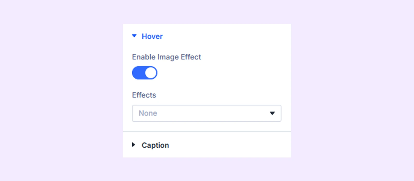
Enable Image Effect: Enable this option to apply hover effects to the image. You can choose from four hover effects, each with its own customization options.
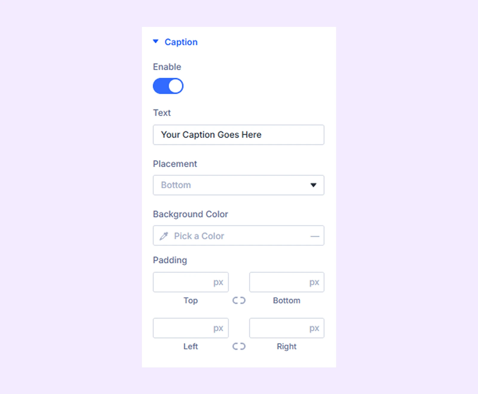
Caption
Enable this option to add a caption to the image. You can customize the caption placement, background color, and padding.
Link: Use this default Divi setting to add a link to the entire module.
Background: Add a background color, gradient, image, video, pattern, or mask to the module.
Element Label: Rename the module to organize it more easily in the Divi Builder. (Only you can see this label.)
Design Tab
This tab lets you customize the visual appearance of the Image Reveal module.
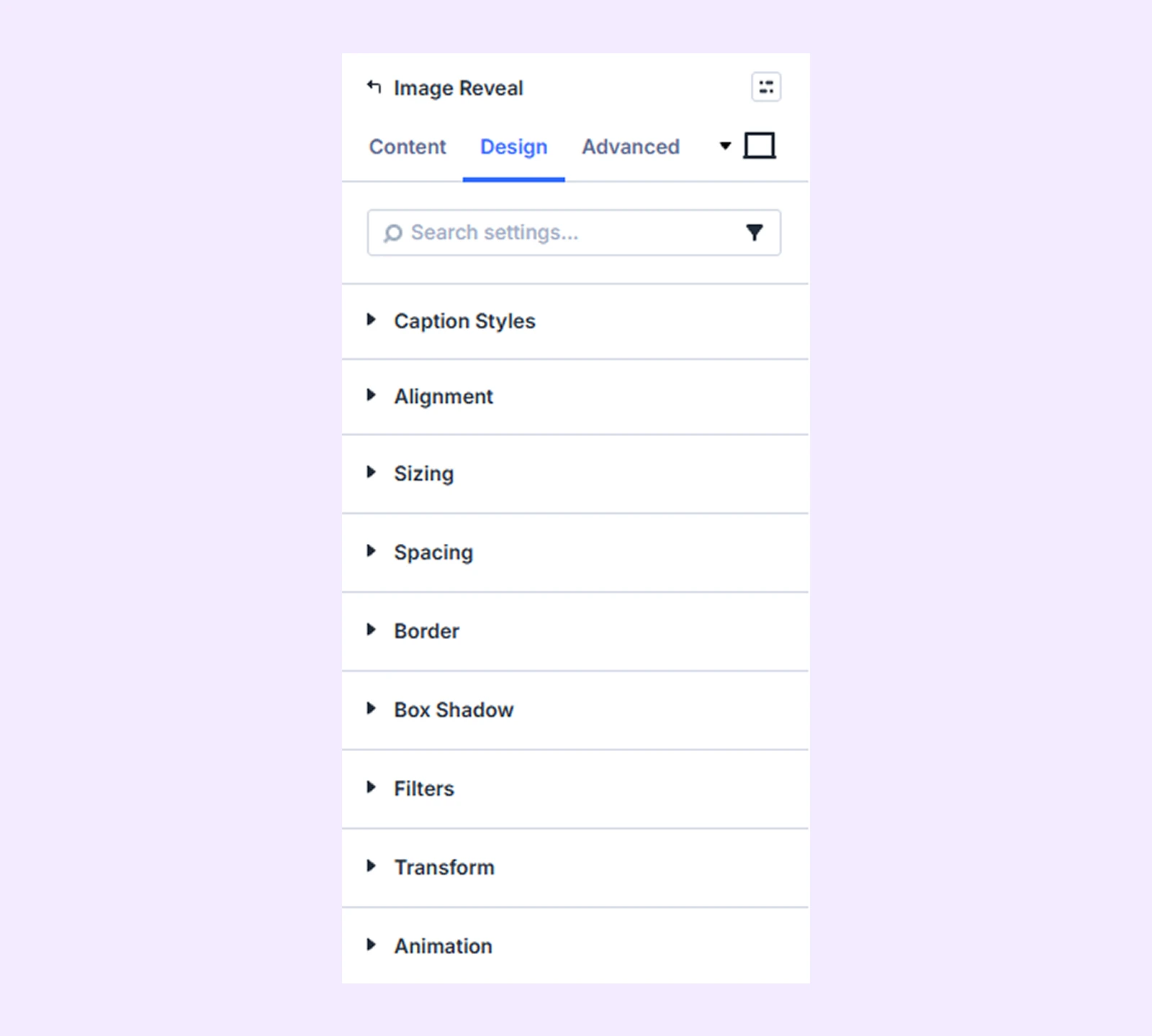
Caption Styles: Typography options for the image caption.
Alignment: Change the vertical placement of the image relative to its container.
Sizing: Adjust the width, height, and alignment of the module.
Spacing: Adjust the margins and padding of the module container.
Border: Customize the border using radius, style, width, and color settings.
Box Shadow: Add shadow effects to the module container.
Filters: Apply color filter effects to the module.
Transform: Adjust the scale, position, rotation, and size of the module.
Animation: Add reveal animation effects and control the animation style, delay, duration, and more.
Advanced Tab
This tab provides additional settings for advanced users who want greater control over the module with custom code, conditions, and more.
Need Help?
If you have any questions or need assistance, contact our support team: [email protected]