The DiviFlash Advanced Divi Menu Module allows you to build fully customizable, interactive menus for your Divi websites.
Activation Required: This module is disabled by default. To use it, you need to enable it manually. Refer to our guide for step-by-step instructions.
Let’s see the settings in brief and how to make better use of it —
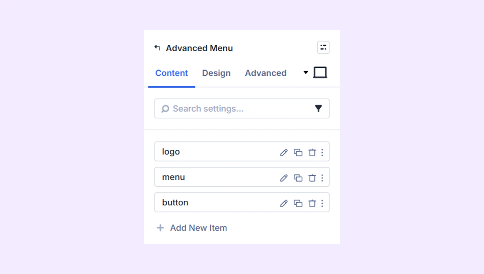
Content Tab
This tab lets you add and configure menu items for your advanced menu.
Add New Item
Click the + Add New Item button to add a menu item. This opens the Advanced Menu Item Settings, where you can customize individual menu items. By default, three menu items are included, which you can edit or delete. To learn how to customize the menu items, click here.
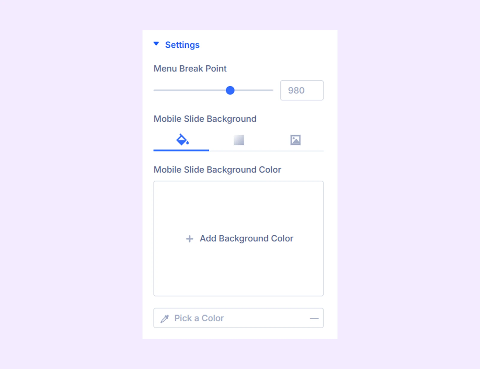
Settings
- Menu Break Point: Set the breakpoint for the advanced menu. When the user’s device screen is smaller than the breakpoint, the menu will collapse automatically.
- Mobile Slide Background: Add a background color, gradient, or image to the mobile slide background.
Builder View
Show Mobile Slide on Builder: By enabling this option, you can view the mobile slide on the builder.

Link: Use this default Divi setting to add a link to the entire module.
Background: Add a background color, gradient, image, video, pattern, or mask to the module.
Element Label: Rename the module to organize it more easily in the Divi Builder. (Only you can see this label.)
Design Tab
Use this tab to customize the visual appearance of the module.
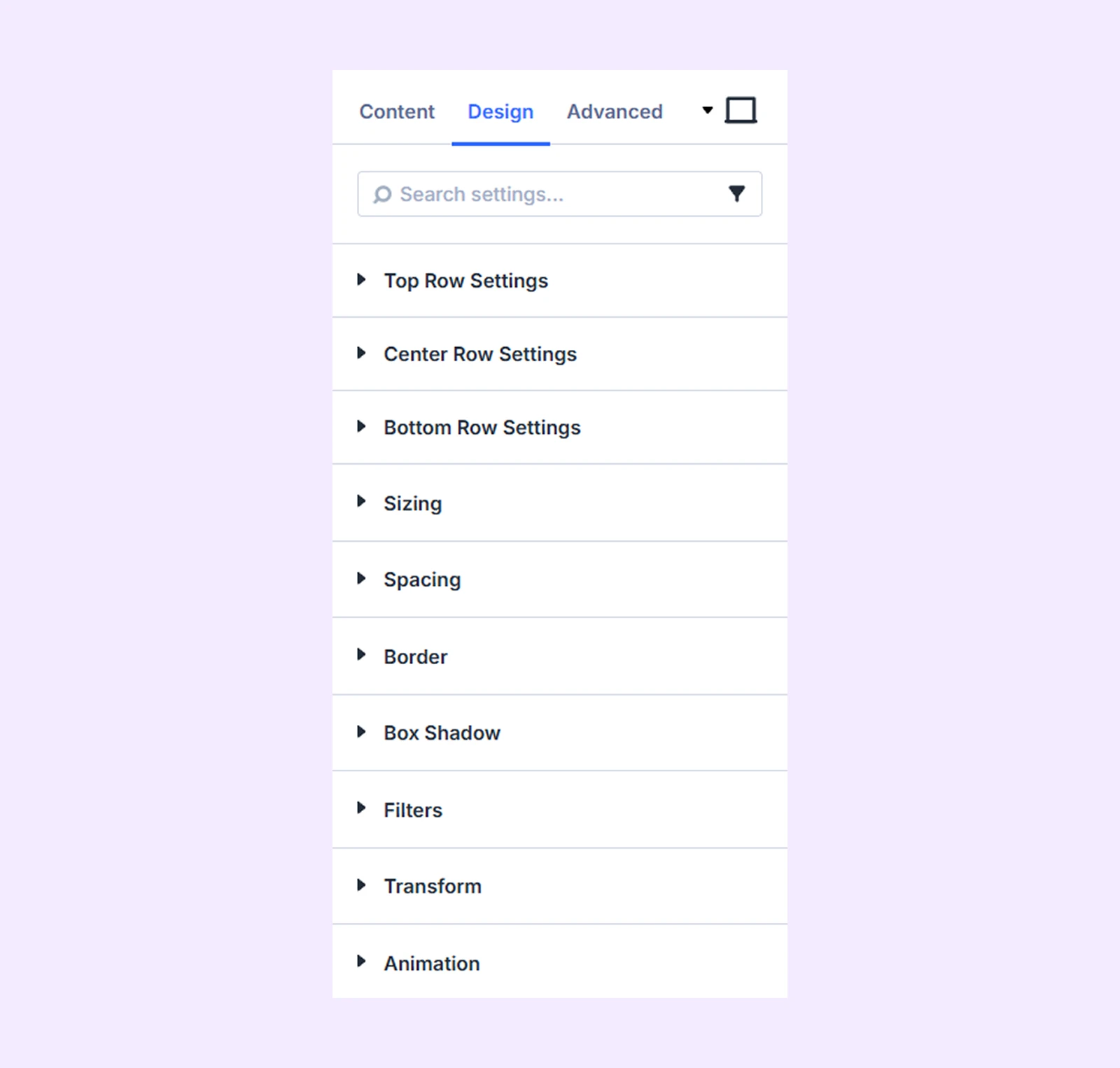
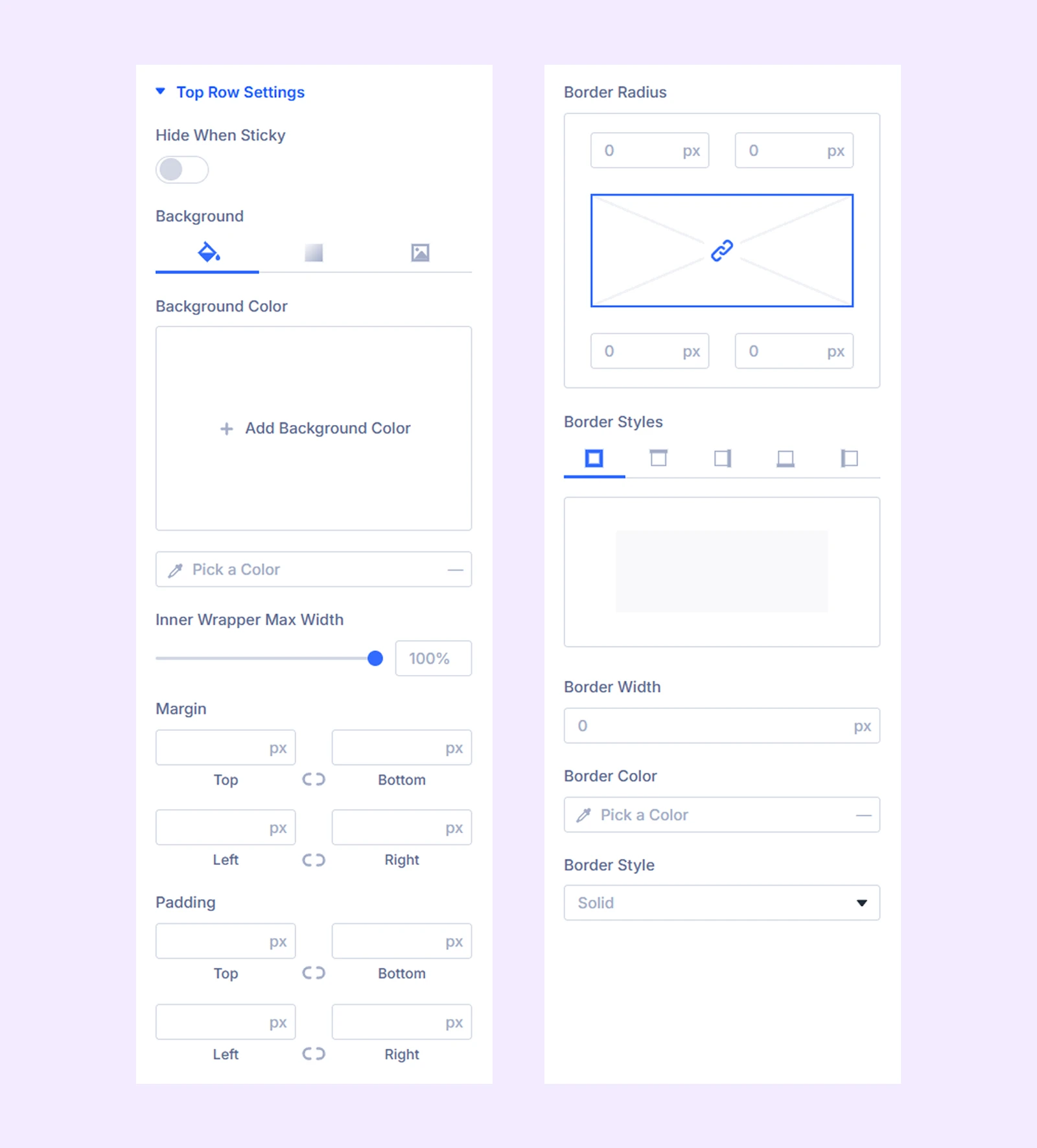
Top Row Settings
- Hide When Sticky: Enable this option to hide the top row of the menu when the menu is sticky.
The rest of the options are for changing the background, spacing, and border of the top row of the menu.
Center Row Settings: The same options as the “Top Row Settings” but for the center row.
Bottom Row Settings: The same options as the “Top Row Settings” but for the bottom row.
Sizing: Adjust the width, height, and alignment of the module.
Spacing: Adjust the margins and padding of the module container.
Border: Customize the border using radius, style, width, and color settings.
Box Shadow: Add shadow effects to the module container.
Transform: Adjust the scale, position, rotation, and size of the module.
Filters: Apply color filter effects to the module.
Animation: Add reveal animation effects and control the animation style, delay, duration, and more.
Advanced Tab
This tab provides additional settings for advanced users who want greater control over the module with custom code, conditions, and more.
Advanced Menu Item Settings
From this settings tab, you can customize each menu item separately. Any customization you make here will override the settings you make in the parent lavel.
Content Tab
Content
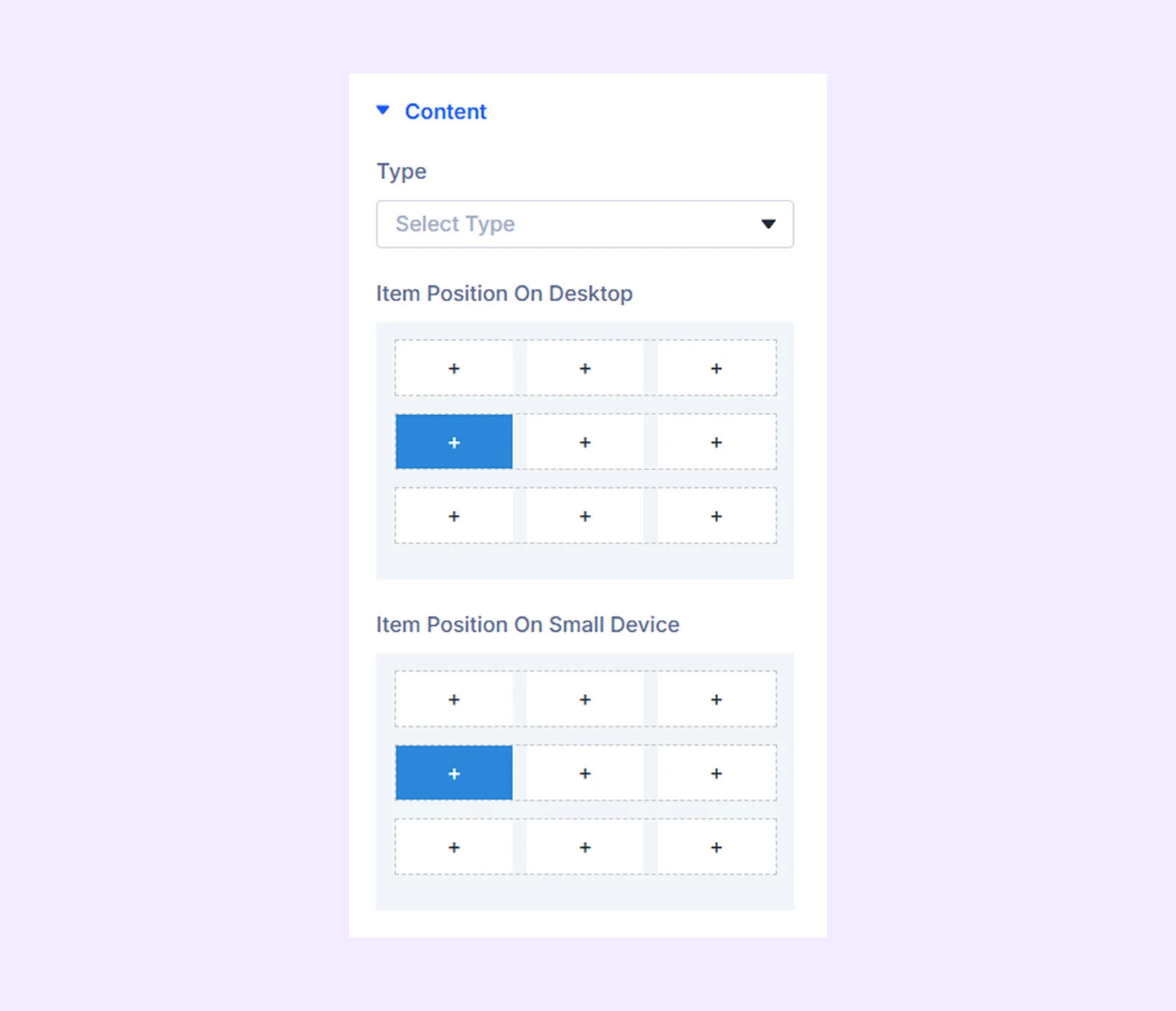
- Type: Choose the menu item you want to use in the advanced menu. There are 8 different menu items to choose from.
- Item Position on Desktop: Position the item vertically (Top, Center, Bottom row) and horizontally (Left, Middle, Right).
- Item Position on Small Device: Choose the vertical and horizontal position of the menu item for smaller devices.
If you choose “Logo” as the “Type-“
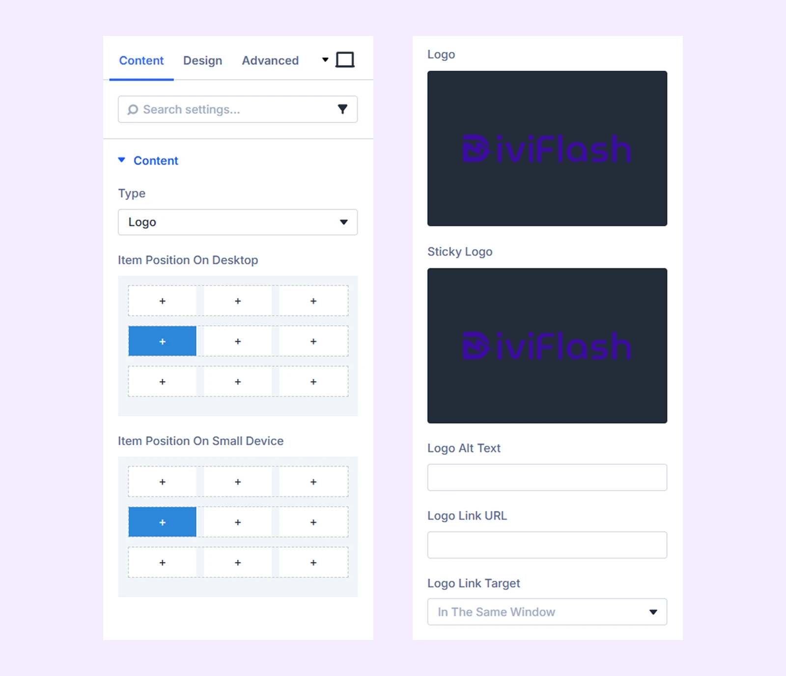
- Logo: Upload the logo you want to use in the menu.
- Sticky Logo: Choose a different logo for the menu when the menu is sticky.
- Logo Alt Text: Submit an alt text for the logo.
- Logo Link URL: Attach a link to the logo.
- Logo Link Target: Decide if the link attached to the logo will open in a new window or in the same tab.
If you choose “Menu” as the “Type-“
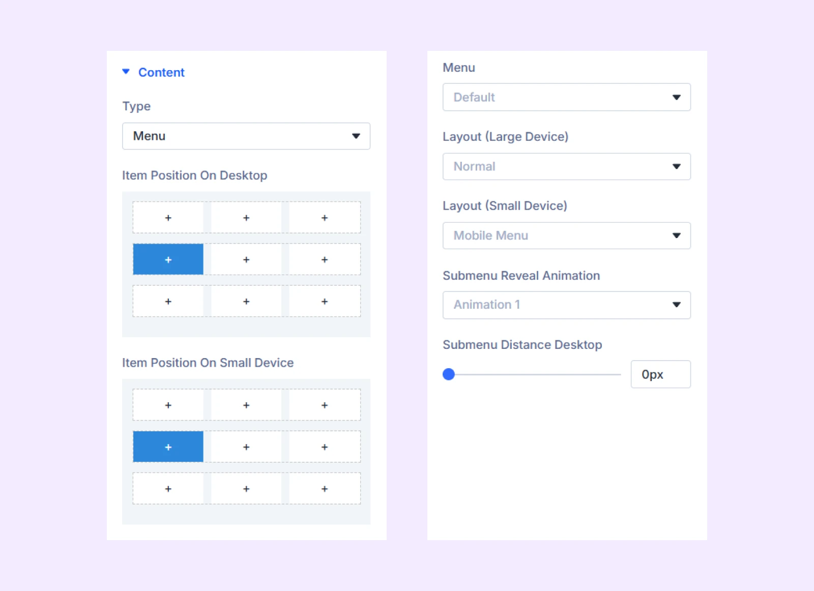
- Menu: Choose the menu you want to use in the advanced menu.
- Layout (Large Device): Choose how the menu is arranged on desktop screens.
- Layout (Small Device): Choose how the menu is arranged on tablets and mobile screens.
- Submenu Reveal Animation: Choose an animation effect from three different preset animation styles.
- Submenu Distance Desktop: Adjust the distance between the main menu item and the submenu in desktop devices.
If you choose “Button” as the “Type-“
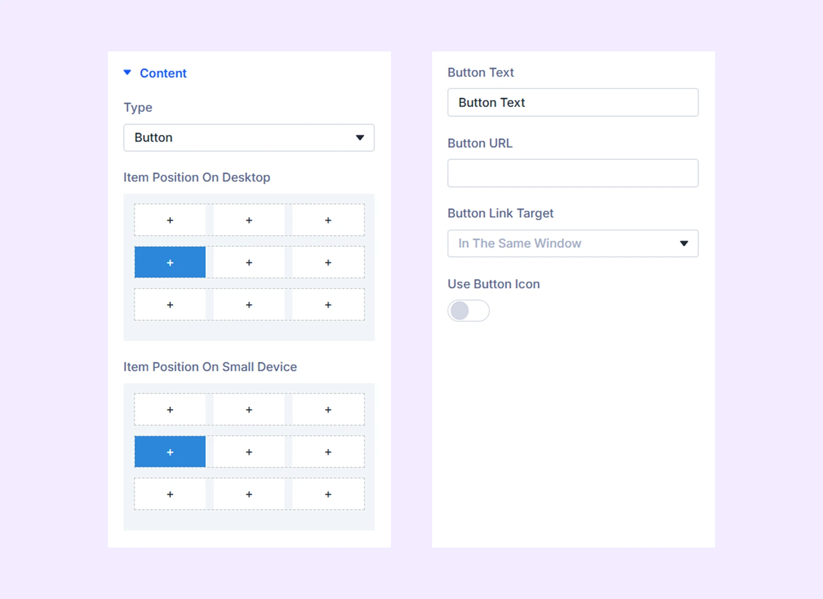
- Button Text: Input the button text.
- Button URL: Input the button URL.
- Button Link Target: Decide if the link attached to the button will open in a new window or in the same tab.
- Use Button Icon: Enable this option to use an icon beside the button text.
- Icon on Left: Toggle this option to place the icon on the left side of the button text.
- Icon on Hover: Enable this option to display the icon only on hover.
If you choose “Search” as the “Type-“
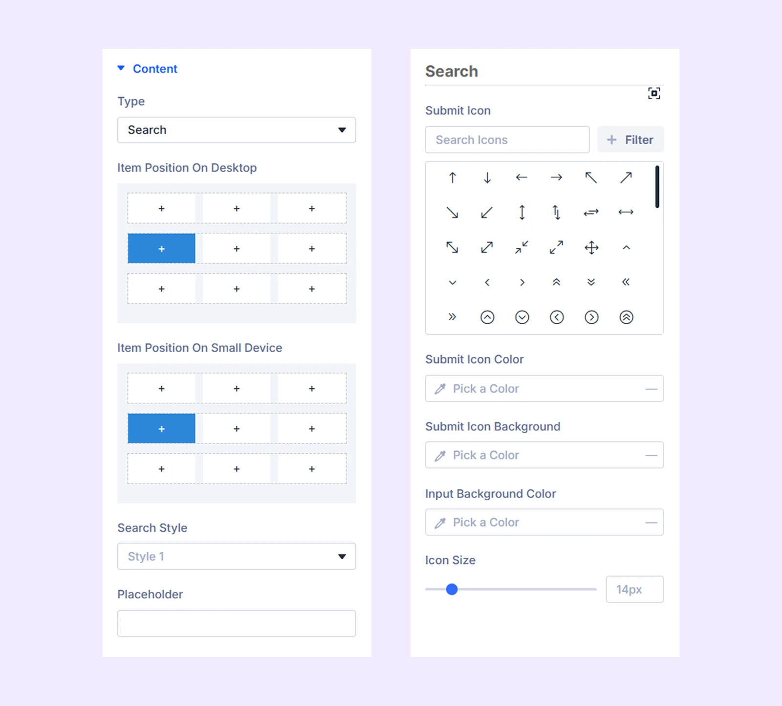
- Search Style: Choose from 5 different preset search bars.
- Placeholder: Input the placeholder text for the search button.
- Submit Icon: Choose an icon for the search bar.
- Submit Icon Color: Choose a color for the search bar icon.
- Submit Icon Background: Choose a color for the search icon background.
- Input Background Color: Choose a background color for the search input field.
- Icon Size: Adjust the size of the search bar icon.
If you choose “Text” as the “Type-“
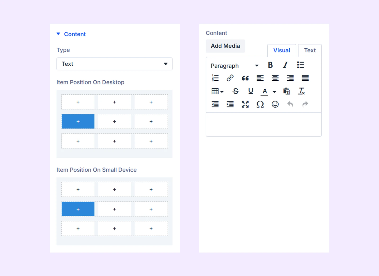
- Content: Add a block of custom text.
If you choose “Woo Cart” as the “Type-“
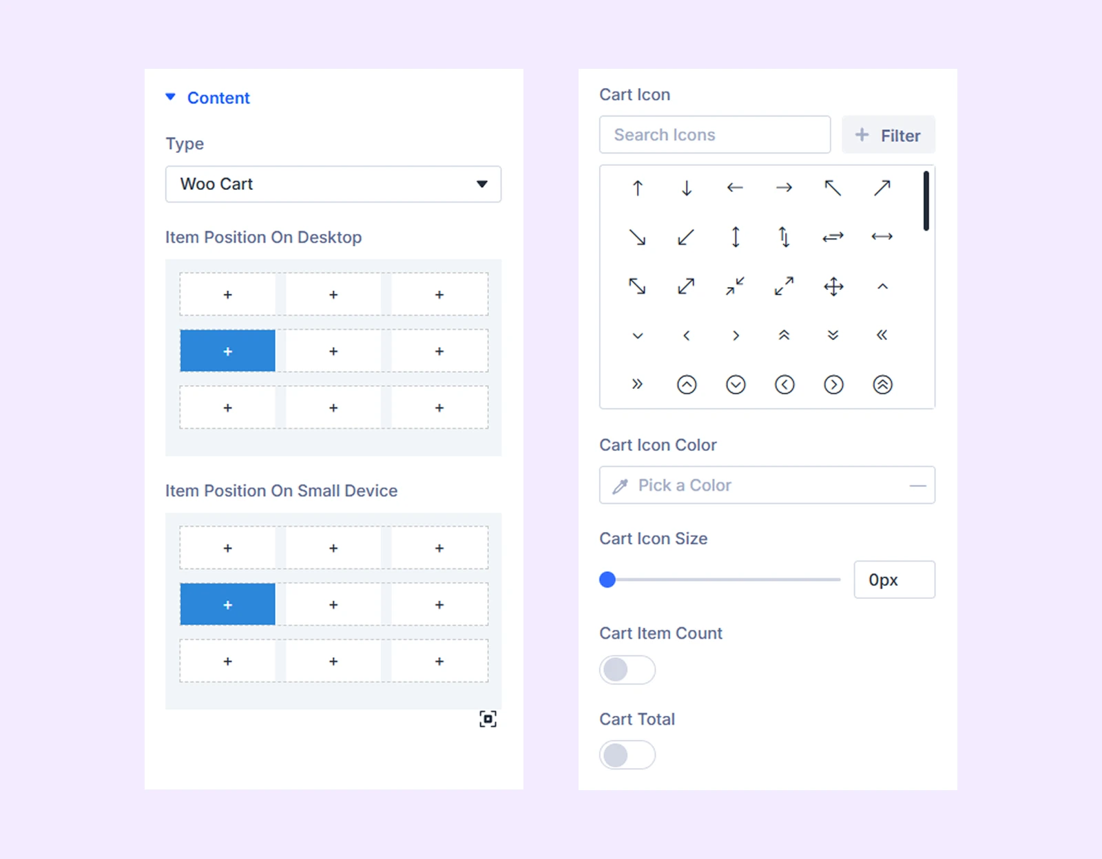
- Cart Icon: Choose an icon for the cart.
- Cart Icon Color: Choose a color for the cart icon.
- Cart Icon Size: Adjust the size of the cart icon.
- Cart Item Count: Enable this option to display the cart item count over the cart icon.
- Cart Count Color: Choose the font color for the cart item count.
- Cart Count Background Color: Choose a background color for the cart item count.
- Cart Total: Enable to display the total value of the cart beside the cart icon.
- Cart Total Color: Choose a font color for the cart total price.
If you choose “Icon Box” as the “Type-“
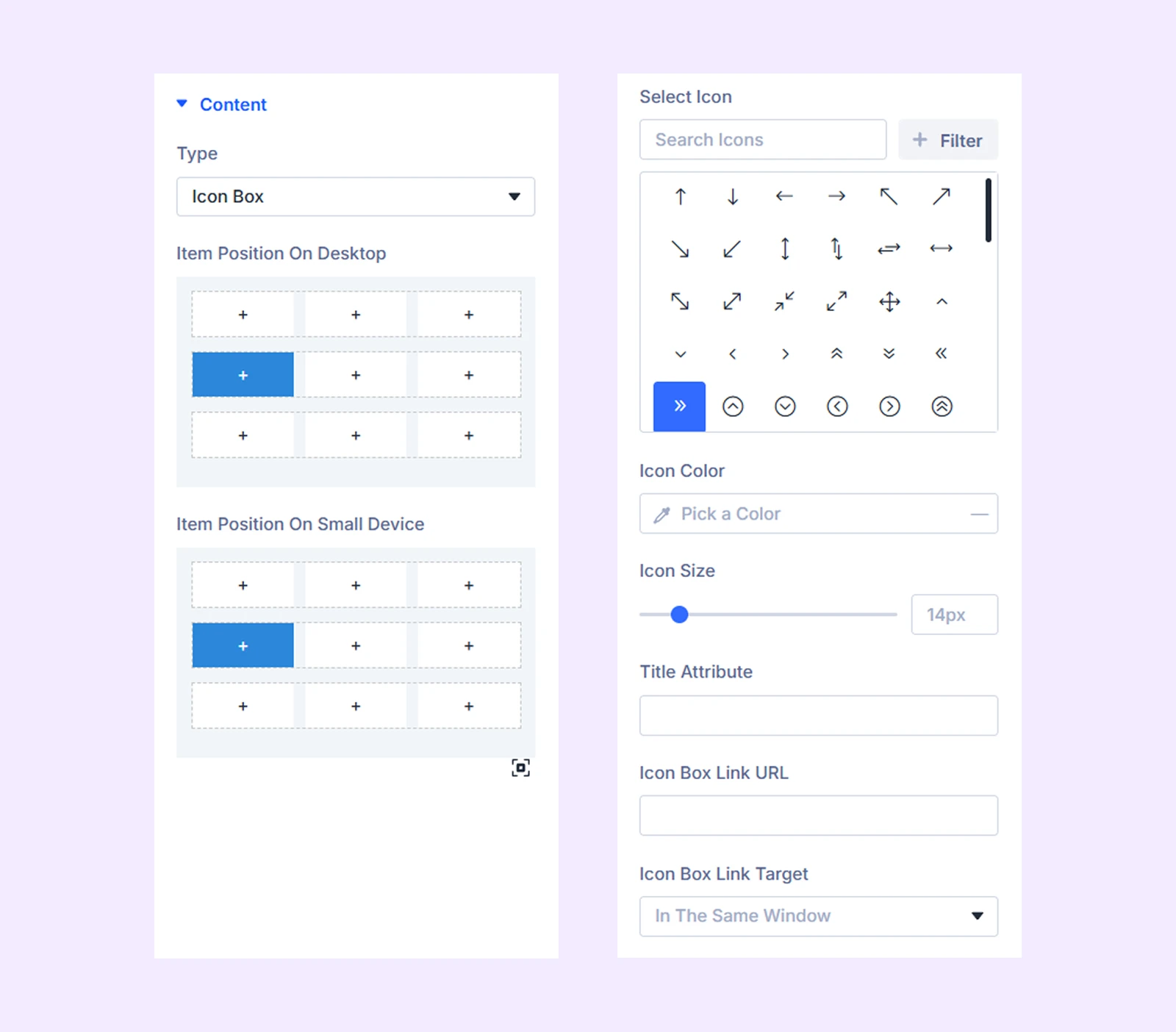
- Select Icon: Choose an icon.
- Icon Color: Choose a color for the icon.
- Icon Size: Adjust the size of the icon.
- Title Attribute:
- Icon Box Link URL: Attach a link to this icon.
- Icon Box Link Target: Choose if the link attached to the icon will open in the same tab or in a new window.
If you choose “Divider” as the “Type-“
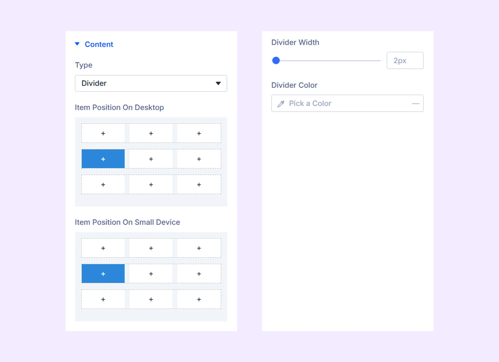
- Divider Width: Adjust the width of the divider line.
- Divider Color: Choose a color for the divider line.
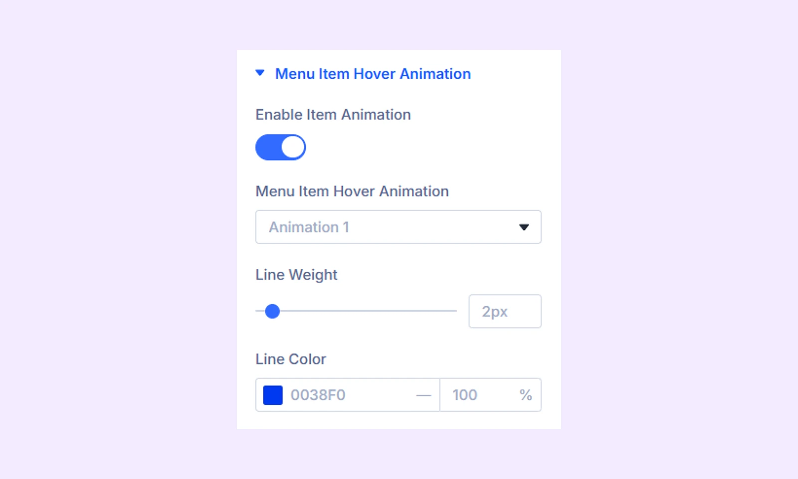
Menu Item Hover Animation
This section will only appear if you choose “Menu” as “Type.”
- Enable Item Animation: Toggle on to enable a line animation effect when hovered over the menu.
- Menu Item Hover Animation: Choose from 5 different preset line animation styles for the hover.
- Line Weight: Adjust the thickness of the animation line.
- Line Color: Choose a color for the animation line.
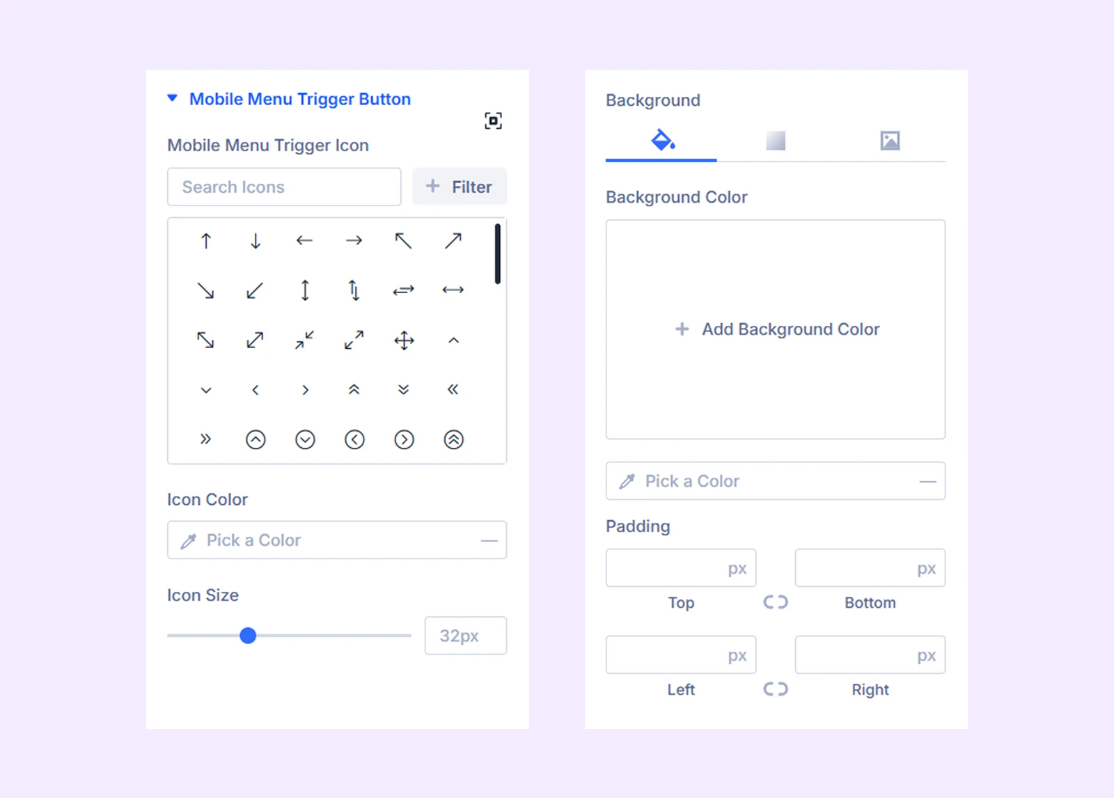
Mobile Menu Trigger Button
Select and customize the menu trigger icon for mobile devices. This section will only appear if you choose “Menu” as “Type.”
- Mobile Menu Trigger Icon: Choose the icon that will open the mobile menu.
- Icon Color: Pick a color for the trigger icon.
- Icon Size: Adjust the size of the trigger icon.
There you will also find background and padding and margin options.
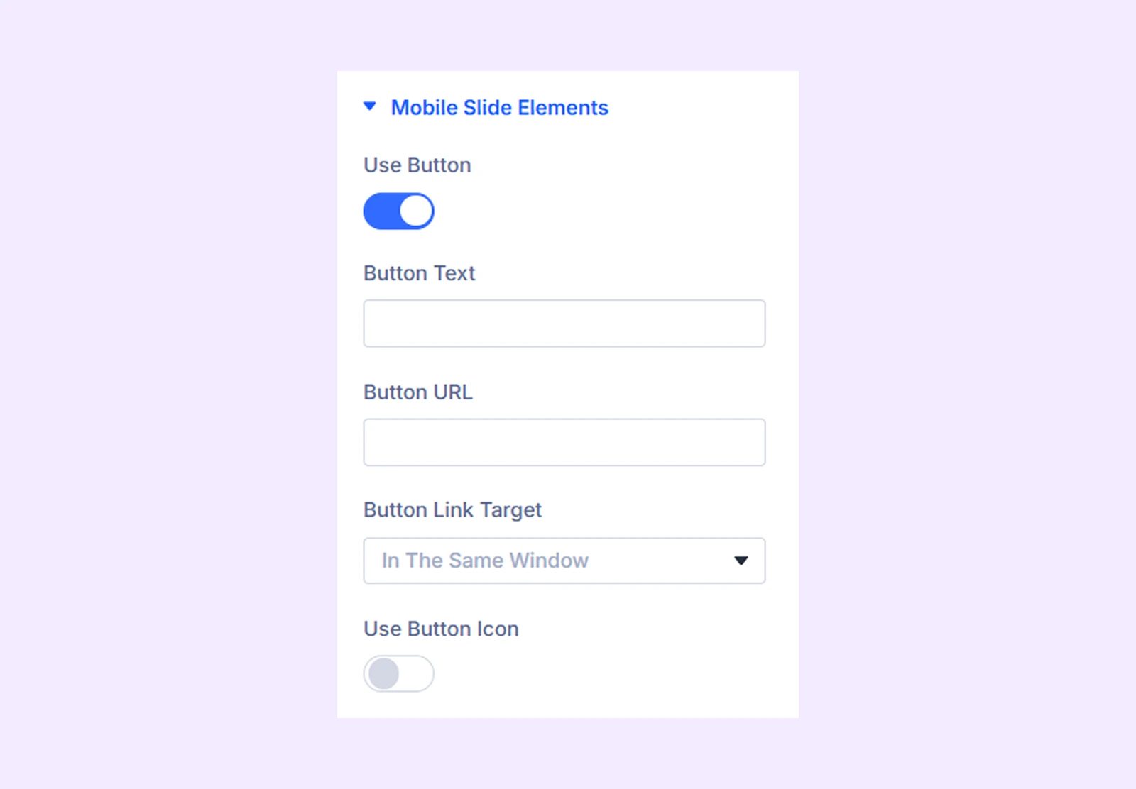
Mobile Slide Elements
Use this section to add a button to the mobile slide. This section will only appear if you choose “Menu” as “Type.”
- Use Button: Toggle this on to add a button inside the mobile menu slide.
- Button Text: Enter the text that will appear on the button.
- Button Link Target: Choose whether the button link opens in the same tab or a new window.
- Use Button Icon: Toggle this on to add an icon to the button.
- Icon On Left: If enabled, the icon will appear on the left side of the button text.
Disabled On: Choose to disable the menu item on desktops or smaller devices.
Link: Add a URL to make the menu item clickable.
Background: Set a background for this menu item.
Element Label: Rename the menu item for easy identification in the Divi Builder (only visible to you).
Design Tab
Text Style: Typography options for the text are entered through the “Text” menu item.
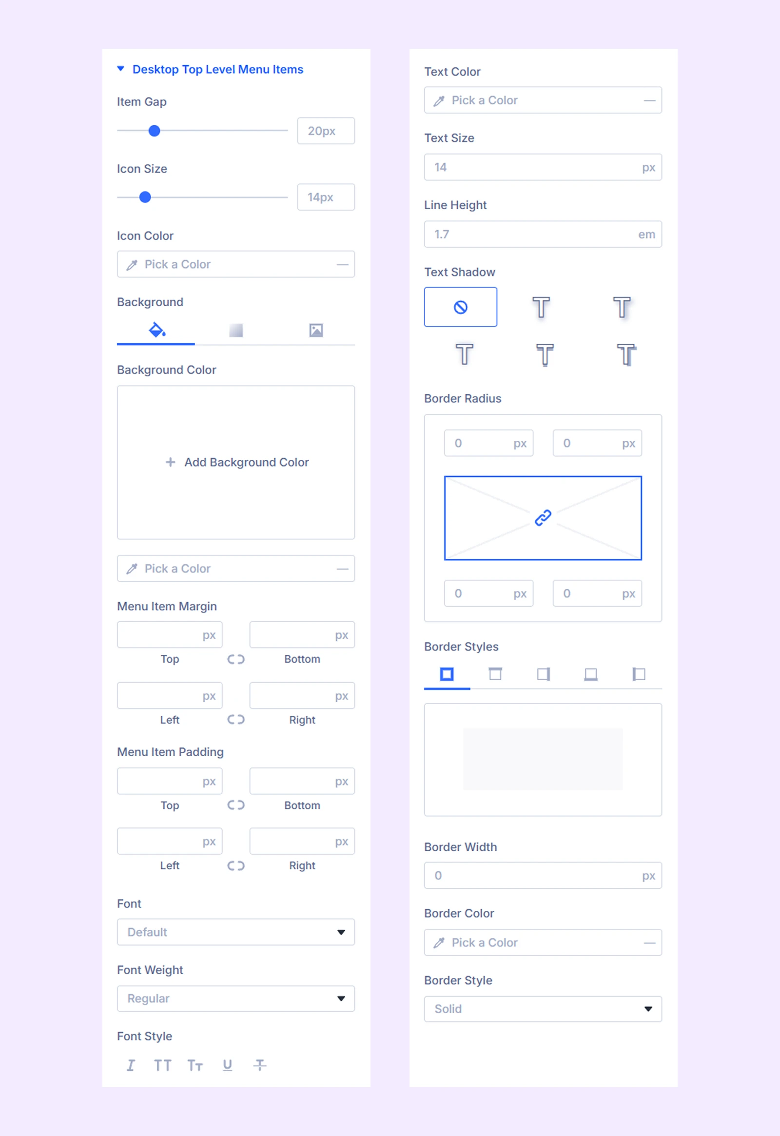
Desktop Top Level Menu Items
Customization options for the menu you use on the top row.
- Item Gap: Adjust the gap between the menu items.
- Icon Color: Pick a for the menu item icons.
- Icon Size: Adjust the size of the menu item icons.
The rest of the items are for background, spacing, and typography for the top level menu.
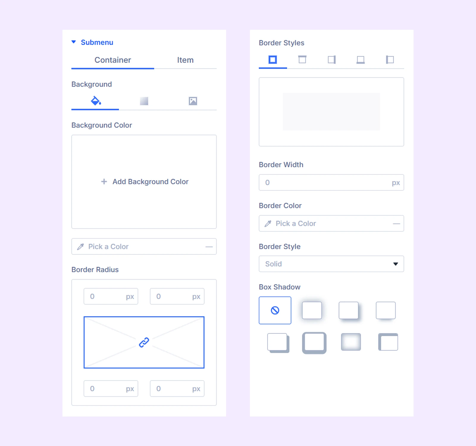
Submenu
Customization options for the submenus of the selected menu.
- Container: Background and border options for the submenu container.
- Item: Icon, background, and typography options for the submenu items.
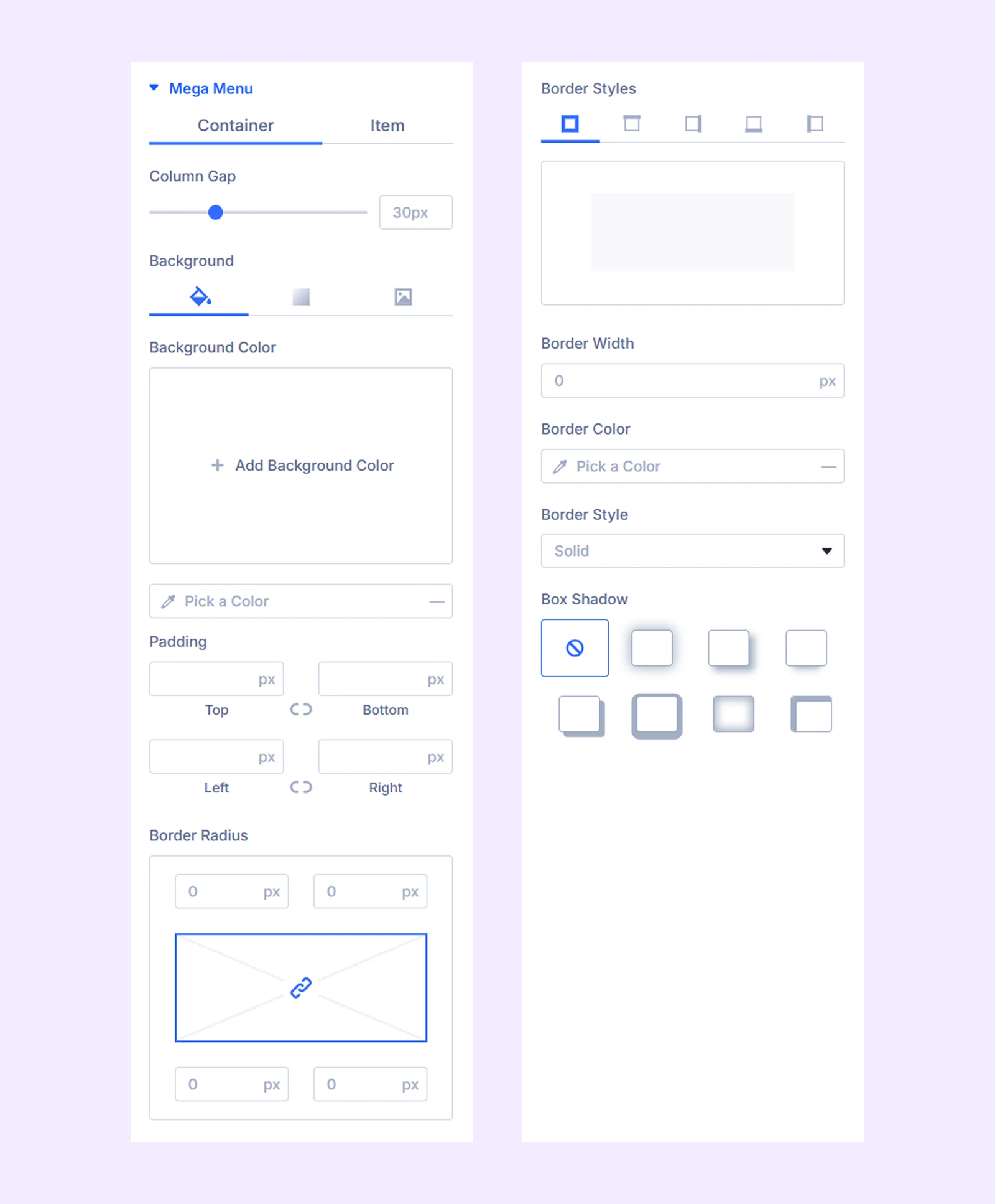
Mega Menu
Customization options for the mega menu of the selected menu.
- Container: Background and border options for the mega menu container.
- Item: Icon, background, and typography options for the mega menu items.
Menu Parents: Typography and border options for the 1st, 2nd, and 3rd menu parents.
Menu Parents Icon: Color, size, spacing, and border options for the 1st, 2nd, and 3rd menu parent icons.
Menu Childs: Typography and border options for the 1st, 2nd, and 3rd menu childs.
Menu Childs Icon: Color, size, spacing, and border options for the 1st, 2nd, and 3rd menu child icons.
Activate State: Color, background, and border options to denote the active menu and submenu item.
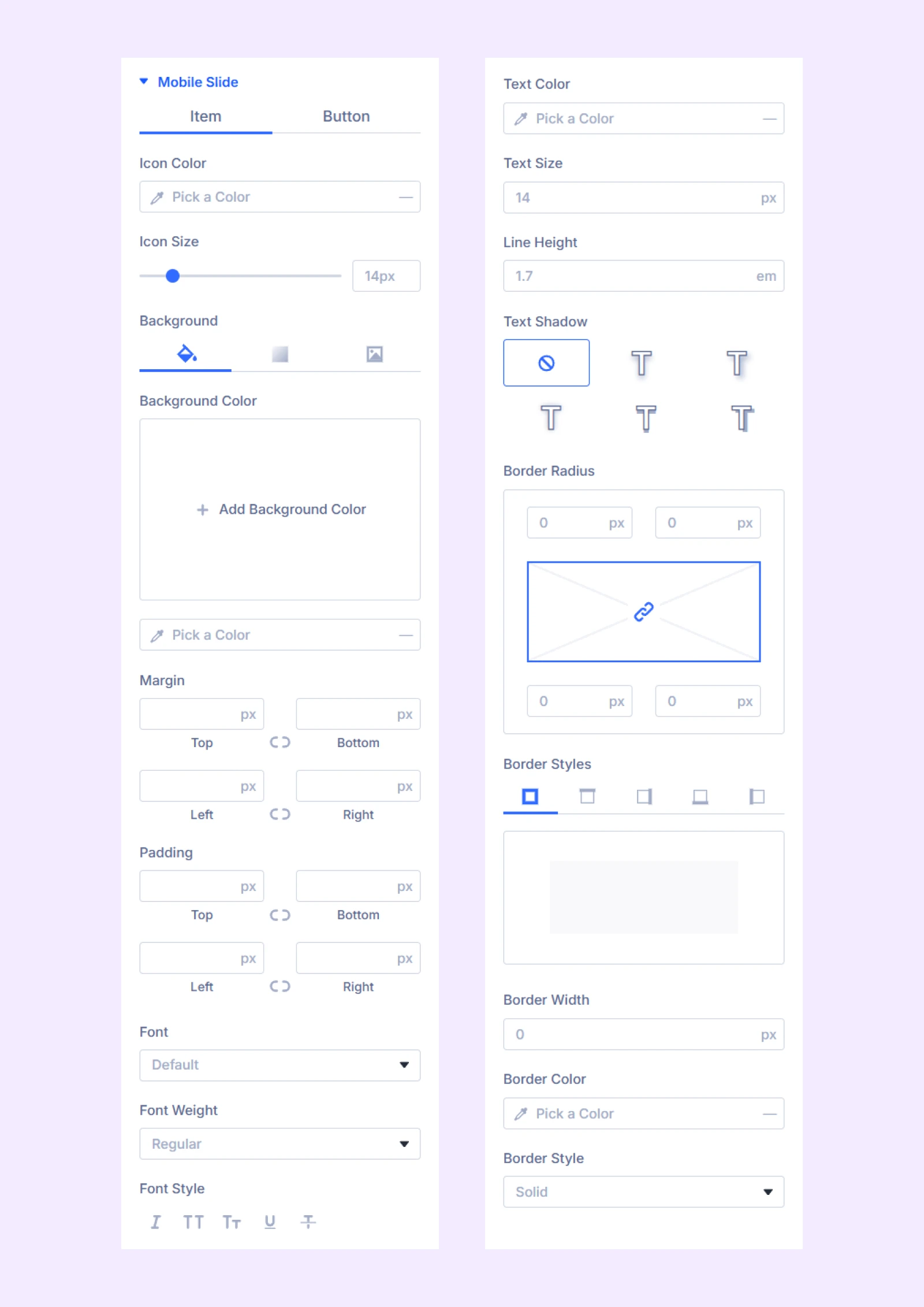
Mobile Slide
- Item: Icon, background, spacing, typography, and border options for the mobile slide menu items.
- Button: Background, spacing, typography, and border options for the mobile slide buttons.
Sizing: Adjust the width, height, and alignment of the menu item.
Spacing: Add custom margins and padding to the menu item.
Border: Border customization options for the menu item.
Box Shadow: Apply a shadow effect to the menu item.
Filters: Add color filters to the menu item.
Transform: Change the scale, placement, size, angle, etc. of the menu item.
Advanced Tab
The default tab for all Divi modules is used to add custom CSS code, conditions, visibilities, etc.
Need Help?
If you have any questions or need assistance, contact our support team: [email protected]