DiviFlash Advanced Carousel Module, you can create dynamic sliders with advanced customization options.
Let’s see the settings in brief and how to make better use of it —
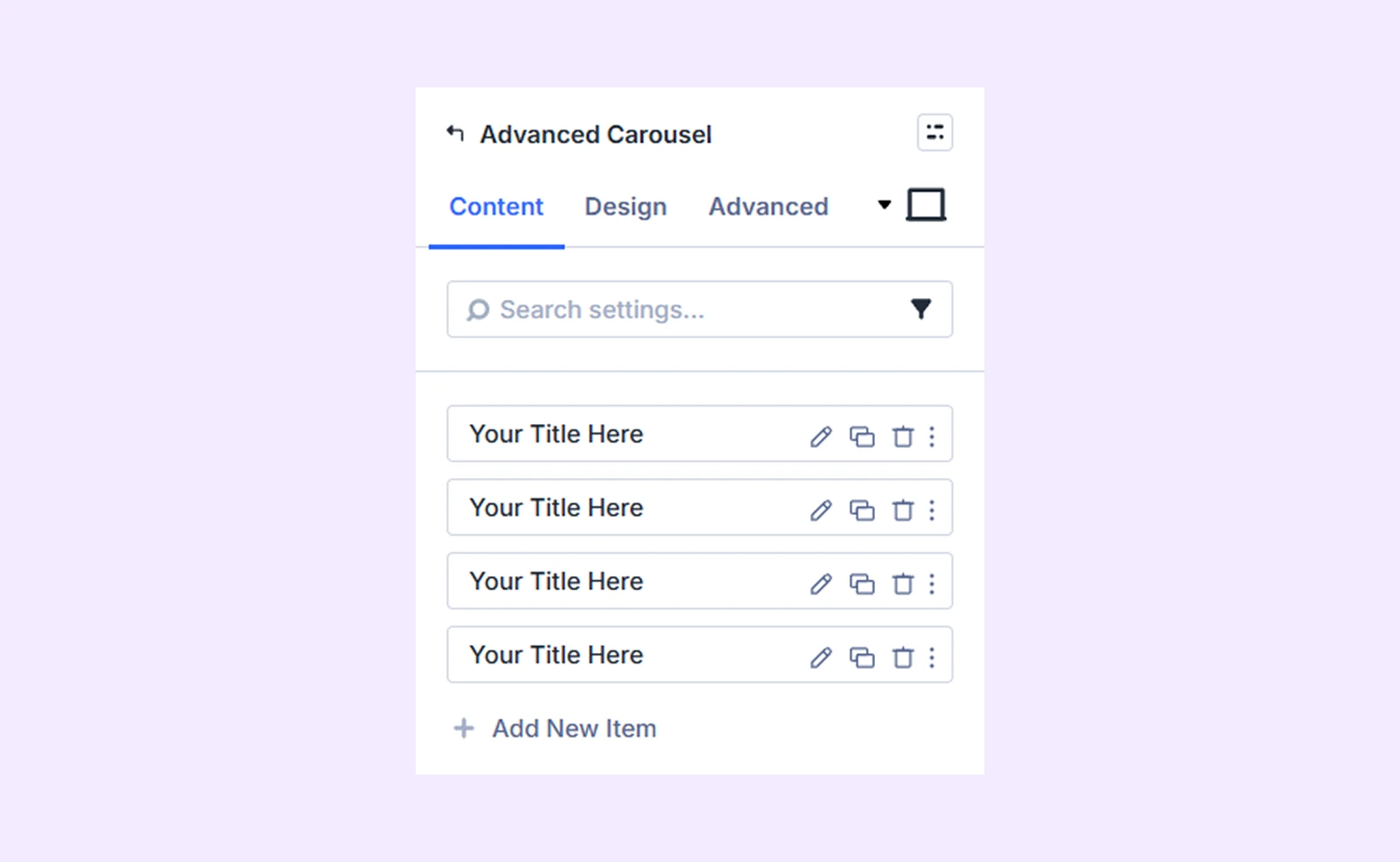
Content Tab
Use this tab to add and configure carousel items and core functionality.
Add New Item
Click the + Add New Item button to create a new slide. This opens the Advanced Carousel Item Settings, where you can customize each carousel item individually. By default, you will see 4 carousel items that you can delete or edit. To know more about customizing sliders separately, click here.
Carousel Settings
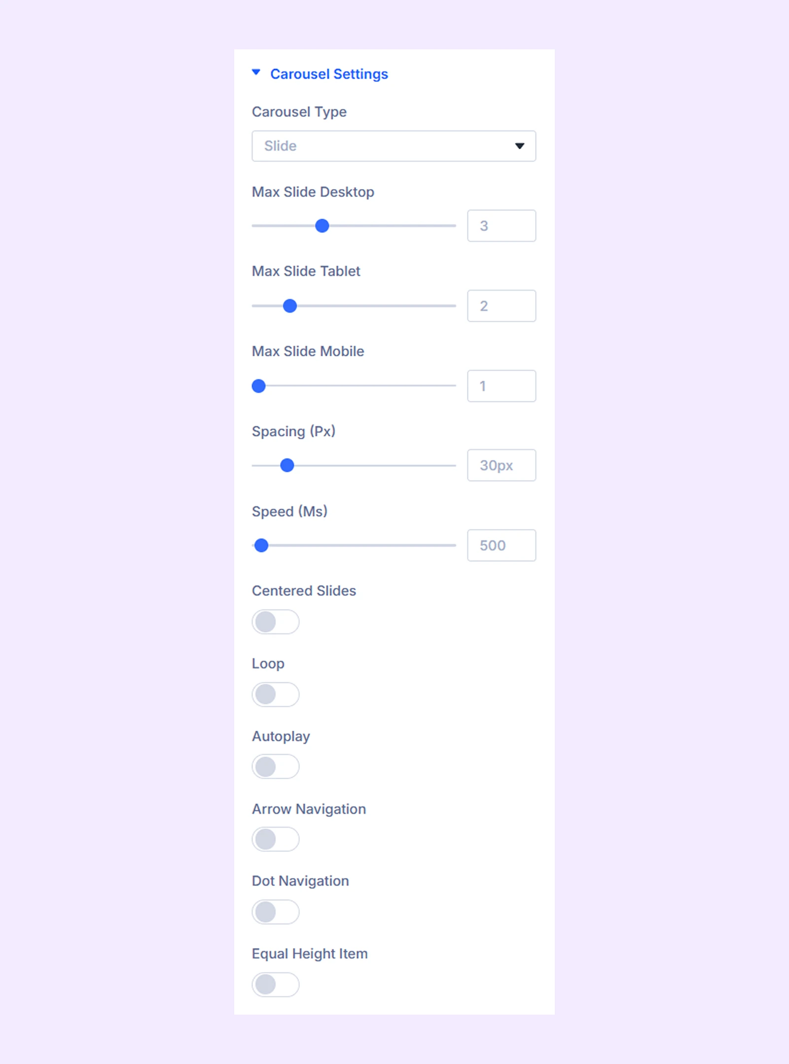
- Carousel Type: Choose if you want your carousel to be a slide or a coverflow.
- Max Slide Desktop: Choose the maximum number of slides you want to display at once on desktops.
- Max Slide Tablet: Choose the maximum number of slides you want to display at once on tablets.
- Max Slide Mobile: Choose the maximum number of slides you want to display at once on mobile phones.
- Spacing: Change the spacing between each slide.
- Speed: Adjust how fast the carousel items will slide.
- Centered Slides: Toggle this option to start the slides from the center.
- Loop: Toggle on to create a loop with the items.
- Autoplay: Turn this option on to automatically start the slideshow.
- Autoplay Speed: Adjust the rotation speed for the automatic slideshow. Only available if “Autoplay” is on.
- Pause on Hover: Enable to pause the autoplay when hovered over. Only available if “Autoplay” is on.
- Arrow Navigation: Enable the use of arrows as navigation.
- Dot Navigation: Enable the use of dots as navigation.
- Equal Height Item: Enable to ensure that each item has the same height regardless of the length of the content.
- Use Lightbox: Make your carousel images appear as in a lightbox when you click them.
- Use Lightbox Caption: Enable to show the carousel title along with the image in Lightbox.
Advanced Settings
If you select “Coverflow” as the “Carousel Type,” you’ll gain access to coverflow slider customization settings.
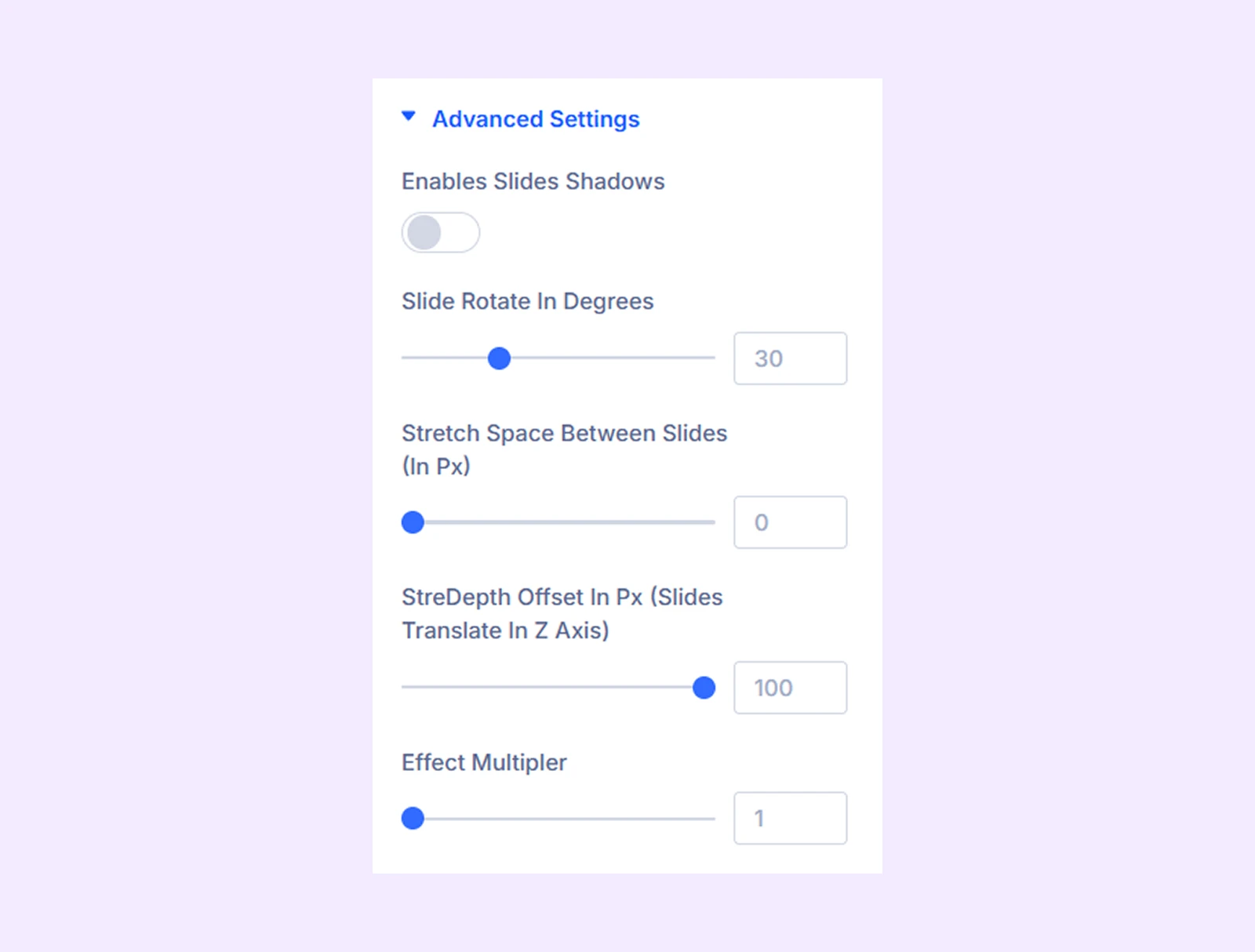
- Enables Slides Shadows: Turn on to add a shadow effect to the coverflow sliders.
- Shadow Color Dark: Choose the darker shade for the shadow effect.
- Shadow Color Light: Choose the lighter shade for the shadow effect.
- Slide Rotate in Degrees: Adjust the angle of the carousel items.
- Stretch Space Between the Slides (In Px): Adjust the gap between the slides.
- StreDepth Offset In Px (Sliders Translate In Z Axis): Adjust how far the slides move along the Z-axis to create a deeper or flatter 3D perspective effect.
- Effect Multiplier: Determines how many times the carousel items will slide or rotate.
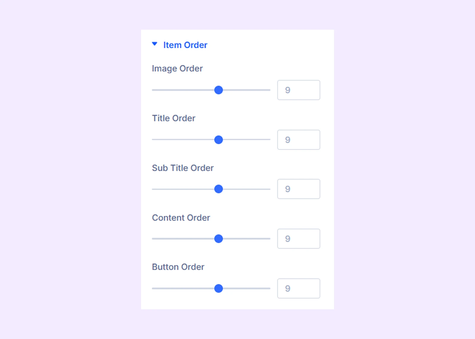
Item Order
Set the order of each component of the carousel item. For example, there are 5 components in the carousel item. You can assign each component a number and they will appear in that order.
Background: Add a background color, gradient, image, video, pattern, or mask to the module.
Element Label: Rename the module to organize it more easily in the Divi Builder. (Only you can see this label.)
Design Tab
Use this tab to style and customize the visual appearance of the carousel.
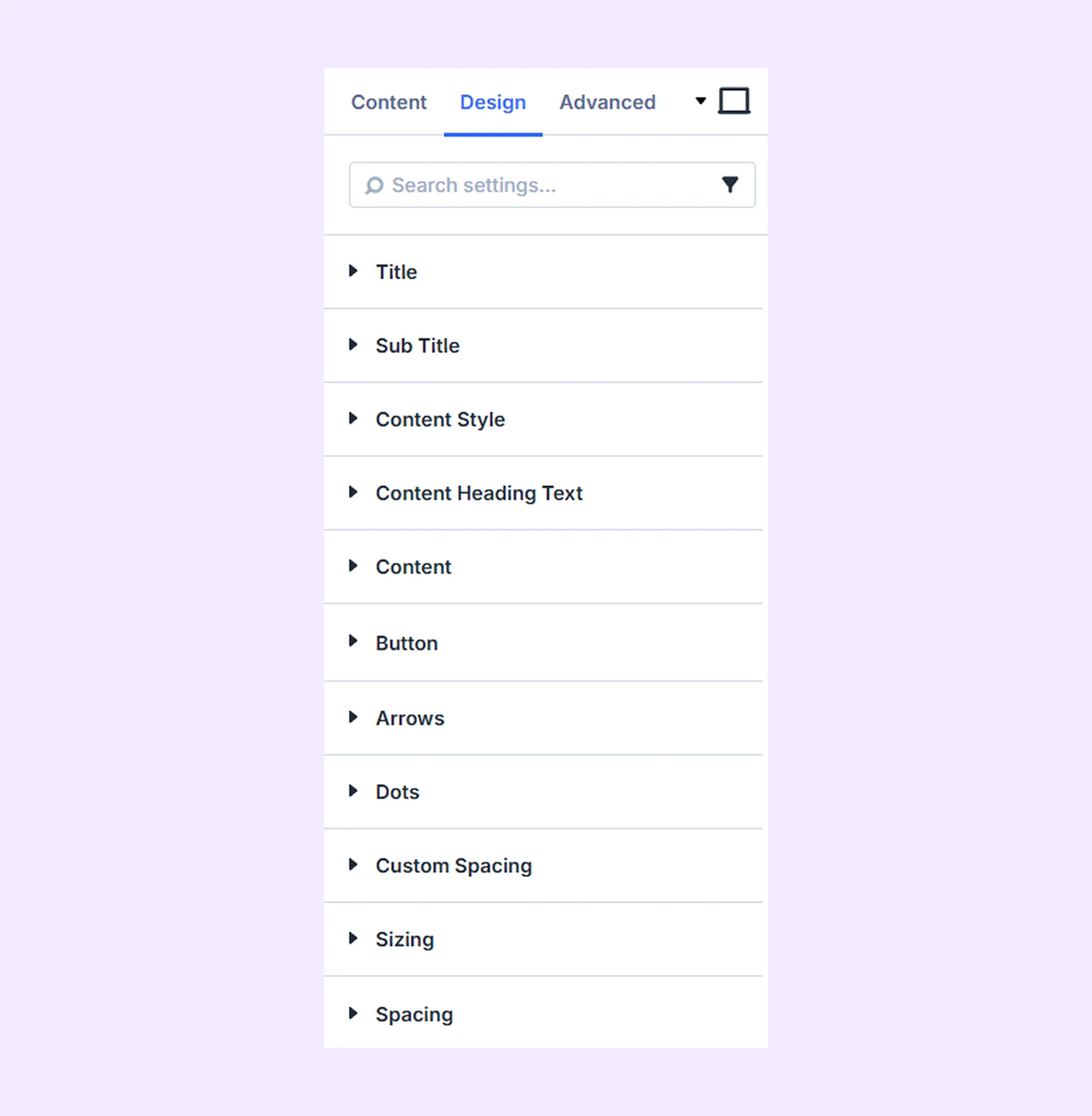
Title: Typography options for the titles of all the carousel sliders.
Sub Title: Typography options for the subtitles of all the carousel sliders.
Content Style: Add a background color, gradient, or an image to the sliders body content.
Content Heading Text: Typography options for the heading text of the sliders body content.
Content: Typography options for the body content of the sliders.
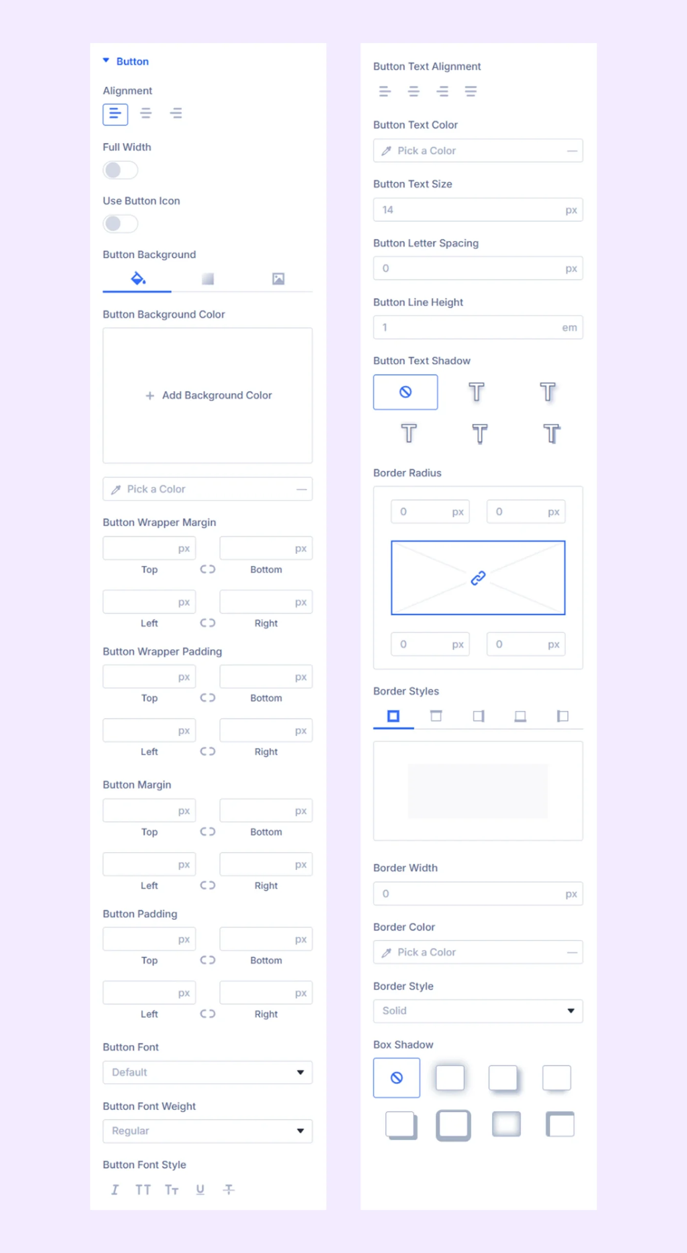
Button
- Alignment: Choose the horizontal placement of the sliders buttons.
- Full Width: Enable to make the button full width respective to the sliders containers.
- Use Button Icon: Enable this to add icon on button with option to adjust size and color.
The next options are for changing the buttons background color, spacing typography, and border.
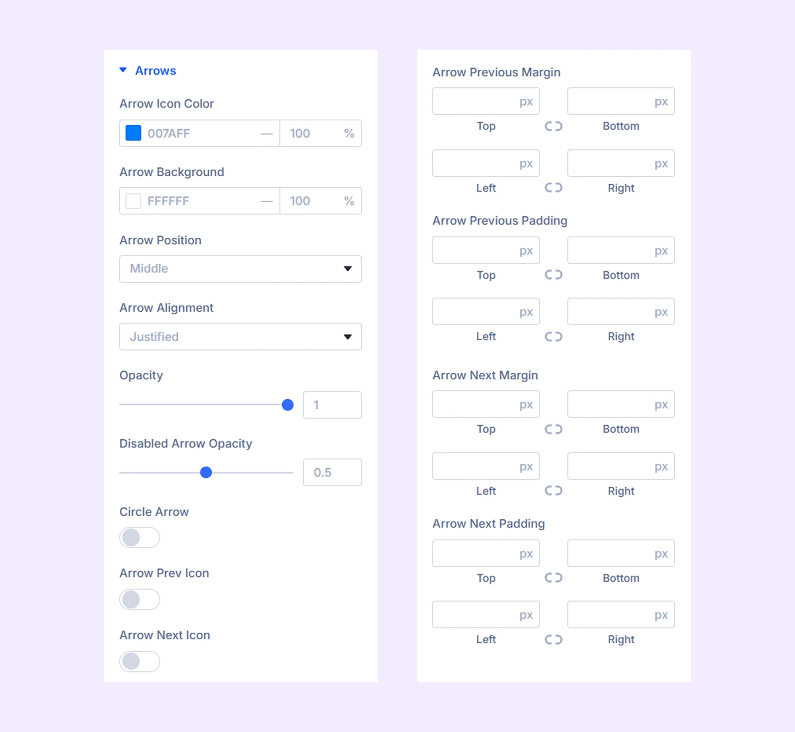
Arrows
Keep the arrow navigation on to use those design options described below-
- Arrow Icon Color: Pick a color for the arrow navigation icons.
- Arrow Background: Pick a background color for the arrow navigation icons.
- Arrow Position: Change the vertical position of the arrow buttons relative to the sliders.
- Arrow Alignment: Change the horizontal position of the arrow buttons.
- Opacity: Adjust the transparency of the arrow buttons.
- Disabled Arrow Opacity: Adjust the transparency of the arrow buttons.
Note: The navigation arrows will be disabled when you reach the end of the carousel if the loop effect is not active.
- Circle Arrow: Enable to make the arrow buttons circular.
- Arrow Prev Icon: Toggle on to use a custom icon for the previous button.
- Arrow Next Icon: Toggle on to use a custom icon for the next button.
- Spacing: Add custom margin and padding to the arrow buttons.
Additional options include border and shadow customization.
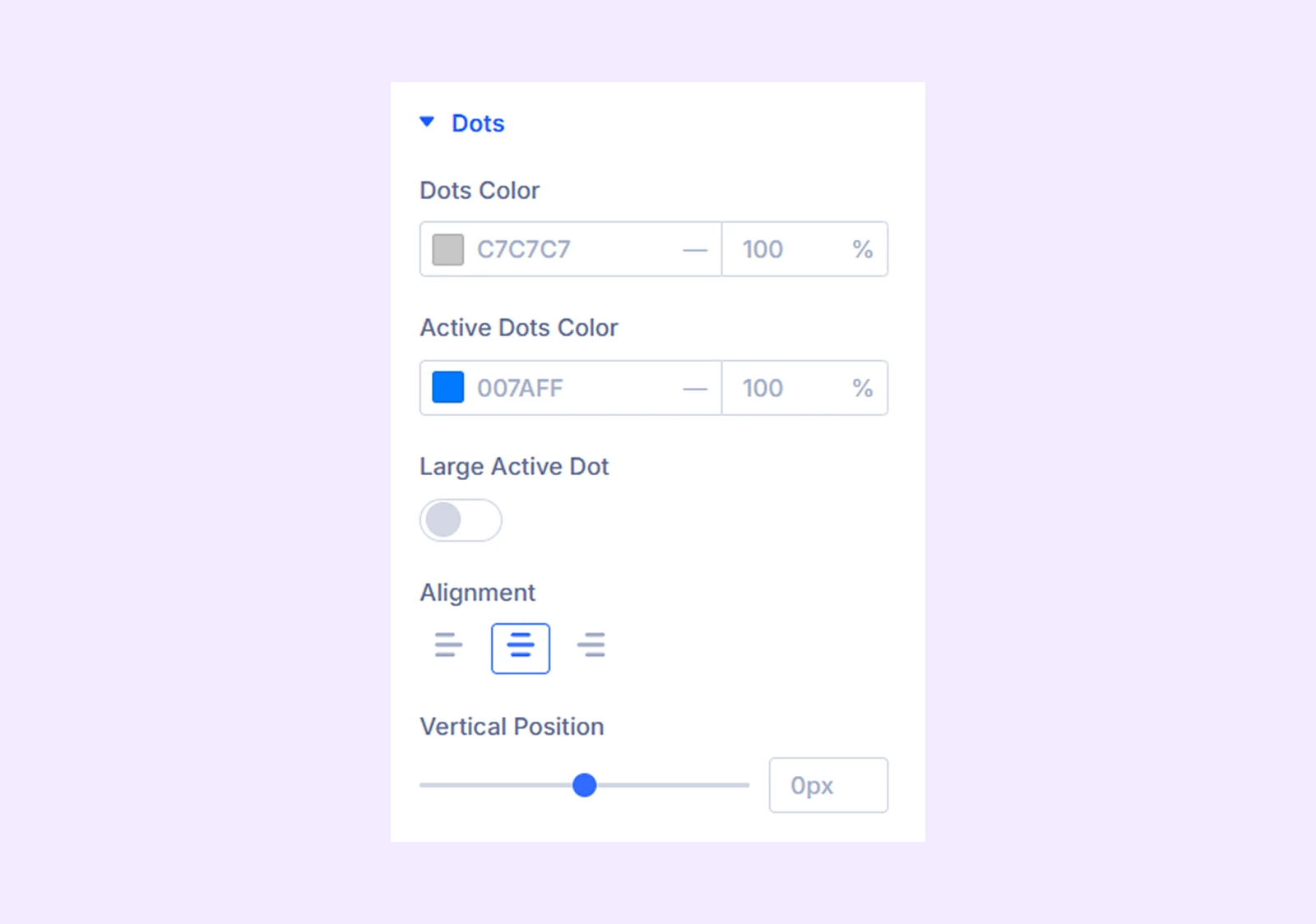
Dots
(Available when Dot Navigation is enabled)
- Dots Color: Pick a color for the dots.
- Active Dots Color: Pick a separate color for the active dot.
- Large Active Dot: Make the active dot larger than the rest.
- Alignment: Change the horizontal position of the dots relative to the sliders.
- Vertical Position: Adjust the vertical position of the dots relative to the sliders.
Custom Spacing
Create custom spacings between the carousel items and each of the components of the carousel items.
- Wrapper: Customize the padding and margin of the wrapper for the entire carousel, the item, and the image individually.
- Content: Customize the padding and margin of each component of all the carousel items separately.
Sizing: Adjust the width, height, and alignment of the module.
Spacing: Add custom margin and padding to the module’s container.
Border: Customize the border style, width, and color. And style each border separately or apply the same style to all sides.
Box Shadow: Add shadow effects to the module.
Animation: Apply reveal animation effects and customize delay, duration, repeat settings, and animation type.
Advanced Tab
This tab provides additional settings for advanced users who want greater control over the module with custom code, conditions, and more.
Advanced Carousel Item Settings
Each carousel item can be customized individually. Settings here override the main module settings.
Content Tab
Content: Add the title, subtitle, and the body content for the slider.
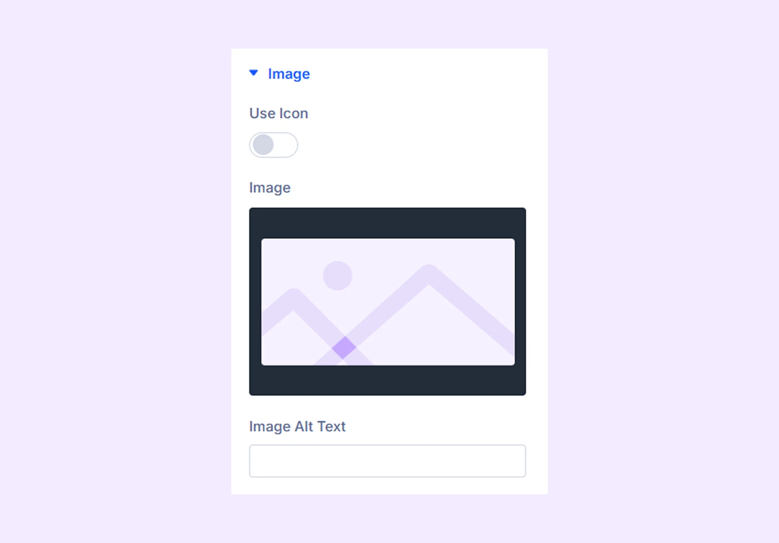
Image
- Image: Upload an image for the slider.
- Image Alt Text: Input the alt text of the carousel image.
- Use Icon: A toggle button to enable the use of an icon instead of an image.
- Icon: Choose an icon of your choice from Divi’s default collection.
- Icon Color: Configure the icon’s color.
- Icon Size: Select the icon’s size.
- Icon Align: Adjust the icon’s placement.
- Icon Background: Set the icon’s background color.
- Circle Icon: Toggle this option on to choose a circle background instead of a square for the icon.
Note: The icon related options will only be available if you enable “Use Icon.”
Button: Enter the text and URL for the slider button, and select whether to open the link in a new or the same tab.
Item Order, Link, Background, Element Label: These options function the same as in the main carousel settings but apply only to this item.
Design Tab
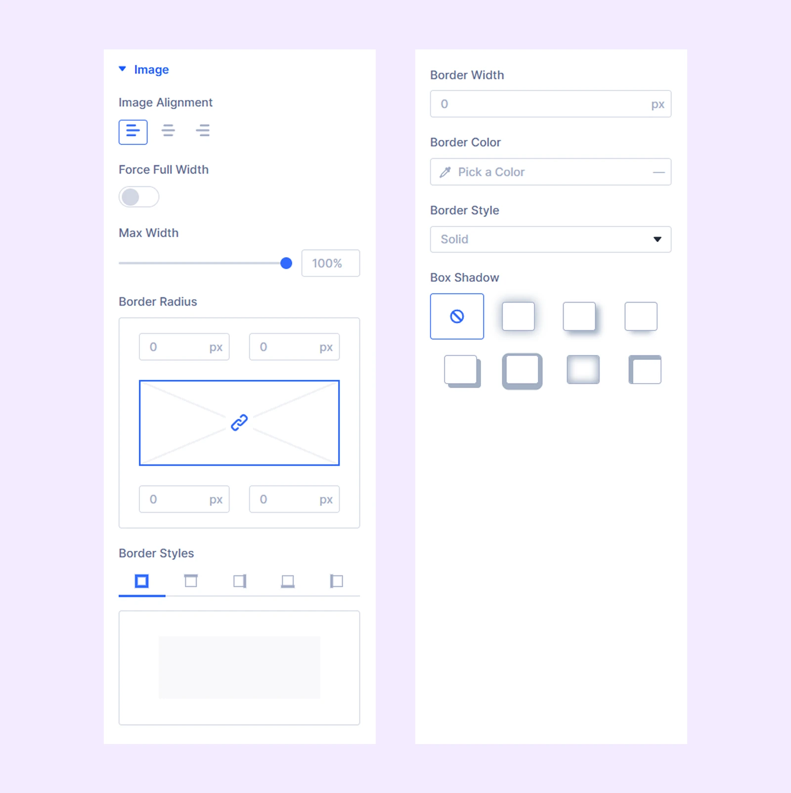
Image
- Image Alignment: Select the placement of the image.
- Force Full Width: Toggle this option on to make the image full-screen.
- Max Width: Limit the maximum width of the image.
Note: If you enable the Force Full Width option, Image Alignment and Max Width will be disabled.
Additional settings allow border customization.
Icon: Border customization options for the icon used in the slider.
The next sections available here offer functionalities similar to those of their counterparts in the “Advanced Carousel Settings.”
Advanced Tab
Use this tab to apply custom CSS, conditions, transitions, and scroll effects to individual items.
Need Help?
If you have any questions or need assistance, contact our support team: [email protected]