The DiviFlash Line Chart module (introduced in DiviFlash 5.2.0) lets you display data using interactive and animated line charts.
Important Note: Line Chart module is built for Divi 5 only. Also, it will be disabled by default and to use it, you must enable it manually. Refer to our guide for step-by-step instructions.
Let’s see the settings in brief and how to make better use of it —
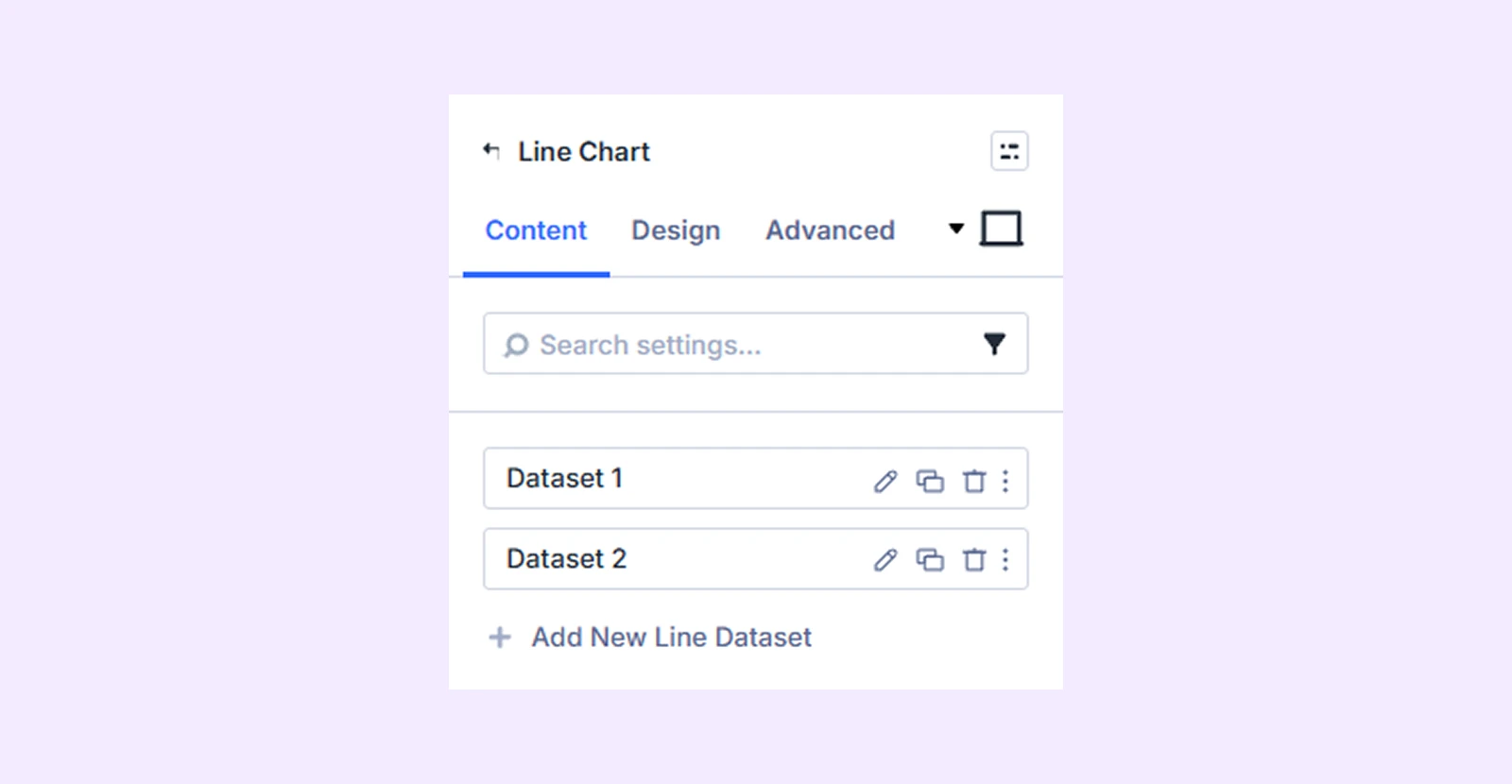
Content Tab
This tab contains all the essential settings to manage your chart data, layout, and behavior.
Add New Line Dataset
By default, you will see 2 line datasets with 3 values each. You can keep them, edit them, or remove them. To add more datasets and values, click on “Add New Line Dataset.” To learn about the available settings for a new line dataset, click here.
Data Source
You can choose how your chart gets data:
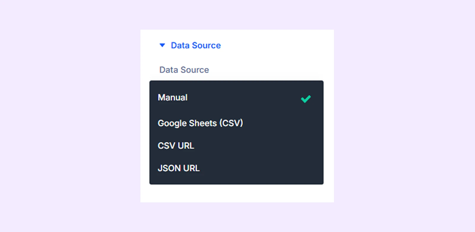
- Manual: Enter values directly inside the module for full control over your data.
- Google Sheets: Pull data from a connected Google Sheet (must be published to the web).
- CSV URL: Fetch data from an external CSV file via public URL.
- JSON URL: Fetch data from a public JSON endpoint data source.
Cache Duration: Set how often data is refreshed (1 hour, 6 hours, 24 hours, or on every page load).
Note: Cache Duration only applies to external data sources: Google Sheets, CSV URL, and JSON URL
General Settings
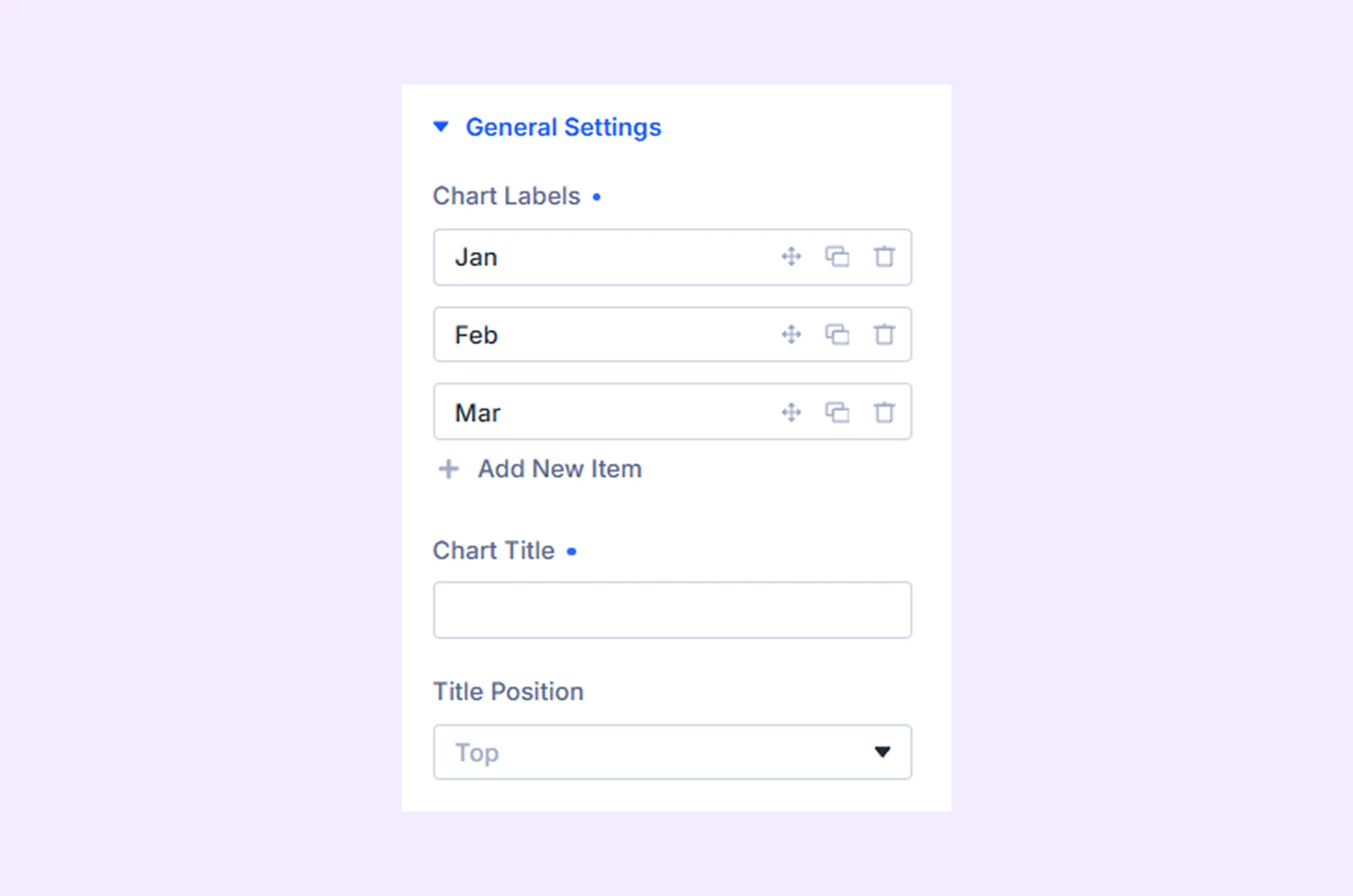
- Chart Labels: Define the categories shown in the chart. By default, 3 labels are included. You can rename, reorder (drag), duplicate, delete, or add more labels based on your data. Each label represents a group of values in the chart.
- Chart Title: Add a title to explain what the chart is about.
- Title Position: Choose where the title appears (top, bottom, left, or right) to fit your layout.
Legend
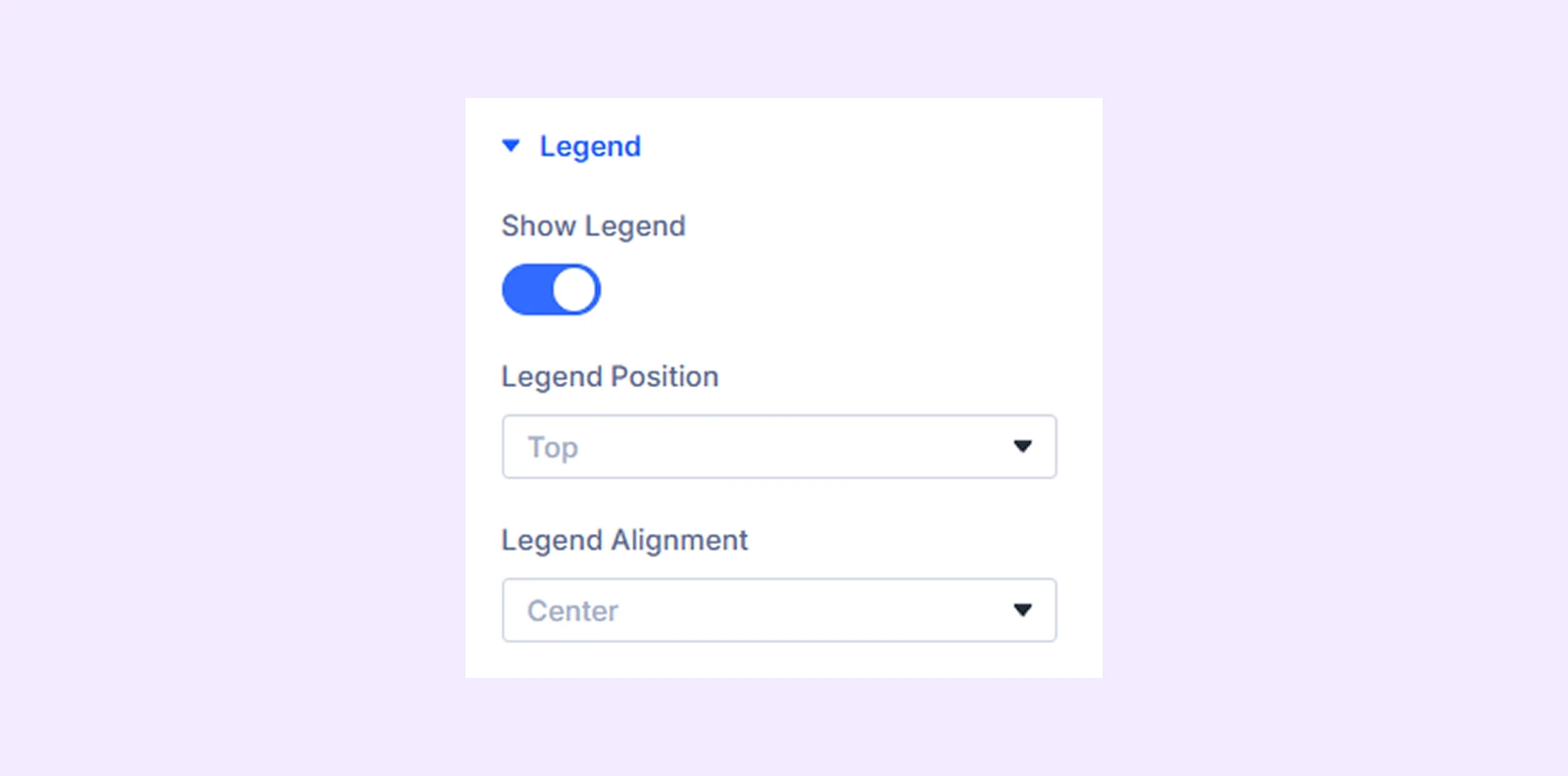
- Show Legend: Enable or disable the dataset legend, which displays names with their corresponding colors.
- Legend Position: Choose where the legend appears (top, bottom, left, or right) to match your layout.
- Legend Alignment: Adjust how the legend items are aligned for better spacing.
Tooltip & Values
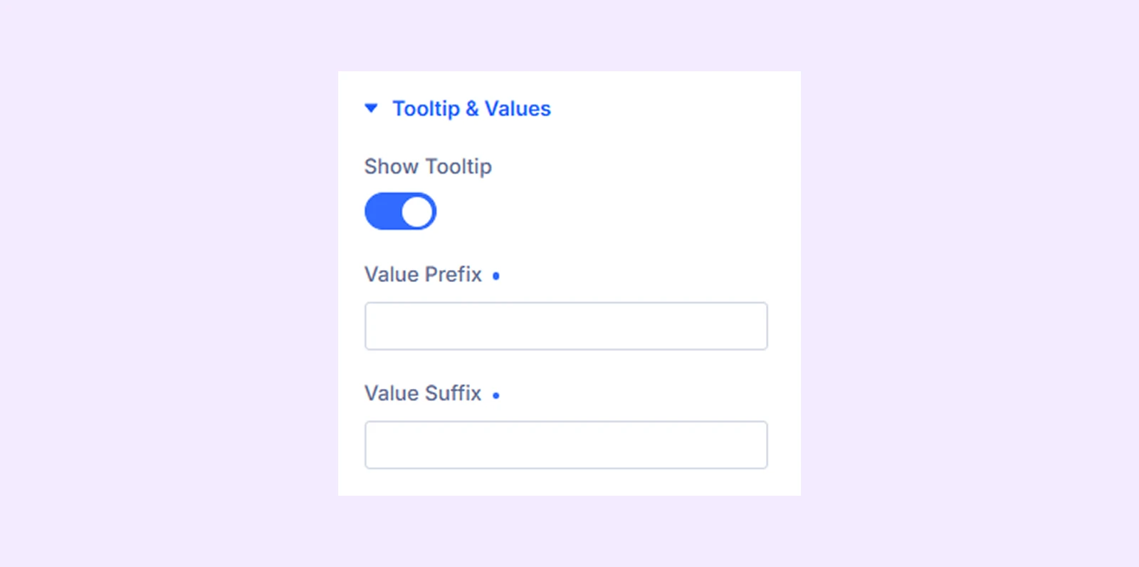
- Show Tooltip: Turn on to display a popup with details when hovering over data points in the chart.
- Value Prefix: Add text before values (for example: $, €, or “Total”).
- Value Suffix: Add text after values (for example: %, units, or “sales”).
X-Axis
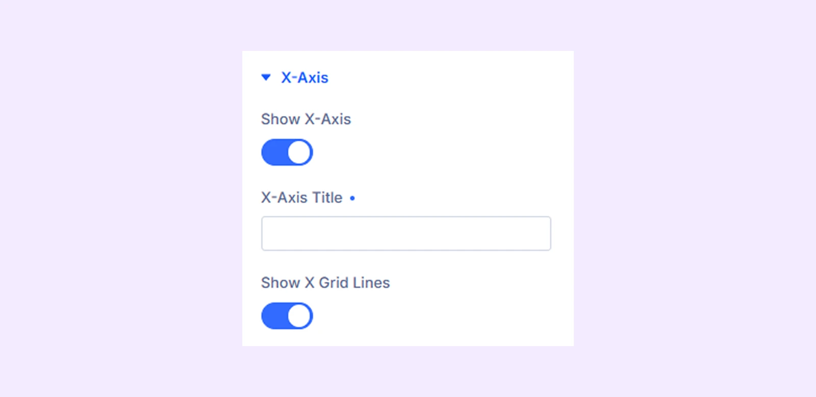
- Show X-Axis: Turn the X-axis on or off. This controls whether category labels appear at the bottom of the chart.
- X-Axis Title: Add a label below the X-axis to explain what the categories represent.
- Show X Grid Lines: Display vertical grid lines inside the chart to help users read values more clearly.
Y-Axis
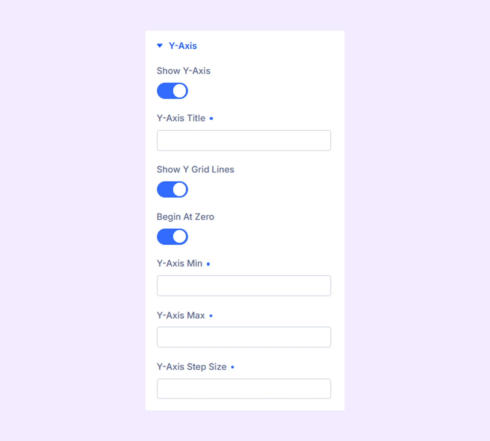
- Show Y-Axis: Turn the Y-axis on or off. This controls whether value labels appear on the left side of the chart.
- Y-Axis Title: Add a label beside the Y-axis to explain what the values represent.
- Show Y Grid Lines: Display horizontal lines across the chart to help compare values more easily.
- Begin At Zero: Start the value scale from 0 to ensure accurate comparison.
- Y-Axis Min: Set the lowest value shown on the axis, or leave empty for automatic scaling.
- Y-Axis Max: Set the highest value shown on the axis, or leave empty for automatic scaling.
- Y-Axis Step Size: Define the interval between values on the axis, or leave empty for automatic spacing.
Link: Use this default Divi setting to add a link to the entire module.
Background: Add a background color, gradient, image, video, pattern, or mask to the module.
Meta: Rename the module to organize it more easily in the Divi Builder. (Only you can see this label.)
Design Tab
Customize the visual appearance of the Line Chart module.
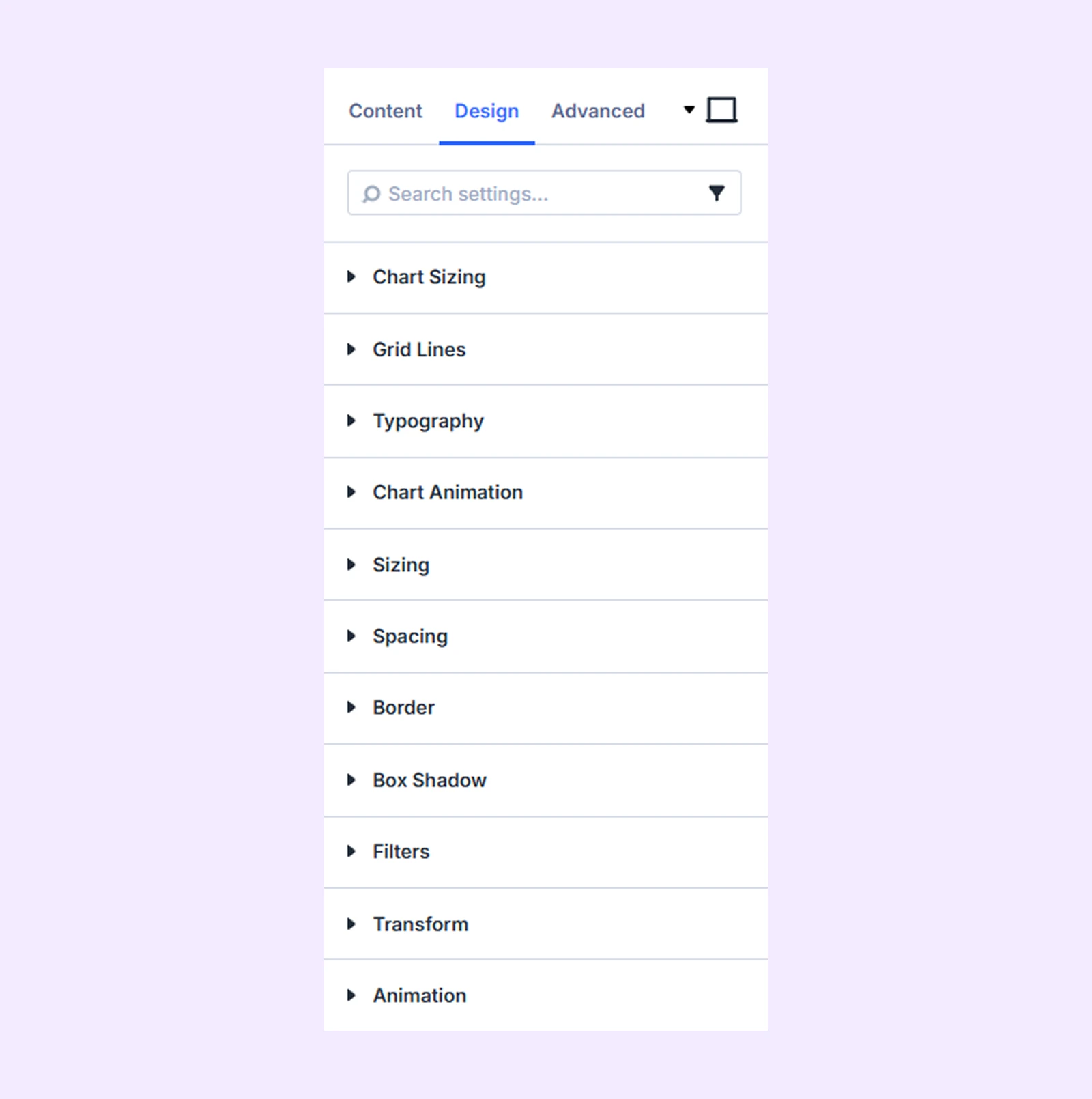
Chart Sizing: Adjust the overall chart height inside the module container.
Grid Lines
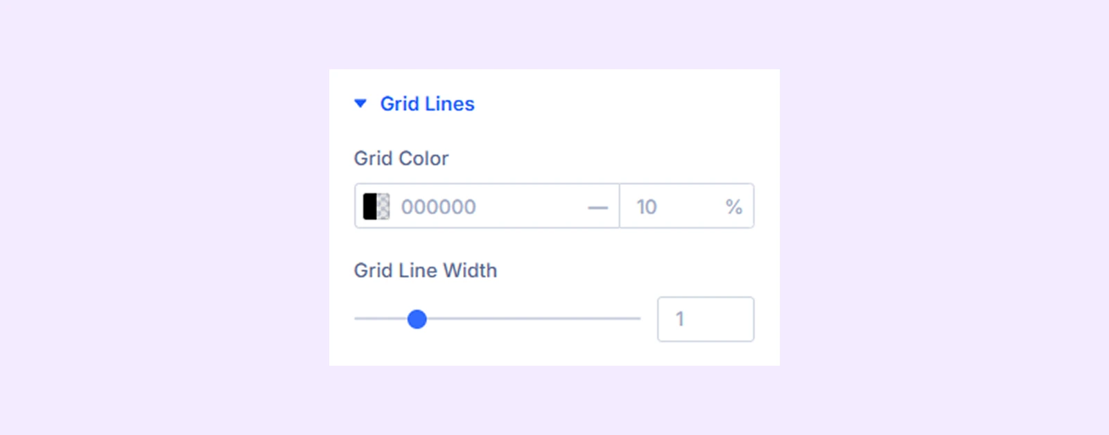
- Grid Color: Set the color of the grid lines.
- Grid Line Width: Adjust how thick or thin the grid lines appear to improve readability.
Typography: Customize the text of title, legend, tooltip, axis ticks and axis title with typography options.
Chart Animation
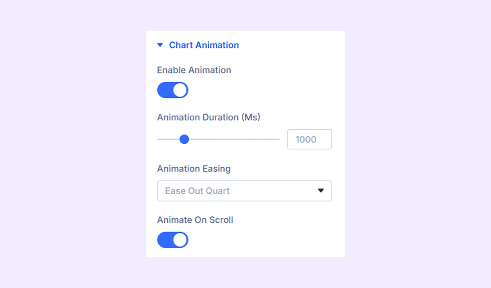
- Enable Animation: Turn animation on or off. When enabled, the chart plays a smooth animation on load.
- Animation Duration (Ms): Set how fast or slow the animation runs. Lower values make it faster, higher values make it slower.
- Animation Easing: Choose how the animation behaves (9 styles) to make motion feel smooth.
- Animate On Scroll: Trigger the animation only when the chart enters the visible area while scrolling.
Sizing: Adjust the width, height, and alignment of the module.
Spacing: Add custom margin and padding to the module’s container.
Border: Customize the border style, width, and color. And style each border separately or apply the same style to all sides.
Box Shadow: Add shadow effects to the module.
Filters: Apply color filters to enhance the appearance.
Transform: Scale, rotate, move, or skew the module.
Animation: Apply reveal animation effects and customize delay, duration, repeat settings, and animation type.
Advanced Tab
Each dataset includes separate Content, Design, and Advanced tabs. These settings apply when creating or editing datasets manually.
Line Dataset Child Item Setting
Each dataset includes separate Content, Design, and Advanced tabs. These settings are used when creating or editing datasets manually for each line in the chart.
Content Tab
Line Content
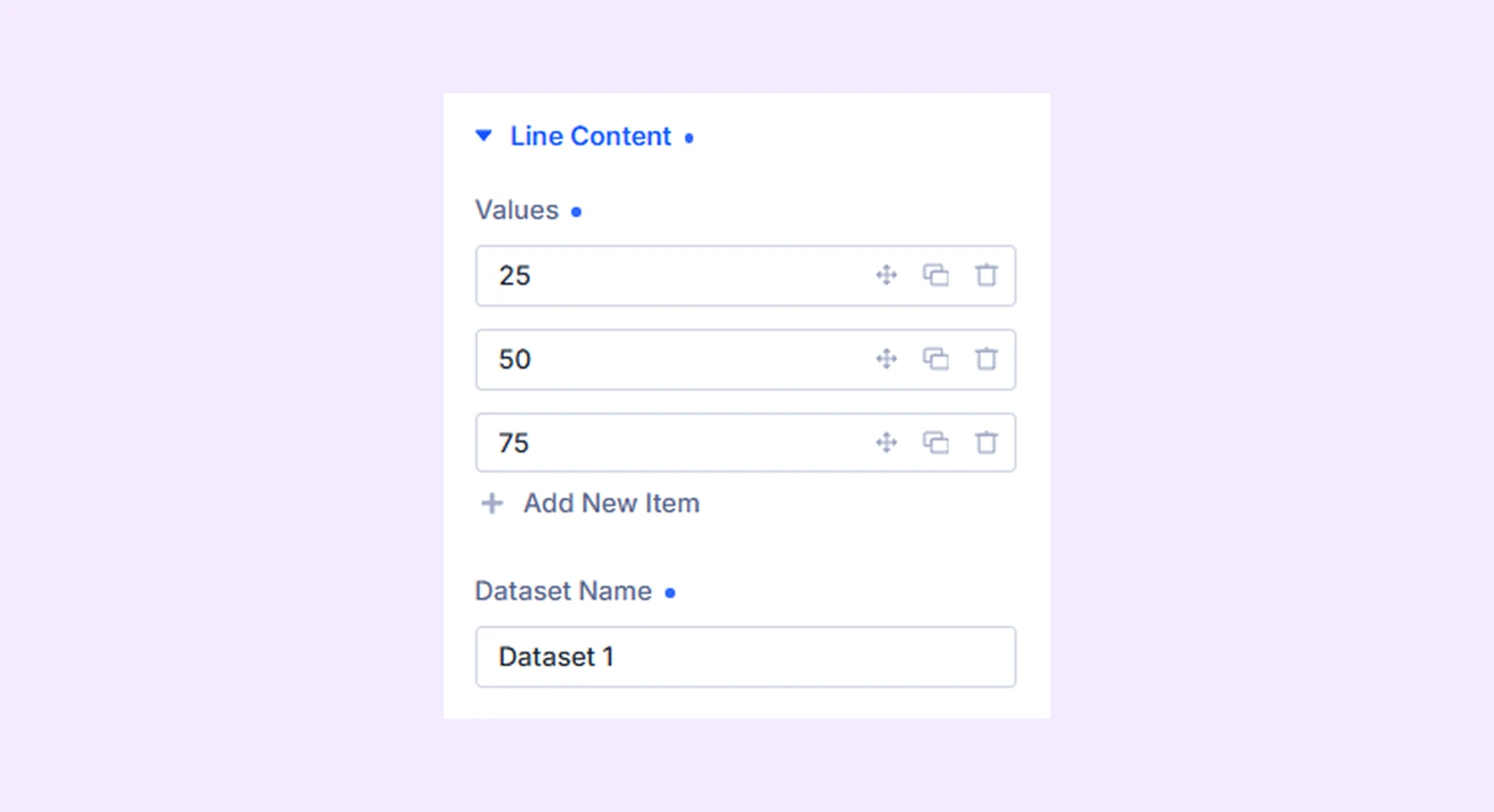
- Values: Enter the numeric values for this dataset. By default, 3 values are included. You can add more values as needed, or edit, reorder, duplicate, or remove existing ones to match your data.
- Dataset Name: Set the name of the dataset. It will appear in the legend and tooltip to help identify the line.
Meta: Rename the line item label for internal organization inside the builder.
Design Tab
Line Style
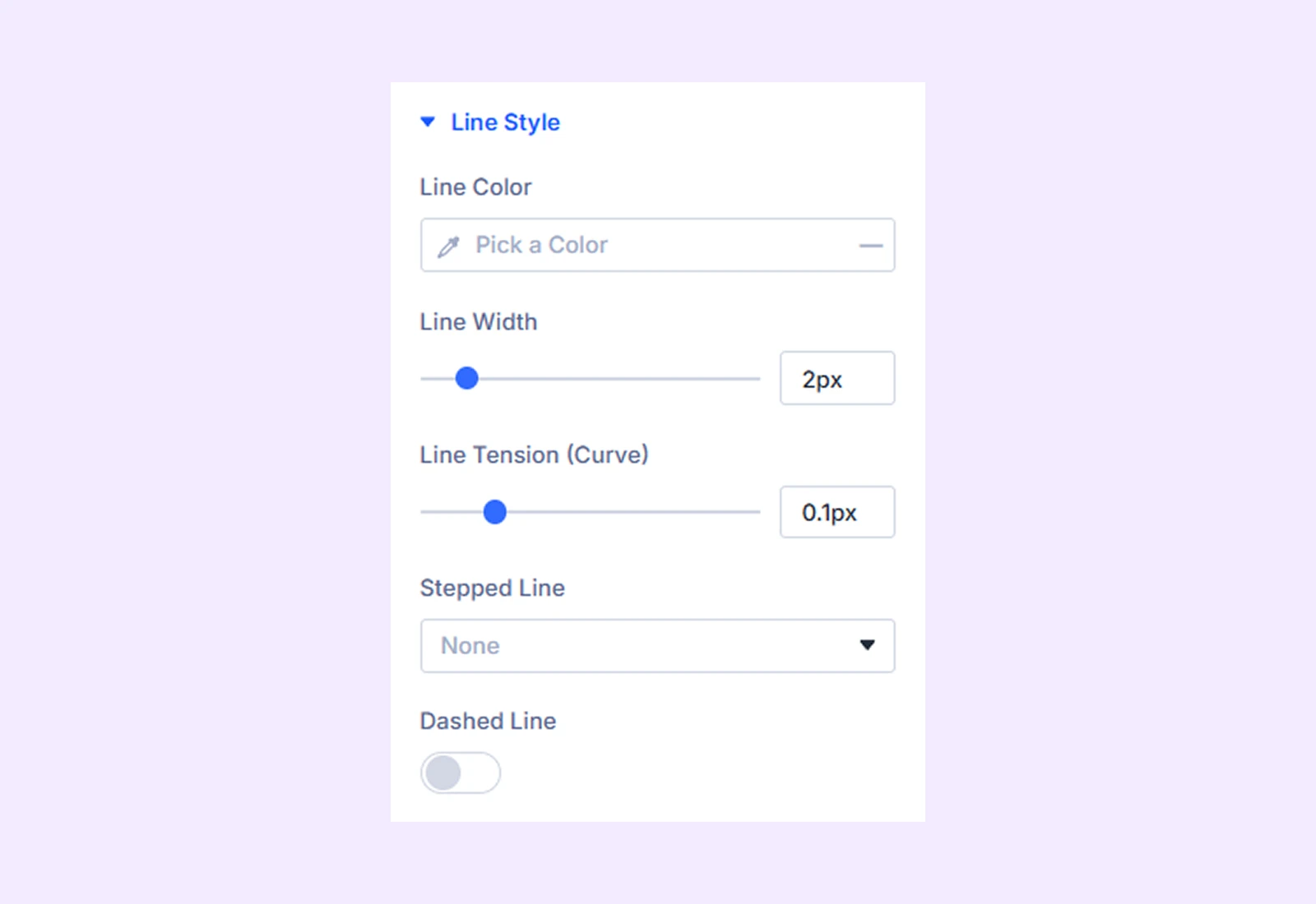
- Line Color: Set the color of the line in the chart.
- Line Width: Control how thick or thin the line will appear.
- Line Tension (Curve): Make the line smooth and curved or keep it straight.
- Stepped Line: Display the line in a step-by-step format instead of a smooth line.
- Dashed Line: Turn the line into a dashed style instead of a solid line.
- Dash Length: Set how long each dash segment is.
- Dash Gap: Set the space between each dash segment.
Point Style
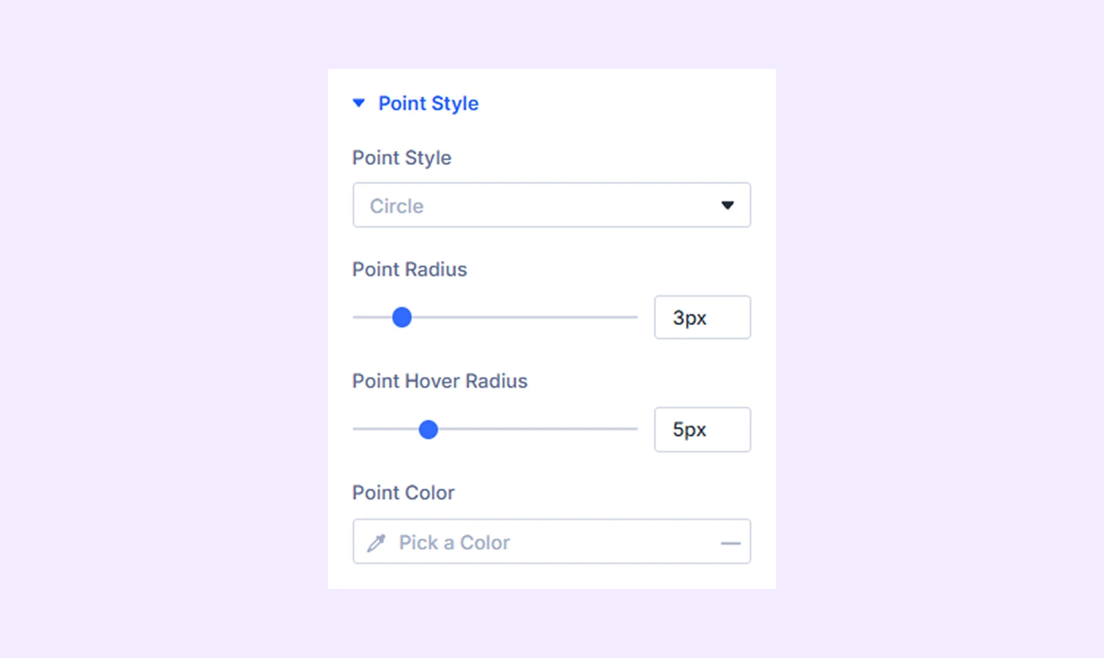
- Point Style: Choose the shape of the data points shown on the line (for example: circle, square, or other styles).
- Point Radius: Set the default size of each data point on the line.
- Point Hover Radius: Control how big the point becomes when a user hovers over it.
- Point Color: Set the color of the data points displayed on the chart.
Area Fill
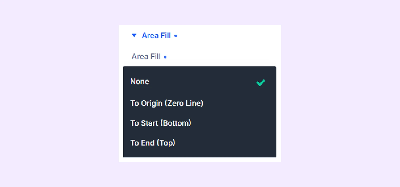
- Area Fill: Turn on to fill the area below (or above) the line with color.
- Fill Color: Set the solid color used for the filled area.
- Use Fill Gradient: Enable to replace the solid fill with a gradient effect.
- Fill Gradient Top: Set the color at the top of the filled area.
- Fill Gradient Bottom: Set the color at the bottom of the filled area.
Advanced Tab
Provides advanced styling options for each dataset.
Need Help?
If you have any questions or need assistance, contact our support team: [email protected]