DiviFlash Bar Chart module (introduced in DiviFlash 5.2.0) lets you display data in an interactive and animated bar chart.
Important Note: Bar Chart module is built for Divi 5 only. Also, it will be disabled by default and to use it, you must enable it manually. Refer to our guide for step-by-step instructions.
Let’s see the settings in brief and how to make better use of it —
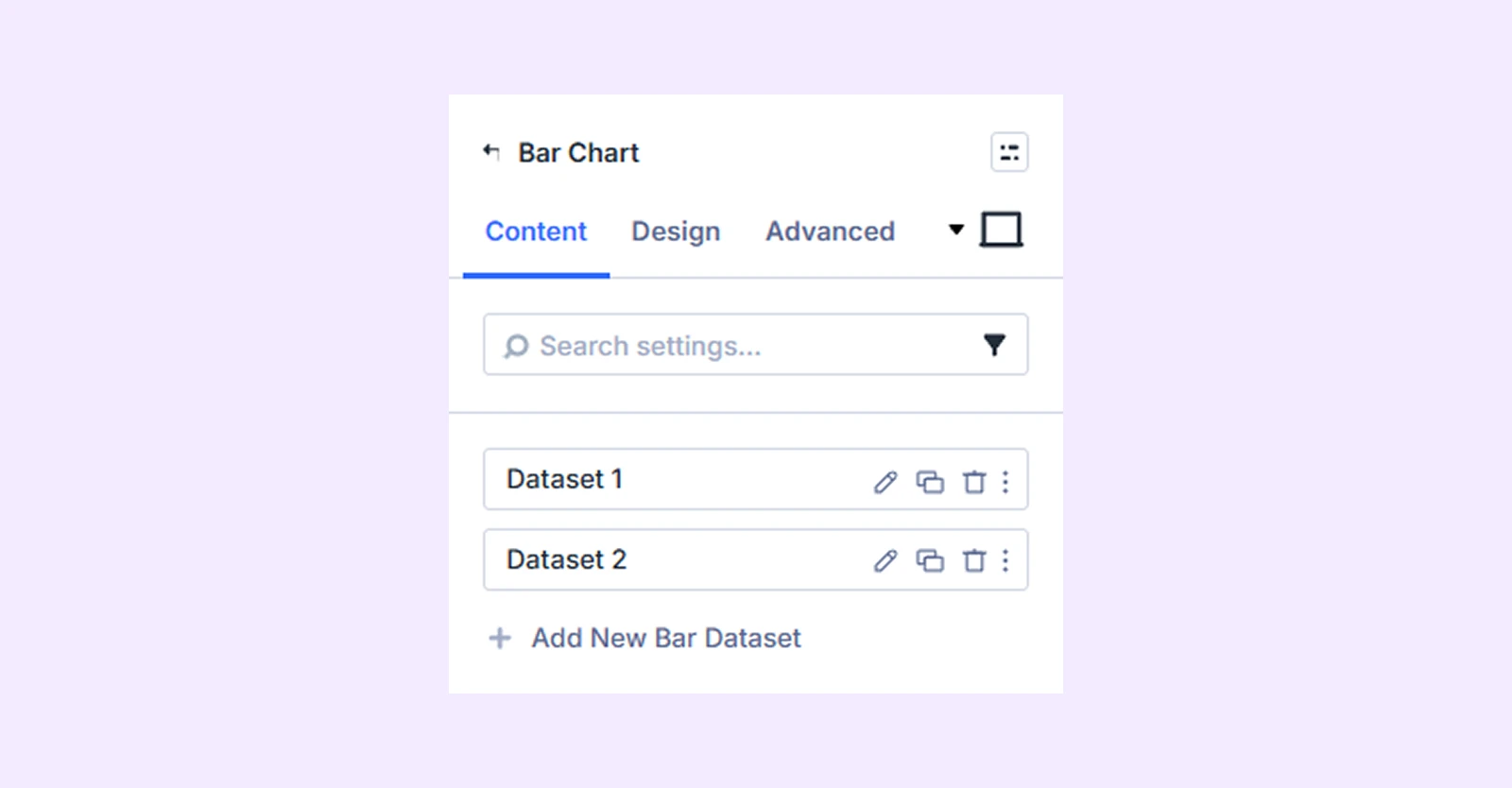
Content Tab
This tab contains all the essential settings to control your chart’s data, structure, and behavior.
Add New Bar Dataset
By default, you will see 2 bar datasets with 3 values each. You can keep them, edit them, or remove them. To add more datasets and values, click on “Add New Bar Dataset.” To learn about the available settings for adding a new bar dataset, click here.
Data Source
Choose how your chart gets its data:
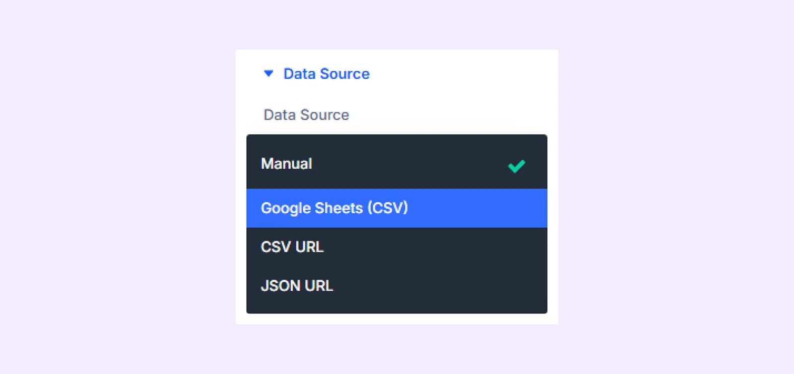
- Manual: Enter values directly in the module for full control.
- Google Sheets: Pull data from a connected Google Sheet (must be published to the web).
- CSV URL: Fetch data from an external CSV file via public URL
- JSON URL: Fetch data from a public JSON endpoint data source.
Cache Duration: Set how often external data is refreshed (1 hour, 6 hours, 24 hours, or always fetch on page load).
Note: Cache Duration only applies to external data sources: Google Sheets, CSV URL, and JSON URL
General Settings
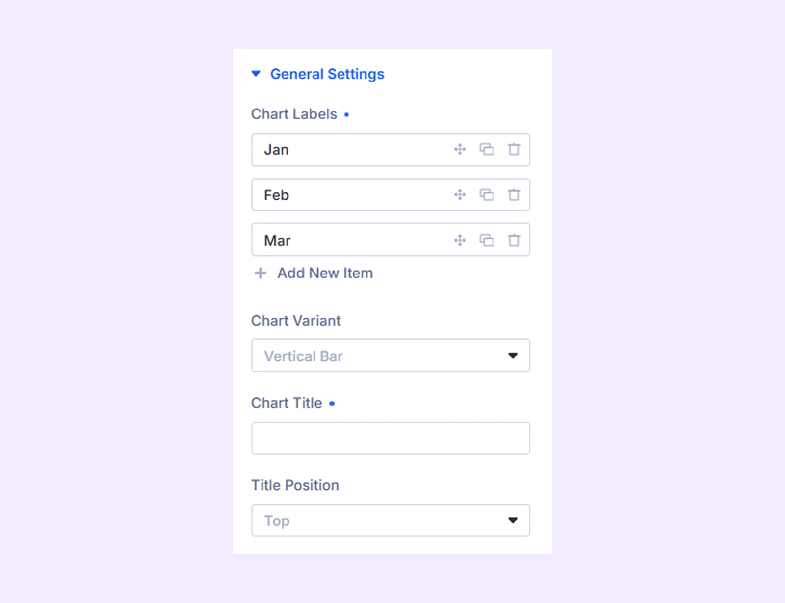
- Chart Labels: Define the categories shown on the x-axis of your chart. By default, the chart includes 3 labels. Each label represents one data category. You can rename, reorder by dragging, and add or remove labels to match your dataset structure.
- Chart Variant: Choose the chart layout style, such as Vertical Bar, Horizontal Bar, Vertical Stacked Bar, or Horizontal Stacked Bar.
- Chart Title: Add a title to describe what the chart represents.
- Title Position: Set where the title appears (top, bottom, left, or right) based on your layout preference.
Legend
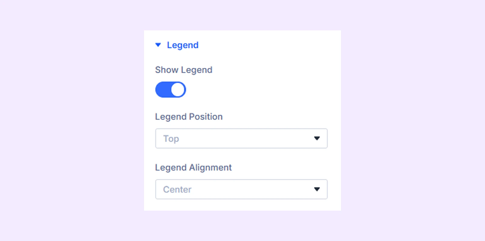
- Show Legend: Turn the legend on or off. The legend shows each dataset name with its color so users can easily identify and compare different data series.
- Legend Position: Choose where the legend appears around the chart (top, bottom, left, or right) to fit your layout.
- Legend Alignment: Adjust how the legend items are aligned within their position for better visual balance.
Tooltip & Values
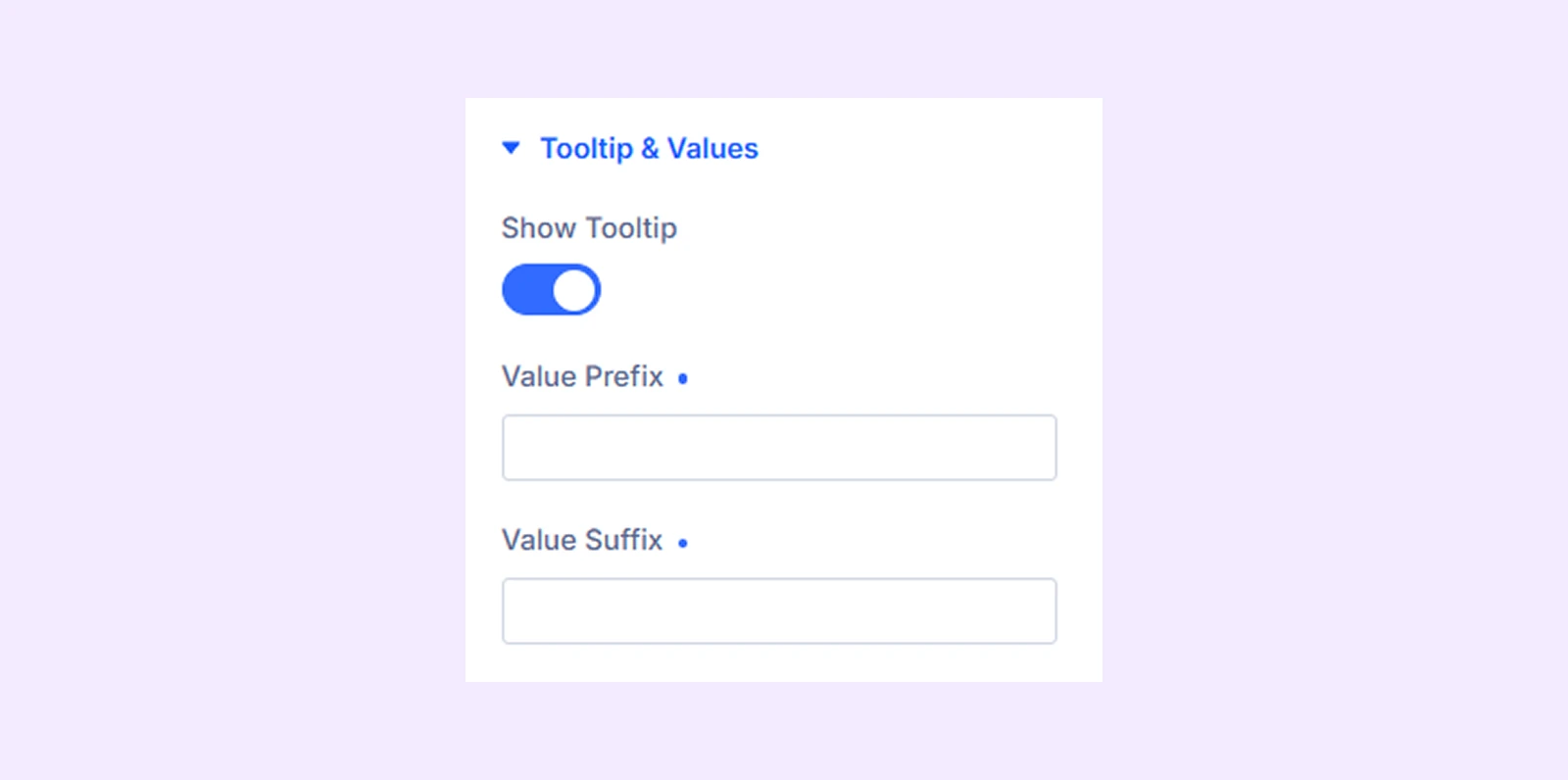
- Show Tooltip: Enable this to display a hover popup with dataset details, including label, color, and value.
- Value Prefix: Add text before the value, such as $, €, or “Total”.
- Value Suffix: Add text after the value, such as %, units, or “sales”.
X-Axis
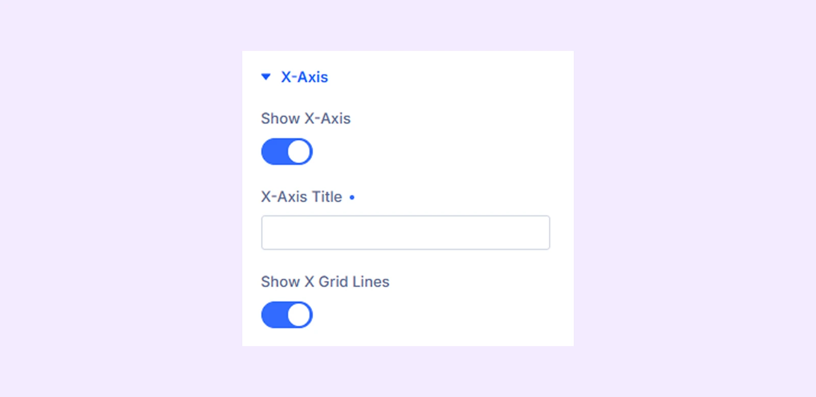
- Show X-Axis: Enable or disable the X-axis to show or hide category labels at the bottom of the chart.
- X-Axis Title: Add a label below the X-axis to describe what the categories represent.
- Show X Grid Lines: Turn on vertical grid lines inside the chart to improve readability of values.
Y-Axis
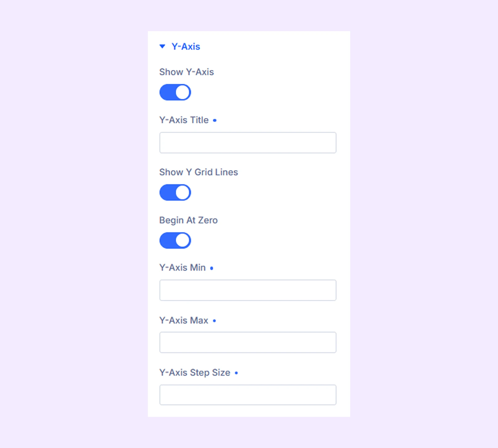
- Show Y-Axis: Enable or disable the Y-axis to show or hide value labels on the left side.
- Y-Axis Title: Add a label beside the Y-axis to describe what the values represent.
- Show Y Grid Lines: Turn on horizontal grid lines across the chart to improve value readability.
- Begin At Zero: Start the Y-axis from 0 instead of using automatic scaling.
- Y-Axis Min: Set the minimum value shown on the Y-axis, or leave it blank for automatic scaling.
- Y-Axis Max: Set the maximum value shown on the Y-axis, or leave it blank for automatic scaling.
- Y-Axis Step Size: Define the interval between axis values, or leave it blank for automatic spacing.
Link: Use this default Divi setting to add a link to the entire module.
Background: Add a background color, gradient, image, video, pattern, or mask to the module.
Meta: Rename the module to organize it more easily in the Divi Builder. (Only you can see this label.)
Design Tab
Customize the visual appearance of the Bar Chart module.
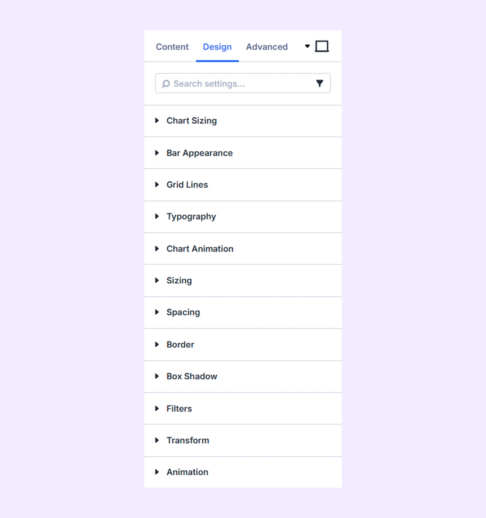
Chart Sizing: Adjust the chart height within the module container.
Bar Appearance
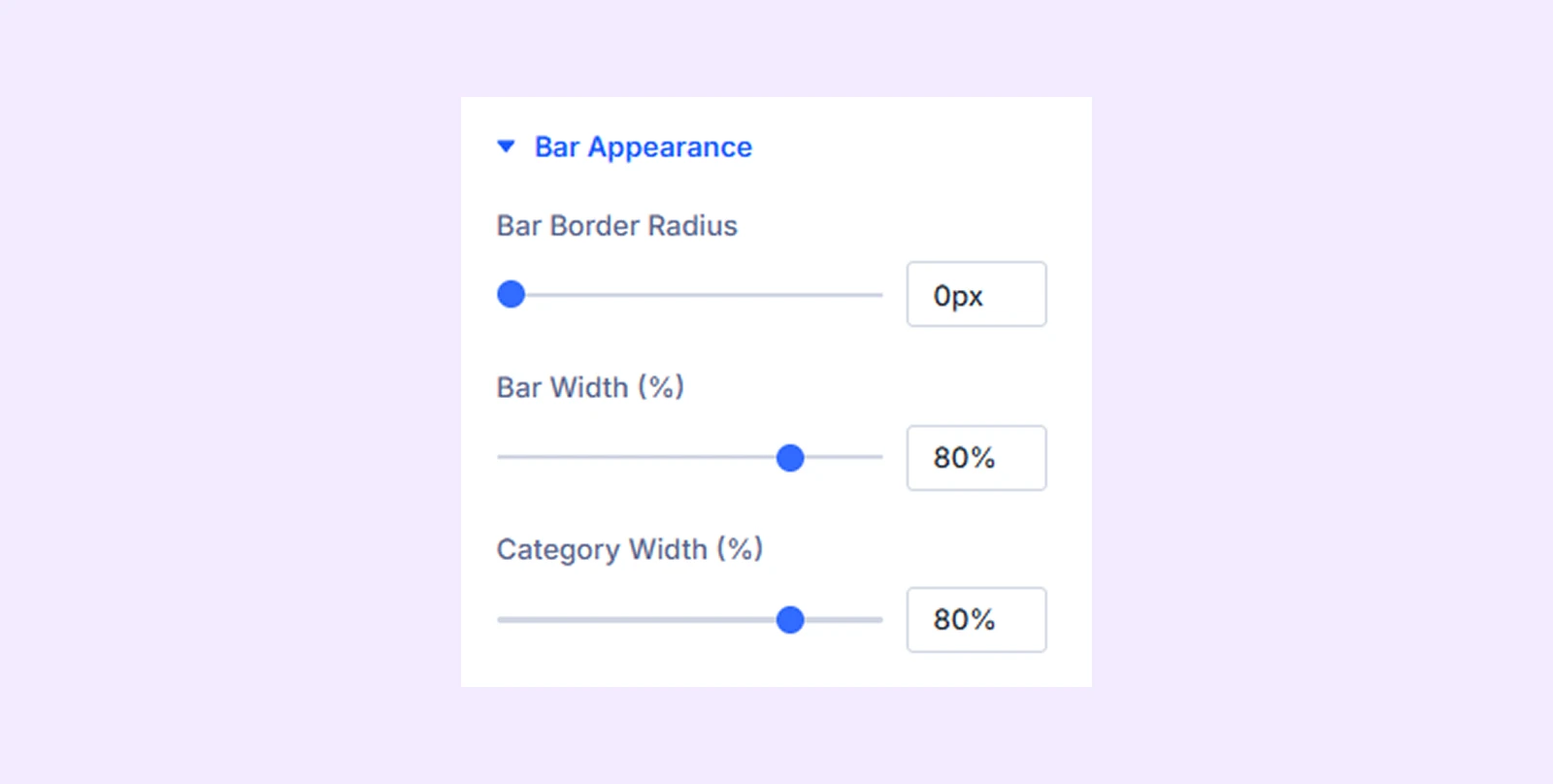
- Bar Border Radius: Round the corners of each bar for a softer visual style.
- Bar Width (%): Adjust how wide each bar appears within the available space.
- Category Width (%): Control the spacing between different bar groups (categories).
Grid Lines
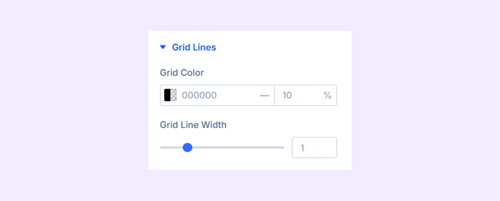
- Grid Color: Set the color of the grid lines to improve visibility and contrast.
- Grid Line Width: Adjust the thickness of the grid lines for a lighter or stronger appearance.
Typography: Customize the text style for the title, legend, tooltip, axis ticks, and axis titles using typography settings.
Chart Animation
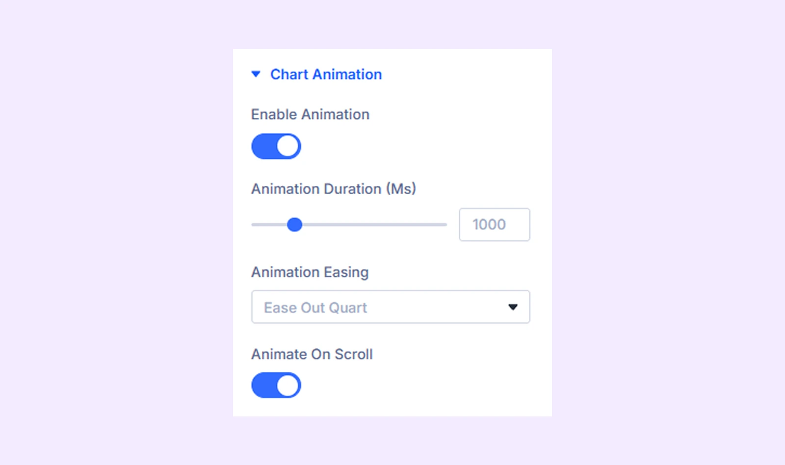
- Enable Animation: Turn chart animations on or off when the chart loads.
- Animation Duration (ms): Set how long the animation takes to complete.
- Animation Easing: Control the motion style of the animation for a smoother or sharper effect (9 options available).
- Animate On Scroll: Trigger the animation only when the chart becomes visible while scrolling.
Sizing: Adjust the width, height, and alignment of the module.
Spacing: Add custom margin and padding to the module’s container.
Border: Customize the border style, width, and color. And style each border separately or apply the same style to all sides.
Box Shadow: Add shadow effects to the module.
Filters: Apply color filters to enhance the appearance.
Transform: Scale, rotate, move, or skew the module.
Animation: Apply reveal animation effects and customize delay, duration, repeat settings, and animation type.
Advanced Tab
This tab provides additional settings for advanced users who want greater control over the module with custom code, conditions, and more.
Bar Content Child Item Settings
Each dataset has its own Content, Design, and Advanced tabs. These settings are used when adding or editing datasets manually.
Content Tab
Bar Content
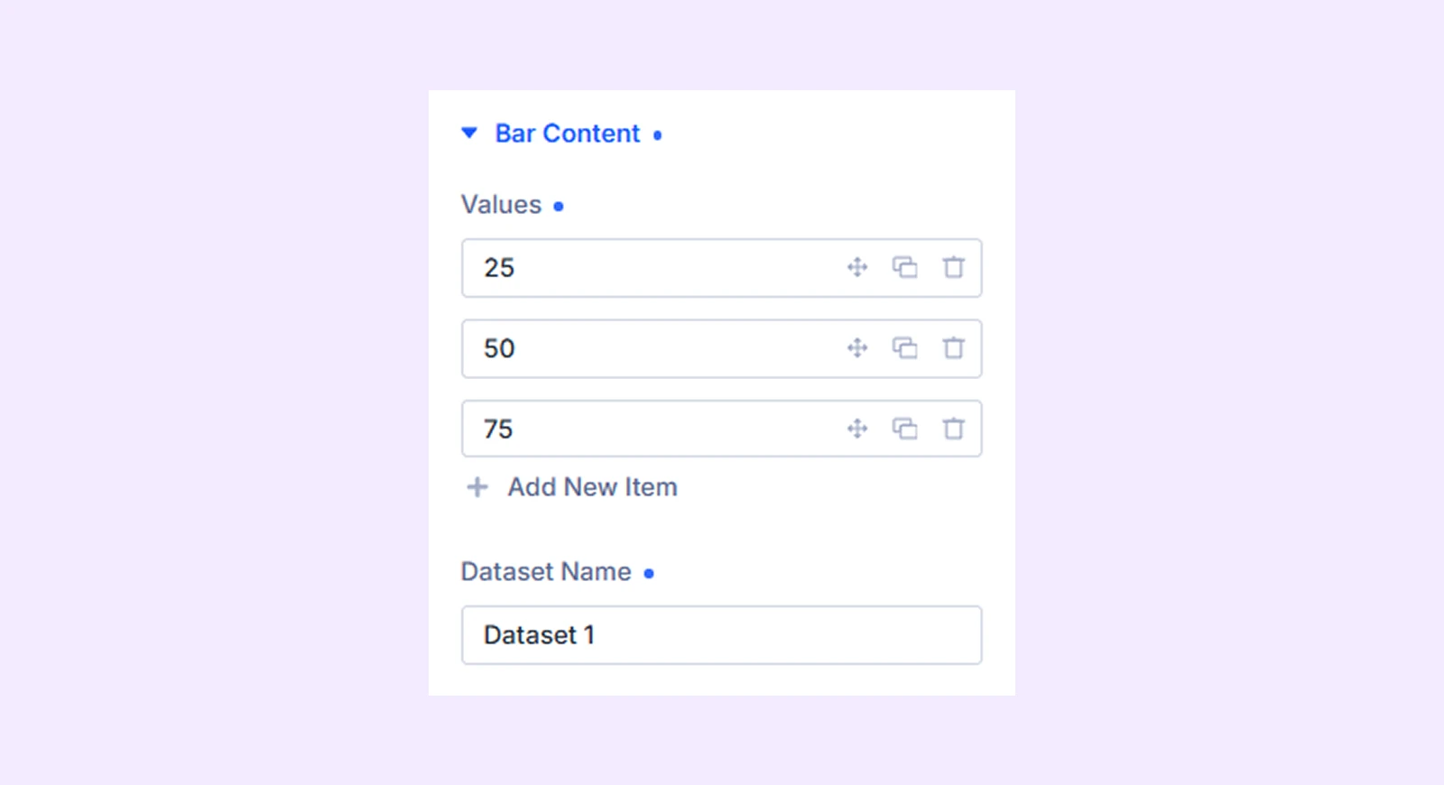
- Values: Enter the numeric values for this dataset. Three values are added by default, and you can edit, reorder, duplicate, or remove them to match your data.
- Dataset Name: Set the name of the dataset. It appears in the legend and tooltip to identify the values.
Meta: Rename the bar item label for internal organization inside the builder.
Design Tab
Bar Style
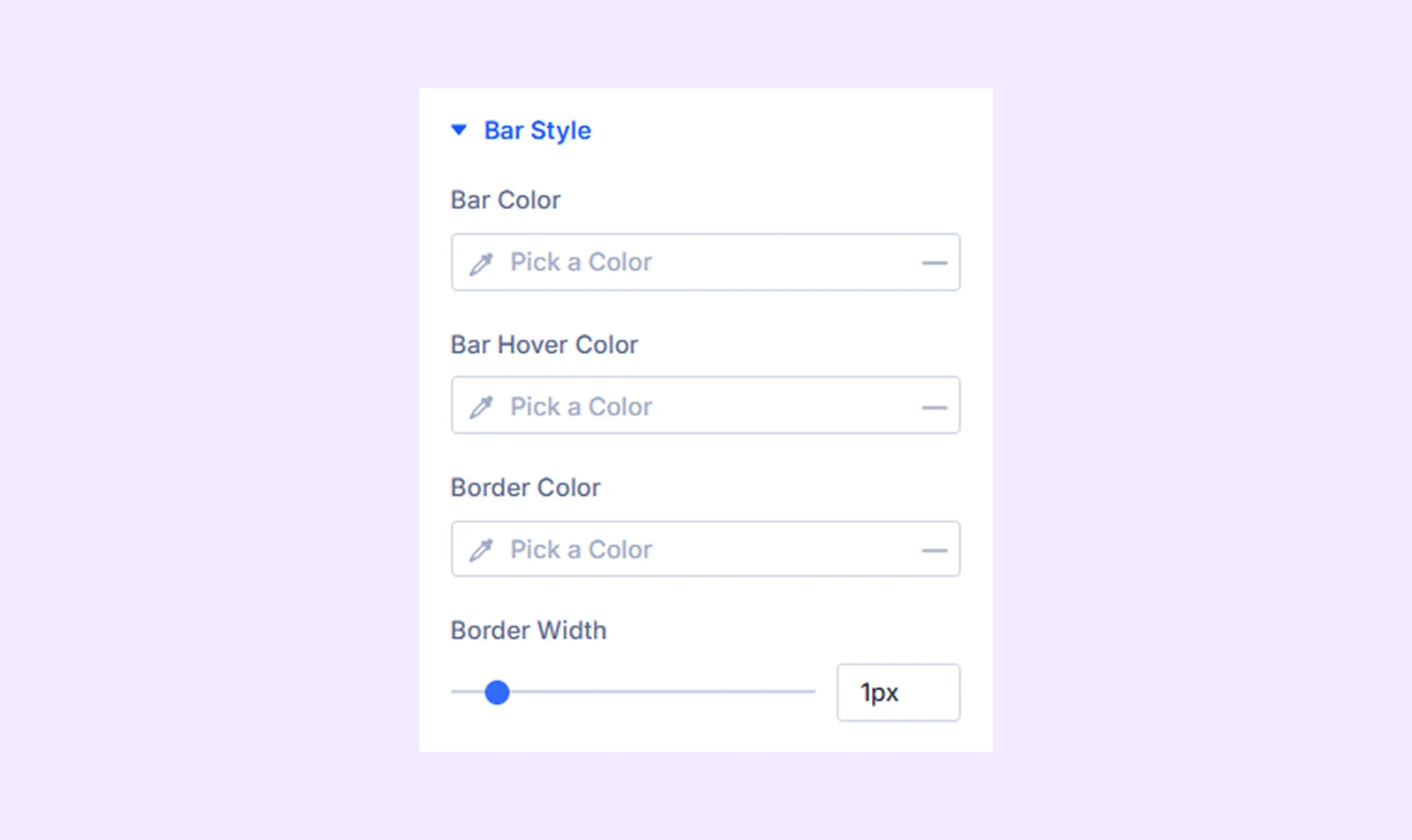
- Bar Color: Set the main fill color of the bars.
- Bar Hover Color: Change the bar color when users hover over it.
- Border Color: Set the color of the outline around each bar.
- Border Width: Adjust the thickness of the bar outline.
Gradient
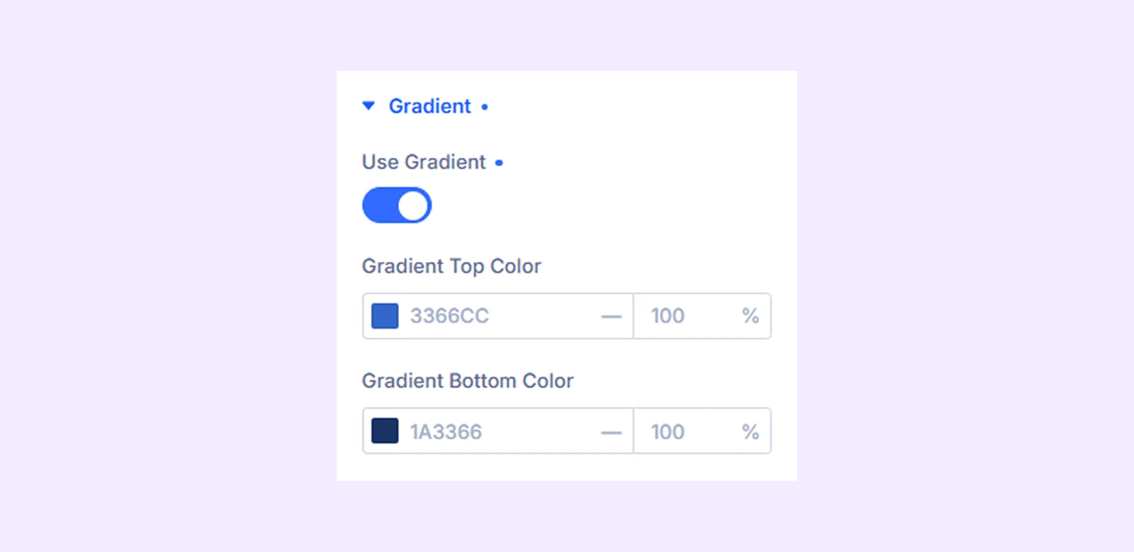
- Use Gradient: Enable a gradient fill instead of a solid color.
- Gradient Top Color: Set the color at the top of the gradient.
- Gradient Bottom Color: Set the color at the bottom of the gradient.
Advanced Tab
Provides advanced styling options for each dataset.
Need Help?
If you have any questions or need assistance, contact our support team: [email protected]