The DiviFlash Social Share module lets you easily add social sharing buttons to your website so visitors can share your content across different platforms.
Activation Required: This module is disabled by default. To use it, you need to enable it manually. Refer to our guide for step-by-step instructions.
Let’s see the settings in brief and how to make better use of it —
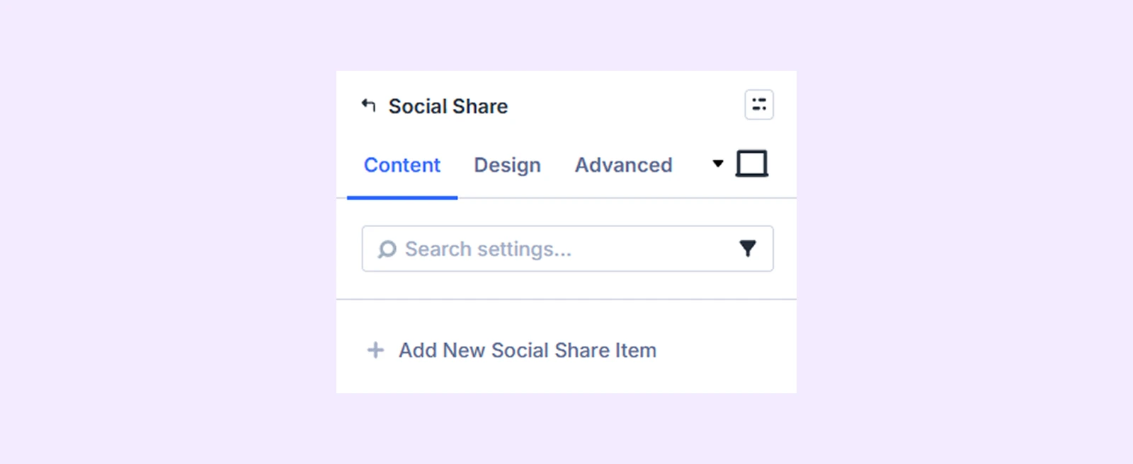
Content Tab
This tab lets you add social share items and manage the essential settings of the module.
Add New Social Share Item
Click the Add New Social Share Item (+) button to add a new social platform. This will open the Social Share Item Settings, where you can customize each button individually. To know more about adding social share buttons and customizing them, click here.
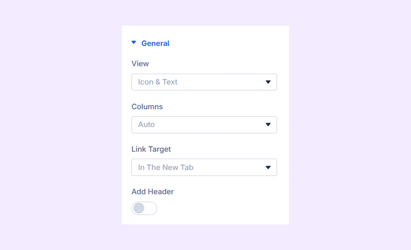
General
- View: Choose what items you want to display as the social share items. You can choose only the icon, only the text, or both the icon and text.
- Columns: Set how many columns to display the buttons in.
- Link Target: Choose whether links open in the same tab or a new tab.
- Add Header: Enable to show a heading above the social buttons.
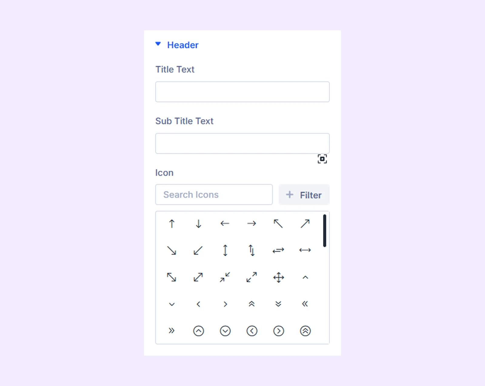
Header: This section will appear if you toggle on “Add Header.” You can add the heading title, subtitle and an icon to the header.
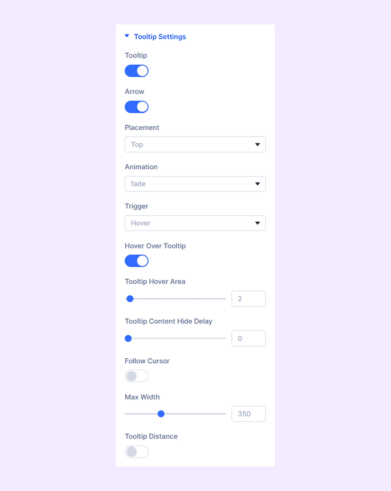
Tooltip
- Tooltip: Turn tooltip feature on or off.
- Arrow: Show or hide the small arrow that points from the tooltip to the button.
- Disable On Mobile: Turn off tooltips on mobile devices.
- Placement: Choose where the tooltip appears.
- Animation: Select how the tooltip appears (fade, slide, etc.).
- Trigger: Decide how the tooltip is activated (on hover or on click).
- Hover Over Tooltip: Keep the tooltip visible when the mouse moves over it.
- Tooltip Hover Area: Adjust how sensitive the hover area is for showing the tooltip.
- Tooltip Content Delay[Ms]: Set how long it takes (in milliseconds) for the tooltip to appear after interaction.
- Tooltip Content Hide Delay: Set how long it takes for the tooltip to disappear.
- Follow Cursor: Make the tooltip follow the mouse cursor as it moves.
- Max Width: Set the maximum width of the tooltip box.
- Tooltip Distance: Control the space between the tooltip and the button.
- Tooltip Horizontal Position: Fine-tune the tooltip’s position left or right.
- Tooltip Vertical Position: Fine-tune the tooltip’s position up or down.
Background: Add a background color, gradient, image, video, pattern, or mask to the module.
Element Label: Rename the module to organize it more easily in the Divi Builder. (Only you can see this label.)
Design Tab
Use this tab to customize the appearance of your social share buttons.
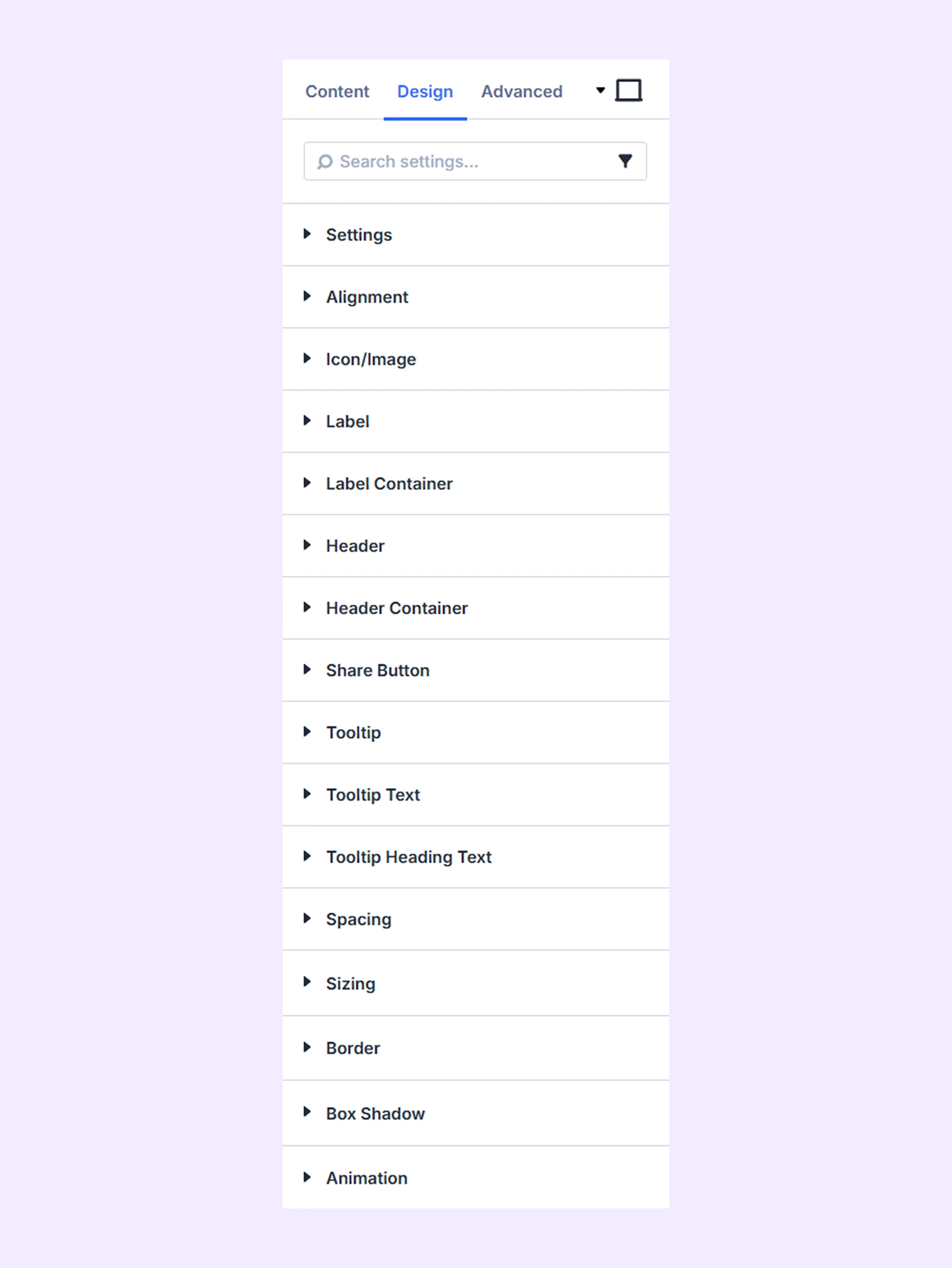
Settings
- Columns Gap: Adjust space between columns
- Row Gap: Adjust space between rows
- Button Height: Set the height of buttons
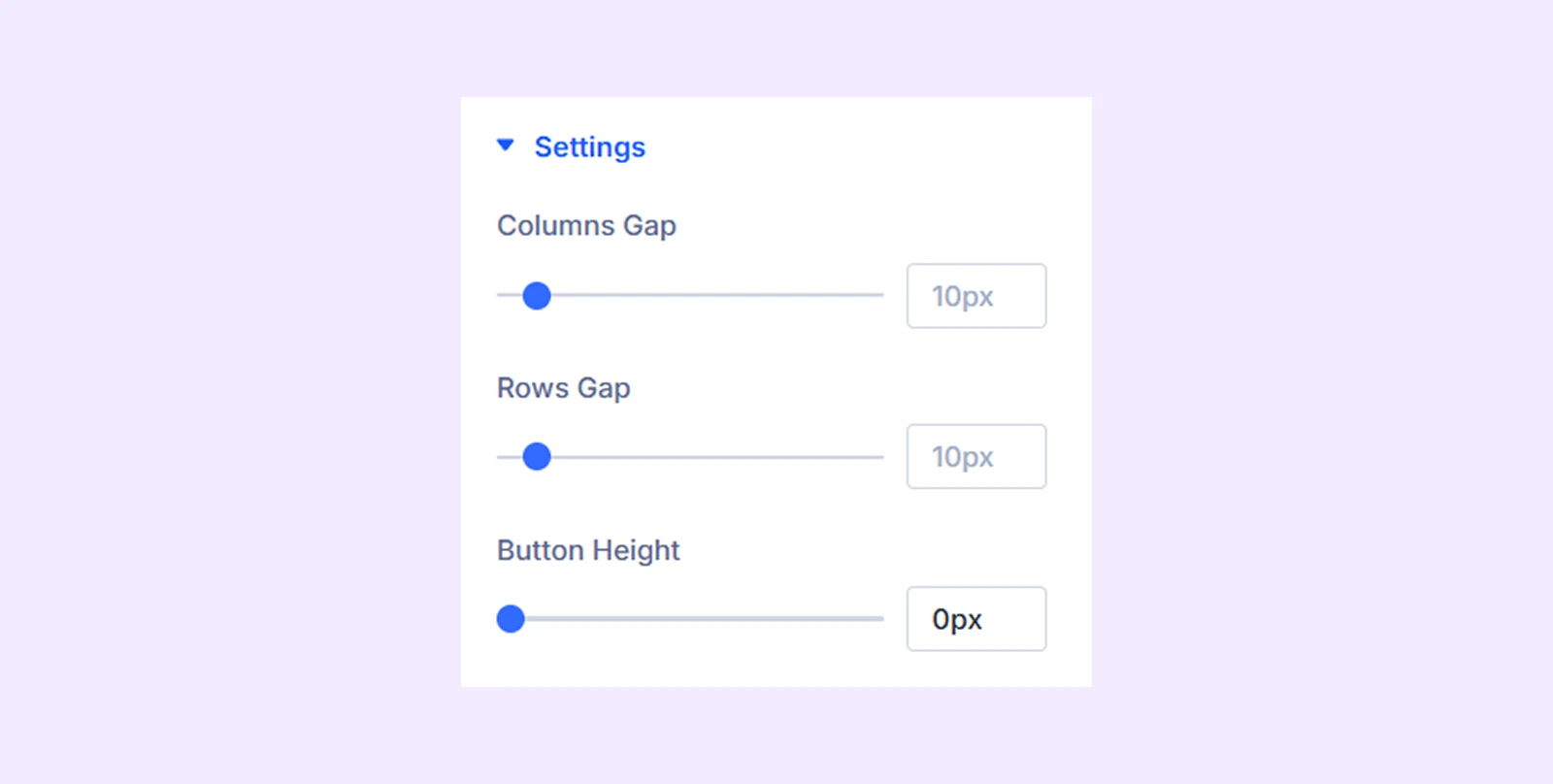
Alignment
- Content Alignment: Change the horizontal placement of the social share buttons respective to their container.
- Child Content Alignment: Change the horizontal placement of the social share button content within the button container.
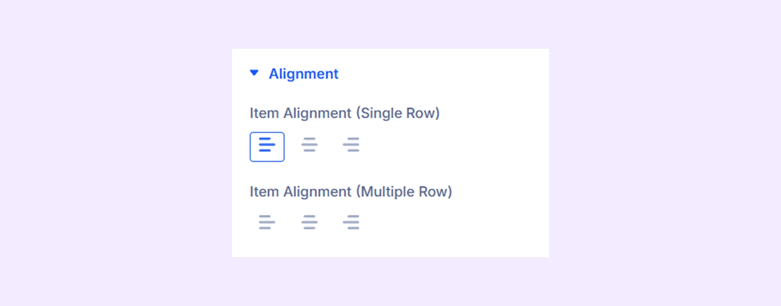
Icon/Image
- Icon Color: Set icon color
- Use Custom Icon Size: Enable and adjust icon size
- Icon Position: Control icon placement
- Icon Alignment: Control icon alignment
There you will also find options for background and border.
Label: Customize text style (font, size, color)
Label Container: Style the label background and border
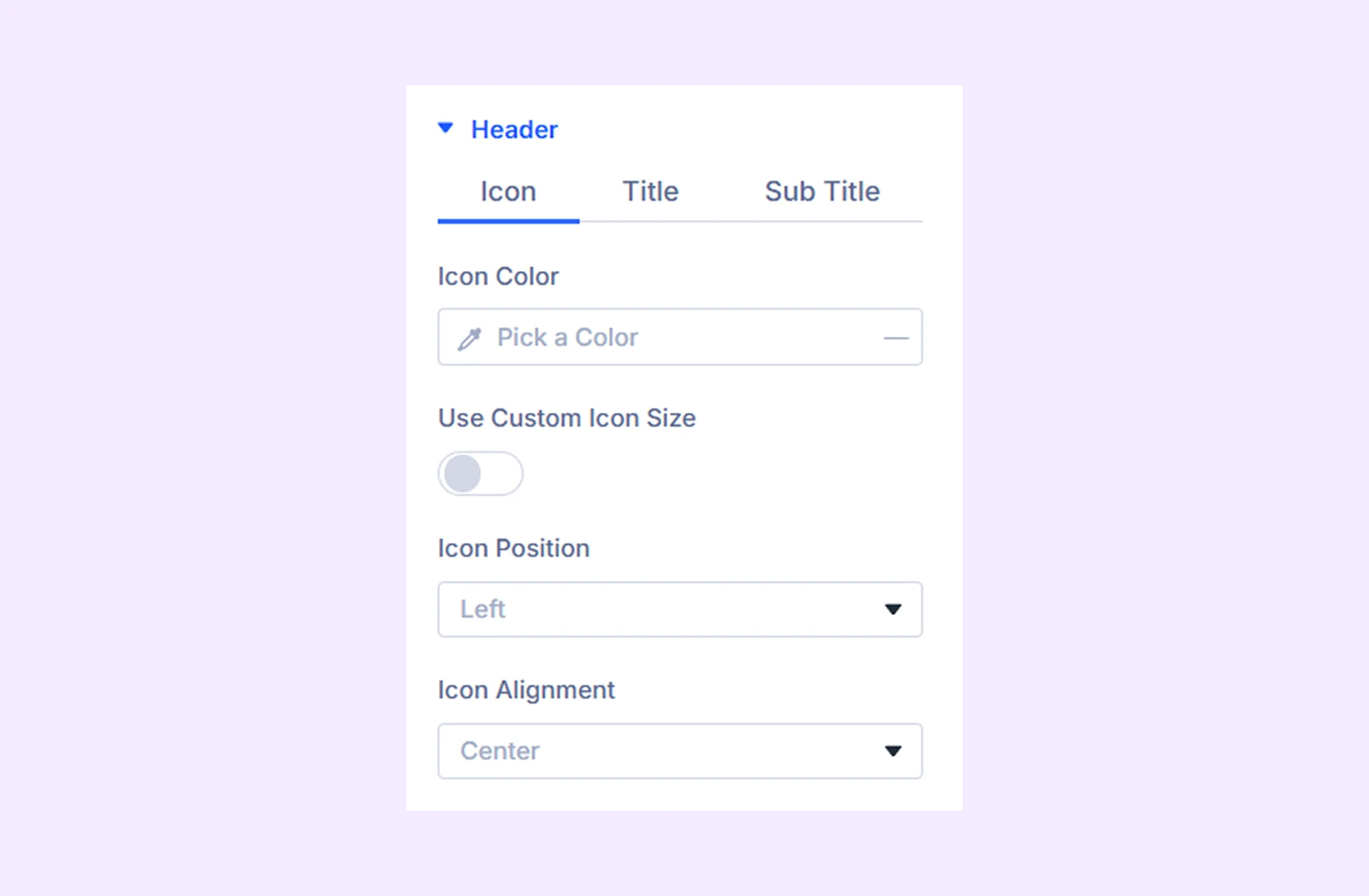
Header
- Icon: Customize header icon (color, size, position)
- Title: Style title text with typography options
- Sub Title: Style sub title text with typography options
Header Container: Adjust spacing, alignment, background, and border
Share Button: Border options for the social share buttons.
Tooltip
- Tooltip Arrow Color: Set tooltip arrow color
There you will also find options for background and border.
Tooltip Text: Typography options for the tooltip text
Tooltip Heading Text: Typography options for the tooltip heading text
Spacing: Add custom margin and padding to the module’s container.
Sizing: Adjust the width, height, and alignment of the module.
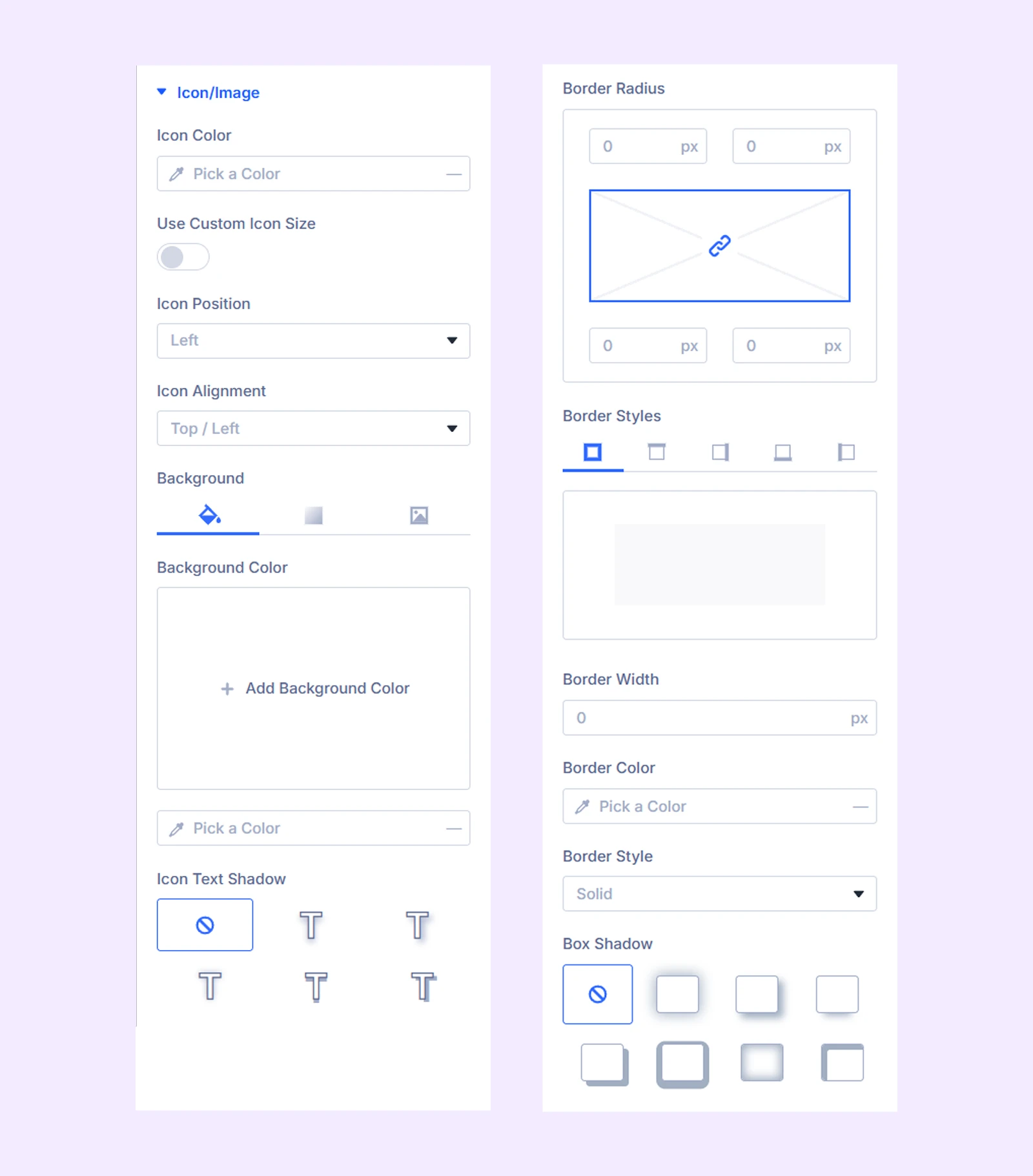
Border: Customize the border style, width, and color. And style each border separately or apply the same style to all sides.
Box Shadow: Add shadow effects to the module.
Animation: Apply reveal animation effects and customize delay, duration, repeat settings, and animation type.
Advanced Tab
This tab provides additional settings for advanced users who want greater control over the module with custom code, conditions, and more.
Social Share Item Settings
From here you can add and customize social share buttons. Keep in mind that the settings you apply here will override the settings applied in “Social Share.” module settings
Content Tab
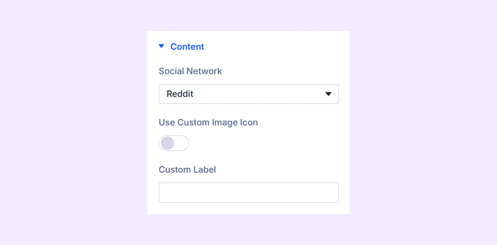
Content
- Social Network: Choose the platform (Facebook, Twitter, etc.)
- Use Custom Image Icon: Enable this option to use a custom image as the social media icon. Also, you can input a custom label for it.
Tooltip Content: Add custom tooltip text
Background: Add a background color, gradient, image, and more to the social share item.
Element Label: Change the name or label of your chosen social media item.
Design Tab
Customize the individual button’s icon, label, spacing, and styles (same options as the main Design tab).
Advanced Tab
Use this tab for custom CSS and advanced settings for this specific button.
Need Help?
If you have any questions or need assistance, contact our support team: [email protected]