
The Advanced Search module, introduced in DiviFlash 5.5.0, lets you create a live search experience that displays matching results while visitors type without reloading the page.
Important Note: Advanced Search module is built for Divi 5 only. Also, it will be disabled by default and to use it, you must enable it manually. Refer to our guide for step-by-step instructions.
Let's see the settings in brief and how to make better use of it.
Content Tab
The Content tab contains the essential settings for choosing searchable content, configuring the search form, adding filters and suggestions, and controlling how search results appear.
Search Settings
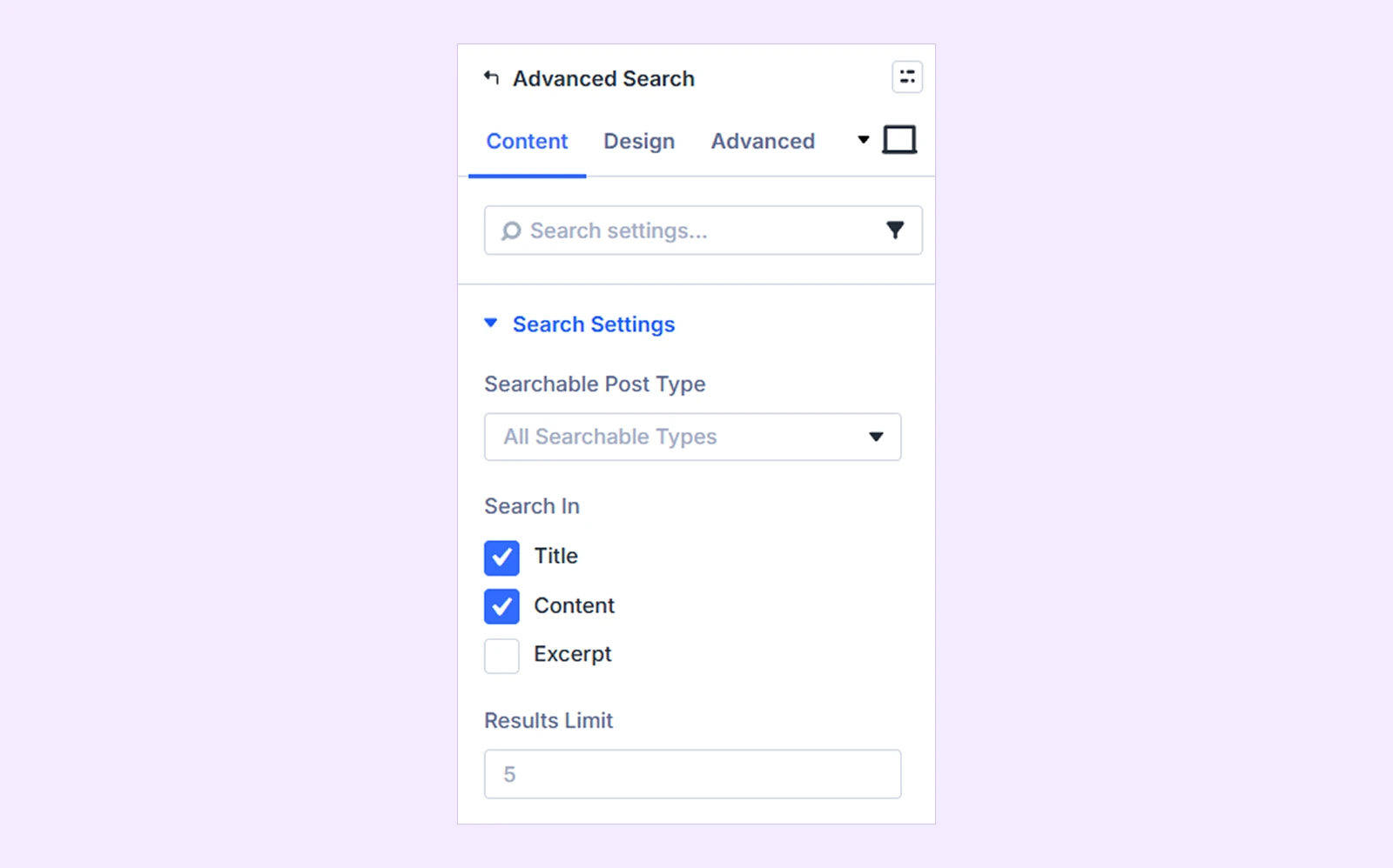
- Searchable Post Type: Choose which post type visitors can search. Available options:
- All Searchable Types
- Posts
- Pages
- Projects
- Products
- Custom post types
Note: Selecting All Searchable Types allows the module to search across all searchable post types available on the website.
- Search In: Choose where the module should look for the searched term. Available options are:
- Title
- Content
- Excerpt
- Results Limit: Set the maximum number of results displayed in the live results panel.
Search Form
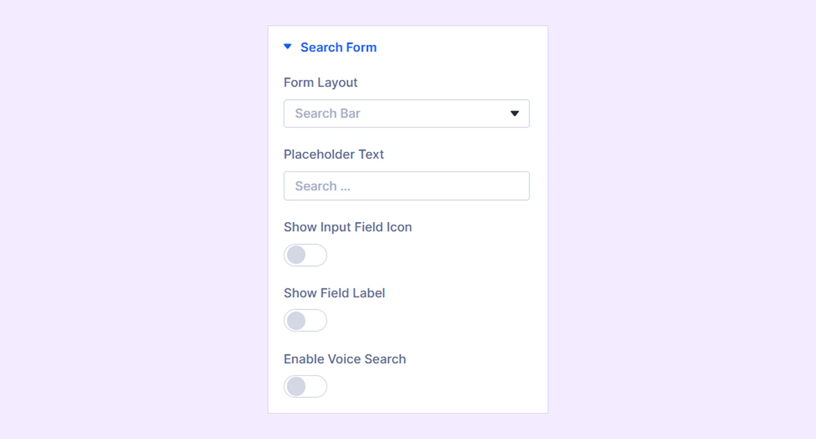
- Form Layout: Choose the type of search interface. Available layouts are:
- Search Bar: Displays the complete search field directly on the page.
- Icon (Expand On Click): Displays a search icon that expands the search field when clicked.
- Gap Between Trigger And Input Field: Adjusts the spacing between the search icon (trigger) and the input field when it expands.
- Fullscreen Overlay: Displays a search icon that opens a fullscreen search interface.
- Expand Direction: Choose in which direction the search form expands to (This option is only available when Icon is selected in Form Layout. Available options:
- Right
- Left
- Bottom
- Expanded Width: Set the width of the expanded search form by pixels.
- Placeholder Text: Enter the placeholder text displayed inside the empty search field.
- Show Input Field Icon: Display an icon inside the search field.
- Input Field Icon: Choose the icon displayed inside the field.
- Show Field Label: Display a text label above the search field.
- Field Label Text: Enter the label text.
- Enable Voice Search: Allow visitors to search using their voice in supported browsers.
- Close On Background Click: Allow visitors to close the search overlay. (Available only with the Fullscreen Overlay layout.)
Search Button
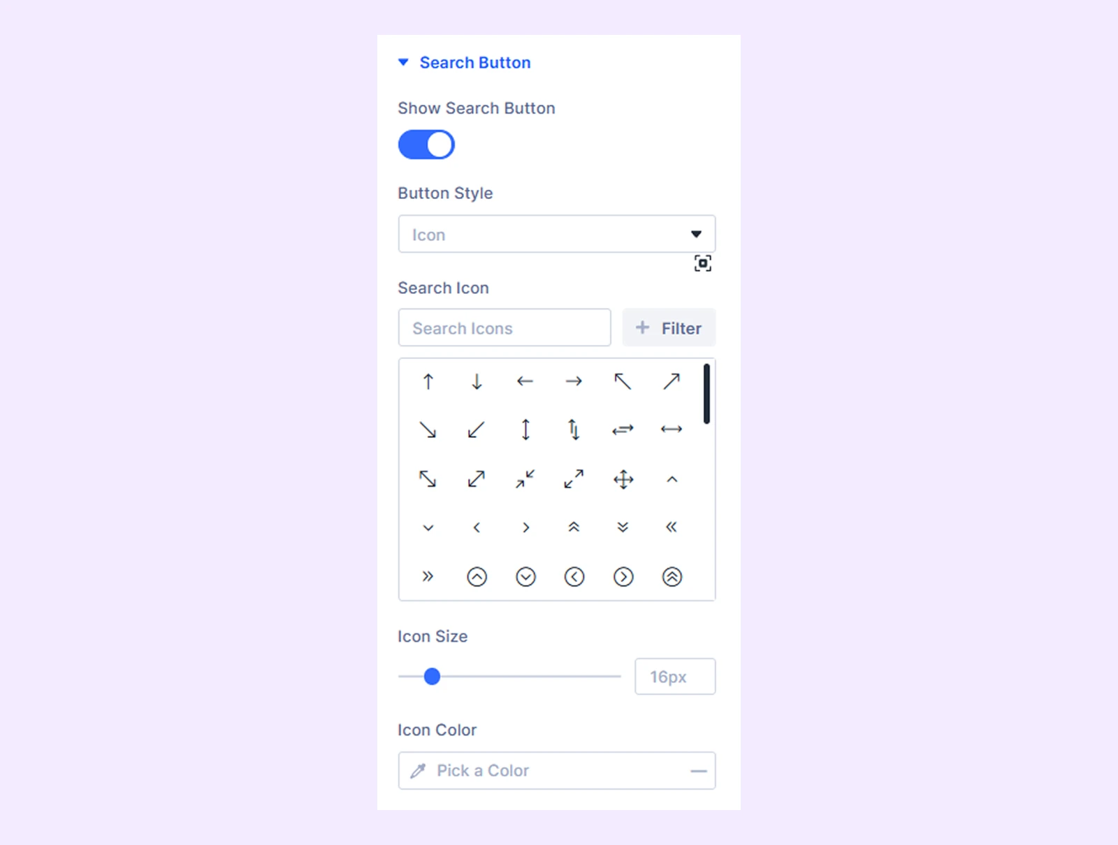
This option only appears when search bar or fullscreen overlay is selected in form layout from Content → Search Form.
- Show Search Button: Show or hide the search button. This option is not available with the Icon (Expand On Click) layout.
- Button Style: Choose how the search button is displayed:
- Icon
- Text
- Icon And Text
- Button Text: Enter the text displayed on the search button. Available when Text or Icon And Text is selected from Button Style dropdown.
- Search Icon: Choose the search icon.
- Icon Size: Set the icon size by pixels. Not available when Text is selected as the button style.
- Icon Color: Pick a suitable color for your used icon. Not available when Text is selected as the button style.
- Search Icon Placement: Place the search icon on the left or right side of the button text. (Available when Icon And Text is selected as the button style.)
- Gap Between Icon And Text: Adjust the gap between used icon and text. Only available when Icon And Text is selected as the button style.
Search Filter
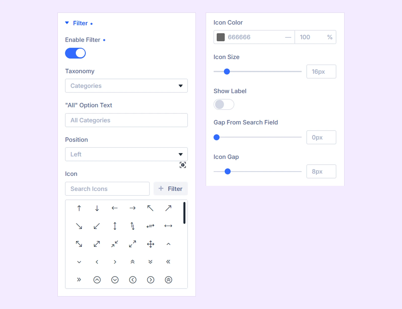
- Enable Filter: Enable a filter dropdown for the search form.
- Taxonomy: Choose the taxonomy visitors can use for filtering, such as Categories, Tags, Product Categories, Project Categories, or other available public taxonomies.
- "All" Option Text: Enter the text displayed for the option that searches all available terms.
- Position: Place the filter on the left or right side of the search field.
- Icon: Add an icon to the filter.
- Icon Color: Choose the filter icon color.
- Icon Size: Adjust the filter icon size.
- Show Label: Display a label above the filter.
- Label Text: Enter the filter label.
- Gap From Search Field: Adjust the spacing between the filter and search field.
- Icon Gap: Adjust the spacing between the filter icon and taxonomy name.
Suggestions
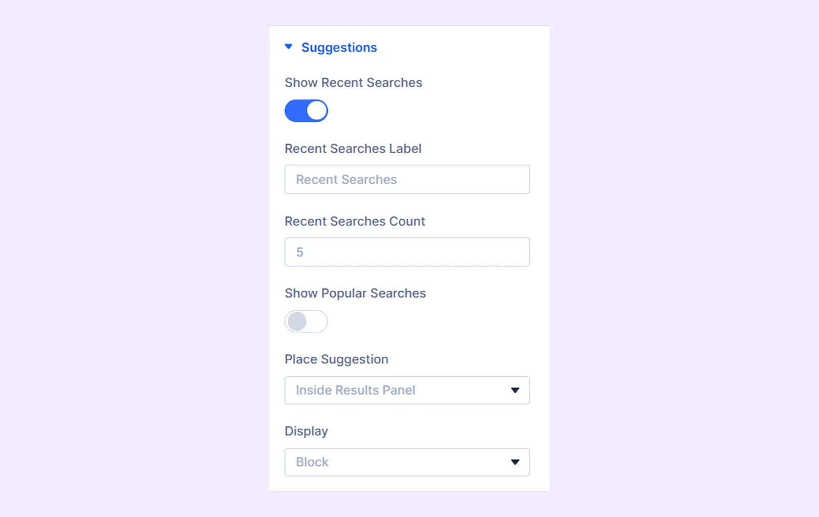
- Show Recent Searches: Display the visitor's previously searched terms.
- Recent Searches Label: Enter the heading displayed above recent searches.
- Recent Searches Count: Choose how many recent searches to display.
- Show Popular Searches: Display most searched terms from across the site.
- Popular Searches Label: Enter the heading displayed above popular searches.
- Popular Searches Count: Choose how many popular searches to display.
- Place Suggestion: Choose where the suggestions appear:
- Inside Results Panel
- Below Search Field
- Display: Choose how the suggestions displays to the visitors:
- Block
- Inline Flex
Advanced Rules
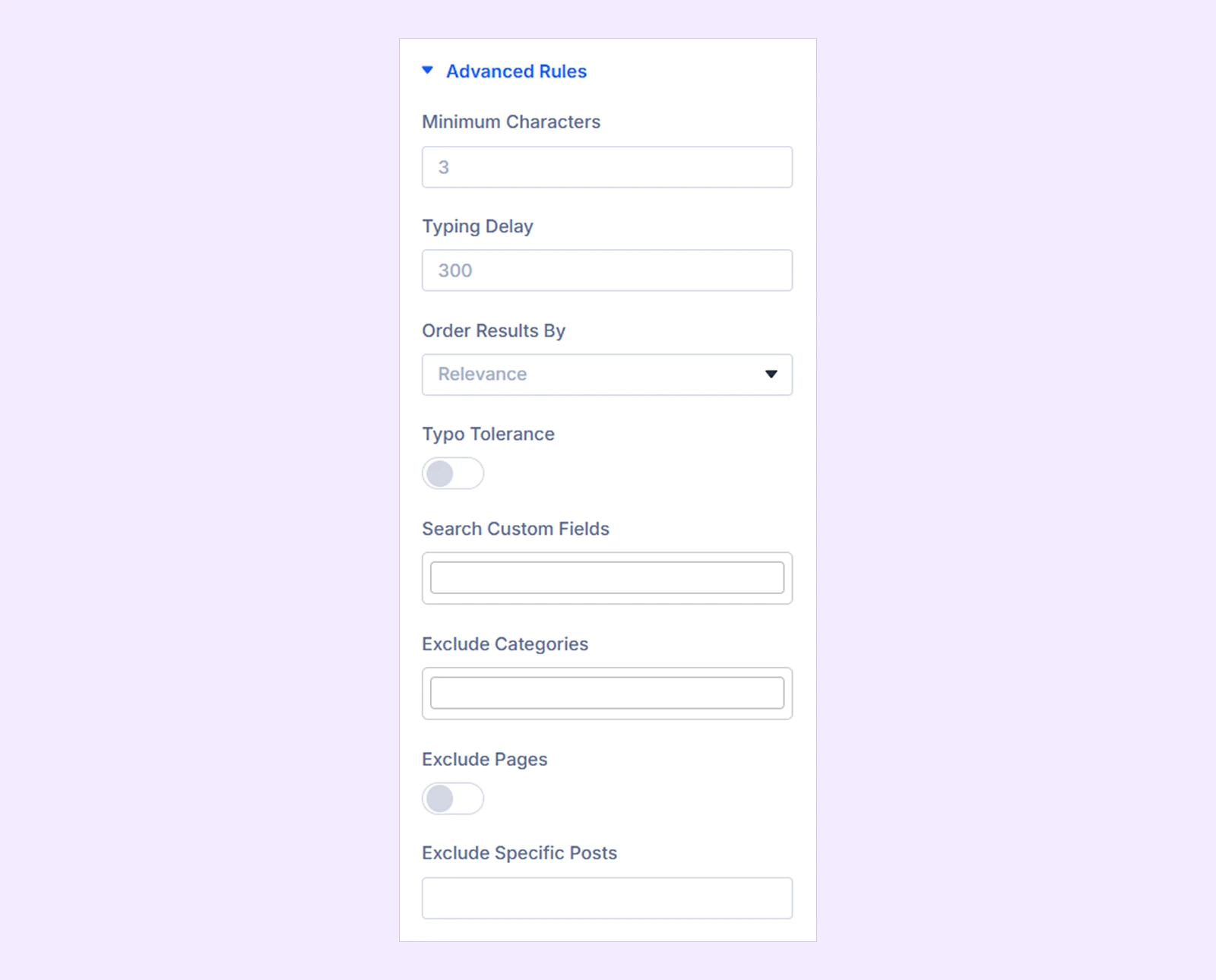
- Minimum Characters: Set the minimum number of characters visitors need to enter before the live search begins.
- Typing Delay: Set how long the module waits after a visitor stops typing before starting the search.
- Order Results By: Choose how search results are ordered:
- Relevance
- Newest to oldest
- Oldest to newest
- A to Z
- Typo Tolerance: Enable a fallback search when the original search returns no results.
- Search Custom Fields: Select custom fields or ACF field keys that should also be included in the search.
- Exclude Categories: Select categories whose posts should not appear in search results.
- Exclude Pages: Exclude static pages when ‘All Searchable Types’ is selected.
- Exclude Specific Posts: Enter the post IDs of specific posts you want to remove from search results.
Result Content
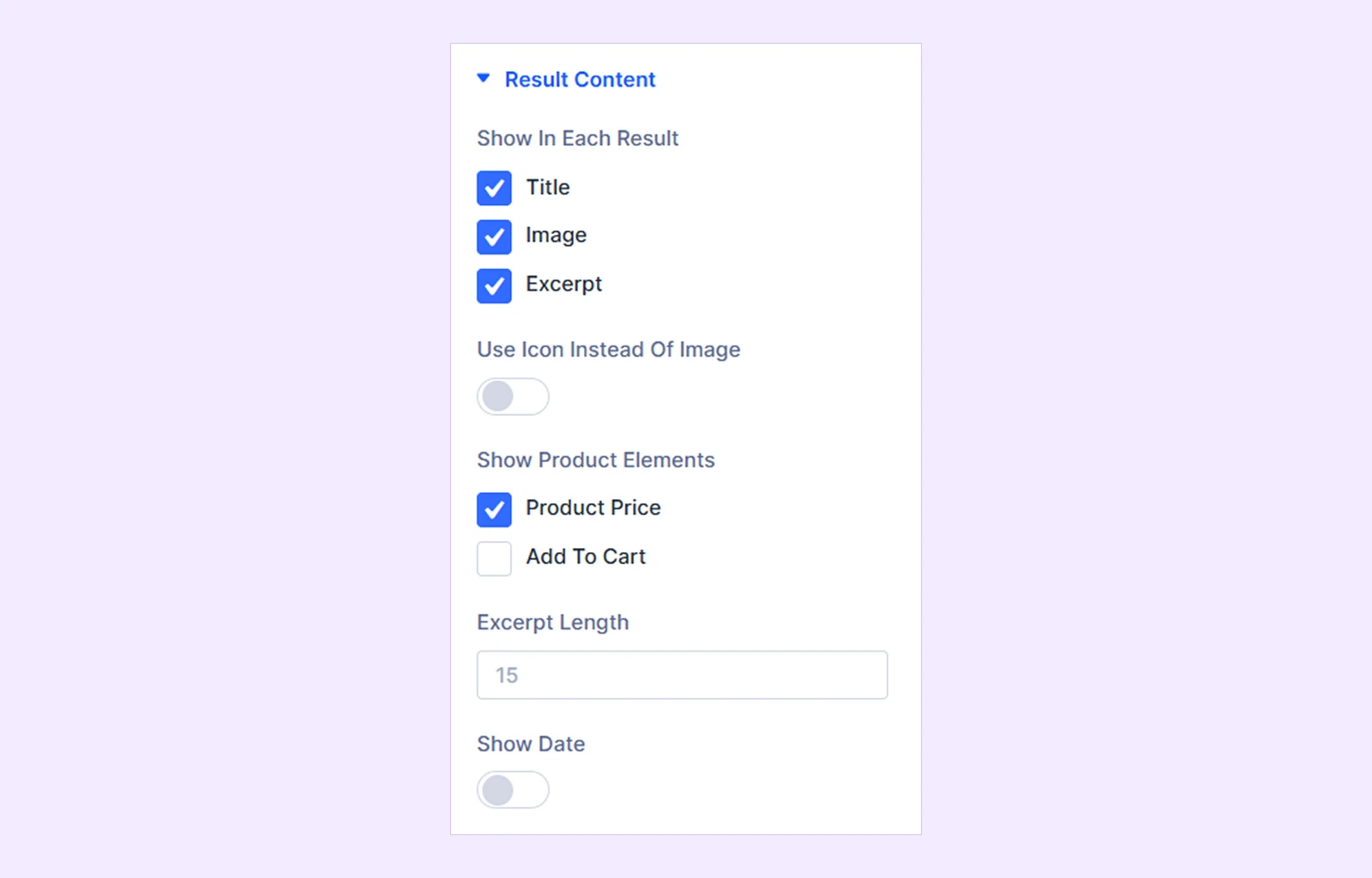
- Show In Each Result: Choose which elements should be displayed:
- Title
- Image
- Excerpt
- Use Icon Instead Of Image: Replace result featured images with an icon.
- Icon: If enabled, choose the icon displayed for each result.
- Show Product Elements: Choose which WooCommerce-specific elements appear in product results. Available when WooCommerce is active and Searchable Post Type is set to Products or All Searchable Types.
- Product Price
- Add To Cart
- Excerpt Length: Set the number of words displayed in the result excerpt.
- Show Date: Display the publish date for each result.
Results Layout

- Columns: Choose how many columns are displayed.
- Gap: Adjust the spacing between grid items
Result Extras
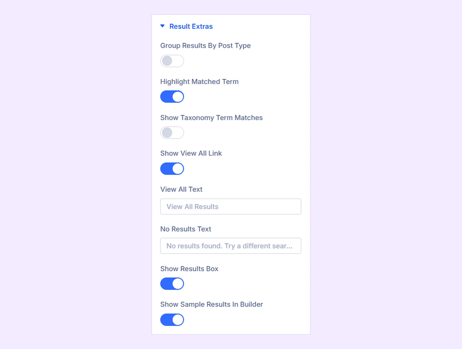
- Group Results By Post Type: Group results under separate headings based on their post type.
- Highlight Matched Term: Highlight the searched words inside result titles and excerpts.
- Show Taxonomy Term Matches: Display matching taxonomy terms above the post results.
- Term Taxonomy: When enabled, choose which taxonomy is used for term matching.
- Show View All Link: Display a link at the bottom of the panel that opens the full WordPress search results page.
- View All Text: Enter the text displayed for the link.
- No Results Text: Enter the message visitors see when no matching content is found.
- Show Results Box: Enable or disable the live results panel.
- Show Sample Results In Builder: Display sample results while working inside the Divi Builder, making it easier to style the results panel.
Results Animation
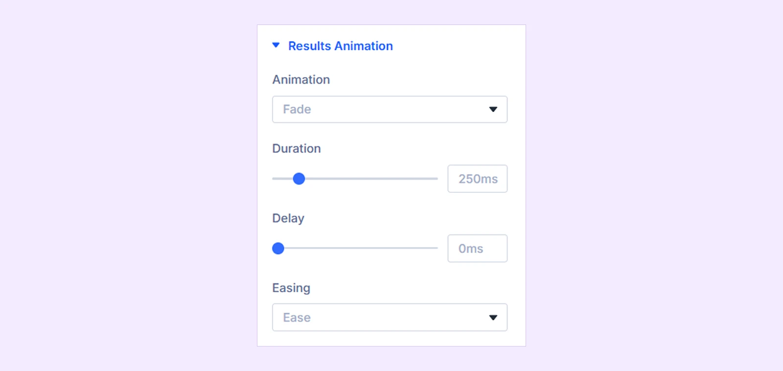
- Animation: Choose the results entrance animation:
- Fade
- Slide Up
- Slide Down
- Zoom
- Blur
- Flip
- Expand
- None
- Duration: Set the animation duration.
- Delay: Add a delay before the animation begins.
- Easing: Choose the animation easing style:
- Ease
- Ease In
- Ease Out
- Ease In Out
- Linear
- Smooth (Out Quint)
- Bounce
- Slide Distance: Set how far the results panel moves during the animation. Available with Slide Up and Slide Down.
- Blur Amount: Adjust the starting blur amount. Available with the Blur animation.
- Expand Animation Duration: Control how long the search field takes to expand and collapse. Available with the Icon (Expand On Click) form layout.
Builder Preview
Adjust how your search configurations appear while working inside the builder itself (exclusively shown in the builder only).

- Show Sample Results in Builder: Enable it to see sample search results while configuring the search form.
- Hide Floating Panel On Builder: Hide the expanded/overlay results panel while editing in the Divi Builder so it doesn't block the canvas. (Available only when Icon and Fullscreen Overlay layouts are selected from Content → Search Form.)
Overlay Animation
These settings are available when Fullscreen Overlay is selected as the Form Layout.
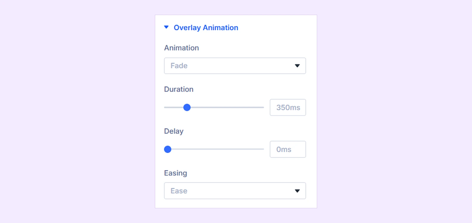
- Animation: Choose how the fullscreen search overlay appears:
- Fade
- Zoom In
- Slide Down
- Slide Up
- None
- Duration: Set the overlay animation duration.
- Delay: Add a delay before the animation begins.
- Easing: Choose the animation easing style.
- Slide Distance: Adjust how far the overlay moves. (Available only when Slide Up or Slide Down is selected from Animations.)
- Zoom Start Scale: Set the starting scale for zoom effects. (Available only when Zoom In is selected from Animation)
Link: Add a URL and configure how it opens.
Background: Add a background color, gradient, image, video, pattern, or mask to the module.
Element Label: Rename the module for easier identification inside the Divi Builder. This label is only visible in the builder.
Design Tab
The Design tab lets you customize the search form, filter, buttons, suggestions, result area, typography, images, and other visual elements.
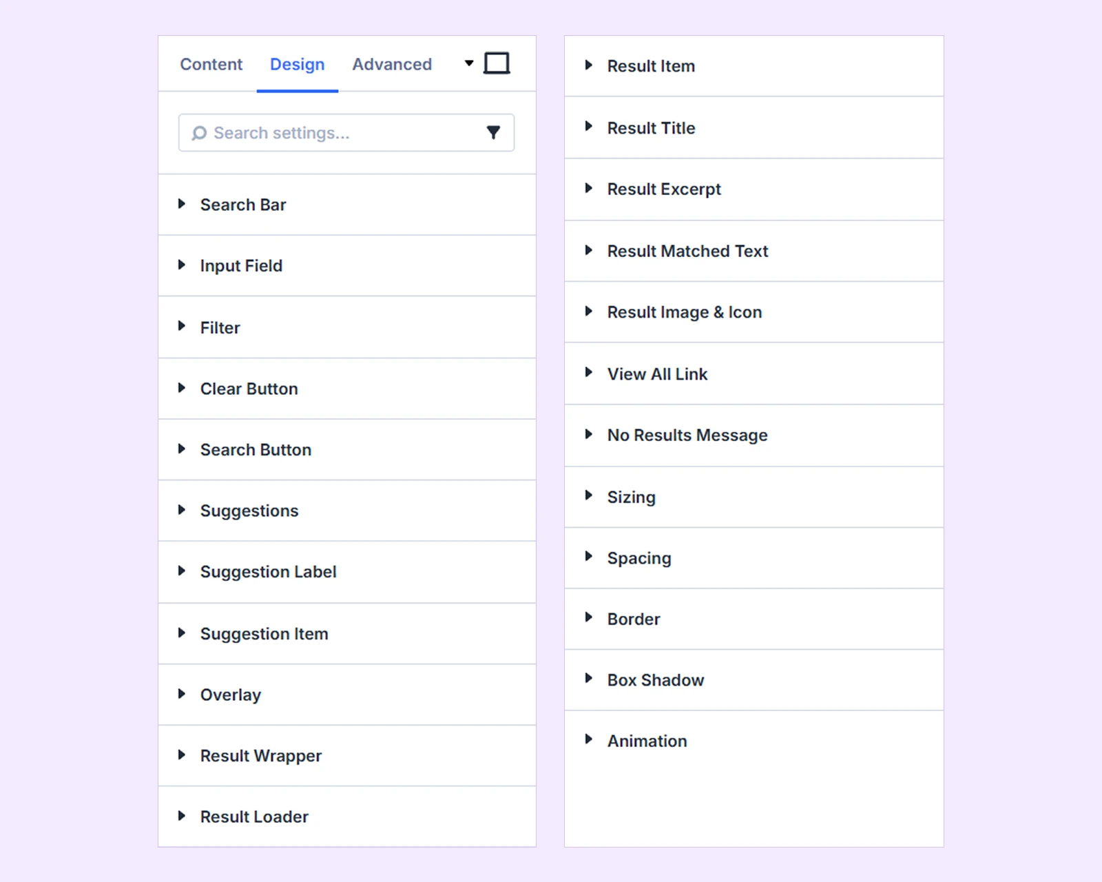
Search Bar
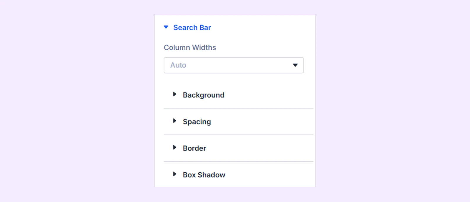
- Column Widths: Choose how the search field, filter, and button widths are handled.
- Auto: Automatically size each element based on the available space.
- Custom: Set individual widths for the search elements.
- Input Width: Adjust the width of the search field.
- Filter Width: Adjust the filter width. Available when Filter is enabled.
- Button Width: Adjust the search button width. Available when the search button is enabled.
You will also find customization options such as background, spacing, border, and box shadow.
Input Field
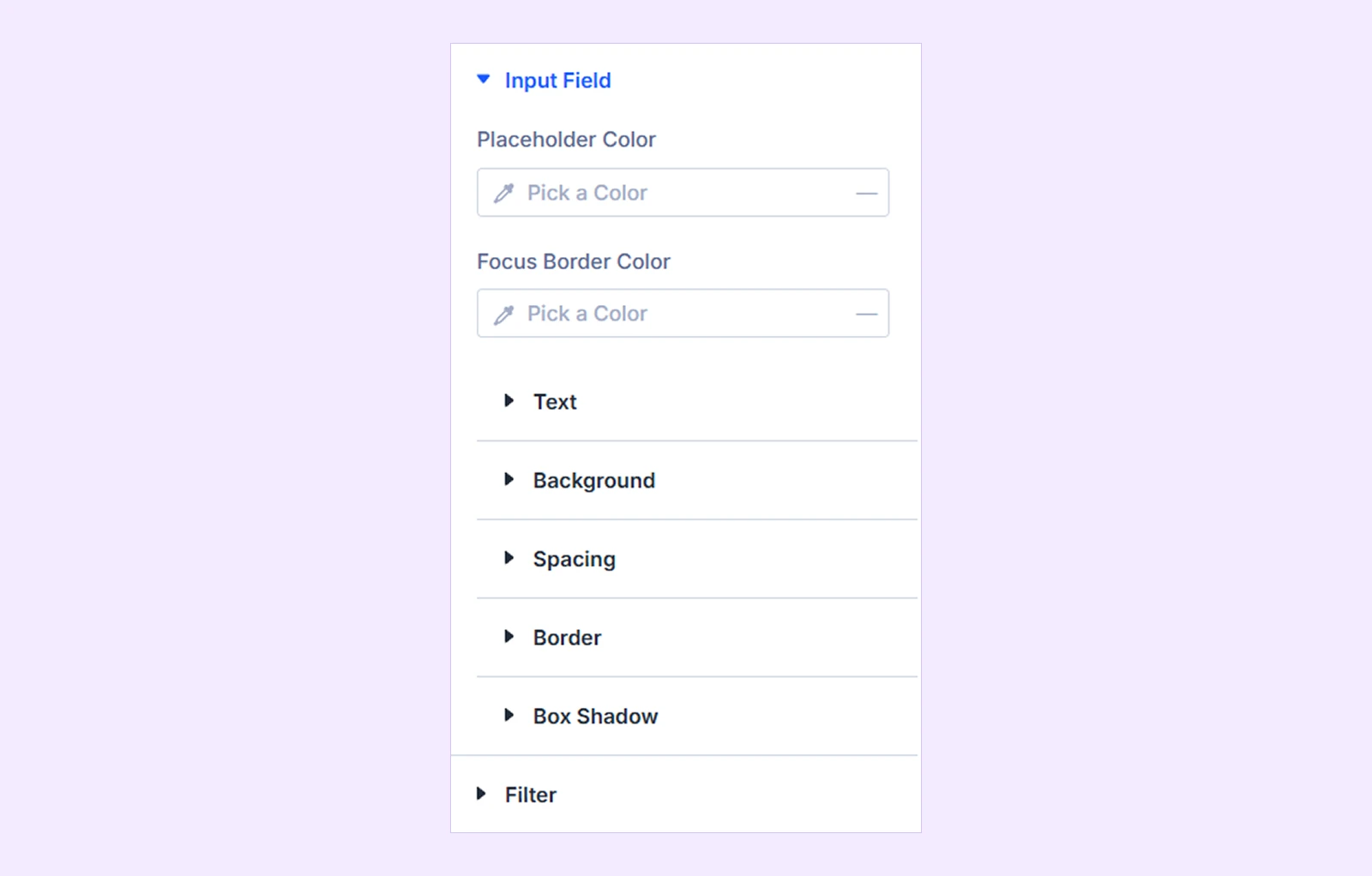
- Placeholder Color: Choose the placeholder text color.
- Focus Border Color: Set a different border color when visitors focus on the search field.
- Voice Icon Color: Set the voice search icon color. Available when Voice Search is enabled.
- Voice Icon Size: Adjust the voice search icon size.
- Icon Color: Choose the input field icon color. Available when the input field icon is enabled.
- Icon Size: Adjust the input field icon size.
- Icon Gap: Adjust the spacing between the input icon and search text.
You will also find settings for customizing the input field typography, background, spacing, border, and box shadow.
Input Field Label: Customize the typography and styling of the label displayed above the search field. (Available when Show Field Label is enabled from Content → Search Form.)
Filter: Customize the typography and styling of the taxonomy filter. (Available when it is enabled from Content → Filter).
Filter Label: Customize the typography and styling of the filter label. (Available when both Enable Filter and Show Label are enabled.)
Clear Button
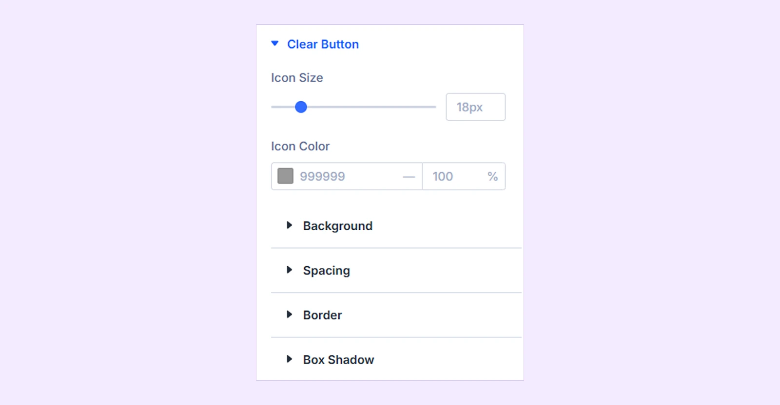
- Icon Size: Adjust the size of the clear icon.
- Icon Color: Choose the clear icon color.
You will also find customization options such as background, spacing, border, and box shadow.
Filter Dropdown: Customize background, spacing, border and box shadow of the filter dropdown. (Available when it is enabled from Content → Filter).
Filter Dropdown Item: Customize text, background, spacing, border and box shadow of the filter dropdown. (Available when it is enabled from Content → Filter).
Search Button
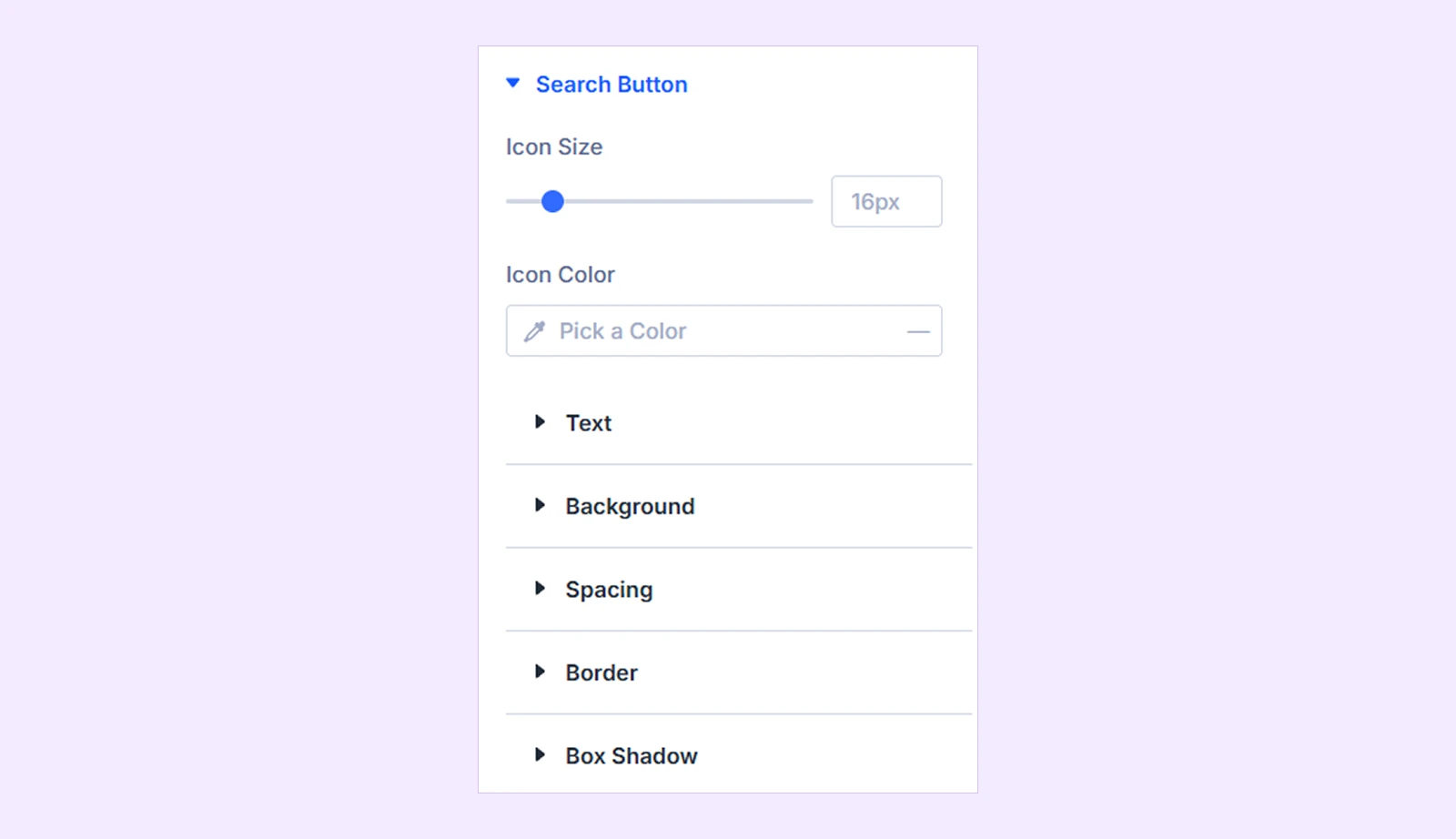
- Icon Size: Adjust the search button icon size. Available when the selected Button Style contains an icon.
- Icon Color: Choose the search button icon color.
You can also customize the button text, background, spacing, border, and box shadow.
Suggestions: Use these settings to customize the suggestions wrapper using options such as background, spacing, border, and box shadow. ()
Suggestion Label: Customize the typography and styling of the Recent Searches and Popular Searches labels.
Suggestion Item: Customize the typography and appearance of individual clickable search suggestions.
Expanding Panel: Use these settings to customize the connected surface around the search form and expand results using background, spacing, border, and box shadow options. (Available when Expand is selected from Content → Results Animation.)
Overlay
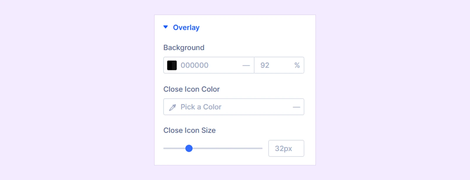
- Background: Set the overlay background.
- Close Icon Color: Set the close icon color.
- Close Icon Size: Adjust the close icon size.
Note: This is available only when the Fullscreen Overlay is selected in the Form Layout from Content → Search Form.
Result Wrapper
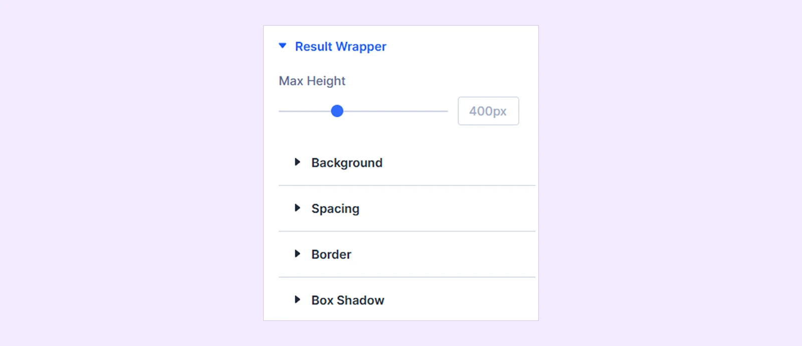
- Max Height: Set the maximum height of the results panel before it becomes scrollable.
There you will also find customization options like background, spacing, border, and box shadow.
Result Loader
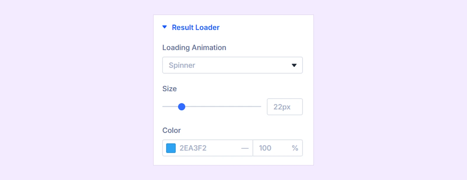
- Loading Animation: Choose the loading indicator:
- Spinner
- Dots
- Pulse
- Bars
- Skeleton Rows
- None
- Size: Adjust the loader size where applicable.
- Color: Choose the loader color.
Result Group Heading: Use these settings to customize the group heading typography, background, spacing, border, and box shadow. (Available when ‘Group Results By Post Type’ or ‘Show Taxonomy Term Matches’ is enabled from Content → Result Extras.)
Result Item: Customize each individual search result using options like background, spacing, and border.
Result Title: Customize the typography and appearance of result titles.
Result Excerpt: Customize the typography and appearance of result excerpts.
Result Matched Text: Use these settings to customize the appearance of the words that match the visitor's search term.
Result Image & Icon
Available when Image is enabled from Content → Result Content → Show In Each Result.
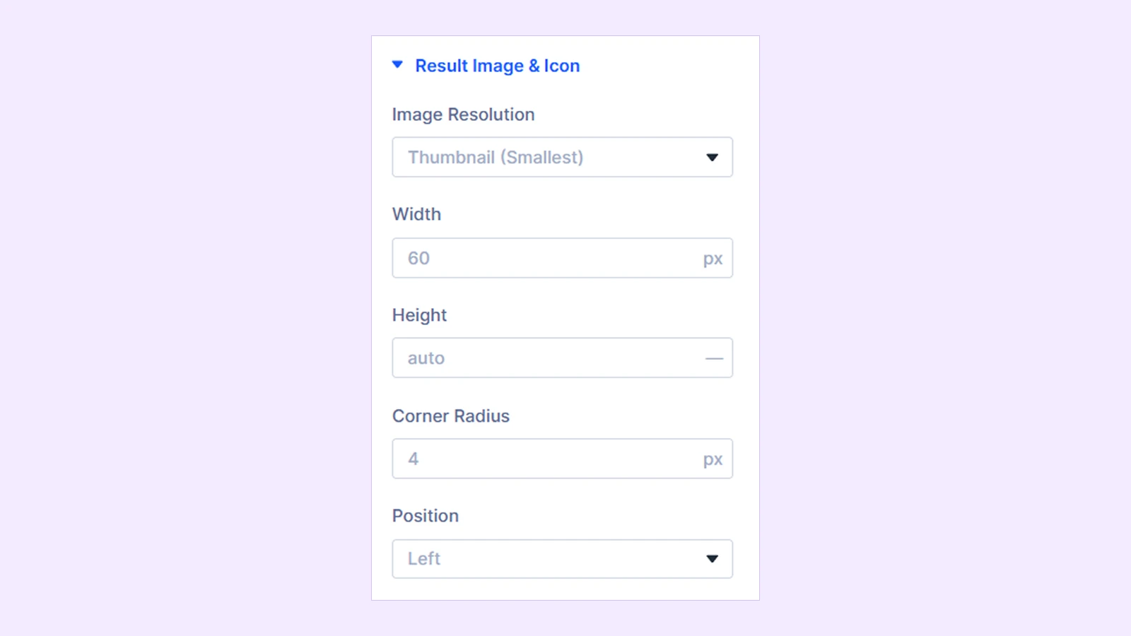
- Image Resolution: Set the WordPress media size used for the result image (Thumbnail, Medium, Medium Large, Large, Full).
- Width: Adjust the width of the selected image.
- Height: Adjust the height of the selected image.
- Corner Radius: Set the corner radius of the selected item by pixels.
- Position: Choose the position of the selected image. Available options:
- Left
- Right
- Top
- Bottom
- Alignment: Set the alignment of the image position. (Available with the top and bottom positions only.)
If Use Icon Instead Of Image is enabled from Content → Result Content:
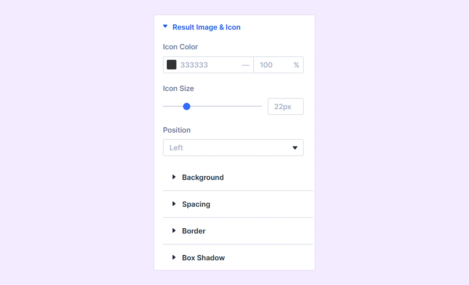
- Icon Color: Choose the result icon color.
- Icon Size: Adjust the icon size.
- Position: Choose the position of the selected icon. Available options:
- Left
- Right
- Top
- Bottom
- Alignment: Set the alignment of the icon position. (Available with the top and bottom positions only.)
When an icon is used, you will also find options such as background, spacing, border, and box shadow.
View All Link: Customize the typography and appearance of the View All Results link. (Available when Show View All Link is enabled from Content → Result Extras.)
No Results Message: Customize the typography of the message displayed when no matching search results are found.
Result Meta: Use these settings to customize the typography and appearance of result metadata such as dates and product prices. (Available when Show Date is enabled from Content → Result Content.)
Add To Cart: Use these settings to customize the button typography, background, spacing, border, and box shadow. (Available when WooCommerce is active and Add To Cart is enabled from Show Product Elements in Content → Result Content.)
Sizing: Adjust the module's width, height, alignment, and overflow behavior.
Spacing: Add custom margin and padding around the module.
Border: Customize the module's border style, width, color, and corner radius.
Box Shadow: Add and customize shadow effects around the module.
Filters: Apply visual filters such as brightness, contrast, saturation, opacity, and blur.
Transform: Scale, move, rotate, or skew the module.
Animation: Apply Divi animation effects and control their timing and behavior.
Advanced Tab
The Advanced tab provides the standard Divi settings for custom CSS, visibility conditions, transitions, attributes, positioning, and other advanced controls.
Need Help?
If you have any questions or need assistance, contact our support team: [email protected]